The magic that transforms the average schoolgirl often transforms more than just one person—it transforms her group of friends. This is, in a loose analogous way, the Japanese version of the American Team Action Fighters, all costumed, who fight on the side of justice. But these girls are more than just fighting for the same cause, they’re also best friends.
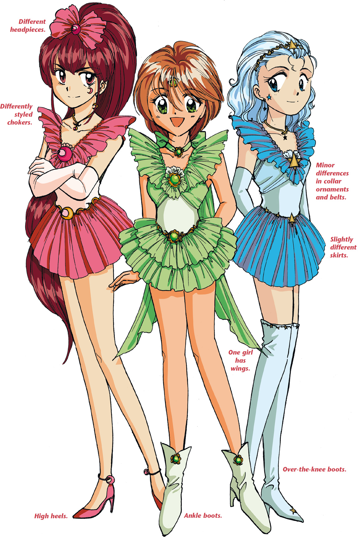
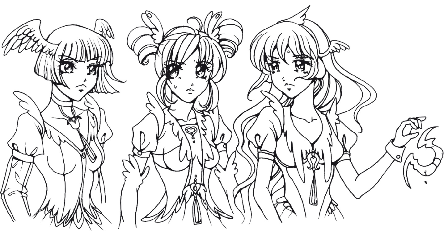
When you’re working with three girls, rather than one, it’s important to create more than just a unifying visual theme, but differences, as well. You don’t want them to blend together to such an extent that they lose their individual personalities.
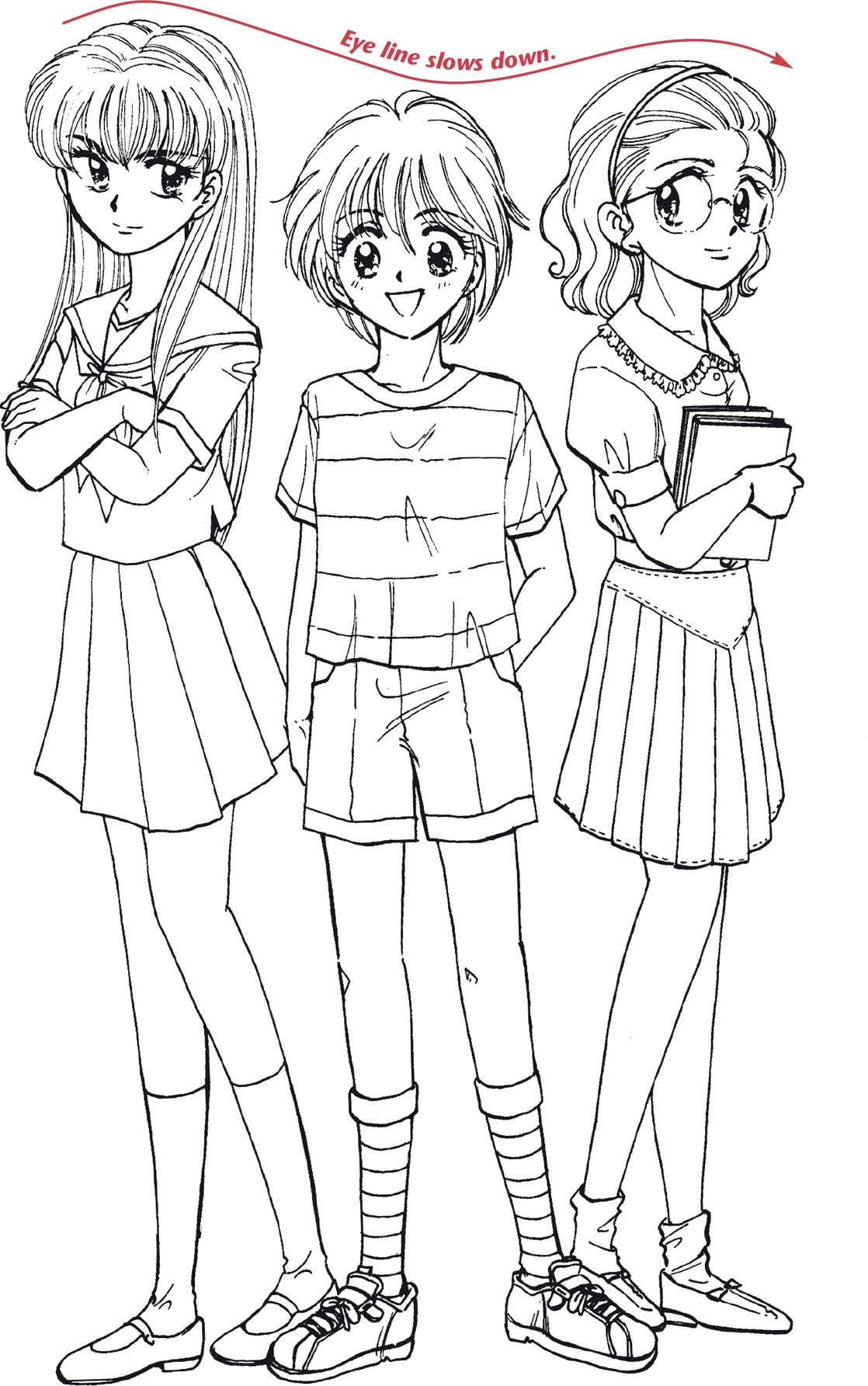
One commonly overlooked way to do this that you should always employ when drawing a group of girls is by varying the height of the characters. Varying the heights forces the eye to travel up and down while scanning the image, which makes the eye slow down and take more time to soak in the image. When the characters are all the same height, the eye tends to skim the image quickly, as one whole clump, without looking at each girl individually, which is a disadvantage for the artist, who has worked hard to draw each figure.

Same Height
The eye doesn’t have to work to scan the image.
Varied Heights
The eye must slow down to take in each character.
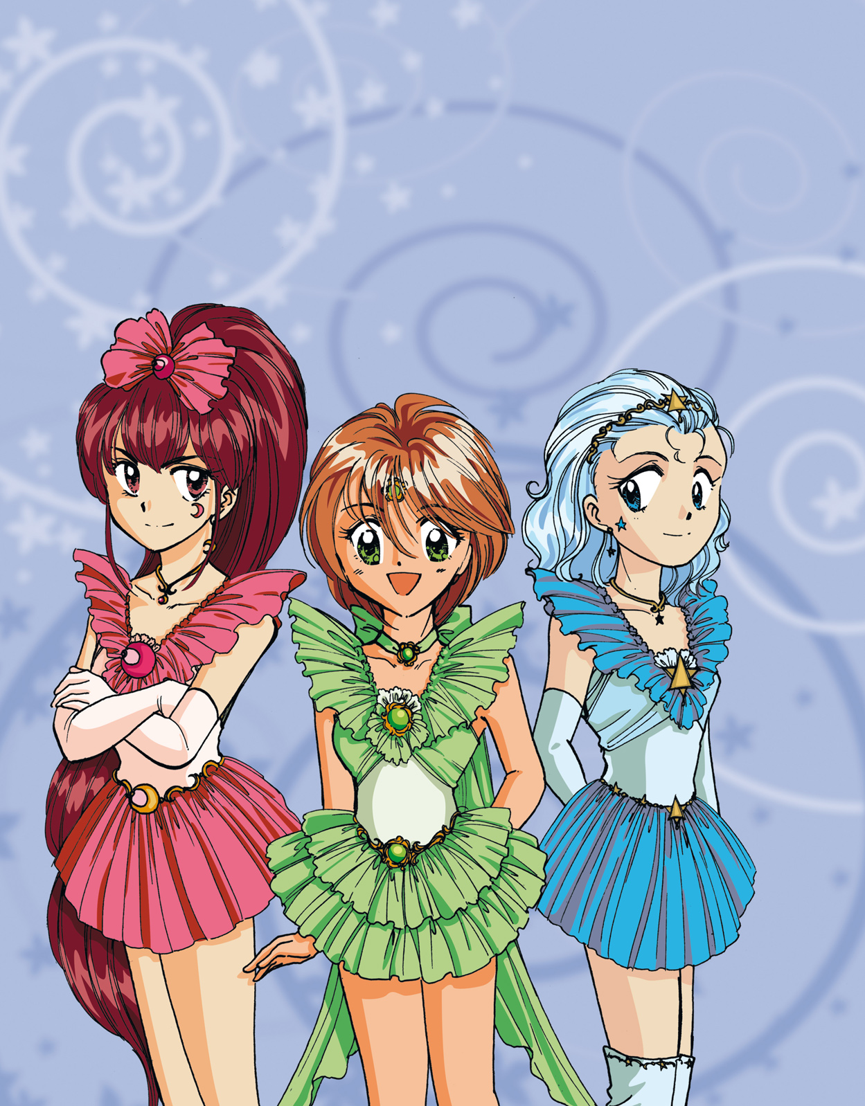
Of course, you’ll give the magical girls outstanding costumes. But will you give them each different costumes? Well before you answer, let me present the issue in more detail. You need to give each girl her own, individual identity. If you give each character the same costume, they will all look like clones. But if the costumes look too different, the characters won’t look like part of a team. So the answer is: No, you don’t give them each totally different costumes. You give them all similar costumes—but with just enough differences to make them look like individuals. The differences in the design of the costumes may be subtle, but with the addition of color, you can highlight the differences one notch further.

Same Costumes
Varied Costumes
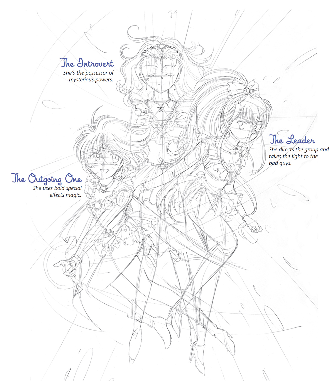
The last step in creating a team is all about staging and matching each personality to a fighting style. You could show your magical girl team standing stiffly, or you could show your team in motion, ready to take on the bad guys. You don’t want the team members standing in a single row, side by side. That’s boring. It’s more exciting if they look as if they’re coming at you. But you have to be careful that the figures don’t overlap one another too much. You want the reader to have a clear view of each character. Try arranging them with the highest figure as the one in the center and the other two below her and to the sides.
Just as there are different hairstyles for different personalities, so too are there different types of magical girl fighters. Choose the personality type that best fits the fighting style. For example, the bubbly personality is best suited to be the fighter with the special effects. The introverted personality is best as a fighter who possesses mysterious powers. And the leader of the group takes the fight to the bad guys.
What’s the most important moment of an effective fight scene?
A. the attack
C. the special effects
D. the near defeat
E. the monster’s expression
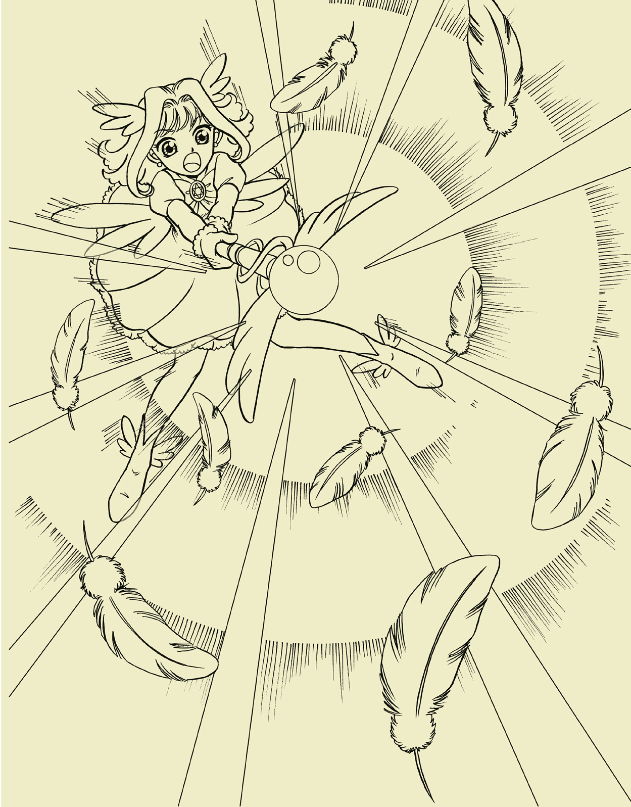
Time’s up. What did you guess—A? That’s what I would have guessed. That makes the most sense, naturally. I mean, you’ve got to have an attack, right? If you guessed A, get down and give me ten push-ups and a lap around the track. You’re wrong! Same with all you readers who picked B, C, and E. The correct answer is D. Yep, that understated, lonely little answer hidden toward the bottom of the stack is the correct one. The near defeat is the key to a good fight scene.
The near defeat comes right after an attack that should work but doesn’t. It’s the “uh-oh” moment of the fight, when the girls realize that they might not have enough of what it takes to win. It’s the necessary point in the scene when the audience goes, “Oh heck, now what do they do?” That’s the point you’ve got to bring your reader to. Without that, you’re just going in a straight line toward victory, and that spells B-O-R-I-N-G. With the setback, the reader suddenly wakes up and realizes, Hey, these gals could actually lose!
Let’s follow the action the way a professional manga artist might lay it out in a scene between a band of magical girls and a fire monster.

Panel 1: The Face-Off
This is when they come face-to-face with their enemy. No blow is struck. It’s just a confrontation at this point.

Panel 2: Lead Girl Takes Her Best Shot
The first magical girl throws her magical boomerang into the heart of the fiery beast. This is her most effective weapon, and it never fails—until now! This is a real setback! Gulp!
Panel 3: The Reaction Shot (the Huddle)
Again to underline the setback, we have a reaction shot, as the girls look to one another, bewildered. Hmmm, this could mean trouble. What are they going to do now?
Panel 4: Strike Again
This time, they combine forces and strike as a single group. Their power multiplied by three, the girls now overcome the fire monster, save the world and the universe, and still have time to complete their homework assignment before class tomorrow.
Before you start to draw your figure, do some very quick, rough sketches—I’m talking fifteen-second sketches—of your character in a variety of poses to decide which is the most dynamic position. Don’t invest anything emotionally in any one, single pose. Add no detail. Don’t get attached. This will help you make a totally dispassionate decision. If you don’t like any of the choices you’ve made, toss ’em and start over. Once you find a pose that’s promising, then start exploring its possibilities and work it up.
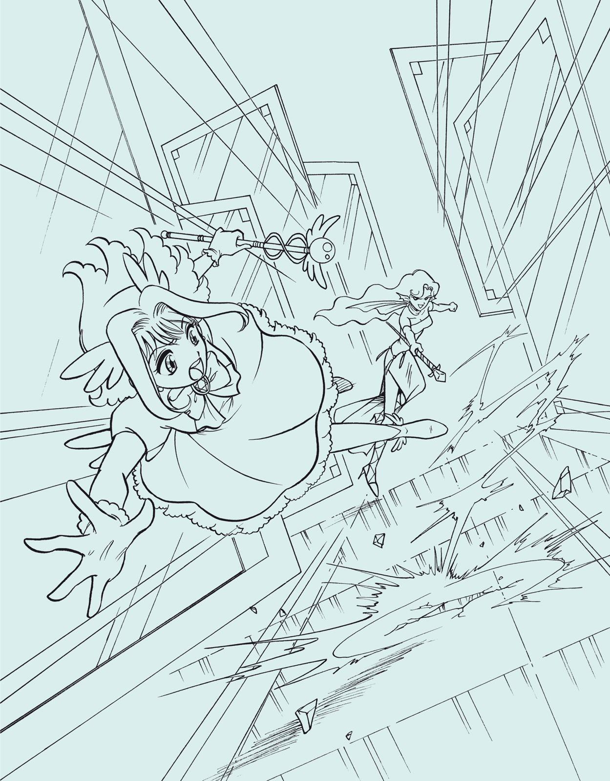
Here’s a typical action that you’ll no doubt have a reason to draw at some point in your magical girl comics. The magical girl has taken just about all the abuse she cares to take … now you’ve gone and ticked her off. Out comes the wand, and she lets you have it! Let’s examine the three most likely ways a beginner might draw this pose. (None of them are wrong, per se, but there are reasons why they might not be your absolute best choice.) And then we’ll see what we can do about it.

Too Flat
The dead-on side pose has no depth. It doesn’t bring the eye into the scene. You’re watching it as a totally neutral observer.

A reverse angle describes viewing the action from over the shoulder of the character. The drawback with this pose is that the biggest, most impressive object in the picture is the girl’s back.

This is usually a nice angle for a change of pace. The problem here is that the action doesn’t support the angle. The high angle doesn’t underscore a sense of power, it detracts from it. Low angles underscore power.
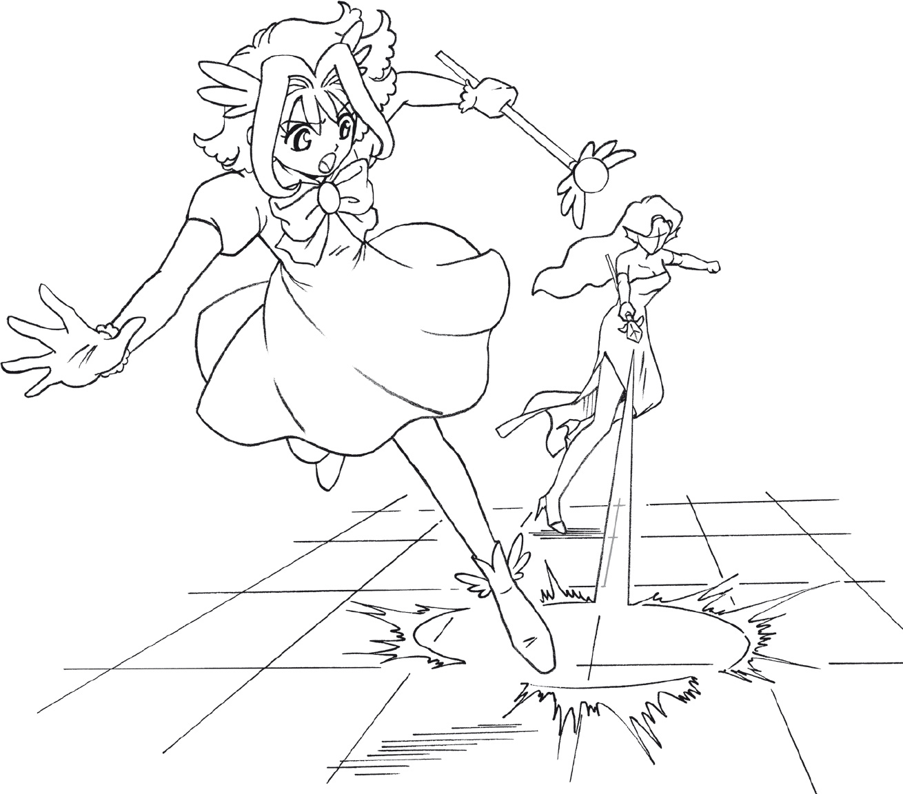
Here’s another comparison of poses. Does this scene remind you of anything? How about the old Westerns when a gunfighter shoots at another guy, who dives behind some cover? Yes, the costumes and settings change, but the plot lines vary little. Instead of bullets, it’s laser beams. But you still have to jump out of the way because you don’t want to get hit by either of them! This is a “money shot” (Hollywood lingo translation: it’s an audience favorite)—so use it! If you’re doing a sequential fight scene, try to work it in.
Not Bad, but …
This works well. But there’s something a little static about the scene. I mean, you’ve got your main character leaping out of the way of a blast, and yet there’s still room to build it into more of a moment.

A Good Idea Taken Too Far
Okay, okay, I said to make a bigger moment out of it, but don’t go nuts! Forced perspective is a great technique. But you’ve still got to be able to see what’s going on. And unfortunately, here you can’t.
When you take a longer view of two characters, it’s called an establishing shot. An establishing shot is very useful for two specific purposes: to set up the beginning of a story and to reestablish where you are in the middle of a scene (if you’ve had so many close-ups and action shots that the reader may have gotten a bit lost). However, to cut to an establishing shot in the middle of an action scene is deadly. It saps all the energy from the moment. Can you feel it? The suspense is suddenly lost. This is where your reader puts the book down and goes to the fridge. Don’t let that happen.
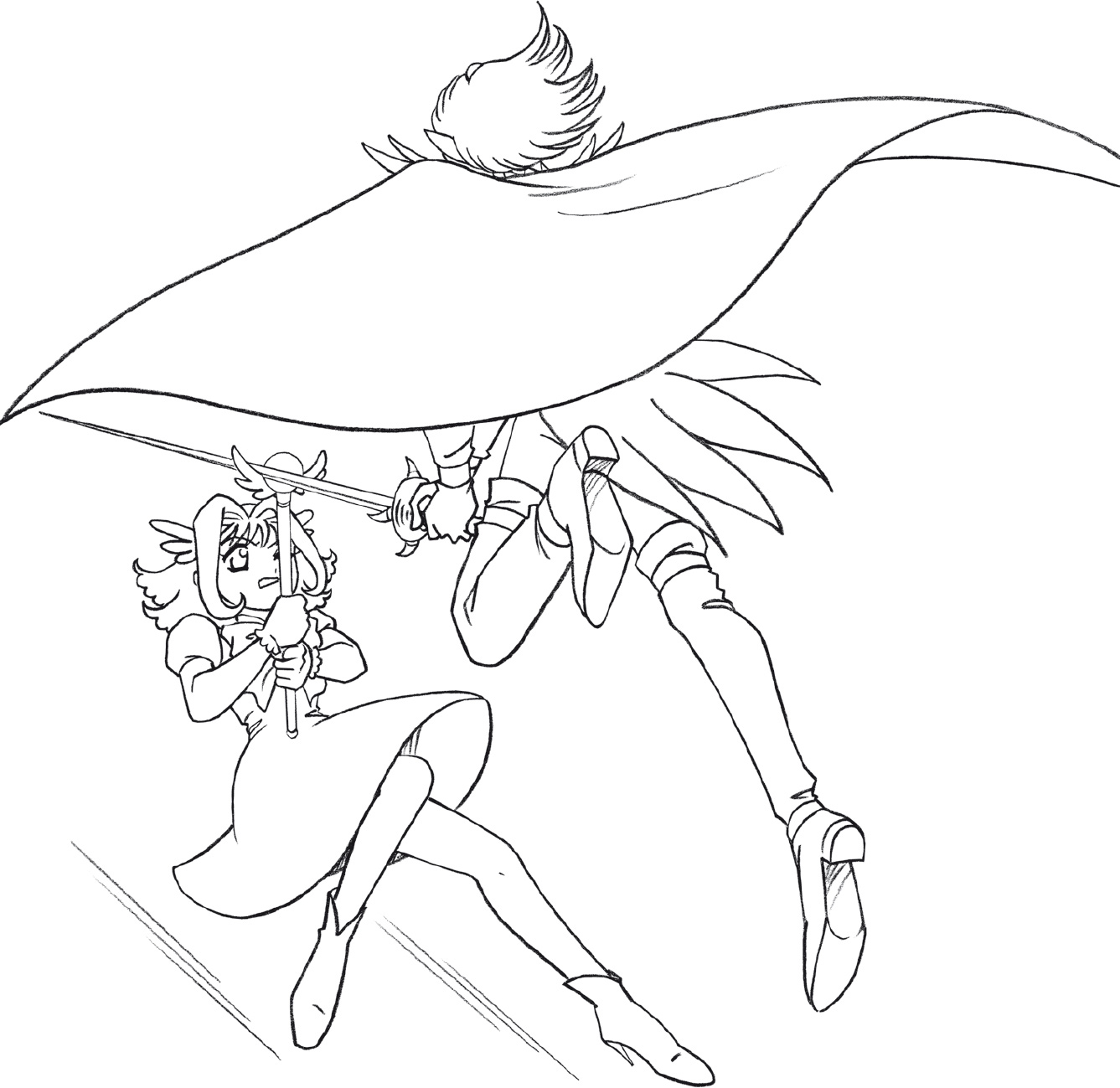
Ah yes, the moment we’ve all been waiting for: It’s a tense instant—at least, it should be—because she cannot hold it for long against her physically more powerful opponent. And readers know it, which adds the classic suspense elements of the ticking clock: How much longer can she keep it up?
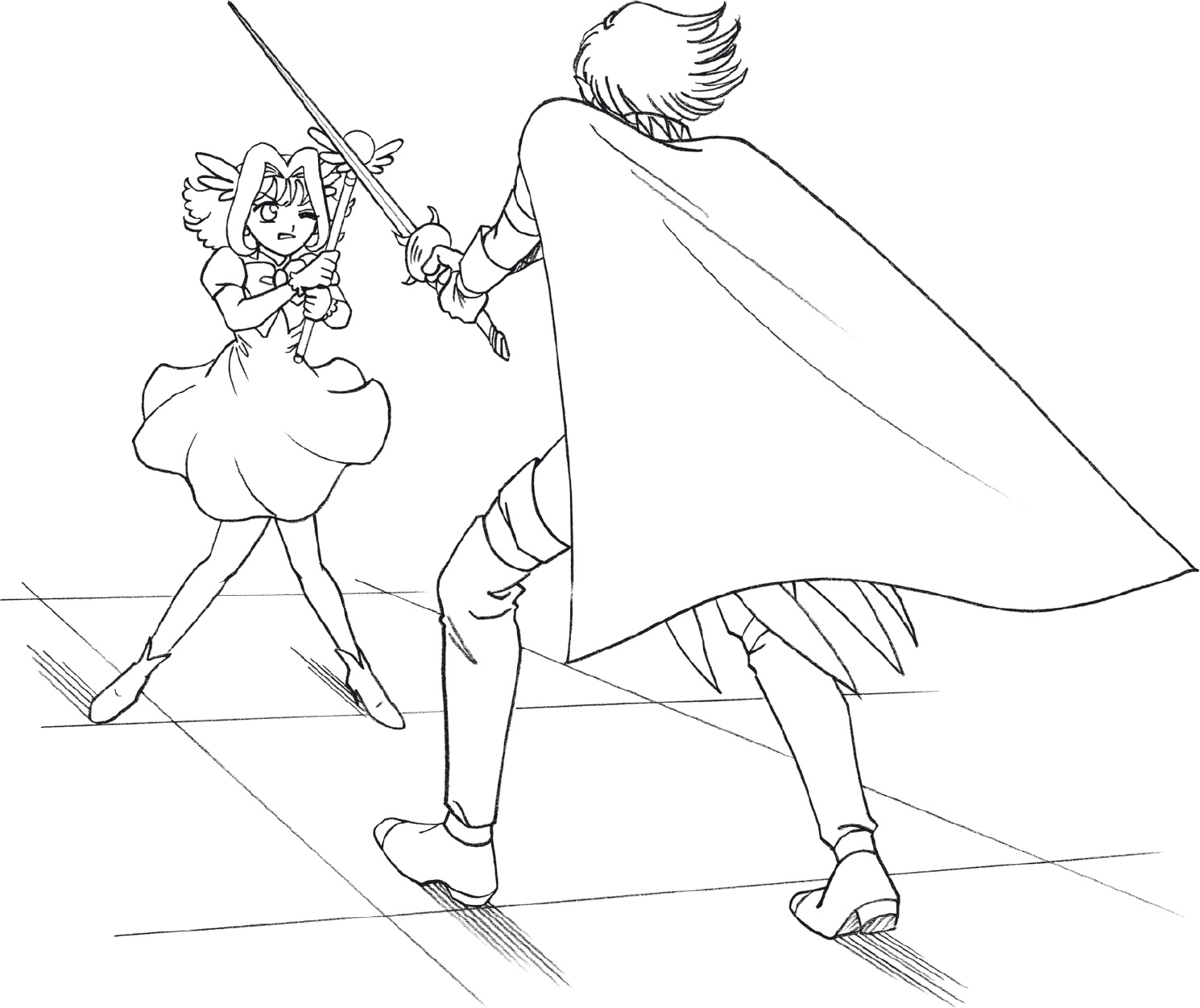
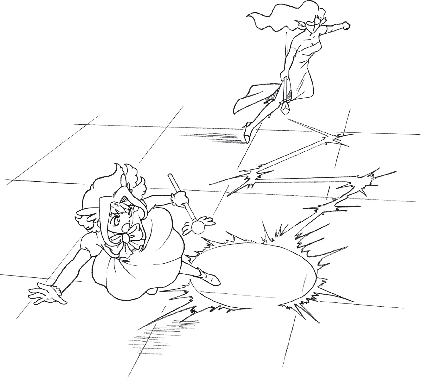
This is a typical beginner’s mistake. Concentrating on making the figures look correct at the expense of the action. Figures in fight scenes do not keep so much distance from each other. There’s one exception to this: when you’re showing a reaction shot in a fight scene. So for example, if someone is punched halfway across a room, you can show that person crashing into a wall twenty feet away. Otherwise, figures in fight scenes should be positioned in close to each other, to heighten the struggle.

This is a great shot to cut into after you first show a two-shot (a shot with two people in it).
Too Far Away
Nice angles, nice everything, but when you’re drawing action scenes in comics, you’ve got to be in the reader’s face. And this is not.