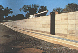
It’s taken me years to be able to discuss the making of the Vietnam Veterans Memorial, partly because I needed to move past it and partly because I had forgotten the process of getting it built. I would not discuss the controversy surrounding its construction and it wasn’t until I saw the documentary, Maya Lin: A Strong Clear Vision, that I was able to remember that time in my life. But I wrote the body of this essay just as the memorial was being completed—in the fall of 1982. Then I put it away . . . until now.
I think the most important aspect of the design of the Vietnam Veterans Memorial was that I had originally designed it for a class I was taking at Yale and not for the competition. In that sense, I had designed it for me—or, more exactly, for what I believed it should be. I never tried to second-guess a jury. And it wasn’t until after I had completed the design that I decided to enter it in the competition.
The design emerged from an architectural seminar I was taking during my senior year. The initial idea of a memorial had come from a notice posted at the school announcing a competition for a Vietnam veterans memorial. The class, which was on funereal architecture, had spent the semester studying how people, through the built form, express their attitudes on death. As a class, we thought the memorial was an appropriate design idea for our program, so we adopted it as our final design project.
At that point, not much was known about the actual competition, so for the first half of the assignment we were left without concrete directions as to what “they” were looking for or even who “they” were. Instead, we had to determine for ourselves what a Vietnam memorial should be. Since a previous project had been to design a memorial for World War III, I had already begun to ask the simple questions: What exactly is a memorial? What should it do?
My design for a World War III memorial was a tomblike underground structure that I deliberately made to be a very futile and frustrating experience. I remember the professor of the class, Andrus Burr, coming up to me afterward, saying quite angrily, “If I had a brother who died in that war, I would never want to visit this memorial.” I was somewhat puzzled that he didn’t quite understand that World War III would be of such devastation that none of us would be around to visit any memorial, and that my design was instead a prewar commentary. In asking myself what a memorial to a third world war would be, I came up with a political statement that was meant as a deterrent.
I had studied earlier monuments and memorials while designing that memorial and I continued this research for the design of the Vietnam memorial. As I did more research on monuments, I realized most carried larger, more general messages about a leader’s victory or accomplishments rather than the lives lost. In fact, at the national level, individual lives were very seldom dealt with, until you arrived at the memorials for World War I. Many of these memorials included the names of those killed. Partly it was a practical need to list those whose bodies could not be identified—since dog tags as identification had not yet been adopted and, due to the nature of the warfare, many killed were not identifiable—but I think as well the listing of names reflected a response by these designers to the horrors of World War I, to the immense loss of life.

The images of these monuments were extremely moving. They captured emotionally what I felt memorials should be: honest about the reality of war, about the loss of life in war, and about remembering those who served and especially those who died.
I made a conscious decision not to do any specific research on the Vietnam War and the political turmoil surrounding it. I felt that the politics had eclipsed the veterans, their service and their lives. I wanted to create a memorial that everyone would be able to respond to, regardless of whether one thought our country should or should not have participated in the war. The power of a name was very much with me at the time, partly because of the Memorial Rotunda at Yale. In Woolsey Hall, the walls are inscribed with the names of all the Yale alumni who have been killed in wars. I had never been able to resist touching the names cut into these marble walls, and no matter how busy or crowded the place is, a sense of quiet, a reverence, always surrounds those names. Throughout my freshman and sophomore years, the stonecutters were carving in by hand the names of those killed in the Vietnam War, and I think it left a lasting impression on me . . . the sense of the power of a name.
• • •
One memorial I came across also made a strong impression on me. It was a monument to the missing soldiers of the World War I battle of the Somme by Sir Edwin Lutyens in Thiepval, France. The monument includes more than 100,000 names of people who were listed as missing because, without ID tags, it was impossible to identify the dead. (The cemetery contains the bodies of 70,000 dead.) To walk past those names and realize those lost lives—the effect of that is the strength of the design. This memorial acknowledged those lives without focusing on the war or on creating a political statement of victory or loss. This apolitical approach became the essential aim of my design; I did not want to civilize war by glorifying it or by forgetting the sacrifices involved. The price of human life in war should always be clearly remembered.
But on a personal level, I wanted to focus on the nature of accepting and coming to terms with a loved one’s death. Simple as it may seem, I remember feeling that accepting a person’s death is the first step in being able to overcome that loss.
I felt that as a culture we were extremely youth-oriented and not willing or able to accept death or dying as a part of life. The rites of mourning, which in more primitive and older cultures were very much a part of life, have been suppressed in our modern times. In the design of the memorial, a fundamental goal was to be honest about death, since we must accept that loss in order to begin to overcome it. The pain of the loss will always be there, it will always hurt, but we must acknowledge the death in order to move on.
What then would bring back the memory of a person? A specific object or image would be limiting. A realistic sculpture would be only one interpretation of that time. I wanted something that all people could relate to on a personal level. At this time I had as yet no form, no specific artistic image.
The use of names was a way to bring back everything someone could remember about a person. The strength in a name is something that has always made me wonder at the “abstraction” of the design; the ability of a name to bring back every single memory you have of that person is far more realistic and specific and much more comprehensive than a still photograph, which captures a specific moment in time or a single event or a generalized image that may or may not be moving for all who have connections to that time.
Then someone in the class received the design program, which stated the basic philosophy of the memorial’s design and also its requirements: all the names of those missing and killed (57,000) must be a part of the memorial; the design must be apolitical, harmonious with the site, and conciliatory.
These were all the thoughts that were in my mind before I went to see the site.
Without having seen it, I couldn’t design the memorial, so a few of us traveled to Washington, D.C., and it was at the site that the idea for the design took shape. The site was a beautiful park surrounded by trees, with traffic and noise coming from one side—Constitution Avenue.
I had a simple impulse to cut into the earth.
I imagined taking a knife and cutting into the earth, opening it up, an initial violence and pain that in time would heal. The grass would grow back, but the initial cut would remain a pure flat surface in the earth with a polished, mirrored surface, much like the surface on a geode when you cut it and polish the edge. The need for the names to be on the memorial would become the memorial; there was no need to embellish the design further. The people and their names would allow everyone to respond and remember.
It would be an interface, between our world and the quieter, darker, more peaceful world beyond. I chose black granite in order to make the surface reflective and peaceful. I never looked at the memorial as a wall, an object, but as an edge to the earth, an opened side. The mirrored effect would double the size of the park, creating two worlds, one we are a part of and one we cannot enter. The two walls were positioned so that one pointed to the Lincoln Memorial and the other pointed to the Washington Monument. By linking these two strong symbols for the country, I wanted to create a unity between the nation’s past and present.
The idea of destroying the park to create something that by its very nature should commemorate life seemed hypocritical, nor was it in my nature. I wanted my design to work with the land, to make something with the site, not to fight it or dominate it. I see my works and their relationship to the landscape as being an additive rather than a combative process.
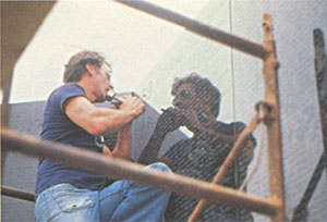
On our return to Yale, I quickly sketched my idea up, and it almost seemed too simple, too little. I toyed with adding some large flat slabs that would appear to lead into the memorial, but they didn’t belong. The image was so simple that anything added to it began to detract from it.
• • •
I always wanted the names to be chronological, to make it so that those who served and returned from the war could find their place in the memorial. I initially had the names beginning on the left side and ending on the right. In a preliminary critique, a professor asked what importance that left for the apex, and I, too, thought it was a weak point, so I changed the design for the final critique. Now the chronological sequence began and ended at the apex so that the time line would circle back to itself and close the sequence. A progression in time is memorialized. The design is not just a list of the dead. To find one name, chances are you will see the others close by, and you will see yourself reflected through them.
The memorial was designed before I decided to enter the competition. I didn’t even consider that it might win. When I submitted the project, I had the greatest difficulty trying to describe it in just one page. It took longer, in fact, to write the statement that I felt was needed to accompany the required drawings than to design the memorial. The description was critical to understanding the design since the memorial worked more on an emotional level than a formal level.
Coincidentally, at the time, I was taking a course with Professor Vincent Scully, in which he just happened to focus on the same memorial I had been so moved by—the Lutyens memorial to the missing. Professor Scully described one’s experience of that piece as a passage or journey through a yawning archway. As he described it, it resembled a gaping scream, which after you passed through, you were left looking out on a simple graveyard with the crosses and tombstones of the French and the English. It was a journey to an awareness of immeasurable loss, with the names of the missing carved on every surface of this immense archway.
• • •
I started writing furiously in Scully’s class. I think he has always been puzzled by my connection to the Lutyens memorial. Formally the two memorials could not be more different. But for me, the experiences of these two memorials describe a similar passage to an awareness about loss.
The competition required drawings, along with the option to include a written description. As the deadline for submission approached, I created a series of simple drawings. The only thing left was to complete the essay, which I instinctively knew was the only way to get anyone to understand the design, the form of which was deceptively simple. I kept reworking and reediting the final description. I actually never quite finished it. I ended up at the last minute writing freehand directly onto the presentation boards (you can see a few misprints on the actual page), and then I sent the project in, never expecting to hear about it again.
The drawings were in soft pastels, very mysterious, very painterly, and not at all typical of architectural drawings. One of the comments made by a juror was “He must really know what he is doing to dare to do something so naive” (italics mine). But ultimately, I think it was the written description that convinced the jurors to select my design.
On my last day of classes my roommate, Liz Perry, came to retrieve me from one of my classes, telling me a call from Washington had come in and that it was from the Vietnam Veterans Memorial Fund; they needed to talk to me and would call back with a few questions about the design. When they called back, they merely said they needed to ask me a few questions and wanted to fly up to New Haven to talk to me. I was convinced that I was number 100 and they were only going to question me about drainage and other technical issues. It never occurred to me that I might have won the competition. It was still, in my mind, an exercise—as competitions customarily are for architecture students.
And even after three officers of the fund were seated in my college dorm room, explaining to me that it was the largest competition of its kind, with more than fourteen hundred entries, and Colonel Schaet, who was talking, without missing a beat calmly added that I had won (I think my roommate’s face showed more emotion than mine did at the time), it still hadn’t registered. I don’t think it did for almost a year. Having studied the nature of competitions, especially in Washington (for instance, the FDR Memorial, still unbuilt in 1981, nearly forty years after it was first proposed, or the artwork Robert Venturi and Richard Serra collaborated on for L’Enfant Plaza, which was completely modified as it went through the required Washington design process of approvals), my attitude about unusual projects getting built in Washington was not optimistic. Partly it’s my nature—I never get my hopes up—and partly I assumed the simplicity of the design, and its atypical form and color, would afford it a difficult time through the various governmental-approval agencies.
After the design had been chosen, it was subject to approval by various governmental agencies at both the conceptual and design development phases. I moved to Washington and stayed there throughout these phases. I expected the design to be debated within the design-approval agencies; I never expected the politics that constantly surrounded its development and fabrication.
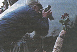
I was driven down to D.C. the day of my college graduation, and I immediately became part of an internal struggle for control of the design. I think my age made it seem apparent to some that I was too young to understand what I had done or to see it through to completion. To bring the design into reality would require that I associate with an architect of record, a qualified firm that would work with me to realize the design. I had a very difficult time convincing the fund in charge of the memorial, the VVMF, of the importance of selecting a qualified firm that had experience both in architecture and landscape-integrated solutions, and that would be sympathetic to the design.
I had gone to Cesar Pelli, then dean of Yale’s School of Architecture, for the names of some firms that could handle the job. A firm by the name of Cooper-Lecky was the one he recommended, and I presented its name to the fund, unaware that the competition’s adviser was the fund’s choice as architect of record. I was told by the fund that this person was the architect of record, and that was that.
After a few weeks of tense and hostile negotiations (in which at one point I was warned that I would regret these actions, and that I would “come crawling back on my hands and knees”), I was finally able to convince the fund to go through a legitimate process of selecting a firm to become the architect of record. The then architecture critic for the Washington Post, Wolf Von Eckardt, was instrumental in pressing the fund to listen to me. But the struggle left a considerable amount of ill will and mistrust between the veterans and myself.
Through the remaining phases of the project I worked with the Cooper-Lecky architectural firm. We worked on the practical details of the design, from the addition of a safety curb to a sidewalk to the problems in inscribing the names. Many of the issues we dealt with were connected to the text and my decision to list the names chronologically. People felt it would be an inconvenience to have to search out a name in a book and then find its panel location and thought that an alphabetical listing would be more convenient—until a tally of how many Smiths had died made it clear that an alphabetical listing wouldn’t be feasible. The MIA groups wanted their list of the missing separated out and listed alphabetically. I knew this would break the strength of the time line, interrupting the real-time experience of the piece, so I fought hard to maintain the chronological listing. I ended up convincing the groups that the time in which an individual was noted as missing was the emotionally compelling time for family members. A system of noting these names with a symbol1 that could be modified to signify if the veteran was later found alive or officially declared dead would appease the concerns of the MIA groups without breaking the time line. I knew the time line was key to the experience of the memorial: a returning veteran would be able to find his or her time of service when finding a friend’s name.
The text of the memorial and the fact that I had left out everything except the names led to a fight as to what else needed to be said about the war. The apex is the memorial’s strongest point; I argued against the addition of text at that point for fear that a politically charged statement, one that would force a specific reading, would destroy the apolitical nature of the design. Throughout this time I was very careful not to discuss my beliefs in terms of politics; I played it extremely naive about politics, instead turning the issue into a strictly aesthetic one. Text could be added, but whatever was said needed to fit in three lines—to match the height of the dates “1959” and “1975” that it would be adjacent to. The veterans approved this graphic parameter, and the statements became a simple prologue and epilogue.
The memorial is analogous to a book in many ways. Note that on the right-hand panels the pages are set ragged right and on the left they are set ragged left, creating a spine at the apex as in a book. Another issue was scale; the text type is the smallest that we had come across, less than half an inch, which is unheard of in monument type sizing. What it does is create a very intimate reading in a very public space, the difference in intimacy between reading a billboard and reading a book.
The only other issue was the polished black granite and how it should be detailed, over which I remember having a few arguments with the architects of record. The architects could not understand my choice of a reflective, highly polished black granite. One of them felt I was making a mistake and the polished surface would be “too feminine.” Also puzzling to them was my choice of detailing the monument as a thin veneer with barely any thickness at its top edge. They wanted to make the monument’s walls read as a massive, thick stone wall, which was not my intention at all. I always saw the wall as pure surface, an interface between light and dark, where I cut the earth and polished its open edge. The wall dematerializes as a form and allows the names to become the object, a pure and reflective surface that would allow visitors the chance to see themselves with the names. I do not think I thought of the color black as a color, more as the idea of a dark mirror into a shadowed mirrored image of the space, a space we cannot enter and from which the names separate us, an interface between the world of the living and the world of the dead.
• • •
One aspect that made the project unusual was its politicized building process. For instance, the granite could not come from Canada or Sweden. Though those countries had beautiful black granites, draft evaders went to both countries, so the veterans felt that we could not consider their granites as options. (The stone finally selected came from India.) The actual building process went smoothly for the most part, and the memorial was built very close to my original intentions.
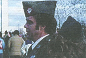
As far as all of the controversy, I really never wanted to go into it too much. The memorial’s starkness, its being below grade, being black, and how much my age, gender, and race played a part in the controversy, we’ll never quite know. I think it is actually a miracle that the piece ever got built. From the very beginning I often wondered, If it had not been an anonymous entry 1026 but rather an entry by Maya Lin, would I have been selected?
I remember at the very first press conference a reporter asking me if I did not find it ironic that the memorial was for the Vietnam War and that I was of Asian descent. I was so righteous in my response that my race was completely irrelevant. It took me almost nine months to ask the VVMF, in charge of building the memorial, if my race was at all an issue. It had never occurred to me that it would be, and I think they had taken all the measures they could to shield me from such comments about a “gook” designing the memorial.
I remember reading the article that appeared in the Washington Post referring to “An Asian Memorial for an Asian War” and I knew we were in trouble. The controversy exploded in Washington after that article. Ironically, one side attacked the design for being “too Asian,” while others saw its simplicity and understatement, not as an intention to create a more Eastern, meditative space, but as a minimalist statement which they interpreted as being non-referential and disconnected from human experience.
This left the opinion in many that the piece emanated from a series of intellectualized aesthetic decisions, which automatically pitted artist against veterans. The fact that I was from an Ivy League college, had hair down to my knees, further fueled this distrust of the design and suspicions of a hippie college liberal or aesthetic elitist forcing her art and commentary upon them.
Perhaps it was an empathetic response to the idea about war that had led me to cut open the earth—an initial violence that heals in time but leaves a memory, like a scar. But this imagery, which some detractors would later describe as “a black gash of shame and sorrow” in which the color black was called the “universal color of shame and dishonor,” would prove incredibly difficult to defend. The misreading of the design as a negative political statement that in some way was meant to reflect upon the service of the veterans was in part fueled by a cultural prejudice against the color black as well as by the misreading or misinformation that led some veterans to imagine the design as a ditch or a hole. It took a prominent four-star general, Brigadier General George Price, who happened to be black, testifying before one of the countless subcommittee hearings and defending the color black, before the design could move forward.
But the distrust, the fact that no veterans had been on the jury, the unconventionality of the design and the designer, and a very radical requirement made by the Vietnam veterans to include all the names of those killed made it inevitable that the project would become controversial. I think ultimately that much of the negative response goes back to the very natural response to cover up or not acknowledge that which is painful or unpleasant. The very fact that the veterans themselves had required the listing and therefore the acknowledgment of the more than 57,000 casualties, which is a landmark in our country in terms of seeing a war via the individual lives lost, was very hard for many to face. I remember Ross Perot when he was trying to persuade the veterans that it was an inappropriate design, asking me if I truly didn’t feel that the veterans would prefer a parade instead, something happy or uplifting, and I can remember thinking that a parade would not in the long term help them overcome the enormous trauma of the politics of that war.
I do not think I fully realized until the dedication and homecoming parade that the veterans needed both. In effect the veterans gave themselves their own homecoming. In November 1982, I was in tears watching these men welcoming themselves home after almost ten years of not being acknowledged by their country for their service, their sacrifice.
But until the memorial was built I don’t think they realized that the design was experiential and cathartic, and, most importantly, designed not for me, but for them. They didn’t see that the chronology of the names allowed a returning veteran the ability to find his or her own time frame on the wall and created a psychological space for them that directly focused on human response and feeling. I remember one of the veterans asking me before the wall was built what I thought people’s reaction would be to it. I realized then that these veterans were willing to defend a design they really didn’t quite understand. I was too afraid to tell him what I was thinking, that I knew a returning veteran would cry.
An architect once told me to look always at what was originally envisioned and try to keep it. I left Washington before ground breaking. I had to. The fund and I knew that we had to accept a compromise. The closer you watch something grow, the less able you are to notice changes in it. When I saw the site again, the granite panels were being put up and the place was frighteningly close to what I thought it should be. It terrified me. It was a strange feeling, to have had an idea that was solely yours be no longer a part of your mind but totally public, no longer yours.
There was always the expectation that since the war had been controversial, the memorial must be also. It wasn’t so much an artistic dispute as a political one. The choice to make an apolitical memorial was in itself political to those who felt only a positive statement about the war would make up for the earlier antiwar days, a past swing to the left now to be balanced. It was extremely naive of me to think that I could produce a neutral statement that would not become politically controversial simply because it chose not to take sides.
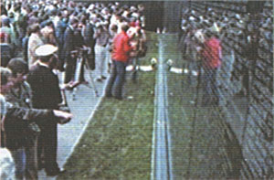
Anyway, the push, as one congressman put it, to “politicize” the design didn’t really affect the memorial in this way. The addition of the statue of infantrymen and then the addition of the female statue to make them equal are to me sad indicators that some politicians believe that you can please all of the people all of the time by compromise and conglomerate works. These statues leave only the false reading that the wall is for the dead and they are for the living, when the design I made was for the returning veterans and equally names all who served regardless of race, creed, or sex. I am only glad that the three infantrymen are not where they had been originally intended, right in the center of the memorial, heads sticking up higher than the walls, converting the walls to a backdrop and violating that private contemplative space. Ironically, the compromise memorializes the conflict in the building of the piece.
People cannot resolve that war, nor can they separate the issues, the politics, from it. As for me, the first time I visited the memorial after it was completed I found myself searching out the name of a friend’s father and touching it. It was strange to realize that I was another visitor and I was reacting to it as I had designed it.