The branding of cities as capitals of this or that has a tragicomic nature—any Glaswegian reminded of the ‘Glasgow’s Miles Better’ campaign that preceded its spell as European City of Culture will tend to be upset—but this doesn’t stop cities appealing for them, and the subsidies they just might have attached. As we set off for the East Midlands, whispers have it that Nottingham will imminently be the British entry for one of the less famous of these, ‘World Capital of Design’. Whether or not this means Forest and County will elicit the same derisive chants that were directed at Liverpool FC fans from rival terraces—‘Capital of Culture, you’re having a laugh’—remains to be seen. The real story with these capitals of art, culture or design is always one of triumphing against the loss of industry, urban transformations from production to consumption. So the question with Nottingham must be: has it replaced the industries—consumer manufacturing, mainly, which died a lot more recently than other parts of industrial Britain—which have gradually been erased? If so, with what? Whether this replacement counts as ‘culture’ we will leave to the judges, but in terms of design, we can make a few judgements of our own.
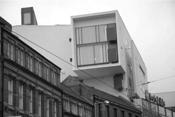
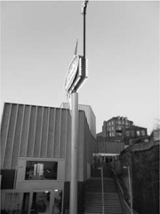
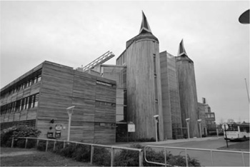
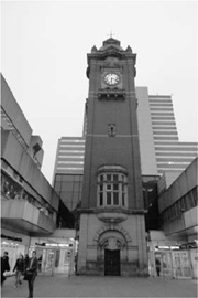
Despite its role in national myth (through that strange socialist monarchist, Robin Hood) and its medieval street plan, Nottingham’s built environment is overwhelmingly of the last two centuries. This is a big city, one of Britain’s largest, but the refusal of many of its suburbs, in a depressing act of egotism, to admit to being part of it means that its true population is significantly larger than the number of people the city council can tax. It’s immediately recognizable as a (former) industrial town, with some massive mills and warehouses in the centre. Architecturally, it is dominated by two styles. These are, from the nineteenth century, a dramatically decorative commercial red-brick Northern Renaissance, Bastardized Bruges, Gradgrindian Gothic; and from the twentieth, a commercial Brutalism, where the earnest urban theories and philosophically argued forms of Alison and Peter Smithson are less important than the profit margins of Arthur Swift and Arndale. These buildings rampage over ancient streets, skywalks and car parks brashly breaking and entering the rows of gables. Both styles can be thrilling and mediocre in roughly equal measure, and in one great moment—where A. E. Lambert’s 1898 Victoria Station clock tower plugs itself into the melodramatic stepped high rise of Peter Winchester’s 1965–72 Victoria Centre —the two styles are part of the same structure.
The monuments to industrial power and civic pride are now more often housing bars, shops, ‘Number 1 Eighties Nights’ and seventies theme pubs. In one example of sheer historical farce, a Pitcher and Piano inhabits a former Unitarian church. The Midland Gothic, the earlier of the city’s two main styles, already based on dreams of a bygone England, is ripe for heritage sightseeing. This brings us to the first in our list of things to do with a post-industrial city: tourism. Nottingham has not, to its credit, opted for simulated Victoriana to fill in the gaps, notwithstanding the tame attempts of 1980s and ’90s vernacular architects. Recent infill is usually modern, as are its new hotels, contemporary buildings billeting those in search of castles and caves. Some are nondescript (Holiday Inn), others are dreadful (Jurys Inn), but one of them is excellent, in fact the only interestingly designed hotel we will find over the next nine months.
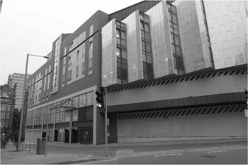
The Victoria Centre
The Ibis ‘Pod’
The Ibis ‘Pod’ is designed by veteran Modernists Benson & Forsyth, whose work has long had the air of followers of the old-time religion. In a sense, their Ibis is just as much of a retro gesture as the nineties bank offices, but while they simulated a past that never occurred, Benson and Forsyth draw on a future that never arrived. In plan, this is a postmodernist building, slotted into the street and determined by aesthetics rather than function, but in every other way it’s Modernist in the ‘heroic’ 1920s sense. Clinging to the street line, the lower floors of the building are given over to the glass walls of Tesco Express. Above and askew, the hotel floors are detailed in Suprematist manner, El Lissitzky for business class. The primary colours are from the De Stijl book of do’s and don’ts, yet the angles culminate in a glazed point in an alleyway which would not pass any functionalist exam. It’s a building that one at first enjoys almost guiltily, its imaginative angles and views compensating for the reduction of idealism to style, but after a while in Nottingham it seems a towering achievement, an uncompromising, fearless thing; one of two new buildings which actually do suggest a city with serious design ambitions.
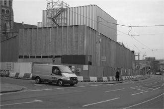
So much for tourism. Second thing to do with a post-industrial city: hand it over to the culture industry, or more politely the ‘creative industries’. Here, also, Nottingham has the usual—a boutique here, a vintage clothes shop there—and another building which impressively avoids contemporary clichés, in the process starting a whole new cliché. Still unfinished when we first visited, it was hard to come to some sort of judgement about Caruso St John’s Centre for Contemporary Art (or ‘Nottingham Contemporary’), but we did at least guess at the likely local jibes or nicknames when this doily-covered shed, this lace shipping container, is finally completed. In fact, within a few weeks of opening its roof had sprung a leak, adding a bucket to the gallery exhibits. What we have here is a series of curtly corrugated boxes stepping down a hill, whose green and gold concrete cladding is, now famously, dressed in lace patterns. Initially, this seems like one of those ubiquitous, shallow gestures at contextualism (here with the former lace mills nearby). After its completion, several proposals for ‘doily’ façades by lesser architects would follow, standard blocks overlaid by repeated images of some local talisman. A building proposed by Bond Bryan for Sheffield Hallam University would reduce it to farce, featuring a pattern of cutlery on its curtain walls.
The concrete doilies of Nottingham Contemporary
This is one of a handful of genuinely unique buildings designed in this decade of competing, egotistical icons, and Caruso St John, usually purveyors of a sober minimalism, seem almost ashamed of their own daring, of the possibility they’d veered into kitsch here. Even critic Ellis Woodman commented, in an otherwise rapturous Building Design review, that he thought the lace pattern was ‘a little naff’,25 although Caruso St John’s appeals to the precedent of the proto-Modernist Chicago School and Louis Sullivan brought them back onto firm scholarly ground. The rippling colours and patterns of the façade are intriguing enough not to need a direct excuse, but in terms of its ‘meaning’, Nottingham Contemporary actually seems to signify something unexpected, and something pointed: a visual amalgam of nineteenth-century industry—intricate patterns, made by underpaid workers on the inhuman machines of the nearby mills—and the twenty-first century’s semi-automated out of town industries, the non-aesthetic of containerization and its windowless warehouses.
On returning to Nottingham nearly a year later to see the completed building at last, it appeared that others had had the same idea. Taking a route to Nottingham Contemporary which traverses the smooth concrete Tram bridge by Nottingham Station, you descend onto the pavement to find two actual shipping containers, one painted green, the other yellow, the same colours as the gallery itself. This is surely someone’s little joke. From then on, however, my initial hesitancy about the building seems like mere bet-hedging. This is a terrific piece of work, fearless and subtle, with a refreshingly intelligent programme (shows are about ‘The Future under Communism’ or ‘Combined and Uneven Geographies’ rather than the customary sensationalist and/or patronizing fluff), which has, at least early on, attracted large crowds. The doilied-up concrete is especially tactile and puzzling up close, but the ornamental display coexists with a raw physicality. The building steadfastly refuses the obvious, even in its means of entry, which is not from the street, but from either a corner entrance by the Lace Market, or up a series of angled stairs from the bottom of the slope. Yet this avoidance of current urbanist common sense doesn’t seem to have put anyone off, given the amount of people milling around when we visit. Walking in, around and through the place’s concrete surfaces, its patterns, colours and angles, I wonder if this might, irrespective of its leaky roof, be the first masterpiece of British architecture of the twenty-first century.
Shipping containers near Nottingham Contemporary
The completed Nottingham Contemporary
It’s especially apposite that Nottingham Contemporary gestures, consciously or otherwise, at the shedscapes of post-Fordist industry. We pass several of these sheds, all quite central, albeit not on a Sotonian scale, on our way to the third thing to do with a post-industrial city: ‘new industries’, the built embodiment, and currently the ruins of, the ‘Anglo-Saxon model’ of financialized capitalism. The roads are ceremonially named. At the junction of Enterprise Way and Experian Way is ng2 (note the modish lower case), a business park, fairly central but set back from the railway in an obvious attempt to move this exurban typology back into the city. The most prominent and most interesting building here is the headquarters of Experian. That it even exists is strange enough in itself. I had always considered Experian to be a sort of spam company, existing only to ask, unbidden, whether you want to see your credit rating (and I know I don’t, nor do most people in Britain right now). To find it has a corporeal presence is surprising, although this 2004 building by Sheppard Robson does everything it can to deny its corporeality, as per the curiously enduring myth that glass makes a structure ethereal and transparent rather than opaque and puzzling. Experian’s central feature is a cantilevered drawer, picked out in an irregular bright blue pattern, overlooking a dangerously deep pond (we know, because a sign tells us so, although it seems so tiny we almost consider testing the idea). Architecturally, it’s the only remotely notable part of ng2, a ring of wasteland and don’t-look-at-me offices for sundry banks, including the deceased HBOS, all of which eschew the dotcom display of Experian for a blank, stolid brick Pseudomodernism, curving over those bits of blasted ground architects call ‘public realm’ in their planning submissions. The pathetically material form of the once so dynamic immaterial finance. A billboard for ng2 declares ‘We’re here, why aren’t you?’ in front of fenced-off wasteland, reserved optimistically for future development, but which may lie empty for years.
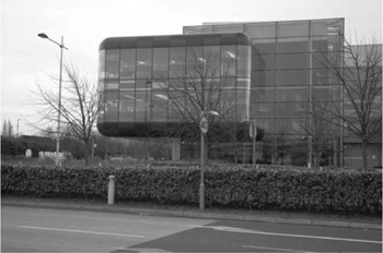
Experian—Spam Architecture
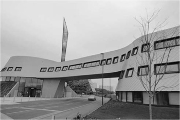
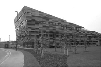
The melancholic atmosphere of this failed business park is rather similar to that of Nottingham University’s new Jubilee Campus, opened in 1999. Things to do with a post-industrial city number four: education. Here this was to be housed in buildings by Make, the practice formed by Ken Shuttleworth, a former partner of Norman Foster, who left the firm in a flurry of controversy over ‘authorship’ of the City of London Gherkin. Very quickly, Make amassed a huge quantity of commissions, for everything from massive redevelopment schemes to skyscrapers and an astoundingly anti-contextual pavilion next to St Paul’s Cathedral. Unexpectedly, given the hype, this, Make’s first large-scale work, was on completion the subject of a chorus of critical derision (at least in the handful of architectural avenues where critique still exists). It’s easy to see why. In its combination of jollity, bathos, vacancy and authoritarianism, it sums up the Blairite era in three dimensions.
Gateway and ‘Aspire’, Jubilee Campus
The site is a former bicycle works, and concrete mills still mark a gateway. The prefab tower blocks filmed in Anton Corbijn’s Control to replicate pre-gentrification Manchester loom nearby. This is in fact where Arthur Seaton works in Alan Sillitoe’s Saturday Night and Sunday Morning, where ‘generators whined all night, and during the day giant milling machines working away on cranks and pedals in the tunnery gave to the terrace the sensation of living within breathing distance of some monstrous being that suffered from a disease of the stomach.’26 It sits on a ground zero for kitchen-sink England, and next to it is the set for a pastiche post-punk rehash of the same genre. So, this seemingly random assemblage of deconstructivist-lite tat, with its apparently contextual pinkish tiles (a bit like brick!) and its giant sculpture (a bit like some spokes in a wind sock), is placed in an area so rich in pop myth that it’s surprising this too wasn’t ‘referenced’. Near the entrance are some earlier buildings by Michael Hopkins, designed in the late nineties. They’re very different—relatively warm, akin to Ralph Erskine’s Greenwich Millennium Village and the Scandinavian style, all wood and water features, with an amusing and possibly inadvertent hint of intimidation in their symmetries and turrets, as is so common with these kinds of buildings. Even given the drama of some of this, presumably it wasn’t ‘iconic’ enough, as the extension is, from the risible central sculpture ‘Aspire’ on down, all about the flash.
‘Aspire’ is a horrendously shrill title for this ridiculous structure, and in the context—the overwriting of former spaces of work, overlooked by the former spaces of working-class housing—it sounds like a gross interpellation. Aspire, god damn you! Aim high, recalcitrant proles! Aspirational bling in architectural form is particularly evident in the metallic Gateway Building which forms an alternative processional entrance to the campus, while the pink-banded International House and Amenity Building are prime examples of Make’s unconscious po-faced spin on 1950s Googie, suggesting both 1970s sci-fi dystopias (Logan’s Run, perhaps) and a desperate eagerness to please. It begs the viewer (and this is viewing architecture, not something physical) to applaud its vaulting geometries, bids us be dazzled by its colour scheme, to the point where a violent reaction is all but inevitable. This is, in function as much as in form, the ideal neoliberal university, made up of ‘business incubator units’ and ‘fitness suites’; our rueful guide to the Jubilee Campus, a lecturer who shall remain anonymous, describes its atmosphere as being like ‘an evangelical college without God’. While one might expect students to be Nottingham’s avant-garde, involved in the artiness and politics which denote a ‘cultured’ city, he tells us that Nottingham University is quietist and deeply conservative. Nottingham’s management has been notorious for its role in the detention without trial of a staff member, Hicham Yezza, whose ‘crime’ was downloading an Al-Qaeda training manual for a student’s research project. Nottingham was the only university that refused to negotiate with the recent Gaza solidarity occupations, eventually hiring muscle to evict the protesters by force. All very appropriate for this university as business park. A poster declares: ‘Your future’s right here’.
Jubilee Campus
Hopkins’s Phase One of the Jubilee Campus
The presence of the two Universities in Nottingham is prominent indeed, with a large amount of new student accommodation. The worst we see is Haskoll’s awful mixed-use block in Trinity Square, a pompous red-brick box with a ridiculous cod-deconstructivist titanium outgrowth at the back, the architectural equivalent of a stockbroker wearing a bumptious tie. This structure is so bad that both the city council and the developer disowned it on completion in late 2009.27 An adjacent block promises ‘plasma screens in every flat’ to its prospective undergraduate tenants. Others cast shadows over council estates and derelict terraces, as if to invite burglaries. Much of the city is clearly very poor, its gun crime statistics oft-quoted, and the gap between haves and have-nots is nonchalantly displayed in its architecture.
Trinity Square
Yet the most worrying things we see in Nottingham are the Police Pledge posters. Based on ‘Keep Calm and Carry On’, the rediscovered, unproduced WWII propaganda poster which became ‘iconic’ as the recession deepened, they’re a bizarre double bind of a design. They share Keep Calm’s minimal layout and its humanist sans serifs, replacing the crown with the police badge. The written content, which we follow around central Nottingham, at first assuming these are local posters for the Nottinghamshire Constabulary in an oblique anti-gun campaign, consists of three slogans, all based on particular clichés used by the police in the popular imagination, albeit in one case with a decidedly sinister twist; ‘WE’D LIKE TO GIVE YOU A GOOD TALKING TO’, ‘ANYTHING YOU SAY MAY BE TAKEN DOWN AND USED AS EVIDENCE’, and, remarkably, ‘YOU HAVE THE RIGHT NOT TO REMAIN SILENT’. Underneath, in an extremely small, easily missed print, is the ‘official’ message, based on ‘the Policing Pledge’, a managerial initiative intended to ‘restore confidence’ and ‘enable choice’. For instance, the ‘talking to’ poster ‘pledges’ to listen to the consumer of policing, while the ‘right not to remain silent’ suggests you make complaints against the police should they inconvenience you. In their split between an authoritarian exclamation and a liberal, caring small print which supposedly gives an amusing gloss to the large print, these are spectacular examples of disavowal and the use of irony to say appalling things unchallenged. The sleight of hand is thus: the pun, the pay-off, is in small print, reminding us that really the police force are all about helping old ladies across the road: ‘the police now pledge to listen …’; the truth, of course, is in large print. Given the recent suspension of Habeas Corpus, you genuinely do not have the right to remain silent. So while this ‘witty’ gesture claims to play with the brutally state-protecting image of the police, it also says, very loudly, that the rules no longer apply, something made all too obvious at the G20 protests in London on 1 April 2009.
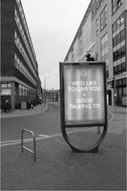
The Policing Pledge
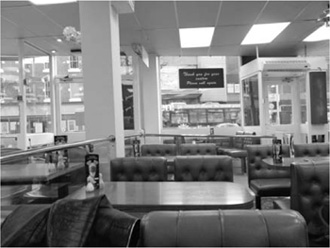
Green leatherette at Hollies’ Caff
Given Nottingham’s aspiration to become a chic ‘Design Capital’, and the shrill commands of its new architecture, this use of design for political ends sits rather well. This seems a slippery city, hard to encompass, a city of contradictions and tensions, juxtapositions which initially appear accidental, but acquire a certain perverse logic. Before leaving I enjoy a fried breakfast in Hollies, a greasy spoon café. Inside is the 1970s in aspic, green leather, brown formica and untouched signage, begging to be used as a film set. On my way out, I do a double-take, noticing the café is part of a garishly façaded redevelopment which has somehow left the interior untouched. But no matter how much Nottingham gestures at modish brightness, it seems a dingy but fascinatingly weird industrial city in essence. Yet it might be running out of ways to fill this post-industrial shell, irrespective of the variable quality of its design.