Analyzing distributions can be quite useful. We've already seen that certain calculations are available for determining statistical information such as averages, percentiles, and standard deviations. Tableau also makes it easy to quickly visualize various distributions including confidence intervals, percentages, percentiles, quantiles, and standard deviations.
You may add any of these visual analytic features using the Analytics pane (alternately, you can right-click an axis and select Add Reference Line). Just like reference lines and bands, distribution analytics can be applied within the scope of a table, pane, or cell. When you drag and drop the desired visual analytic, you'll have options for selecting the scope and the axis. In the following example, we've dragged and dropped Distribution Band from the Analytics pane onto the scope of Pane for the axis defined by Sum(Price):
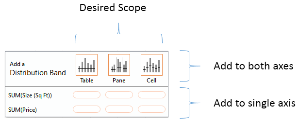
Once you've selected the scope and axis, you'll be given options to change settings. You may also edit lines, bands, distributions, and box plots by right-clicking the analytic feature in the view or by right-clicking the axis or the reference lines themselves.
As an example, let's take the scatterplot of addresses by price and size with Type of Sale on Columns in addition to color:

Next, we'll drag and drop Distribution Band from the Analytics pane onto Pane only for the axis defined by Price. When we do, we'll get a dialog box to set the options:

Each specific Distribution option specified in the Value drop-down menu under Computation has unique settings. Confidence Interval, for example, allows you to specify a percent value for the interval. Standard Deviation allows you to enter a comma-delimited list of values that describe how many standard deviations and at what intervals. The preceding settings reflect specifying standard deviations of -2, -1, 1, and 2. After adjusting the label and formatting as shown in the preceding screenshot, you should see results like this:
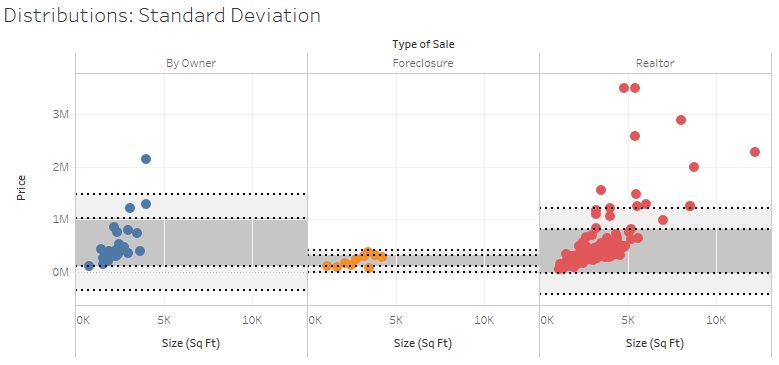
Since you applied the standard deviations per pane, you get different bands for each type of sale. Each axis can support multiple distributions, reference lines, and bands. You could, for example, add an average line in the preceding view to help a viewer to understand the center of the standard deviations.
On a scatterplot, using a distribution for each axis can yield a very useful way to analyze outliers. Showing a single standard deviation for both Area and Price allows you to easily see properties that fall within norms for both, one, or neither (you might consider purchasing a house that was on the high end of size, but within normal price limits!):
