Present Data with PivotCharts
Another way you can present your pivot data is by using charts. In my Excel 2019 Basics
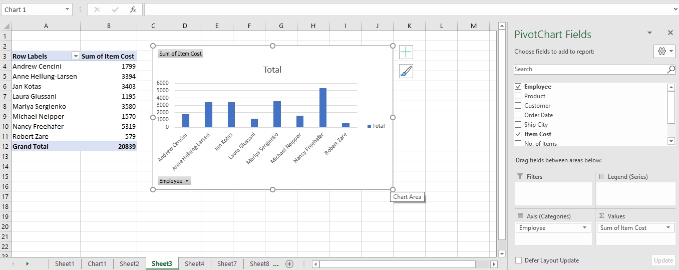
book, I covered creating, editing, and formatting regular Excel charts. Here we will be focusing on generating charts from pivot tables. A pivot chart is simply a chart based on a pivot table. So, instead of manually aggregating your data first before creating a regular Excel chart, you can simply generate a quick pivot table and pivot chart based on the pivot table. This makes the process much faster.
To create a pivot chart based on a pivot table, follow these steps:
- Place the cell pointer anywhere in the pivot table. On the Insert
tab, in the Charts
group, click on the PivotChart
command button.
Note that you can also find the PivotChart
command button in the Tools
group of the PivotTable Tools
contextual menu (which is displayed when the cell pointer is in the PivotTable).
- Excel opens the Insert Chart
dialog box which allows you to select the type and subtype of the pivot chart you want to create.
- Select the type and subtype of the chart you want in the Insert Chart dialog box and click OK
.
When you click OK, Excel inserts an embedded pivot chart in the worksheet with the pivot table used as the data source.
Tip
: To move the chart around the screen, move your mouse pointer over the chart (the mouse pointer will change to a crosshair), then click and drag the chart to any part of the screen you want.
When you click on the PivotChart, a PivotChart Tools
contextual tab appears on the Ribbon (above the regular tabs). The PivotChart Tools contextual tab adds three further tabs to the regular tabs, named: Analyze
, Design
, and Format
. You can use commands on these tabs to redesign, modify, and format your pivot chart.


