

Landscape and seascape

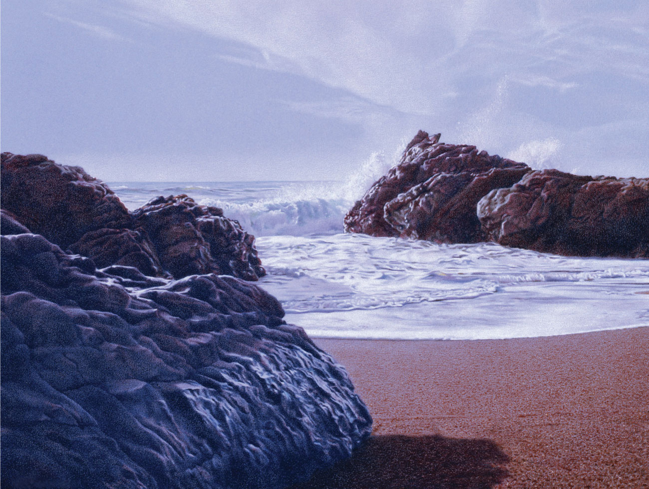
The Wave
by K. Scott McGregor
Working mainly with water-soluble pencils, and using layering and blending techniques, the artist has given a wonderfully accurate account of the breaking wave and the plumes of spray. The picture is full of life and movement due to the use of repeated curves and strong tonal contrasts.
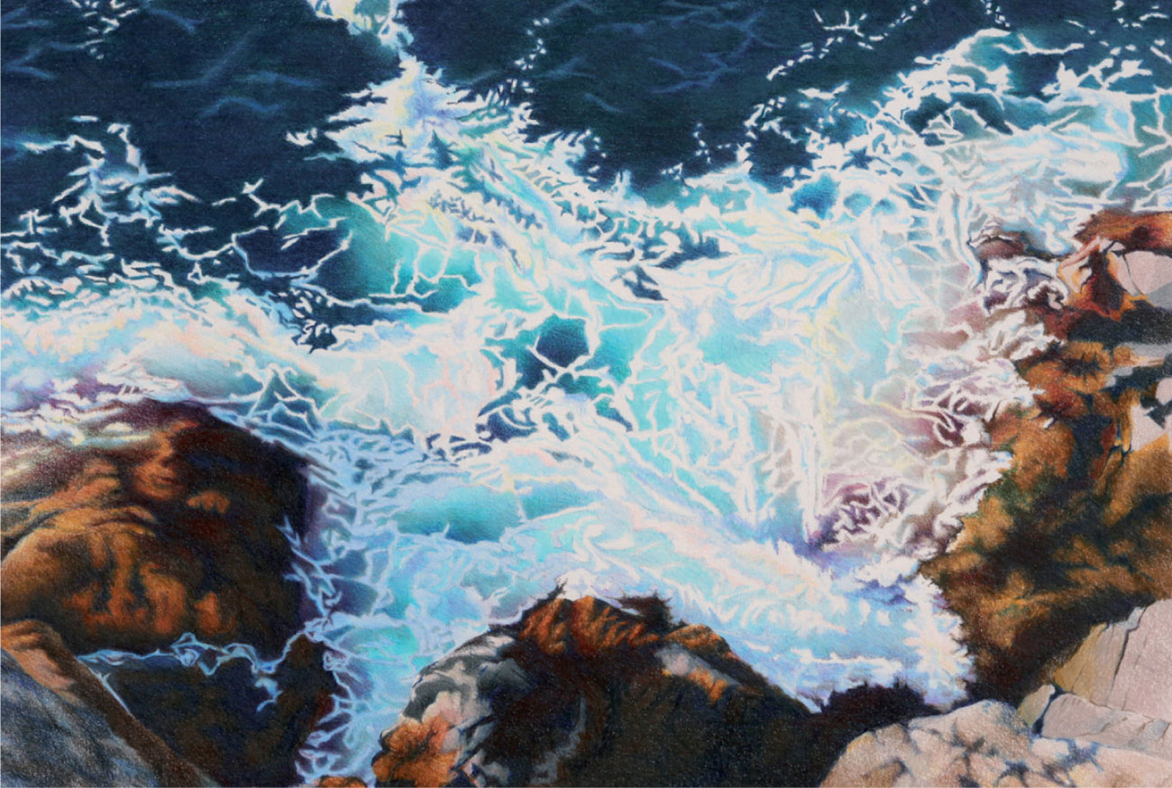
Morning Surf, Monhegan Island
by Kendra Bidwell Ferreira
By focusing in closely on a small section of the rocks and water, the artist has produced a wonderful patterned effect reminiscent of a lacy fabric. Minimal layering of color has been used—the white foam and waves are areas of the paper which were sketched in and have been left white. The color is juxtaposed and mixed by the viewer’s eye and the strong tonal contrasts enhance the delicate fragility of the swirling water.
Perpetual
by Jeff George
In this atmospheric work, dry colored pencils have been used more as a painting than a drawing medium; careful, painstaking layering and blending have ensured that no pencil marks are visible. The artist has worked on blue paper to give an overall cool blue cast to the painting, and to avoid the reserved highlights on the rocks from appearing too bright.

Evening Flight, Hook Quay
by Graham Brace
This scene was worked in the studio from notes, observations, and photographs. It was begun with a colored ground laid with pastel pencils rubbed and blended into the surface and then fixed, and continued with two different brands of dry colored pencils, one softer and waxier than the other. The fine detail in the vegetation was achieved by scratching out, together with some fine brushwork in gouache paint.
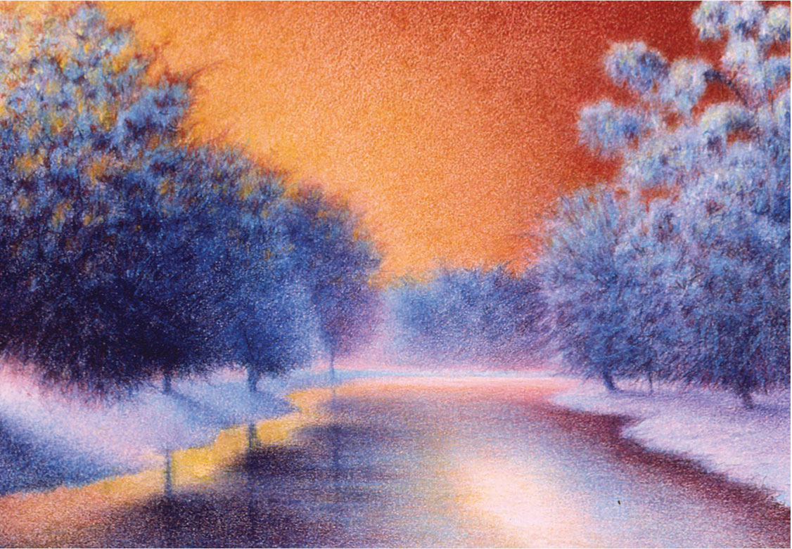
Equanimity
by Susan L. Brooks
The artist has chosen to work on sanded paper designed for pastel work, which grips the pigment very firmly and allows for a considerable build-up of colors. The color scheme is a simple but highly dramatic one, based on the yellow/violet complementary contrast.
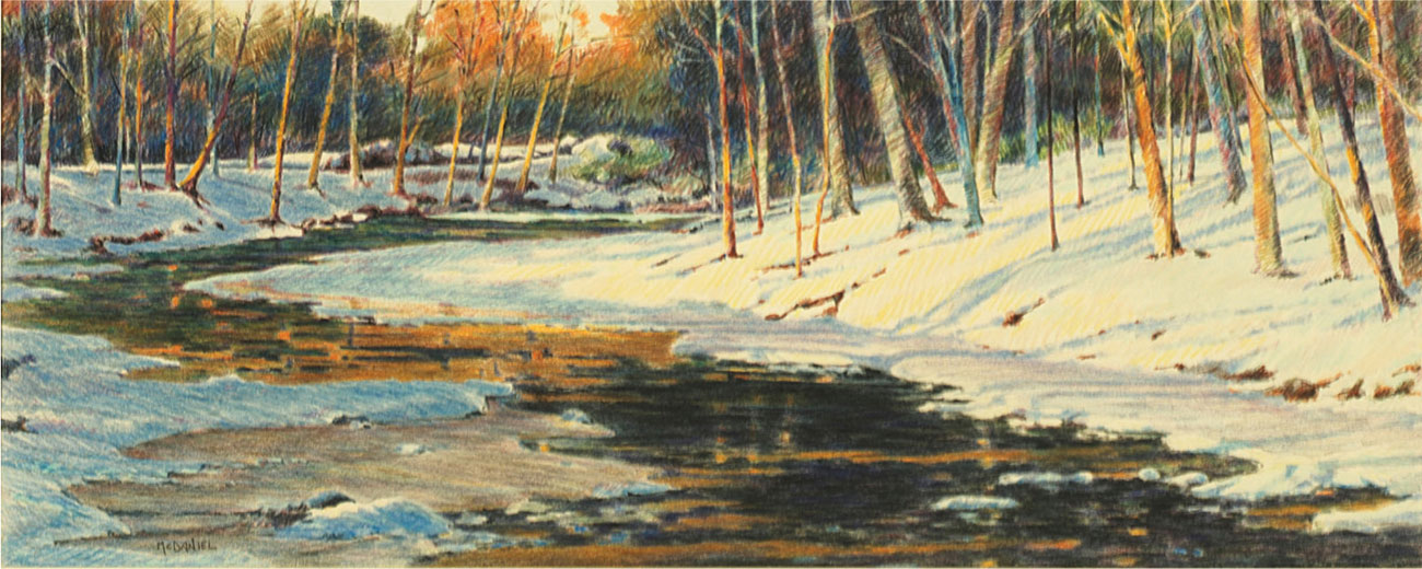
Riparian Winter
by Richard McDaniel
An unusually wide, shallow landscape format has been chosen for this image to make the most of the lovely sweep of the river running from foreground to middle distance. The tones and colors have been built up by several layers of hatching and crosshatching, but blending has been kept to a minimum in order for the pencil marks to play a part in the composition.
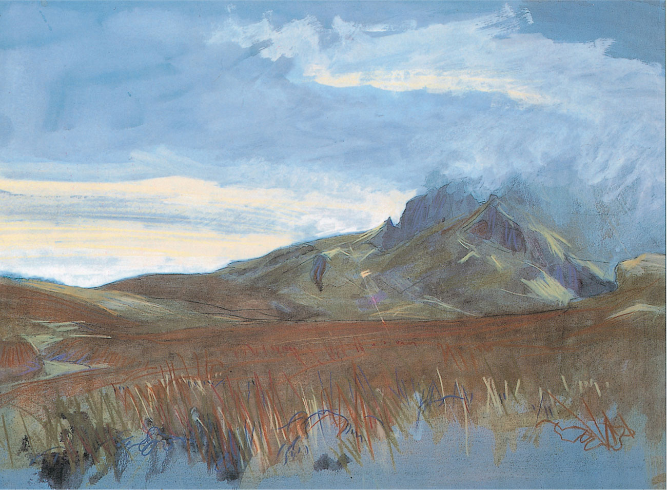
Mountain Landscape
by Mark Hudson
The painting was begun with light washes of watercolor to form the ground (this is still visible in the immediate foreground). Rough shading and hatching with colored pencils contribute to the atmospherics of the sky, while linear work in the foreground suggests the textures of the grass. The colors chosen are natural hues that both reflect the subject and create a harmonious mood.
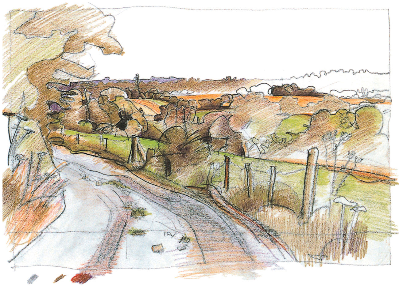
A View Near Biggin Hill
by John Townend
The style used here is bold and free. A strong sense of rhythm and movement is achieved through bold outlines defining individual forms together with multi-directional hatching and crosshatching, especially noticeable in the foreground.
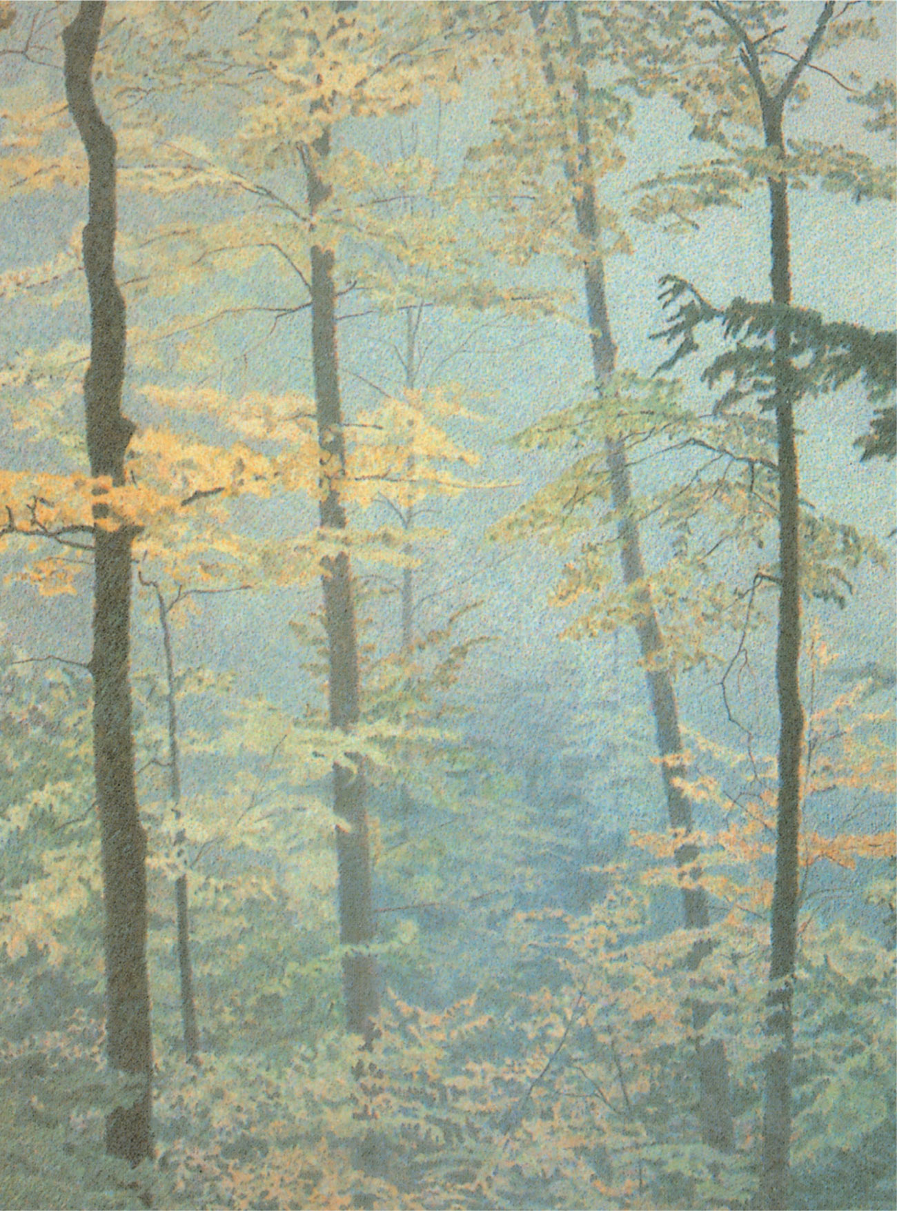
Forest Light
by Mike Pease
In this piece, tonal contrasts are used to create the strong light effect. Simultaneously, the muted background colors and small, intricate shapes, give a misty, fragile quality to the rendering.
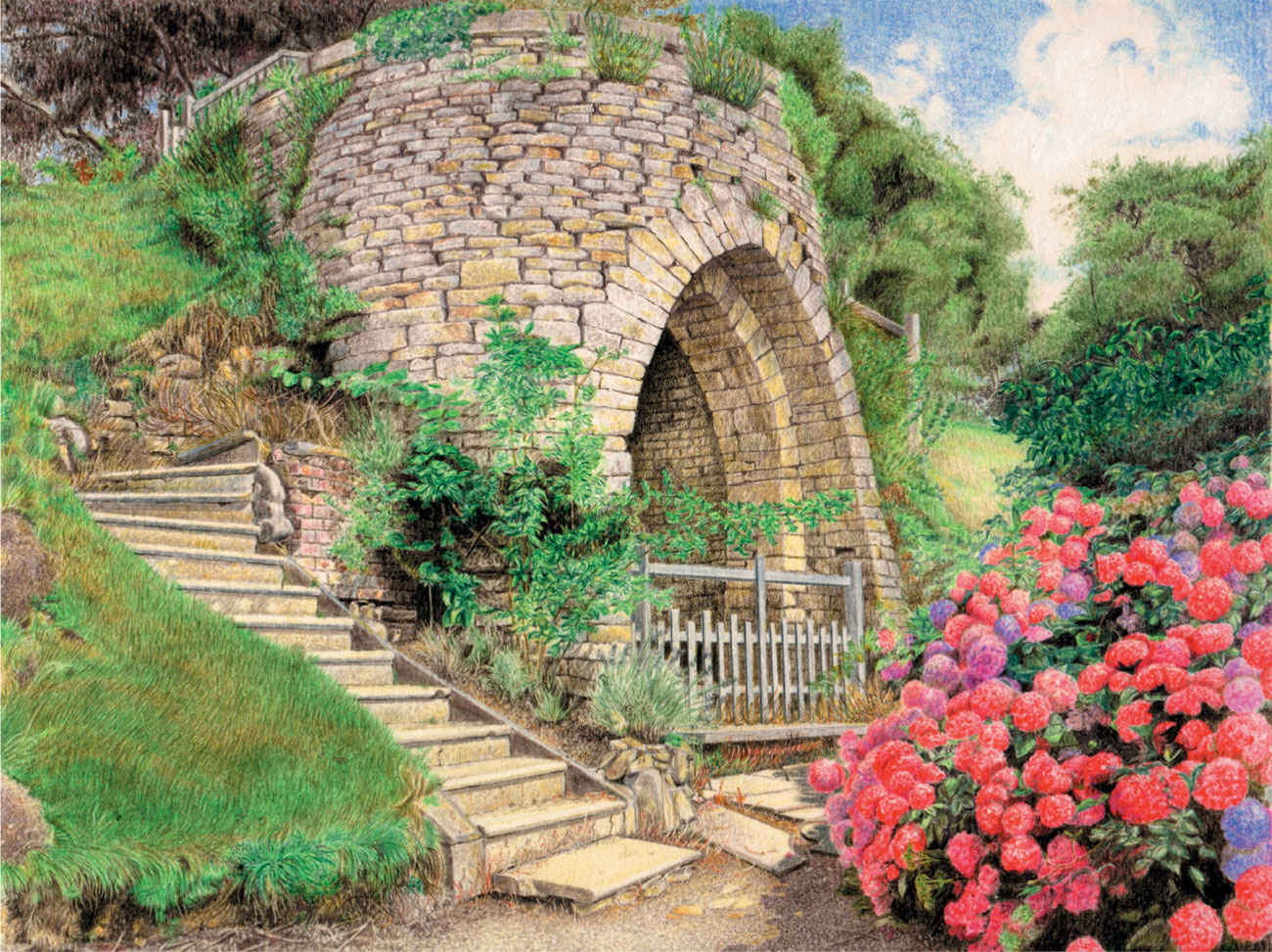
Stone Summerhouse—Belvoir Castle
by Robin Borrett
The textures play a major part in this picture. The three main areas of grass, stone wall, and flowers each have a specific texture. The early layers were kept light, and bolder and darker colors were added to create form. Scratching out the pigment and impressing techniques were used in the area at the top of the steps to accurately render the form of the twigs and branches in the shrubbery.
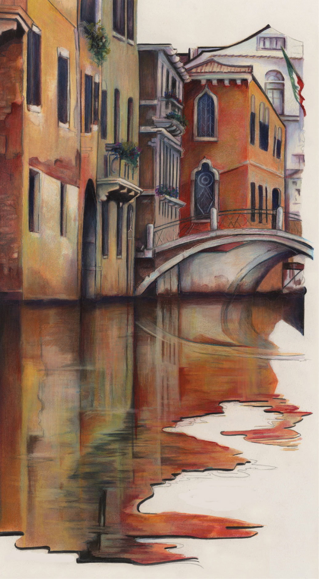
Reflections of Venice
by Vera Curnow
The artist has used an interesting technique for this rendering. Working on illustration board, she covered the whole surface with low-tack adhesive film, cutting and peeling it away section by section as she worked with wax-based colored pencils and mineral spirits. In the final stages, detail was added with dry pencils.
Nature

The Palm Jungle
by Dyanne Locati
For this powerful image, which has strong abstract-pattern qualities, the artist has used even shading to build up the shapes and forms and achieve subtle variations of tone and color. The grain of the paper allows the applied colors to “breathe,” adding sparkle to the rendering.
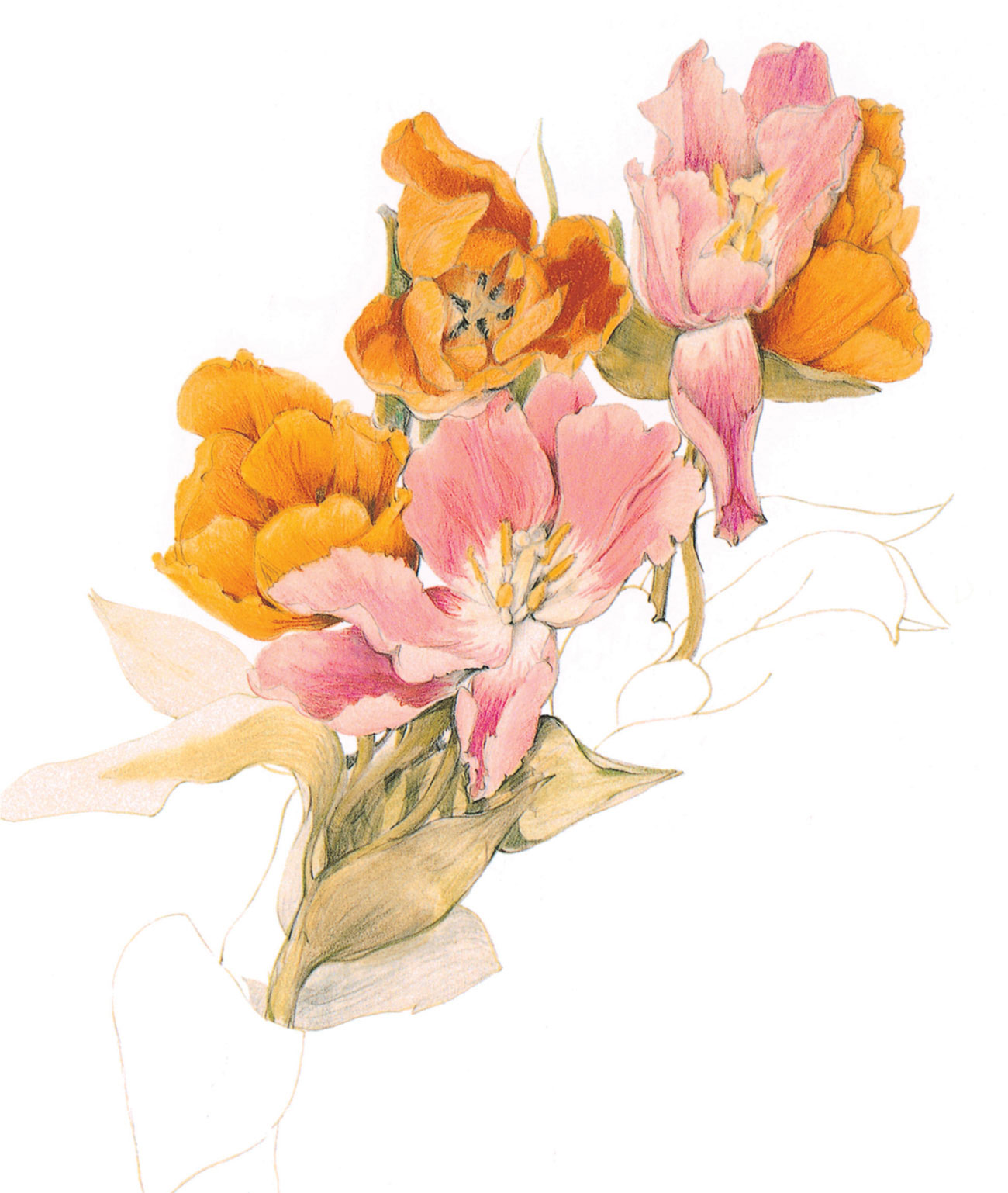
Tulips
by Angela Morgan
The complex arrangement of petals and leaves that forms this composition is created with a faint pencil outline. Although the overall effect is light and fresh, the pencil colors have been laid with a confident, free technique. The orange tulips are a vibrant blend of yellow, orange, and red pencils, and the more delicate pinks are similarly described with varying tones of the basic hue.

Butterfly
by Kendra Bidwell Ferreira
When depicting small-scale objects such as these, accuracy is essential; an impressionistic approach would not convey the essence of the subject. The butterfly has been very carefully drawn, as have the flowerheads, and built up in layers to achieve depth of color and tone. Notice that the flowers at the top have been treated in less detail, while those just behind the butterfly are in sharp focus.
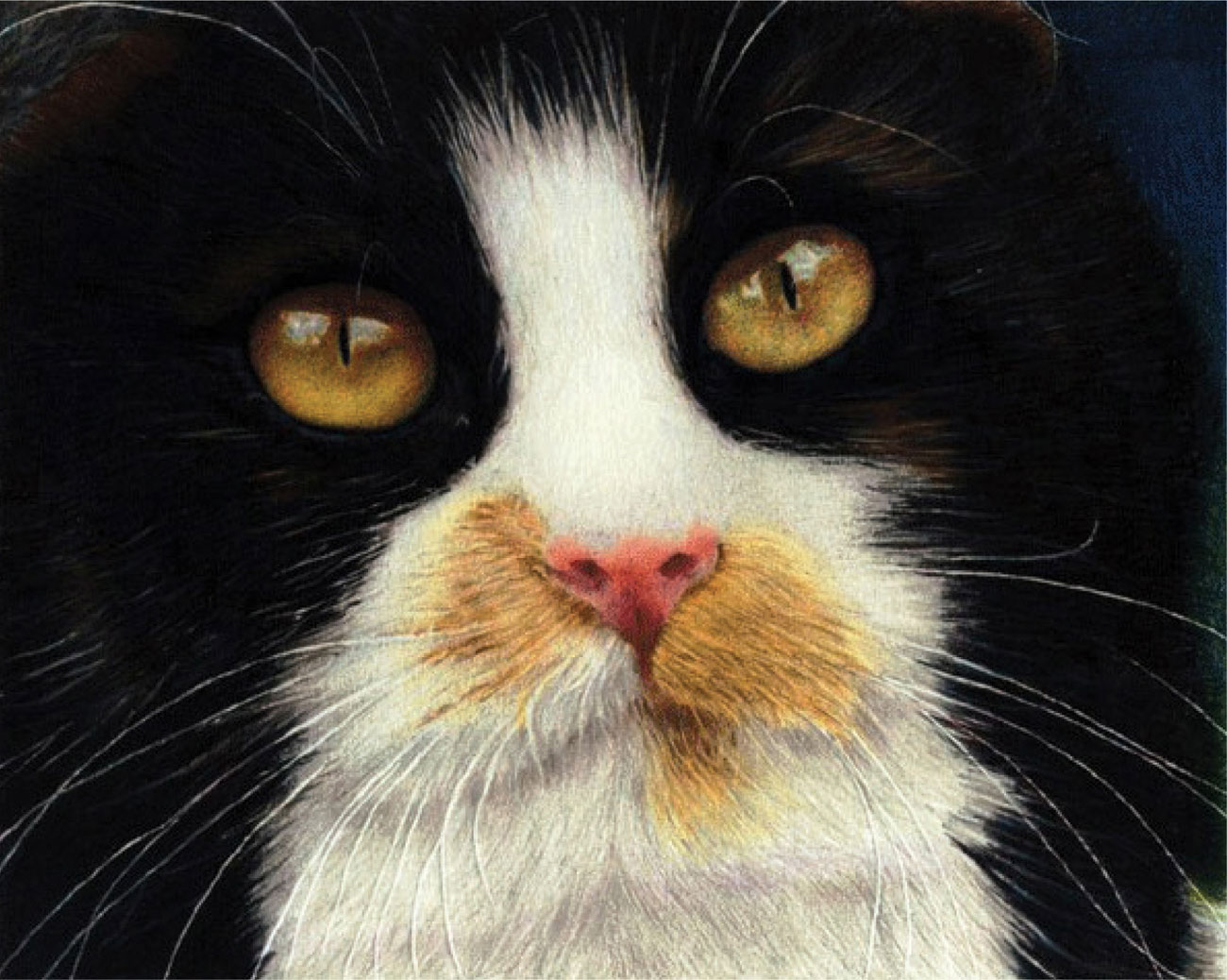
Buffy the Cat
by Richard Childs
This is one of a number of studies of this cat, and here the artist has focused closely on the face, creating a highly dramatic and eye-catching composition. The whiskers were achieved by impressing lines with an inkless ballpoint pen and then working many layers of soft colored pencil on top.
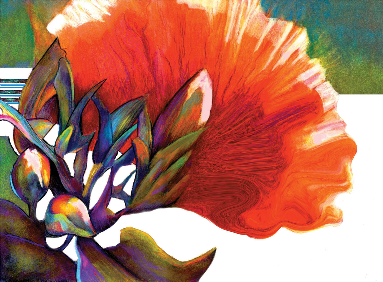
Spectrum
by Vera Curnow
Both the red/green complementary contrast and tonal counterchange have been exploited here, with an excellent balance of light, dark, and middle tones. Notice especially the pattern made by the “negative shapes” behind the buds and stems on the left. The artist has used wax-based colored pencils blended with mineral spirits, and has given the work a glossy finish by applying thick fixative.
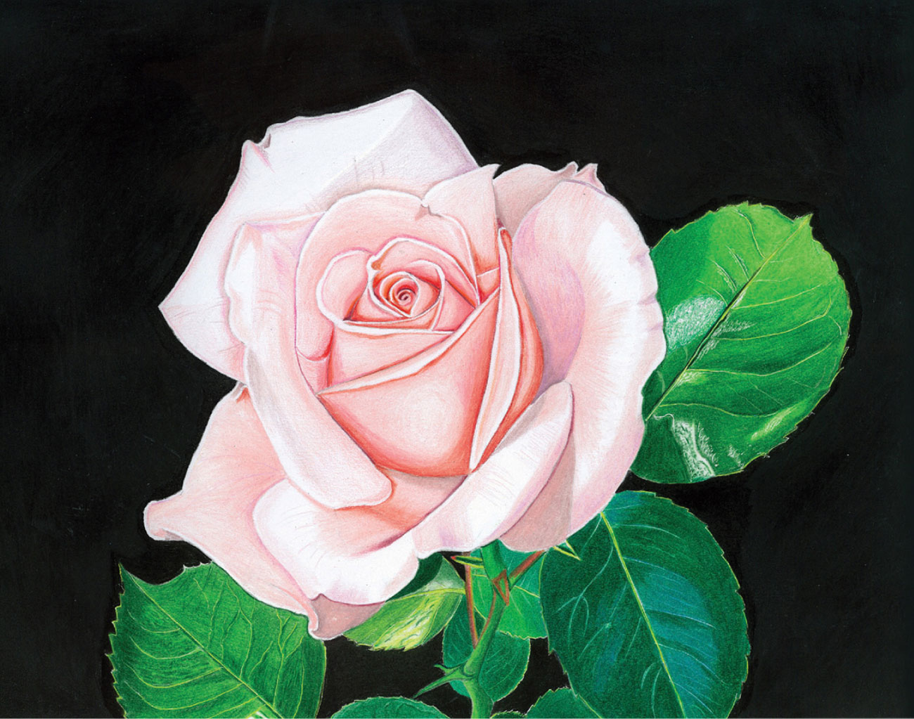
Nina’s Rose
by John Hayes
This piece was drawn from an enlarged photograph, using a light box. The darkest tones were added first using small overlapping circular strokes, decreasing the pressure toward the lightest area of each tone. A colorless blending pencil was used to blend the colored layers in the same circular motion. Further blending was undertaken with a paper stump (torchon) dipped in solvent. This eradicated any colored-pencil lines, before a layer of white was added and rubbed gently with a paper towel, helping to create the carefully placed highlights. A black gouache background and light layer of fixative sharpens the finished picture.

Sweet Chestnut
by Elisabeth Aubury
This drawing is in the tradition of botanical illustration, with each element arranged so that all are clearly visible and also make an attractive pattern on the page. The artist has used dry colored pencils with layering and blending methods, and has lifted out some highlights with an eraser.
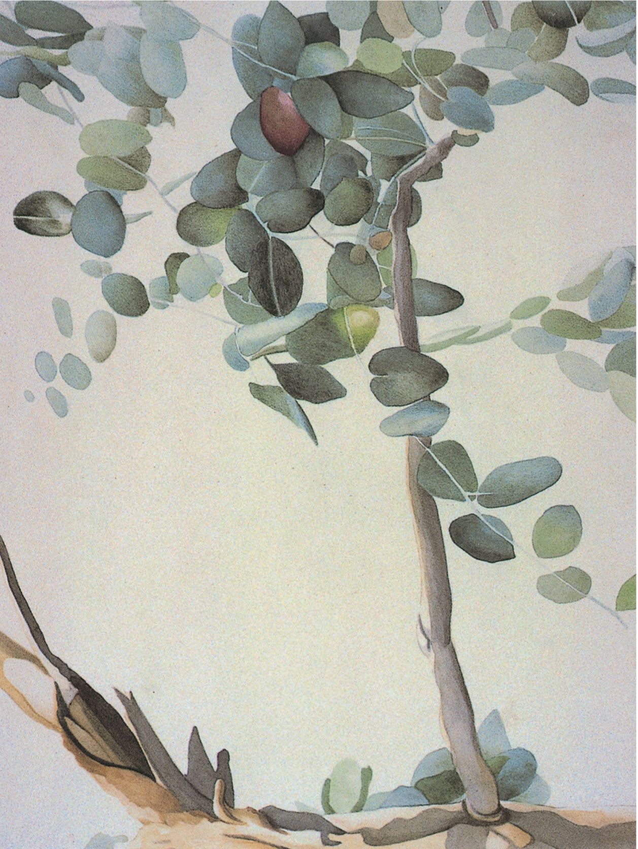
Eucalyptus by Steve Taylor
The leaf shapes in this piece are simple forms, and so a controlled tonal balance is essential to the complexity of the rendering. The artist has chosen gentle watercolor hues which have been strengthened with light pencil shading. Paper has been left bare or very lightly painted where veins and stems show white against the color.
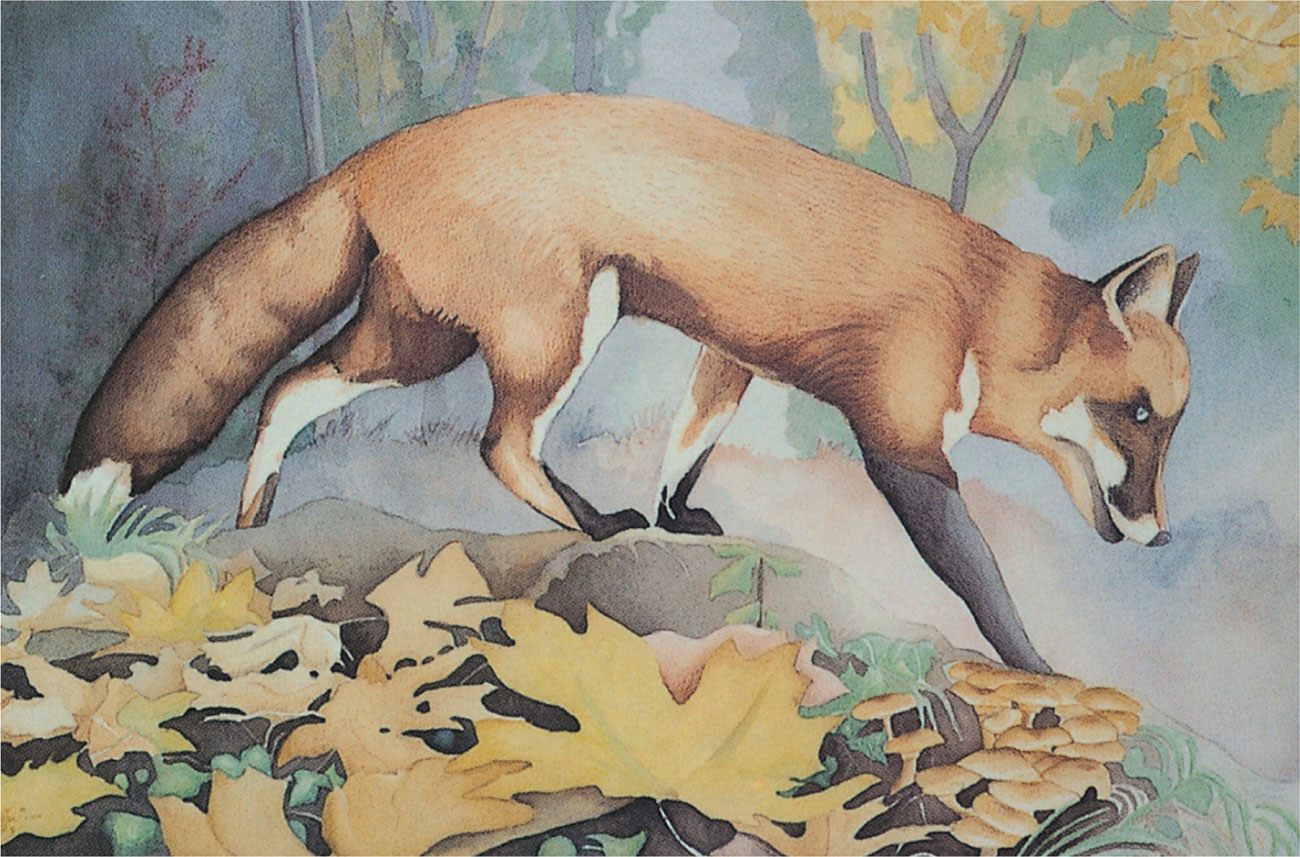
Fox in Autumn
by Steve Taylor
Most of the modeling and atmospheric description is created here with watercolor, subtly modified with water-soluble pencils. The movement is expressed by the fluid lines of the fox—the angle of its body and the downward thrust of the head, as well as the more obvious motion of its legs and paws.
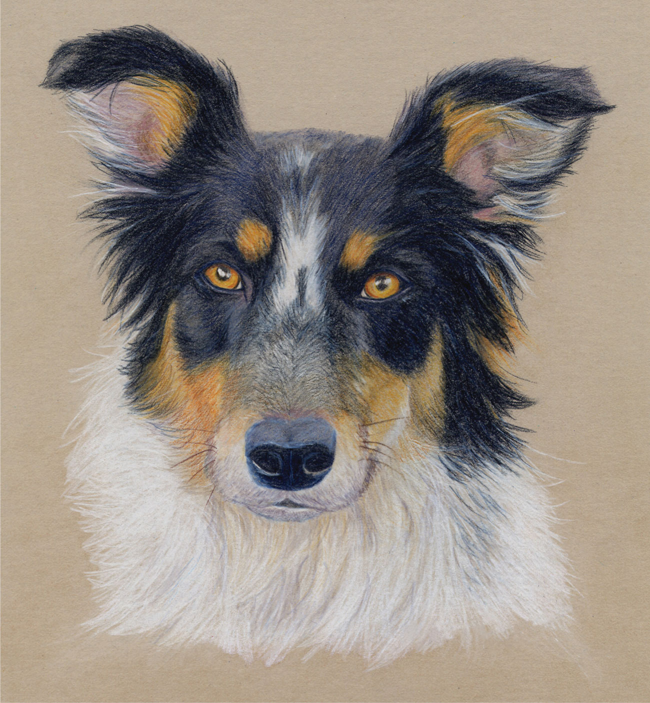
Border Collie
by Richard Lovesey
In this lovely drawing, the artist has captured both the texture of the hair and the expression of the dog—it is very much a portrait of a specific animal rather than just a dog.
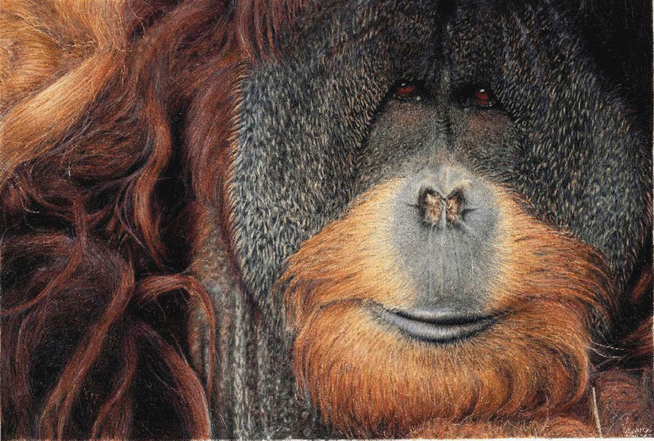
Hope of Sepilok
by Richard Childs
This wonderful drawing was inspired by a visit to the orangutan sanctuary in North Borneo, and was done from a photograph. The textures of the animal’s fur was built up with many layers of soft colored pencils, which were then burnished with hard strokes of a colorless blender in the direction of the fur. White, cream, and French grays were then laid on top for the wispy hairs.
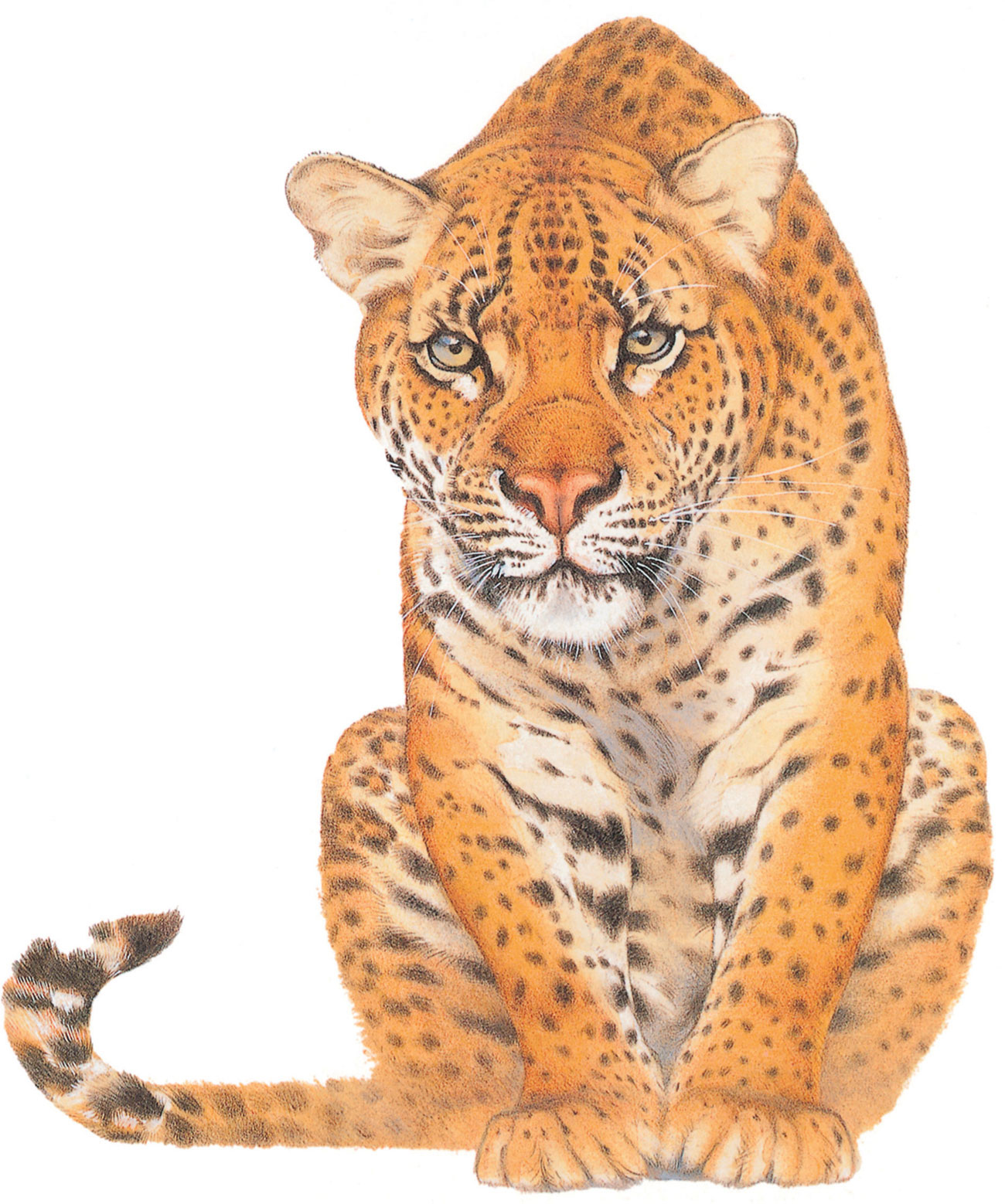
Leopard
by Kees De Kiefte
Here the artist has used soft shading to build up the curving volumes in the heavy body of the leopard, developing naturalistic modeling and rich color qualities. Small checks and dashes made with a sharpened pencil tip elaborate the coarser textures. The whiskers and clean white patches around the eyes and muzzle, and the bright fur on the tail, have been crisply painted with opaque white.
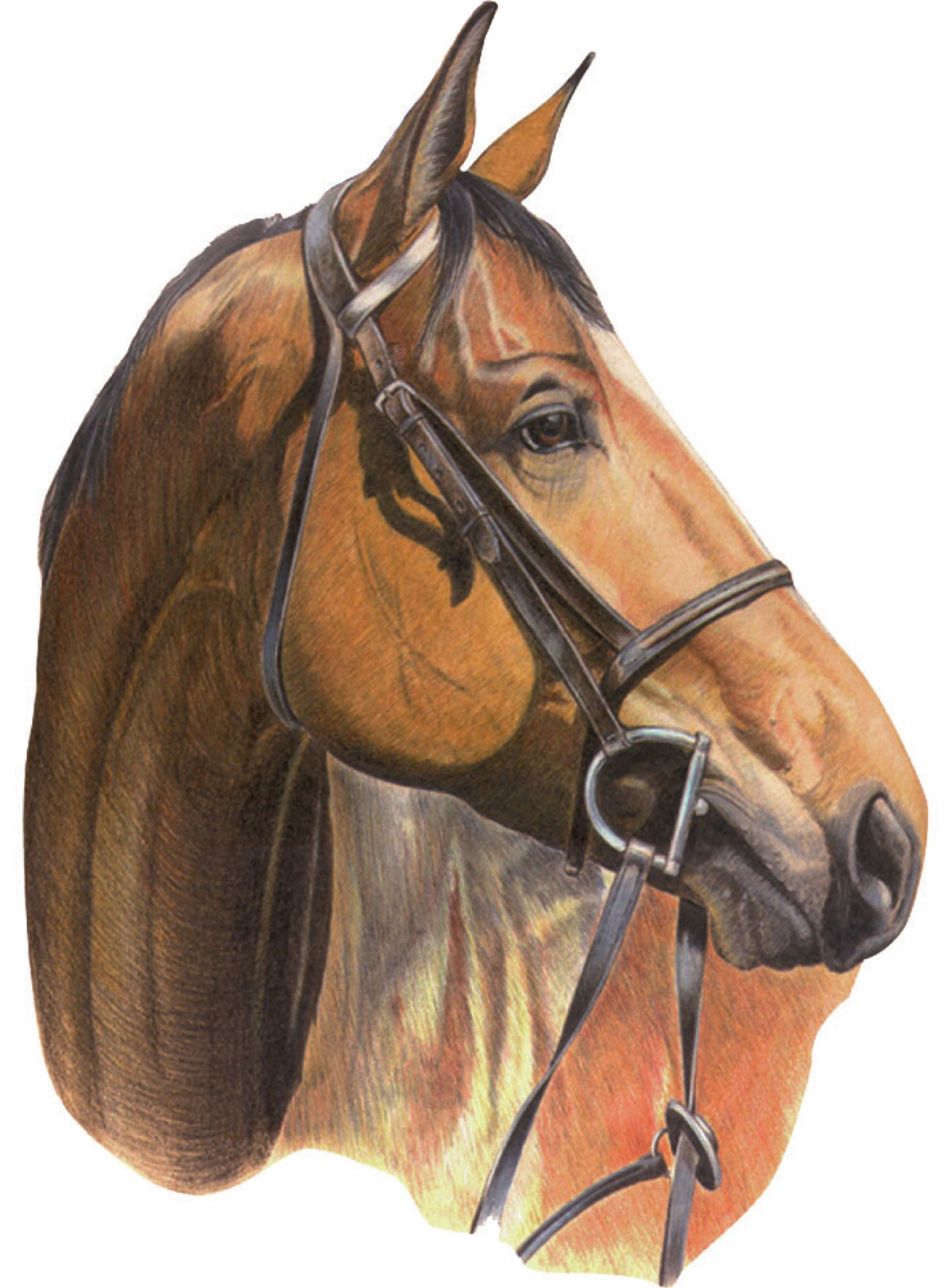
Bad Language
by Robin Borrett
This picture illustrates how colored pencils work so well when illustrating animals. Using a fine point, the artist has created the animal’s coat with accurate detail. The bridle was treated differently by burnishing, creating a smoother surface without showing the pencil strokes.
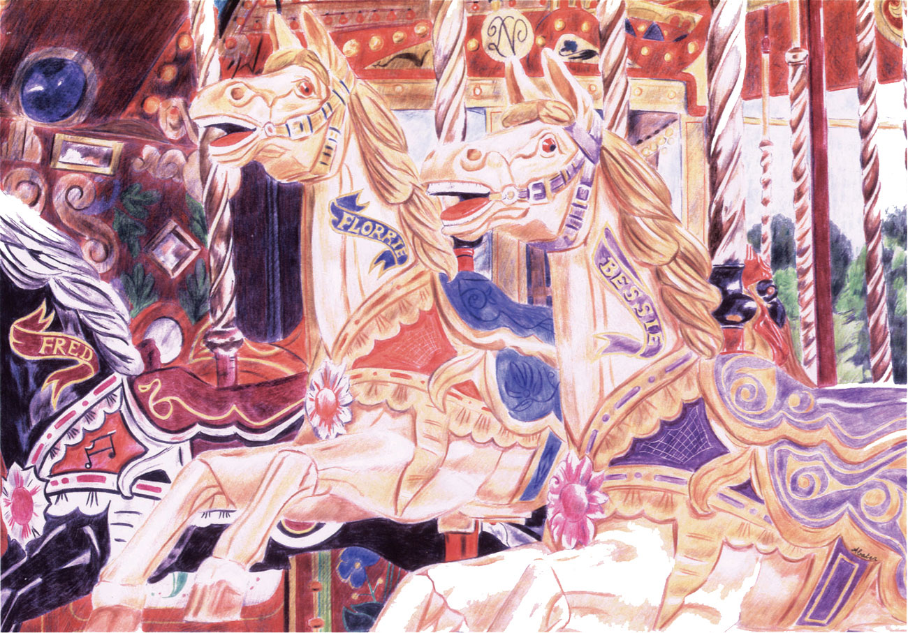
The Merry-Go-Round
by Angela Cater
For the artist, this was very much a nostalgic piece, as she spent many happy times on the merry-go-round with her Grandmother. Dry colored pencils were used to build the color in layers, working from light to dark. The detail on the saddles was impressed into the paper using an empty ballpoint pen, so the white paper was then retained when color was overlaid.
Still life
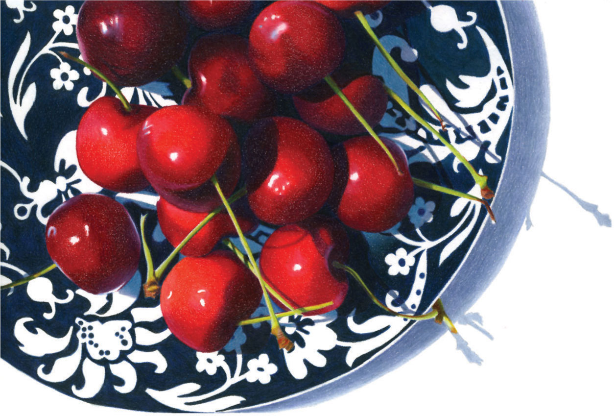
Sweet cherries
by Kendra Bidwell Ferreira
This piece was begun with a wash of indigo blue colored pencil and solvent for the plate. Light red colored pencil and solvent were then used as an underpainting for some areas of the cherries. Beginning with a wash helps to eliminate some of the texture of the paper, although white paper was left to create the carefully-placed highlights on the cherries. Layers of dry pencil were then added for depth of tone and to deepen the contrast with the plate.
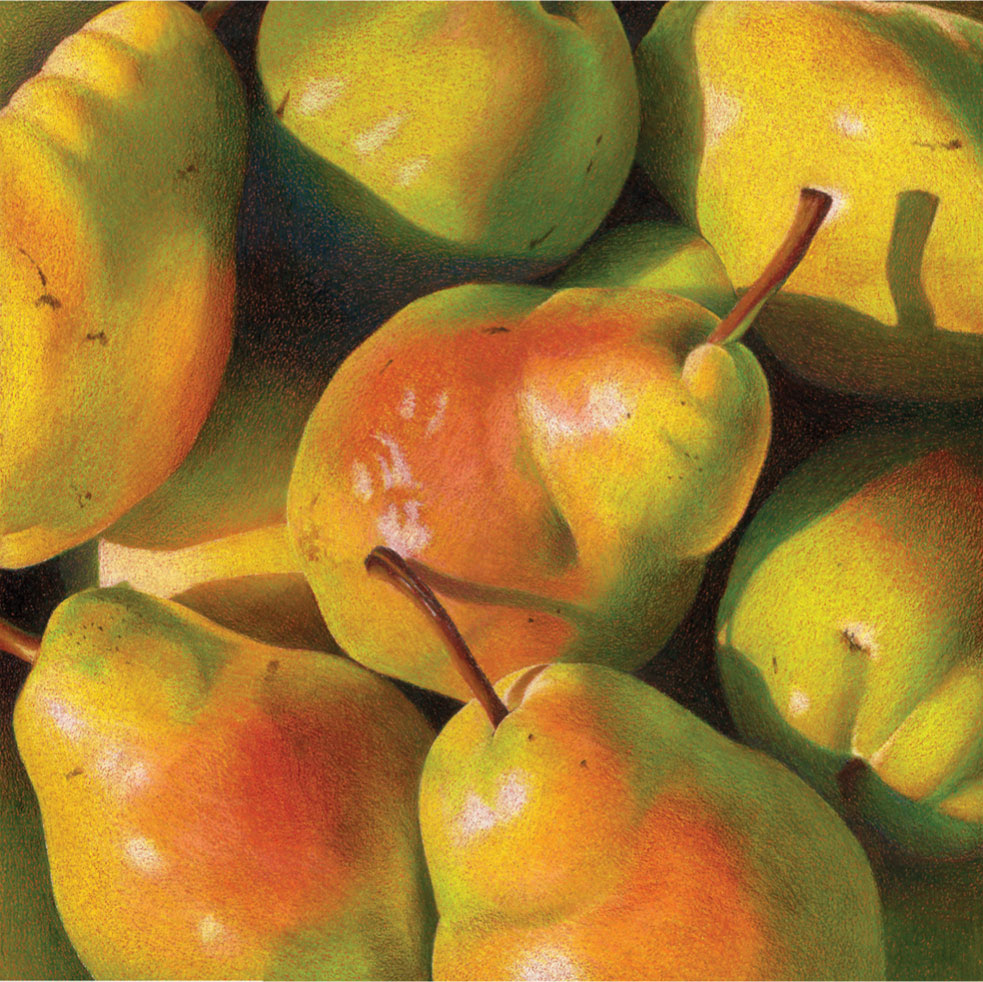
Pears
by Kendra Bidwell Ferreira
The artist has organized both the objects and the lighting to ensure that cast shadows play an important role in this image. Notice how the contrast between warm and cool colors is used to build up the forms, rather than relying on tone.

Bowl with Apples
by Peter Woof
This is an interesting example of cropping to make a more powerful composition. The central area of the plate, with the strong pattern framed by the sweeping curve, provides the perfect background for the gently colored, rounded forms of the apples. The artist has used soft, waxy colored pencils, which facilitate blending, and has worked on heavy watercolor paper.
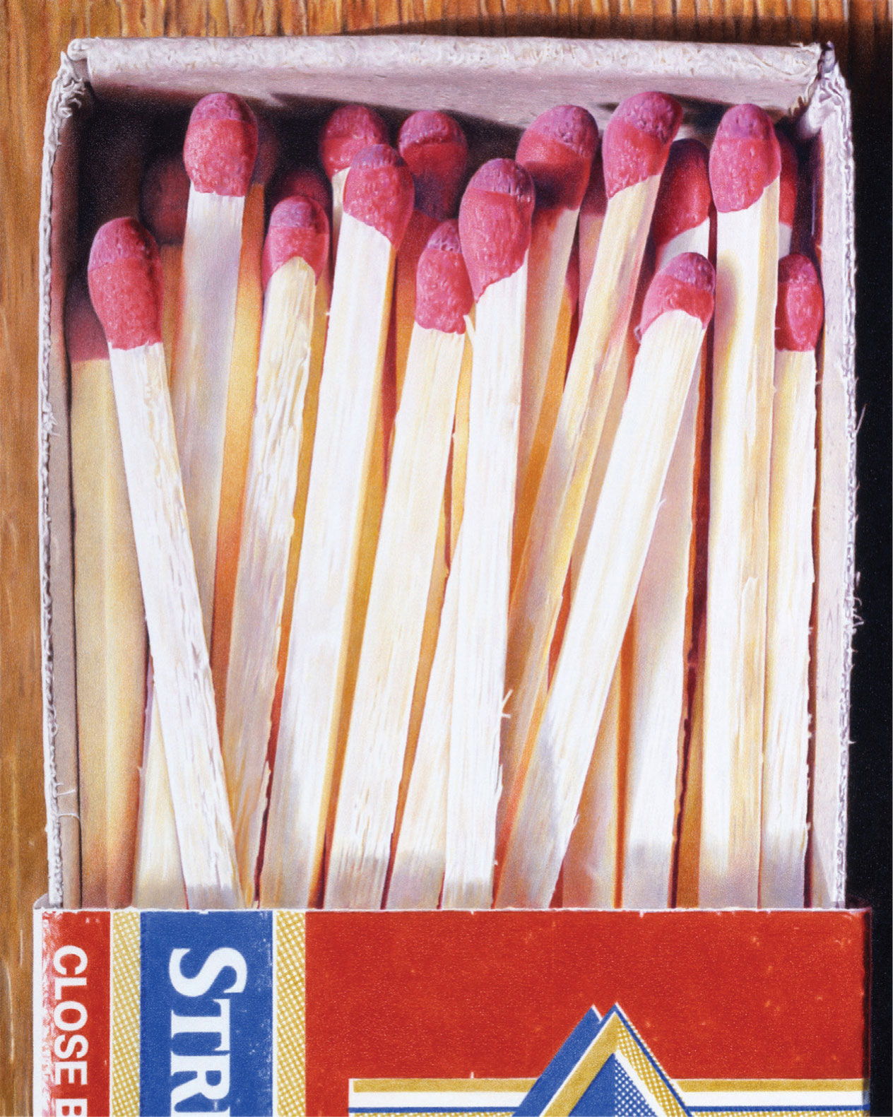
Death Row
by Jeff George
This piece was completed section by section: the woodgrain perimeter first, followed by the interior of the matchbox, then the colorful match-heads, the matchsticks, and finally the box exterior. In each segment the darker layers were added first, before working toward the lighter values.
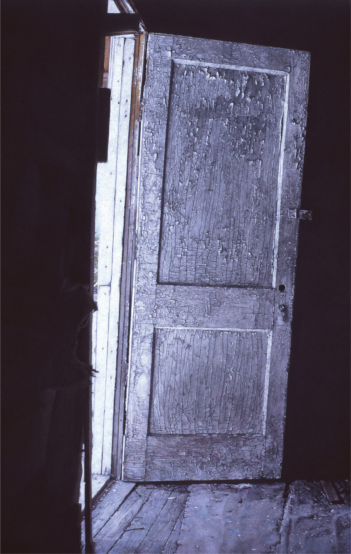
Empty Nest
by Jeff George
Empty Nest has been worked on a black illustration board. The door is composed of three different layers of white colored pencil, a hard lead white pencil to establish the local color of the door, a slightly softer, more opaque white pencil to enhance and enrich the details, and then a final layer of soft pencil to achieve the brightest highlights. Blues and lavenders were then layered on top to give tints of color, and to increase contrast and drama, a black pencil was used to develop small shadow details.
Portraits
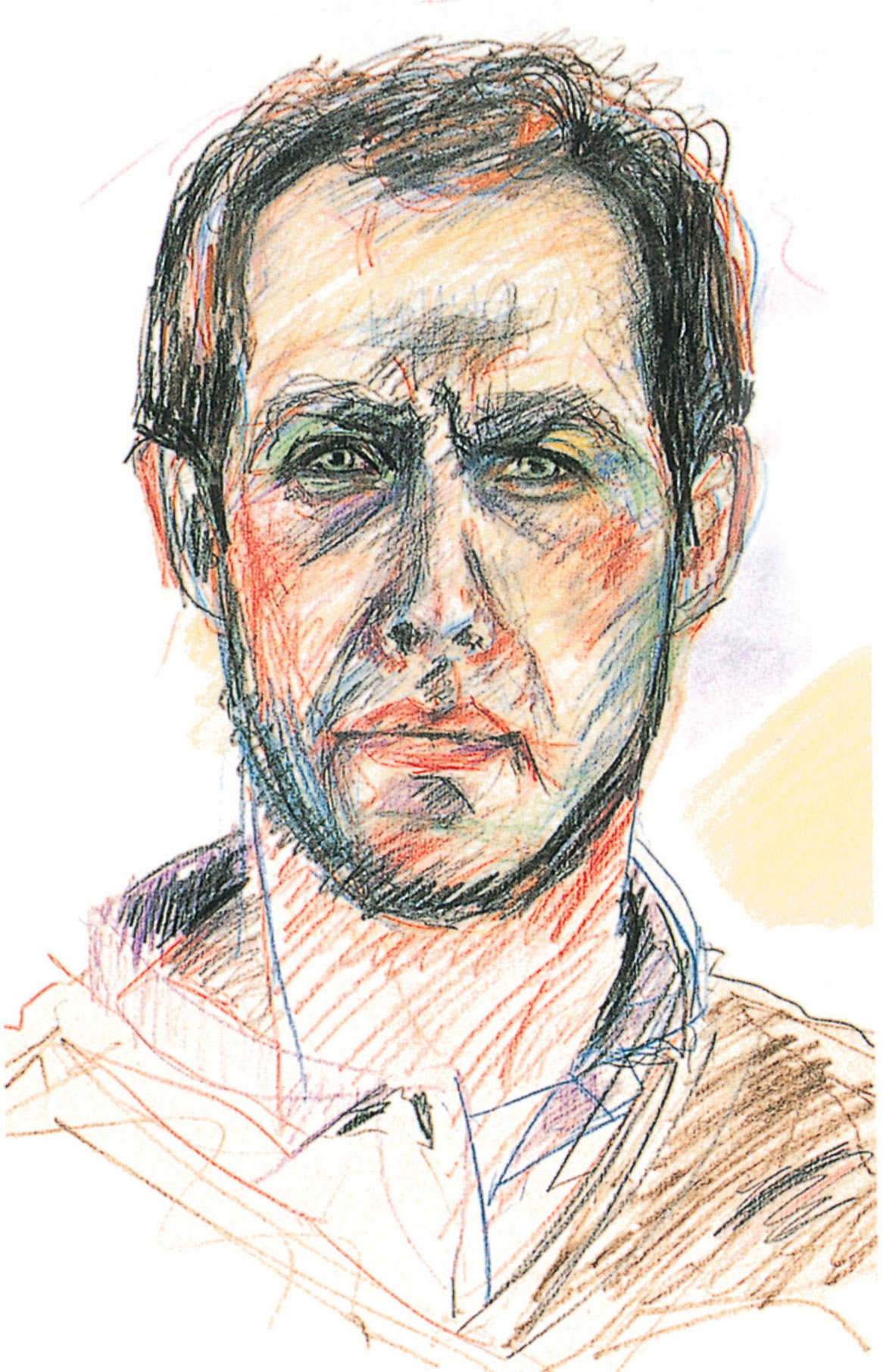
Self Portrait
by John Townend
The strong contrasts of black and red, together with the complementary contrasts of green shadow areas, creates a powerful, almost aggressive effect. The mood is emphasized by the busy pencils marks, weaving over and around each other to describe form and texture.
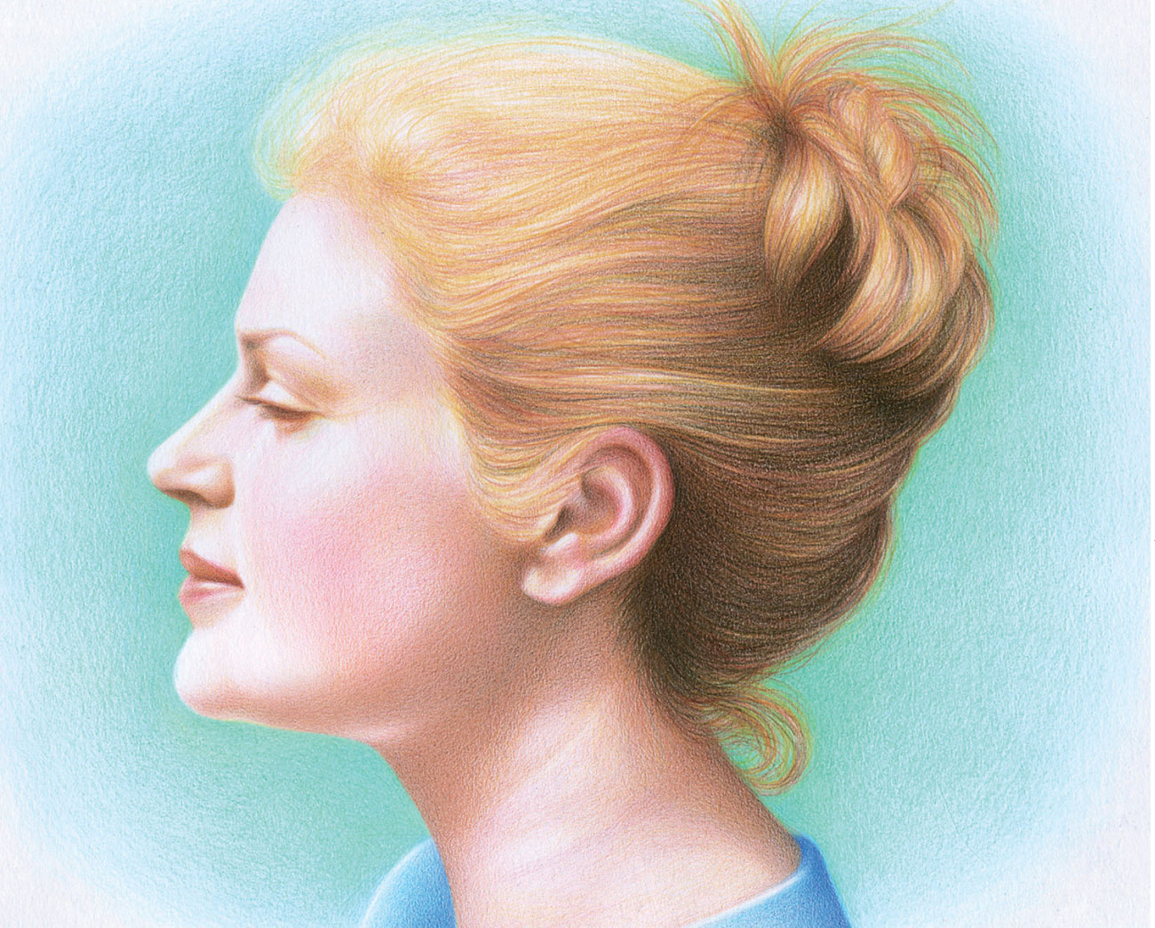
Portrait of Caith
by Katriona Chapman
The mood of this portrait is serene and gentle, as befits the subject. The artist has used watercolor pencils on board, skillfully blending to achieve soft gradations of tone and color.
