Landscapes
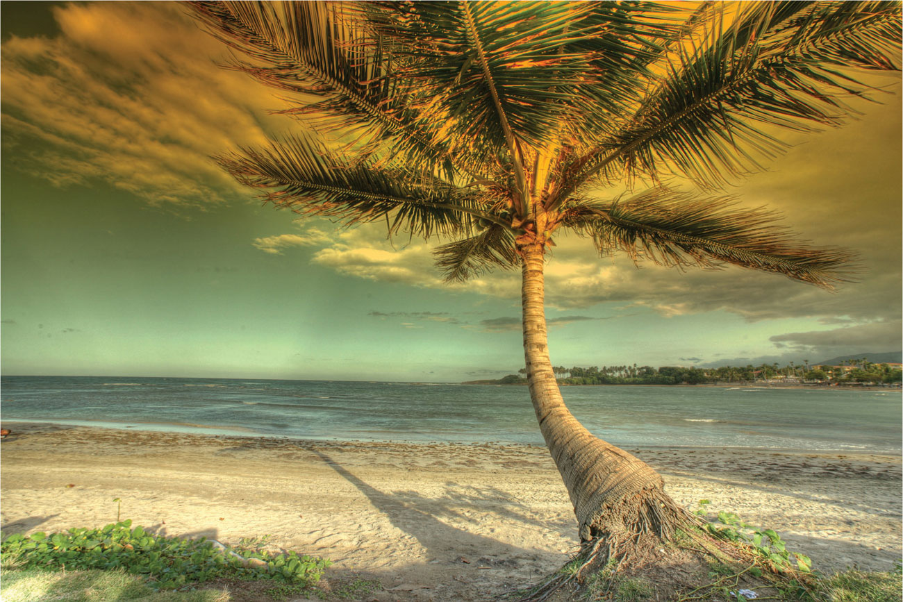
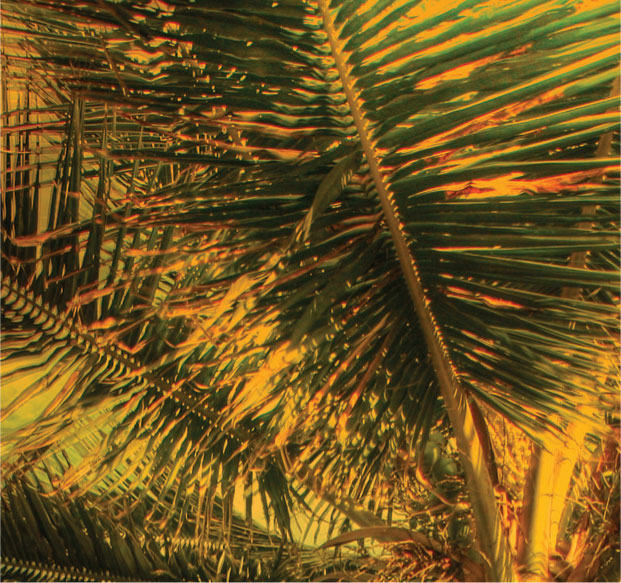
Beach with palm tree This subject demands a painterly approach, using water-soluble pencils or blending with solvent for the background and beach. Use a clear, light turquoise green and raw sienna together with more muted colors such as grays and blue-violet. The tree can be described with more linear marks.
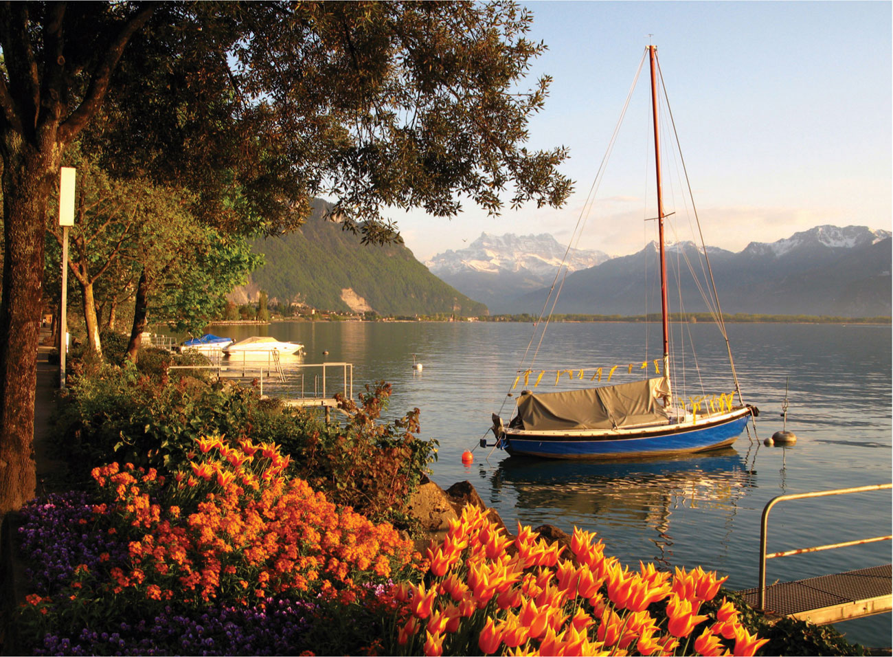
Evening on the water The warm oranges of the tulips in the foreground can be echoed subtly throughout the picture area, hinting at the warmth of the evening light bathing the promontory in the middle distance, the trees, and the water. Warm pinks and ochres will modify and unify the greens and blues, allowing the pure cobalt blue of the boat to stand out in contrast.
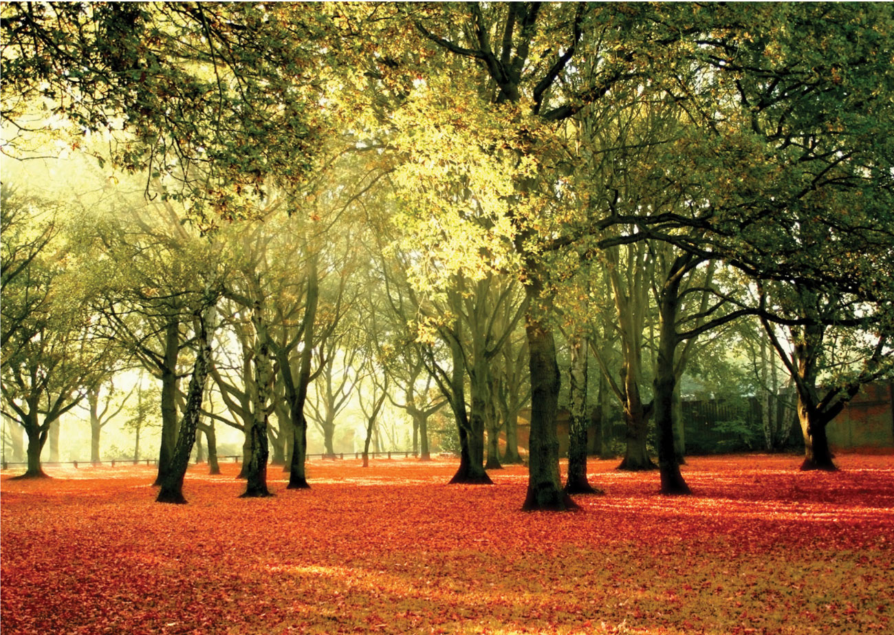
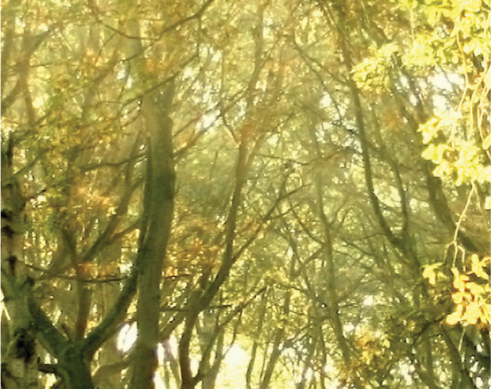
Autumn colors Underpainting in lemon yellow would unify the colors in this composition, enhancing the bright orange and making a good ground color for the trees. Keep the yellow clean and fresh, and build up the foliage with small strokes of well-sharpened pencils to create a stippled effect, layering dark colors over light. If necessary small patches of light can be revealed with sgraffito.
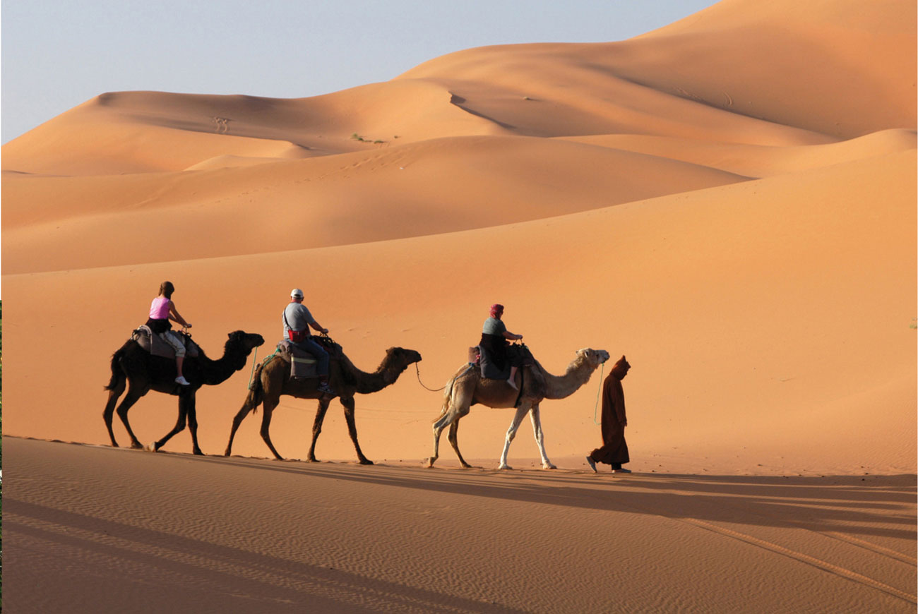
Desert Blending two complementaries gradually reduces the intensity of each. To begin, copy this image in cyan blue and red-orange, varying the pressure. Add yellow for the highlights and perhaps burnt sienna, but keep your palette to a minimum.
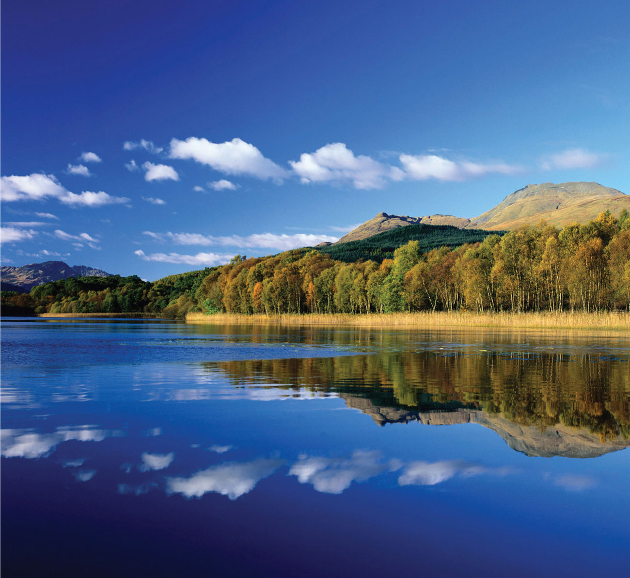
Lakeside The lakeside is mirrored almost perfectly. Use tracing or transfer paper to transfer the image. Once the colors have been built up to a compacted surface, burnishing or work with an eraser will help you achieve the blurred effect in the water. For the clouds, you might try mixing white gouache with a little wet color rather than leaving the paper white. The intense blue should be built up by layering dense color, working on a bright white paper for the best results.
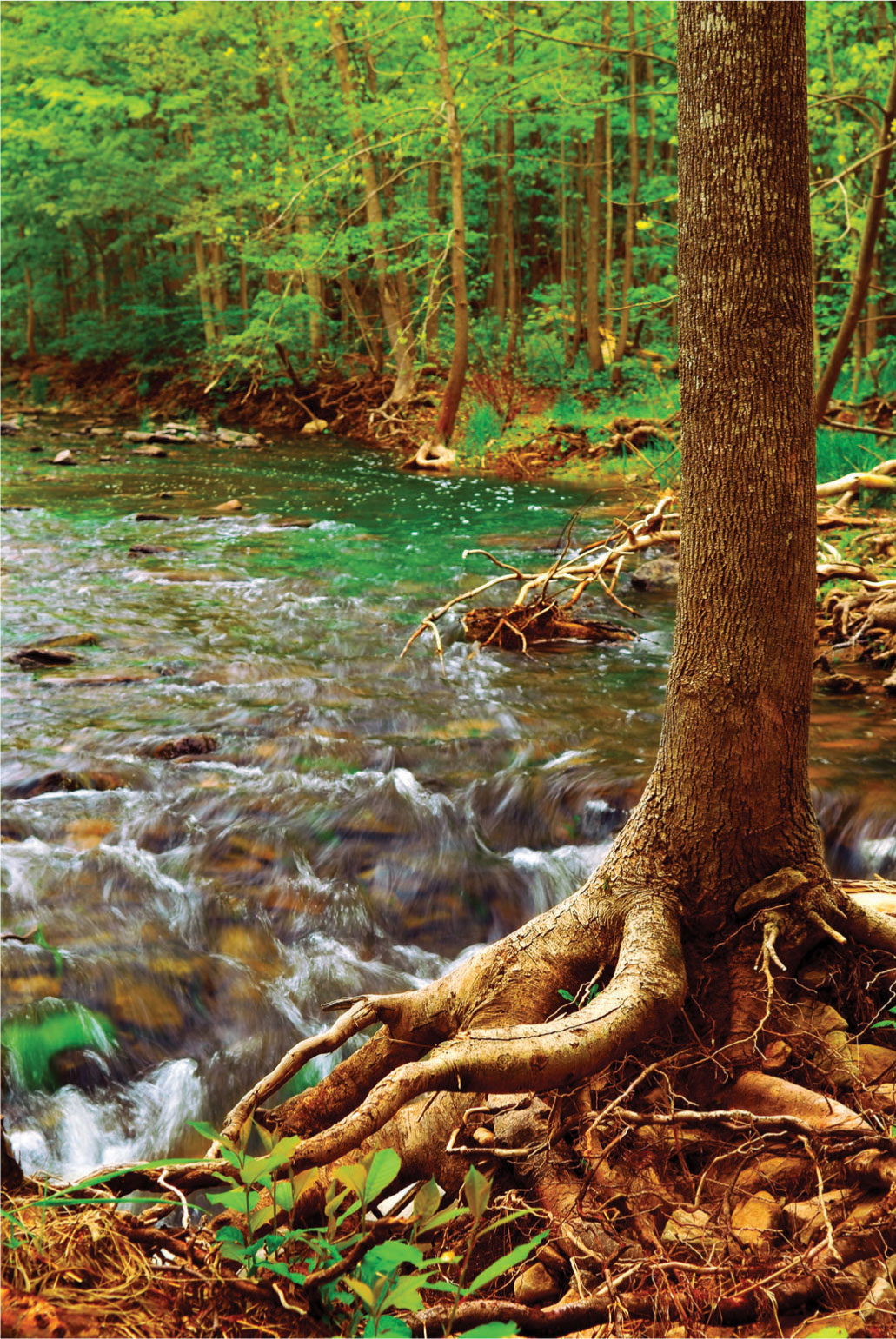
The Beck The translucency of water is not easy to achieve. Start with the underlying colors—the browns, yellows, and grays—and once the surface is compacted, burnish with white or a selection of pale tints. Very thin acrylic, mixed with a medium rather than water, could be applied with a brush or a sponge, but it shouldn’t become too wet. Work quickly, as the wet paint will “melt” the pencil marks, making the mixture difficult to control.
Nature
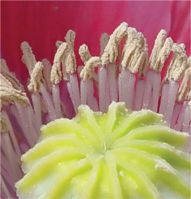
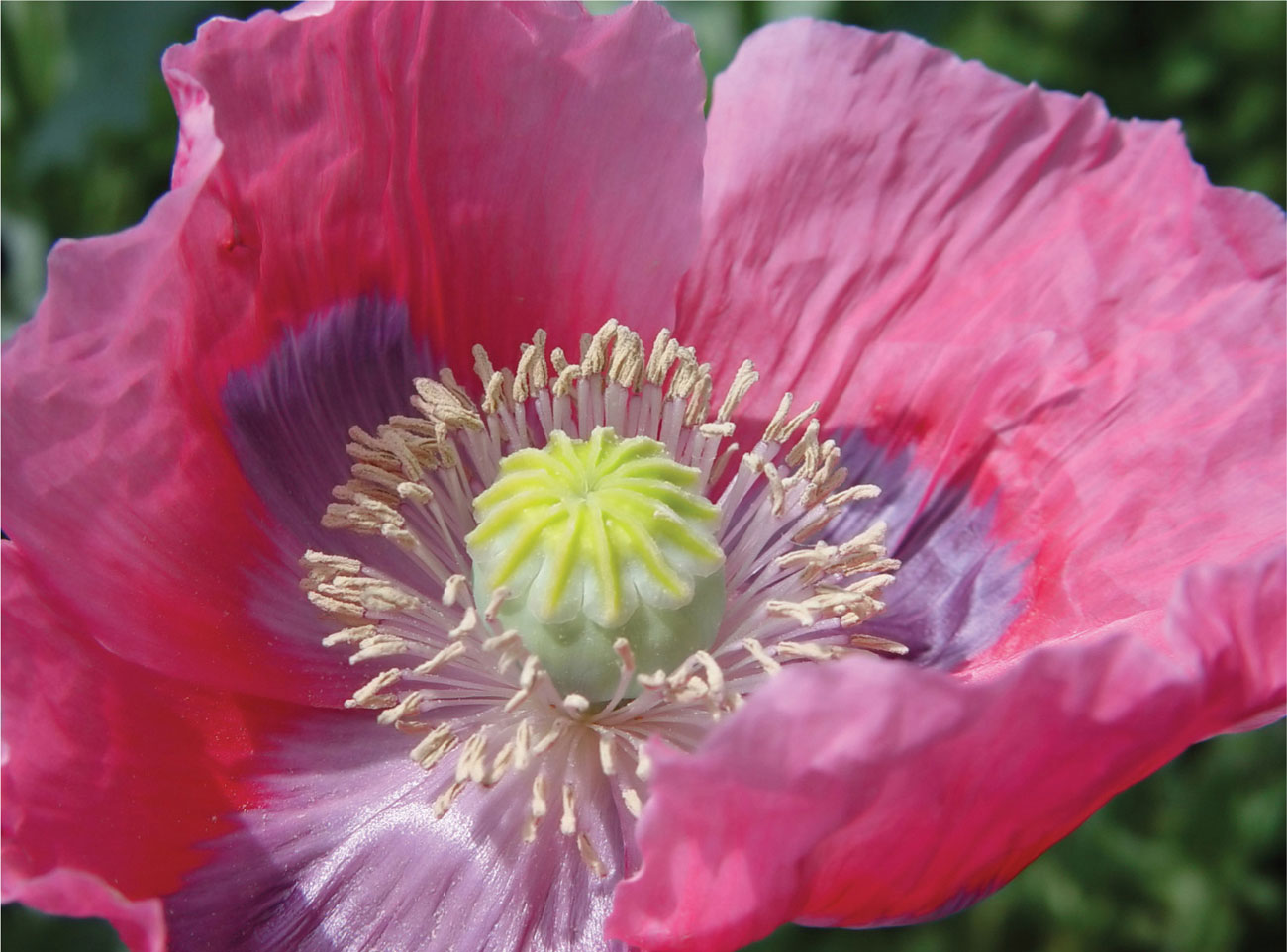
Poppy The calyx and the stamens probably need to be worked up first from a carefully observed drawing in order to keep the image crisp. Use well-sharpened pencils for this area to provide a contrast with the softer petals, which could be worked with blended water-soluble pencils and added linear work for the tonal detail.
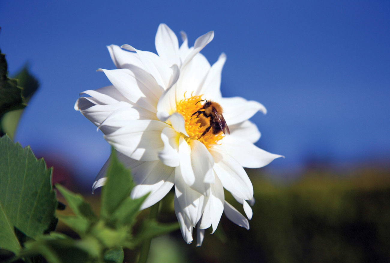
White flower with bee You will need no more than a handful of pencils to tackle the flower. Work on a smooth-surfaced paper which will allow white and pale tints to show up, and describe the overlapping petals by building up the tones in layers. Use a sharp pencil at all times to keep the work fresh and achieve the sharp edge quality. Experiment with blues and violet combinations for the greatest resonance in the background area.
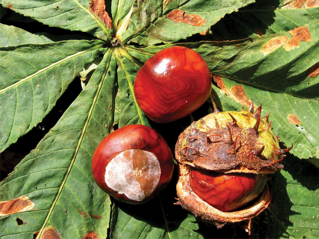
Conkers This close up shows off the exciting textures of the shiny conkers, their prickly cases and the veining of the leaves. Make the most of this in your work by burnishing compacted layers of reds, burnt sienna, and dark blue for the markings, and experiment with sgraffito or impressing for the leaf veins, using different implements for the various thickness of line.
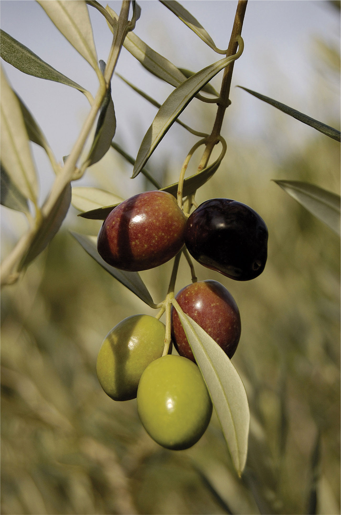
Olives Notice the part the soft, out of focus background plays in this simple but powerful image, contrasting with the sharp clarity of the olives and a very subtle use of complementary color. Use just a handful of pencils to begin with: olive green, of course, plus a more yellow-green, burnt sienna, and a dark and light violet.
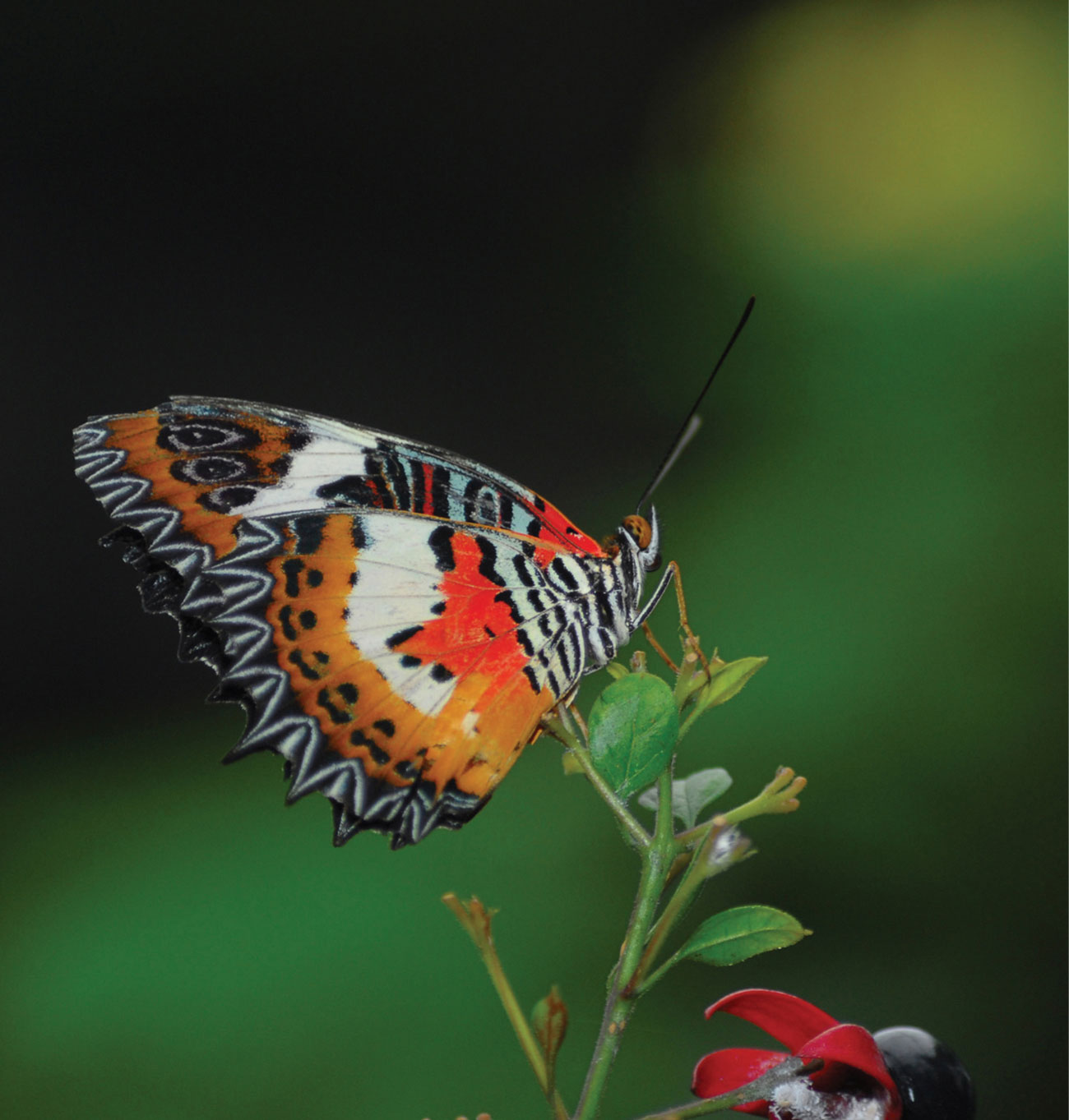
Butterfly The strength of this photographic image is in the contrast between the small but vibrant color and patterning of the butterfly and the soft, dark, out of focus background. In order to accentuate this differentiation you could work on stretched white paper and mask out the image carefully with masking fluid until you have painted the background, or alternatively you could work on dark colored paper, keeping the image distinct with well-sharpened pencils.
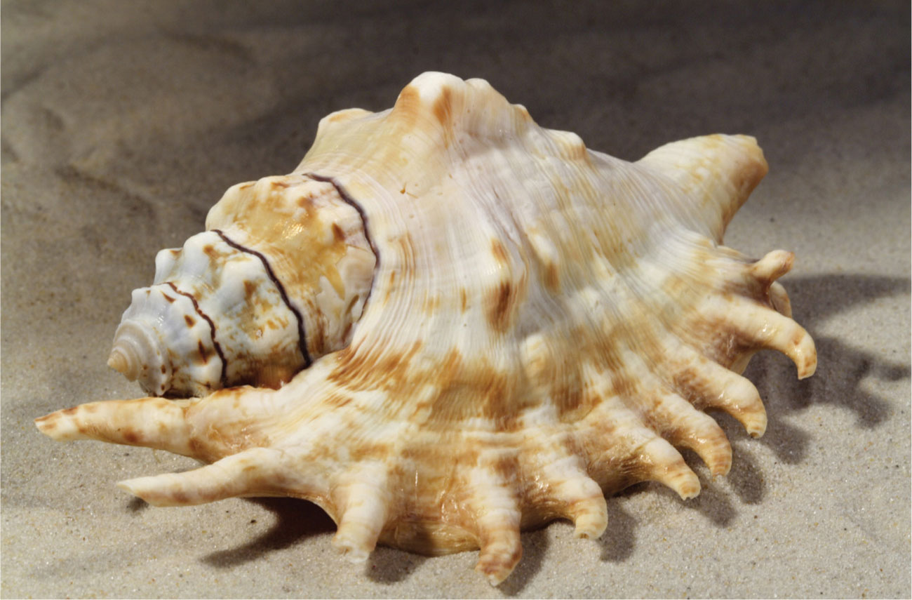
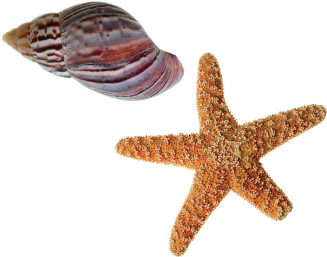
Seashells Shells are not easy to draw, as the spirals and the general asymmetry require close observation. Contour drawing is perhaps the best way to attempt this—describe the volume in terms of fine lines of differing weights, in two or three colors.
Animals
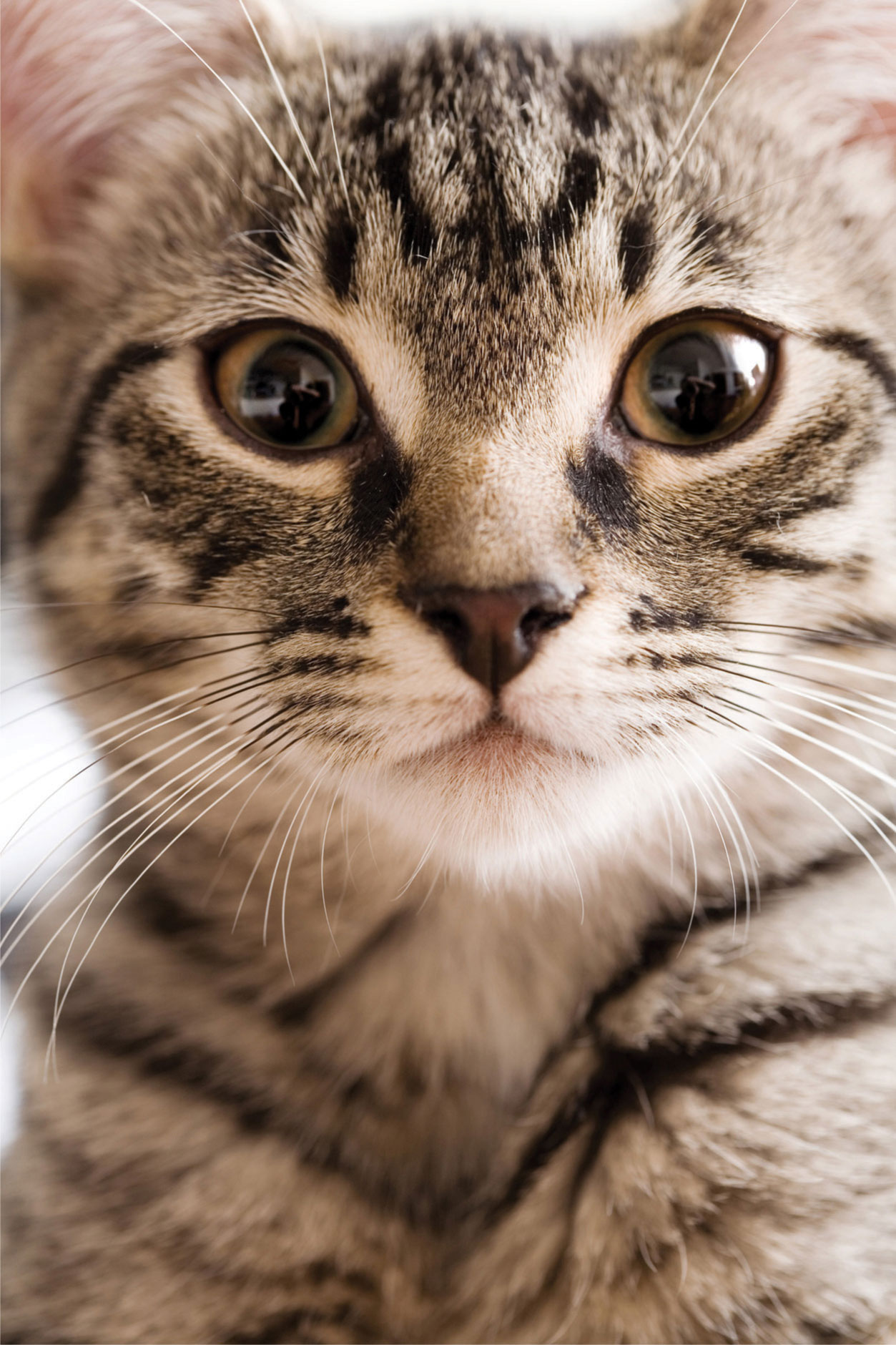
Kitten in close-up
For animal fur, blend by a combination of shading and light hatching. Use a plastic eraser in the direction of the fur to soften the blends and blur the edges. Shade the eyes densely, either reserving the highlights or lifting them out with an eraser.
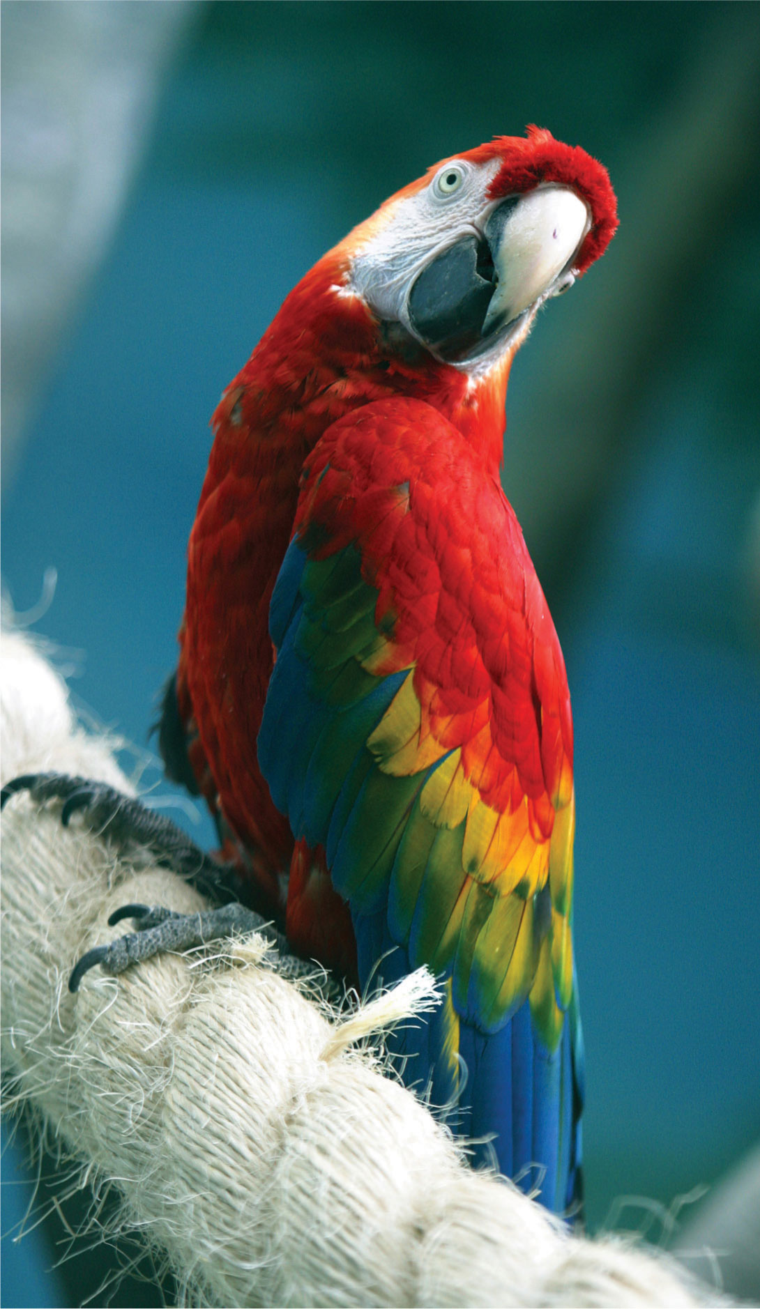
Parrot It could be helpful to enlarge this image, using a scanner or color photocopier so that you can see the structure of the feathers more clearly. Tackle these and the fine hairs of the frayed rope with sharp pencils and sgraffito methods.
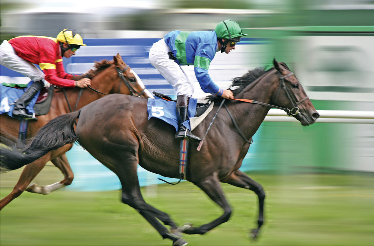
Horse race It is important to give a feeling of speed in your rendering, and you could do this by making vigorous hatched or shaded marks in the same direction as the horses’ movement, from left to right. Carry this treatment through into the background, blending the marks to give a softer focus than that of the horses. Or you might like to work on the fine nuances of light and shade on the horse’s coat, seen clearly in the close up, layering, compacting, and burnishing your color.
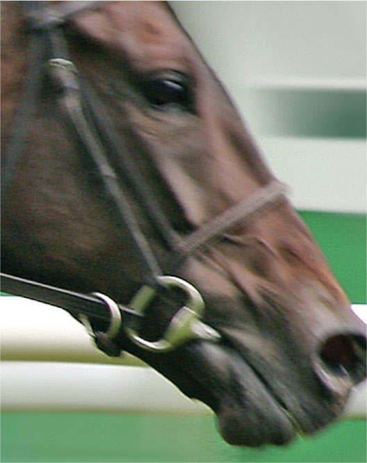
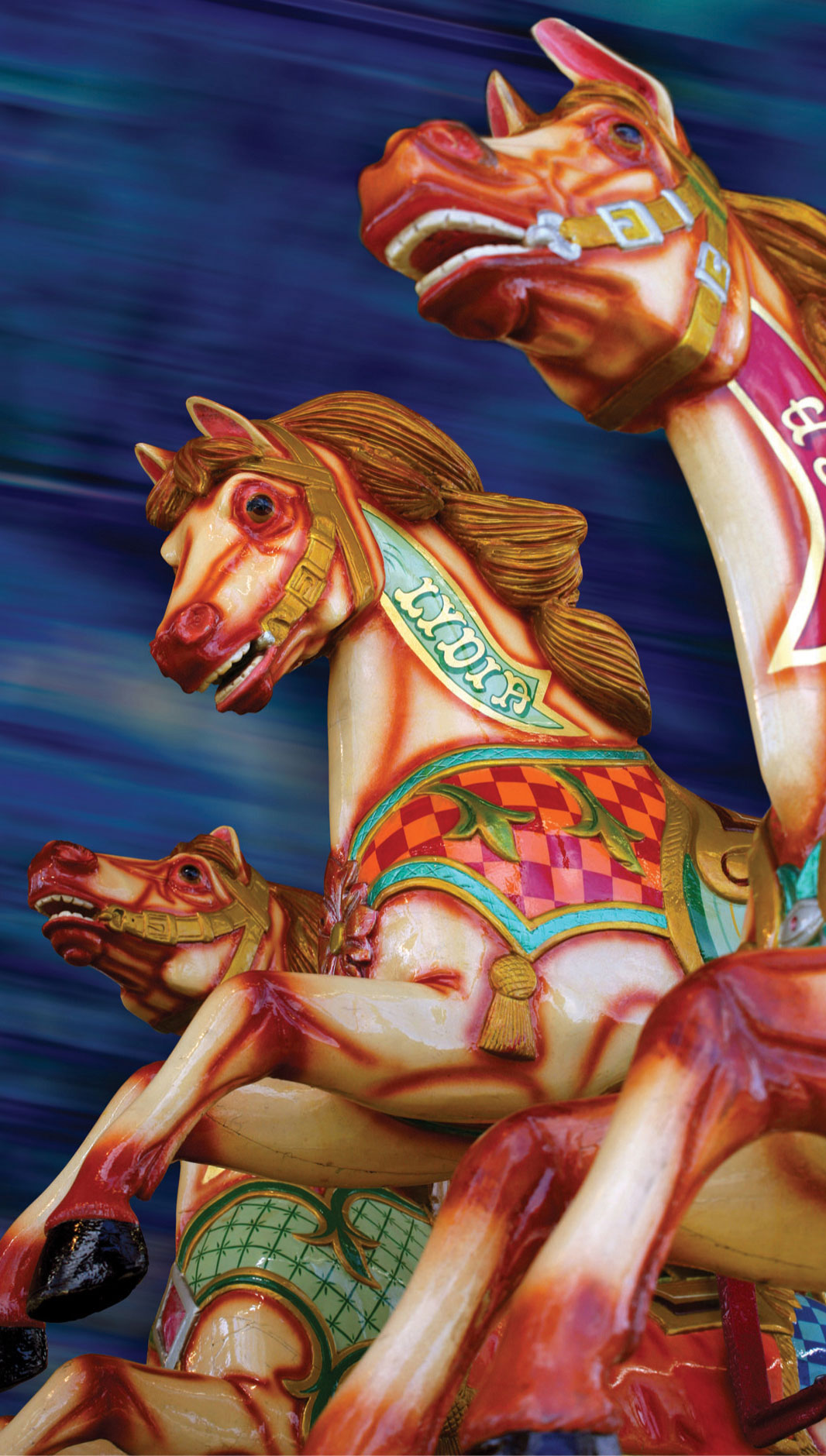
Carousel horses Like the live horses, these painted and varnished creatures have a strong sheen, which can be achieved by careful blending and burnishing. Directional marks in the background will help to create the feeling of movement.
Still life
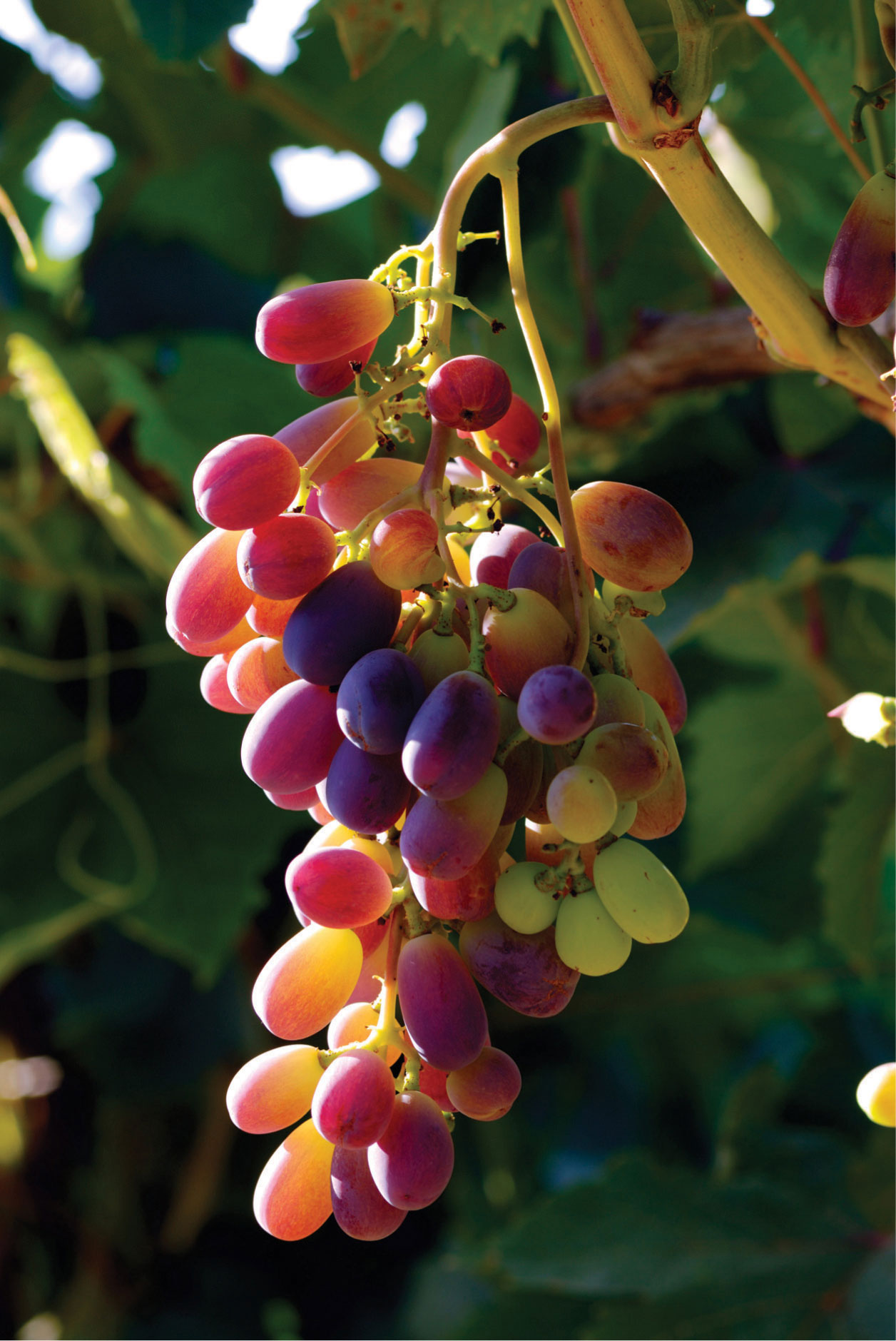
Grapes You will need to use strong tone and color contrasts to achieve this degree of vibrancy. The range of deep greens in the background will require several layers of densely shaded color—dark reds, purple, and indigo—to remove any vestige of white paper. Alternatively, a colored paper could be used as a base for the layering, followed by maximum use of the lighter pinks, oranges, and yellows for the fruit.
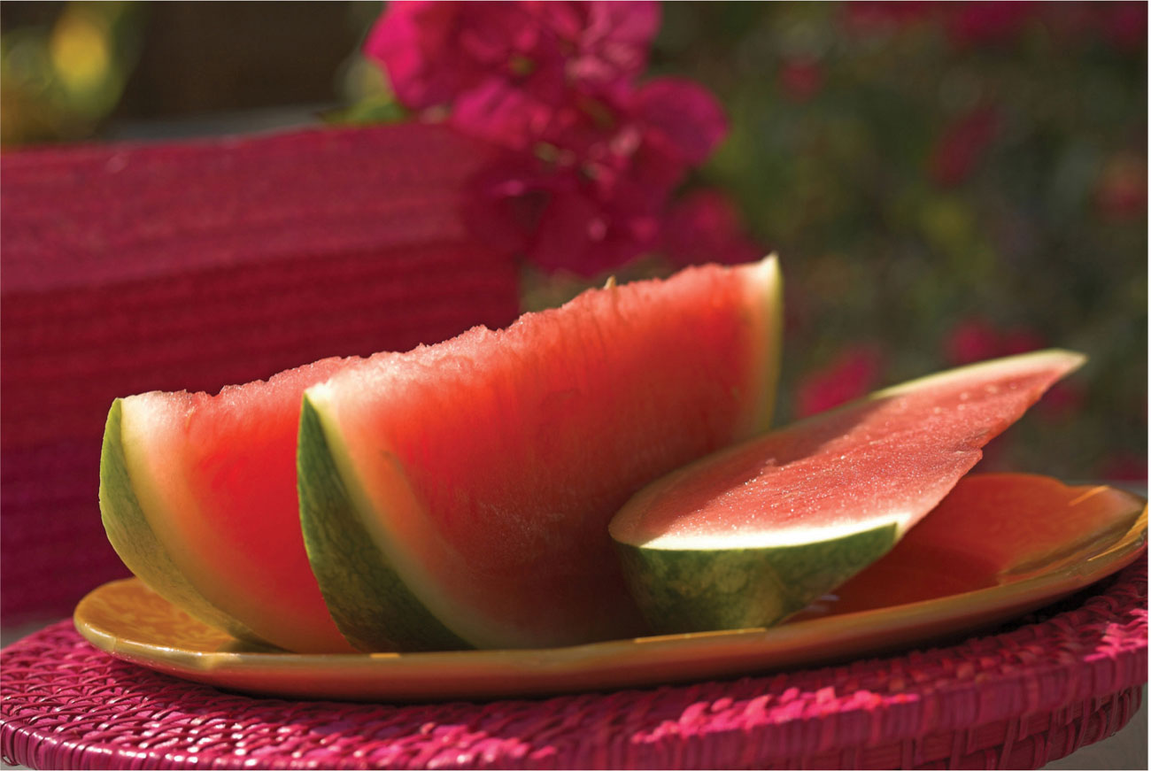
Melon slices You could experiment with just red, yellow, and green pencils of various hues, with layering to obtain the intense shadows. Compacted layered color would be best to suggest the background, which acts as a foil to the clear pinks and oranges in the foreground.
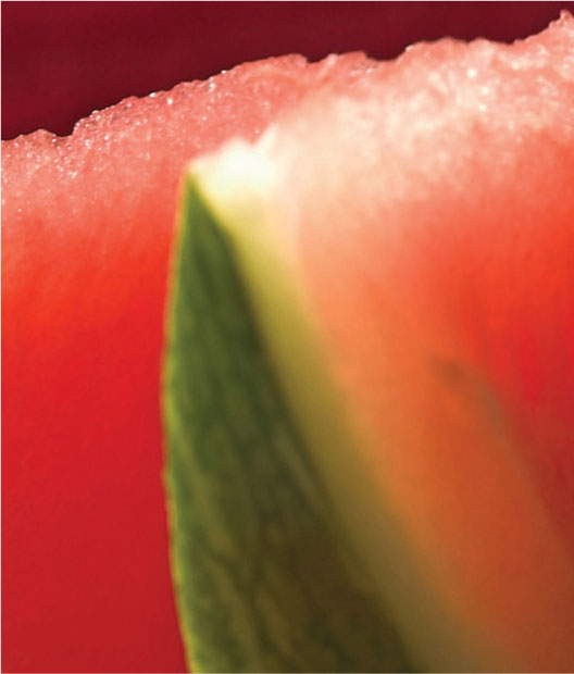
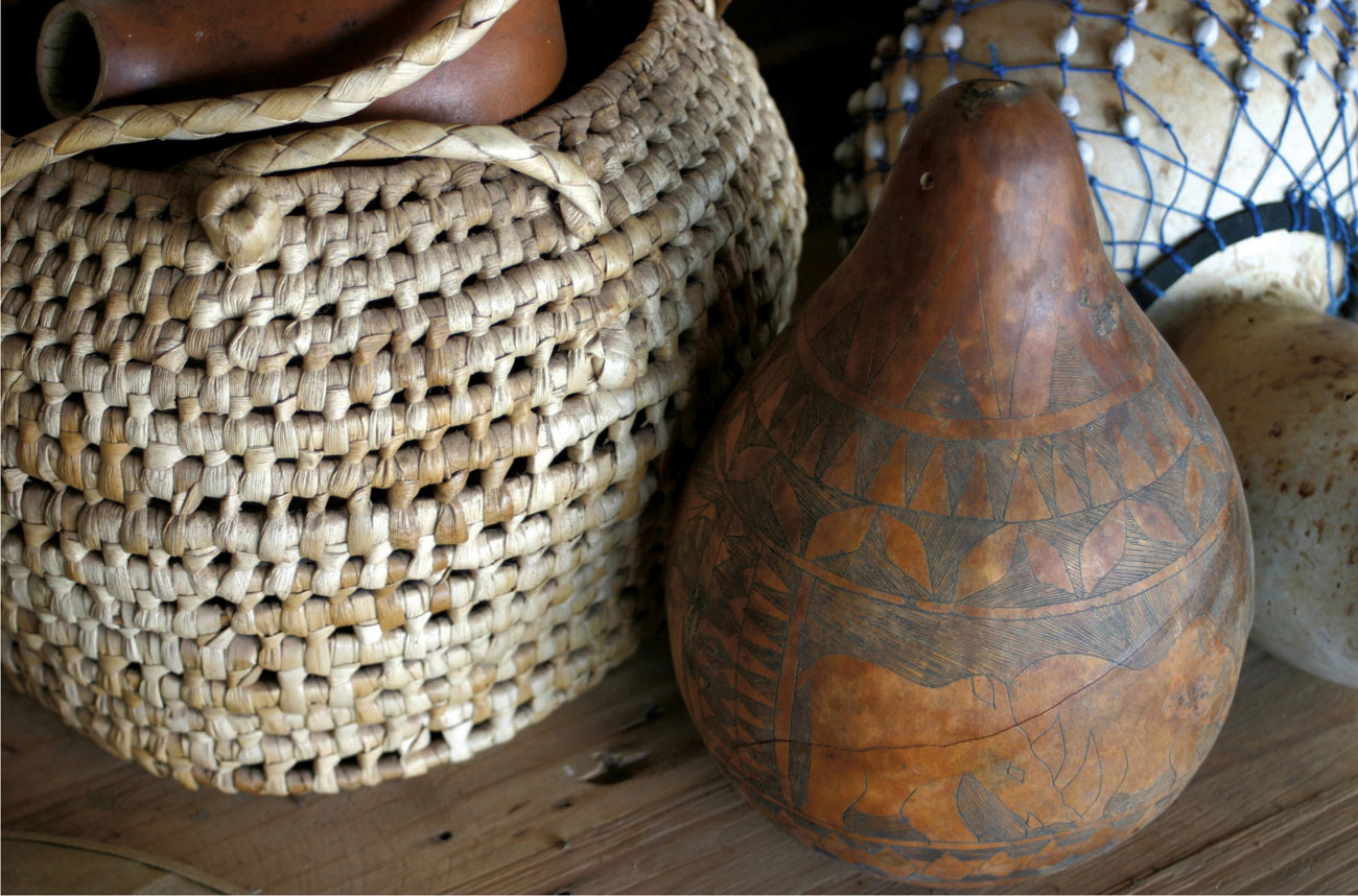
African basket and gourd
This subject offers the artist lovely textures to play with. Use an eraser as a tool to soften the relatively light-toned basket work—the removal of pigment being an integral part of the gradual build-up of tone and color, as you define your work.
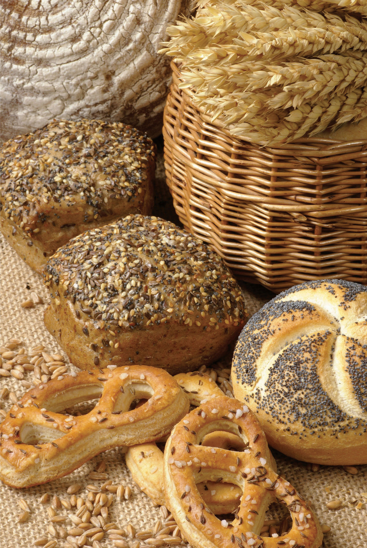
Baked goods
You could describe the woven patterns of the basket and the texture of the wheat, bread, and pastries using hatching and crosshatching techniques. Because of the relatively monochromatic color of the subject, vary the tones with obvious changes in pressure and density.
Buildings
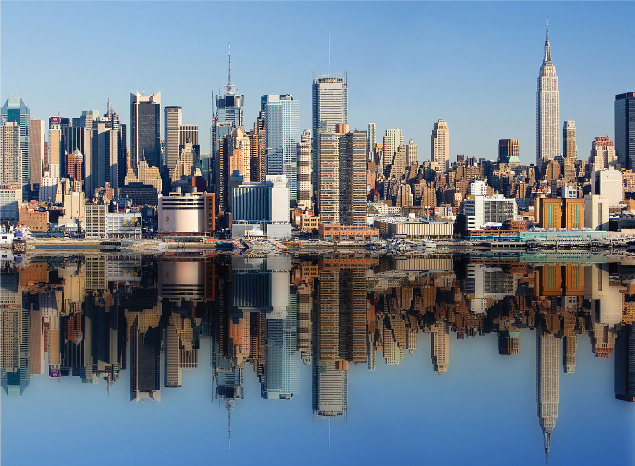
Reflected buildings With an image as complex as this, you would need to trace the reflections in order to get everything in the right place. Start the color work by putting in the main blocks of color first and then overlay the shadows rather than coloring them separately. You may find an impressing tool with a fine point useful for the window grids of the office blocks.
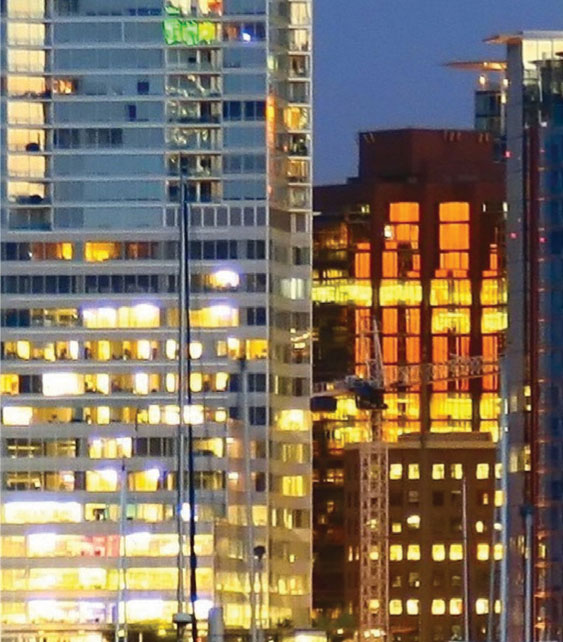
Evening lights Bright lights at twilight can make the sky seem a vivid blue, becoming deeper as the light fades. Make the most of the blue/orange complementary contrast to enhance the brightness by using dense shading or hatching for the lights and their reflections, or you could try using chalky oranges and yellows in light tones on a colored paper.
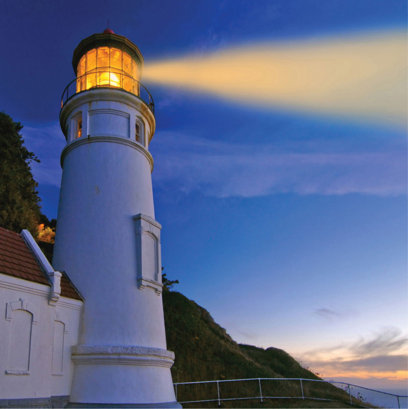
Lighthouse at dusk Play around with different sizes and scales when planning your compositions. Here, the horizon is very low, and the lighthouse fills the space vertically, its height accentuated by the perspective that leads the eye upward from almost ground level. You might try a colored paper for this subject, working the orange and yellow very densely.
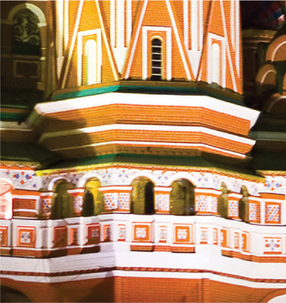
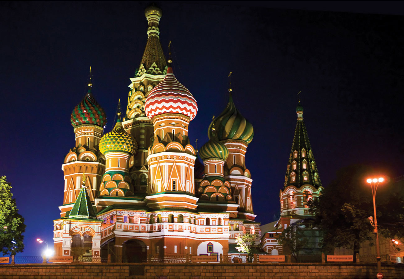
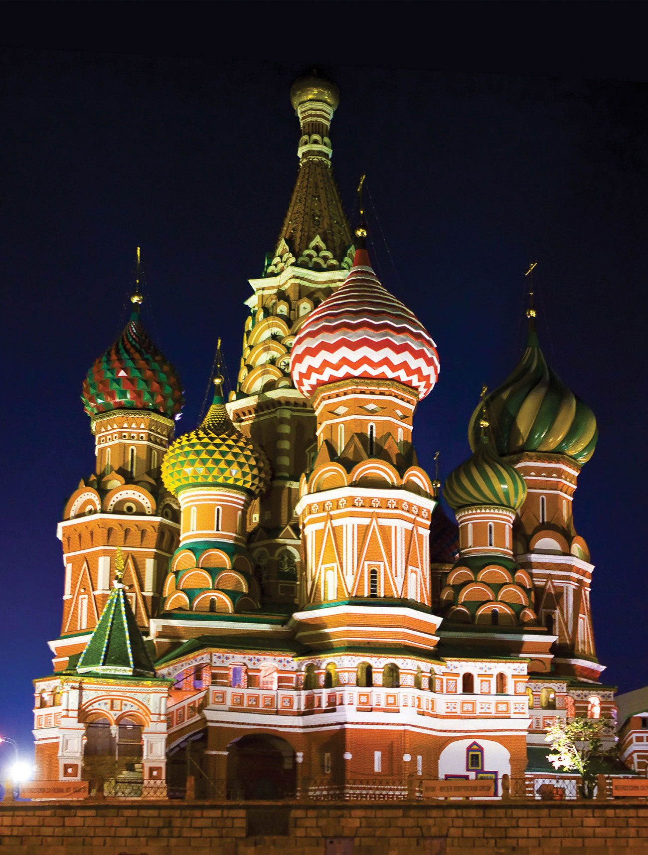
Onion domes This image is all about rich color and pattern, which need to be crisp and clear cut. If the scale of your work is small, your impressing tool should come in handy, used both at the initial drawing stage when the white of the paper will be incorporated and possibly later as well, for the green and yellow patterns.
