CHAPTER 8
Reporting
Congratulations! You have now selected measures to include in your measurement strategy for the coming year or perhaps just measures to meet a specific need. The next order of business is to decide what to do with them once the data are available. How should you share this information? What format should you use? This chapter provides answers to these questions, starting with a return to the measurement hierarchy for guidance on reporting. We recommend different types of reports depending on the purpose and user of the report, and we share examples to help you understand the options.
Types of Reports and Data Displays
We start by admitting that there is no standard definition in our field for the terms report, scorecard, or dashboard. We use report generically to mean any display of data for purposes of this chapter. A report may just be a display of data or it may be a written document containing data. We reserve scorecard to refer to a tabular or table-like display of data that contains only the results (history) for the measures. It may also contain a threshold if the purpose is to monitor.
We use dashboard to mean a higher-order report than a scorecard, although it may still be tabular in format. A dashboard may be interactive, allowing the user to drill down into the data, or it may contain a visual display of data like a bar chart, line graph, or speedometer. It may also contain a threshold if the purpose is to monitor.
Last, we reserve management report to mean a report that shows the plan (synonymous with goal or target) for a measure, YTD results, YTD results compared to plan, forecast for how the measure is likely to end for the year, and a comparison of forecast to plan. A management report may also have interactive capabilities and visual displays, but the defining characteristics are inclusion of plan, YTD results, and forecast for each measure. The characteristics for each of these reports are described in Table 8-1.
Table 8-1. Characteristics of the Three Most Common Types of Reports

Since there is no standard, organizations often use these terms differently, and some reports will not fit neatly into our classification scheme. Regardless of nomenclature, though, we want to make the point that not all reports are equal, and reports have different characteristics, which will be important as we recommend the best ones to use in different circumstances. Furthermore, in the TDRp framework, reports are used at all maturity levels (scorecards for lower maturity and management reports for higher maturity). This contrasts with many who do not differentiate by type of report and instead classify all reporting as a low maturity-level activity.
In addition to displaying data in tables, charts and graphs can supplement the table or can replace the table entirely. Bar charts are common in our field and lend themselves to comparisons of several measures for the same time period or one or several measures over time. Likewise, graphs display data for one or more measures over time, particularly when there are numerous data points (like monthly data over three years or more).
We continue our discussion of the different reports by returning to the measurement hierarchy first shared in chapter 1 (Table 8-2). Recall that the hierarchy is based on the reasons to measure, and the reason to measure will dictate the type of report to use.
Table 8-2. Measurement Requirements and the Impact on Reporting

In this chapter, we focus on each measurement purpose and the reports that typically serve that purpose.
Reporting to Inform
As we discussed in chapter 1, the most common reason to measure is to inform or answer questions, identify trends, and share activity. Sometimes, the question is very simple: “How many courses were used last year?” In this case, you may simply provide the answer in person or in an email—no table required. More often, though, the question is more complex, or the answer would benefit from some detail. For example, the user might want to see the breakdown of courses used by type or subject matter, and it might be useful to show the answer for both unique and total courses. In this case, you would display the data in a table or scorecard but sometimes in a graph or chart as well.
Scorecards are an effective way to inform. They are one of the most common reports and are a natural starting point for our examination of reporting options to inform. At its simplest, the scorecard is simply a table of historical results. Typically, the x-axis (horizontal) is time and the y-axis (vertical) is the name of the measure. Table 8-3 shows a simple example for unique courses used by type of learning.
Table 8-3. Example of a Simple Scorecard
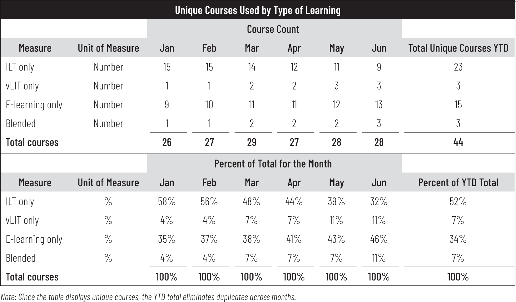
Since the purpose of a scorecard is to answer questions, a table like this is appropriate if the CLO asked to see a breakdown of courses used by type of learning for the first six months of the year. This table provides that information very clearly answers the following types of questions:
• How many courses were used in June? (Answer: 28)
• How does that compare to the first five months? (Answer: Down from March but up from January, February, and April)
• What type of course has been more popular over the first six months? (Answer: ILT at 52 percent but e-learning has gradually increased in popularity, surpassing ILT in May)
• Is there a trend? (Answer: Yes. E-learning, vILT, and blended have increased since the start of the year.)
It is a best practice to always add a note if something in the table is likely to confuse the user. In this case, a user may have quickly noticed that the YTD column does not appear to be summing the six months correctly. Rather than waiting for them to point this out (or just assume you made an error), it would be wise to explain it. In this case, the measure is unique courses used, not the total, so just like with unique participants, you cannot simply sum the amounts across time periods because that will result in duplicates being counted. In other words, there were only 23 unique (by name) ILT courses used in the first six months. They were never all used in the same month, and each month would have a slightly different list of courses used. Using an LMS or a spreadsheet is essential to obtain the unique count.
This scorecard includes the YTD column, which we always recommend when displaying partial-year data, so the user does not have to calculate it manually.
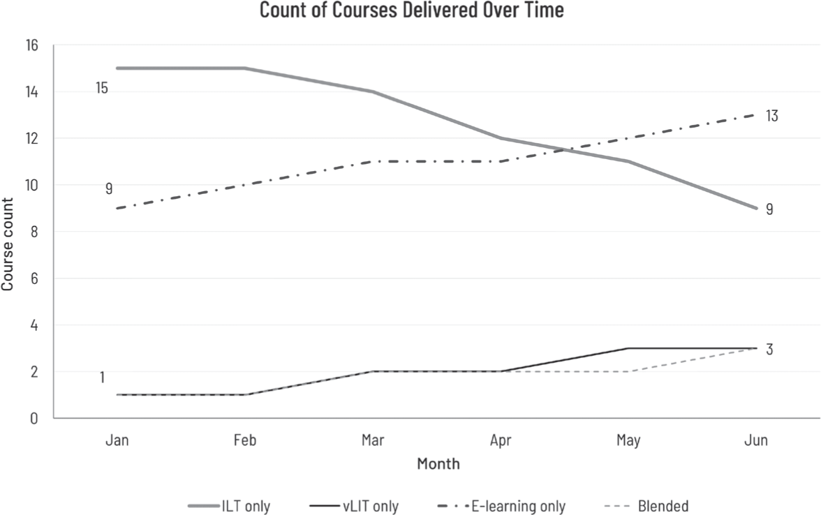
In many cases, the report recipient will want to review trends. While the table includes the percentage of total courses delivered by modality, it’s easier to see the trend via a graph (Figure 8-1).
Figure 8-1. Graphical Depiction of Trends
In our client work, we are often asked when it’s appropriate to use a table versus a graph or bar chart. We suggest the following:
• A table is best when:
![]() You need to look up specific values.
You need to look up specific values.
![]() Users need precise values.
Users need precise values.
![]() You need to compare related values (for example, sales in Q1 versus Q2).
You need to compare related values (for example, sales in Q1 versus Q2).
![]() You have multiple data sets with different units of measure.
You have multiple data sets with different units of measure.
• A graph or bar chart is best when:
![]() You have large data sets.
You have large data sets.
![]() You want to reveal relationships among multiple values (similarities and differences).
You want to reveal relationships among multiple values (similarities and differences).
![]() The shape of the graph tells the story.
The shape of the graph tells the story.
Often, our clients need to see the specific values and the overall trends in an easy-to-read view. In this case, use both the table and the graph. Your users will thank you.
We depict a slightly more complex scorecard in Table 8-4. The CLO requested a report showing the historical results for the organization’s effectiveness measures during the last six quarters.
Table 8-4. Example of a More Complex Scorecard

This view answers the following questions:
• What is the average Level 1 participant reaction score for 2019 and for the first six months of 2020? (Answer: 80 percent for 2019 and 86 percent for 2020.)
• What are the lowest and highest components of Level 1 participant reaction for 2020? (Answer: Four components tie for lowest score at 85 percent favorable—instructor quality, environment quality, relevance to job, and worthwhile investment—and recommend to others is the highest at 90 percent.)
• Is goal owner satisfaction improving in 2020? (Answer: It improved slightly from Q4 2019 to Q1 2020 but did not increase any further in Q2.)
• Has the application rate improved over the last six quarters? (Answer: Yes. Intent to apply improved from 79 percent to 87 percent while actual application improved from 58 percent to 78 percent.)
Notice that in both examples the scorecard did not contain a threshold, plan, or target values. Consequently, a user could not say whether the values were good or bad, just whether they were improving or deteriorating. There is no information on what the L&D department wanted to achieve. For example, did the department intend to move away from ILT and toward vILT, e-learning, and blended? Is the department actively trying to improve Level 1 scores or did this improvement just happen on its own?
In summary, if a scorecard is going to inform, it must provide information about relevant measures in a way that recipients can easily interpret and identify where to take action.
Note
This scorecard raises the issue of when to use a simple versus weighted average. We use a simple average here to provide the average for 2019 for each component, which means each value is weighted equally. An alternative would be to use a weighted average where the weight is the number of respondents each quarter. If one quarter had a lot more respondents than other quarters, the value for that quarter would receive a heavier weighting. Likewise, the average for the Level 1 subcategory of quality is the simple average of the subcategory components (content through environment). And the average for Level 1 participant reaction is the simple average of the five components (quality, alignment, recommend, relevance, and worthwhile investment).
An analyst could choose to weight the categories differently to give some more weight than the others. Typically, simple averages are employed but the option always exists to weight. If that’s what you decide to do, be sure to disclose that in a note because the reader will assume you have used a simple average.
Reporting to Monitor
The next use of measures is to monitor or determine if a measure meets a threshold or is within an acceptable range. Scorecards with thresholds and dashboards with thresholds are well suited to this purpose.
Many scorecards and dashboards will use color coding to indicate satisfactory, marginal, or unsatisfactory results. The color coding may include predefined thresholds or may use the concept of a “heat map,” which assigns colors (typically green, yellow, and red) based on the distribution of the data. The thresholds, however, are generally not equivalent to a target or plan. That is, the colors merely make it easier to assess the level of performance. Table 8-5 is an example of such a scorecard. (Note that the colors have been adjusted to grayscale for printing; light gray represents green, medium gray is yellow, and dark gray is red.)
Table 8-5. Example of a Scorecard With Color Coding

In this scorecard, leadership sets thresholds (shown at right) for each measure. These thresholds then determine the status or color for each measure. For example, the threshold for LMS uptime is 99 percent, meaning that the expectation is for the system to be available 99 percent of the time. Values between 97 percent and 99 percent signal a warning and are not expected to occur very often. A value in the red is a cause for concern and requires immediate attention.
LMS uptime has been green and meeting expectations every month except February, where it slipped into the yellow. Help desk wait time, on the other hand, is not doing well. It is very erratic, meaning the process is not under control, has registered two months of red, only one green, and is not showing any sustained improvement. So, management needs to address and improve help desk wait time and percentage on time completions. Other measures are doing well and show sustained improvement.
This type of scorecard, particularly if it is color coded, is very popular since it is so easy to use, and it clearly shows when a measure is out of an acceptable range. Also, the use of color coding can improve the usefulness of the report. Without at least some context (what does “good” look like?), the data on the report has limited value, particularly to a recipient who may not even have asked for the report.
Dashboards often look like a scorecard but usually provide drill down capability to examine select measures or a specific timeframe. They often include visual displays such as bar charts or line graphs. Some have “speedometer” dials, which show activity. Like scorecards, if dashboards are used to monitor, they will also include a threshold, which is an acceptable range for a measure or a minimum or maximum value so a user can see if the measure is in compliance or not. The thresholds are predefined and may use benchmarks to compare results to a broader population.
The Use of Benchmarks
As we mentioned in chapters 3 and 4, benchmarks are extremely helpful to gauge your performance against other organizations. ATD and Explorance provide robust benchmarks they continually refresh to reflect shifting trends in L&D.
We recommend that L&D use benchmarks to help leaders set appropriate goals for their organizations. In some cases, the benchmark may become the goal, which is acceptable as long as the decision is intentional. However, leaders should not simply make the goal to equal the benchmark. Rather, they should adjust the goal to reflect the maturity of their organization and its ability to meet or exceed a specific threshold at a particular point.
Dashboards for monitoring (like scorecards) are best employed when the measures historically have been in an acceptable range and are likely to remain within an acceptable range going forward. This is often the case for effectiveness measures, especially Level 1 participant reaction, where many organizations consistently receive high marks. They may average 4.5 on a 5-point scale with little variability around the average (most responses fall between 4.2 and 4.8). So, it would be unusual to have a value below 4.2, and accordingly, 4.2 is set as the threshold value. The program manager and CLO want to receive an alert when a value falls below 4.2—if they don’t hear otherwise they will assume everything remains within the acceptable range.
Dashboard designs vary considerably. Reporting users often want fewer tables and more visualization. To respond to this demand, L&D technology providers have customized their dashboards to include combinations of colorful visual displays and often graphs. In some cases, these dashboards are simply glorified scorecards with no thresholds, interactivity, or drilldown capability. The difference is that dashboards convey some information graphically, which also means that dashboards often contain much less specific information than scorecards, given the limit on how much information they can display visually.
As vendors respond to client needs, they have increasingly provided dashboards that provide thresholds as well as drill down capability. The example dashboard in Table 8-6 shows Level 1 participant reaction average scores for the first three quarters, where the threshold or minimally acceptable score is 4.2. View 1 of the dashboard shows the high-level view of the results across all quarters. When you examine the data, it’s clear that something happened in Q2 causing program scores to decline by 0.3 point from Q1. If you are monitoring these programs, you might want to know if the problem occurred for all programs and courses or only a subset.
When you double click on “All Programs,” the dashboard will display the results of Program A and Program B (view 2). While the scores of both programs declined in Q2, the larger drop was for Program B, which declined by 0.4 point versus the overall 0.3 point average. At this point, you would likely want to explore if all courses in Program B had similar declines. To do so, you would double click on Program B so the dashboard displays the results of two courses, Course B1 and Course B2 (view 3). Clearly, Course B2 is pulling down the average. What you might not know is that the initial rollout of Course B2 occurred in Q2 with a score of 3.9. So, we are seeing not a decline in the scores from Q1 to Q2, but rather the introduction of a new course, which impacted the overall average. When you double click on Course B2, it’s obvious that all three instructors (D, E, and F) had similar scores (view 4). The next step would be to investigate Course B2 and identify why it did not meet the threshold overall.
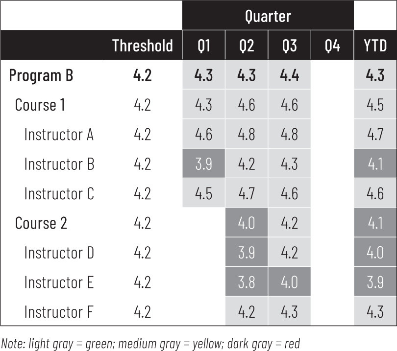
While this dashboard enables drill down, it doesn’t color code the results, requiring a bit more work on the part of the user to compare the actuals to the threshold. Table 8-7 is a dashboard with drill down capability and color-coded scores to facilitate easy comparison to plan. This dashboard focuses on Level 1 content questions only.
Walking through the example, you encounter possible pitfalls when simply monitoring results versus managing them. In Table 8-7, view 1 only shows the total for all programs where the YTD average of 4.2 indicates that the threshold is being met and no further investigation is necessary. However, averages can be deceiving. When you double click on “All programs” in view 1 to see the details by program (view 2), you discover that Program B seems to be doing well (at or above the threshold), but Program A is falling behind.
Table 8-6. Dashboard With Drill Down Capability
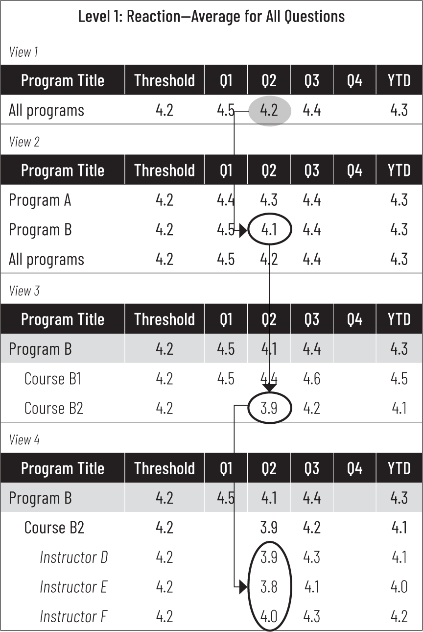
Table 8-7. Example of Dashboard Drill Down by Content With Color (Views 1 and 2)

You now double click Program A in view 2, which brings up the detail for Program A (view 3; Table 8-8). Here you find that the 4.1 score for Program A results from a mix of courses and instructors who are exceeding the threshold (Instructors A, C, E and F), those who are a bit below (Instructor D), and one who is underperforming considerably (Instructor B). Had you only looked at the top-line results, you might not have uncovered areas for further action.
You now feel you’ve done your due diligence and that you don’t have to investigate further. Program B is doing great, right? Well, maybe not.
Return to view 2 and double click on Program B. In view 4, you’ll see that the averages masked courses that were underperforming (Table 8-9). Course 2 is at risk, below threshold, or just barely meeting for all instructors.
The point of this example is that when you choose to monitor results, do not assume that the average is telling the full story. Explore beyond the top-line result to uncover emerging issues early that require less drastic corrective action.
Table 8-8. View 3: Result of Double Clicking on Program A in View 2

Table 8-9. View 4: Result of Double Clicking on Program B in View 2
Note
Since monitoring implies that the values are expected to fall in an acceptable range, most values in a dashboard should be in the green or yellow. If a scorecard or dashboard is predominantly red, leaders have set the threshold too high for monitoring. If the wto manage the measure to a higher level and will require a management report rather than a scorecard or dashboard to achieve the desired result.
Next, we provide examples of actual dashboards. They all include visually appealing displays of data and some include thresholds or small tables as well.
The oil company Marathon provides an example of a dashboard for an organization just beginning the measurement journey (Figure 8-2). When they first began measuring they had no benchmarks but simply collected data. By year two, they had sufficient efficiency and effectiveness data so that they could set individual and department thresholds or goals and use the dashboard to monitor.
Figure 8-2. Sample Dashboard From Marathon

Figures 8-3 and 8-4 are two dashboards from the solution provider Explorance that illustrate what can be generated for a client with a measurement and reporting tool, in this case Metrics That Matter (MTM), which we introduced in an earlier chapter. Both dashboards contain visual displays of the data as well as simple tabular presentations; each is interactive, allowing the user to select the time period. The custom dashboard illustrates what the CLO and program managers would use to monitor the key measures of net promoter score and scrap learning with some detail for each (Figure 8-3). Details on business results (1) and application challenges (2) are found on the left-hand side.
The dashboard provides six views chosen by the client to monitor progress:
1. The top left panel identifies the top three business results reported across all courses. For this client, the top results are teamwork/office dynamics, patient satisfaction, and productivity.
2. The middle left panel shows the barriers to application reported across all programs. More than 53 percent of participants reported having no challenges, whereas 26 percent reported not having enough time and 13 percent could not apply the learning because it conflicted with their current work processes.
3. The bottom left panel shows a 12-month trend of two indicators, job impact and perceived value, compared to the corporate university benchmark that is available in the MTM database.
4. The top middle panel shows the courses that reported the most unapplied learning (scrap) ordered from most scrap to least scrap.
5. The top right panel depicts instructor Likert scores from lowest to highest (Note: we have replaced the names for confidentiality).
6. Finally, the bottom right panel shows the trend of Net Promoter Score over the past 12 months compared to the corporate benchmark.
Figure 8-3. Custom Dashboard From Metrics That Matter

It’s worth noting that while the dashboard provides information and is useful for monitoring, this particular company is very focused on managing their learning business. As a result, key measures like scrap and NPS fall within a very narrow range.
The dashboard in Figure 8-4 is designed to be shared with senior leaders like the CEO, CFO, and business unit heads. It highlights the four key measures that senior leaders care about:
1. The top left panel shows the overall usage of learning by purpose of the training: operational efficiency, mitigate risk, foundational skills, and drive growth. This view provides insight into the type of training that the organization is consuming.
2. The second panel to the right shows the overall scrap rate for L&D in that period. The green dot denotes that scrap rates are lower than the corporate benchmark (a lower value of scrap is good).
3. The third panel to the right depicts the overall performance improvement as calculated by the MTM system. The green dot also shows that training across the enterprise in the reported period is above benchmark.
4. The panel on the top right shows the overall net promoter score, which is also above benchmark.
5. The final view on the bottom right depicts the scrap rates for all of L&D over the past 12 months compared to the corporate benchmark. As you can see, this organization had scrap rates that fell below the benchmark for every month in the past year.
Figure 8-4. Executive Dashboard Template

These views are customizable. Over time, L&D and business stakeholders may decide to focus on different efficiency and effectiveness measures, enabling L&D to replace the existing panels with data that is relevant to their business objectives.
Reporting to Evaluate and Analyze
The need to evaluate programs and analyze a variety of data represent the next category in our reasons to measure. We recommend sharing program evaluation results in a program evaluation report and custom analysis results in a custom analysis report. We start with program evaluation reports.
Program Evaluation Report
The in-depth evaluation of a specific program is often summarized in a program evaluation report. The report may take the form of a short, written report or a PowerPoint presentation. In either case, it should include the following information:
• The goal or need addressed by the program (like a goal to increase sales by 10 percent)
![]() The mutually agreed-upon planned impact (the Phillips approach) or expectations (the Kirkpatrick approach) from the goal owner (like the head of sales) and L&D
The mutually agreed-upon planned impact (the Phillips approach) or expectations (the Kirkpatrick approach) from the goal owner (like the head of sales) and L&D
• The plan to achieve the impact or meet expectations. This might include:
![]() Description and size of the target audience
Description and size of the target audience
![]() Brief description of the training solution
Brief description of the training solution
![]() Planned completion date
Planned completion date
![]() Planned completion rate
Planned completion rate
![]() Plans for the goal owner to communicate the importance of the learning program, expectations for it, and reinforcement plans
Plans for the goal owner to communicate the importance of the learning program, expectations for it, and reinforcement plans
![]() Planned cost
Planned cost
• Results of the implementation
![]() Key efficiency measures such as:
Key efficiency measures such as:
» Number of participants versus plan
» Actual completion date versus plan
» Completion rate versus plan
» Cost versus plan
» Key communication and reinforcement initiatives
![]() Key effectiveness measures such as:
Key effectiveness measures such as:
» Participant reaction
» Learning
» Application rates
» Manager support
• Results for the business outcome measure (like a 9 percent increase in sales)
![]() The isolated contribution of learning on the business goal (the Phillips approach, like 3 percent higher sales due to learning) or a discussion of whether the goal owner expectations were met (Kirkpatrick approach)
The isolated contribution of learning on the business goal (the Phillips approach, like 3 percent higher sales due to learning) or a discussion of whether the goal owner expectations were met (Kirkpatrick approach)
• The ROI on the program (if the Phillips approach is used)
• Lessons learned.
Figure 8-5 shows a three-slide presentation for a sales training initiative. The number of slides or length of the written summary will of course depend on the audience and the purpose of the briefing. Use what is common in your environment. Figure 8-5 might be appropriate for a 15-minute high-level briefing to the CEO or for sharing in an all-employee meeting for the L&D department. A more detailed summary would be appropriate for briefing the head of sales or for an after-action review by L&D. The basic elements remain the same, however.
Figure 8-5. Three-Slide PowerPoint Program Evaluation Report

Custom Analysis Report
Custom analysis reports are used to share the results of one-off analysis projects like a special analysis exploring the relationship between the number (or type) of courses used and employee engagement (or retention).
Like program evaluation reports, these may be written documents or PowerPoint presentations and will vary in length and detail depending on the topic, audience, and purpose of the briefing. The elements for a custom analysis report for a one-off analysis might include:
• The research question to be answered (for example, is there a relationship between amount or type of learning and employee engagement and retention?)
• Brief description of the analysis:
![]() Methodology
Methodology
![]() Data
Data
![]() Problems encountered and steps taken to address issues
Problems encountered and steps taken to address issues
• Results
• Opportunities for additional research.
Figure 8-6 shows a PowerPoint custom analysis report.
Figure 8-6. Sample PowerPoint Custom Analysis Report

You could also generate a custom analysis report to share the results of department initiatives to improve efficiency and effectiveness across all programs. This type of custom report might address:
• The need (like a desire to improve level application across all programs)
• The planned actions
![]() Specific actions or tasks
Specific actions or tasks
![]() Task owners
Task owners
![]() Completion deadlines
Completion deadlines
![]() Resources required
Resources required
• The results
• Lessons learned
• Recommendations for next year if the goal is not realized.
Reporting to Manage
The highest-level reason for measuring is to manage, which means delivering planned results. This effort requires the results from evaluation and analysis as well as data that otherwise may have simply been used to inform. As we have mentioned before, you can use the same measure for all four purposes. However, when you select a measure to manage (versus inform or monitor), you will share and report it quite differently. Management requires a separate set of reports to support the concept of running L&D like a business; we will introduce them in this chapter but provide more detail in chapter 9.
A management report is appropriate when the purpose is to improve the value of a measure or attain a certain value. This purpose stands in contrast to monitoring where the purpose was to ensure that a measure remained within an acceptable range. Management implies that leaders are not satisfied with historical results and are willing to dedicate resources to “move the needle” or make improvements. Accordingly, managers will implement programs to achieve the planned results, and a program manager will be accountable for achieving them. Again, this is in contrast to monitoring, where leaders did not develop any specific programs to improve the measure. Instead, leaders expected the measure would remain within an historically acceptable range. If leaders wish to improve a measure, they will have to expend the effort to manage the program and consequently will require management reports.
Management reports are specifically designed to meet the needs of leaders, and thus the format for management reports for L&D will be like reports for sales, manufacturing, and other organizational functions since all leaders have similar needs. A management report should contain:
• Last year’s actual results, if available
• Plan or target for this year
• Year-to-date (YTD) results
• Comparison of YTD results with plan
• Forecast for the year-end value of the measure
• Comparison of forecast to plan.
The last two items involving forecast may not be present and sometimes there is no historical data, but for a management report, you must include the plan and YTD results.
A management report organizes the data by type of measure, and often by program or initiative as well. The simple report shown in Table 8-10 is organized just by type of measure—the name of the measure is on the left followed by the unit of measure, 2020 Actual, 2021 Plan, 2021 YTD Results, YTD Results Compared to Plan, 2021 Forecast, and Forecast Compared to Plan. To use a management report, start by looking at last year’s actual results and the plan for this year. These two columns will tell a story, namely, what the CLO or program manager wants to accomplish in the new year. In this case, the plan is to increase the number of unique participants to 600 and dramatically increase the total number of participants to 1,800, implying each unique participant will take an average of three courses (1,800 ÷ 600 = 3). Leaders are very unhappy with last year’s 49 percent on-time completion rate and have targeted 80 percent for this year. The department is planning to spend an additional $55,000 this year to make all the planned improvements and to reach more participants.
Table 8-10. Sample Management Report

In similar fashion, the plan for effectiveness measures calls for improvement across the board as well as a first-time score for goal owner satisfaction of 4.0. The CLO wants an 8 percentage point increase in participant reaction, an 8 percentage point increase in pass rates, a 9 percentage point increase in intent to apply (measured in the post-event survey), and a whopping 19 percentage point increase in actual application (measured in the follow-up survey).
The department supports three key outcomes in 2021 and has worked with the goal owners to establish mutually agreeable plans for the impact of learning. In 2021, the learning plan is to increase sales by 3 percent, decrease injuries by 10 percent, and improve the leadership score on the employee engagement survey by two points.
That is the plan. Now, leaders need to know how they are doing. More specifically, how are they doing year-to-date, and are they likely to make plan for the year based on all that is known so far? The June YTD Results and YTD Compared to Plan columns help answer the first question, while the Forecast and Forecast Compared to Plan columns help answer the second question.
In Table 8-10, the YTD results indicate that good progress is being made toward plan for most measures except actual application, which has improved only slightly in six months, to 55 percent. Apparently, this is turning out to be more difficult than anticipated. Intent to apply is nearly at plan, so the focus for further analysis must be on what happens when employees go back to their workplace. They may not be receiving the support, tools, time, or resources they need to apply what they learned. In addition, total number of participants, percent on-time completion, and sales are behind plan YTD and not expected to make plan.
The forecast column answers the ultimate question about whether the organization will achieve its plan. The forecast is simply how the year is likely to end for a measure if leaders take no special action. In other words, if the original plan to improve the measure is executed in the remaining months of the year, and given what is now known about achieving the plan, how will the year likely end? In our sample report, all measures are forecast to end the year on or near plan except for total participants (6 percent below plan), percentage on-time completion (5 percent below plan), participant reaction (2 percent below plan), and actual application (10 percent below plan). Armed with this report, leaders can focus their efforts on better understanding why these measures are not forecast to make plan and the special actions that could be undertaken to get back on plan. This is the essence of active management and running learning like a business, which will be explored further in the next chapter.
Conclusion
In this chapter we examined the five most common types of reports to share measures. Even more importantly, we identified the most appropriate type of report to use based on the reasons for measuring. Our hope is that the framework and terminology for reporting we introduced will become standardized and provide a common language for the profession since none exists today for this important topic. We would also note that while L&D has made great progress in creating ever better dashboards, much less progress has been made in creating and using management reports, which represents one of the greatest opportunities for the profession going forward.
With this overview of reporting, we are now ready to explore the three TDRp reports for management in the next chapter.