2
IN THE BEGINNING . . .
This financial crisis was avoidable.
—REPORT OF THE FINANCIAL CRISIS INQUIRY COMMISSION
A geologist, a chemist, and an investment banker are arguing over whose profession is the oldest. The geologist points out that his science is as old as the Earth itself. The chemist scoffs at that: “Long before the Earth was formed, there were masses of swirling gasses—chemicals. Before that, there was just chaos.” The investment banker smiles slyly, nursing a martini: “And who do you think created all that chaos?”
It would be emotionally satisfying to pin the blame for the crumbling of the financial system on a single culprit—such as greedy bankers, who certainly deserve their share. But it’s only a share. While it is natural to crave simple explanations, complicated events are, well, complicated. It is hard to imagine how something as sweeping and multifaceted as the financial crisis could have stemmed from a single cause or had a single villain.
Which it didn’t. Knowing full well that any short list will be necessarily incomplete, this chapter and the next focus on seven key weaknesses that predate the fateful summer of 2007 and that contributed mightily to the ensuing financial mess. These are the main villains of the piece. (Lesser villains will appear in later chapters.) The malevolent seven are:
1. inflated asset prices, especially of houses (the housing bubble) but also of certain securities (the bond bubble);
2. excessive leverage (heavy borrowing) throughout the financial system and the economy;
3. lax financial regulation, both in terms of what the law left unregulated and how poorly the various regulators performed their duties;
4. disgraceful banking practices in subprime and other mortgage lending;
5. the crazy-quilt of unregulated securities and derivatives that were built on these bad mortgages;
6. the abysmal performance of the statistical rating agencies, which helped the crazy-quilt get stitched together; and
7. the perverse compensation systems in many financial institutions that created powerful incentives to go for broke.
This book aims to explain how these factors conspired to create the financial crisis so that citizens can understand what happened to them, why their government took the actions it did, and whether those policies were wise. Toward that end, this chapter and the next take up the seven villains in turn. In each case, I illustrate how it created a vulnerability that could and should have been avoided. Yes, as the Financial Crisis Inquiry Commission (FCIC)—which Congress established to “examine the causes of the current financial and economic crisis in the United States”—concluded, this mess did not have to happen.
VILLAIN 1: DOUBLE BUBBLE, TOIL AND TROUBLE
Two bubbles blew up and burst during the last decade, combining to deliver a devastating one-two punch, first to the financial system and then to the economy. The first was the notorious house-price bubble, about which so much has been written. The second, which I’ll call the bond bubble, is almost unknown by comparison. I’ll begin with the more famous of the two bubbles because no one doubts that the crash of house prices after 2006 was among the major causes of the crisis and the ensuing recession. But first, let’s ask a logically prior question: What is a “bubble” anyway?
What Is a Bubble?
A bubble is a large and long-lasting deviation of the price of some asset—such as a stock, a bond, or a house—from its fundamental value. Usually, it’s an upward deviation; it is rare to hear anyone speak of a “negative bubble.” Mindful of Supreme Court Justice Potter Stewart’s classic definition of pornography—“I know it when I see it”—let’s pause over each of the three italicized adjectives, starting with fundamental.
The idea here seems simple enough, though in practice it is not. In theory, the correct price of an asset depends on certain fundamentals—the things that determine an asset’s inherent value to an actual or prospective owner. So, for example, we teach in financial kindergarten that the fundamental value of a share of stock is the value, in terms of today’s money, of the dividends and capital gains that are expected to accrue to its owner in the future. The reason is pretty obvious. Though there may be isolated exceptions—such as buying shares in the Green Bay Packers—most people value shares in a company only for the money they expect those shares to bring them. Because sentimental value is nil, the fundamental determinants of stock values are dividends, their expected growth rates, and interest rates. Period.
Why interest rates? Because dividends and capital gains received in the future are worth less today when interest rates are higher and more when interest rates are lower. The reason is the time value of money: $1 received later is worth less than $1 received sooner because, if you can get your hands on money sooner, you can put it to work earning interest. When interest rates fall, this difference shrinks. The time value of money becomes less and less important. The reverse happens when interest rates rise.
A similar valuation analysis applies to houses, if we ignore emotional attachments and treat buying a house as an investment. Then the “dividends” you receive are the monthly rental fees you save by owning rather than renting. Since houses last for decades, most of these rental savings come far in the future. So lower interest rates imply higher fundamental values for houses, just as they do for stocks or bonds—and for basically the same reason: the time value of money.
The calculation of fundamental value for houses is not quite as straightforward as this, of course. One reason is that huge idiosyncrasies across individual houses make the precise rent that is being “saved” hard to know precisely. (It’s ten o’clock. Do you know how much your house would rent for?) Furthermore, perhaps even more so than with shares of the Green Bay Packers, genuine nonmonetary benefits may accompany homeownership. A house is, after all, something personal—you live in it. It may be worth more to you than the rent you save each month.
The next italicized word is large. It has been said that the one thing we really know about speculative markets is that prices go up and down. Small asset-price movements that are part of the normal background noise certainly don’t merit the label “bubble.” But where does small end and large begin? Therein lies the second difficulty in recognizing and measuring a bubble in real time. Sometimes a bubble is called too soon, and sometimes a bubble is not recognized until it’s too late.
Suppose some outside observer calculates that the fundamental value of a particular house is $300,000. If it then sells for $330,000, is that evidence of a housing bubble? Probably not, because a 10 percent price deviation is not large enough, relative to the inherent uncertainties in estimating a house’s fundamental value, to declare it a bubbly valuation. Maybe the buyer just fell in love with it. But what about a 20 percent deviation? Or 30 percent? Where do we draw the line? Like Potter Stewart and pornography, the existence of a bubble may be in the eyes of the beholder.
Finally, consider the term long-lasting. Some asset prices—but not usually house prices—bounce around a lot on a daily basis. If the price of some stock soars 50 percent in a week because of an unfounded rumor, and then falls back down to earth, we would not normally call that a bubble because the event was so fleeting. “Long-lasting” means that the price stays elevated long enough that it’s easily confused with a higher fundamental value.
So that’s my admittedly squishy definition of a bubble: a large and long-lasting deviation of the price of an asset from its fundamental value. And like Mr. Justice Stewart, you are supposed to recognize one when you see one.
Inevitably, however, not everyone sees things the same way. Furthermore, bubbles don’t just emerge spontaneously. More often than not, the fundamentals are becoming more favorable as the bubble inflates. For example, in the case of houses, population may be growing or interest rates may be falling. Bubbles typically arise from either exaggeration or unwarranted extrapolation of genuinely favorable trends. The upshot is that reasonable people can and do disagree over what portion of any asset-price increase constitutes a bubble and what portion reflects improved fundamentals. During a bubble, we often hear stories about how some grand new era makes previous valuation standards obsolete. Remember how the Internet was going to create a whole New Economy with different rules that made eyeballs more important than profits? It didn’t.
The Housing Bubble
All that said, there can be little doubt that the United States experienced a pretty gigantic housing bubble that blew up and then burst with disastrous consequences in, roughly, the years 2000–2009. Let’s look at some of the evidence, starting with the remarkable figure 2.1, which is due to the efforts of Robert Shiller, perhaps our nation’s most perspicacious chronicler of the housing bubble.
Notice two things about this graph. First, the data go all the way back to 1890—over 120 years! That should be long enough to give us historical perspective. Second, the graph plots real house prices—that is, house prices deflated by the Consumer Price Index (CPI). In plain English, what we see here is the history of house prices relative to the prices of other things that consumers buy. That is why, for example, you don’t see price declines during the Great Depression. House prices did fall quite a bit then, but so did other prices. Ranges in which the graph is relatively flat—such as the half century from the late 1940s to the late 1990s—connote periods when house prices moved more or less in tandem with other prices.
FIGURE 2.1 Real House Prices: The Long View
(index, 1890 = 100)

SOURCE: Robert Shiller and author's calculations.
Now compare the value of the index in 1890 with its value in the 1990s. The two look about the same. Specifically, the index, which is constructed to start at 100 in 1890, averages about 110 in the years 1995–1997. That historical comparison reveals a stunning—and virtually unknown—fact: On balance, the relative prices of houses in America barely changed over more than a century! To be precise, the average annual relative price increase from 1890 to 1997 was just 0.09 of 1 percent. You don’t get rich on that.
Then things changed dramatically. After 2000 the graph gives the visual impression of a rocket ship taking off. According to the Case-Shiller index, real house prices soared by an astounding 85 percent between 1997 and 2006—and then came crashing down to earth from 2006 to 2012. America had never seen anything like it. Did this huge run-up and crash constitute a bubble? I think Mr. Justice Stewart would have said yes. It was certainly large, long-lasting, and a sharp deviation from fundamental value.
Such judgments are, however, all too easy to make with the incredible clarity of hindsight. The tougher and more important question is whether and when the bubble should have been recognized by the people of the day. Notice that during the hundred-plus years prior to the big housing bubble, Shiller’s index rose to as high as 124 in 1894 and 128 in 1989, and fell to as low as about 66 in 1921 and 69 in 1942. So while the data exhibit no long-run trend for over a century, there were some very conspicuous ups and downs. For example, real house prices rose almost 60 percent from 1942 to 1947 and, more recently, jumped over 20 percent from 1984 to 1989.
Now, imagine yourself living in 2002. Real house prices are up almost 30 percent over the past five years. Are you in a house-price bubble? Maybe—but only a few contemporary observers thought so. Paul Krugman began mentioning the possibility of a housing bubble in his New York Times columns in 2001 and 2002. The Economist magazine, which seems to see bubbles everywhere, was hinting at such in 2002. The clearest early call of a housing bubble that I could find came from economist Dean Baker, who concluded in a 2002 paper that “the only plausible explanation for the sudden surge in home prices is the existence of a housing bubble.” By 2003 magazines like the Economist, Barron’s, and Money began carrying articles about a possible housing bubble. But not even Shiller seemed convinced at the time. By 2004 media stories about a possible bursting of the housing bubble were becoming commonplace. It was then that the now-renowned economic pessimist Nouriel Roubini began warning of serious troubles ahead.
It is not hard to understand why most of us—including me—missed the early stages of the house-price bubble. America had witnessed comparable price increases in its history. Mortgage interest rates had fallen, which should boost house prices for perfectly conventional fundamental reasons. Judgment was further clouded by a detail I mentioned in the last chapter: The Case-Shiller index shown in figure 2.1 is not the only measure of house prices, maybe not even the best. As we saw in the previous chapter, the government’s price index rose considerably less than Case-Shiller.
Concentrating now on the shorter period from 2000 to 2010, figure 2.2 displays the two indexes again, now with both deflated by the CPI. We see once again that the price run-up from 2000 to 2006 was much smaller when measured by the official FHFA index than when measured by Case-Shiller. The disagreement is not minor: Case-Shiller says real prices rose about 72 percent from January 2000 to January 2006, while FHFA puts the increase at just 34 percent.
Of course, Americans were not studying either index in real time. They were, however, witnessing the actual behavior of house prices in their own neighborhoods. So what matters is which of the indexes offered the more accurate representation of reality during the bubble period. Unfortunately, even experts disagree about that.
One further important point is buried in figure 2.2. Even by the time real house prices started to flatten out in May 2009, they had retreated back to only about 2001 levels, not to 1997 levels. (They later fell more.) So, even with the magnificent wisdom of hindsight, it is not obvious that house prices were bubbly in 2002 or 2003. How much harder, then, must it have been to tell in real time?
FIGURE 2.2 A Tale of Two Indexes
Two measures of real house prices

SOURCES: Standard & Poor’s and Federal Housing Finance Agency (deflated by the author)
As late as October 2005, as keen an observer as Ben Bernanke, who was then Chairman of President Bush’s Council of Economic Advisers, declared that while “house prices have risen by nearly 25 percent over the past two years . . . these price increases largely reflect strong economic fundamentals.” While Bernanke was wrong—prices in the Capitol Hill area, where Bernanke bought a house in May 2004, were peaking just about then—he was not alone in this judgment. A skeptical Wall Street Journal article from July 2005 was titled, “What Housing Bubble?” And as late as 2008, two housing experts published a book titled, Houseonomics: Why Owning a Home Is Still a Great Investment. The book’s index has no entry for “bubble.”
So, yes, we experienced a house-price bubble and bust of historic proportions in the 2000s. But if you were living through it in real time, it wasn’t obvious that we were in a bubble until sometime after 2003, maybe not until after 2005. That said, it was pretty clear by 2006–2007 that the house-price bubble had blown up into something large and dangerous.
Big bubbles leave their marks on economies, not just on financial markets. The nineteenth-century railroad bubble left us with plenty of unused track; the Internet bubble of the late 1990s left us with thousands of miles of unused fiber optic cable; and the house-price bubble left us with a glut of houses, many of which are now vacant, and many more of which are “underwater”—that is, worth less than their mortgages.
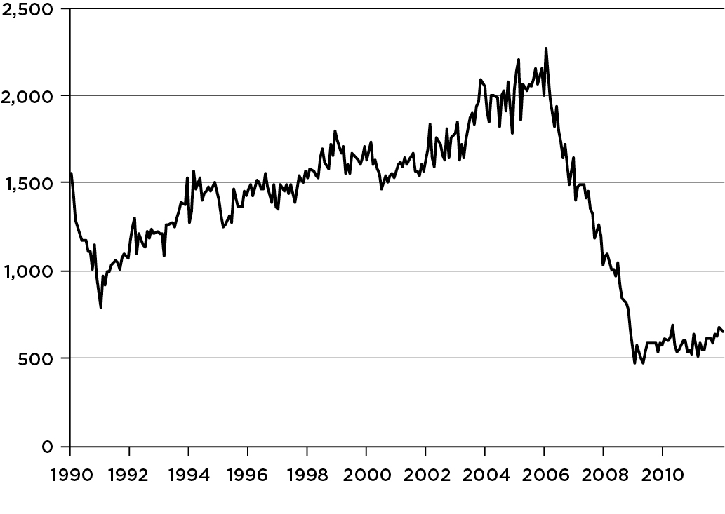
Figure 2.3 displays the most scrutinized measure of homebuilding activity: new housing starts. We see quite dramatically that homebuilding is a boom-and-bust industry—with a particularly large bust after 2006. Housing starts soared from a recession-induced low of around 800,000 units per year in January 1991 to a stunning peak of almost 2.3 million units per year in January 2006, and then fell off a cliff—bottoming out at under 500,000 units per year in April 2009, the lowest number in the history of a series that dates back to January 1959. It was quite a roller-coaster ride.
The data thus paint two vivid and remarkably consistent pictures—one for prices, the other for building activity—of a gigantic housing bubble that blew up gradually and then imploded ferociously. It would have been asking a lot of people to recognize the housing bubble and the dangers inherent therein by, say, 2002–2003. But by 2006–2007, the bubble should have been obvious. Apparently, it wasn’t.
This quick perusal of the facts leaves us with a nagging question: Why? Why did it happen? What were the major causes of the housing boom and bust? Let me offer a few likely culprits.
The first, and I think the foremost, is summarized in the famous Pogo line, “We have met the enemy and he is us.” We Americans, frankly, went a little crazy about housing. In this, we were not alone. There were also major housing bubbles in the United Kingdom, Ireland, Spain, Australia, and South Africa, among others. The belief that house prices inevitably rise year after year spread like an epidemic and became part of the conventional wisdom. You allegedly couldn’t lose by investing in houses—which would rise in value by 10 percent or so a year forever. Never mind the history shown in figure 2.1. So too many Americans took on too much debt to buy houses they couldn’t afford—and then refinanced them several times to pocket capital gains. The media fed the beast by hyping the good real estate news.
Here are two concrete examples from 2005 in California—one of the epicenters of the bubble. A survey of San Francisco homebuyers conducted by Case and Shiller found that the average price increase expected over the next decade was 14 percent per annum—and about a third of the sample expected substantially more than that. The Economist reported a survey of Los Angeles homebuyers who expected gains of 22 percent per annum over that same time span. Think about it: If house prices actually rose 14 percent a year for ten years, the cumulative increase would be an incredible (and I mean that literally—not credible) 271 percent, meaning that a $500,000 home in 2005 would be worth $1,854,000 by 2015. At 22 percent a year, the cumulative price appreciation is a jaw-dropping 630 percent, taking that same house’s value up to a staggering $3,652,000. If you believed that, it made all the sense in the world to damn the torpedoes and go full speed ahead. After all, housing was a great investment. Where else could you earn 22 percent a year?
One fascinating question is where the belief in ever-rising house prices came from when, in fact, house prices had risen, on average, no faster than general inflation for over a century. Part of the answer was surely unwarranted extrapolation of recent trends. House prices had, after all, soared in recent years. Wouldn’t they keep doing so?
Another part lies in leverage. A simple example will illustrate how it can distort vision. Suppose John and Jane Doe buy a $200,000 house, putting $40,000 down and taking out a $160,000 mortgage. Because they have acquired a $200,000 asset with only $40,000 in equity, we say that their real estate investment is leveraged 5 to 1—the asset is worth five times the equity. To keep the arithmetic simple, assume the Does have an interest-only mortgage, so that five years later they still owe the bank $160,000. And assume further—in line with historical evidence—that the house’s value rises only with general inflation, which cumulates to 20 percent over the five years. At the end of five years, the Does’ home will be worth 20 percent more than what they paid for it, or $240,000, and they will still owe $160,000 on their mortgage. Their equity in the house will therefore have risen from $40,000 to $80,000—a doubling of their original investment in just five years. It’s unlikely they could have done that well in the stock market because they would never have used five times’ leverage.
Even adjusting for inflation, something John and Jane probably would not do, the value of the couple’s real estate investment would have risen at an annual rate of 10.8 percent in real terms. That’s impressive. And remember, once adjusted for inflation, the real value of the house didn’t rise at all, in this example; it all came from leverage. Many Americans who own homes have had actual experiences that mimicked the hypothetical Does’ experience. Some have done it multiple times. No wonder they think homeownership is a great deal.
I find this story plausible. But was the house-price boom based entirely on such misconceptions? Certainly not. First of all, it wasn’t all myth. As the numerical example illustrated, you really could earn a high real return by investing in housing, even with only historically average price increases.
Second, after the tech stock bubble burst in 2000 and the stock market crashed, many Americans were looking around for a safer, stabler place to invest their money. Houses looked like such a place.
Third, as Bernanke observed in 2005, the fundamentals for housing—such as income growth and interest rates—were strong over the years 2003 through 2006.
Fourth, banks and other lenders were practically throwing money both at prospective new homebuyers and existing homeowners who could refinance, encouraging both to lever up. (Where were the regulators, you may ask? We’ll come back to that.)
Fifth, many homeowners figured out how to turn their houses into ATMs. As house prices rose they could refinance their mortgages, often to a bigger mortgage with a lower interest rate, and take out some spendable cash in the bargain.
Sixth, the Federal Reserve, trying to give the languid economy a shot in the arm, held short-term interest rates extraordinarily low in 2003 and 2004, adding fuel to the housing boom. In fact, some critics have gone so far as to lay most of the blame for the house-price bubble squarely on the central bank’s doorstep. To me, that is a grotesque exaggeration; at worst, the Fed’s monetary policy was a minor contributor to the boom.
But don’t take my word for it. Draw your own conclusions after considering three pertinent facts: (1) The bubble started several years before the Fed adopted its superlow interest-rate policy in June 2003; (2) the bubble continued to inflate for at least two years after the Fed began raising interest rates in June 2004; and (3) other countries, such as the UK, experienced a house-price bubble as severe as ours or worse, even though their central banks kept interest rates much higher than the Fed throughout the 2003–2004 period. Facts like these should make you wonder how anyone can believe that loose monetary policy was the primary cause of the housing bubble. I wonder, too.
Anyway, one thing we do know about speculative bubbles—whether in houses, stocks, or anything else—is that they eventually burst. And this one did, spectacularly, starting in either 2006 or 2007, depending on which price index you use. Why then, rather than earlier or later? No one will ever know. Ask yourself why the NASDAQ bubble burst in March 2000, not sooner or later. Or why the stock market crashed in October 1987, rather than in September or November. No one will ever know those answers, either.
The metaphor I use to illustrate the bursting of bubbles is Wile E. Coyote, that hapless enemy of the Road Runner in the well-known cartoons. (Meep, Meep!) As you’ll recall, every now and then Wile E. Coyote, in hot pursuit of the Road Runner, dashes straight off a cliff. He remains there for a while, suspended in midair, until he looks down, realizes he is supported by nothing, and crashes violently to the earth.
Bubble bursting is like that. At some unpredictable moment, investors start “looking down,” realize that the sky-high prices they believed would never end are not supported by the fundamentals, and start selling. It is abundantly clear that the crash must come—eventually. Fundamentals win out in the end. But why it happens just when it does is always a mystery.
We know now that the house-price crash started in 2006–2007. Didn’t anyone see it coming in, say, 2005? Yes, some people did. As noted earlier, a few Cassandras were predicting an imminent fall in house prices as early as 2002. But forecasters who are that early are like the proverbial stopped clock that shows the correct time twice a day—or, more apropos, like the pessimist who predicts that the stock market will crash every year and is eventually right.
The Wile E. Coyote of house prices did not fall from the sky without warning. By 2004–2005 a vigorous national and international debate over whether house prices were too bubbly was in train. Some said yes, others said no. Most of our policy makers turned out to be on the wrong side of this debate—the no side. But here’s the rub: By the end of 2005, it was already too late for the housing bubble not to end badly. That, too, is part of the sad-but-true chronology of most bubbles: It is extremely difficult to recognize them early enough to do much good. By the time a bubble is widely recognized, it’s too late. Such was the case with the housing bubble.
The Bond Bubble
However, housing was not the only bubble to inflate and blow up during the last decade, maybe not even the most damaging one. There was also a gigantic bond bubble that you may never have heard of.
Bonds and other fixed-income securities derive their names from the fact that the borrower is legally obliged to pay the lender a fixed number of dollars (or euros, or pounds, or whatever) at dates set in advance. Should the borrowing company fare exceptionally well during the decade, the lender will not share in its prosperity—it will just receive the promised interest payments. Similarly, if the business does poorly, the lender will not share in the downside—unless the borrower defaults. This fixity of the income stream contrasts starkly with common stocks, where dividends and capital gains rise and fall with the fortunes of companies and are not specified in advance.
The fundamental value of a fixed-income security is easy to compute in the absence of default risk: One need compute only the present values of all the future flows of interest and principal, which are fixed and known—and then add them up. Because of the time value of money, lower interest rates make those future flows worth more, implying higher bond prices.
For U.S. Treasury bonds, which carry no risk of default, the fundamentals are only the stated (“coupon”) rate of interest and the current market rate of interest. When the market interest rate falls, the bond’s fundamental value rises—and the bond’s value falls when the market interest rate rises. That’s it. But for any other type of bond there is some risk of default.
Default risk both complicates valuation and opens up the possibility of bubbles. In particular, the fundamentals for a corporate bond or a mortgage-backed security (MBS) are not only the stated coupon interest payments and the corresponding risk-free Treasury rate, but also the perceived probability of loss from default. Underestimating the risk of default is therefore tantamount to overestimating the value of the bond. And that’s what can give rise to bubbles. The bubble in house prices had as its counterpart a bubble in MBS because investors falsely believed that the probabilities of mortgage default were tiny.
Just as the fundamentals for, say, stocks and houses are often improving as a bubble inflates, the same is true of bonds and other fixed-income securities. During prosperous times, default rates drop to very low levels. Investors then deduce that rational interest-rate spreads over Treasuries—just enough to compensate lenders for the default risks they bear—should also drop to very low levels. The trouble is, how low is low? Markets sometimes get carried away.
The default experience with home mortgages during the boom is a poignant case in point, especially in view of the subsequent bust. Over the period from 1991 through 2001, banks lost only 0.15 percent (15 basis points) on home mortgages. Think about what that means: For every million dollars in outstanding mortgage balances, banks lost an average of $1,500! That’s nothing. In short, home mortgages were an exceptionally safe form of lending for over a decade. Then they got even safer.
Figure 2.4 shows the behavior of bank loss rates on residential mortgages over the period 1991–2004. Notice the vertical scale used for the graph. What looks like a big spike in loss rates in the third quarter of 2001 is a paltry 0.45 percent. With a few other brief upward blips, the loss rate fell from 0.24 percent in 1992 to just 0.10 percent in 2004—and hit a puny 0.08 percent in the fourth quarter of 2004, the lowest ever. Actual defaults in those years were, in a word, negligible.
(loss rates on home mortgages, 1991–2004, in percent)

SOURCE: Federal Reserve
Now, imagine yourself as a banker in 2005. House prices have been soaring for eight years or so, with nary a break in the seemingly inexorable upward trend. Mortgage delinquencies and defaults have plummeted to historic lows. From your perch, mortgage lending, which was always a safe form of lending, looks safer than ever—a veritable walk in the park. Or imagine yourself as an investor, listening to a bond salesman tout the virtues of MBS. (Mortgages never default.) Sounds like a very-low-risk investment that pays more than Treasuries, right? Well, it was—until it wasn’t.
You know what happened next, and figure 2.5 shows you. Here I have extended exactly the same data series through the year 2011, adjusting the scale for the much higher loss rates. On this larger scale, the two blips that stood out in figure 2.4 are barely noticeable. You see now that the superlow delinquency rates continued for a while longer, but then reversed with a vengeance starting in 2006. By 2008 mortgage lending didn’t look so safe anymore. And then things got much worse. Imagine yourself walking into a bank for a mortgage in 2009, or listening to a sales pitch for MBS. Times had indeed changed.
FIGURE 2.5 Unsafety in Numbers
(loss rates on home mortgages, 1991–2011, in percent)

SOURCE: Federal Reserve
My point here is not to argue that bankers were foolish—especially since the bursting of the bond bubble caught so many other people by surprise, too. In fairness, no one should have been expected to foresee accurately the truly unprecedented collapse of the residential mortgage market. It was bigger than your worst nightmare.
But I am claiming that neither bankers nor other investors should have extrapolated the superlow default rates of 2003–2006, which in many cases were unprecedented, indefinitely into the future—especially as so many of the underlying mortgages were, to put it politely, junk. But many short-sighted investors apparently did just that. For example, many fancy mathematical models of risk were based on only three years’ worth of data or less. Three years! Of course, underestimating the probabilities of default led to risk spreads (over Treasuries) that were far too small, and, therefore, to bond prices that were far too high. The result? A huge bond bubble.
I used residential mortgages as my example because the home mortgage collapse was at the epicenter of the financial earthquake that struck in 2007. However, the bond bubble was by no means limited to mortgages. It was ubiquitous.
During the years 2004–2006, I occasionally spoke to financial market audiences about the dangers lurking in the bond bubble. My belief, which was hardly unique to me, was that risk spreads were irrationally small and therefore had to widen. The bond market was like Wile E. Coyote suspended in midair. But, of course, I had no idea when the bust would come. Needless to say, such dour—and unspecific—warnings were widely ignored.
I remember one such speech vividly. It was to a hotel ballroom full of stockbrokers, sometime in 2005. I had read in the newspaper that morning that Colombian government bonds were paying only 100 basis points above U.S. Treasuries, which struck me as nutty. Sure, the Colombians were doing much better at managing their economy, and I claimed no special expertise about the country. But a mere 100 basis points over Treasuries, which implied a 1 percent expected loss rate per annum, seemed wildly optimistic. So when I came to the part of my speech about the bond-market bubble and put a picture of Wile E. Coyote on the screen, I had Colombian debt on my mind. When I asked who among the assembled brokers thought that 100 basis points was a reasonable spread over U.S. Treasuries, not a single hand went up. Then I broke the news: The market does, because that’s what Colombian bonds sell for today.
By early 2006, I had grown tired of listening to myself speak about the bond bubble to deaf ears. So I gave up. Maybe I should have kept at it.
Where did the bond bubble come from? That story, I’m afraid, does start with the Federal Reserve’s monetary policy. The U.S. economy limped, rather than leaped, out of the minirecession of 2001. GDP grew slowly at first, and employment continued to decline for nearly two years of so-called job-loss recovery. Inflation was low and falling. In fact, by 2003 the Fed was getting worried that the United States might actually slip into deflation. In an effort to stimulate the sluggish economy, it pushed its overnight interest rate (called the federal funds rate) all the way down to 1 percent—the lowest since 1954. The aggressive monetary policy worked, and the economy perked up. But it also meant that investors in safe assets like Treasuries were earning very little.
That, in turn, led investors to “reach for yield.” If a Treasury bond would pay you only 4.5 percent interest, but a mortgage-backed security with (allegedly) negligible default risk would pay you 6 percent interest instead, why not sell the Treasury bond and buy the MBS, picking up an extra 150 basis points in the process? Seems like a no-brainer, right? And if default risk really is negligible, it is. But, of course, the risk wasn’t negligible. Investors should never have extrapolated the amazingly favorable default experience of 2004–2006 into the indefinite future. But they did. It was the kind of thinking that led to the bond-market bubble.
As investors shifted out of Treasuries into riskier fixed-income securities—whether Columbian government bonds or MBS backed by subprime mortgages—those riskier securities were bid up in price, and hence down in yield. You had to pay more to buy the same stream of interest payments. So what was once, say, a 150-basis-point reward for bearing more risk became a 100-basis-point reward, or maybe just a 50-basis-point reward. Investors’ response to dwindling yields on fixed-income securities was to try to magnify their yields by going for more leverage—which is the second item on my list of villains.
If bearing a little additional risk would bring you only, say, 50 basis points in additional return, you could magnify that reward to 500 basis points by making the investment with 10-to-1 leverage. Now you’re talking real money. I’ll explain how that worked shortly, but first let’s pause for a moment to think about remedies—or at least palliatives.
Can we prevent asset-price bubbles in the future? Here, unfortunately, the answer is mostly no. Speculative markets have succumbed to occasional bubbles for as long as there have been speculative markets. Indeed, one of the first common stocks ever issued, in the South Sea Company in England, was hyped into the first stock-market bubble—the famed South Sea Bubble of 1720—which devastated, among others, a pretty smart fellow named Isaac Newton. And the Dutch had managed to grow a gigantic bubble in—of all things—tulip bulbs almost a century earlier.
No, while we may be lucky enough to nip a few bubbles in the bud, we will never stamp them out. The herding behavior that produces them may well be programmed into our DNA. Our best hope is to minimize the consequences when bubbles go splat—as they inevitably will. And that’s worth doing.
VILLAIN 2: LEVERAGE, HANDLED WITHOUT CARE
I emphasized leverage as a way to magnify investment returns. There is nothing wrong with leverage per se. Like a little wine, a little leverage can be good for you. But just as with consumption of alcoholic beverages, excesses can lead to disaster because leverage is the proverbial double-edged sword. It does magnify returns on the upside, which is what investors want. But it also magnifies losses on the downside, which can be fatal. So a company, investor, or household operating with high leverage should be labeled FRAGILE: HANDLE WITH CARE. Its shock absorbers may not be resilient. Unfortunately, by 2007 leverage was everywhere in the U.S. economy.
Leverage at Home
Start with American homebuyers. Back in the day, people used to purchase homes with 20 percent down, as in our earlier example of 5-to-1 leverage. But during the heady days of the real estate boom, when you couldn’t lose in real estate, that old rule of thumb came to be seen as outmoded. Mortgages with 5 percent down or less became common. Twenty-to-one leverage is dangerous enough: If the house’s value declines a mere 5 percent, you’re wiped out. But sometimes even the down payment was borrowed, perhaps via a second mortgage. A homeowner with no money down has, in effect, infinite leverage. Even the slightest loss will put him underwater. In fact, he’s not an “owner” in any real sense as his equity in the house is zero. He’s more of a speculator, betting on rising house prices and doomed if they fall.
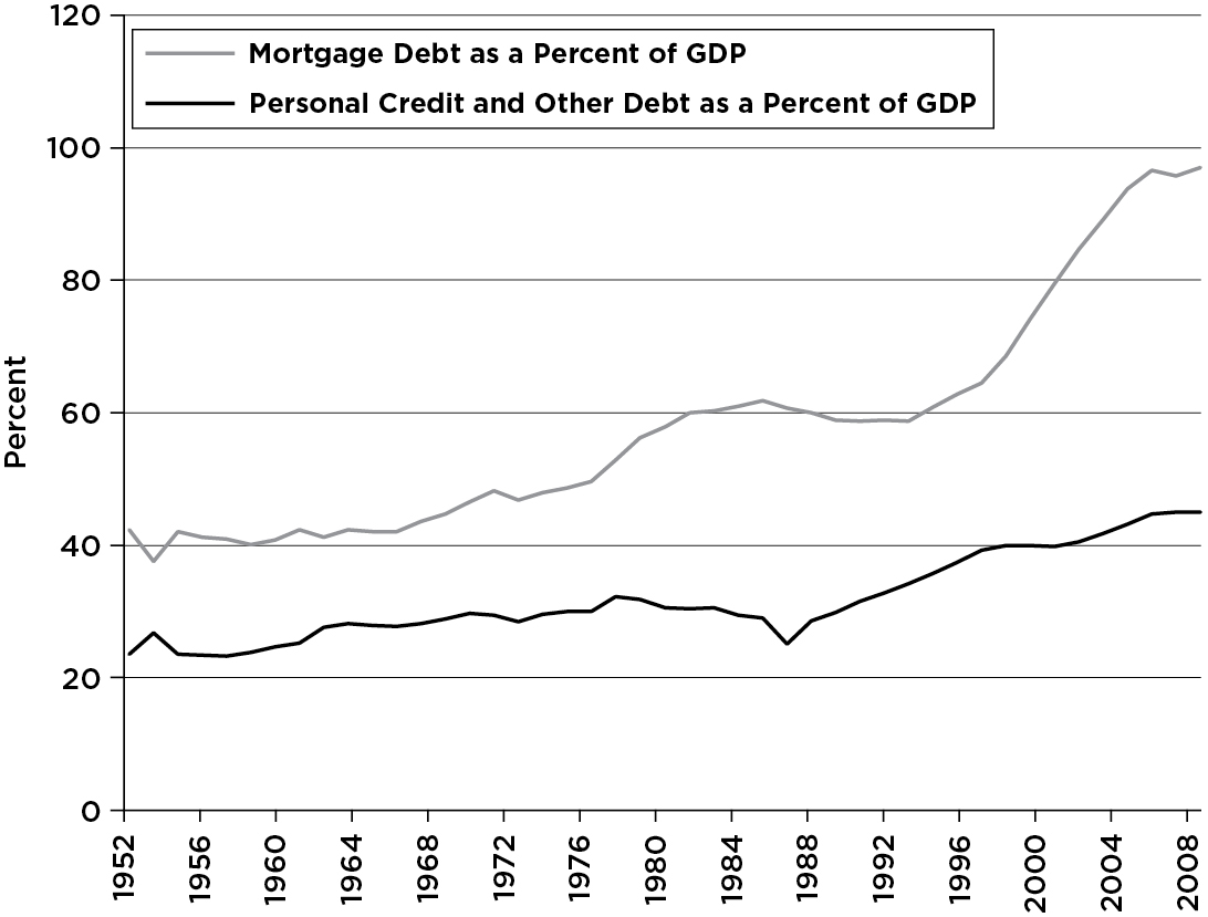
The dangers of leverage notwithstanding, there was a bit of a debt explosion between 2000 and 2008. Figure 2.6 shows that total household debt (mortgage plus personal) rose from about 100 percent of GDP to about 140 percent in only eight years. The lion’s share of that increase came in mortgage indebtedness. American households were levering up.
Leverage at the Bank
So were the banks. Banking has always been a leveraged business. Most people don’t think of it this way, but a bank “borrows” money from its depositors and “invests” those funds in, say, loans. If a bank’s capital amounts to 10 percent of its assets, the bank is leveraged 10 to 1. That’s pretty normal—and also pretty safe, because loan losses rarely come close to 10 percent. But during the boom, too many of our leading banks employed legal and accounting gimmicks to push their leverage higher. One way they did so was by creating off-balance-sheet entities such as structured investment vehicles (SIVs)—which almost no one had ever heard of before the crisis but whose collapses made the crisis much worse.
Here’s how SIVs worked—and then failed to work. Table 2.1 is the balance sheet of Big-But-Simple Bank (BBSB). This old-fashioned bank has taken $10 billion of shareholders’ equity, leveraged it 10 to 1 by raising $90 billion in deposits, and made $100 billion worth of loans. As long as its loan losses don’t exceed 10 percent, it’s safe.
TABLE 2.1 Balance Sheet of Big-But-Simple Bank (BBSB)
|
Assets |
Liabilities and Net Worth |
|
Loans $100 billion |
Deposits $90 billion |
|
Equity $10 billion |
But it’s also stodgy. If the managers want to grow the bank—and, not incidentally, their own salaries and bonuses—without raising more capital, the bank can sponsor a SIV and sell it, say, $50 billion of the bank’s loans. Since the bank gives a tacit or explicit guarantee against most loan losses, the SIV is apparently in a safe position. Perhaps it holds just $1 billion in capital, raising the other $49 billion it needs in the commercial paper market, where top-rated companies go to raise short-term funding. That would create the balance sheet shown in table 2.2. The SIV is leveraged 50 to 1, which may seem high. But believe it or not, actual SIVs were often leveraged even more!
TABLE 2.2 Balance Sheet of BBSB’s SIV
|
Assets |
Liabilities and Net Worth |
|
Loans $50 billion |
Commercial paper $49 billion |
|
Equity $1 billion |
Meanwhile, back at the bank, BBSB has sold off $50 billion of its loans and received in return $49 billion in cash and $1 billion in stock in the SIV. But it won’t just sit on the cash. When it lends out the $49 billion, its balance sheet becomes:
TABLE 2.3 New Balance Sheet of BBSB
|
Assets |
Liabilities and Net Worth |
|
Loans $99 billion |
Deposits $90 billion |
|
Stock in SIV $1 billion |
Equity $10 billion |
It still appears to be leveraged 10 to 1. But is it? If we consolidate the two balance sheets, we get this:
TABLE 2.4 Consolidated Balance Sheet of BBSB and Its SIV
|
Assets |
Liabilities and Net Worth |
|
Loans $149 billion |
Deposits $90 billion |
|
Commercial paper $49 billion |
|
|
Equity $10 billion |
Isn’t accounting wonderful? Since the SIV is the dependent child of the parent bank, the organization’s true leverage is now 14.9 to 1, as seen in table 2.4. However, it reports only 9.9 to 1 to its regulators (see table 2.3). That’s what it pays its accountants and lawyers for.
All’s well as long as the SIV, with its 50-to-1 leverage, stays solvent. Unfortunately, if things turn sour, SIVs have hardly any capital to buffer them against loan losses. Once losses surpass 2 percent, this hypothetical SIV is wiped out. At that point the losses, in effect, accrue to the bank. In terms of the economics rather than the accounting, the bank’s real balance was always table 2.4 (with about 15-to-1 leverage), not table 2.3 (with about 10-to-1 leverage). The SIV was a legal and accounting dodge to avoid leverage limits.
Leverage on Wall Street
Leverage numbers like the 15 to 1 in our banking example were chump change compared to what the big investment banks were doing prior to the meltdown. Venerable firms like Bear Stearns, Lehman Brothers, Merrill Lynch, Morgan Stanley, and Goldman Sachs (the old Big Five) operated with 30-to-1 or even 40-to-1 leverage. Think about what that means: With 40-to-1 leverage, a mere 2.5 percent decline in the value of your assets wipes out all shareholder value. That’s a pretty risky way to run a business. What were they thinking? Where were the regulators?
The result of extreme leverage is predictable, though its timing never is. When asset values dropped after the housing and fixed-income bubbles burst, many of these highly leveraged firms were ill prepared to absorb losses. Lehman, of course, perished. Bear and Merrill were absorbed into commercial banks in shotgun marriages. Morgan Stanley and Goldman hid behind the Fed’s protective skirts by becoming bank holding companies, at least de jure.
But even high leverage was apparently not enough to sate their hearty appetites for risk. If you look back at the liabilities side of BBSB’s balance sheet in table 2.1, you will see that the bank funded itself exclusively by deposits and equity. That’s quite unrealistic for big money-center banks, which have multiple and complex sources of funds. Nonetheless, commercial banks do have deposits—that’s why we call them banks. Investment banks do not. They fund themselves almost entirely by borrowing.
Remember, with 40-to-1 leverage, capital constitutes a mere 2.5 percent of assets. They must borrow the other 97.5 percent. Some of this borrowing is long-term—bonds, more or less. But prior to the crisis, and still today, a great deal was and is very short-term, much of it overnight. For example, Bear Stearns’ year-end 2006 balance sheet listed only 16 percent of its liabilities as long-term borrowings. Its short-term borrowings were more than eight times its equity. Its reported leverage, by the way, was 29 to 1.
Is the mix of short-term versus long-term financing a mere detail, of interest only to green eyeshades? Hardly. If Risky Investment Bank (RIB) borrows by selling a 10-year bond, that bit of funding is guaranteed to be there for ten years. But interest rates on bonds are far higher than interest rates on overnight, collateralized loans called repurchase agreements (“repos”). RIB may find it more attractive to borrow cheaply in the market for repos. But here’s the catch: If RIB borrows overnight via repos, it must return to the capital markets to borrow every single day. Should the markets view RIB as creditworthy on Tuesday but risky on Wednesday, the company is in big trouble. In fact, the inability to roll over short-term borrowing is the modern version of a run on the bank. Such runs more or less killed both Bear Stearns and Lehman Brothers in 2008, and almost killed Merrill Lynch, Morgan Stanley, and Goldman Sachs. All five were playing with fire.
Synthetic Leverage
Finally, let’s not forget about derivatives. Derivatives serve many purposes, some of them valuable. But one common purpose is to create lots of synthetic leverage, which is often embedded in the design of the contract.
The most familiar example of a derivative, a stock option, provides a clear example. At the end of February 2012, Google shares were selling for about $610. On that same day, a seven-month call option, giving the buyer the right but not the obligation, to buy Google at $610 per share (the “strike price”) was selling for about $48 (the “option premium”). Think about what that meant: If Google shares were worth $658 in September 2012, the option-buyer would just break even: She could acquire shares of Google by paying only the $610 strike price. That, plus the $48 option premium she paid earlier, would come to exactly the market value of the shares ($658). Ignoring the time value of money, which is small over seven months, her rate of return on the option would be exactly zero.
But what if, instead, Google shares were worth $710 in September 2012? By buying the shares at the $610 strike price, and immediately selling them at the $710 market price, she would pocket a $100 profit. Since she paid $48 for the option, her net gain would be $52, which is 108 percent of her original $48 investment—even though the shares themselves rose by only 16 percent. Nice.
But now think about the other edge of the sword. What happens if Google stock is still worth only $610 a share when the option expires? While the stock price would have remained unchanged, for a rate of return of zero, the option would have lost all its value—a 100 percent loss! Welcome to the dark side of leverage.
Table 2.5 compares six investment outcomes, depending on whether the investor buys the stock or the call option and on whether Google shares wind up at $610, $658, or $710. The strong magnification of returns by the option—whether up or down—is evident. As the performance of the underlying stock ranges from no gain to a 16 percent appreciation, the rate of return on the option ranges from minus 100 percent to plus 108 percent. It behaves very much like a highly leveraged investment even though no borrowing is involved. Hence, the leverage is “synthetic.”
TABLE 2.5 Embedded Leverage: An Example
|
Value of underlying stock |
$610 |
$658 |
$710 |
|
BUY THE STOCK |
|||
|
Terminal value of investment Rate of return |
$610 0 |
$658 8% |
$710 16% |
|
BUY THE OPTION |
|||
|
Terminal value of investment Rate of return |
0 -100% |
$48 0 |
$100 108% |
There’s nothing inherently wrong with this synthetic leverage, as long as it’s understood and managed. But many of the newfangled derivatives that played such large roles in the crisis are vastly more complicated than this simple stock option—and some were poorly understood. They amounted to placing high-risk bets on such things as whether the losses in a mortgage pool would exceed certain thresholds or whether a company would default on its bonded debt. They all shared the common element illustrated by table 2.5, however: They created synthetic leverage, sometimes in stunningly large amounts. So when the bubble in MBS burst, a far bigger bubble in leveraged bets on MBS burst at the same time—making one big mess.
Letting Our Guard Down—or Worse
Leverage was everywhere. Indeed, often leverage was piled on top of leverage—as when companies with highly levered balance sheets bought derivatives with high synthetic leverage. The hint here for regulatory reform is too obvious to miss: We need a financial system with much less leverage.
A financial system that is highly leveraged and betting massively on the continuation of bubbles is a two-pronged accident waiting to happen. But that wasn’t all. A nation can put safeguards in place, just in case—things like regulation and prudent lending standards. But in early twenty-first-century America, we didn’t—as we will see next.