Chapter 4
Expressing Your Artistry
IN THIS CHAPTER
 Converting color photos to black and white
Colorizing, duotoning, and cross-processing
Using fun filters
Creating the same effects with your camera
Ithink you'll find this a fun and rewarding chapter. It's amazing to see how your photos transform when you process them artistically. You can let your creativity loose as you convert them from color to black and white, colorize and tint photos, and apply artistic filters and effects. I also take a quick peek at creative styles and filters available in-camera.
Although you're using modern technology, don't think these pursuits are new. Photographers of all eras have manipulated, tweaked, and perfected their photos using whatever they could get their hands on.
Why Be Creative?
I write this section as a form of encouragement to those of you who want to get really creative with your photos. Don’t be timid, and don’t apologize. Not everyone is going to like your style, but that’s the way the world works. Keep trying, learning, and improving. I’ve written down a few reasons for expressing your creativity that might help you overcome the doldrums:
- For concealing: Sometimes a color photo has something wrong that you can hide by converting it to black and white or colorizing. You may also be able to turn a “so-so” photo around by applying a creative filter. Don’t let any photo go to waste. Turn the “Converting to Black and White” section and jump right in.
- For emphasis: Often, you can use artistic techniques to emphasize certain elements. Details and geometry stand out and make a photo interesting when shown from a completely different point of view. The “Experimenting with Artistic Filters” section has a lot of great ideas that can help you emphasize aspects of your photos.
- For mood: It's possible to create many different moods by converting a photo to black and white or using select color tints to colorize it. Different filters may have the same effect. Create whatever mood you're after. See the “Colorizing Your Photos” section for more information.
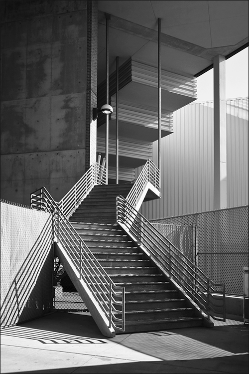
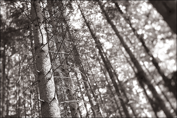
- For art: No one says you have to have a solid reason to do anything artistic. It's your art. You decide. Some photographers have developed their own sense of style over the years regardless of what anyone else thought. Figure 4-1 is a stairwell that looks like MC Escher put it together. It’s in the loading area of the building in Figure 4-16. The shot looks boring in color. As a black-and-white image, the lines, shapes, tones, and shadows leap out at you.
Software for Your Artistic Endeavors
As with the other software chapters, I need to add a quick disclaimer before the action starts. I’ve chosen to feature Adobe Photoshop in this chapter because it represents the pinnacle of creative photo editing. It is more accessible than ever, and no longer costs an arm and a leg to get into (long-run costs are another story).
You can accomplish most of the tasks in this chapter using other applications, including software that comes with your camera. Specific features and capabilities will differ, however. If you’re using something besides Photoshop, don’t worry. The fundamentals of expressing your artistry are the same.
Converting to Black and White
Black-and-white (also known as B&W) prints evoke different feelings than do their color counterparts. In B&W, the focus is on tone, texture, and mood rather than on hue and saturation. They can be magical or somber or parts in between. This section shows you the easiest way to use Photoshop to change color photos to black and white. Conversion is different than shooting directly in black and white, which I cover near the end of the chapter. The advantage to conversion is that you have more control over how your photos are changed.
Using black-and-white adjustment layers
Not surprisingly, Photoshop has many powerful tools that change color images to black and white. Rather than try to show them all to you, I want to cut to the chase and feature the one I use the most: the Black & White adjustment layer. This technique gives you lots of control over how the final image looks and is relatively painless. For example, you can change blue skies into dark gray shades, green grass into lighter gray, and red features to medium gray.
I encourage you to make basic adjustments to your color photo in Adobe Lightroom. This includes lens corrections, overall exposure, protecting highlights and shadows, contrast, and so forth. Load the finished color photo into Photoshop. To convert color photos using Photoshop’s Black & White adjustment tool, follow these steps:
-
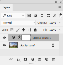
Click the New Adjustment Layer button and choose Black & White.
The button is at the bottom of the Layers panel. The Black & White option is in the middle of the second group from the bottom.
Photoshop quickly creates the adjustment layer, as shown in Figure 4-2, and loads the default settings.
-
Choose a different preset from the Properties panel, if desired.
Each preset is a predefined grayscale mix. Options include mixes like Darker, Infrared, Neutral Density, and Red filter. Scroll the list to find one that sounds interesting and select it. The effect on the photo is immediately updated. If you like, you can click the Auto button and see what Photoshop thinks.
-
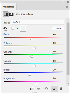
Manually adjust the effect using the color sliders, if desired.
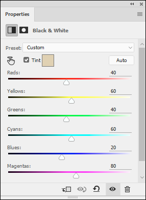
Photoshop adjusts the gray tones in the image based on the position of each color slider (see Figure 4-3). Dragging a slider to the left darkens the gray tone for areas of the photo with that color. Dragging it right lightens the gray tone. The numerical values range from -200 (very dark) to 200 (very light).
These controls make it easy to lighten or darken specific areas of the black-and-white image by changing the sliders for each color.
If you’re more visually inclined, you can also click the On-image adjustment tool (the small hand with the index finger extended) and click a color in the photo you want to modify. While you hold the mouse button down, drag left and right on the photo to darken or lighten that area. The correct color slider automatically updates the photo.
 You’re not colorizing the image when you make changes to the color sliders. Instead, you’re adjusting the gray tone of the specific color you choose. You can, for example, turn blues dark gray and reds light gray.
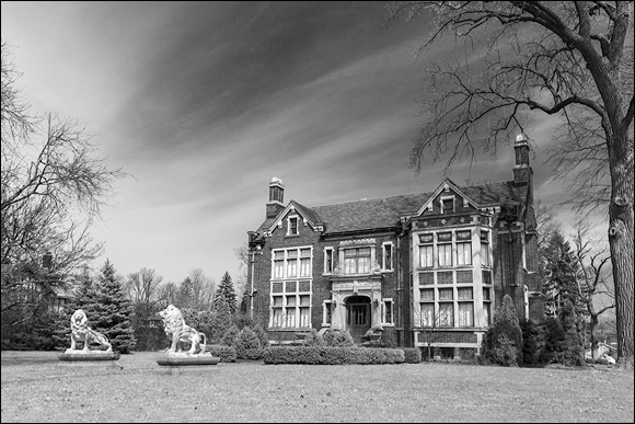
The final photo is shown in Figure 4-4. It represents a good example of how black and white can transform a photo. This large historical house looks great when converted to black and white.
 With practice, you can train yourself to see or think in black and white. You'll be able to more easily pick out potentially amazing tones, textures, and contrasts, and then bring them out as you take and process your shots.
When you’ve finished your black-and-white adjustments, you can continue to edit the photo like any other. If you need to make contrast, brightness, or other adjustments, you can use more adjustment layers if you like.
When you’re finished making adjustments, I recommend importing your photo back into Lightroom or other photo-management program. After it’s back in the fold, so to speak, you can continue to manage, edit, print, and archive the image, along with your other photos, using Lightroom.
Photo gallery
Okay, so you’ve seen that the process of converting your photos from color to black and white in Photoshop isn’t that technically difficult. Time for a few examples.
Exploring cool presets
The presets contained in the Properties panel of the Black & White adjustment layer are good. That’s one reason I like using Photoshop instead of Lightroom to mess around with black-and-white photos. Use them without modification or load one and use it as a starting point.
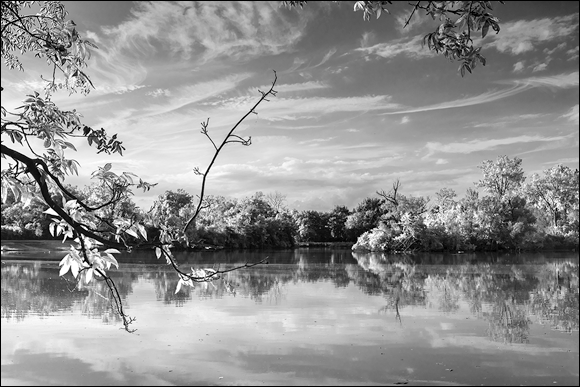
I used the Infrared preset on the photo in Figure 4-5. It’s quite stunning how the leaves of the tree in the foreground and those on the far bank of the river appear to be brightly lit. That’s the effect of the preset turning yellow and green colors into bright grayscale tones. The sky and water contrast nicely with the clouds.
Muting colors with a black-and-white layer
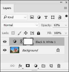
Don’t feel like you always have to turn a color photo fully into black and white. I like mixing things up by lowering the opacity of the Black & White adjustment layer and letting some color show through. Figure 4-6 shows the Layers panel of a photo. The adjustment layer is only 63% solid.
Figure 4-7 shows the final result. The colors have been muted and the image looks a little bit like an old, faded postcard. I was going to convert it entirely to black and white, but as I played around with the opacity of the adjustment layers, I found that I liked it with a little color. This technique is another way to integrate black and white into your creative repertoire.
Using multiple black-and-white adjustments
Expressing your creativity artistry has a lot to do with thinking outside the box. One way of doing that is to create multiple Black & White adjustment layers and mask them in such a way that each one alters a specific part of the photo.
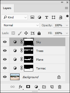
I did just that for this photo. Figure 4-8 shows the Layers panel. I have no less than four Black & White adjustment layers going on. Each one targets a different part of the photo. I have one for the sky, another for the trees and grass, another for the plane, and another for the tarmac.
Figure 4-9 shows the finished black-and-white image. I could not accomplish what I wanted creatively with a single black-and-white adjustment. It took four, each having different goals. I wanted the sky a little darker, so that the clouds were defined but not overdone. The trees needed to be brightened so they didn’t appear to be in shadow. The plane had to be bright, but the colorful areas on the spinner and tail dark. Finally, the concrete looked best darkened. This is the only airworthy TP-51C in existence. It was converted from a P-51C to the dual-control variant in 2003.
Colorizing Your Photos
Colorizing (or tinting or toning) black-and-white images replaces black with one, two, or more colors, resulting in unique color effects that create different moods, tonalities, or apparent age. You can also colorize color photos. You can approach colorizing images in several ways. I’ll run through a few that I use regularly.
Tinting the fast and easy way
Tinting your photos as you convert them to black and white is both convenient and easy. Here’s how:
- Create a Black & White adjustment layer, as described in the “Using black-and-white adjustment layers” section.
- Select the Tint option on the Properties panel, as shown in Figure 4-10.
- Click the color swatch to open the Color Picker.
-
Adjust the color to taste.
Click in the Color Picker to select a Tint Color or enter the numeric color values of your choice next to the appropriate radio buttons.
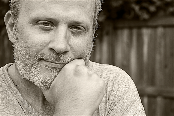
Figure 4-11 shows the finished image. (Yes, that’s me. After a few days of not shaving and posing hilariously for my wife. I rarely make it into my books. I’m the one normally taking the photos.)
Colorizing with Hue/Saturation
Another painless way to colorize photos is to use Photoshop’s Hue/Saturation adjustment. It’s a great method to quickly explore possibilities. You can use this technique for color or black-and-white photos. To give it a try, follow these steps:
-
Create a Hue/Saturation adjustment layer.
You get more control over tonality by converting the photo to black and white first. To do so, create a Black & White adjustment layer, then a Hue/Saturation layer. If you forget, you can always create the Black & White adjustment layer second and drag it below the Hue/Saturation adjustment layer in the Layers panel.
-
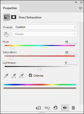
Select the small Colorize box beneath the sliders (see Figure 4-12).
It’s a small box beneath the sliders. This removes the color from the photo and then applies the current hue (a fancy name for color) whose intensity is set with the Saturation control.
-
Make Hue, Saturation, and Lightness adjustments.
To change the color, drag the Hue slider. Saturation affects the color intensity. Lightness controls the overall brightness of the photo.
Split toning using Color Balance
Split toning enables you to apply colors to a photo's shadows and highlights. This means you can selectively colorize black-and-white photos or create interesting special effects with color photos. The easiest way to split tone in Photoshop is to use a Color Balance adjustment layer. Here’s how:
- Create a Color Balance adjustment layer.
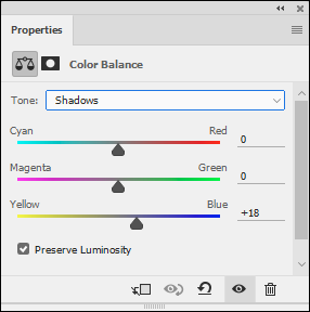
- In the Properties panel, select Shadows from the Tone drop-down list.
-
Adjust the color sliders, as shown in Figure 4-13.
On the left side of this panel are three colors: Cyan, Magenta, and Yellow. The colors on the right represent the three color channels in an RGB image: Red, Green, and Blue. The sliders control the amount of the colors on the left in their corresponding color channels.
For all intents and purposes, Color Balance works as if you have three color pairs: Cyan/Red, Magenta/Green, and Yellow/Blue. Drag the slider toward the color you want to increase.
The side effect is reducing the opposite color. When you add cyan, you reduce red. When you add blue, you reduce yellow. You can’t increase two opposing colors, magenta and green, for example, at the same time. It’s an either-or proposition.
- Select Highlights from the Tone drop-down list.
-
Adjust the color sliders.
This time you’re working in the highlight tonal range.
- Balance the effect by adjusting the opacity of the Color Balance adjustment layer.
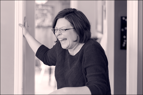
Figure 4-14 shows the effects of making the highlights in this shot of my wife magenta with yellow and the shadows a deep blue. It's quite fun to play with split toning.
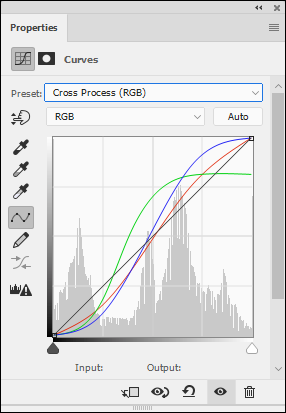
Cross-processing with Curves
Cross-processing is a term that comes from the art of processing film with the wrong chemicals. Yes, it sounds wrong, but it’s possible to create uniquely toned photos in the darkroom. Thankfully, cross-processing in Photoshop is easier than messing with smelly chemicals. To cross-process a photo (color or black and white) in Photoshop, follow these steps:
- Create a Curves adjustment layer.
-
Select the Cross Process (RGB) preset from the Preset drop-down list.
Figure 4-15 shows the Curves panel with the Cross Process (RGB) preset loaded.
-
Alter the curve, if you want, by editing the RGB curve or selecting specific channels (R, G, or B) and altering those curves individually.
You’re free to continue editing or publishing your image. If you want to tone down the effect, try lowering the opacity of the adjustment layer. Figure 4-16 reveals the final, cross-processed photo. Notice the otherworldly tones and accentuated contrast applied to the image. That’s the beauty of cross-processing.
It’s possible to create a cross process look by using the Color Balance adjustment layer. Set the shadows to green and highlights to yellow. Other programs sometimes seem to ignore cross-processing. You can work around a lack of a cross-processing option by split toning.
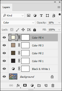
Using color layers
Another approach to colorizing a photo is to use color layers. You can work with color or black-and-white photos. With this technique, you add layers filled with color (either a solid color or gradient) over the photo layer. You blend the color layer with the photo layer by lowering the color layer's opacity.
You should also experiment with blend modes. Blending modes affect whether (and how) layers on top allow other layers to show through. Normally, these layers don’t allow other layers to show through because they’re opaque (the opposite of transparent). You can change this behavior, which is what you’re counting on to colorize the image.
You can use more than one color in more than one color layer and erase or blend them in creative ways. For example, you can create blue-tinted shadows and gold-tinted highlights. Some applications (Photoshop, but not Photoshop Elements) let you modify which portions of the color layer blend with the lower layer based on the tonality of either layer.
This technique is a bit more involved. It’s not rocket science, but you’ll have to do more work in Photoshop. To use color layers, follow these steps:
- Create a Black & White adjustment layer and adjust it to your liking; see the “Using black-and-white adjustment layers” section.
- Click the New Adjustment Layer button and choose Solid Color.
- Choose a color from the Color Picker; then click OK.
- Change the blending mode on the Layers panel to Color.
-
Lower the color layer opacity to blend by using the Opacity slider on the Layers panel.
The Opacity slider controls the color intensity, as shown in Figure 4-17. The black-and-white image should show through even at 100 percent because you changed the blend mode to Color.
If you have more than one color layer, all except the bottom one must have their opacity set to less than 100 percent. This allows the bottom color layers to show through. You’d think that changing the blend mode to Color mode would be enough, but it isn’t.
-
Blend by masking areas on the color layer that you don’t want to affect the photo.
You can also control blending by using the Layer Style dialog box. Double-click by (not on) the layer name in the Layers panel to open it. Then change the Underlying Layer sliders to control what tones you want to accept the color.
-
Add more color layers, if you want.
It’s possible to go all out and create duotones, tritons, quadtones, and more by adding more color layers. Have one or more colors tint the shadows, another for mid-tones, and another tint highlights.
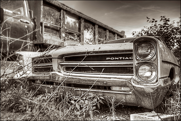
Figure 4-18 shows the final result. I found this old, abandoned Pontiac Executive and quickly fell in love with it. They were in production from 1966 through 1970. Subjects like this are great to photograph. I like sleek and pretty as much as the next person (see the P-51 in Figure 4-9), but this car has a lot of grit.
If your application doesn't support color blending but does use layers, blend with opacity.
Creating duotones
Duotones are a powerful, yet simple, Photoshop feature that automates the process of colorizing a photo with up to four colors, called inks. The process was created to expand the ability of printing presses to print more shades of gray. Using up to four colors to print the grayscale image resulted in much greater tonal range.
The greatest challenge you face is deciding what looks best to you, not implementing it.
The drawback to creating duotones in Photoshop is that you have to convert the image to grayscale and then convert it to duotone. You can’t stay in RGB, which is the standard color mode of most photos. But I have a way around that.
To apply a duotone, follow these steps:
-
Create a Black & White adjustment layer and adjust it to your liking, as shown in the “Using black-and-white adjustment layers” section.
This converts the photo to black and white without destroying any information.
-
Create a duplicate image with merged layers.
Do so by choosing Image ⇒ Duplicate. Check the Duplicate Merged Layers Only box in the Duplicate Image dialog box. Click OK.
This gives you a copy of your photo, converted to black and white, that you’ll use to create the duotone. It’s a temporary working file that you’ll use to convert the photo to the color format necessary to create duotones. When you’ve created the duotone, you’ll reconvert it back to the original color format, then copy and paste it into your normal file. At that point, you can continue editing normally.
You can close the original file for this part of the process as long as you save it in Photoshop format. You’ll need it at the end.
-
Convert the duplicate image to grayscale by choosing Image ⇒ Mode ⇒ Grayscale.
When asked, choose to discard the color information.
-
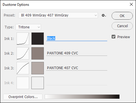
Convert the duplicate image to Duotone by choosing Image ⇒ Mode ⇒ Duotone.
The Duotone Options dialog box shows a monotone initially, or the settings from your last application.
-
In the Duotone Options dialog box, choose a duotone from the Preset drop-down menu.
I suggest first browsing through the extensive list of presets and applying those that you like. Figure 4-19 shows a preset loaded in the dialog box and the image visible onscreen. I selected the Bl 409 WmGray 407 Wm Gray option from the Preset menu.
When you become familiar with duotones, load a preset that’s close to what you want and use it as a starting point to create your own preset. You can apply a number of inks, create specific curves for each color, and choose the colors themselves (by using the Color Picker or browsing the extensive color libraries). Experiment with the settings in the dialog box.
It’s possible to save presets that you have changed. Choose the settings you like, and then select the small drop-down menu tucked between the Preset menu and the OK button — within this list are Save and Load Preset menus.
-
Click OK.
You’ve created the duotone using the copied image. Now it’s time to covert it back to RGB and put it back into your original file as a new layer.
- Convert the duplicate image to RGB by choosing Image ⇒ Mode⇒ RGB Color.
- Select the layer in the duplicate image by pressing Ctrl+A/
 +A (Win/Mac).
- Copy the later in the duplicate image by pressing Ctrl+C/ +C (Win/Mac).
-
Switch to the original image file.
Reopen it if you have to.
- Paste the Duotone layer into the original file by pressing Ctrl+V/ +V (Win/Mac).
-
Close the copied duplicate image. There is no need to save this working file.
That’s it. See Figure 4-20 for my final photo. I took this shot with the Canon TS-E 24mm f/3.5L II tilt-shift lens. While it looks okay in color, it’s not really that memorable. When converted to black and white and given a little color, it’s far more compelling.
If you're not working in Photoshop, create your own duotones using color layers. If using Lightroom, use the Split Toning feature.
Experimenting with Artistic Filters
I could play around with artistic filters all day. I really could. They are creative, inspiring, and easy to use. The challenge is finding the right photo to match up with the right filter, or combination of filters. The process involves a degree of trial and error.
Using the Filter Gallery
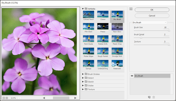
Your first stop should be the Filter Gallery, which is a special dialog box that allows you to preview and experiment with many different types of filters. To launch the Filter Gallery, follow these steps:
-
Choose Filter ⇒ Filter Gallery.
A large dialog box opens, as shown in Figure 4-21. A preview of the photo is shown on the left side. Click the magnification buttons at the lower-left corner to zoom in and out. You can press Ctrl+0/ +0 (Win/Mac) to view the entire photo.
Individual filters are grouped by categories to the right of the preview window. Click the arrow by the category name to see the filter thumbnails associated with that category.
Settings for the selected filter are shown on the right. The name of the currently selected filter appears in a drop-down list above the settings. If you prefer, you can select new filters using this list instead of the thumbnails.
Additional controls are shown in the bottom of the dialog box. You can add or remove filters, turn them on or off, and rearrange them using the controls in this area.
-
Find and choose a filter that you want to apply.
Select filters from the thumbnails or the drop-down list. The thumbnails are arranged in these categories: Artistic, Brush Strokes, Distort, Sketch, Stylize, and Texture. The filters are alphabetized in the drop-down list.
-
Experiment with the filter’s settings.
I encourage you to experiment with different settings. Filters that may seem uninspiring may turn around if you tweak the slider controls a bit. If you’re in a hurry, don’t feel bad about having a quick look at the default settings and moving on if the result doesn’t look promising.
- Click OK to apply or Cancel to quit the Filter Gallery without applying.
I show a few examples of filters from the Filter gallery in an upcoming section called “Filter fun.”
Applying other filters
If the Filter Gallery doesn’t have want you’re looking for, the Filters menu includes additional filters. Several are grouped with the Filter Gallery in the same area of the menu. There are numerous categories listed on the bottom half of the menu. To apply one of these filters, follow these steps:
- Select the Filters menu.
-
Choose the filter that you want to apply from the menu.
Most filters open a dialog box with one or more controls. Some, like Find Edges, don’t.
-
Modify the filter’s settings, if possible.
Filters like Liquify open a complicated dialog box with many options and settings. Some, like Pointillize, are easy to understand and have very intuitive settings. Unfortunately, I don’t have the room to go into all the interesting details. While I show a few examples in the section called “Filter fun,” you should take advantage of the Photoshop Help menu and manual for more details about each filter.
Smart Filters
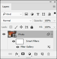
The process I’ve described thus far applies the filter you’ve chosen, whether from the Filter Gallery or not, to the layer you have selected. You can’t change the filter once applied. You must Undo and then reapply the same filter or filters with new settings or use a different filter. If you want to edit filters, you should convert the photo layer to a Smart Object by choosing Filter ⇒ Convert for Smart Filters. Apply the filter as usual. To edit it afterward, double-click the filter name in the Layers panel (see Figure 4-22).
Filter fun
Telling you about filters is one thing. Showing you is another. I’ve selected several of my photos and applied interesting filters for this section. I hope to give you an idea of the many artistic possibilities you have at your fingertips.
Extrude
Extrude is a funky filter. I love it. It’s in the Stylize group of the Filters menu. When you select it, you get a few options. You can select the shape of the extrusion (blocks or pyramids), the size, depth, and make a few other choices. Aside from boosting the depth to 150, I left the settings alone for this photo in Figure 4-23. It’s a macro of some resistors on the circuit board of my Marshall 9001 Stereo Valve Pre-amp.
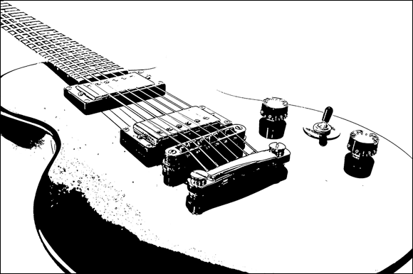
Stamp
Figure 4-24 is a photo of one of my electric guitars, after having applied the Stamp filter. Located in the Filter Gallery, the Stamp filter has an important requirement. Like some of the other filters in the Sketch group, the foreground and background colors determine the colors of the stamp. In this case, I chose black as the foreground and white as the background color. It turns the black guitar mostly white.
Cutout
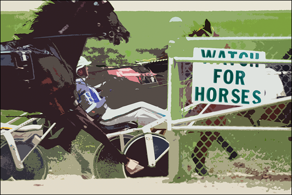
The photo shown in Figure 4-25 is of horses racing past. I set up at this particular vantage point because I thought the sign was quite ironic. It’s meant as a warning, but I found it funny. At any rate, I have applied the Cutout filter to the original photo. This filter is located in the Filter Gallery. It has simplified the color scheme dramatically and turned the photo into something you might make in art class with construction paper.
Poster edges
I took the photo in Figure 4-26 from inside the Gateway Arch in St. Louis. I’m at the very top looking due west. The downtown area is prominently featured in this photo, and the baseball stadium is visible to the left side.
This photo doesn’t look like a photo anymore because I applied the Poster Edges filter to it. You can find it in the Filter Gallery.
Pointillize
Pointillize is a fun filter that I want to use on everything. It doesn’t look good on everything though, so I have to hold back some. It has one option: the size of the dots. Pointillize is in the Pixelate group of filters.
Figure 4-27 shows the filter applied to a photo of my daughter on a swing right beside a lake. I didn’t have to do much to prepare the photo for the filter. I exported a TIFF from Lightroom and loaded it into Photoshop, then applied the filter. Afterward, you can always import your work back into Lightroom to manage it.
Blurring with poster edges
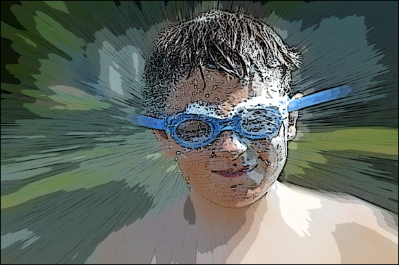
Figure 4-28 is a photo of my son, Jacob, getting sprayed down with the garden hose in our backyard. I applied two filters to this shot. First, I duplicated the photo layer, then blurred it with a Radial Blur (that’s with the Blur filters) set to zoom. I then masked his face, which means that I hid it. This allowed the unblurred version just around his face to be visible. I then merged a copy of all the visible layers to a new target layer (Ctrl+Shift+Alt+E for Windows, +Shift+Option+E for Mac) and applied the Poster Edges filter to that layer. I couldn’t use a single Smart Filter because I wanted to mask the blur effect on his face but apply the Poster Edge filter to the entire photo.
With some persistence, patience, and experimentation, you can create really cool effects like this by stacking filters and being creative with different masks.
Using In-Camera Creative Styles and Filters
Don’t think you have to wait until you get to your computer to turn on your creativity. Start before you shoot with camera styles and continue through playback with special filters.
Using in-camera styles
Creative styles (Nikon cameras call this feature picture control) are a type of in-camera processing option. I love them because they let me creatively push photos in different directions without having to be a photo-retouching expert.
The processing is applied to the raw data and saved as a JPEG. If you have the camera set to JPEGs only and then take photos with a particular style, such as black-and-white, what’s done is done. You can't undo it or retrieve a color photo to start over from. If you've set the camera to store the raw data in the form of a raw image (or RAW+JPEG), the raw photo preserves the original color information.
Here are some of the standard creative styles you see on most cameras:
- Standard: Your basic photo. Optimized for good all-round appearance.
- Neutral: Toned down compared to Standard. Use if you plan to process it with software.
- Vivid: Increases the saturation and contrast to add pop.
- Portrait: Optimizes for people and skin tones. May be softer than normal.
- Landscape: Optimizes for natural tones. May be more colorful and sharper.
- Black & White/Monochrome: Choose this setting (see Figure 4-29) for a classic black-and-white photo (see Figure 4-30).
Some other options you may run across are:
- Sunset: Use when you’re shooting into or in the sunset. This style emphasizes the reddish-orange colors.
- Clear: Captures transparent colors in bright areas. Good for lights.
- Deep: Colorful and solid.
- Light: Bright and airy.
- Night Scene: Tones down contrast to make night scenes more realistic.
- Autumn Leaves: Saturates reds and yellows.
- Sepia: Applies an old-school tint to a black-and-white photo.
I strongly recommend saving RAW+JPEG if you want to experiment with different creative styles.
You may be able to customize the built-in styles on your camera by editing them. They most often have three or four tweakable parameters, such as contrast, saturation, and sharpness. You might even be able to download styles from the Internet and load them into your camera.
Applying in-camera filters
Many cameras have photo-editing and retouching features that allow you to process photos on your memory card instead of using a computer. Normally, you take the photo, and then apply the filter during using the camera’s menu or during playback, as shown in Figure 4-31. Some dSLRs let you shoot in these modes.
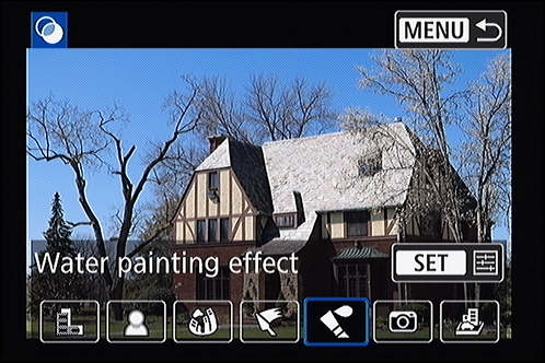
Figure 4-32 shows the image created by the camera using the Water Painting effect. As you can see, you can apply your creativity using your camera as well as a computer.