
The controversial Absolut vodka ad, showing Mexico in its pre-1848 borders
5. THE POWER MAP
So Geographers, in Afric-maps,
With savage-pictures fill their gaps;
And o’er unhabitable downs
Place elephants for want of towns.
˜ Jonathan Swift, A Rhapsody
For a taste of the visceral power of maps, you can do no better than visiting two sites in Italy: the Galleria delle Carte (Gallery of Maps) in the Vatican and the Sala delle Mappe (Map Room) in the Doge’s Palace, Venice. The Vatican gallery is a long corridor decorated with forty-four monumental sixteenth-century maps of Italian regions and cities, together with other Church holdings. Its intent is clear: a bold, brilliant use of space and decor to induce a feeling in the viewer of overwhelming intimidation by the sheer power of the papacy. The Venetian map room has an even more explicitly political edge. Its eighteenth-century maps, copies of ones lost earlier in a fire, are sumptuous in their execution, detailing all the known lands of the world, with particular emphasis on Venetian domains and those visited by Venetian explorers, most notably Marco Polo. Visiting dignitaries to the secretive headquarters of the all-powerful, paranoid Venetian republic would have passed through the Sala delle Mappe on their way to see the Doge, having already been dazzled and humbled in equal measure by the Scala d’Oro (Golden Staircase) and numerous other rooms and corridors of unprecedented ostentation. As political strategy, it was meticulously calculated and stunningly effective.
If history is written by the winners, then it’s they that get to draw the maps too, often in the immediate aftermath of victory. Maps have been used for political and propaganda purposes since they were first drawn in the sand with a stick, and have facilitated every war in history. Great leaps forward in cartography have almost always had a military catalyst, not least in our own Ordnance Survey, whose name is a blast from the fledgling days of the Empire, when the Board of Ordnance surveyed and mapped the south-eastern coasts of Britain in case of an invasion by Napoleon.
We like to think that maps are factual and somehow true, that they have little or no agenda, but that can never be the case. Their representation of reality can only ever be selective and subjective. Every cartographer has to decide what to include on their map and, perhaps more importantly, what to exclude. Emphasis of one feature over another requires choice and thus bias, and absolutely no map is too trivial or inconsequential not to upset or offend somebody. When, in 2005, the BBC changed its weather map, a very British storm-in-a-teacup ensued. Gone was the two-dimensional flat elevation of the British Isles, to be replaced by a tilted view taken from somewhere above France. The effect was to emphasise the southern and eastern parts of the country, with a much-reduced Scotland receding into the distance. Within days, the BBC had received over four thousand complaints and questions were being tabled in both the Edinburgh and Westminster parliaments. Faced with such pressure, the corporation could do little but back down gracelessly, reduce the angle of the tilt and restore some measure of Caledonian cartographic pride. Not that this did anything for the weather up there.

Different emphasis—on roads, say, over railways, or south-east England over Scotland—could be described as a cartographic economy with the truth. But maps also tell barefaced lies. Near where I grew up
was a government rocket-research establishment, spread over hundreds of acres behind massive fences patrolled by shadowy guards. On the Ordnance Survey, none of this was shown: just empty fields and the odd wandering contour. That was it. A few miles from where my grandparents lived in Leamington Spa was another huge military base, the Kineton armaments depot, three or four times the size of the rocket establishment. Occasionally we’d go for a walk on nearby Edge Hill, from where you’d have the most fabulous panoramic view over the base, its watchtowers, hangars, roads, railways and clusters of sinister buildings. The gap on the map was even more marked there: so huge was the site that the void in the middle of pastoral Warwickshire looked, if anything, even more suspicious on the OS than any accurate rendition of the base would have. Most ridiculous of all, when we went on holiday to Scarborough, a favourite trip was over the moors to see the vast golf ballof the Fylingdales early-warning radar station. Again, the map showed nothing. I began to comb my growing OS collection for other obvious empty spaces, and discovered that there were dozens. They were all secret sites of one sort or another. In a country the size of Britain, who did they think they were kidding?
This was at the height of the Cold War, however, and propaganda was everywhere. I remember the relish with which my school geography teacher, a luminary of the local SDP and fresh back from a holiday in West Berlin, brandished an East German map of the city in our startled faces. On it, the western sector was blank, almost devoid of any feature at all. ‘How stupid must the communists be,’ he boomed, ‘to deny the existence of a city that everyone can see for themselves, just by looking across the river?’ Fair point, but we weren’t averse to doing exactly the same thing on our own maps. And were it not for the satellite imagery of Google Earth and the like, the British government would still be demanding that our maps maintain their secretive black holes. It was only in 2006—some seventeen years after all Berliners were finally able to see every street of their city represented on the map—that the policy was quietly dropped, as the Cabinet Office spokesman put it, ‘because of the availability of this information from open sources’.
The policy of blanking out military establishments from the map had lasted almost eighty years. In 1927, Prime Minister Stanley Baldwin ordered that ‘no work of defence shall appear upon any map on sale to the general public’. In a largely vain attempt to conceal the policy, he further decreed that ‘no blank space shall appear, but the natural physical features of the country shall continue to appear’. Sometimes, that worked, but for the larger sites this often looked ridiculous and, even to the amateur eye, highly suspicious. Paranoia reached new heights during the Cold War: almost five thousand specific ‘key points’ (as defined by MI5) were wiped from the map during the 1950s and ’60s, lasting, in most cases, well into the 1990s. The ambiguous—and ubiquitous—OS label ‘Works’ also stems from this time, as it was decided not to specify the business of any factory, lest such information prove useful to the all-seeing enemy. It was a bit late for that. The Russian maps of Britain from this era, based wholly on the OS and with other information provided by aerial photography and local spies, managed to specify the activity of thousands of mines, quarries, mills and factories, as well as fill in the blanks of the military sites.
Since the end of the Cold War, but more especially since the advent of the internet, this highly secretive door to the innermost workings of the state has been flung open quite spectacularly. Some former topsecret sites are now busy tourist attractions, many others the target of ‘urban cavers’ and intrigued locals. It is a huge area of study: there is so much that the government kept from our eyes and our maps, often for reasons far short of defence of the realm. Learning about such places will have you looking at both maps and the landscape in a wholly new way. The net, of course, is the medium for this, as the kind of men who love maps, secrets and conspiracies are also, handily, very good at building websites: the collection of the irrepressible Alan Turnbull, accessed from www.secret-bases.co.uk, is a jaw-dropping place to start. Be prepared to lose a whole day, though.
The early 1980s was not a great time to be a nervous, impressionable teenager. With Reagan’s clownish finger on the button, the concept of Mutually Assured Destruction being wafted around and government leaflets dropping on the doormat telling us that we should stockpile some tomato soup and paracetamol in case the bomb was dropped, every day brought something new to feel depressed about. In the middle of all this, our local paper ran an April Fool’s joke that the toilets being built in the new shopping centre were actually a nuclear bunker for the great and the good of the area. Little did any of us know that the real thing was only just up the road, the secret Regional Government Headquarters built in the Drakelow sandstone tunnels just north of Kidderminster. This was one of the second range of emergency centres, under the main command of the vast complex beneath Corsham in Wiltshire. At one stage in the 1960s, military top brass advised the government that, due to worries about Corsham’s ability to withstand an H-bomb attack, it should be quietly leaked that Drakelow was the principal site for the main government headquarters, so that they’d come and blast us instead. Much as I would have felt very proud of the idea of Kidderminster as the de facto—if brief, and probably final—capital of Britain, if I’d known that at the time, I wouldn’t have slept a wink between the ages of about thirteen and sixteen.
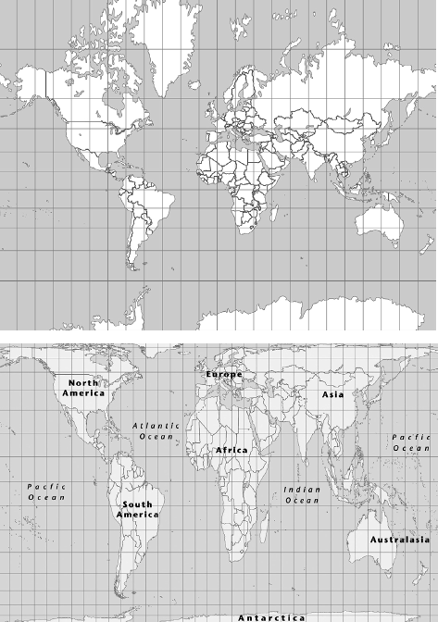
If most cartographic falsehoods stem from emphasis and exclusion of often quite tiny details, then distortions of the truth can be found on the largest possible scale. The problem of perspective—basically, how to represent our spherical planet in two flat dimensions—has for centuries riven minds and caused controversy, none more divisive than the thorny question of how to represent the entire globe itself. Any attempt to portray the world in this way necessitates a compromise between accurately showing the shape of continents and accurately showing their size; one or the other has to give. Precisely where to strike that compromise has been the central question for centuries, although it’s only in the past forty years that the debate has become heavily politicised and surprisingly bitter.
The Flemish cartographer Gerardus Mercator produced the most famous world projection in 1569, a literal transposition of the globe in cylindrical form, and then rolled out as a flat sheet. Its main purpose was as a nautical aid, as the lines of navigation remain true. For centuries, this remained the gold standard of world maps, even though it massively boosts the apparent size of landmasses towards the northern and southern latitudes at the expense of those nearer the Equator. To compound its sins, as Antarctica is usually shorn off, the northern hemisphere commonly accounts for about two-thirds of the map, massively exaggerating the size of Europe, Russia and North America. On the Mercator Projection, Alaska (0.66 million square miles) and Brazil (3.28 million square miles) appear to be much the same size, but things get even more distorted the nearer you get to the poles: Greenland (0.8 million square miles) and Africa (11.6 million square miles) also appear to be pretty equal in area.
In 1973, Arno Peters, radical German writer and film-maker, with a dissertation in propaganda techniques, startled the hitherto sleepy world of cartography by publishing what he claimed was a brand new way of looking at our globe. Launching the modestly named Peters Projection in a blaze of publicity, he rounded on what he called the imperialist and even racist overtones of the Mercator map, claiming that his new piece of work, which puts a much elongated Africa centre stage, was an important building block in overcoming such entrenched attitudes. Developing-world charities and damp liberals everywhere loved it, and the Peters map became an essential feature on the wall of every scruffy pressure-group office and lefty student bedsit in the West. It was an instant icon, the Doc Marten of maps.
In Britain, the radical New Internationalist magazine has been banging the drum for the Peters Projection for decades, inveigling new subscribers for well over twenty years now with the offer of a free Peters world plan if they sign up. It was enough to hook me in as a student and the map took pride of place on my wall, between the Coal Not Dole placard and some knick-knack from the Nicaragua Solidarity Campaign. Since the early 1980s, the NI’s subscription offer has flagged up the Peters map freebie by rubbishing the Mercator Projection as ‘a colonialist, Eurocentric view of the world’. When the magazine first published the map in 1983, it ran a regular column that invited its readers to snitch on any Mercator Projections that had been spotted in public places, as if poor, long-dead Gerardus was something dodgy hanging around a school playground. In America, the Peters map made little headway beyond the offices of the hardcore, until it featured in a 2001 episode of hit drama The West Wing, in which an earnest representative of the fictional Organisation of Cartographers for Social Equality appeared, demanding that the President champion the cause of the Peters Projection map to help the USA atone for its imperial misadventures. Sales of the map in the States rocketed in the aftermath of the show’s airing.
Many organisations and individuals have clung to the Peters map like a set of right-on rosary beads, refusing to countenance that there is anything wrong with it, and even denouncing those who question its provenance, accuracy or aesthetic as being bullies and racists. But it isn’t quite that simple. For starters, in the razzmatazz with which he first presented the map to the world back in the 1970s, Arno Peters rather forgot to mention that his projection was a near-identical copy of one produced over a century earlier by Scottish clergyman James Gall—indeed, most cartographers now refer to the image as the Gall-Peters Projection. Neither did he mention that, for all his bluster about righting the wrongs of the cartographically oppressed, the only latitude on the map that is an accurate representation of size and scale is not around the poorer countries of the Equator, but at the 45° line, which, in the southern hemisphere, passes almost entirely through the sea
(save for briefly grazing Chile, Argentina, New Zealand and the Crozet Islands, uninhabited except for a French research station and about five million penguins). In the northern hemisphere, by contrast, the 45° line passes through such downtrodden corners as the USA, Canada (even forming their mutual border for 150 miles south of Montreal), France, Italy, Croatia, Russia, China and Japan.
Then there is the not unfamiliar irony of someone from the West making quite a name for themselves (and, in Peters’ case, a fair bit of money) out of lambasting others to take the problems of the developing world seriously. Once the guilt-tripping marketing machine had been cranked into action, the ‘Peters Equal Area World Map’ (as it is now promoted) was flying off the press to decorate schoolrooms, offices, international agencies and ideologically sound bedrooms the world over: to date, nearly 100 million have been sold. Perhaps the most strident criticism, however, has to be an aesthetic one: there’s something uncommonly ugly about the Peters map, with its stretched centre and squashed extremities. As rival cartographer Arthur Robinson has so pithily put it, the Peters map is ‘somewhat reminiscent of wet, ragged long winter underwear hung out to dry on the Arctic Circle’.
Mercator versus Peters: the fight for the soul of world mapping
Like many coming from an immovably ideological position to prove a point, Arno Peters deliberately picked a fight that wasn’t really there. Usage of the Mercator Projection was already dying out when he seized on it and denounced it so shrilly, in order to flag up the difference of his own map. Thirty-five years on, the debate is still often presented as Mercator versus Peters, the great cartographic slugfest between the Eurocentric imperialists in the one corner, and the progressive internationalists in the other. In creating and sustaining this illusion of a fight for the soul of world mapping, Peters has been enormously successful. Not to be churlish, he has succeeded too in asking important questions about the way we perceive the world thanks to its mapping, and what implications that has for global geopolitics. Geography professor Thomas Saarinen collected more than 3,800 sketch maps of the world by children from forty-nine countries for a National Geographic-sponsored research project in 1999; most, even from kids in developing countries, hugely over-inflated the size of Europe and placed it far more centrally than is truly the case.
The Mercator versus Peters argument has split and electrified the world of cartography for decades. It’s astonishing to see just how vehement the debate has become, and what mud has been flung from both sides in its course. Imagine, then, just how many feathers can be spat when the entire world is turned upside down, with south at the top and north at the bottom. In The West Wing episode mentioned earlier, this is the pièce de résistance of the representatives of the Organisation of Cartographers for Social Equality in their presentation to the President’s press secretary, the elegant Claudia (‘C. J.’) Cregg. ‘But you can’t do that!’ she squeals as the topsy-turvy map loads on to the screen. ‘Why not?’ asks one of the evangelising cartographers. ‘‘Cause it’s freakin’ me out!’ Cregg shoots back.
She’s got a point. Your first view of the world ‘upside down’ is startling; dizzying and disorienting in fairly equal doses, laced with a hint of the unspecifically offensive. Remember how, as a child, you’d hang upside down or do a handstand and the most familiar faces looming up at you would appear as freakish as if they’d just landed from Planet Zog? How odd do the eyes look below the nose and mouth? Is that a smile or a frown? Try the same effect looking at the whole world. The cosy and familiar has been upended and turned into something entirely alien: a made-up landscape worthy of Tolkien or the Reverend Awdry. It’s not just that Australia is at the top, Europe and North America at the bottom, it’s that the shapes look so suddenly strange and fantastical. The archipelago of Indonesia leaps into pole position, Africa, India and South America all taper upwards like giant fir trees, the Iberian peninsula thrusts out from Europe like an angry skinhead, Madrid is above London, which is in turn above Edinburgh. Most disconcerting of all, the whole world seems to be resting its substantial weight on just two countries, Canada and Russia.
Move the focus closer to home, and the effect is just as startling. The island of Britain viewed upside down challenges almost every assumption we hold about our own geography. Politics too: a map like this takes us right out of the equation, for the focus is no longer on the parts of the island that are manmade and man-dominated. Just as globally, it’s the thinly populated lands of northern Canada and Russia that suddenly hold our attention, at home it’s Scotland that demands respect and closer scrutiny. Although England is clearly still the larger constituent country of Britain, it looks a far closer-run thing upside down, for Scotland’s bony bulges appear far more prominent. It’s amazing that they’ve not yet begun marketing such a map as a souvenir north of the border.
The frontispiece of Robert Macfarlane’s masterful The Wild Places consists of a map that is almost the exact antithesis of the BBC’s weather map. It has the British Isles upside down and viewed from somewhere over Rockall, far to the north-west of Ireland. This has the effect of grandiosely emphasising what passes for wilderness in our temperate little lands, places that Macfarlane tells us will only be found ‘far north or far west; for to my mind, this was where wildness survived, if it survived anywhere at all’. Macfarlane’s map brings the ragged coasts of western Scotland and western Ireland to the fore, the archipelago of Hebrides, Inner and Outer, bask, and look quite stunning, in their unaccustomed limelight. Conversely, the commuter lands and manicured countryside of the south and east disappear into a vague distance. Without even turning a page, it is unambiguously clear what and where has captured Macfarlane, and from what angle he will be taking it.
Although a number of medieval charts and maps had south at the top, in modern times the ‘upside-down’ map of the world first gained prominence in—of course—Australia. It was created by Stuart McArthur of Melbourne, who drew his first south-up map in 1970 for a primary school geography assignment. His teacher told him to redraw it the ‘right’ way up, if he wished to pass the module. At fifteen, he went on a school exchange programme to Japan, where he encountered American students who taunted him for coming from ‘the bottom of the world’. These slights to his country’s place on the globe spurred him on to produce and market the first modern south-up map, the McArthur’s Universal Corrective Map of the World, launched on Australia Day in 1979, when he was nineteen. It’s sold over 350,000 copies. Stuart’s text on the original map is written in pure teenage, testosterone-lashed Ocker:
At last, the first move has been made—the first step in the long overdue crusade to elevate our glorious but neglected nation from the gloomy depths of anonymity in the world power struggle to its rightful position—towering over its Northern neighbours, reigning splendidly at the helm of the universe.
Never again to suffer the the perpetual onslaught of ‘down under’ jokes—implications from Northern nations that the height of a country’s prestige is determined by its equivalent spatial location on a conventional map of the world.
This map, a subtle but definite first step, corrects the situation. No longer will the South wallow in a pit of insignificance, carrying the North on its shoulders for little or no recognition of her efforts. Finally South emerges on top.
So spread the word. Spread the map!
South is superior. South dominates!
Long live AUSTRALIA—RULER OF THE UNIVERSE!
Stuart McArthur not only turned the globe upside down, he moved the traditional east-west axis so as to place Oz centre stage. It’s a commanding image, especially for a European, who suddenly finds himself resident of a tiny knot of seemingly irrelevant little countries in the distant bottom-right corner. Shifting the left and right axes is a very common way for different cultures to represent the world with themselves as near to the centre as possible: it’s general practice on world maps in the old USSR, Japan, China and around the Pacific Rim. It’s often the norm too in the USA, despite the fact that, in order to place themselves in the middle, it necessitates a particularly savage split of the landmass of Asia, with territory up to India and the west of China and Russia on the right-hand side of the map, while Japan, South-east Asia and the east of China and Russia come in from the left. Some territories—usually around Bhutan and Bangladesh—virtually disappear into the margin. To reproduce a globe on a flat page, there obviously needs to be a vertical division somewhere, and if the main reason for the map is to show the landmasses of the world and their relative positions, the only elegant way to do that is by drawing the line down the Pacific or Atlantic oceans. But that, of course, wouldn’t have the Americans in the middle; lying between these two great oceans, they are condemned to living on the far left or far right of most world maps, so they have to butcher other continents to ensure that the spotlight remains on them.
It is all politics: you can see why Arno Peters got his sackcloth Unterhosen in such a twist. In that regard, the received wisdom of the north-up, Europe-centred plan (on the Mercator Projection) can be seen to be very heavily loaded indeed. After all, there is no scientific or inherently topographical reason for north being at the top of any map. Until the Middle Ages, east—the direction of the rising sun and the presumed location of Paradise—was generally placed at a map’s upper edge: it’s from this that the term orientation arises, i.e. to place yourself in relation to the orient, the east. North overtook east as the upper direction of choice from the adoption by mariners of the North Star as their principal point of navigation. Look at the Earth from space, and there is no natural up or down—indeed, the famous photo of the planet, known as the ‘Blue Marble’, from the 1972 Apollo 17 space mission, was inverted to fit the traditional view. The original had the South Pole at the top, but that was deemed by NASA to be unacceptable for public consumption.
With the benefit of modern political hindsight, we can look at almost any early map and see just how stacked it is, even if we cannot always be sure why. The c.1400-1420 Evesham map of the world, for example (with east and Jerusalem at the top), bolsters every facet of early English nationalism under Henry IV: newly seized Calais is shown as far bigger and more important than Rome or Paris, while the island of England stretches along the entire western coast of Europe from Scandinavia to the Mediterranean. And it is England alone that is shown, as a discrete—albeit fairly shapeless—island, dotted with important-looking settlements, particularly around the wool-wealthy Abbey of Evesham, for whom the map was commissioned (and mysteriously including the miniscule Devon hamlet of Taddiport; it’s assumed that this is where the map-maker hailed from). Wales and Scotland are shown as separate offshore islands, almost entirely featureless and wholly removed from bustling, powerful England.
Quite why the Evesham map-maker went to such lengths to separate the three British countries is a mystery, although it undoubtedly reflected—and fuelled—the febrile constitutional atmosphere of the day. In 1406, King James I of Scotland was captured en route to safety in France and kept hostage by the English Crown for eighteen years. At the same time, Owain Glyndŵr was mounting his rebellion in Wales which, at its height, saw almost all of the country under his command. The Evesham Map was clearly more of a political poster than an accurate topographic representation, for common knowledge of the real size and shape of Britain was firmly in the public domain by the time it was drawn, as can be seen from the most celebrated and accurate early medieval plan of Britain, the Gough Map, published some forty years earlier in about 1360. It is full of telling detail, showing over six hundred settlements, two hundred rivers and a road network of some three thousand miles, including distances between the major towns. It provided the basis for all British maps for the next two hundred and fifty years, until the Tudor golden age of cartography.
Like the much-harrumphed-over BBC weather map of six and a half centuries later, the Gough Map is massively skewed towards southern and eastern England: the shape of the coast of Lincolnshire, East Anglia, Kent, Sussex and Hampshire is astonishingly accurate and beautifully delineated. The West Country, Wales, north-west England and Scotland do not fare so well. Wales looks like a cancerous lump on the western edge of the plan (at the bottom), with a tiny fraction of the detail shown elsewhere. Around London and Oxford, numerous roads are carefully pinpointed. In Wales, only one is shown, and that is a route that hugs the coast and connects the recently built ‘iron ring’ of Edward I’s castles, from Flint to Rhuddlan, Conwy, Caernarfon, Cricieth, Harlech and Aberystwyth, thence into the less troubled lands in the south. The inference is clear: inland Wales is not safe for travellers, who are best advised to scurry from one English plantation town to the next. Scotland fares even worse: as well as bearing the immortal legend ‘Here Dwell Wolves’ in the Highlands, it is as shapeless as an old sock and, apparently, has no roads at all. (Incidentally, there is no surviving map that contains that legendary motto ‘Here Be Dragons’, although there are plenty of historic maps illustrated with dragons and all manner of other beasties. The only example that has ever been found is on an early sixteenth-century globe, which states hic sunt dracones near the east coast of Asia. This is often optimistically translated as ‘here are dragons’, but it is far more likely to be a reference to the Dagroian tribe of Sumatra. Sorry.)
Map-making played a pivotal role in the growing British Empire; at its late Victorian peak, it was the map of the world, with huge swathes coloured imperial pinky-red, that was the chief icon of Great Britishness—on the Mercator Projection, naturally, as it made Canada look enormous. All empires have used the same techniques, often employing gross exaggeration to underline their point. This can afford great opportunity for satire—witness the distorted map of the ‘World According to George W. Bush’ that did the email rounds a couple of years ago, or the Ronald Reagan version of two decades earlier, which became a best-selling poster across the world. On this, the UK (and Ireland) were marked as Thatcherland (‘a subsidiary of Disneyland’), a reduced, grey Canada became Acidrainia (‘a wholly owned US subsidiary’), ‘Our China’ (i.e. Taiwan) was much the same size as ‘Their China’, the ‘Japan Corporation’ was in the shape of a car, while Israel was massive and dominated the Middle East. Such cartoon frivolity has an absolute basis in historic cartography.
That joke maps can so swiftly make their point in such a clear, graphic way is testament to the visual immediacy of a map, and the information that it contains. Inevitably, such swift potency can cause equally speedy controversy. In early 2008, Absolut Vodka used a map of pre-1848 North America, when Mexican territory extended far north and east into what is now the USA, as an advertisement in Quién, a Mexican celebrity gossip magazine, and on a few street billboards. Over the map, where Mexico and the Estados Unido de América (USA) are of pretty much equal size, the legend simply states ‘In An Absolut World’. This was swiftly picked up in the States, and thanks to wall-to-wall news TV stations, radio ranters and internet forum boards, the story went ballistic. The Los Angeles Times ran a poll on people’s attitudes to the advert: nearly two-thirds of the 70,000 respondents voted for the option ‘The ad is an affront to Americans. I’m going to be boycotting the product.’ Thousands made their fury known on the paper’s website, as well as in just about every other internet forum going, expletive-filled home movies on YouTube included. Reading them is a salutary reminder of just how explosively potent one map can be. It’s also very funny. Comments such as ‘I’ll be pouring my Absolut down the drain today—what a bunch of morons’ came thick and fast, with the emphasis firmly on the thick. Mind you, that contribution is a masterstroke of literacy and wisdom, compared with many, such as this extract from an email sent to Absolut HQ that the sender proudly shared on the message boards:
I JUST TOOK MY HALF FULL BOTTLE OF ABSOLUT VODKA AND POURED IT IN MY TOILET!! AND THEN I TOOK A SHIT ON IT!!! I SHIT ON YOU AND YOUR DISGUSTING COMPANY WITH NO BRAINS. I WILL INFORM EVERY (REAL) AMERICAN CITIZEN AT EVERY OPPORTUNITY ABOUT THIS INJUSTICE. YOU JUST ALIENATED MILLIONS OF POTENTIAL CUSTOMERS OF WHICH A MAJORITY WILL NEVER RETURN TO PURCHASING YOUR PRODUCTS. FUCK YOU!
And that was far from the worst. Many conservative American commentators quickly adopted their own version of the map, showing a vast razor-wire fence along the entire modern USA-Mexico border, under the same strapline as the original.
A cynic might think that Absolut achieved everything and more they could have wanted from their map advert: huge publicity for the brand and thousands of hours of excitable airtime around the world, all for a modest initial outlay in one Mexican magazine and a few roadside hoardings. It was the stark clarity and utter unambiguity of the image that lit the controversy: a map can do this more quickly than almost anything. Maps that show some change to the status quo seem to tap into something very deep, particularly for conservative-minded individuals: fear of change, of shifting borders, of losing land and identity. The virulently anti-EU stories that fill the pages of the Sun, Daily Express and Daily Mail often use very simple maps to demonstrate how they claim the EU intends to ‘carve up’ the UK. They have all recycled parodies of the old Dad’s Army title sequence, which showed swastika-headed arrows sweeping across a map of Europe to the northern coast of France, where they were repelled by a plucky Union Jack arrow taunting them from the coast of impregnable Albion. This image has been used time and again by right-wing papers, the Nazi arrows being replaced variously by French, German, Russian, East European or EU flags, the € symbol, pictures of gypsies, Trabant cars and even strange foreign food. A picture, in this case a map, really is worth at least a thousand words.
In some ways, the Absolut advert harks back to the eighteenthand nineteenth-century heyday of the caricature map, the staple of parodists, from those who hawked their pamphlets in the city streets of Georgian England to the earliest satirical magazines, most notably Punch, established at the cusp of the Victorian age in 1841. James Gillray (1757-1815) was the greatest exponent of the first wave, and it is no coincidence that his two most celebrated images both employ maps. Both deal with the aftermath of the French Revolution. The first, from 1793, flicks a bullish two-fingers at the French: a map of England, personified into the figure of King George III, forcibly expelling a great fart of brown ‘bum boats’ over to the coast of France. The source of the mass elimination is halfway down the south coast, most probably Portsmouth, the chief naval base. George III’s rounded backside is represented by Sussex on the map, his rubicund face replaces the county of Durham, Northumberland is his nightcap, Kent and Cornwall his feet. By contrast, the French coast is depicted as a mean, cadaverous face in profile, with the eye at the Seine estuary, the Normandy peninsula as the nose and Brittany as the chin. England is shown crapping straight into France’s mouth (see the beginning of Chapter 2 for the actual map).
Even more famous is a later Gillray cartoon from 1805, entitled ‘The Plumb-Pudding in Danger’. The pudding in question is the globe, which British prime minister William Pitt the Younger and French emperor Napoleon Bonaparte are excitedly carving up between them. This image has been much used as a graphic illustration of the iniquities of imperialism, for, at first glance, Gillray seems to be damning his own country as much as the French. Closer inspection reveals that the wild-eyed Napoleon is busily helping himself to the countries of Europe, while the daffy-looking Pitt is being left to slice off only the seas.
Many maps have used the same technique as Gillray, in his ‘bum boats’ satire, to anthropomorphise countries and territories, and usually for explicitly political ends. These can be both damning and alarmist, such as in Fred W. Rose’s famous 1877 ‘Serio-Comic War Map’, showing Russia as a vast octopus whose tentacles are spreading in all directions and throttling, or threatening to throttle, a top-hatted Persia, a furious Turkey, a comatose Poland and a simple-looking Finland. Hungary is raring to have a pop at the Russian octopus, but is being held back by his elegant sister, Austria. Although the main point is clearly made, Rose could not resist a few other cartographical digs: Sicily consists only of wine barrels, Spain is fast asleep, Greece is a crab nipping at the Turkish Empire from below, Belgium the figure of King Leopold II counting his money, and Ireland a monk with ‘Home Rule’ on the brain—quite literally, for the words are written on his hood. Rose’s map was hugely successful, and he returned to the same theme to update it at other points in his career.
Although these maps personifying nations were usually employed in a negative manner (many British ones showed a corpulent, drunk Prussia and a huge, savage Russia), they could also be given a positive, uplifting spin. Ireland, for example, often portrayed in British anthropomorphic maps as a thug or thicko, could be transformed into the shape of the beautiful Erin, her calm gaze rallying those who fought for her cause. Such an image became especially popular with Irish expatriates in America, as well as those fighting for the cause at home, who revered not just Erin, but other sentimental personifications of Ireland as a woman or mother, including Queen Maeve and Cathleen ní Houlihan.
In the popular British children’s atlas Geographical Fun: Being Humourous [sic] Outlines of Various Countries (1869), Ireland has reverted to its less uplifting cliché, portrayed here as a stout peasant woman carrying an uncommonly ugly, ape-like, red-haired baby on her back. She is, the accompanying verse assures us, ‘…happy in her baby’s smile / No fortune her’s—though rich in nature’s grace / Herrings, potatoes and a joyous face’. Geographical Fun was a huge seller, found in the nurseries of most late Victorian children, who lapped up its blunt stereotypes about everyone who had not had the good grace to be born English. For that was to be truly blessed, as the map-portrait of England, a classical figure of Britannia, and its accompanying verse (‘Beautiful England—on her Island throne / Grandly she rules—with half the world her own’) makes ringingly clear. By contrast, Scotland is shown as a cadaverous bagpiper struggling into a fierce wind and Wales as Owain Glyndŵr wittering on about ‘King Arthur’s long, long pedigree / And cheese and leeks, and Knights of high degree’. France is a hook-nosed old crone admiring herself in the mirror, Spain a dusky señorita making indecent eyes at a Portuguese bear, Germany a studious young woman who can’t stop herself dancing frivolously, Italy a sinister revolutionary and Prussia a gun-toting buffoon looking the wrong way.
Over the centuries, Europe has accounted for the vast majority of the world’s controversial cartography. It’s only two decades since the European map that many of us had grown up with was shattered into fragments as the countries of Eastern Europe broke out from behind the Iron Curtain; it was seeing the first maps from which Czechoslovakia, East Germany and Yugoslavia had vanished that brought home the enormity of what had just happened. And as for the USSR, it was quite unimaginable that the great monolithic block of colour at the continent’s right edge had suddenly fractured into so many oddly shaped, and even more oddly named, little shards. For any map aficionado, the maps and atlases from their childhood have a certain permanence, as if they have been hewn from ancient stone. I’m sure my great-grandfather would have felt the same about the disappearance of the Austro- Hungarian Empire and Prussia, the radical revision of the shapes of Romania, Greece, even Denmark and France. The map of the New Europe still looks odd to me now.
Eastern Europe is a fascinating place for a map addict, not just to chart the changes in national borders before and since Communism, but to see the physical alteration, born of sweeping social engineering, within a country. We think that the map of Britain, or of any of our great cities, is almost unrecognisable from sixty years ago, but in truth our essentially conservative approach to planning and development has kept the shapes remarkably consistent, even if most towns and cities have bloated massively, especially those fed by the arteries of motorway. The maps have changed far more dramatically in Eastern Europe. Millions of people have been shunted around into instant new towns, old ones razed to the ground and whole zones cleared for industrial or military use.
Nowhere is this more palpably displayed than in Romania’s National Museum of Old Maps, a collection donated to the nation by former prime minister Adrian Nastase. Among the dozens of luscious manuscripts from all over the world, the most sobering is a municipal map of Bucharest itself from less than fifty years ago. There, on the south side of the city centre is the capital’s grand arsenal, sat on top of a small hill. Around it runs a warren of medieval streets and cuts, dotted with churches; an area not dissimilar to the famous, and fascinating, Lipscani district just across the Dâmbovita river. All gone now, all traces removed, swept away by the megalomania of Nicolae Ceausescu. In 1971, the President visited North Korea and was stunned by the gargantuan scale of civic planning in the capital, Pyongyang. He returned to Romania, determined to do the same in Bucharest, and set about sweeping aside an entire quarter of the city in order to build a new municipal district of wide boulevards, government buildings and housing for the Party faithful. The centrepiece, on the old arsenal hill, was to be his great legacy, a parliamentary palace of unprecedented size and ostentation, a building that’s said to be second in size only to the Pentagon. When the Ceausescus were overthrown and summarily executed on Christmas Day 1989, the cost of the building had almost crippled the country, but it was still far from finished. Questions were posed as to whether this obscene monument to the former president’s self-aggrandisement should even stay up; there were compelling arguments, both political and financial, to bulldoze it into history. Fortunately for Ceausescu’s palace, the mob that took over the country on his execution were the same old Stalinists at heart, and loved the palace with as much passion as their erstwhile guru. So on went the work, and on it goes even now; the building is still only 90 per cent complete.
The Eurovision Song Contest, that orgy of spangles and bad hair, is as good a place as any to see the ancient fault lines across our continent flicker into life. A map was published in the Independent shortly after the 2007 contest, won, on its first attempt as a solo nation, by Serbia. Originally produced by an English father for his daughter’s school project, the map was a neat graphic illustration of where the winning country had garnered its 268 votes from. On an outline plan of European nations, each country that had given Serbia a maximum tally of douze points was shaded in black, each that had given it ten a dark grey, eight points a lighter grey, and so on through the monochromatic spectrum to virginal white, for any country that had awarded Serbia the celebrated nul points. There was a big, black blot, like an angry ink stain, over the Adriatic and leeching into central and Eastern Europe. The further you got from it, the paler the shades became until it faded out altogether at the leftmost fringes of our fractious continent.
The map became something of a symbolic cause célèbre to paranoid Western European Eurovision fans. Visual proof, they crowed, of the conspiracy that has hijacked the contest since those from the other side of the Iron Curtain had been allowed to play. They’d crashed the party, behaved with the most appalling rudeness to the generous hosts and then run off with the silverware. Never able to resist the rumble of a passing bandwagon, Liberal Democrat MP Richard Younger-Ross tabled a motion in Parliament ‘that this House believes that voting in the Eurovision Song Contest has become a joke as countries vote largely on narrow nationalistic grounds or for neighbour countries rather than the quality of the song, and that such narrow voting is harmful to the relationship between the peoples of Europe; and calls for the BBC to insist on changes to the voting system or to withdraw from the contest’.
Where politicians were duty-bound to moderate their language slightly, no such restriction in cyberspace. Eurovision websites, debate forums and social networking sites were aflame with indignation and hatred. Calls for two separate Eurovisions—one for the West, like the good old days, and one for the East—weremade by numerous screaming queens, often punctuating their hysteria with observations about how the ‘dirty gypos’, ‘illiterate spud-pickers’ and so on had stolen their baby. If it wasn’t quite a call to resurrect the Iron Curtain, it was a fervent desire to see a ruched velvet one parting the two sides of the continent once more.
But Eurovision has only ever been about politics. In its fifty years of broadcasting tone-deaf kitsch to the world, the stitch-up votes and mutual point-swapping have been as precisely political as any international summit communiqué. Eurovision is the continent’s way of slapping a country on the back, only marginally assisted by the quality of the song proffered. Thus it was that Israel (that well-known European nation) triumphed twice in succession in the late 1970s, as the Begin-Sadat Peace Accord was chewed over on nightly news bulletins. One of Yugoslavia’s final acts as a nation was to win the 1989 contest, just before the growing cracks split asunder and the region descended into butchery. Ireland’s spectacular run in the early 1990s, winning four contests between 1992 and 1996, was two-pronged: a thumbs-up for the first paramilitary ceasefires of the Peace Process and a more general acceptance that, for those few short years, the country really was the coolest place in Europe, before the ker-ching! of dollars drowned out the music. Even Britain has reaped handsome rewards from political voting: was it really any coincidence that our last win, on 3 May 1997, came just thirty-six hours after the country had so joyously ejected the Conservative government from office after eighteen long years? Eurovision was the rest of the continent cracking open the champagne with us.
The East European surge in recent years is inevitable, given that they are so excited to be there and throw their all at the competition, their top talent included. In contrast, over the last decade, we’ve sent a motley pack of session singers, chisel-jawed fag hags and Pop Idol rejects to fly the flag on our behalf. There’s a gap as big as the North Sea between the British paranoia about Eurovision (that the Commies have hijacked it) and the reality (Serbia would have won in 2007 anyway, if only the votes from Western European countries had counted, and—for crying out loud—since when was Serbia, the tinderbox of the Balkans, a natural depository for anyone’s sentimental affection or political boosterism?). Like the breathless certainty that England is almost guaranteed to triumph in every football tournament, we believe that winning is our rightful position, even if every shred of evidence points the other way.
So to our nearest neighbour, the most successful Eurovision nation of us all, Ireland. In a study of the politics of mapping, nothing has been so delicate in recent times as the way in which partition and the civil war in the north of the island have impacted on the way it is mapped. Take this encounter, from 1987:
[The British soldier] showed me his map, making sure that none of his comrades could see what he was doing. The map was incredibly detailed, every house, every field, every road carefully denoted and described. It would be impossible to go wrong with such a map. Different colours made everything clear. He laughed when I explained my plight with maps. I showed him my Michelin and my Ordnance Survey, and he shook his head in wonder at how out-of-date they were. His was the map I should have, he said.
This comes from Bad Blood: A Walk Along the Irish Border, by the Dublin-based novelist Colm Tóibín; his tale of walking the divide between the Republic and Northern Ireland at a time when bombs and beatings were the stuff of daily life. In the book, Tóibín moans regularly about the inadequacies of his Michelin map, eventually swapping it for an Ordnance Survey, which he found ‘even more useless’. By contrast, the British Army, tooled up and patrolling the fields and farms of the borderlands, were equipped with pinpoint accurate maps, ones that were entirely unavailable to mere mortals.
More than anywhere else in these islands, Ireland demonstrates the often thorny politics and unequal power of mapping. Until very recently, the standard of maps available to the public, on both sides of the border, was lamentable: hardly surprising, when they were based on antique surveying carried out by officers of the British Ordnance Survey in the early years of the nineteenth century. The 1801 Act of Union had ramped up British expansionism in Ireland; map-makers, if not quite the vanguard of the colonialists, came hotfoot behind. Brian Friel’s masterful play Translations, premiered in 1980, caught this epoch beautifully: the starkest of culture clashes between the English military cartographers and the rural Irish population. The greatest flashpoint was language: the indigenous population, educated in the hedge schools in Irish, Greek and Latin, saw the place names so integral to their lives ridden roughshod over as the surveyors clumsily rendered them into English, a language few locally had any knowledge of.
I spent a deliriously happy few months bussing, hitching, walking and cycling around Ireland in the late summer of 1991, four years after Colm Tóibin’s disoriented ramble along the border. If the basic principle of a map is to prevent you getting lost, the Irish Ordnance Survey wasn’t much help. The Half Inch (to the mile) series was the best you could get back then, and while OS maps on my side of the Irish Sea were slickly modern and metric, their Irish brethren looked as if nothing had been added or changed since the days of horse-drawn carts. The tang of antiquity was not just stylistic. A note at their bottom said it all: ‘Altitudes are given in feet and are referred to Ordnance Survey Datum of 1837 which is a Low Water of Spring Tides observed in Dublin Bay on the 8th April 1837.’ In other words, the topographical data was collected two months before an eighteen-year-old Princess Victoria stumbled nervously on to the throne, at the beginning of her 64-year reign.
The maps were rubbish, but that only served to highlight the happy difference between here and there. I revelled in their primitiveness, even when lanes that definitely existed on paper were either nowhere to be found or faded out into impenetrable clouds of nettles and horseflies. One blazing day, I set off by bike from a hostel in west Cork to explore the coves and lanes around Clonakilty, hitting the town itself for a bite of dinner before the last, easyish seven-mile trundle in the fading light back to the hostel. The map showed me a perfect route as I bumped along lanes and through hills flooded by a rich, red sunset. Deep in the nape of the green slopes, a plume of pink-grey smoke was twirling heavenwards from the chimney of an impossibly cute cottage. My soul sang as I climbed briefly off my bike to lean on the fence and take in the scene. The fence was heavily electrified. A surge of current flung me on to the tarmac, grazing my knee, sending my heart racing, my temples throbbing, my guts to liquid and my legs to jelly.
Wobbling off on the bike, my leg bleeding and heart still threatening to snap, I shortly came to a crossroads that wasn’t on the map. With precious little daylight left, and no bike lights, I struck out in the direction that seemed most sensible, and became increasingly lost. A good hour after leaving Clonakilty, I hit a mystery junction where a sign told me that the town was still only three kilometres away; there were more than five miles to go, and I finally limped up the hill to the hostel in coal-black darkness and a panicky sweat. Needing human reassurance, tea and sympathy, I floundered into the hostel kitchen, where a group of travelling girls were having a lovely, cosy time together. They turned to me and smiled. ‘I just got so lost on my bike,’ I whimpered at them. ‘I’ve been all over the place trying to find my way back. The map’s wrong. And I got an electric shock.’ My voice trailed away to a barely audible stutter: ‘And I’m really, really knackered.’ Instead of jumping to put the kettle on and toast me a comforting crumpet, my fellow hostellers stared at me with rictus smiles. ‘Excuse me,’ one of them ventured in a thick German accent, ‘no English.’ They turned back to their games and laughter, warmth and comradeship.
Irish mapping has come a long way since even 1991. The old Half Inch maps that steered me blindly around the country were being gradually replaced by a far superior 1:50 000 series, modelled fairly extensively on the British Ordnance Survey’s system introduced in the 1970s. Based fairly extensively, but, this being Ireland, not overly much. Since my first visit to ‘the south’ in 1976, it’s been a source of fascination to see how, little by little, the Irish have distanced themselves from the Brits in the wallpaper and furniture of their national identity. When it comes to designing things like maps or new stamps, coins, banknotes, phone and post boxes, road signs, road markings, car tax discs or number plates, ‘not looking like a British one’ seems, altogether understandably, to have become bullet-point number one on the design remit. So determined were the Irish to leapfrog the Brits and become New Model Europeans instead, they even took the decision to replace the mileage distance on road signs with kilometres. Only, this was done at a very Irish pace, so that, even today, you will come across multiple fingerposts at junctions with a glorious jumble of signs in different colours and typefaces, and even different systems of measurement on the same post.
The remnants of Ireland’s troubled history can still be seen on its maps, none more so than those that cover the 224-mile border between ‘the north’ and ‘the south’. Let’s get those terms, anathema to the ears of any map addict, out of the way from the start. The island of Ireland’s most northerly point is Malin Head, in County Donegal, in the Republic. Nothing in ‘the north’ comes anywhere near as far up the map. Neither should the province attached to the UK be known as Ulster, for that is the name of one of the island’s four provinces, and includes three counties (Donegal, Monaghan and Cavan) in the Republic as well as the six in Northern Ireland. Whichever way you talk about this border, it is a tale of confusion, obfuscation and downright sadness, from this foggy nomenclature to the spiky matter of its cartographic representation.
Maps from the 1960s through to the turn of the new century paint a stark picture of communities divorced from their roots and hinterland, innumerable ancient roads and lanes ‘spiked’, cratered or blockaded off the map. Colm Tóibín describes one such former crossing in Bad Blood:
I had no trouble spotting the border, which someone had gone to a lot of bother to make impassable. The track was blocked with rusted barbed wire and huge blocks of concrete with rusted iron fenders sticking up from the concrete at all sorts of angles, like a building after a bomb. A few yards away there was a second block of concrete and more iron fenders, and then the bridge over the stream which was also blocked. The bodies of a few abandoned cars lay among all this debris. Even on foot it took a bit of an effort to climb over. A motorbike would have considerable difficulty; for a car it would be impossible. The border was blocked.
Many remain closed to this day.
The awful, chilling watchtowers that suddenly reared up out of the gentle greenery may have gone, but the scars remain on the map as much as the land. On a 1:250 000 tourist map from 1990 of the north of Ireland, there are regular gaps of twenty and thirty miles between approved crossings, slicing natural communities apart with all of the brutal efficiency of the Berlin Wall. The road-numbering system in the two countries is also different—British A roads become Irish N (national) roads and Bs become Rs (regional), though occasionally a British A is deemed to be no better than an Irish R, or vice versa. One seven-mile stretch of the main road from Clones, County Monaghan, to Cavan Town crosses the border four times, meaning that the road starts as the N54, becomes the A3 for a couple of miles, briefly returns to its N54 status, then quickly becomes the A3 again before finally going back to the name by which it started. Not that many people were travelling it in the 1970s, ’80s or ’90s—none of the border crossings was approved and the road had been rendered impassable by the British army, meaning that the journey from one Republic of Ireland town to another necessitated a hefty detour down back roads.
Since the mid 1990s, the jagged breaks in the maps of the Irish borderland have been gradually healed, although not all of the most minor routes have been reinstated—or, indeed, are ever likely to be. Not that that, of course, is sufficient in itself to heal the wounds that years of forcible, armed partition have wreaked; the ‘borders of the mind’—far more insidious than anything on the map—will be in place for generations yet. Clones, County Monaghan, is a good example: once a thriving market town and important railway junction, the trains were all withdrawn overnight in 1959 (when the only cross-border service left was that between Dublin and Belfast), a presage for the even greater disruption caused from the 1960s onwards by the steady, forcible closure of most roads that straddled both sides. The town was divided from its natural County Fermanagh hinterland, its economy collapsed and its once vibrant music scene evaporated. Its residents became used to being stopped and searched (on both sides of the border), and, in an area very equally spread between the two countries and the two religious communities, ‘The Troubles’ became a no-go public topic, fuelling all manner of corrosive private paranoia and suspicion, leaving the area as somewhere regularly identified as one of the most insular in Ireland.
In these post-settlement days, the better quality of mapping, once available only to the military, has finally been made accessible to all. There are still political fault lines running through the system, however, ones that have been solved in uniquely Irish ways. The new 1:50 000 series of the Ordnance Survey of Ireland (OSI) and its Northern Ireland counterpart, the OSNI, uses a united numbering system for the maps, going west-east, north-south, from number 1, in the north-western corner of Donegal, through 15 for Belfast and 50 for Dublin, to number 89, at County Cork’s southern tip. Those that cover an area solely under the jurisdiction of the Republic are published by the OSI, and are called the Discovery series. Those wholly in the northern province—called the Discoverer series; see, we’re different—are produced by the OSNI (in rather better covers, it should be said). The OSI maps show their grid covering the entire island, with no visible border; for the OSNI, only the grid of maps covering Northern Ireland (and neighbouring County Donegal) are shown: as in so many areas of Norn Iron life, there’s scant acknowledgement of any landmass to the south or west of its border.
The problem, as ever, comes along these border areas. Say you’re off to visit Belturbet, County Cavan, for its glittering annual Lady of the Erne beauty pageant (first prize an ‘all expenses paid’ week in, er, Belturbet). Although there’s almost certainly no reason to leave the town, in the unlikely event that you fancied a little spin into the countryside, you’d go and pick up the local OS. That would be the number 27 map, Upper Lough Erne, covering a roughly 50:50 split of the two sovereign states, but published by the OSNI. Should buying such a product be a peace process too far for you, help is at hand, for the OSI have an almost identical map—number 27A, Cavan, Fermanagh, Leitrim, Monaghan—available too. The split between the OSI and OSNI along the Donegal border seems to have been achieved quite happily, but it all goes to pieces further towards the east coast, with a stack of huge overlaps and outright repetition. The politics of mapping this hateful divide go a lot further than whether to label it Derry or Londonderry (or, as many agencies have done, reach the ultimate in unsatisfactory compromises by labelling the city Londonderry, but the county Derry; never the other way around).
For all the back-slapping and eye-popping scenes of Ian Paisley and Martin McGuinness doing their Chuckle Brothers routine, there is one part of Ireland where the map still lies through its teeth. Buy any street atlas of Belfast, or print off a city map from the internet, and it will show you the confident, cosmopolitan city of the marketing men, all shiny new shops and buffed heritage. This, we’re told, is the peace dividend writ large. On none of the official maps is the heavy cost of that shown, in the shape of the city’s thirteen miles of walls, fences and impenetrable barricades known, with Orwellian Newspeak, as the Peace Line. Erected as a temporary measure to keep the two communities apart in the early 1970s, it has instead been repeatedly beefed up and extended, even through the years of ceasefire and subsequent peace when all of the other border barriers were being steadily dismantled. Now the Line, or rather Lines, for there are bits strewn throughout Belfast, are towering in their scale, great forty-foot-high blockades scything through gardens and across streets, dwarfing the houses below them. Some remain the original vast panels of grey steel and razor wire, and have been prettified with murals and even ironic trompe l’œils of painted streets receding into the distance, like the backdrop to an old movie. Others have been thoroughly institutionalised as fence-topped red-brick walls, planted with tumbling shrubs to soften the blow. And none appear on the map, despite the fact that their presence forces any pedestrian, cyclist or driver to make a massive detour.
In parts of west Belfast, where the oldest Peace Lines appear, you can just about plot part of their course on the map from the pattern of truncated streets and disconnected neighbourhoods. In most areas, the streets are still shown as whole and continuous, even if they are entirely impassable. For the most part, you’re best off, yet again, checking the internet, using a satellite-image map where you can bounce between the maps and the aerial photos. They tell very different stories: the photo an absolute statement of fact and the map not even so much as a half-truth.