Chapter 18
Data Interpretation questions are based on information located in tables or graphs, and they test your understanding of statistics. The data may be located in one table or graph, but you might also need to extract data from two or more tables or graphs. There will be a set of questions for you to answer based on each data presentation.
You may be asked to choose one or more answers from a set of answer choices or to enter your answer in a Numeric Entry field.
The directions for Data Interpretation questions will look like this:
Questions 15–17 are based on the following table.
PERCENT OF SALES PER CLIENT FOR CURTAIN FABRIC OVER THREE MONTHS
| May | June | July | |
|---|---|---|---|
| The Home Touch | 45% | 25% | 48% |
| Curtains Unlimited | 30% | 23% | 23% |
| Max’s Curtain Supply | 9% | 23% | 17% |
| Valances by Val | 13% | 20% | 8% |
| Wendy’s Windows | 3% | 9% | 4% |
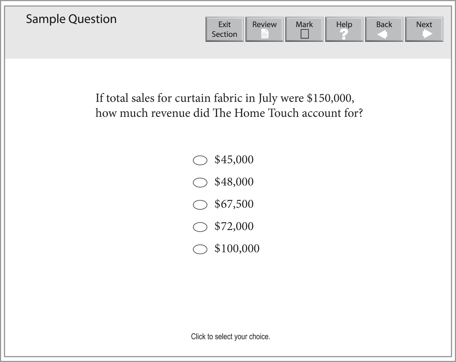
A Data Interpretation question that requires you to choose exactly one correct answer will look like this:
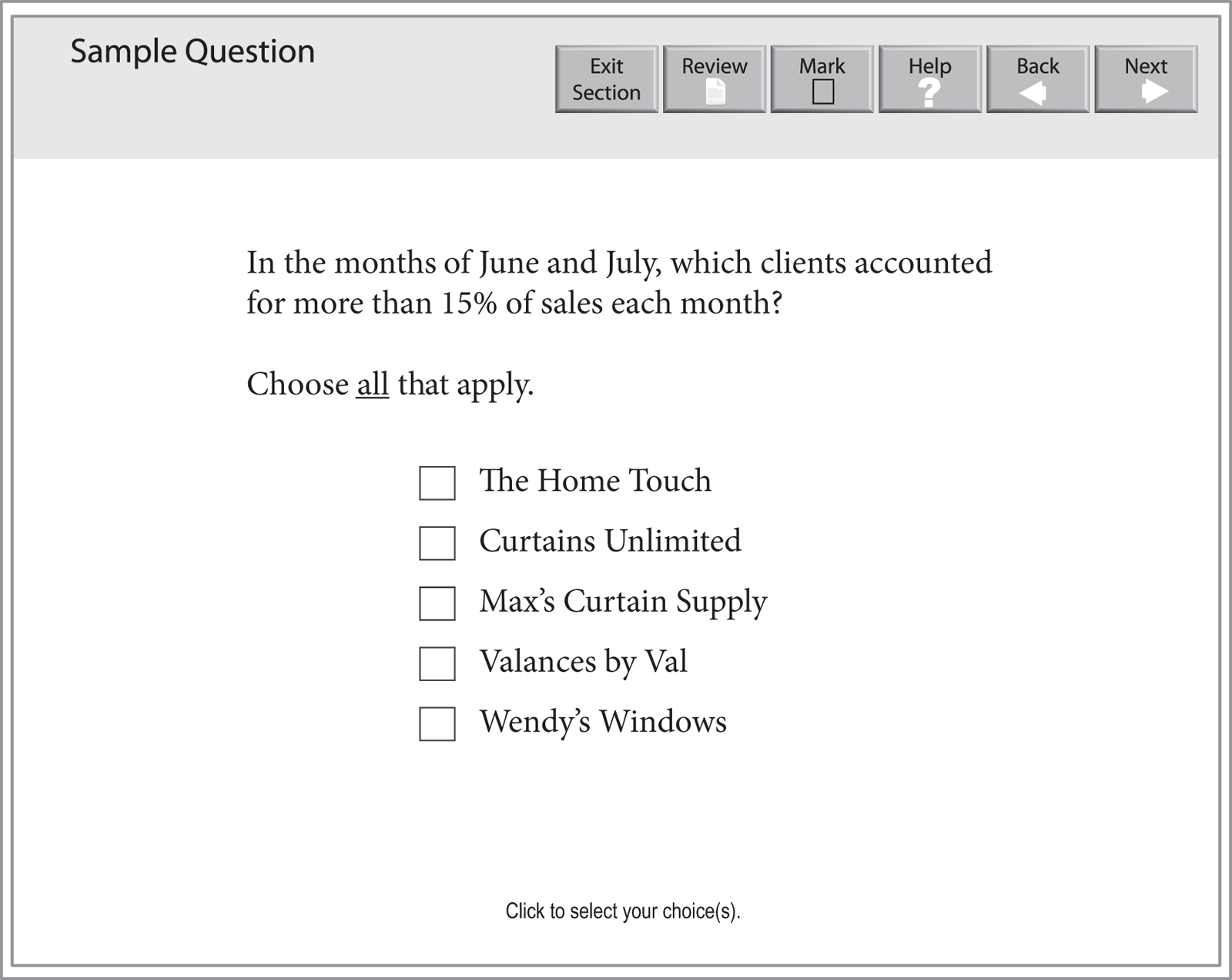
A Data Interpretation question that requires you to select all the answer choices that apply will look like this:
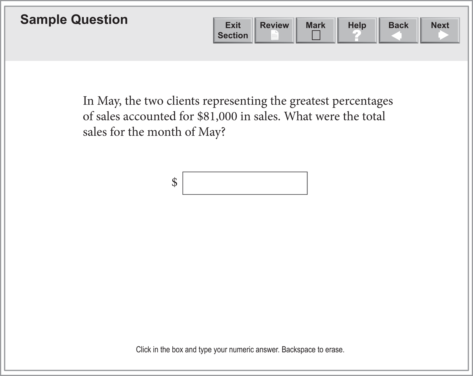
A Data Interpretation question that requires you to enter your numeric answer in a box will look like this:
Now let’s discuss how the Kaplan Method for Data Interpretation works.
Tables, graphs, and charts often come in pairs that are linked in some way (for example, a manufacturer’s total revenue and its revenue by product line). Familiarize yourself with the information in both graphs (or tables) and with how the two are related before attacking the questions. Scan the figures for these components:
Data Interpretation questions are designed to test your understanding of fractions and percents and your attention to detail. Taking a split second to make sure you answered the right question can make the difference between a correct answer and the “right” answer to the wrong question.
Questions tend to become more complex as you move through a set. For instance, if a question set contains two graphs, the first question likely refers to just one graph. A later question will most often combine data from both graphs. If you don’t use both graphs for this later question, the chances are good you have missed something.
No matter how difficult graph questions appear at first glance, you can usually simplify single-answer multiple-choice questions by taking advantage of their answer-choice format. By approximating the answer rather than calculating it wherever possible, you can quickly identify the right one. As we saw with Problem Solving, estimation can be one of the fastest ways to identify the correct answer in math problems. Data Interpretation questions benefit from this strategy, as they tend to be the most time-consuming questions to answer.
Now let’s apply the Kaplan Method to a Data Interpretation question:

The Tourism Board of City S uses the information provided in the climograph to market the city as a tourist destination. One criterion is that the average monthly rainfall be less than 60 millimeters. What fraction of the months meet this criterion?
Take the analysis of the graph step-by-step. Start with the title of the graph to verify that the data given are for City S. Then take note of the scale for each type of information—degrees Celsius for temperature and millimeters for rainfall. There are data for each month of the year, which means you will not have to convert the units to answer the question that’s being asked.
The question asks only about rainfall; those data are given by the bars on the graph. According to the bars, rainfall is greater than 60 mm in August, September, October, and November. That’s 4 of 12 months that do not meet the criterion, so 8 of 12 months do meet it. You may enter the fraction
 directly into the boxes, and your answer will be accepted. It is not required that you reduce it.
Now let’s apply the Kaplan Method to a second Data Interpretation question:
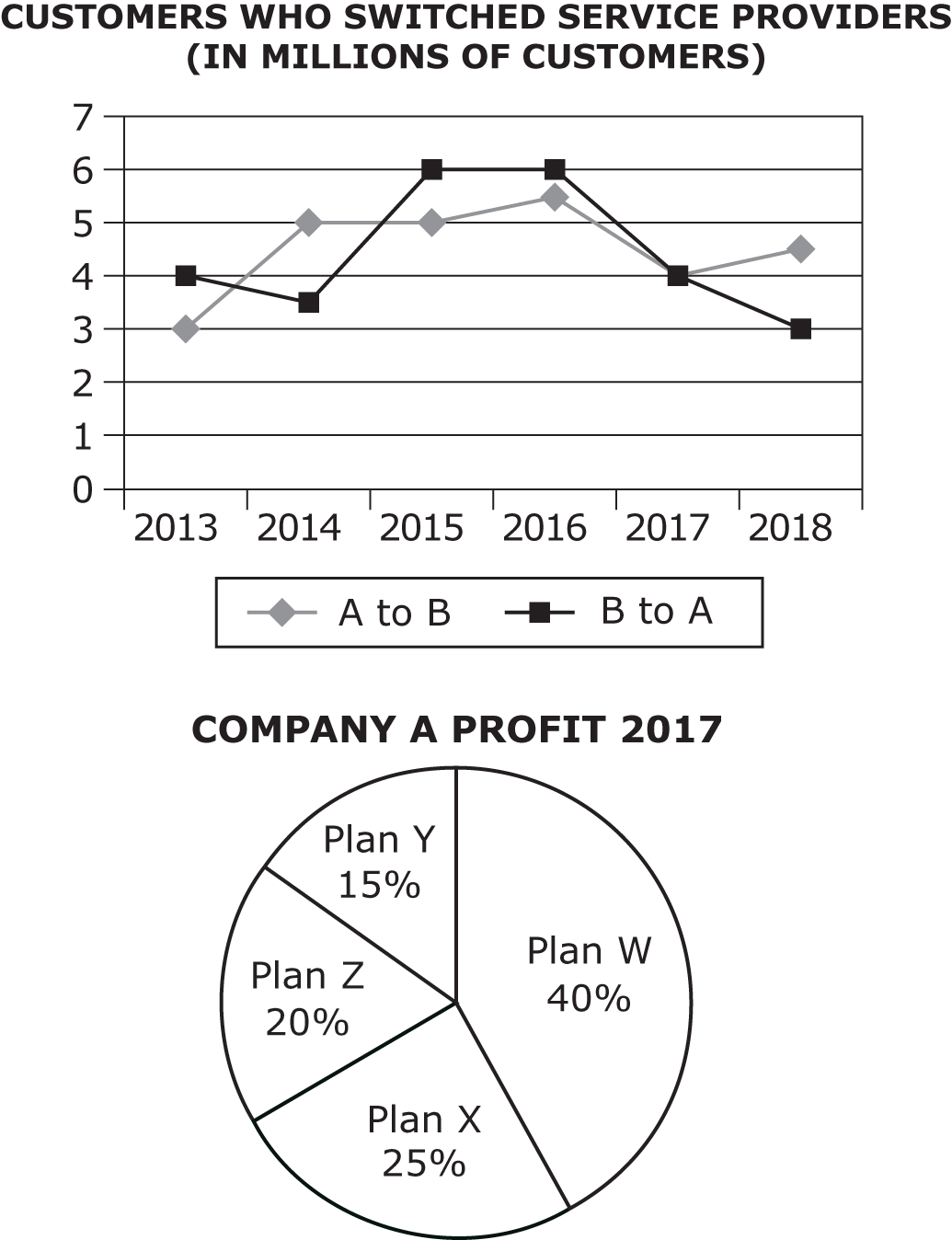
In 2017, Company A had a total profit of $220 million. If half of the customers who switched to Company A were responsible for half of the profit for Plan X, how much did these customers contribute per person toward Company A’s profit for the year?
This question has information about numbers of customers switching service providers for various years. It also has information about one company’s profit for the year 2017, so the data in the two graphs will be linked by the year 2017.
Approach the question methodically, starting with identifying the number of customers who switched to Company A. The line chart indicates that 4 million customers switched to Company A. This is the only information needed from the top graph.
The pie chart shows the breakdown of profit from the various plans offered and indicates that 25% of the profit came from Plan X.
The other information you need to get to the correct answer is given in the question stem:
Now that your information is organized, all you need to do is the calculation. Plan X accounts for 25% of $220 million = $55 million. Half of $55 million is $27.5 million.
If 4 million people switched, then half of the people who switched would be 2 million.
The last step is to divide $27.5 by 2 (you can drop the zeros in the millions because they will cancel out): $27.5 ÷ 2 = $13.75. The correct choice is (B).
Now let’s apply the Kaplan Method to a third Data Interpretation question:
The management of Company B is most interested in the data for the years in which there were at least one million more customers who switched from Company A to Company B than switched from Company B to Company A. In which years did this happen?
Choose all that apply.
This question asks for a comparison of facts between Company A and Company B. Take time to verify which line in the top graph represents customers switching to Company A and which line represents customers switching to Company B. Confirm that the title states that the data are given in millions and then look at the scale on the line graph.
After examining the line graph carefully, you are ready to gather the information needed to answer the question. The years that satisfy the requirement are those years for which the line representing A to B is at least one full horizontal row above the line representing B to A. Read the graph carefully because you must identify all the correct choices to get credit for a correct answer.
When you are clear what to look for on the graph, start from the left and identify the years 2014 and 2018 as those in which at least one million more customers switched from A to B than switched from B to A. These are choices (A) and (E).