10.16 Intro to Data Science: Time Series and Simple Linear Regression
We’ve looked at sequences, such as lists, tuples and arrays. In this section, we’ll discuss time series, which are sequences of values (called observations) associated with points in time. Some examples are daily closing stock prices, hourly temperature readings, the changing positions of a plane in flight, annual crop yields and quarterly company profits. Perhaps the ultimate time series is the stream of time-stamped tweets coming from Twitter users worldwide. In the “Data Mining Twitter” chapter, we’ll study Twitter data in depth.
In this section, we’ll use a technique called simple linear regression to make predictions from time series data. We’ll use the 1895 through 2018 January average high temperatures in New York City to predict future average January high temperatures and to estimate the average January high temperatures for years preceding 1895.
In the “Machine Learning” chapter, we’ll revisit this example using the scikit-learn library. In the “Deep Learning” chapter, we’ll use recurrent neural networks (RNNs) to analyze time series.
In later chapters, we’ll see that time series are popular in financial applications and with the Internet of Things (IoT), which we’ll discuss in the “Big Data: Hadoop, Spark, NoSQL and IoT” chapter.
In this section, we’ll display graphs with Seaborn and pandas, which both use Matplotlib, so launch IPython with Matplotlib support:
ipython --matplotlibTime Series
The data we’ll use is a time series in which the observations are ordered by year. Univariate time series have one observation per time, such as the average of the January high temperatures in New York City for a particular year. Multivariate time series have two or more observations per time, such as temperature, humidity and barometric pressure readings in a weather application. Here, we’ll analyze a univariate time series.
Two tasks often performed with time series are:
Time series analysis, which looks at existing time series data for patterns, helping data analysts understand the data. A common analysis task is to look for seasonality in the data. For example, in New York City, the monthly average high temperature varies significantly based on the seasons (winter, spring, summer or fall).
Time series forecasting, which uses past data to predict the future.
We’ll perform time series forecasting in this section.
Simple Linear Regression
Using a technique called simple linear regression, we’ll make predictions by finding a linear relationship between the months (January of each year) and New York City’s average January high temperatures. Given a collection of values representing an independent variable (the month/year combination) and a dependent variable (the average high temperature for that month/year), simple linear regression describes the relationship between these variables with a straight line, known as the regression line.
Linear Relationships
To understand the general concept of a linear relationship, consider Fahrenheit and Celsius temperatures. Given a Fahrenheit temperature, we can calculate the corresponding Celsius temperature using the following formula:
c = 5 / 9 * (f - 32)In this formula, f (the Fahrenheit temperature) is the independent variable, and c (the Celsius temperature) is the dependent variable—each value of c depends on the value of f used in the calculation.
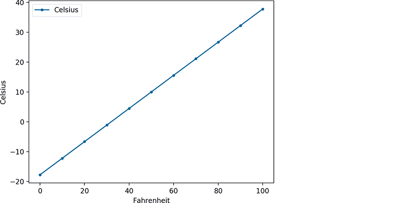
Plotting Fahrenheit temperatures and their corresponding Celsius temperatures produces a straight line. To show this, let’s first create a lambda for the preceding formula and use it to calculate the Celsius equivalents of the Fahrenheit temperatures 0–100 in 10-degree increments. We store each Fahrenheit/Celsius pair as a tuple in temps:
In [1]: c = lambda f: 5 / 9 * (f - 32)In [2]: temps = [(f, c(f)) for f in range(0, 101, 10)]
Next, let’s place the data in a DataFrame, then use its plot method to display the linear relationship between the Fahrenheit and Celsius temperatures. The plot method’s style keyword argument controls the data’s appearance. The period in the string '.-' indicates that each point should appear as a dot, and the dash indicates that lines should connect the dots. We manually set the y-axis label to 'Celsius' because the plot method shows 'Celsius' only in the graph’s upper-left corner legend, by default.
In [3]: import pandas as pdIn [4]: temps_df = pd.DataFrame(temps, columns=['Fahrenheit', 'Celsius'])In [5]: axes = temps_df.plot(x='Fahrenheit', y='Celsius', style='.-')In [6]: y_label = axes.set_ylabel('Celsius')
Components of the Simple Linear Regression Equation
The points along any straight line (in two dimensions) like those shown in the preceding graph can be calculated with the equation:
y = mx + b
where
m is the line’s slope,
b is the line’s intercept with the y-axis (at x = 0),
x is the independent variable (the date in this example), and
y is the dependent variable (the temperature in this example).
In simple linear regression, y is the predicted value for a given x.
Function linregress from the SciPy’s stats Module
Simple linear regression determines the slope (m) and intercept (b) of a straight line that best fits your data. Consider the following diagram, which shows a few of the time-series data points we’ll process in this section and a corresponding regression line. We added vertical lines to indicate each data point’s distance from the regression line:
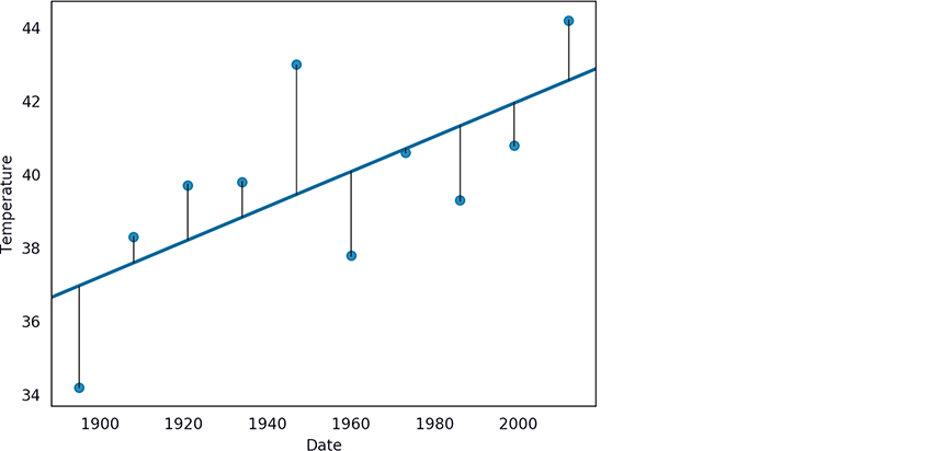
The simple linear regression algorithm iteratively adjusts the slope and intercept and, for each adjustment, calculates the square of each point’s distance from the line. The “best fit” occurs when the slope and intercept values minimize the sum of those squared distances. This is known as an ordinary least squares calculation.21
The SciPy (Scientific Python) library is widely used for engineering, science and math in Python. This library’s linregress function (from the scipy.stats module) performs simple linear regression for you. After calling linregress, you’ll plug the resulting slope and intercept into the y = mx + b equation to make predictions.
Pandas
In the three previous Intro to Data Science sections, you used pandas to work with data. You’ll continue using pandas throughout the rest of the book. In this example, we’ll load the data for New York City’s 1895–2018 average January high temperatures from a CSV file into a DataFrame. We’ll then format the data for use in this example.
Seaborn Visualization
We’ll use Seaborn to plot the DataFrame’s data with a regression line that shows the average high-temperature trend over the period 1895–2018.
Getting Weather Data from NOAA
Let’s get the data for our study. The National Oceanic and Atmospheric Administration (NOAA)22 offers lots of public historical data including time series for average high temperatures in specific cities over various time intervals.
We obtained the January average high temperatures for New York City from 1895 through 2018 from NOAA’s “Climate at a Glance” time series at:
https:/
On that web page, you can select temperature, precipitation and other data for the entire U.S., regions within the U.S., states, cities and more. Once you’ve set the area and time frame, click Plot to display a diagram and view a table of the selected data. At the top of that table are links for downloading the data in several formats including CSV, which we discussed in the “Files and Exceptions” chapter. NOAA’s maximum date range available at the time of this writing was 1895–2018. For your convenience, we provided the data in the ch10 examples folder in the file ave_hi_nyc_jan_1895-2018.csv. If you download the data on your own, delete the rows above the line containing "Date,Value,Anomaly".
This data contains three columns per observation:
Date—A value of the form'YYYYMM’(such as'201801').MMis always01because we downloaded data for only January of each year.Value—A floating-point Fahrenheit temperature.Anomaly—The difference between the value for the given date and average values for all dates. We do not use theAnomalyvalue in this example, so we’ll ignore it.
Loading the Average High Temperatures into a DataFrame
Let’s load and display the New York City data from ave_hi_nyc_jan_1895-2018.csv:
In [7]: nyc = pd.read_csv('ave_hi_nyc_jan_1895-2018.csv')We can look at the DataFrame’s head and tail to get a sense of the data:
In [8]: nyc.head()Out[8]:Date Value Anomaly0 189501 34.2 -3.21 189601 34.7 -2.72 189701 35.5 -1.93 189801 39.6 2.24 189901 36.4 -1.0In [9]: nyc.tail()Out[9]:Date Value Anomaly119 201401 35.5 -1.9120 201501 36.1 -1.3121 201601 40.8 3.4122 201701 42.8 5.4123 201801 38.7 1.3
Cleaning the Data
We’ll soon use Seaborn to graph the Date-Value pairs and a regression line. When plotting data from a DataFrame, Seaborn labels a graph’s axes using the DataFrame’s column names. For readability, let’s rename the 'Value' column as 'Temperature':
In [10]: nyc.columns = ['Date', 'Temperature', 'Anomaly']In [11]: nyc.head(3)Out[11]:Date Temperature Anomaly0 189501 34.2 -3.21 189601 34.7 -2.72 189701 35.5 -1.9
Seaborn labels the tick marks on the x-axis with Date values. Since this example processes only January temperatures, the x-axis labels will be more readable if they do not contain 01 (for January), we’ll remove it from each Date. First, let’s check the column’s type:
In [12]: nyc.Date.dtypeOut[12]: dtype('int64')
The values are integers, so we can divide by 100 to truncate the last two digits. Recall that each column in a DataFrame is a Series. Calling Series method floordiv performs integer division on every element of the Series:
In [13]: nyc.Date = nyc.Date.floordiv(100)In [14]: nyc.head(3)Out[14]:Date Temperature Anomaly0 1895 34.2 -3.21 1896 34.7 -2.72 1897 35.5 -1.9
Calculating Basic Descriptive Statistics for the Dataset
For some quick statistics on the dataset’s temperatures, call describe on the Temperature column. We can see that there are 124 observations, the mean value of the observations is 37.60, and the lowest and highest observations are 26.10 and 47.60 degrees, respectively:
In [15]: pd.set_option('precision', 2)In [16]: nyc.Temperature.describe()Out[16]:count 124.00mean 37.60std 4.54min 26.1025% 34.5850% 37.6075% 40.60max 47.60Name: Temperature, dtype: float64
Forecasting Future January Average High Temperatures
The SciPy (Scientific Python) library is widely used for engineering, science and math in Python. Its stats module provides function linregress, which calculates a regression line’s slope and intercept for a given set of data points:
In [17]: from scipy import statsIn [18]: linear_regression = stats.linregress(x=nyc.Date,...: y=nyc.Temperature)...:
Function linregress receives two one-dimensional arrays23 of the same length representing the data points’ x- and y-coordinates. The keyword arguments x and y represent the independent and dependent variables, respectively. The object returned by linregress contains the regression line’s slope and intercept:
In [19]: linear_regression.slopeOut[19]: 0.00014771361132966167In [20]: linear_regression.interceptOut[20]: 8.694845520062952
We can use these values with the simple linear regression equation for a straight line, y = mx + b, to predict the average January temperature in New York City for a given year. Let’s predict the average Fahrenheit temperature for January of 2019. In the following calculation, linear_regression.slope is m, 2019 is x (the date value for which you’d like to predict the temperature), and linear_regression.intercept is b:
In [21]: linear_regression.slope * 2019 + linear_regression.interceptOut[21]: 38.51837136113298
We also can approximate what the average temperature might have been in the years before 1895. For example, let’s approximate the average temperature for January of 1890:
In [22]: linear_regression.slope * 1890 + linear_regression.interceptOut[22]: 36.612865774980335
For this example, we had data for 1895–2018. You should expect that the further you go outside this range, the less reliable the predictions will be.
Plotting the Average High Temperatures and a Regression Line
Next, let’s use Seaborn’s regplot function to plot each data point with the dates on the x-axis and the temperatures on the y-axis. The regplot function creates the scatter plot or scattergram below in which the scattered blue dots represent the Temperatures for the given Dates, and the straight line displayed through the points is the regression line:
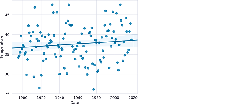
First, close the prior Matplotlib window if you have not done so already—otherwise, regplot will use the existing window that already contains a graph. Function regplot’s x and y keyword arguments are one-dimensional arrays24 of the same length representing the x-y coordinate pairs to plot. Recall that pandas automatically creates attributes for each column name if the name can be a valid Python identifier:25
In [23]: import seaborn as snsIn [24]: sns.set_style('whitegrid')In [25]: axes = sns.regplot(x=nyc.Date, y=nyc.Temperature)
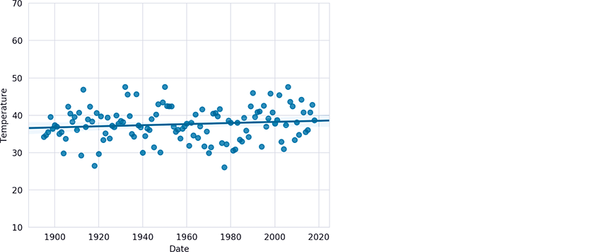
The regression line’s slope (lower at the left and higher at the right) indicates a warming trend over the last 124 years. In this graph, the y-axis represents a 21.5-degree temperature range between the minimum of 26.1 and the maximum of 47.6, so the data appears to be spread significantly above and below the regression line, making it difficult to see the linear relationship. This is a common issue in data analytics visualizations. When you have axes that reflect different kinds of data (dates and temperatures in this case), how do you reasonably determine their respective scales? In the preceding graph, this is purely an issue of the graph’s height—Seaborn and Matplotlib auto-scale the axes, based on the data’s range of values. We can scale the y-axis range of values to emphasize the linear relationship. Here, we scaled the y-axis from a 21.5-degree range to a 60-degree range (from 10 to 70 degrees):
In [26]: axes.set_ylim(10, 70)Out[26]: (10, 70)
Getting Time Series Datasets
Here are some popular sites where you can find time series to use in your studies:
https:/This is the U.S. government’s open data portal. Searching for “time series” yields over 7200 time-series datasets. |
https:/The National Oceanic and Atmospheric Administration (NOAA) Climate at a Glance portal provides both global and U.S. weather-related time series. |
https:/NOAA’s Earth System Research Laboratory (ESRL) portal provides monthly and seasonal climate-related time series. |
https:/Quandl provides hundreds of free financial-related time series, as well as fee-based time series. |
https://datamarket.com/data/list/?q=provider:tsdlThe Time Series Data Library (TSDL) provides links to hundreds of time series datasets across many industries. |
http://archive.ics.uci.edu/ml/datasets.htmlThe University of California Irvine (UCI) Machine Learning Repository contains dozens of time-series datasets for a variety of topics. |
http:/The University of Maryland’s EconData service provides links to thousands of economic time series from various U.S. government agencies. |
 Self Check
(Fill-In) Time series _________ looks at existing time series data for patterns, helping data analysts understand the data. Time series _________ uses data from the past to predict the future.
Answer: analysis, forecasting.(True/False) In the formula,
c=5/9*(f-32),f(the Fahrenheit temperature) is the independent variable andc(the Celsius temperature) is the dependent variable.
Answer: True.(IPython Session) Assuming that this linear trend continues, based on the slope and intercept values calculated in this section’s interactive session, in what year might the average January temperature in New York City reach 40 degrees Fahrenheit.
Answer:In [27]: year = 2019In [28]: slope = linear_regression.slopeIn [29]: intercept = linear_regression.interceptIn [30]: temperature = slope * year + interceptIn [31]: while temperature < 40.0:...: year += 1...: temperature = slope * year + intercept...:In [32]: yearOut[32]: 2120