CHAPTER 14:
Working with Data

“At this point, your probability of success has greatly increased. This chapter is a combination of related topics. Let’s start with measures of central tendency.”
CENTRAL TENDENCY
People say you can prove anything with statistics. You need to know what you are taking statistics of, how many in the group, and many other variables. Even then, depending on the “spin” you want, you can choose among three measures to describe the data and prove your point. These measures of central tendency are ways to find a “typical” value. The measures of central tendency, introduced in Chapter 1 are:
Mean: Add up the number of terms and divide the sum by the number of terms; that’s the way your grades are usually determined in school.
Median: The middle term when the numbers are put in order from smallest to largest (or the other way around); for an odd number of terms, it is the middle term; for an even number, it’s the mean of the middle two numbers.
Mode: The most common term; there can be one mode, two modes (bimodal), or any number of modes.
Example 1:
For the data consisting of the numbers 5, 6, 8, 9, 12, 12, 18, The mean is 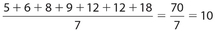 . The median is 9. There are three numbers above it and three numbers below it.
The mode is 12. It is the most common number, appearing twice.
Now can you see how you can prove anything with statistics?
 Let’s do some exercises.
For Exercises 1-3, use the following numbers:
8, 10, 10, 16, 16, 18
Exercise 1:
The mean is
- 8
- 10
- 13
- 16
- There are two of them
Exercise 2:
The median is
- 8
- 10
- 13
- 16
- There are two of them
Exercise 3:
The mode is
- 8
- 10
- 13
- 16
- There are two of them
 Let’s look at the answers.
Answer1:
The answer (C).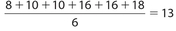
Answer 2:
The answer is (C). There are an even number of numbers, so we have to take the average of the middle two:  .
.
Answer 3:
The answer is (E). It’s bimodal; the modes are 10 and 16, each appearing twice.
Sometimes statistics are given in frequency distribution tables, such as this one showing the grades Sandy received on 10 English quizzes.
Example 2:
Find the measures of central tendency of Sandy’s quiz scores.
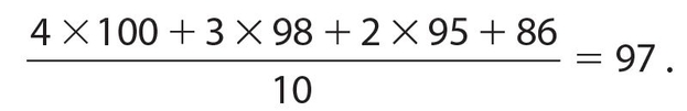
| Grade | Number | |
|---|---|---|
| 100 | 4 | |
| 98 | 3 | |
| 95 | 2 | |
| 86 | 1 | |
| Total | 10 |
Solution:
The mean is the longest measure to compute:
The median is determined by putting all of the numbers in order, so we have 100, 100, 100, 100, 98, 98, 98, 95, 95, 86. The middle terms are 98 and 98, so the median is 98.
The mode is 100 since that is the most common score; there are four of them.
STANDARD DEVIATION
Look at these two sets of numbers:
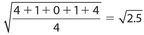
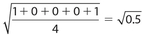
Set A: {16, 18, 18, 19, 22, 23, 24}
Set B: {2, 18, 18, 19, 25, 28, 30}
If we find the median for each set, it is 19; if we find the mean for each set, it is 20; if we find the mode for each set, it is 18. The measures of central tendency are the same for both sets. However, there is something different about each set. In set A, all the numbers are relatively close to the mean. In set B, that is not true. We can measure the spread of the data by finding the standard deviation. Here are the steps to calculate it:
- Find the mean of the set.
- For each number, subtract the mean and square the result.
- Add these squares together and divide by the number of elements in the set.
- Take the square root of this result. That is the standard deviation.
The standard deviation of set A is:

The standard deviation of set B is:

By comparing these two results, we have proof that the numbers in set B are more spread out, or dispersed, than those in set A. The standard deviation is a useful measure, especially in relation to the normal or bell-shaped curve. For example, by using multiples of the standard deviation (there are published tables for this), a manufacturer can determine how many items to produce. Suppose the manufacturer wanted to produce 100,000 pairs of a particular shoe. The standard deviation will tell how many of each size to produce. It also says that if you are a man wearing size 15 or a woman wearing size 12, you must go to a specialty store. If you are a man wearing size 5 or a woman wearing size 3, most of your shoes are children’s shoes. The statistics tell you that it doesn’t pay to make many shoes, if any, in those sizes.
This topic will be on the GRE exam. You should be familiar with the vocabulary presented here.
 Let’s try some exercises.
Exercise 4:
Group 1 has five data, a median of 10, and a lowest value of 0. Group 2 has five data, a median of 10, and a lowest value of 8.
| Quantity A | Quantity B |
|---|---|
| The standard deviation of group 1 | The standard deviation of group 2 |
For Exercises 5, 6, and 7, you are given the following list of data:
1, 1, 1, 2, 2, 3, 3, 3, 4, 5, 5, 5, 6, 7, 12
Exercise 5:
Which of the following individual numbers could be inserted in this list and not change the median? Indicate all correct choices.
- 2
- 3
- 4
- 6
- 8
- 13
Exercise 6:
Which additional pairs of numbers would change the mode(s)? Indicate all correct choices.
- 0, 1
- − 2, 4
- 2, 9
- 0, 7
- 6, 12
- 3, 5
Exercise 7:
Which additional pairs of numbers would not change the mean? Indicate all correct choices.
- 4,7
- 2, 6
- 3, 4
- 1, 7
- − 1, 9
- − 2, 12
Exercise 8:
For which of the following groups of numbers is the range equal to 8? Indicate all correct choices.
- 2, 4, 5, 6, 6, 7, 8, 9
- 3, 3, 3, 3, 4, 4, 7, 14
- 4, 5, 8, 8, 10, 10, 10, 12
- 5, 7, 9, 10, 12, 14, 17
- 6, 6, 6, 9, 9, 13, 13, 19
- 7, 7, 9, 9, 11, 11, 15, 15
Exercise 9:
The formula for the standard deviation of a sample of data is  , where xi represents each datum,
  represents the mean, and n is the number of data. The notation
  means “sum of.” For which of the following groups of data is the standard deviation less than 2? Indicate all correct choices.
- 0, 3, 6, 11, 15
- 0, 2, 3, 5, 10
- 4, 5, 6, 7, 8
- 8, 9, 9, 9, 10
- 7, 7, 7, 7, 7
- 6, 9, 12, 12, 16
 Let’s look at the answers.
Answer 4:
The correct answer is (D). It is impossible to determine which group has the larger standard deviation. For example, suppose the data in Quantity A were 0, 5, 10, 15, and 20. The standard deviation for Quantity A would be  . If the data in Quantity B were 8, 9, 10, 11, and 12, then the corresponding standard deviation would be
  . But if the data in Quantity B were 8, 10, 10, 32, and 100, then the corresponding standard deviation would be approximately 39.42.
Answer 5:
The correct answers are (A) and (B). The original list has 15 numbers arranged in ascending order. The median is the 8th number, which is 3. Choice (A) is correct because by inserting the number 2, there would be 16 numbers for which the median would be in position 8.5. This would appear between the second and third 3’s, so the median would still be 3. Choice (B) is correct for the same reason. Each of choices (C), (D), (E), and (F) would be wrong because there would still be 16 numbers, but the 8.5th position would land between the numbers 3 and 4. Thus, the median would change to 3.5.
Answer 6:
The correct answers are (A), (C), and (F). The original list has the three modes, 1, 3, and 5. For choice (A), there would be four 1’s, so the only mode would be 1. For choice (C), there would be three 2’s, so there would be four modes, namely 1, 2, 3, and 5. For choice (F), there would be four 3’s and four 5’s. So the two modes would be 3 and 5. The addition of any of the pairs from choices (B), (D), or (E) would not affect the modes of the original list.
Answer 7:
The correct answers are (B), (D), and (E). The sum of the 15 numbers of the original list is 60, so its mean is  . If the new list of 17 numbers 15 had the same mean, its total would be (17)(4) = 68. This implies that if we add two numbers whose sum is 68 − 60 = 8, the mean will remain unchanged. The sum of each of the pairs of numbers in choices (B), (D), and (E) is 8.
Answer 8:
The correct answers are (C) and (F). For any group of data, the range is defined as the difference between the highest and lowest values. For choices (C) and (F), this difference is 8. The range for choices (A), (B), (D), and (E) are 7, 11, 12, and 13, respectively.
Answer 9:
The correct answers are (C), (D), and (E). You need only to check whether the standard deviation is < 2, or whether the value under the radical is < 4.
For choice (C), the standard deviation is 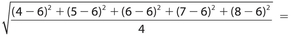
 .
.
For choice (D), the standard deviation is 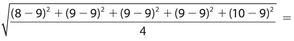
 .
.
For choice (E), the standard deviation is 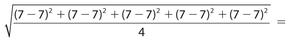
 .
.
The standard deviations for each of choices (A), (B), and (F) are greater than 2. Their standard deviations are  ,
,  ,
,  , respectively.
COUNTING
The basic law of counting says: “If you can do something in p ways, and a second thing in q ways, and a third thing in r ways, and so on, the total number of ways you can do the first thing, then the second thing, then the third thing, etc., is p × q × r × . . .
Example 3:
If you have a lunch choice of 5 sandwiches, 4 desserts, and 3 drinks, and you can have one of each, how many different meals could you choose?
Solution:
You can choose from (5)(4)(3) = 60 different meals.
Arrangements
Let n(A) be the number of elements in set A. In how many ways can these elements be arranged? The answer is that the first has n choices, the second has (n − 1) choices (since one is already used), the third has (n − 2) choices, all the way down to the last element, which has only one choice. In general, if there are n choices, the number of ways to choose is n! (n factorial) = n(n − 1)(n − 2)× . . . (3)(2)(1).
The factorial symbol is used only with nonnegative integers, so that, for example, (−2)! and ( )! have no meaning. It is easy to see that 1! = 1 and 2! = (2)(1) = 2, but what about 0! ? Most books will simply state that 0! = 1, which may seem confusing. However, there is a rational reason for this. Consider that 4! = (4)(3)(2)(1) = 24. If we divide 24 by 4, we get 6, which is equivalent to 3! Now divide 6 by 3, we get 2, which is the value of 2! Dividing 2 by 2 leads to 1, which is 1!. Continuing this pattern, if we divide 1 by 1, we should get 0!. But 1 divided by 1 = 1. This line of reasoning helps us to equate 0! with 1.
Example 4:
How many ways can five people line up?
Solution:
This is just 5 × 4 × 3 × 2 × 1 = 120.
Example 5:
How many ways can 5 people sit in a circle?
Solution:
It would appear to be the same question as Example 4, but it’s not. If you draw the picture, each of 5 positions would be the same. The answer is (5)(4)(3)(2)(1) ÷ 5 = (4)(3)(2)(1) = 24. So n people can sit in a circle in (n − 1)! ways.
Permutations
Permutations are essentially the law of counting without repeating, but order counts.
Example 6:
How many ways can 7 people occupy 3 seats on a bench?
Solution:
Any one of 7 people can be in the first seat, then any one of 6 people can be in the second seat, and any one of 5 people can be in the third seat. The total number would be (7)(6)(5) = 210 ways. There are many notations for permutations. One notation for this example would be P(7, 3).

If we were to determine the number of ways in which seven people can occupy seven seats on a bench, the answer would be 7 × 6 × 5 × 4 × 3 × 2 × 1 = 7! = 5,040.
Combinations
Combinations are essentially the law of counting, with no repetition, and order doesn’t count.
Example 7:
How many sets of three different letters can be made from eight different letters?
Solution:
Since order doesn’t count, unlike with permutations, AB is the same as BA. So we can take the number of permutations, but we have to divide by the number of duplicates. It turns out that the duplicates for 3 letters is 3 × 2 × 1 = 6. So we would have  . Again, there are many notations for combinations. One notation for this example is C(8,3). Another notation is
  . In general,
  .
.
Avoiding Duplicates
When we count how many ways to do A or B, we should be careful not to count any item twice. We must subtract out any items that include both A and B:
N(A or B) = N(A) + N(B) − N(A and B)
Example 8:
Thirty students take French or German. If 20 took French and 18 took German, and if each student took at least one language, how many took both French and German?
Solution:
N(A or B) = N(A) + N(B) − N(A and B), or 30 = 20 + 18 − x, so x = 8 took both languages.
Example 9:
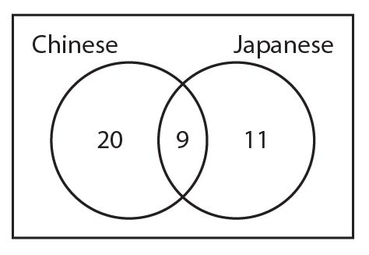
Forty students take Chinese or Japanese. If 9 take both and 20 take Japanese, how many students take only Chinese?
Solution:
N(C or J) = N(C) + N(J) − N(both), or 40 = x + 20 − 9, so x = 29 take only Chinese.
 Let’s do some exercises.
For Exercises 10-15, use the set {e, f, g, h, i}. A word is considered to be any group of letters together; for example, hhg is a three-letter word.
Exercise 10:
From this set, the number of three-letter words is:
- 6
- 27
- 30
- 60
- 125
Exercise 11:
How many three-letter permutations are there in this set?
- 6
- 27
- 30
- 60
- 125
Exercise 12:
How many three-letter words starting with a vowel and ending in a consonant can be made from this set?
- 6
- 27
- 30
- 60
- 125
Exercise 13:
How many three-letter words with the second and third numbers the same can be made from this set?
- 5
- 20
- 25
- 60
- 125
Exercise 14:
How many three-letter permutations with the first and last letters not vowels can be made from this set?
- 18
- 27
- 30
- 45
- 125
Exercise 15:
Fifty students take Spanish or Portuguese. If 20 take both and 40 take Spanish, the number of students taking only Portuguese is
- 0
- 5
- 10
- 20
- 30
 Let’s look at the answers.
Answer 10:
The answer is (E). (5)(5)(5) = 125.
Answer 11:
The answer is (D). (5)(4)(3) = 60.
Answer 12:
The answer is (C). The first letter has 2 choices, the second can be any 5, and the third has 3 choices, so (2)(5)(3) = 30.
Answer 13:
The answer is (C). There are 5 choices for the first two letters, but there is only 1 choice for the third letter since it must be the same as the second, so (5)(5)(1) = 25.
Answer 14:
The answer is (A). There are 3 choices for the first letter, but only 2 choices for the last letter since it can’t be a vowel and must be different than the first letter. There are 3 choices for the middle letter since two letters have already been used; so the answer is (3)(3)(2) = 18. These questions must be read very carefully!
Answer 15:
The answer is (C). This is not quite the same. N(S or P) = N(S) + N(P) − N (both); 50 = 40 + x − 20; x = 30, but that is not the answer. If 30 take Portuguese and 20 take both, then 10 take only Portuguese.
VENN DIAGRAMS
Venn diagrams are graphical illustrations that show the relationship between two sets or among several sets. Our discussion will be limited to two sets, so our Venn diagram consists of a rectangle with two overlapping circles inside it. Let’s revisit Examples 8 and 9.
In Example 8, we found out that eight students took both languages. Here is a partial picture of a Venn diagram with this information.
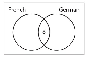
The 20 students who take French include the 8 students who take both languages, so there must be 20 − 8 = 12 students who take French but not German. Similarly, the 18 students who take German also include the 8 students who take both languages. This means that 18 − 8 = 10 students who take German but not French. Here is the completed Venn diagram.
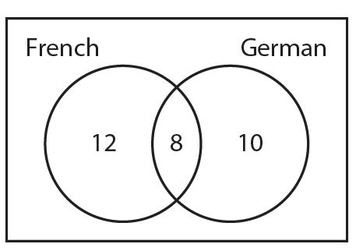
In Example 9, we start with the nine students who take both Chinese and Japanese. Here is a partial Venn diagram with this information.
We know that a total of 20 students take Japanese. Since this total includes the 9 students who take both languages, there must be 20 − 9 = 11 students who take Japanese but not Chinese. Now, of the 40 students, we know the number of students who take Japanese but not Chinese (11) and the number of students who take both languages (9). This means that the number of students who take Chinese but not Japanese must be 40 − 11 − 9 = 20. Here is the completed Venn diagram.
In some instances, we may have a numerical value that lies outside the two circles but within the rectangle. In the diagram above, that would indicate the students who do not take Chinese or Japanese.
 If there were no students who take both Chinese and Japanese, the two circles would not overlap.
Example 10:
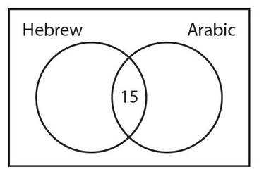
In a group of 50 students, 25 take Hebrew, 22 take Arabic, and 15 take both languages. How many students take neither of these languages?
Solution:
We start with the 15 students who take both Hebrew and Arabic. Put this number in the overlapping region of the two circles, as shown below.
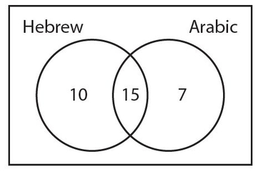
The 25 students who take Hebrew include the 15 who take both languages. So, 25 − 15 = 10 students who take Hebrew but not Arabic. We also know that the 22 students who take Arabic include the 15 who take both languages. So, 22 − 15 = 7 students who take Arabic but not Hebrew. Here is the Venn diagram thus far.
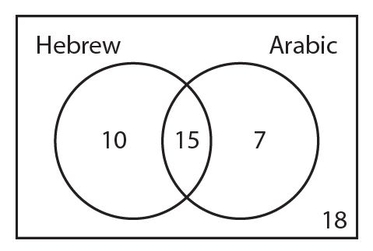
But notice that the number of students that we have accounted for is 10 + 15 + 7 = 32. This means that 50 − 32 = 18 students are taking neither Hebrew nor Arabic. The number 18 is traditionally placed in the lower right-hand corner of the rectangle. The completed Venn diagram appears below.
 Let’s try two exercises on Venn diagrams.
Exercise 16:
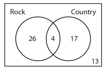
In a certain group of 60 people, 30 enjoy rock music, 21 enjoy country music, and 4 people enjoy both rock and country music. How many people enjoy neither rock nor country music?
Exercise 17:
In a group of 100 people, a survey was taken to determine how many people like vanilla ice cream and how many people like chocolate ice cream. The results showed that 53 people like vanilla ice cream, including 9 people who also like chocolate ice cream. If 22 people like neither of these two flavors of ice cream, how many people like chocolate ice cream?
 Let’s look at the answers.
Answer 16:
The correct answer is 13. We start with the 4 people who enjoy both types of music. Since the 30 people who enjoy rock music includes the 4 people who enjoy both types of music, there must be 30 − 4 = 26 people who enjoy rock but not country music. Likewise, there are 21 − 4 = 17 people who enjoy country music but not rock. Here is how the Venn diagram looks thus far.
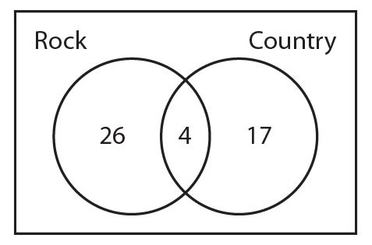
However, we have only accounted for 26 + 4 + 17 = 47 people. Therefore, the number of people who do not enjoy either type of music is 60 − 47 = 13. The completed Venn diagram appears below.
Answer 17:
The correct answer is 34. We start with the 9 people who like both flavors. The number of people who like vanilla but not chocolate ice cream must be 53 − 9 = 44. The number of people who like neither flavor (22) should be placed in the lower right-hand corner of the rectangle. Here is how the Venn diagram looks thus far.
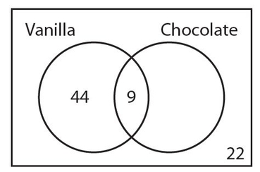
Now we can determine the number of people who like chocolate but not vanilla ice cream to be 100 − 44 − 9 − 22 = 25. The completed Venn diagram is shown below.
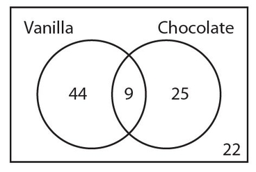
Therefore, the number of people who like chocolate ice cream is 9 + 25 = 34.
PROBABILITY
The probability of an event is the number of “good” outcomes divided by the total number of outcomes possible, or Pr(success) =  .
.
Example 11:
Consider the following sets: {26 letter English alphabet}; vowels = {a, e, i, o, u}; consonants = {the rest of the letters}. What are the probabilities of choosing a vowel? a consonant? any letter? π?
Solution:
Pr(vowel) =  ; Pr(consonant) =
  ; Pr(letter) =
  = 1; Pr(π) =
  = 0. Probability follows the same rule about avoiding duplicates, as discussed in the previous section.
Pr(A or B) = Pr(A) + Pr(B) − Pr(A and B)
Example 12:
What is the probability that a spade or an ace is pulled from a 52-card deck?
Solution:
Pr(Spade or ace) = Pr(Spade) + Pr(Ace) − Pr(Spade ace) = 13 4 1 16 4 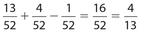
As weird as it sounds, whenever I taught this in a class, I never failed to have at least two students who didn’t know what a deck of cards was, and I taught in New York City!
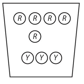
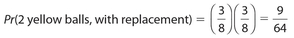
Use this figure for Examples 13 and 14. In the jar are 5 red balls and 3 yellow balls.
Example 13:
What is the probability that two yellow balls are picked, with replacement?
Solution:
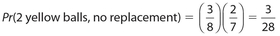
Example 14:
What is the probability of picking two yellow balls, without replacement?
Solution:
Independent Events
Two events are independent if the occurrence of one of them has no effect on the probability of the other event to occur. The probability that both events occur is the product of the individual probabilities of each event to occur. Thus, if A and B are independent events, then Pr(A and B) = Pr(A) × Pr(B).
Example 15:
A coin is flipped once and a die is rolled. What is the probability that the coin will show heads and the die will show a number greater than 1?
Solution:
There are only two outcomes for the coin, so the probability that it will show heads is  . There are six outcomes for the die, so the probability that it will show a number greater than 1 (that is, 2, 3, 4, 5, or 6) is
  . Therefore, the probability that both events will occur is
Example 16:
A die is rolled once and a card is randomly drawn from an ordinary deck. What is the probability that the die will show a number less than 3 and the selected card is an ace?
Solution:
Of the six outcomes on the die, the only numbers less than 3 are 1 and 2. So, the probability for this event is  . Of the 52 cards in the deck, 4 are aces. This means that the probability of drawing an ace is
  . Therefore, the probability that both events occur is
  .
.
Example 17:
Events E and F are independent. The probability is 0.8 that at least one of these events will occur. If the probability is 0.6 that event E will occur, what is the probability that event F will occur?
Solution:
We need to use the formula Pr(E or F) = Pr(E) + Pr(F) − Pr(E and F). Let x represent Pr(F). Then 0.8 = 0.6 + x − (0.6)(x), which simplifies to 0.8 = 0.6 + 0.4x. Subtract 0.6 from each side to get 0.2 = 0.4x. Thus,  .
.
Conditional Probability
Conditional probability is used when the probability of an event is dependent upon whether or not another event occurs. Usually, conditional probability problems contain the word “given.”
Example 18:
A person randomly selects a letter of the alphabet. What is the probability that the selected letter is the letter e given that we know he has selected one of the five vowels?
Solution:
Rather than look at the entire alphabet, we need consider only the five vowels. Since the person has chosen a vowel, the probability that the letter e was selected is  .
.
Example 19:
A person selects one card from an ordinary deck of 52 cards. Given that the selected card is black, what is the probability that the card is the ace of clubs?
Solution:
There are 26 black cards in the deck. Since there is only one ace of clubs, the probability is  .
.
Example 20:
There are two boxes of radios. The first box has nine radios, of which three are defective. The second box has ten radios, of which only one is defective. All the radios are placed in a large container. A person randomly selects one radio and finds that it is defective. What is the probability that this defective radio came from the first box?
Solution:
Although there are a total of 19 radios, we need only note that there are just four defective radios. Since three out of the four defective radios belonged to the first box, the probability is  .
.

In Example 20, the sentence, “A person randomly selects one radio and finds that it is defective,” could have said, “Given that a radio selected at random is defective,” indicating that this is a conditional probability problem.
EXPECTED VALUE
An important application of probability deals with expected value. Expected value is the sum of the products of individual probabilities and their associated values. As applied to game theory, there are usually dollar amounts that can be won or lost, as well as associated probabilities.
Example 21:
A wheel contains ten evenly divided sections, numbered 1 through 10, with a spinner. The game involves spinning the wheel once, for a cost of $10 to the player. If the spinner lands on a number from 1 to 7, the player loses his or her $10. If the spinner lands on either 8 or on 9, the player gets back $30. If the spinner lands on the number 10, the player gets back $60. What is the expected value?
Solution:
The expected value is the sum of the product of individual prohabilities and their associated values. Be aware that when a player gets back a certain dollar amount, it includes the original investment. Thus, if a player gets back $30 with a $10 investment, the amount won is actually $30 − $10 = $20. Also, a loss of any dollar amount can be recorded as a negative number. Thus, for this particular game, the expected value is (0.7)(−$10) + (0.2)($20) + (0.1)($50) = −$7 + $4 + $5 = $2. This is the average amount that a player can expect to win per game.

There is a very logical way to check this computation. Suppose a player plays this game ten times, and the spinner lands on each of the ten numbers once. Then the total amount played would be (10)($10) = $100. The player would receive no money for each of the times that the spinner lands on the numbers 1 through 7. But the player would receive (2) ($30) = $60 for the times that the spinner lands on 8 or 9. In addition, the player would receive $60 for the time that the spinner lands on the number 10. So, for the ten spins, the player would receive $60 + $60 = $120. The net gain for the ten games is $120 − $100 = $20. This means that the average gain per game is  . Be aware, however, that games of chance at a casino are designed so that a player can expect to lose money, on average.
 Let’s do a few exercises on probability and expected value.
Exercise 18:
A coin is flipped once and a card is randomly drawn from an ordinary deck. What is the probability that the coin will show tails and a diamond picture card is drawn? Write your answer as a ratio of integers.
Exercise 19:
Two dice are rolled and a card is randomly drawn from an ordinary deck. What is the probability that the sum of the dice is 3 and a black ace is drawn? Write your answer as a ratio of integers.
Exercise 20:
Events A and B are independent. The probability is 0.5 that event A occurs and the probability is 0.4 that event B occurs. What is the probability that at least one of these events occurs?
Exercise 21:
At a carnival, a wheel with a spinner contains five evenly divided sections, labeled as A, B, C, D, and E. The game involves spinning the wheel once, for a cost of $6 to the player. If the spinner lands on A or B, the player loses his or her money. If the spinner lands on either C or D, the player gets back $8. If the spinner lands on E, the player gets back $12. What is the expected value of this game?
- −$1.20
- −$0.80
- −$0.60
- −$0.40
- −$0.20
For Exercises 22−24, use the following chart regarding the ages and gender of 100 people attending a concert. One person will be randomly selected.
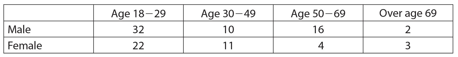
Exercise 22:
What is the probability that the given person is male, given that a person under 30 years old has been selected? Write your answer as a ratio of integers.
Exercise 23:
What is the probability that the given person is over 69 years old, given that a female has been selected?


Exercise 24:
What is the probability that the given person is between ages 30 and 69, given that a male has been selected? Write your answer as a ratio of integers.
 Let’s look at the answers.
Answer 18:
The correct answer is  . The probability that the coin will land on tails 104 is
  . There are three picture diamonds in a deck of cards, namely the jack, queen, and king. So the probability of drawing a picture diamond is
  . Since these events are independent, the probability that both occur is
  .
.
Answer 19:
The correct answer is  . There are (6)(6) = 36 different possible outcomes when two dice are rolled. Of these, the only two outcomes in which the sum is 3 are: (a) 1 on the first die and 2 on the second die or (b) 2 on the first die and 1 on the second die. Its associated probability is
  . The two black aces in a deck of cards are the 36 18 ace of spades and the ace of clubs, so its associated probability is
  . These events are independent, so the required probability is
  .
.
Answer 20:
The correct answer is 0.7. The probability that at least one of these events occurred is denoted as Pr(A or B), which equals Pr(A) + Pr(B) − Pr(A and B). Note that Pr(A and B) = Pr(A) X Pr(B) because the events are independent. Thus, by substitution, Pr(A or B) = 0.5 + 0.4 − (0.5)(0.4) = 0.5 + 0.4 − 0.2 = 0.7.
Answer 21:
The correct answer is (D). The probability that the spinner lands on A or B and the player loses $6 is  . If the spinner lands on C or D, the 5 person will win $2 ($8 − $6). So the probability that a player wins $2, is also
  . There is a probability of
  that the player will win $6 ($12 − $6). Therefore, the expected value is
 .
.
Answer 22:
The correct answer is  . There are 32 + 22 = 54 people under the age 27 of 30. Of these, 32 are male. Thus, the required probability is
  , which reduces to
  .
.
Answer 23:
The correct answer is (D). There are a total of 22 +11 + 4 + 3 = 40 females. Of these, three of them are over the age of 69. Thus, the required probability is  .
.
Answer 24:
The correct answer is  . There are a total of 32 + 10 + 16 + 2 = 60 males. Of these, there are 10 + 16 = 26 between the ages of 30 and 69. Thus, the required probability is
  , which reduces to
  .
.
CHARTS AND GRAPHS
A significant part of the GRE consists of charts and graphs. In all likelihood, out of 60 questions, there will be 10 such questions: two graphs and chart problems, with five questions each. Here is one problem having one pie chart and one bar graph. There will be more such exercises in the practice tests.
Circle Graph
One popular way to present data in a pictorial form is the circle graph. Other names for this type of data display are pie graph and pie chart. This type of graph is most useful when comparing the component categories of one heading. Each component part becomes a sector of the circle that represents the entire heading.
Example 22:
A survey was sent to the residents of the town of Peopleville, in which residents were asked to rank the town mayor. The five categories from which a resident could enter a response were (a) excellent, (b) very good, (c) average, (d) below average, and (e) poor. Use the following circle graph, with a fraction assigned to each category, to determine the central angles for the “excellent” and “very good” categories.
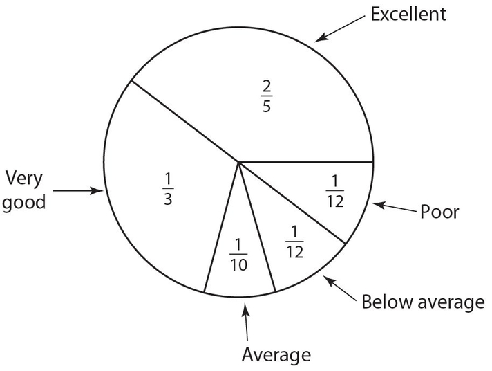
Solution:
The answers are 144° and 120°, respectively. Note that the fractions must add up to 1, which is equivalent to 100%. Each category represents a sector, which is a portion of a circle that is bounded by two radii and an included arc. The central angles of each sector are calculated by 2 multiplying the associated fraction by 360°. For instance, the fraction  corresponds to a central angle of
  . Likewise, a fraction of
  corresponds to a central angle of
  .
.
For Examples 23 and 24, assume that 1,080 residents responded to the survey mentioned in Example 22.
Example 23:
How many residents ranked the mayor as either “excellent” or “very good”?
Solution:
The answer is 792. The fraction of residents who ranked the mayor in either of those categories was 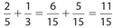 . Thus, the answer is
 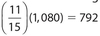 .
.
Example 24:
How many residents did not rank the mayor as “poor.”
Solution:
The answer is 990. The quickest way to solve this question is to determine the number of residents who did rank the mayor as “poor.” That number is  . Therefore, the required number is 1,080 − 90 = 990.
Line Graph
A second popular way to illustrate data is the line graph. This type of graph is most advantageous when we are showing a trend of a quantity over a period of time. A line graph typically is a plot of individual data points. For example, consider the following graph, which shows data for the number of projects for each of the first six months of the year.
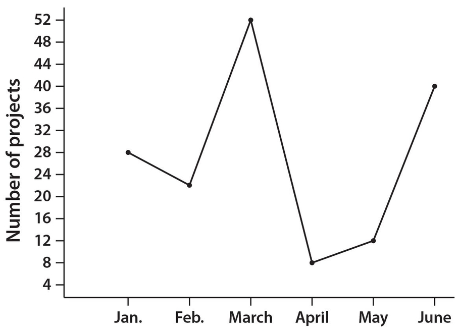
Note that the months are evenly spaced along the horizontal axis. The vertical scale represents a list of numbers that encompasses the number of projects. The lowest number of projects was 8 and the highest number was 52. Since many of the number of projects are divisible by 4, the scale was developed by using multiples of 4. In reality, other patterns of numbers on the vertical axis could have been used, such as multiples of 6.
Examples 25 and 26 refer to the line graph shown above.
Example 25:
The number of projects assigned in February was what percent lower than the number of projects assigned in June?
Solution:
The answer is 45. There were 40 − 22 = 18 fewer projects in February than in June. Thus, the percent decrease was  .
.
Example 26:
What was the average (mean) number of projects assigned for the six-month period January through June?
Solution:
The mean number of projects was  .
.
Bar Graph
A third way to display data is a bar graph. This special type graph simply shows a set of categories (usually non-numerical along the horizontal axis). Their associated frequencies are displayed on the vertical axis. The bars are shown as rectangles with the same width.
Example 27:
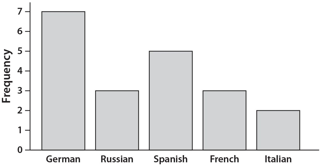
In Mrs. Triple’s math class, each of the 20 students is taking a foreign language. Each student is taking exactly one foreign language. Here is the bar graph showing how many students take each language. Note that the vertical scale has a maximum value of 7.
Example 28:
What percent of the students in Mrs. Triple’s class are studying either Spanish or French?
Solution:
There are 5 + 3 = 8 students who are studying one of these two languages. Thus, the answer is 
Histogram
A fourth way to graphically display data is a histogram, which bears some resemblance to a bar graph. Just as the case for a bar graph, a histogram is a series of connected bars that have the same width, but different heights, and the heights represent the frequency of the data for each bar. The difference is that the horizontal data are not non-numerical categories, but rather groupings of the data. So for a histogram, the data are first summarized into groups, called classes. The upper and lower limits on these groups, or class intervals, depend on how the data are distributed. The bars touch but they do not overlap. Example 29 shows how data are grouped for a histogram.
Example 29:
Members of the Weightless Gym Club were asked to record their initial weight when they first joined the club. The weights in pounds, and in ascending order for all 40 members are 97, 97, 113, 116, 117, 121, 125, 130, 132, 135, 136, 138, 139, 148, 149, 159, 161, 162, 163, 166, 166, 189, 191, 192, 192, 195, 196, 197, 198, 208, 212, 219, 222, 225, 233, 233, 236, 239, 250, and 254. Construct a histogram of the data and determine what percent of the Weightless Gym members weigh more than 194 pounds.
Solution:
Group the weights into the following seven classes with lower and upper limits: 95−119, 120−144, 145−169, 170−194, 195−219, 220−244, and 245−269. Notice that all these classes are of equal width. For example 119-95 = 24, which is the same as 144-120.
The next step is create “boundaries” for these seven classes so that the corresponding bars will touch. Do this by subtracting 0.5 units from each lower limit and adding 0.5 units to each upper limit. (While the rationale for this procedure is beyond the scope of the GRE, the exercise is bound to help you cope with the material on the test.) Then the seven classes appear as follows: 94.5−119.5, 119.5−144.5, 144.5−169.5, 169.5−194.5, 194.5−219.5, 219.5−244.5, and 244.5−269.5.
Now count the frequencies for each class, where the frequency is the number of data points in that class:
| Class | Frequency |
|---|---|
| 94.5−119.5 | 5 |
| 119.5−144.5 | 8 |
| 144.5−169.5 | 8 |
| 169.5−194.5 | 4 |
| 194.5−219.5 | 7 |
| 219.5−244.5 | 6 |
| 244.5−269.5 | 2 |
It is critical that each of the 40 weights be assigned to exactly one class and that the classes do not overlap. The completed histogram is shown below.
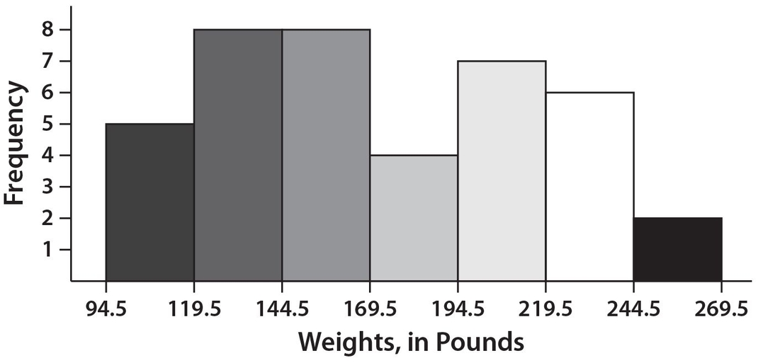
There are seven members in the weight class 194.5−219.5, six members in the weight class 219.5−244.5, and two members in the weight class 244.5−269.5. Thus, there are a total of 15 members whose weights exceed 194 pounds. Therefore, the answer is  .
.
You could have obtained this answer from the original given data, but the idea of this example is to show how a histogram is constructed. On the GRE, you will be given a histogram but not the raw data.
 Let’s try some exercises on the various types of graphs.
Use the following circle graph for Exercises 25 and 26. There are a total of 1,500 employees.
Growing Strong Hospital Employees
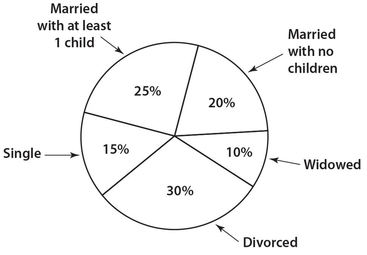
Exercise 25:
What is the combined number of employees who are either single or divorced?
Exercise 26:
If the hospital administration hires 250 additional widowed individuals, what will be the new percent for that category? Write your answer to the nearest whole number percent. Assume that there are no other changes.
Use the following line graph for Exercises 27 and 28. The graph represents the number of books sold by the Reading Aloud Book Company.
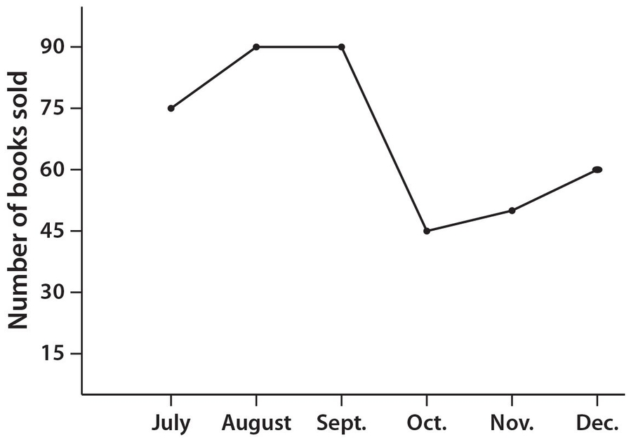
Exercise 27:
The number of books sold in December was what percent lower than the number of books sold in July?
Exercise 28:
The average (mean) price of a book sold in October was $20. If the total sales for the books sold in September was $612 more than the total sales for the books sold in October, what was the average price of a book sold in September?
Use the following bar graph for Exercises 29 and 30. The graph shows the number of old-style diners in a select group of six states that were still operating as of 2011.
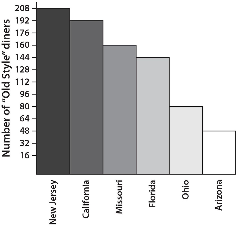
Exercise 29:
How many more diners were operating in California than in the combined states of Ohio and Arizona?
Exercise 30:
The average square footage for the diners in New Jersey is 3,600 square feet. If the total square footage for all the diners in Florida is 288,000 square feet less than the total square footage for all the diners in New Jersey, what is the average square footage for the diners in Florida?
Use the following histogram for Exercises 31 and 32. The graph refers to the number of minutes that each of 48 students in a specific math class devotes to homework each night.
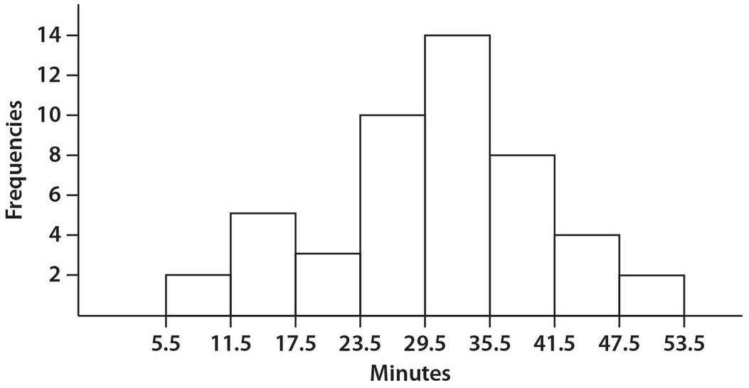
Exercise 31:
What is the combined number of students who studied fewer than 24 minutes or more than 47 minutes each night?
Exercise 32:
What percent of the students studied more than 29 minutes per night? Write your answer to the nearest one-tenth of one percent.
The arithmetic on the actual GRE could be less or more, nicer or messier, than the following exercises. It depends on the test form you actually take.
Use the following graphs for Exercises 33-37. Some of the major expenses of the apartment of Mr. and Mrs. Smith in Smallville, USA, are shown in this pie chart and bar graph. The pie chart is for year M with a $1,200 budget, and the bar graph is for year N, some years later, with an $1,800 budget.
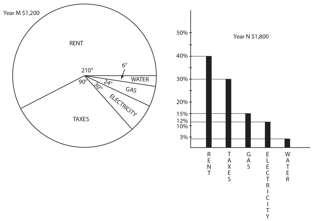

Exercises 33-37 are easier to answer if we exactly calculate all of the money answers and put the items next to each other in a table:
| Year M | Year N | |
|---|---|---|
| Rent (sample calculations) | 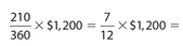 |
.40 × $1,800 = |
| Rent | $700 | $720 |
| Taxes | $300 | $540 |
| Electricity | $100 | $216 |
| Gas | $80 | $270 |
| Water | $20 | $54 |
Exercise 33:
The smallest percentage increase from year M to year N is for
- Rent
- Taxes
- Electricity
- Gas
- Water
Exercise 34:
The largest percentage increase from year M to year N is for
- Rent
- Taxes
- Electricity
- Gas
- Water
Exercise 35:
The change in rent from year M to year N was
- −$80
- none
- +$20
- +$100
- +$190
Exercise 36:
The two closest monetary amounts are
- Rent in year M and the Rent in year N
- Electricity in year M and Gas in year N
- Water in year M and Water in year N
- Taxes in year M and Gas in year N
- Electricity in year M and Electricity in year N
Exercise 37:
Which expenses exceeded the percentage increase in the total budget?
- All the expenses
- All except Rent
- All except Water
- All except Water and Rent
- All except Rent and Taxes
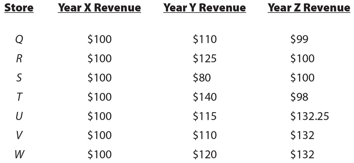
For Exercises 38-47, use the following information concerning the percentage change of gross revenue from year X to year Y, and from year Y to year Z for stores identified as Q, R, S, T, U, V, and W.
| Store | % Change from X to Y | % Change from Y to Z |
|---|---|---|
| Q | +10 | –10 |
| R | +25 | –20 |
| S | –20 | +25 |
| T | +40 | –30 |
| U | +15 | +15 |
| V | +10 | +20 |
| W | +20 | +10 |
Exercise 38:
Which stores had a loss from year X to year Z? Indicate all correct choices.
- Q
- R
- S
- T
- U
- V
- W
Exercise 39:
Which stores showed no gain or loss from year X to year Z? Indicate all correct choices.
- Q
- R
- S
- T
- U
- V
- W
Exercise 40:
Besides stores R and S, which two of the following stores had exactly the same dollar change from year X to year Z? Indicate exactly two choices.
- Q
- T
- U
- V
- W
Exercise 41:
Which stores experienced both a percentage gain from year X to year Y and a percentage loss from year Y to year Z. Indicate all correct choices.
- Q
- R
- S
- T
- U
- V
- W
Exercise 42:
What is the highest percentage gain of any of these seven stores from year X to year Z?
Exercise 43:
For store T, the gross revenue in year Y was $840,234. To the nearest thousand dollars, what was the gross revenue for store T in the year X?
Exercise 44:
Store R had gross revenue of $949,357 in year Z. To the nearest dollar, what was this store’s gross revenue in year Y?
Exercise 45:
Store W had gross revenue of $821,698 in year X, which was 15% greater than the gross revenue of store V in year X. What was the gross revenue of store V in year Y?
Exercise 46:
Store S had gross revenue of $554,722 for year Z, which was 30% less than the gross revenue of store U in year Z. To the nearest dollar, what was the gross revenue of store U in year Y?
Exercise 47:
Each of stores Q and W had gross revenues of $821,698 in year X. In year Z, store W′s gross revenue was what percent higher than store Q’s gross revenue? Round your answer to the nearest whole number percent.
 Let’s look at the answers.
Answer 25:
The correct answer is 675. There are a total of 15% + 30% = 45% of the employees who are single or divorced. Thus, the actual number of employees in either of these categories is (1,500)(0.45) = 675.
Answer 26:
The correct answer is 23. Currently, there are (1,500)(0.10) = 150 widowed employees. With the addition of 250 widowed individuals, there will be a total of 400 widowed employees and a new grand total of 1,500 + 250 = 1,750 employees. Thus,  .
.
Answer 27:
The correct answer is 20. There were 75 − 60 = 15 fewer books sold in December than in July. Then 
Answer 28:
The correct answer is 16.80. The total book sales for October was (45) ($20) = $900. Then the total book sales for September was $900 + $612 = $1,512. Thus, the average price of a book sold in September was  .
.
Answer 29:
The correct answer is 64. The combined number of diners in Ohio and Arizona was 80 + 48 = 128. Thus, there were 192 − 128 = 64 more diners in California than there were in Ohio and Arizona combined.
Answer 30:
The correct answer is 3,200. The total square footage for all New Jersey diners is (208)(3,600) = 748,800 square feet. Then the square footage for all Florida diners is 748,800 − 288,000 = 460,800 square feet. Therefore, the average square footage is  .
.
Answer 31:
The correct answer is 12. There were 2 + 5 + 3 = 10 students who studied fewer than 24 minutes per night. In addition, there were 2 students who studied more than 47 minutes per night.
Answer 32:
The correct answer is 58.3. There were 14 + 8 + 4 + 2 = 28 students who studied more than 29 minutes per night. Then  .
.
Answer 33:
The answer is (A). Rent increased by only $20 (due perhaps to rent control or family member owner); the percentage increase is the smallest increase  . You don’t actually have to calculate the 700 exact percentage. You only have to note the percentage increase is obviously much smaller than the percentage increase of any other item.
Answer 34:
The answer is (D). The percentage increase for gas is  , or more than a 200% increase.
Answer 35:
The answer is (C). $720 − $700 = $20.
Answer 36:
The answer is (A). The rents in year M and year N are only $20 apart. No other choices are this close.
Answer 37:
The answer is (B). The total increase from year M to year N is 50%; taxes almost doubled; electricity more than doubled; gas more than tripled, and water almost tripled.
For the answers to Exercises 38-40, the easiest way to do problems of this nature is to use dollar amounts. Assume that each store had a gross revenue of $100 in Year X. For store Q, its gross revenue in Year Y would be ($100)(1.10) = $110. Its gross revenue in Year Z would be ($110)(0.90) = $99. Note that a 10% increase is equivalent to multiplying by 1.10 and a 10% loss is equivalent to multiplying by 0.90 (1.00 − 0.10 = 0.90). Here is how the chart would now appear with revenue in place of percents:
Answer 38:
The correct answers are (A) and (D). From the table above, store Q had a loss of $1 and store T had a loss of $2 from year X to year Z.
Answer 39:
The correct answers are (B) and (C). Each of stores R and S had a gross revenue of $100 in year X and year Z.
Answer 40:
The correct answers are (D) and (E). Each of stores V and W gained $32 from year X to year Z.
Answer 41:
The correct answers are (A), (B), and (D). Each of stores Q, R, and T showed a percentage gain from year X to year Y and a percentage loss from year Y to year Z.
Answer 42:
The correct answer is 32.25. Using the base amount of $100 for year X, Store U increased to $132.25 in year Z, for a 132.25 − 100 = 32.25% increase. (Do not put the percent sign in the box.) Note that this percent increase would not change even if we knew the exact gross revenues for the stores.
Answer 43:
The correct answer is 600,000. Since store T had a 40% increase from year X to year Y, the gross revenue in year Y was 140% (or equivalently 1.40) of the gross revenue in year X. Thus, the gross revenue in year X equals 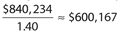 . To the nearest thousand, this figure becomes $600,000. (Do not put the dollar sign in the box.)
Answer 44:
The correct answer is 1,186,696. Since store R had a 20% decrease from year Y to year Z, the gross revenue in year Z was 80% ( or equivalently 0.80) of the gross revenue for year Y. Thus, the gross revenue in year Y equals 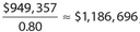 , rounded to the nearest dollar. (Do not put the dollar sign in the box.)
Answer 45:
The correct answer is 785,972. The gross revenue of store W in year X was 115% of the gross revenue of store V in that year. So, the gross revenue of store V in year X was 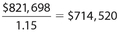 . Thus, the gross revenue of store V in year Y was ($714,520)(1.10) = $785,972. (Do not put the dollar sign in the box.)
Answer 46:
The correct answer is 689,096. The gross revenue of store S in year Z was 70% (100% − 30%) of the gross revenue of store U in year Z. So the gross revenue of store U in year Z was 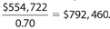 . Thus, the gross revenue of store U in year Y was
 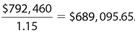 . To the nearest dollar, this figure becomes $689,096. (Do not put the dollar sign in the box.)
Answer 47:
The correct answer is 33.The gross revenue of store Q in year Y was ($821,698)(1.10) ≈ $903,868, and its gross revenue in year Z was ($903,868)(0.90) ≈ $813,481. The gross revenue of store W in year Y was ($821,698)(1.20) ≈ $986,038, and its gross revenue in year Z was ($986,038)(1.10) ≈ $1,084,642. Then the difference of the gross revenues of these two stores in year Z was approximately $1,084,642 − $813,481 = $271,161. Thus, store W′s gross revenue was  higher than that of store Q. (Do not put the percent sign in the box.)
PERCENTILES
Percentiles are assigned to each data in a group in order to indicate their relative position to the other data. It is understood that the data must be arranged in ascending order, and that all occurrences of an individual value are represented. In general, if a score of p is assigned the nth percentile, it means that approximately n% of all scores were equal to or lower than p. For example, if your score on a test was assigned to the 97th percentile, then approximately 97% of all students who took this test had the same score or a lower score than you achieved. If your score was assigned to the 50th percentile, then approximately half of all students who took this test had a score equal to or lower than your score.
It is extremely important to realize that the same score on different tests could easily have a different percentile. Suppose there are two classes of 100 students each. If Jimmy got a score of 90 in the first class and only three students scored higher than him, his score would be the 97th percentile. If Nancy got a score of 90 in the second class and 50 students scored higher than her, her score would only be the 50th percentile.
Quartiles
Certain percentiles are much more commonly used than others. One such measure is that of quartiles. The first quartile, denoted as Q1, represents the 25th percentile. It is equivalent to the median of the lower half of the data. Approximately 25% of all the data are either equal to or lower than Q1 It is also called the lower quartile.
The second quartile, denoted as Q2, represents the 50th percentile. It is equivalent to the median of the group of data. Approximately 50% of all the data are either equal to or lower than Q2.
The third quartile, denoted as Q3, represents the 75th percentile. It is equivalent to the median of the upper half of the data. Approximately 75% of all the data are either equal to or lower than Q3. It is also called the upper quartile.
The interquartile range, commonly abbreviated as IQR, is equal to Q3 − Q1. Some rules exist for the location of these quartiles. Let n represent the number of data in a group. If n is an odd number, the location of Q1 is given by  , the location of Q2 is given by
  , and the location for Q3 is given by
  or equivalently
  .
.
Example 30:
A group consists of 17 data points. What are the locations of the first, second, and third quartiles?
Solution:
The location of Q1 is  , so its value is the mean of the 4th and 5th data points. The location of Q2 is
  , so its value is the 9th data point. The location of Q2 is
  , so its value is the mean of the 13th and 14th data points.
Example 31:
Consider the following group of data: 4, 7, 8, 10, 13, 14, 20, 21, 25, 25, 29. What are the values of the three quartiles?
Solution:
There are a total of 11 data points. Don’t forget to count each of the 25s. The location of Q1 is  , so its value is the third number, which is 8. The location of Q2 is
  ,so its value is the sixth number, which is 14. The location of Q3 is
  , so its value is the ninth number, which is 25. In summary, Q1 = 8, Q2 = 14, and Q3 = 25.
The expressions for the locations of Q1 and Q3 change if the number of data, n, is even.
The location of Q2 remains as  . For Q1, its location is given by
  . For Q3, its location is given by
  .
.
Example 32:
A group consists of 26 data points. What are the locations of the first, second, and third quartiles?
Solution:
The location of Q1 is  , so its value is the 7th data point. The location of Q2 is
  , so its value is the mean of the 13th and 14th data points. The location of Q3 is
  , so its value is the 20th data point.
Example 33:
Consider the following group of data: 5, 8, 13, 15, 15, 19, 24, 30, 36, 40, 42, 42. What are the values of the three quartiles and what is the value of the interquartile range?
Solution:
There are a total of 12 data points. Don’t forget to count the duplicates. The location of Q1 is  , so its value is the mean of the 3rd and 4th data points, which is 14. The location of Q2 is
  , so its value is the mean of the 6th and 7th data points, which is 21.5. The location of Q3 is
  , so its value is the mean of the 9th and 10th data points, which is 38. In summary, Q1 = 14, Q2 = 21.5. and Q3 = 38. Also, the interquartile range (IQR) is 38 − 14 = 24.
Sometimes a quartile can refer to a group of data, not just the location of one particular data. Consider Example 33. We found that Q1 = 14. A GRE test question might refer to the data in the first quartile. In this context, your answer would be the numbers 5, 8, and 13. Each of these numbers has a value less than or equal to Q1.
Likewise, the data that are found in the second quartile would be 15 and 19, since each of these numbers has a value greater than Q1 but less than or equal to Q2. (Repetition of 15 would not be necessary if we are just naming the data within a quartile.)
Continuing in this fashion, the data that are found in the third quartile would be 24, 30, and 36. Each of these numbers has a value greater than Q2 but less than or equal to Q3.
The numbers 40 and 42 are considered to be in the fourth quartile because their values are greater than Q3. Note that there is no assigned number for Q4, even though data will exist in the fourth quartile.
Here is a trick in remembering the locations of the first and third quartiles for any group of data. The sum of the locations of Q1 and Q3 is always 1 more than the number of data points.
Referring to Example 33, the locations of Q1 and Q3 is 3.5 and 9.5, respectively. Notice that 3.5 + 9.5 = 13, which is one more than the number of data points (12).
Boxplots
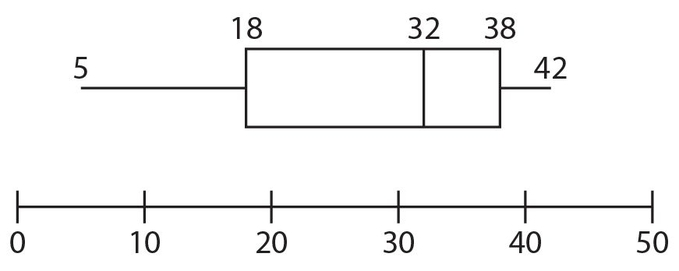
A useful graphical way to summarize key elements of a group of data is a boxplot, also known as a box-and-whisker plot. In particular, a boxplot shows the following values of a group of data, namely, (a) the lowest value, (b) the first quartile, (c) the median, (d) the third quartile, and (e) the highest value. Let’s look at a completed boxplot, as shown below.
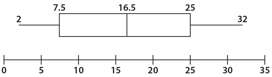
Note that there is a horizontal scale with numbers evenly spaced. The numbers on this scale are chosen such that the lowest and highest numbers in the given group of data are included. A horizontal segment is shown to the left of the box. This segment connects the lowest value of the group of data (2) with the first quartile (7.5).The box is actually split vertically so that the first vertical segment identifies the first quartile (7.5), the second vertical segment identifies the median (16.5), and the third vertical segment identifies the third quartile (25).The horizontal segment to the right of the box connects the third quartile with the highest value (32). The IQR = Q3 − Q1 = 25 − 7.5 = 17.5. Notice that the scale extends beyond both the lowest and the highest values of the given data. Also, notice that the mean of this data group is not shown.
In the previous boxplot, the box appears to be evenly split by the median. It looks as if the median lies midway between the lower quartile (Q1) and the upper quartile (Q3). However, this appearance of symmetry is not required. Consider, as an example, the following boxplot.
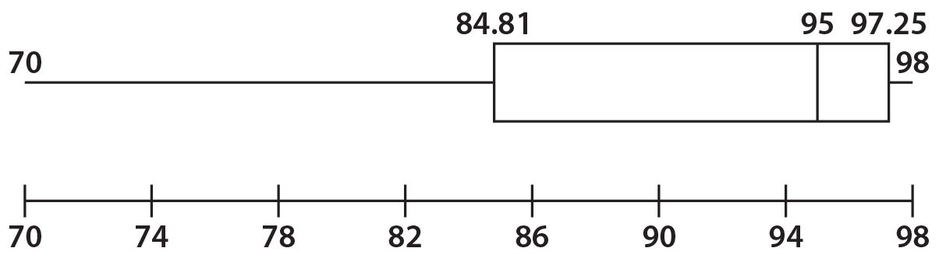
Here the horizontal scale begins and ends with the lowest and highest values, respectively, of the group of data. For this group of data, we observe that the lowest value is 70, Q1 = 84.81, Q2 = 95, Q3 = 97.25, and the highest value is 98.The IQR = 97.25 − 84.81 = 12.44.
Since the left “whisker” (which extends from the lowest value to Q1) is longer than the right “whisker” (which extends from Q3 to the highest value), we can deduce that there would be a greater concentration of higher values than lower values. Remember that each quartile contains the same number of values. For example, in this boxplot, there are as many values between 95 and 97.25 as there are between 70 and 84.81.
The following boxplot has a longer “whisker” to the right of the box.
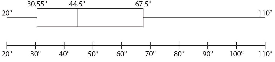
As with the previous boxplot, the horizontal scale here begins with the lowest value and ends with the highest value of the distribution of data. The lowest value is 20°, Q1 = 30.55°, Q2 = 44.5°, Q3 = 67.5°, and the highest value is 110°.The IQR = 67.5° − 30.55° = 36.95°. Since the left “whisker” is shorter than the right “whisker,” there is a greater concentration of smaller values than of larger values. Notice that there are as many values between 20° and 30.55° as there are between 67.5° and 110°.
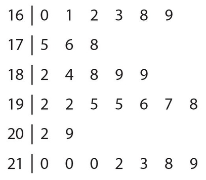
Stem-and-Leaf Plot
A useful way to tabulate data is a method called stem-and-leaf plot. This method is best used when (a) the range of data is relatively small, (b) there are some repetitions of data values, and (c) each data value has the same number of digits. The data must first be arranged in ascending order (including all repeating values). The stem consists of all digits, except the units digit. The leaf consists of only the units digit. So if each of the data points is between 100 and 999, the stems would consist of the hundreds digit and the tens digit. But if each of the data lies between 10 and 99, the stem would consist of only the tens digit. The data are arranged in ascending order in a vertical manner, with the lowest number appearing at the top.
Example 34:
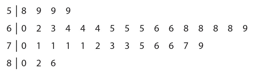
The 36 employees at the XYZ watch company listed their heights, to the nearest inch. Here are the results, listed in ascending order: 58, 59, 59, 59, 60, 62, 63, 64, 64, 64, 65, 65, 65, 66, 66, 68, 68, 68, 68, 69, 70, 71, 71, 71, 71, 72, 73, 73, 75, 76, 76, 77, 79, 80, 82, 86. Create a stem-and-leaf plot.
Solution:
The stems will be 5, 6, 7, and 8 (the tens digits). They will be placed in a vertical quantity. For each stem, the leaves will be placed in ascending order, from left to right. The actual plot is shown below.
Example 35:
Referring to the stem-and-leaf plot of Example 34, what is the interquartile range?
Solution:
For 36 data, the location of Q1 is 9.5 and the location for Q3 is 27.5. Since the 9th and 10th numbers are 64, Q1 = 64. Since the 27th and 28th numbers are both 73, Q3 = 73.Thus, the interquartile range is 9.
 Let’s try a few exercises on quartiles, boxplots, and stem-and-leaf plots.
For Exercises 48−51, use the following group of data: 76, 77, 82, 82, 85, 92, 95, 96, 98.
Exercise 48:
What position number is the location of Q3?
- 2.5th
- 4th
- 5th
- 6.5th
- 7.5th
Exercise 49:
What is the interquartile range?
Exercise 50:
Which of the following numbers are in the second quartile? Indicate all correct answers.
- 77
- 82
- 85
- 92
- 95
- 96
Exercise 51:
Which of the following numbers are in the fourth quartile? Indicate all correct answers.
- 82
- 85
- 92
- 95
- 96
- 98
For Exercises 52-54, refer to the following boxplot.
Exercise 52:
What is the interquartile range?
Exercise 53:
What is the sum of the lowest value and the median?
Exercise 54:
Suppose that there are 25 data in the first quartile. Which of the following represent a range of numbers for which there would be 25 data? Indicate all correct answers.
- Greater than 18 but less than or equal to 32
- Greater than 18 but less than or equal to 38
- Greater than 5 but less than or equal to 42
- Greater than 32 but less than or equal to 38
- Greater than 32 but less than or equal to 42
- Greater than 38 but less than or equal to 42
Exercise 55:
Consider the following stem-and-leaf plot
Which of the following numbers are found in the second quartile? Indicate all correct answers.
- 176
- 178
- 184
- 189
- 192
- 196
- 202
 Let’s look at the answers.
Answer 48:
The correct answer is (E). For an odd number of data, the location of 
Answer 49:
The correct answer is 16. The location of Q1 is  , so
, so  Also, the location of Q3 is 7.5, so
  . Therefore, the IQR = 95.5 − 79.5 = 16.
Answer 50:
The correct answers are (B) and (C). Q1 = 79.5 and Q2 = 85. Each of 82 and 85 are greater than 79.5 and less than or equal to 85.
Answer 51:
The correct answers are (E) and (F). The fourth quartile consists of numbers that are greater than Q3. Since Q3 = 95.5, only 96 and 98 are greater than Q3.
Answer 52:
The correct answer is 20. The interquartile range equals Q3 − Q1 = 38 − 18 = 20.
Answer 53:
The correct answer is 37. The lowest value is 5 and the median is the middle vertical bar, which is 32.
Answer 54:
The correct answers are (A), (D), and (F). Each quartile must have 25 data points. The first quartile is represented by 5 through 18, the second quartile is represented by 18 through 32, the third quartile is represented by 32 through 38, and the fourth quartile is represented by 38 through 42.
Answer 55:
The correct answers are (B), (C), (D), and (E). We determine that the location of Q1 is the  8th number and the location of Q2 is the
  15.5th number. The 8th number is 176 and the average (mean) of the 15th and 16th numbers is 192.Therefore, each number in the second quartile must be greater than 176 and less than or equal to 192. The numbers 178, 184, 189, and 192 satisfy this requirement.
Scatterplots
A scatterplot is a method of displaying the relationship between two numerical quantities on the xy-coordinate plane. It is simply a plot of all the data points, with one variable on the horizontal axis and the other on the vertical axis. The points are not connected so they look like scattered points, thus the name scatterplot; however, if there is a relationship between the variables, it usually shows up as a trend on the scatterplot. Exercise 36 shows such a trend.
Example 36:
In a small class of nine students, the teacher was interested in comparing the number of absences during the school year with each student’s final numerical grade. Here are the results in tabular form:

Draw a scatterplot of these results.
Solution:
The positive x-axis will be labeled “Number of Absences” and the positive y-axis will be labeled “Final Grade.” The scatterplot is shown below.
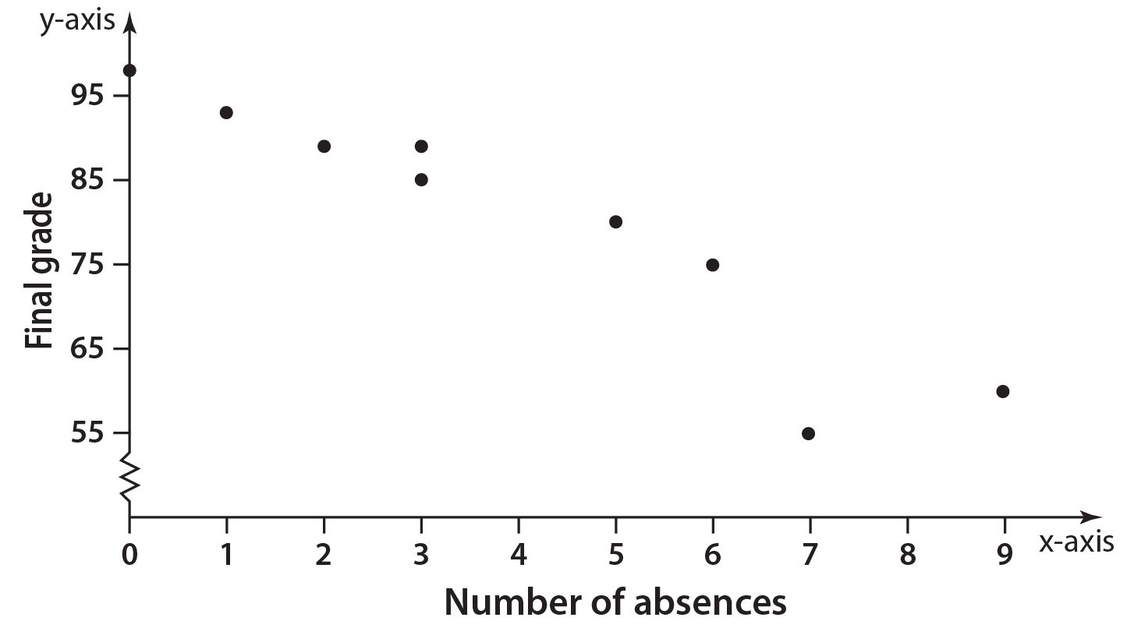
Note that since the grades range from 55 to 98, a squiggle line is shown between 0 and 55 on the vertical axis. This indicates that there are no values between 0 and 55. Looking at the trend of the data points, the teacher could conclude that absences negatively affect a student’s final grade.
Line of Best Fit
In some cases, the data points appear to lie in a straight line. The GRE will present examples for which a line of best fit will be given for a set of data points. This is the line for which the distances between the data points and the line are minimized. The GRE will not require the derivation of the equation for this line. Be aware that although some of the data points may lie on this line, it is not a requirement. Often, the line of best fit contains very few, if any, of the data points.
For Examples 37-41, use the following information.
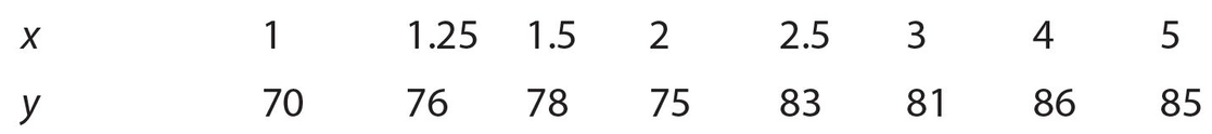
Suppose that a college instructor asked eight of his students to indicate how many hours they studied for the exams he gave each week. The instructor then calculated each of these eight students’ average exam grades. Here are the results, with x representing the number of hours of study and y representing the average exam grade.
The instructor then calculated the equation of the line of best fit to be y = 2.95x + 70.79. Below are the scatterplot and the line of best fit.
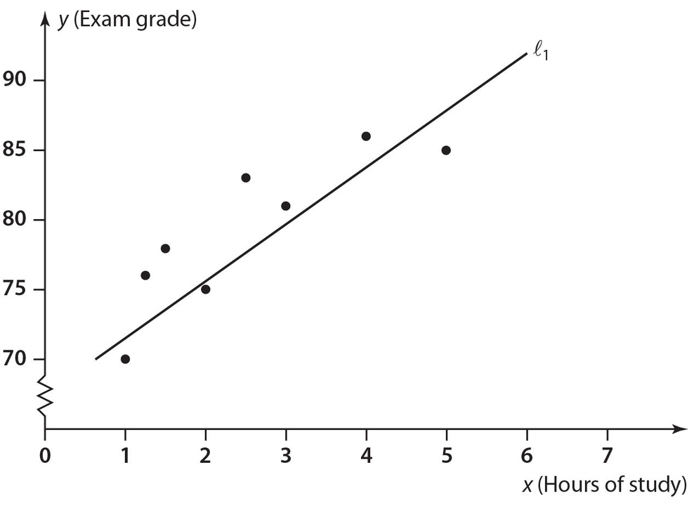
Example 37:
What percentage of these eight students had an average exam grade below the line of best fit?
Solution:
The answer is 37.5. The data points (1, 70), (2, 75), and (5, 85) lie below the line of best fit. This represents  of the points, so the answer is 37.5%. 8
Example 38:
For the data point that lies farthest from the line of best fit, by what amount does the actual score differ from the projected score? (Note that the projected score is the value of y that is computed from the line of best fit equation.)
Solution:
The answer is 4.835. The point (2.5, 83) lies farthest from the line of best fit. This can be observed by noting the vertical distance at x = 2.5 from the point to the line. The line of best fit represents the projected score of (2.95)(2.5) + 70.79 = 78.165. Thus, the answer is 83 − 78.165 = 4.835.
Example 39:
Suppose this line of best fit applies to all 40 students in the class. What would be the projected exam score, rounded off to the nearest hundredth, of a student who studied for 3.5 hours?
Solution:
The answer is 81.12. By substitution, y = (2.95)(3.5) + 70.79 = 81.115 ≈ 81.12.
Example 40:
A projected exam score of 79 would correspond to how many hours of studying? (Round off your answer to the nearest tenth.)
Solution:
The answer is 2.8. By substitution, 79 = 2.95x + 70.79. Then subtract 70.79 from each side to get 8.21 = 2.95x.Thus, 
Example 41:
In another class similar to the one in Examples 37-40, the line of best fit was y = 2.65x + 72. Which common exam score for these two classes would yield the same projected score? Round off your answer to the nearest hundredth.
Solution:
The answer is 82.68. We start with 2.95x + 70.79 = 2.65x + 72. Subtracting 2.65x from each side, we get 0.3x + 70.79 = 72. Now 1.21 subtract 70.79 from each side to get 0.3x = 1.21. Then, 
Therefore, the common exam score is (2.65)(4.03) + 72 = 82.6795 ≈ 82.68.
(Note that we could have also substituted 4.03 for x in the equation y = 2.95x + 70.79.)
 Let’s try a few exercises on scatterplots and lines of best fit.
For Exercises 56-60, use the following information.
A 64-ounce block of substance Y is undergoing a procedure to melt it. The independent variable (x) represents number of minutes and the dependent variable (y) represents the number of ounces the block contains. Its corresponding line of best fit is y = −0.7x + 63.3.
A second substance Z is also undergoing a procedure to melt it. The corresponding line of best fit is y = − 0.5x + 48. No data points are given for substance Z. Here is the graph of the line of best fit for substance Y with the following data points: (5, 60), (10, 56.5), (15, 51 ), (20, 48.5), (25, 44.5), and (30, 42).
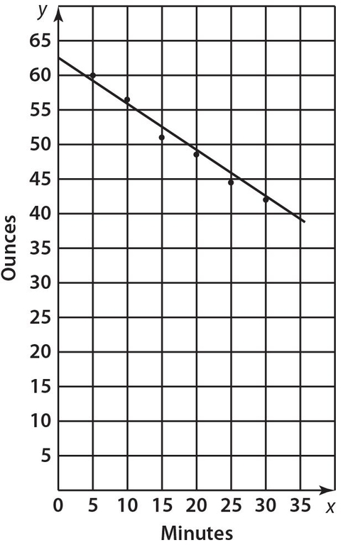
Exercise 56:
For which data points does the projected weight (given by the equation of the line of best fit) for substance Y differ from the actual weight by less than one ounce? Indicate all correct answers.
- (5, 60)
- (10, 56.5)
- (15,51)
- (20, 48.5)
- (25, 44.5)
- (30,42)
Exercise 57:
For how many data points does the difference between the actual weight and the projected weight exceed 1.5 ounces for substance Y?
Exercise 58:
In how many minutes will the two substances weigh the same?
Exercise 59:
What will be the weight, in ounces, of each when the two substances are of equal weight?
Exercise 60:
How many more minutes, to the nearest tenth of a minute, will it take for substance Z to melt completely than for substance Y to melt completely?
 Let’s look at the answers.
Answer 56:
The correct answers are (A), (B), (D), and (F). By substituting each of the x values into the equation y = −0.7x + 63.3 (line of best fit), we get the corresponding y values on the actual line. The corresponding values for x = 5, 10, 15, 20, 25, and 30, are y =59.8, 56.3, 52.8, 49.3, 45.8, and 42.3. We then inspect the y values of the given data points and the projected y values based on the line of best fit. In choice (A), the difference is 0.2. In choice (B), the difference is 0.2. In choice (C), the difference is 1.8. In choice (D), the difference is 0.8. In choice (E), the difference is 1.3. In choice (F), the difference is 0.3.
Answer 57:
The correct answer is 1. We just need to look at the computations in the solution to Exercise 56. In choice (C), the difference between the actual and projected weights is 1.8, which exceeds 1.5. This weight difference does not exceed 1.5 for any of the other choices.
Answer 58:
The correct answer is 76.5. We need to solve the equation −0.7x + 63.3 = −0.5x + 48. Adding 0.5x to each side, we get −0.2x + 63.3 = 48. Next, subtract 63.3 from each side. This leads to −0.2x = −15.3.Thus, 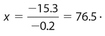
Answer 59:
The correct answer is 9.75. From answer 58, we need only substitute 76.5 into either equation y = −0.7x + 63.3 or y = −0.5x + 48. Choosing the first equation, we get y = (− 0.7)(76.5) + 63.3 = 9.75.
Answer 60:
The correct answer is 5.6. In order to determine the number of minutes for substance Y to melt, we solve the equation 0 = −0.7x + 63.3. Subtract 63.3 from each side to get −63.3 = −0.7x.Then 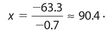 In order to determine the number of minutes for substance Z to melt, we solve the equation 0 = −0.5x + 48. Subtracting 48 from each side yields −48 = −0.5x, so
  .Thus, the required number of minutes is 96 − 90.4 = 5.6.
NORMAL CURVE
Earlier in this chapter, we studied a type of graphical display of data called a histogram. For this type of graph, each bar represented a specific (numerical) class of data for which there was a corresponding frequency. None of the classes contained overlapping data on the x-axis.
There are instances where the histogram resembles a bell-shaped curve, as shown below.
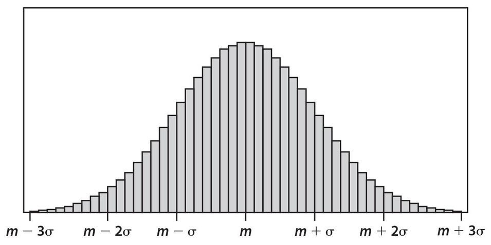
For this curve, m represents the mean of the data and σ represents the standard deviation, which is a measure of the spread of the data about the mean.
 On the GRE exam, sometimes the letter d is used for standard deviation.
Examples of data that would resemble this bell-shaped distribution include (a) heights of all adult women, (b) weights of all adult men, (c) highest daily temperatures in a given city over a period of years, and (d) amount of ounces of coffee dispensed in a cup by a vending machine.
This type of distribution is called a normal curve. The two main properties of a normal curve are: (a) the mean, median, and mode are nearly identical; and (b) the data are grouped very symmetrically about the mean. It has been determined that approximately 68% of the data lies within one standard deviation of the mean; approximately 96% of the data lies within two standard deviations of the mean; and nearly all the data lies within three standard deviations of the mean.
It should be noted that theoretically this graph never intersects the x-axis. In reality, no group of data can actually represent a true normal distribution. However, the normal curve can be used as a very accurate approximation for many groups of data. Often, the amount of data is so large that we use a continuous curve to replace the series of rectangular bars, as shown below.
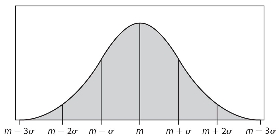
The values of the mean and the standard deviation of a normal distribution will affect its location and “width.” In the figure below, the means (µ1 and µ2) are identical but the standard deviation of curve 1 (σ1) is larger than that of curve 2 (σ2).
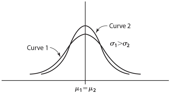
In some instances, the means are different but the standard deviations are identical, as shown below.
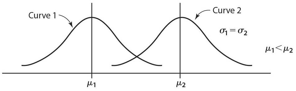
Of course, we recognize that it is possible for neither the means nor the standard deviations to be identical for two normal distributions. This is illustrated below.
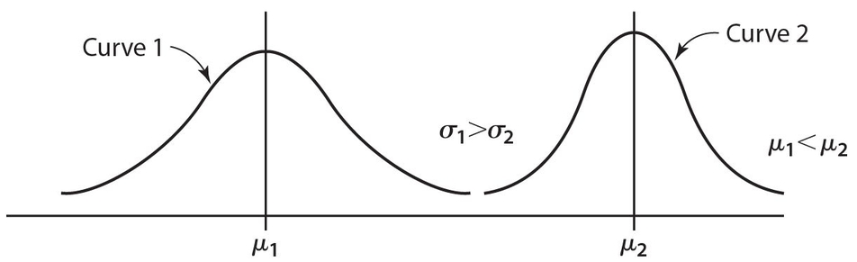
In order to apply the properties of a normal distribution to practical applications, the standard normal distribution is used. For a standard normal distribution, the mean equals zero and the standard deviation equals 1. Conversion to a standard normal distribution can be performed on any normal distribution by using the formula  where z is called a standard score (also called a z-score). The variable x is called the raw score. A raw score is a value found in the original distribution (one of the data points). The standard score is a measure of how many standard deviations that score is from the mean.
Example 42:
A normal distribution has a mean of 20 and a standard deviation of 4. Change the x scores of 16 and 30 to z-scores.
Solution:
The x-value 16 has a z-score of  , and the x value 30 has a z-score of
  So 16 is one standard deviation below the mean, and 30 is 2.5 standard deviations above the mean.
Example 43:
A normal distribution has a mean of 100 and a standard deviation of 15. A standard score of −1.4 corresponds to what raw score?
Solution:
The answer is 79. By substitution,  . Multiply both sides by 15 to get −21 = x − 100. Thus, x = 100 − 21 = 79.
Example 44:
In a particular normal distribution, a raw score of 60 corresponds to a standard score of 0. What is the mean raw score?
Solution:
The answer is 60. By substitution, we have  . Notice that we do not know the value of the standard deviation of the given data (σ), but it will not be needed. Assuming that σ ≠ 0 (which can occur only if all the data are the same), multiply both sides of the equation by σ. Then (0)(σ) = 0 = 60 − µ, so µ = 60.
For Examples 39-42, use the following graph of a normal distribution. This graph represents the heights of 5,000 adult women. Assume that their mean height is 65 inches, with a standard deviation of 2.4 inches.
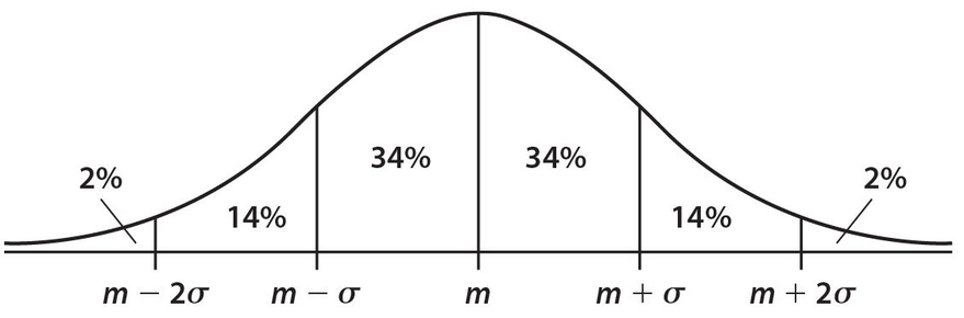
Example 45:
How many women are taller than 67.4 inches?
Solution:
The answer is 800 Change 67.4 into its standard score, which is  . The percentage of data that are greater than 1 standard deviation from the mean (m + σ) is 14% + 2% = 16%. Thus, the answer is (0.16)(5,000) = 800.
Example 46:
How many women are shorter than 69.8 inches?
Solution:
The answer is 4,900. Change 69.8 into its z-score, which is  Instead of adding the percentages that lie to the left of 2 standard deviations (m + 2σ), we note that only 2% lies to its right. Therefore, we know that 100% − 2% = 98% of the data lies to the left of a z-score of 2. Thus, the required number of women is (0.98)(5,000) = 4,900.
Example 47:
How many women are between 62.6 inches and 67.4 inches tall?
Solution:
The answer is 3,400. We have already changed 67.4 to its z-score of 1. Change 62.6 into its z-score, which is  . The percentage of data that lies between z-scores of − 1 and 1 is 34% + 34% = 68%.Thus, the answer is (0.68)(5,000) = 3,400.
Example 48:
What is the probability that the height of a randomly chosen woman is less than 62.6 inches?
Solution:
The answer is 0.16. The concept of probability is parallel to that of percent. We only need to find the percentage of the data that is less than the z-score for 62.6. In Example 47, we identified the z-score of 62.6 to be − 1.The corresponding probability matches the percentage of data that lies to the left of − 1, which is 2% + 14% = 16%. Since probability is usually presented as a decimal (or fraction), our answer can be expressed as 0.16.
In full-year statistics courses, we can determine probabilities and percents that correspond to z-scores that are not integers. However, these calculations are beyond the scope of the GRE.
 Let’s try some exercises on the normal distribution.
For Exercises 61-64, use the following information.
In a town of 45,000 adults, the number of times they eat at a fast-food restaurant per year represents a normal distribution with a mean of 29 and a standard deviation of 8.
Below is the graph of normal distribution and specific percents.
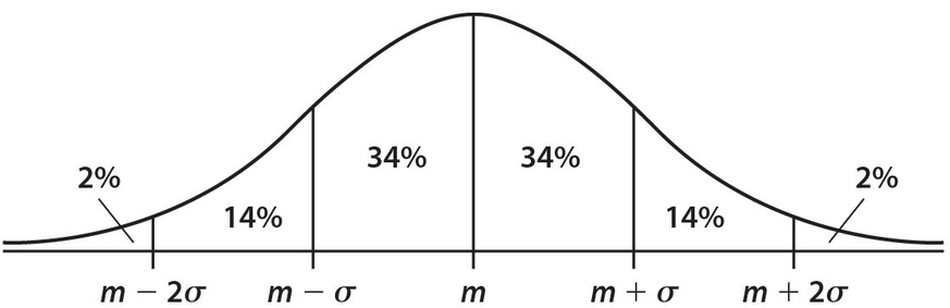
Exercise 61:
How many adults in this town eat between 37 and 45 times per year at a fast-food restaurant?
Exercise 62:
How many adults in this town eat more than 29 times per year at a fast-food restaurant?
Exercise 63:
What is the probability that a randomly chosen adult in this town eats at a fast-food restaurant fewer than 13 times per year?
- 0.13
- 0.09
- 0.07
- 0.04
- 0.02
Exercise 64:
What is the probability that a randomly chosen adult in this town eats at a fast-food restaurant between 13 times per year and 37 times per year?
- 0.98
- 0.88
- 0.82
- 0.72
- 0.68
Exercise 65:
Which of the following are true regarding any normal distribution? Indicate all correct answers.
- The mean equals the median.
- The mode does not exist.
- The standard deviation is 1.
- Approximately 68% of all the data lies within one standard deviation of the mean.
- The graph does not intersect the x-axis.
- Approximately 34% of the data lies below the mean.
Exercise 66:
A normal distribution has a mean of 150 and a standard deviation of 6. What is the standard score that corresponds to a raw score of 139.2?
Exercise 67:
A normal distribution has a mean of 84 and a standard deviation of 8. What is the raw score that corresponds to a standard score of 2.2?
Exercise 68:
A certain normal distribution has a standard deviation of 5. An x-score of 30 corresponds to a z-score of 0.6. What is the value of the mean?
 Let’s look at the answers.
Answer 61:
The correct answer is 6,300. The z-score for 37 is  and the z-score for 45 is
  . We find that 14% of the data lies between 1 standard deviation and 2 standard deviations. Thus, (0.14)(45,000) = 6,300.
Answer 62:
The correct answer is 22,500. Since 29 is the mean, its corresponding z-score is zero. Half the data lies to the right of the mean, so (0.50) (45,000) = 22,500.
Answer 63:
The correct answer is (E). Change 13 to its z-score of  . For the normal distribution, only 2% lies to the left of a standard score of − 2.
Answer 64:
The correct answer is (C). We have already changed 13 to its z-score of 37 − 29 −2. Change 37 to its z-score of  . Then 14% + 34% + 34% = 82% of the data lies between z-scores of −2 and 1. This means that the correct probability is 0.82.
Answer 65:
The correct answers are (A), (D), and (E). Choice (B) is wrong because the mode does exist, and has the same value as the mean and the median. Choice (C) is wrong because the standard deviation can be any non-negative number. For a standard normal distribution, the standard deviation is always 1. Answer choice (F) is wrong because approximately 50% of the data lies below the mean.
Answer 66:
The correct answer is −1.8. The standard score is computed as 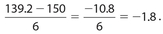
Answer 67:
The correct answer is 101.6. By substitution,  . Multiply both sides by 8 to get 17.6 = x − 84. Thus, x = 17.6 + 84 = 101.6.
Answer 68:
The correct answer is 27. By substitution,  . Multiply both sides by 5 to get 3 = 30 − µ. Thus, µ = 30 − 3 = 27.
Now we are ready for the practice tests.