Chapter 6
Paying Attention to Color in Composition
In This Chapter
Using color to control the message and feeling in a photograph
Making interesting compositions in black and white
Determining when to shoot for color and for black and white
Color may be the most powerful compositional element. I make such a bold statement because color can alter a person’s mood or cause a familiar sensation to occur. Fast-food operations know that red makes you hungry, for example. People also associate colors with various emotions. When a person says, “I’m seeing red,” you know she’s angry. And you know that someone who says he’s blue is in low spirits.
When combined with other, more literal elements, color can enhance the mood or feeling you want to convey in a photograph. A scene of a family sitting by the fireplace will likely feel warm to a viewer because of the orange glow the fire casts onto the other elements.
In this chapter, I show you how color affects your images, how best to use the drama of black and white photography, and how to decide whether to shoot in color or not.
Discovering Color Basics
Color exists in almost every scenario that you may photograph, so you need to understand the basics and how color can affect your images. Most importantly, you need to realize that the light waves hitting your eyes or your camera’s digital sensor create the illusion of color.
 In nature, red, green, and blue waves of light combine to make every color you see. Because of their prominence, red, green, and blue are considered the primary additive colors. When you mix red and green waves of light, you get yellow; green and blue give you cyan; and blue and red create magenta. The color wheel in Figure 6-1 shows you how colors relate to each other and what their differences are.
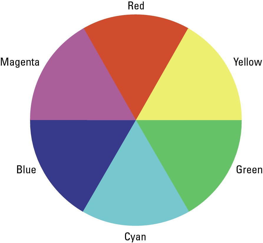
Figure 6-1: The color wheel.
Each color on the color wheel relies on the following three properties that differentiate that color from other colors:
Saturation: Saturation refers to the purity of a color. Equal amounts of red, green, and blue create a neutral color such as white, gray, or black. The more dominant a single color is, the more saturation you have. Figure 6-2 shows the saturation levels in red.
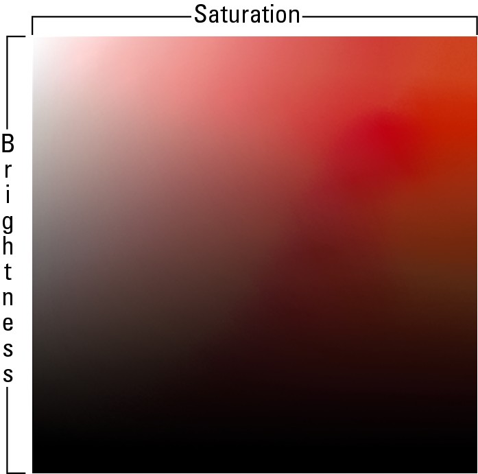
Figure 6-2: This graph represents the saturation and brightness of the red hue.
Brightness: Brightness describes how much light exists in a color. Lighter shades are considered brighter than darker shades of a particular color. Brightness is represented in Figure 6-2 on the vertical axis of the color grid.
Hue: Hue represents the combination of red, green, and blue that exists in a color. Pure red, for example, has a red hue. Red and green combined creates a yellow hue. If a color combination has more red than green, the hue is orange. Notice the image of different hues in Figure 6-3.

Figure 6-3: From left to right, each point represents a different hue.
The properties of a color determine how certain colors will react together in a composition and which colors should be used to create specific effects, feelings, and looks. The design of color in a photographic composition is its color scheme; when used properly, it can enhance the strength of your message. When you create an image, keep in mind the following characteristics that people commonly associate with various colors:
Red: Excitement, drama, danger, lust, love, passion, vigor, strength, hunger, stimulation
Orange: Encouragement, warmth, plenty, kindness, nearness
Yellow: Comfort, joy, brightness, friendliness, knowledge, persuasion, concentration, dishonesty, betrayal, caution
Green: Success, luck, nature, growth, finances, greed, jealousy, freshness, fertility, optimism
Blue: Tranquility, patience, health, sadness, truth, honor, peace, freshness, wisdom, distance, authority
Purple: Royalty, power, tension, wisdom, sentimentality, bravery, magic, intelligence, creativity
In the following sections, I explain how to use the color wheel to create compositions that generate a feeling. I describe the many different color schemes you can use and when you’re likely to have the most success with them.
Using complementary colors for contrast
The colors that are directly across from each other on the color wheel (refer to Figure 6-1) are complementary colors. They’re opposites, so they cause the maximum level of contrast when you use them in the same photographic composition. For instance, a red balloon sailing upward against the cyan sky would stand out to your eyes more so than a blue or green balloon would.
When a composition is made up of complementary colors, it has a complementary color scheme. You can use a complementary color scheme to clarify your subject or your intended message. By including only complementary colors in your composition, you eliminate distracting colors and allow viewers to concentrate on the relationship of the colors.
Using a complementary color scheme in a composition is especially effective when you want to do the following:
Draw attention to your subject
Create a composition that’s vibrant, exciting, or powerful
Give the sense of conflicting feelings in a scene (For example, an image of a red, sunburned tourist standing at the edge of a cool, cyan pool conveys that the day is hot and the pool is a refreshing alternative to the baking lounge chairs.)
The subject in Figure 6-4 stands out because of the level of contrast the complimentary color scheme creates. Everything in the scene is either red or neutral in color apart from the cyan dress that the model is wearing. The dress stands out drastically because of this.
Maximizing monochromatic color schemes
A monochromatic scene is one that contains only one hue (I explain hue earlier in the chapter). The monochromatic colors are made up of the various combinations of saturation and brightness levels within a single hue. Figure 6-3 provides a map of the colors that exist in the red hue.
Using a monochromatic color scheme can help you achieve subdued energy levels in a photograph. When a scene offers only one hue, very little color contrast exists. Elements that have a similar hue tend to naturally fit together and create a sense of harmony that seems peaceful. Figure 6-5 shows an example of a monochromatic image.
Certain situations work best with a monochromatic color scheme. Use one when you want to do any of the following:
Create a clean, simplistic composition: Including more than one hue tends to distract from the subtler elements in a scene.
Give the feeling of a specific hue without having any possible distractions from another hue: Colors carry specific associations (see my discussion of this earlier in the chapter). For example, a scene made up of different shades of blue could appear cool, fresh, and calming.
Convey the idea of elegance in a photograph: A monochromatic design rarely seems tacky. It’s clean and proves that less is more.
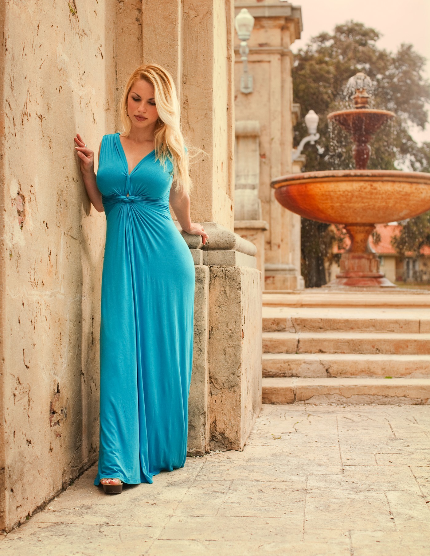
Figure 6-4: Complementary colors create interest through contrast.
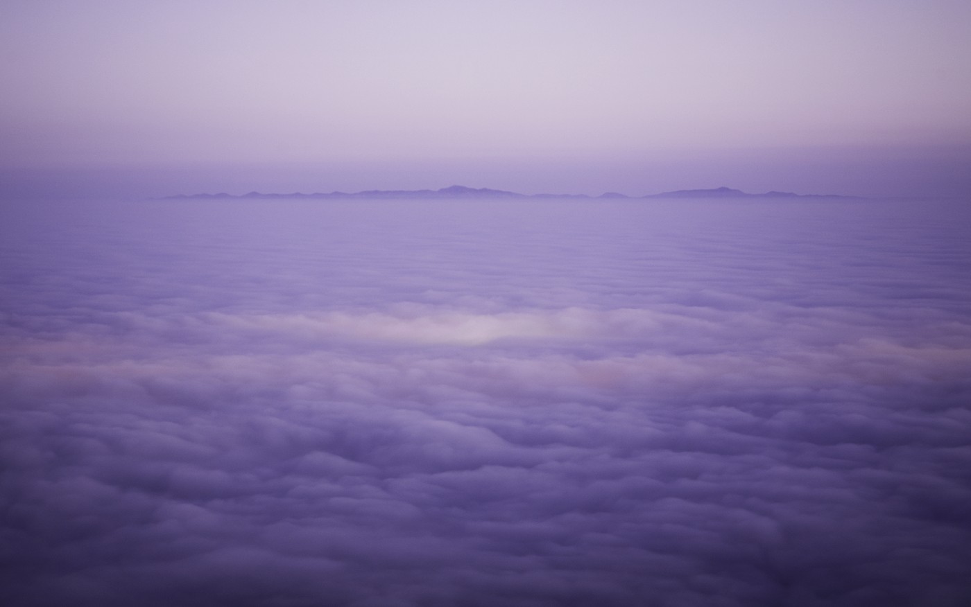
Figure 6-5: Use a monochromatic color scheme to create a sense of harmony.
Creating harmony with analogous colors
Using colors that reside next to each other on the color wheel (refer to Figure 6-1) creates an analogous color scheme. The closer two colors are to each other on the wheel, the more similar they appear to your eyes and the smoother the transition from one to the other. Your eyes notice a dramatic difference between complementary colors, but analogous colors have a subtler impact. However, keep in mind that an analogous color scheme isn’t as subtle as the monochromatic scheme that I discuss in the preceding section.
Analogous color combinations are useful when you want flexibility with your message. You can work with all warm colors, all cool colors, or a mixture of the two depending on what area of the color wheel you’re using. You can create a specific mood by allowing one color to be dominant, while including its neighboring colors to invite a gradual amount of color contrast that helps to liven your image. If you aren’t looking for the drama of complementary colors, but you want some color variety, choose the analogous scheme.
In Figure 6-6, I combined the analogous colors green, yellow, and cyan to create a cohesive story:
Cyan resides in the woman’s dress and in the shadow areas of the tree. It works to create a sense of coldness or mystery.
Green works as a transition from cyan to yellow and exists on the lit areas of the tree.
Yellow provides a subtle contrast to the cyan because it has a warm and sunny feeling. The shadows in Figure 6-6 are uninviting, but the lit area is appealing and comforting.
If I had used the complementary scheme of a bluish-cyan in the shadows and orange (which is a combination of red and yellow) in the lit area, the message would be similar but the drama would be higher.
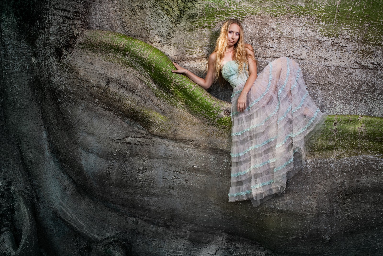
Figure 6-6: The analogous color scheme helps create subtle transitions from one color to the next.
Drawing the eye with color
Any area with high contrast in an image acts as a point of interest. Whether the contrast is caused by a drastic change in tone or in color, it draws your eyes to it. As a result, you can show a viewer where to look in a photograph by positioning an element with a contrasting color in a specific area, like I did in Figure 6-7. The yellow raincoat in this image stands out a great deal in the otherwise blue and grey scene. In this example, your eyes are likely to fixate first on the yellow coat for a while, and then they’ll be drawn back to it as you scan the rest of the frame. (Head to Chapter 10 for more on contrast.)

Figure 6-7: A single color that stands alone in a frame will draw a viewer’s attention.
In Chapter 4, I show you how to use lines and shapes to lead a viewer’s eyes through a frame. You can do the same with color. You can use color as a leading element by positioning it throughout the frame in a way that gradually moves toward something of interest.
Figure 6-8 uses color as a leading element with the pink flowers, which draw your eyes toward the cyan church in the background. The flowers stand out as a contrasting color in this image and have the strongest visual presence. Because they lead toward the church window in the background, which has the most tonal contrast in the scene, the compositional strength is distributed between the two. The flowers catch your attention, and then they lead your eyes to another area of visual importance in the image.

Figure 6-8: Color as a leading element.
Shooting for Black and White
Sometimes a scene contains no significant qualities with regard to color. If you see no reason to show an image in color or feel that the colors in a scene take away from your composition rather than adding to it, shoot the scene for black and white. Doing so eliminates your concern about color while still creating a photo that’s full of life.
 Your digital camera can shoot in black and white mode, but usually you don’t need that mode. Shooting in color and converting your image to black and white during postproduction provides the best results.
Converting your images to black and white is easier than ever, and I explain a few ways to do so in this section. However, to understand how color converts to black and white, you first need to understand how your digital sensor captures an image.
Being aware of how your digital sensor sees light
A digital camera uses an array of millions of tiny pixels to produce images. Tiny wells distributed throughout the surface of your camera’s digital sensor receive light when you take a photograph, and each well represents a tiny portion of the entire image. A single well can’t determine the difference between red, green, and blue light; it simply receives light and measures its intensity as a whole.
In order for a digital camera to record color information, filters over each well allow one specific wavelength of light to enter. Some wells receive red light, some green, and some blue (see the earlier section “Discovering Color Basics” for more on these primary additive colors). These wells are distributed evenly throughout the space of the sensor and determine how much of each color of light a photo records.
When you take a photograph with your digital camera, you’re actually recording three separate images, called channels. The camera has a red, a green, and a blue channel. The combination of the three channels creates a color photograph, but the image in each channel is represented as black and white. You basically have three black and white photographs in every color image, which is important to realize when converting your images to black and white with your photo-editing software. You can benefit from these three images as follows:
The red channel allows more red light (and less green or blue light) into an image. The result is darker skies and brighter tones in people’s skin.
The green channel also produces darker skies but not as dark as the red channel. Photographers use the green channel primarily to brighten green areas in an image, such as grass and trees.
The blue channel produces bright skies in comparison to trees and skin tones. This channel shows the most flaws in a person’s skin. If you want to accentuate the wrinkles and texture of someone’s face, the blue channel is the one you want. Otherwise, to avoid unflattering shots, steer clear of this channel when converting portraits to black and white (which is discussed in the later section “Converting an image to black and white using the three channels”).
Figure 6-9 shows you how each channel affects an image that contains elements that are predominantly red, green, and blue. The red channel emphasizes the red glow coming from inside the tent, and it shows a very dark sky. The green channel emphasizes the green grass and shows a normal representation of the sky and the light within the tent. The blue channel shows a bright sky and the darkest representation of the tent’s interior.
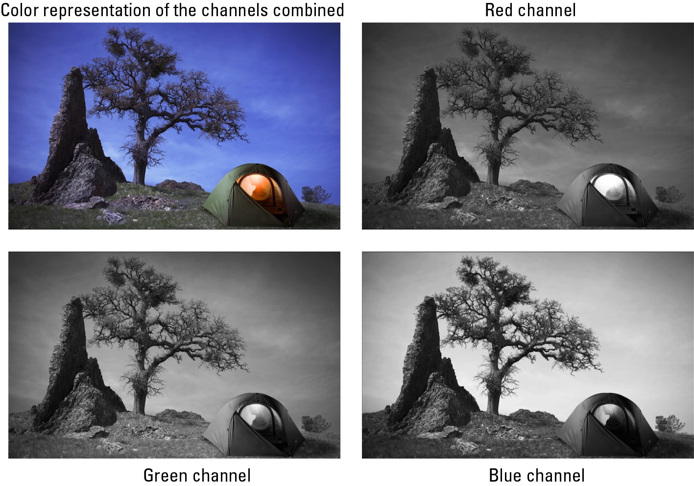
Figure 6-9: Looking at how red, green, and blue are represented in each channel.
Exposing your photo for black and white
When you approach a scene with the intentions of photographing it for black and white, the most important thing to consider is how you’ll expose it. After all, most normal situations contain too much contrast for your digital sensor to record a perfect reading. The difference in brightness in the shadows and highlights is too great for each to be exposed properly.
To solve this problem, expose for your highlights and process for your shadows. Be careful not to overexpose the highlights in your scene to the point that they have no detail, however. (Chapter 3 covers how to set your exposures and check them, using the tools provided by your camera.) If you lose the detail in your highlights, you can’t bring it back in postproduction. You’re more likely to be able to brighten your shadow areas in postproduction.
Your camera likely provides an exposure-warning feature that causes the image on your LCD display to flash when you’ve experienced a loss of detail. If you receive this warning, decrease your exposure and take another shot to ensure you have detail in your highlights. See your owner’s manual to find out more about this feature.
When you expose a scene for its highlights, your original image probably will have very dark shadows. These dark shadows are fine if you feel they serve your message appropriately. However, if you want to create a black and white image that has a smooth gradation of contrast from black to white, with everything in-between, you most likely have to do some postproduction work to get it there, including brightening the shadows.
Figure 6-10 shows a tonal scale that represents the shades that make up a full-scale, black-and-white photo. When you produce an image that contains each of the shades shown, you’re on par with Ansel Adams as far as creating a true black-and-white photo. The scale ranges from white without detail to black without detail. The shades in between include whites with detail (or texture), light gray, middle gray, dark gray, and blacks with detail. If you can’t see the surface texture of snow in an image, you have white without detail. By having the slightest amount of texture present, you have white with detail.

Figure 6-10: A full-scale, black-and-white image contains each of these tones.
The point in trying to create full-scale black-and-white images is to avoid creating an image that’s a muddy, gray mess. Contrast in an image enables viewers to better see what’s happening in the scene and makes the overall image look nicer.
Keep the tonal scale from Figure 6-10 in mind when you’re exposing an image. Besides representing how much detail is in an image, these tones also help you understand your camera’s histogram. Chapter 3 explains how to read the histogram and how to control your exposure.
Converting an image to black and white using the three channels
Because shooting in color with your digital camera produces three black-and-white versions of an image, you really don’t need to shoot in black-and-white mode. Doing so gives you less control over your final results. Instead, you can use the three channels I describe in the earlier section “Being aware of how your digital sensor sees light” to mix and match the channel percentages to create a combination that suits a specific scenario.
You can do this conversion in most photo-editing software programs. Adobe Photoshop is the most common program, so I show you how to convert with it here. Follow these steps to convert a color image to black and white while maintaining control over each element in your scene:
1. Open your image in Photoshop so it contains all its original color data.
 Don’t convert the image to grayscale. Doing so provides a black-and-white image but eliminates the color information, making all three channels the same. Because of this loss of color information, you lose the benefits of working with these channels.
2. From the layers palette, open a new Channel Mixer layer.
A window opens and enables you to make adjustments to convert your image to black and white. It contains three separate sliders that allow you to adjust the red, green, and blue channels. For more information on working with layers read Chapter 18.
3. Click the box labeled “Monochrome.”
The image is now black and white.
4. Use the sliders to adjust the percentages of each channel to control how that channel affects your overall image.
When you begin, your red and green channels are each set to 40 percent, and your blue channel is set to 20 percent. They, of course, add up to 100 percent, which represents the normal exposure for the original image you took. So, if you want to emphasize the red light in your scene, set the red channel to 100 percent and the others to 0. Remember: Finding the perfect balance between the three channels is the key to creating the perfect amount of contrast exactly where you want it in your frame.
You can create a curves layer to tweak your contrast even more. Chapter 18 gives you the scoop on using curves to adjust contrast in a scene.
Figure 6-11 shows two versions of the same image. The original was exposed properly but needed some work to reach its potential. I converted the first image straight to black and white without making any other changes. The red and green channels were set to 40 percent, and the blue was set to 20 percent.
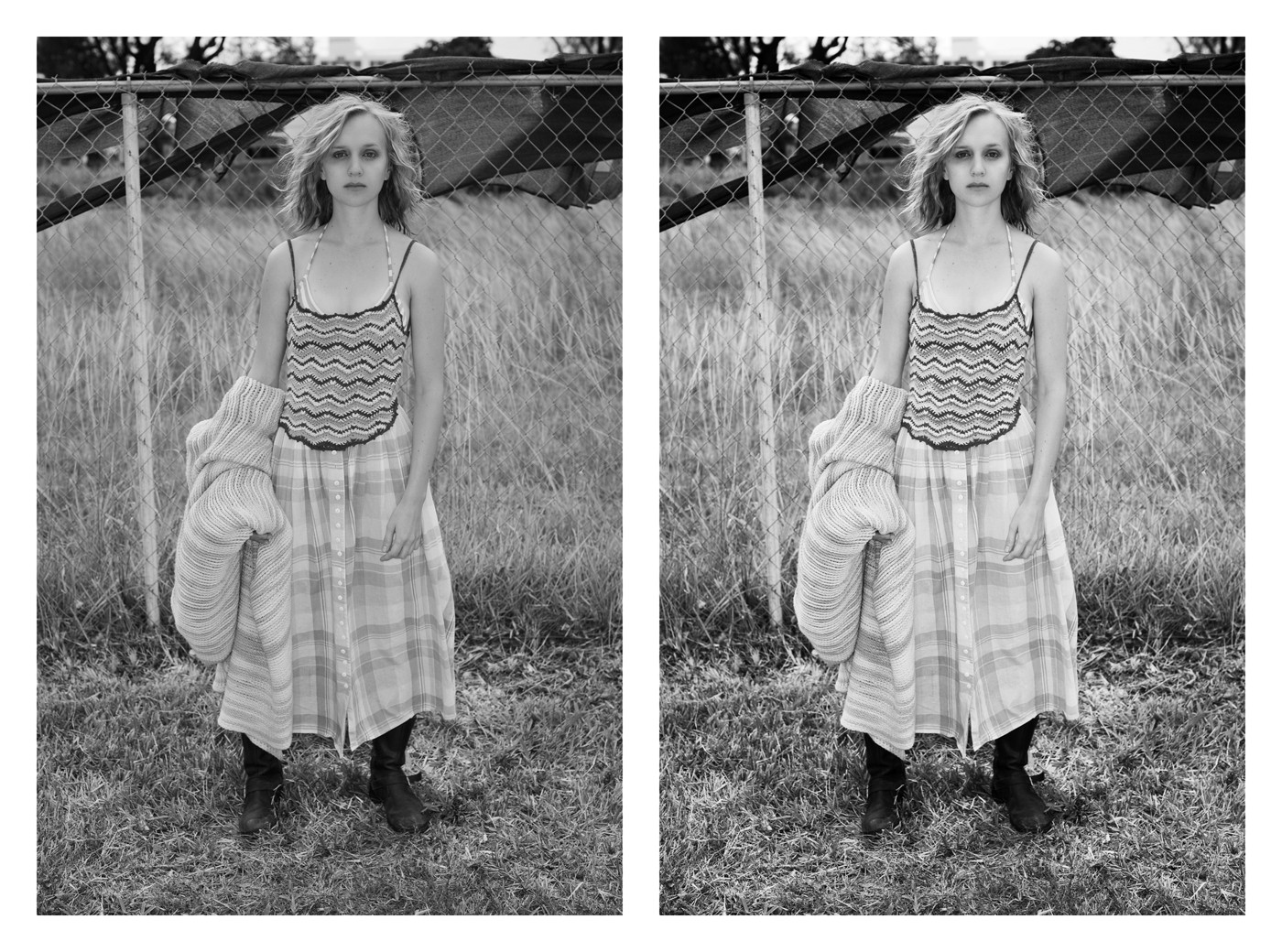
Figure 6-11: Postproduction work enabled me to increase the contrast in this image and avoid a muddy composition.
I converted the second image more carefully to concentrate on specific elements. Consider the following changes:
Bringing the red channel to 65 percent brightened the tonality of the woman’s skin.
Dialing back the green to 25 percent gave the grass more brightness. (Grass usually comes out as yellow in an image and is affected by the red channel as well as the green channel.)
Reducing the blue channel to 10 percent minimized the texture of the woman’s skin.
After I converted the image, I used the Curves Layers feature in Photoshop to further increase the contrast and make the whites and blacks in the image richer. (Check out Chapter 18 for more about using this feature.) The result is a more descriptive photograph that’s more pleasing to look at.
Color or Black and White? How Your Decision Impacts Your Message
In photography, each scene is unique, and you have several options for capturing it. One major decision you have to make is whether a particular scene would be better represented in color or in black and white.
The easiest way to figure out whether to shoot in color is to look at the colors in your scene. Ask yourself whether the colors are creating any significant impact. Look for complementary color relationships. If those are absent, perhaps you see an analogous relationship or a monochromatic one that you can work with. Does any element stand out because of its color, or do the colors in the scene work well together?
If the colors in the scene don’t create any interest or impact, and you decide that black and white would be most representative of your message, you should still shoot the scene in color. That way, if you download your images to your computer later and decide that the image looks good in color, you can roll with it. If not, you can convert it to black and white.
If you intend to convey a specific message, you may need to shoot in color or in black and white to accomplish that message. Each format has a different way of telling a story and can be used to achieve different effects on viewers.
Color photography is the better choice when you want to convey the following:
Temperature: Warm colors give a warm feeling and cool colors do the opposite. If you were selling the idea of a cold, refreshing drink, you’d need color to enhance your message.
Emotion: Different colors signify different emotions, and if your intent is to convey a specific emotion, using color (along with the other elements in your composition) strengthens your message.
Separation: In black-and-white photography, you may have a difficult time creating separation between elements that are different in color but similar in tonality. Color photography gives you the ability to separate compositional elements through tonal and color differences. For example, it shows the difference between a red apple and a green apple, and black and white could make them appear the same.
Vibrance: Color is vibrant and creates an image with a modern feel that most people prefer. Just like pop music sells more than the blues or jazz, color photography sells more than black and white.
You may shoot in black and white when you want to
Simplify the scene: If the colors in your scene don’t work well together, you can simply remove the mess of color by converting the image to black and white.
Create an artistic edge: Black-and-white photography is still familiar to people as a classic art form. By converting your images, you automatically cause them to appear more artistic.
Provide emphasis: A subject that doesn’t rely on color may be better shown without it. If the main focus of your image reveals the shape and texture of someone’s body, for example, including color in your composition may distract viewers from your message. Minimizing the elements in an image (such as color) emphasizes the ones you keep.
Generate drama: By creating a great deal of contrast between your shadows and highlights, you can create a feeling of drama that’s clear-cut and uninterrupted by the distraction of color.