Chapter 9
Backgrounds: As Important as the Subject

In This Chapter
Working with different types of backgrounds
Knowing when a background is going to cause problems
Eliminating distracting elements in your background
Supporting your subject with background details
As a kid, I remember having my portrait taken once a year from a photographer at my school. It was quite a big deal. Maybe you remember picture day, too? A few weeks after having your picture taken, you could buy different packages. Of course, all the kids wanted the premium setup that included some absurd amount of wallet-size photos to hand out to friends.
If your parents were willing to dish out some extra cash, the photographer would hook you up with the popular bookshelf or laser backdrop. I was always stuck with the plain old blue-blur background, and now that I look back on it, this was probably a good thing. Everyone must reach a certain age when they realize that the laser background isn’t only irrelevant to the portrait but it’s also distracting. A viewer spends more time examining the neon glow of the straight, high-contrast lines intersecting with your head than they do with you — the subject.
A good composition creates a balance between the subject and background and enhances your message. In portrait photography, you almost never want a background that draws more attention than the subject does. The rare exception is a situation in which the background tells a great deal about the subject. In this chapter, I give you pointers on planning the perfect background for your shot, including a few examples that show backgrounds that gain more attention than your subject.
 Keep the lasers in mind when you compose your images, and ask yourself whether the background is appropriate and supportive to your subject and message. In great compositions, the background is just as important as the subject and other elements in the scene.
From Great Outdoors to Crawlspace: Considering Types of Backgrounds
When I’m planning a photo shoot, the first question I ask myself is, “What would be the most appropriate setting for the subject?” Based on the subject and the purpose of the shoot, I decide right away whether I should shoot on location or in the studio.
Nine times out of ten, I choose to shoot on location. I tend to take mostly environmental portrait and fashion assignments, and shooting on location brings up new challenges with each different environment; striving to get the most out of each one keeps my creative urges alive. When I spend too much time in the studio, I start to feel like I’ve seen it all before. (By the way, an environmental portrait is one that tells who someone is by incorporating a descriptive background.)
Where you shoot depends on what type of background you’re looking for. Ask yourself these questions when considering where to set up:
Do you want a background that provides an environment for the subject? If so, shooting on location is your best bet. In this case, you need to determine how much information you’ll include from the scene.
Do you want a background that provides negative space (areas of the frame that aren’t filled with any elements of interest)? If so, you can either shoot in the studio or find a location that enables you to position your subject in front of the open sky or a large solid wall that’s monochromatic and has little texture.
How much space do you need and what lens will you use? If you want to shoot with a shallow depth of field (to blur the background) and a long lens, you’ll need adequate space between you and the subject. If you’re shooting multiple subjects (like a group portrait), choose a location that has enough space to fit them all in. If your studio space is small, it will limit your compositional capabilities.
If you’re going to photograph on location, do you need an area with light pedestrian traffic, and will you need to pull a permit for that location? The city wants to make sure you have insurance if you’re going to be working on public property. You have certain liabilities to consider when photographing. If someone gets hurt while on your set, you may be responsible. When you’re being paid to photograph, chances are you should have insurance and a permit to work on public property.
Are you going to create a clipping path around your subject in order to place them in front of a new background in postproduction with image-editing software? If so, you want to separate the subject from the background as much as possible through the use of contrast and color. This pertains to shooting in the studio or on location. (A clipping path is an outline that isolates a subject from its surroundings so you can move it or place it into a new image. Techniques like these are discussed further in Chapter 18.)
Asking these questions helps you put yourself in situations that work to your advantage based on the photo you want or need to take. If you’re shooting street photography or travel photography, you have to work with what you’re given as far as subject matter and backgrounds. Using this type of photography is a great way to develop your skills in composition because you’re forced to think fast and pay attention to details. Working with in-studio shoots, on the other hand, allows you to manipulate the scenes more.
In this section, you discover some of the pros and cons associated with shooting in open spaces and in tight spaces as well as how to work within each. You also find out what solid backgrounds do for your message and how to achieve different effects when using them.
 If you choose to photograph on location, I recommend shooting at times during the day when the light is directional and creates interesting effects on your backgrounds and subjects. For instance, it’s a good practice to shoot early in the morning and late in the afternoon. See Chapter 10 for more on ideal outdoor lighting conditions.
Working with wide-open spaces
Having space to work with is essential to compositional freedom. You may not take advantage of the entire scene by including it in your frame, but you have the option to. When you’re surrounded by expansive space, the background is probably going to be far from your subject, which gives you flexibility when it comes to lens choice. You can use different focal lengths to create entirely different representations of the same scene. Consider the following, for example:
A wide-angle lens will show how expansive the space is in relation to your subject and will reveal more details in the background. Shooting with a wide-angle lens in a wide-open space means that you can move around without changing your background too drastically. You can get as close or as far from your subject as you see fit. You control your depth of field partially by getting closer or farther from the subject.
In the left-hand image of Figure 9-1, I kept my distance from the subject in order to show the scene that she was photographing. In this image, you see that she is photographing. You also see what she is photographing. In the right-hand image, I got very close to the subject to make it all about her hands and the 4-x-5-view camera she’s operating. In this shot, you can still see mountains in the background, but the depth of field has changed and the subject takes up the majority of the frame, lessening the importance of the background. You can’t see what the subject is photographing; you can only tell that she’s using the camera.
A telephoto lens will show a more intimate relationship between the subject and the background by decreasing the amount of background in the frame. If I would have moved in on my subject in the images in Figure 9-1 by using a telephoto lens rather than physically getting closer to her, I would have lost a great portion of the mountains that were in the background. This would have made the composition even more about the hands and the camera’s parts and less about the relationship of the photographer and the environment.
Handling tight spaces
Photographing in a tight space is much more limiting than working in open spaces (see the preceding section). Because the amount of space you can set between yourself, the subject, and the background is sparse, you have to rely on aperture for depth of field. (Chapters 3 and 7 provide more information on aperture and depth of field.) Depending on the size of your subject, your telephoto lens may be useless in a tight space.
I typically shoot with a 50mm lens when I have little room to work with. I feel that this lens shows things as closely as possible to the way the human eye sees them in reality, which provides a certain integrity to the photograph. Using an extremely wide-angle lens in a tight space helps you show as much of the scene as possible; however, the closer the elements in a scene are to your wide lens, the more barrel distortion you have in the image. (Barrel distortion refers to an object looking larger in the middle than at its edges; I discuss this type of distortion in detail in Chapter 8.)
A tight space keeps you up-close and personal with the background and forces you to examine the strong points and weaknesses in it. (In a wide-open space, your background could be so far that you don’t see intimate details in it; you simply see more of it.) So, pay attention to shapes, textures, colors, and light. These elements add interest to your composition. If, for example, your background is a wall with peeling paint, use the area of the wall that has the most interesting shapes, colors, and textures as a result of the corrosion.
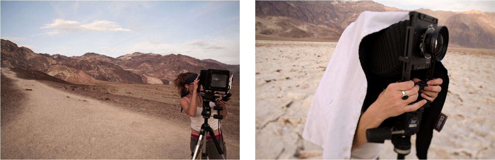
Figure 9-1: In wide-open spaces, you have more control of your distance to the subject than to the background.
Find a way to fit your subject into the scene comfortably, keeping in mind what I mention about intersecting and merging lines in the later section “Backgrounds that merge with your subject.” The subject’s shape should interact positively with the background so the tight space makes sense. Otherwise, you may end up with a composition that feels awkward or unnatural.
I was in a tight squeeze when I shot Figure 9-2, so I placed the model right up against the background and shot with my normal 50mm lens. The result was a tight crop, which works well for images used on a model comp card (a marketing tool for models to show off their features and posing abilities). Positioning the model so close to the background was beneficial because the wall’s texture was interesting and worth having in focus.
Using solid backgrounds
Solid backgrounds enable you to surround your subject with negative space, which is ideal when you want to make sure your viewers concentrate on the subject and nothing else. Eliminating competing elements in the scene ensures that the subject remains the sole reason for the photograph to exist.
When you use solid backgrounds, you have fewer elements to get your message across; so every compositional decision you make will have a strong impact on your message. So you have to be creative when using solid backgrounds and make decisions based on your desired message. Here are some background elements to pay attention to:

Figure 9-2: Tight spaces often call for tight crops that reveal as much detail as possible.
Detail: Because the background provides few details, each detail has a great impact on the story. If, for example, you provide an image with no details in the background, viewers won’t focus attention on that background. However, if you include a shadow on the background, you’ve introduced a detail that tells viewers that a background exists.
Texture: When shooting against a solid background, you typically want to eliminate all texture in order to keep the viewer’s focus on your subject. If you don’t have a smooth background available, you can have your subject step away from the background as much as possible. Because of depth of field, the farther the subject is from the background, the less detail the background shows in the photograph. (I explain depth of field in detail in Chapter 7.) In the case that you include the texture of the background, viewers will naturally consider what type of background they’re looking at.
Color: If the background is one solid color, the color will most likely be the strongest supporting element in the photograph. You can choose the color of your background based on what mood you want to create or on how well it complements the subject. Refer to Chapter 6 for details regarding complementary colors and how they affect a person’s view of an image.
Subject placement and size: Your placement of the subject in your frame and its size in relation to the negative space plays a major role in revealing the purpose of the image. A subject that appears small and is surrounded by much negative space seems less dominant and important than a subject that appears large and takes up most of the frame’s space.
When you’re using a solid background and want to be more creative and interactive with it, putting the subject close to or against the background will show texture and may cause the subject to cast an interesting shadow on it. Some photographers crinkle the paper backdrops in their studios and position models right in front of them. An image with this background doesn’t try to conceal the photographic process. Rather, it gives you the sense that the photographer was present and that the subject was photographed in the studio. Some photographers even use wide-angle lenses to reveal the stands that are holding up the backdrop and the paint buckets and ladders in the back corner of the studio. This gives a sort of behind-the-scenes, creative twist to studio photography.
 In fashion and product photography, you may sometimes want to create an environment that contains no detail whatsoever — a monotone and monochromatic environment that surrounds the subject. In studio or on location, you can create these solid, seamless backgrounds with rolls of paper that are suspended in the air and pulled down and out along the floor or table. You position your subject on the paper with enough distance from the background to ensure that it blurs and reveals no flaws in the paper. This type of shooting is great for drawing attention to your subject with absolutely no distractions. To view examples of this type of photography, visit any online department store and browse the clothing galleries. Or take a look at some fashion catalogs.
In Figure 9-3, I show a photograph of my father shortly after he went through a successful treatment for throat cancer. He was happy to be alive and cancer-free, but at the same time he was experiencing steady discomfort and would continue to wear the tracheostomy tube in his throat for months to come. His body language and expression combined with this composition and the muted colors relay the conflict of accomplishment and uncertainty. I placed him in the bottom corner of the frame and made him relatively small in comparison to the negative space, which gives the sense of being cornered and alone. Cancer is an uncomfortable topic, so I felt that an uncomfortable composition was fitting.
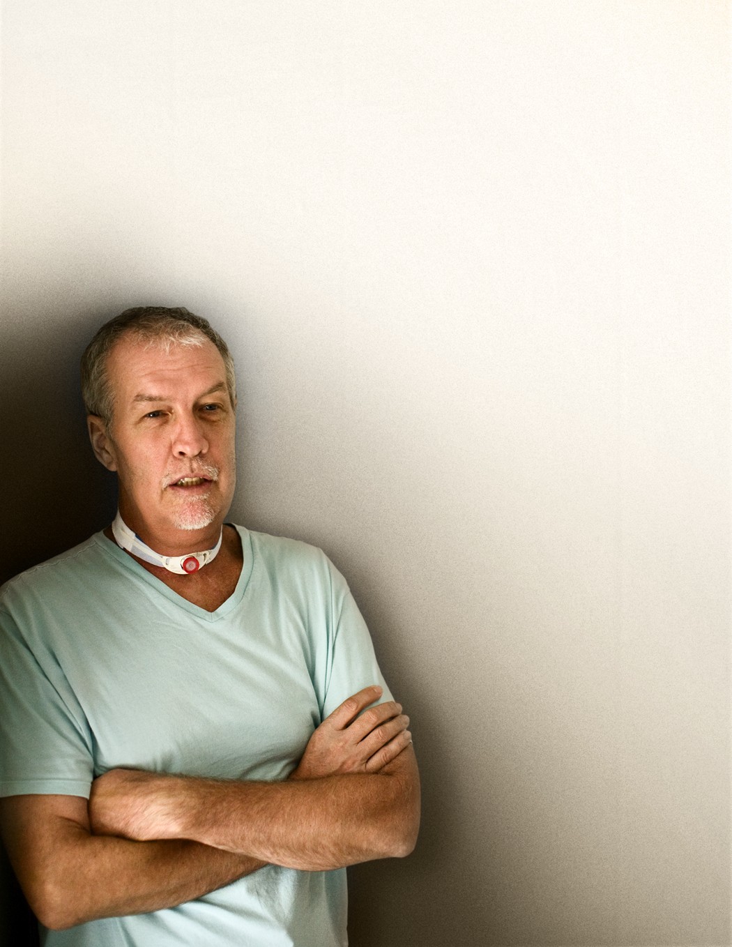
Figure 9-3: A balance of negative space, color, subject placement, and expression.
Recognizing Problem Backgrounds
In some situations, your background may not cooperate with your subject or your message. It may be too busy, meaning it contains too many elements that don’t support your subject or message in any way. Or a subject may blend in too well with the background if it’s similar in color or tone or has a similar texture or pattern as the background. These situations create compositional problems in which your viewers are distracted by the background and can’t read the image in a clear manner. So, when you’re trying to make your subject stand out from the background, you want to avoid situations like these.
However, sometimes you may not consider these situations to be problematic. For instance, you may find situations in which you can use a busy background or one that blends with your subject creatively to reveal a certain message. Your job is to decide when a background works with your message and when it detracts from it.
To help you get a handle on what works and what doesn’t, in the following sections, I review some background problems you may experience, along with some ways to avoid or fix them.
Badly lit backgrounds
The most common issue that new photographers encounter with regard to backgrounds is too much or too little light hitting the background in comparison to how much light is hitting the subject. If you find that your subject is being lit by full, direct sunlight and your background is in complete shadow, you’re going to have exposure problems (unless of course, your background has distracting elements and you want it to appear as dark as possible). In this situation, try to move your subject to an area that isn’t being lit by the direct sunlight (if you can). Or, find a way to shed some light on the background. I usually carry a small, battery-powered flash in my camera bag in case I need to balance the light in a scene.
Another background problem may be that your subject is indoors but near a window through which sunlight beams into the scene. The window will be overexposed if you expose for the indoor light. To solve this problem, bounce a portable flash off a wall or the ceiling to bring up the ambient exposure inside to more closely match the outside exposure.
To operate a flash that isn’t on your camera, you can sync it to your camera with a chord. However, this may not give you the reach that you require. I use a PocketWizard that transmits a signal from the camera to the flash telling it when to fire. With this system, I can place the flash far away from the camera and still have it sync with my shutter. Finding the right flash (and setup) for your specific camera and needs requires some research. I suggest asking the folks at your local camera shop or browsing forums online to see what other photographers are doing.
To ensure that you accommodate areas being hit by bright light, consider your shot carefully before you work. Determine whether you even want to include the details in the background before getting out your flash. Sometimes, letting the background lose detail helps to bring more attention to your subject.
Distracting backgrounds
You’ve probably seen the ubiquitous party snapshot with some guy standing in the background staring at the camera or — even worse — posing in an absurd way. Nobody knows who the guy is, but for some reason he decided to steal the show in this group photograph. The unannounced visitor is pretty much the worst-case scenario for a distracting background. Other distractions could include the following:
Shapes or lines that are high in contrast or bold in color: These elements can take attention away from your subject in some cases. To lessen the distraction when removal is impossible, use a shallow depth of field to blur them a little.
Harsh spots of light or shadow: A spotlight is meant to direct attention to a specific area. If a spot in your background draws attention away from your subject, try changing your perspective (the relationship between your camera, the subject, and the background elements) in order to use the harsh tonality to draw attention to your subject. Or eliminate it from your frame all together. Check out Chapter 8 for more information on perspective.
Subjects placed directly in front of noticeable lines or straight objects: For instance when a person is positioned directly in front of a telephone pole, it can appear that the pole is growing out of her head. By moving the subject or the camera so the telephone pole is no longer a distraction, you can fix this problem.
Horizon lines in the center of a frame: The center of your frame can act like a bull’s-eye when it contains strong elements. A horizon cutting through the center of a frame is more successful as a distraction than as a complimentary compositional element.
Photos with too many elements that are irrelevant to your subject or message: When taking a picture of the bride and groom at a wedding, for instance, you wouldn’t want to include the empty beer bottles on the table and the trash can that’s just behind them. Crop in tight or change your camera angle to find the appropriate composition.
Any element in the background that causes tension and takes priority away from the subject and supporting elements in the scene is a distraction and can hijack your message. Distractions can have different levels of competing power. For instance, the annoying, background party guy creates enough tension that he actually takes over as the subject. A harsh spot of light, on the other hand, may be less of a distraction.
![]() When you’re dealing with a distracting background, try one of the following:
When you’re dealing with a distracting background, try one of the following:
Change your perspective. You may be able to find the perfect angle to minimize or eliminate the distractions. (See Chapter 8 for more about perspective.)
Use a shallow depth of field. You may be able to use a focal length and aperture that cause the background to go out of focus and minimize the distractions. Chapter 7 tells you how to work with focal length and aperture.
Edit out the distractions during postproduction. If you want to use a great depth of field and can’t eliminate the distractions, you can always clean up the problem with a photo-editing program like Adobe Photoshop. I discuss techniques to do this in Chapter 18.
Backgrounds that merge with your subject
Keep an eye out for merging shapes and lines in your compositions. A merger — when the edges of two shapes meet at the same point — causes confusion. You usually want your subject to stand out from the background, and that doesn’t happen when a background element merges with the subject.
In particular, pay attention to how the horizon line intersects with the subject and the elements in a scene. You want to avoid merging lines and awkward intersections. You don’t want to let a horizon line (or any background line) merge with the top of a person’s head or to pass through their eyes, neck, or knees. Basically, don’t allow any joints or points of interest to have a line cutting through them.
In Figure 9-4, I provide two example photos of the same scene. In the left-hand image, the subject and background merge, making a weaker composition than in the right-hand image, where they don’t merge. Notice how the subject’s shape is more defined when a merger doesn’t take place.
Adjust your camera position or the position of the subject to eliminate mergers. The slightest movement could make a great difference in compositional quality.

Figure 9-4: Merging elements create tension in composition rather than harmony.
Avoiding lines and shapes that merge is a good practice for compositional quality, but you don’t always have to separate the subject from elements in the background. Placing your subject partially in front of an element that’s behind it can create the idea of depth or three-dimensionality. In this method, the subject’s shape overlaps the shape of the background element, revealing that it’s closer to the camera. However, do pay careful attention to how the two shapes overlap, making sure the points of intersection aren’t awkward.
Preventing and Fixing Problems
To avoid background problems, you have a few options. If you’re shooting on location and making do with the background that’s available, you can check and fix shots as you take them. Or, if you’re going to be in the studio, you can make your own backgrounds so they fit your needs exactly. I discuss each method in the following sections.
Identifying poor backgrounds by reviewing your work as you go
If you’re lucky, you catch a background problem at first glance of a scene or notice it while looking through your viewfinder. In the days of film, photographers had to catch a problem by this stage in the process or it would be exposed later when they processed the film. By then it usually was too late — the perfect shot would be missed. Fortunately, your digital camera has a viewing screen so that you can see your images immediately after shooting.
After you compose a scene, snap a shot and check your results to make sure you haven’t missed any problematic background issues. When a shoot permits, I tether my camera to a laptop so I can view the images on a larger screen as I shoot them. Viewing the pictures this way allows me to see my compositions more clearly so I get the most accurate exposures and the sharpest focus.
After you determine that something about the background is hurting your composition, figure out which of these categories you’re dealing with:
Problems that can be fixed by changing your perspective: This category pertains to situations where a specific element is a compositional nuisance and makes up only a small portion of the background. You can crop the element out of the frame, block it with another element in the scene, or eliminate it by putting it out of focus. Or, if necessary, you can use a combination of these techniques. In Chapter 8, I discuss your options for finding the right perspective.
Problems that can be fixed through lighting: With this category of problems, you have too much or too little light on the background compared to the subject. In other words, in some cases you want to hide background details (or reveal them) by changing the intensity of light on the background. In the earlier section “Badly lit backgrounds,” I mention carrying a battery-operated flash that you can use to create a more intense light on the background or on the subject. When photographing outdoors, you can wait for the sun’s position to change in order to achieve the light you desire, or you can use strobes to increase the light intensity where it’s needed, which in turn decreases the light intensity everywhere else.
Problems that you can fix in postproduction: Problems that can’t be fixed with changes in perspective or lighting have to be manipulated using photo-editing software. You can clone out a distracting background element with this type of software, and you can increase the lightness and darkness in certain areas of your scene.
Fixing a problematic background while shooting can save you a lot of time in front of the computer. I also try to minimize the amount of work I do to a photo on a computer in order to maximize the quality of my images. The more alterations you make in postproduction, the more likely it is that you’ll have inconsistencies as far as noise distribution and tonal and color gradations. In Chapter 18, I discuss postproduction techniques in detail.
Problems that can’t be fixed and should be avoided: If you come across a problem that would be too much work to fix in a program (and isn’t fixable using changes in perspective and lighting), you should reconsider the background entirely. If you notice that the background doesn’t work for your purposes, perhaps you can move to a new location. Or, if possible, consider creating your own background (as I discuss in the following section).
Creating your own backgrounds to avoid problems
You can avoid many background problems by creating your own sets or backdrops. Some types of photography demand specific backgrounds because they require consistency in order to show a coherent story of many images. Fashion, product, and portrait photography often fit this description. Consider the following reasons you may want to create sets in the studio or other indoor locations:
If you’re shooting for a catalog, your client may want the images to have consistent lighting and tonalities so the images look like they go together.
If clouds are moving through the sky during a shoot, your lighting will keep changing, and the consistency of the background may be jeopardized.
If you’re shooting large products that are difficult to move and each one needs to be shot in a different room, in-studio sets are convenient, because they can be built around the large product rather than moving the product itself.
After a set is built and lit, it will remain the same for as long as you want it to. However, after you’re finished with the set, you can easily change it around and create a brand-new set with whatever type of lighting you need. Building sets gives you 100 percent control over your backgrounds and enables you to focus on your subject as the priority.
Depending on your budget and the kind of photography you’re involved in, building sets can be as simple as creating the illusion of one wall that’s a certain color and texture or as complicated as creating a space with multiple levels and rooms that are furnished and appear functional. A commercial studio has walls on standby, ready to be painted and brought on set as well as rolls of linoleum flooring ready to be rolled out. Windows built into the walls have backdrops outside of them with blurry images of nature depending on the season you’re trying to sell. Props are brought in and the photographer composes the image so it appears to be a real room.
If you have the studio space but can’t currently build elaborate sets, you can use a few tricks to build nice sets for portraits and editorial fashion photography. One idea is to purchase 4-foot-x-8-foot pieces of foam core and use them as walls. These pieces of foam are lightweight, affordable, and easy to prop up. You can spray paint them, but the best way to give them life is to attach fabric to the surface. If you cover them with fabric, you can remove that fabric and reuse the foam boards multiple times. Plus, you can find many interesting fabrics that have designs and patterns that would be difficult to achieve with spray paint.
You may want to keep your own backgrounds simple and use a shallow depth of field to minimize the amount of detail revealed. This way you can suggest a certain background exists without having to pay elaborate attention to detail in creating it.
Using Background Elements to Support Your Subject
In some cases, the background in a scene is the most descriptive or one of the most descriptive elements to support your subject. This situation can happen because of these reasons:
The scene doesn’t include many supporting elements.
The subject itself has few descriptive qualities.
The background reveals the location, which is important to the message.
Take advantage of a background that includes useful information. Consider, for example, the images in Figure 9-5, which show the back of a woman’s head. Because you see so few details, the woman remains a mystery. These images work together to tell you that the woman is a tourist. The only reason you know that about her is because of the backgrounds. She’s facing the backgrounds; in the top image she’s taking in the architecture, and in the bottom image she’s taking in the detailed sculpture. In this diptych, the background speaks to you, and the subject’s purpose is to make you imagine yourself in her position.
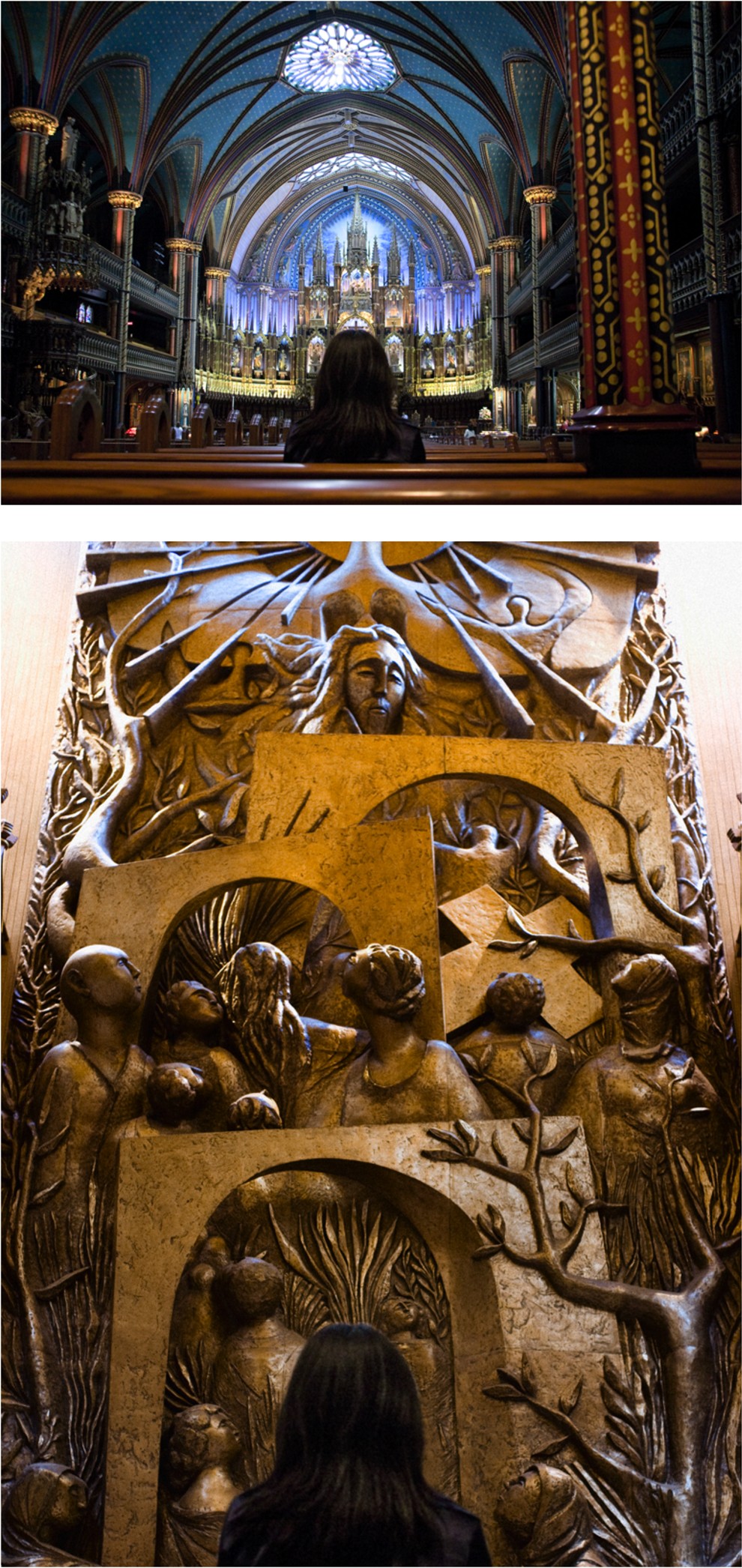
Figure 9-5: Use the background as the sole source of information supporting the subject.
Train yourself to seek out interesting backgrounds that offer information about your subject. Think creatively and look for relationships between the subject and the background elements. You can make connections through color, texture, tonality, simplicity/chaos (a simplistic subject would fit into a simplistic background and would contrast with a chaotic background), shape, and even literal elements.
![]() Keep the following tips in mind to effectively choose and use a background:
Keep the following tips in mind to effectively choose and use a background:
The color scheme in a background works with your subject to control the message in an image. Each color has a different message, which typically is derived from natural senses and cultural conditions. Blue typically gives the feeling of openness or cool temperatures, but in some cases it represents depression. Orange can give the feeling of warmth and is often associated with stimulating a viewer’s appetite. Green can be associated with freshness and has a calming effect in some cases. Chapter 6 has more information on colors and their meanings.
A background’s tonality speaks greatly to the meaning of an image. A high-key image is one that has light tones and gives the feeling of cleanliness, life, and energy. A low-key image has mostly dark tones and speaks a more mysterious, melodramatic, and quiet message.
Texture in a background can take on many different characteristics. It can be smooth, rough, old, new, clean, dirty, and so on. It should be appropriate for your subject and your message.
A solid background with few details and elements is considered simplistic, and a background with lots of texture, lines, shapes, colors, and tones often appears chaotic. The same goes for your subject. A chaotic subject stands out more on a simplistic background and blends in more to a chaotic background. For example, picture a floral-print sofa in front of a solid-colored wall. Then picture the same sofa in front of a wall with floral-print wallpaper. Each background could be interesting, but each represents the sofa in a different way.
Literal elements in the background tell you about the subject based on things you already know. A man and woman kissing in front of an altar, for example, have just been married. An adult in front of a chalkboard that has mathematic equations on it is most likely a teacher; a child in front of the same background is most likely a student.
Figure 9-6 shows a photograph that I took while shooting for a health-food restaurant. This wheatgrass shot showed one of their menu items, which they wanted to look heroic. After all, wheatgrass is supposed to do great things for you. Putting the raw product behind the prepared shot and getting a tight perspective worked out to my advantage in a few ways. For one, it suggests that the product is fresh. Also, it helps you to understand what the product is. If you saw just the green liquid in the shot glass, you might or might not know what it was. If you saw just the grass, you would assume it was grass, but you might not know what kind of grass. Seeing the two together lets you know exactly what you’re looking at.
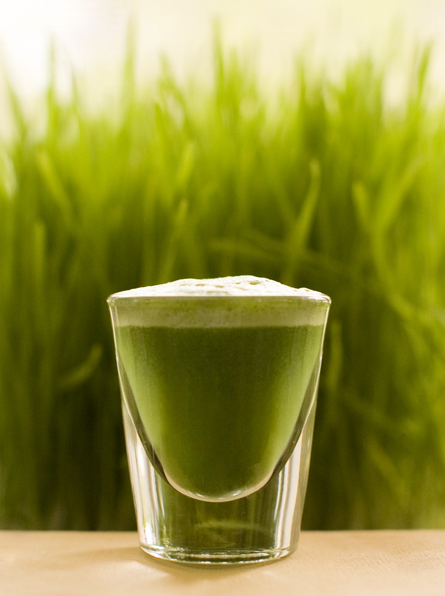
Figure 9-6: When combined with the subject, this background reveals important details.