Chapter 15
Shooting Still-Life Photography

In This Chapter
Bringing life and meaning to photographs of still objects
Styling an arrangement of flowers, fruit, or food in an image
Creating superior images of buildings and interiors
Photographing objects (rather than people) comes with particular joys and challenges. One of the joys of photographing still-life objects and architecture is that you’re working with subjects that don’t move. You can concentrate solely on your composition and lighting without having to worry about directing your subject or having it become bored.
But objects also require you to get all the details just right. Good composition and good lighting always are important in photography, but they’re especially important when you photograph subjects that aren’t alive. Living subjects can bring more to your message through expression and body language. Objects don’t have that quality, so your message relies completely on what you’re photographing and how you photograph it.
In this chapter, you find information on how to create beautiful photographs of fine art and commercial still-life subjects as well as flowers both in the studio and in their natural locations. I also cover the art of architectural and interior photography, including tips for getting the perfect composition and lighting your scenes.
Making Everyday Objects Interesting
Still-life photography, or the portrayal of an inanimate subject matter, can be created for artistic or commercial purposes. Although the objects can be similar in the two styles, the message usually is much different.
For example, a pair of soccer cleats hanging from a rusty nail in your grandfather’s shed could make a great fine-art subject. Dramatic lighting on the weathered cleats set in the rustic environment would create a sense of nostalgia. Product photography, on the other hand, wouldn’t show old cleats. A new pair of cleats hanging in the locker room would be more likely to show that the cleats are used by someone on a team.
In the following sections, I provide pointers on shooting both fine art and commercial product photos.
Seeing objects as fine art
Fine art is fun because you can show objects for what they really are, or you can fabricate their relevance in any way you choose. Either way, a fine-art photograph is your personal work, and you can say whatever you want in it. Nostalgia works particularly well in fine art because it speaks to the human condition. Things fall apart or change through time. There’s something romantic about photographs that reveal this aspect of life.
Consider, for instance, the example of the old cleats from earlier in the chapter. Adding a deflated soccer ball to that scene would reinforce the idea that the footwear hadn’t been used for a while. At one time the cleats and ball worked together, but now they just sit in the shed. When photographed together, however, they tell the story of what used to be — and that’s their new purpose.
Such a dramatic theme requires dramatic light and a dramatic composition. Dramatic light is directional and high in contrast. (Check out Chapter 10 for more details about lighting.) A dramatic composition in the case of the cleats and soccer ball in the shed reveals the textures of the objects in the scene. By cropping in fairly tightly, you maximize the detail in the cleats, the soccer ball, and the shed to most effectively tell the specific story of those objects.
A wider crop includes more of the environment and concentrates less on the soccer-related items. This kind of composition tells more about the cleat owner’s life as a whole. Maybe it shows some heavily used tools, telling viewers he was handy, and some old military medals, showing that he survived a war.
 Everything in your frame adds to or detracts from your message. So think about what you want to say and compose your image accordingly.
The first time I set out to take pictures for art’s sake, I took photos of my feet, my girlfriend’s feet, railroad tracks, some tombstones in a graveyard, and the tire swing in Figure 15-1, which I like to think of as my first photograph. This image includes only a few elements, so they each have a great impact on the message. The tire swing is the subject, and you know this because it’s placed on the frame’s bottom third in a dominant compositional position (for more on placing elements in a scene, take a look at Chapter 5). The tire also makes up the area of the frame with the most contrast and is my focal point. The wooden beams behind the swing give you a sense of what’s holding the swing in midair. The lines created by the wooden beams mimic the lines created by the tire’s chains. This mimicry causes viewers to look back and forth between the two elements, comparing their similarities and differences. (I discuss the use of repeating elements in Chapter 12.) The leaves on the ground help to give a sense of the environment with regard to the time of year and the types of trees present. Anyone who grew up in the northeastern part of the United States would subconsciously be aware that this scene took place in autumn. The background is made up of a tree line, but no fences or buildings are present. This park is most likely not in an urban environment.
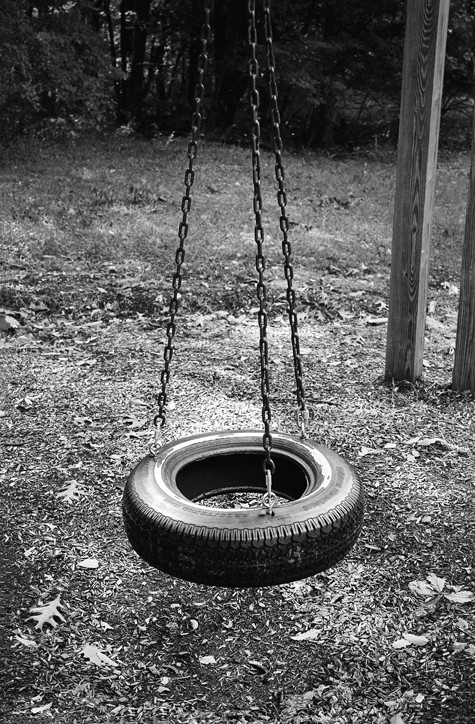
Figure 15-1: A fine-art photo of an ordinary object.
Selling objects with photography
Commercial product photography is all about making the subject look its best. No matter the message, the product always looks perfect. One of the biggest fabrications in everyday life is the way companies show their products in relation to how they really are. Have you ever gotten a deluxe burger that looked the same as the one in the photograph on the menu board? I know I haven’t.
The two main ways to glorify a product are lighting and product enhancement — tricks of the trade that cause products to look ideal. I discuss these in the following sections.
Lighting your product
The way you light a shiny soda can is going to be different from the way you light a dull but highly textured basketball. You use different lighting techniques to make different products look great.
Chapter 10 gives you the details about lighting, but here are some of the ways you apply those principles in product photography:
Directional, soft light reveals the shape of opaque objects and is ideal for rounded objects.
Directional, hard light reveals the texture of opaque objects.
High contrast conveys power, drama, high energy, mystery, and masculinity.
Low contrast conveys beauty, sincerity, calmness, smoothness, and dreamlike states.
A reflective surface is like a mirror, and you light it differently from opaque surfaces. Lighting the surface of a reflective object isn’t as effective as actually lighting what’s being reflected. For instance, to better see your face in a mirror you light your face, not the mirror itself. Place white or black pieces of foam core around your subject to add or take away light in the reflection.
In Figure 15-2, I created the highlight running down the left side of the glass bottle by placing a large piece of white foam core just to the left of the frame. The white surface reflects light from the key light source (a strobe that was bounced onto the ceiling just behind the camera), and its reflection shows in the surface of the glass bottle. I also used an available light that was directly above the martini glass, which helped to light the liquid without affecting too much of the bottle’s surface.
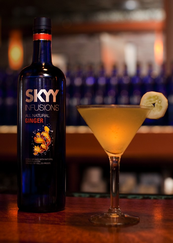
Figure 15-2: Lighting your scene according to a subject’s reflective characteristics.
In Figure 15-3, the product has a plastic wrapper. The client wanted to show the product inside the plastic without glare and reflection, so I positioned my lights in a way that eliminated distracting highlights. This way you can see clearly through the packaging. Sidelighting was used to show texture in the product and provide a low level of contrast to keep the image from being overdramatic.

Figure 15-3: Minimizing the visibility of reflections by properly positioning the scene’s lights.
Enhancing your product
Viewers have certain expectations from the products they see in photographs, and certainly clients care deeply about the way you present their products. As a result, it’s often necessary to enhance products when photographing them.
 The following list shows a few of the ways you can show off products to their best advantage in photographs:
Steam clothing and linens to ensure they’re wrinkle-free. Also, use pins to make clothes fit a model or mannequin perfectly and to make curtains fall to the perfect length.
Mix glycerin and water in a 50/50 ratio to create a substance that makes perfect sweat beads on the outside of bottles and glasses. You can buy glycerin in the first-aid aisle of most drug stores. Apply the mixture to the bottle or glass with a spray bottle; for larger drops use a syringe.
Experiment with fire to make foods look more appealing. For instance, a torch gives the perfect level of char to a steak and browns the edges of baked goods. You can use an electric charcoal starter or metal skewers heated over an open flame to apply grill marks.
Place the hands of a clock or watch on the ten and the two so the time reads 10:10. This position generally looks good on most watches and is an old-school trick that many photographers use. Of course, if you’re shooting a watch with a face that has other smaller dials or graphics, you want to place the hands in a way that doesn’t block those extra items.
Add some texture bubbles to the back edge of a cup of coffee. You can do so by applying a mixture of the drink and some detergent to the surface with an eyedropper.
Enhance milk’s color and texture, which come out looking yellowish and translucent in photos, with glue. If you’re shooting a glass of milk, use white glue instead.
Because representing a product at its best is critical in commercial images, photographers often use photo-editing software to remove flaws and to enhance contrast and color saturation. You can find out more about digital enhancement in Chapter 18.
Photographing Flowers in Studio and in Nature
Flowers probably are the most common still-life subjects for artistic photography. They act as recognizable, everyday subjects that can be shown in extraordinary ways. Flowers make for such common photographic subjects because they’re beautiful and designed to attract. They’re also easily accessible and somewhat compliant.
Images of flowers have been created for many years in drawings, paintings, and photographs; they’re most successful when paired with the appropriate light, environment, and composition. Achieving these requirements depends on whether you’re shooting in studio or out in nature itself. So, I discuss each scenario in the following sections.
Some flowers are fairly small, so no matter where you’re shooting — indoors or out — using a macro lens may be your best bet to create a composition that magnifies the flower enough to reveal maximum detail. I cover macro lenses further in Chapter 3.
Producing images in the studio
When you photograph flowers in a studio, you don’t have to worry about wind or overly bright sunshine, but you do have to create a background for the flower. If your shot consists of just a flower and a background (as it likely will in studio), the background has a major impact on your message. So be sure to choose a background that’s appropriate for the flower you’re shooting and for the mood you’re trying to create. Of course, you should use your best creative judgment for your situation, but here are some general pointers for choosing a background:
A smooth and even-toned background helps create a simple composition in which the flower is the main focal point.
A textured and high-contrast background is more chaotic and competes with the flower for attention.
Setting a bright flower against a dark background causes it to stand out. Similarly, a dark flower stands out more on a bright background. Placing a flower in front of a background with a similar tonality shows the flower in a subtler way.
Figure 15-4 depicts the same flower in front of two different backgrounds. Each has a much different feel and produces a different message. The white background causes you to look only at the flower and maximizes the emphasis on the rose’s shape. The green, textured background is more similar to one you’d see in nature. Flowers naturally stand out from the color green (perhaps so bees and birds can see them from far away). The background competes slightly with the rose in a complimentary way and gives you more to look at than just the flower. The shape of the rose isn’t as identifiable in this image as it is in the one with the white background.
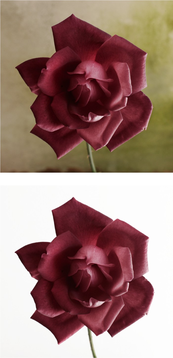
Figure 15-4: A background alone can change your message when photographing flowers.
After you choose an in-studio background for your flower, you also have to consider your lighting. Fortunately, when shooting in the studio, you have complete control over your lighting. You can manipulate its direction, quality, intensity, and the number of sources of light that are used. Most often, flowers are shot with a soft key light source. I shot the roses in Figure 15-4 using window light. The sun wasn’t shining directly in the window, so the quality of light was very soft.
![]() Here are some guidelines to keep in mind as you consider your lighting:
Here are some guidelines to keep in mind as you consider your lighting:
Soft light is used for representing beauty, and most people associate flowers with being beautiful. It also accentuates the rounded shapes of buds and petals. The larger the window, the softer the light will be.
A directional light coming from one side or the other helps to reveal the texture of the flower’s petals, buds, stems, and leaves.
Shooting with high contrast will produce a dramatic representation of the flower, and shooting with low contrast will produce a subdued representation.
For more details about lighting, head to Chapter 10.
Capturing flowers in their natural environments
Photographing flower subjects in the studio gives you control over the wind and the lighting, but shooting them outdoors enables you to capture their images in a realistic and natural setting. Taking photos of your flower subjects in their most natural settings requires you to consider both background and lighting and also perspective.
Most flowers are naturally designed to stand out from their surroundings. Notice, for example, how well the flowers in Figure 15-5 pop because of their color. A flower’s prominence in a scene makes it fairly easy to choose a perspective that enables you to capture great images without having to manipulate the background too much.
Consider the following when finding your perspective for an effective flower image:
Angles: Shoot from an angle that shows the flower clearly. Avoid positioning it in front of background elements that are a similar color or that interfere with the perceived shape of the flower. As I explain in Chapter 9, you want to avoid merging lines and shapes.
Depth of field: If you’re stuck with a busy background, using a shallow depth of field can help to make the flower stand out.
Grouping: If you’re shooting multiple flowers, remember that multiples usually look better compositionally when grouped in odd numbers.
Lighting: The direction of your lighting (combined with the elements discussed in the first bullet point) should determine how you approach a flower. A sidelit scenario helps to reveal texture in a flower. Some flowers have thin petals that are semitransparent. A backlit scenario can cause them to glow, such as in the example shown in Figure 15-5.
 Flowers can be unruly in a breeze; they sway easily and can make focusing and exposing with slower shutter speeds difficult (movement in slow shutter speeds causes blurring in your photo). However, if you block or eliminate the wind through the use of a collapsible reflector (as I discuss in Chapter 14) or shoot on a calm day, you should have an easy time working with flowers.
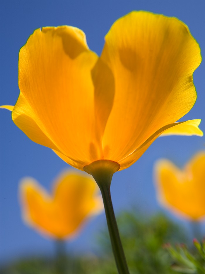
Figure 15-5: Flowers naturally stand out from their environments.
Cooking Up Beautiful Food Photos
Food is a frequently chosen subject for still-life photography. You may find yourself composing images of food for a number of reasons. The most common food images are for product photography, lifestyle photography (images that sell the feelings associated with a product rather than just the product itself), and fine-art photography. The tricks discussed in this section are useful for all types of food photography.
In product photography, food is treated in the same manner as any other subject: It’s idealized and made to look immaculate. In the earlier section “Enhancing your product,” I list some methods of making products look their best. If you’re working on a commercial assignment, a professional food stylist is likely to be on set. A stylist handles the food preparation and does all the tricks necessary to get the look the client is going for. So, you’re responsible for (and free to focus on) lighting and composing a beautiful photograph of the final product.
Here are some tricks I’ve discovered for getting great images while photographing food:
Light your subject from the back. Many times foods are grouped on a plate and the various items merge with each other. Backlighting food helps to separate the shapes of different items on the platter and helps to reveal texture.
Even though backlighting is important, be sure to fill in your scene from the front as well to bring out the details in the shadow areas. To do so, use a reflective material to bounce light in from the key light source. (Chapter 10 provides further information on lighting.)
Keep angle in mind. Of course, you can shoot from any angle you want, but you should understand what the angle says about the subject. Consider these guidelines:
• A high angle shows food as viewers are used to seeing it in reality when seated at a table, so the angle looks natural in photographs.
• A low angle gives the perspective as if the viewer is looking up at the subject. This angle isn’t a natural one for someone to see food from in real life, and it often causes the subject to appear as a hero of sorts.
• A bird’s-eye view of food is interesting when you have various shapes to work with, and it gives viewers the sense that they’re directly over the food, as if they were about to dig in to it.
Figure 15-6 shows the same scene photographed with a traditional high angle and with a bird’s-eye view.
Get close to your subject. Doing so helps you draw more attention to it and show the textures, juices, and smaller ingredients.
Choose a background that has appropriate colors for your specific subject. Similar colors work well to make the subject fit in, and opposite colors make the subject stand out. In Figure 15-6, the subject fits into the scene because of the similarity in colors. This similarity makes it seem like it belongs there. If you have distracting background details in your composition (and you can’t choose another background), use a shallow depth of field to eliminate them.

Figure 15-6: Two angles of the same food item.
You can combine these and other compositional elements to achieve the look you want. The photo in Figure 15-7, for example, uses many different elements. A shallow depth of field eliminates the details from outside the window in the background, and the low angle makes the dessert look like a piece of art rather than just something you eat. The close perspective also reveals the dessert’s texture. The plant in the background gives a sense of environment, but it isn’t distracting because of the shallow depth of field. The glass of juice in the background acts as a complimentary color to the garnish on top of the dessert, and the backlighting highlights the texture and shapes of the dessert while separating it from the background.
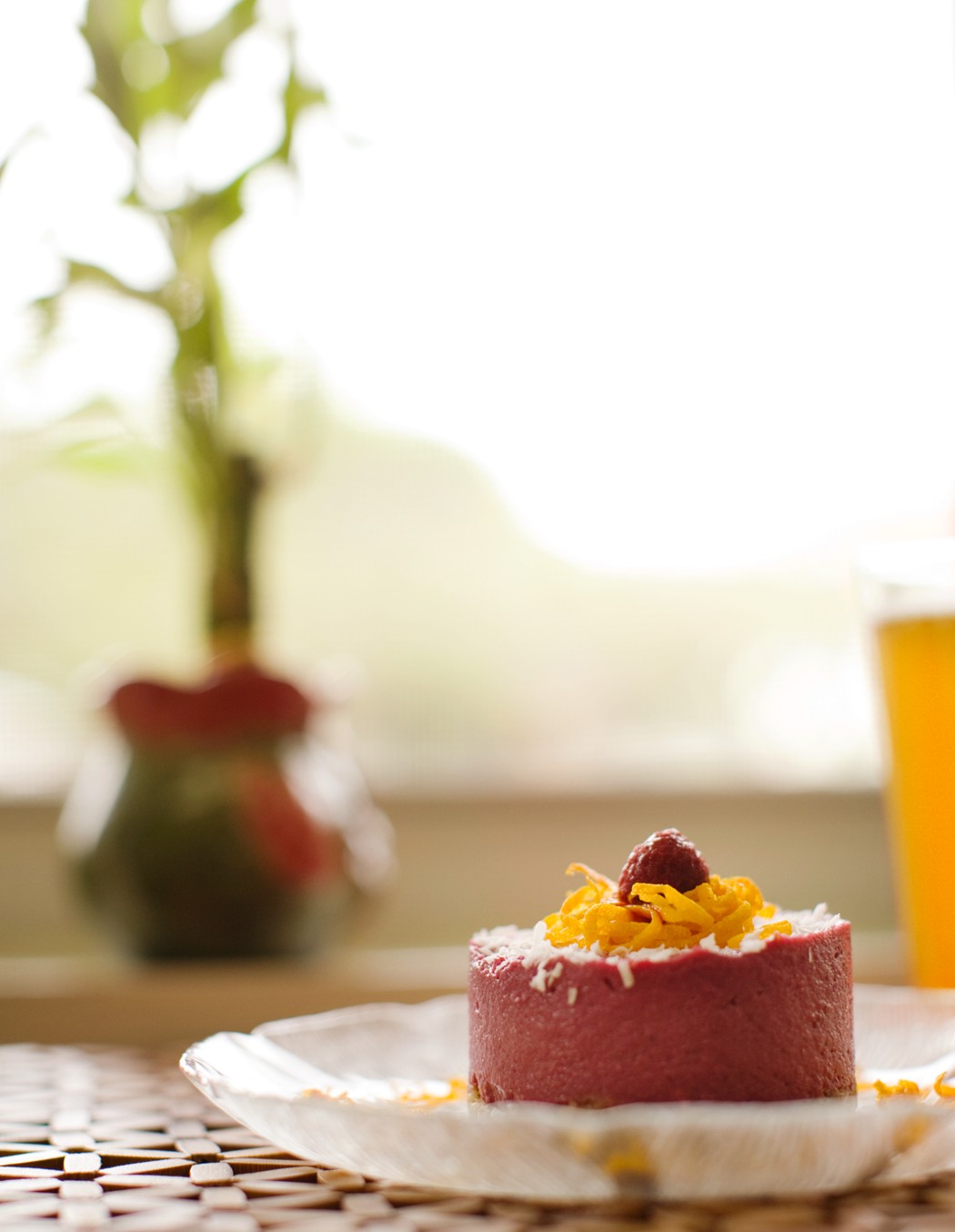
Figure 15-7: Multiple compositional elements combine to create one message.
Working with Architectural and Interior Photography
Like photography, architecture is an art form that uses composition to create works that are functional and aesthetically pleasing. The spaces created by architects and interior designers affect your mood while you’re in them. They manipulate the way you feel, and it happens in such a subtle way that you likely won’t notice it. Consider the outside of a building as the cover of a book and the interior spaces as the content inside that book. Each building is a story, and an architectural photographer’s job is to document that story in the best way possible.
When photographing a building, think about the architect who designed it and why she did things the way she did. And when shooting interiors for a hotel, restaurant, condo, or home, pay attention to how the décor works with the architecture to provide a complete mood in your image. All the design work in architectural and interior photography has already been done and is laid out in front of you. You just have to know it when you see it and be able to capture it appropriately on your digital sensor.
Often you have to tweak the layout of a room’s design to accommodate for the specific camera angle you’ve chosen. Some furniture may have to be moved to better reveal details that are behind it, and some angles and placements of furniture may have to be cheated a bit in order to better suit your composition. Look through the viewfinder while your assistant moves the elements based on your instructions. If you’re shooting in a privately owned property, be respectful of the owner’s concerns about moving furniture, and involve them in the creative process by showing them the results of your styling on the camera’s display screen.
I provide you with some guidance on photographing both exteriors and interiors in the following sections. The images used in this section are courtesy of Craig Denis, a photographer and friend of mine who specializes in architectural and interior photography.
In Chapter 12, I explain how you can raise and lower the lens element of a tilt-shift lens to correct distortion caused by high and low perspectives. These lenses are great for shooting architecture and interiors, but if you don’t have one, you can correct distortion with your photo-editing software. I discuss postproduction techniques in Chapter 18.
Crafting images of building exteriors
To get great compositions of building exteriors, you first need to determine the best time of day to photograph. After all, sometimes the lighting is the most interesting part about the exterior of a building. Because your subject is large and can’t be moved or repositioned, you have to shoot when the sun is in the appropriate area for your desired lighting. Take some time before your shoot to figure this out. Go to the location in the morning and in the afternoon to see which looks best. Also, check to see whether the building looks best at night.
If you’re going to photograph a building at night, start shooting just after the sun goes down and continue shooting until it gets dark. Sooner or later, you’ll hit the specific time during which the ambient light that’s fading from the day and the building’s lights expose properly together. Think of the ambient light as your fill light and the building’s lights as your key light. (Check out Chapter 10 for more on these types of light.) Because you can’t control the ambient light, you have to be in the right place at the right time, and the best method to make sure you get the shot is to continually take test shots as the light fades.
After determining your lighting, you’re ready to focus on the composition. Composing your shot is all about perspective (refer to Chapter 8). Buildings provide interesting lines and shapes, so their immediate surroundings can and should work to enhance those lines and shapes. In many cases, you want to photograph buildings from a high angle. You can do so by bringing a ladder or by shooting from the roof or a high window in a neighboring building. High angles provide a sense of how the building fits into its surroundings and show its landscape, which also is a part of the overall story. A low angle most likely emphasizes how tall a structure is, but it doesn’t provide the optimum amount of detail.
Balance, as a compositional quality, ensures that your viewers can comfortably view the entire frame of your composition without getting stuck in one area that’s weighted too heavily. By paying attention to the shape of the building and how it fits into a rectangular frame, you can determine how much space to leave around the building and which surrounding elements to include in your composition. Make sure that the building you’re shooting is large enough in the frame that viewers know it’s the subject. However, also leave enough space around its edges so that viewers have some supporting elements to explore or negative space to guide their eyes around the edge of the subject. Chapter 12 provides more information on balance and space.
Figure 15-8 shows the exterior of a house in which the structure is framed by the trees surrounding it. This composition helps keep your eyes in the frame and coming back to the house itself. The columns are highlighted by the use of exterior lights and the soft light available at dusk.
Taking a look inside: Composing interior shots
Composing an interior image usually is about giving a sense of space. With these types of images, typically you shoot with a slightly higher angle, which enables you to see over the elements of the room and creates depth and space. Balance also is important. Balance is created when the various elements in a room are positioned in your frame to lead a viewer through the space without getting stuck in one area that’s overweighted (containing a dominant amount of detail in comparison to the other areas in the frame). The key is to spread the love.
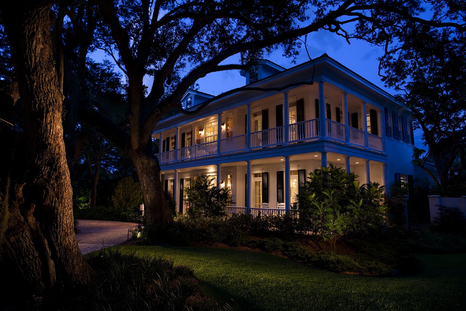
Figure 15-8: An exterior image of a house and its landscape.
![]() Here are three excellent ways to add to the sense of space in an interior photo:
Here are three excellent ways to add to the sense of space in an interior photo:
Create an interesting foreground, and then lead your viewers through the space in a way that gives them a sense of the architecture and the design. The shapes created by the space itself — furniture, rugs, fixtures, and accessories — can be used to achieve this interesting foreground, or starting point. Then you can lead the viewer’s eye into the frame to an area that counters the starting point. Finally, have that area lead to another point of interest and create a flow, which ultimately leads back to the starting point.
In Figure 15-9, Craig Denis used the shape of the bar to lead viewers into the image to an area where guests can lounge. Just above that part of the composition is a shape on the ceiling that mimics that of the bar. This brings your eyes over to the right side of the frame where you can get an idea of the texture of the chairs that are shown on the left side of the frame. In the end, your eyes are brought back to the bar and ideally it leads you back into the image again.

Figure 15-9: An example of leading viewers from the foreground into the image.
Light your scene to suggest depth. You can light the farthest elements more than the nearer elements to create the sense of depth. Viewers will notice the foreground elements and continuously go to the brighter elements as their eyes move through the scene’s space.
Include multiple areas in one composition. By looking through the main area of interest and into another area beyond it, you get the sense that there’s more to the story. For example, say you’re shooting the master bedroom of a high-end condominium. By opening the bathroom door and choosing a perspective that shows the room in a pleasant way and reveals the bathroom’s whirlpool, you’re showing viewers that the people who sleep in this room have style and a private, luxury bath.
Lighting is just as important as composition. Lighting interiors can be simple or complex depending on the space and your desired look. To achieve a natural look, shoot during the day and let as much daylight in through the windows as possible. Using a single strobe at a low setting and bouncing it off the ceiling helps to fill in shadow areas and lower the overall contrast. (Chapter 10 provides more on the different types of lights.) This is a minimalist approach and provides good clean results — assuming, of course, you have a decent amount and quality of window light to work with.