Chapter 5
Giving Your E-Business Site Structure and Style
In This Chapter
![]() Creating a simple and well-organised business site
Creating a simple and well-organised business site
![]() Establishing a graphic identity through colour and type
Establishing a graphic identity through colour and type
![]() Scanning, cropping, and retouching photos
Scanning, cropping, and retouching photos
![]() Using Web page frames and tables effectively
Using Web page frames and tables effectively
Not so long ago, a business that was on the World Wide Web was distinctive by definition. Nowadays, it seems that every business – from your local newsagent to international conglomerates – is on the Web. As cyberspace fills up with small businesses trying to find their niches, standing out from the crowd and attracting attention on the Internet becomes increasingly difficult.
But the same tried and tested principles apply, even though Web surfers are increasingly mobile and increasingly accustomed to sophisticated content. You don’t have to load your site with scripts, animations, and flashy gimmicks. Often, the trick is to have no trick: Keep your site simple, well organised, and content rich.
In this chapter, we present one of the best ways for a new business to attract attention online: through a clearly organised and eye-catching Web site. (Another strategy for attracting visitors – developing promotions and content that encourages interaction – is the subject of Chapter 6.)
Feng Shui Your Web Site
According to the Web site The Geomancer (thegeomancer.netfirms.com/fengshui.htm), Feng Shui is the art of arranging objects in an environment to achieve (among other things) success in your career, wealth, and happiness. If that’s true, you should try to practise some Feng Shui with your online business environment, too.
You may be tempted to rush into the process of designing and building your Web site, but while enthusiasm is always a good thing, you should try to think with a clear head and take time to plan what you’re going to do. Whether you’re setting off on a road trip across the country or building a new extension on your house, you’ll progress more smoothly by drawing a blueprint of how you want to progress. Do you remember when you were a tiny little nipper and did your homework with a pencil and paper? Dig ’em out again and make a list of the elements you want to have on your site.
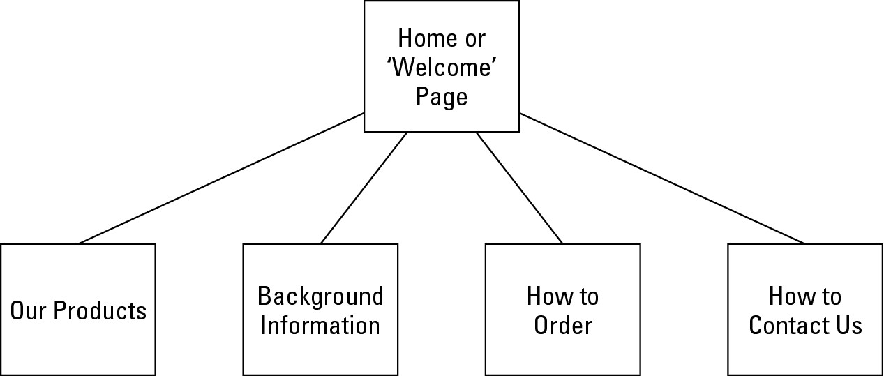
Look over the items on your list and break them into two or three main categories. These main categories will branch off your home page, which functions as the grand entrance for your online business site. You can then draw a map of your site that assumes the shape of a triangle, as shown in Figure 5-1.
|
Figure 5-1: A home page is the point from which your site branches into more specific levels of information. |
|
Note: The page heading ‘Background Information’ is a placeholder for detailed information about some aspect of your online business. For Greg’s brother’s audio restoration business, he suggested including a page of tech-nical information listing the equipment he uses and describing the steps he takes to process audio. You can write about your experience with and love for what you buy and sell, or anything else that will personalise your site and build trust.
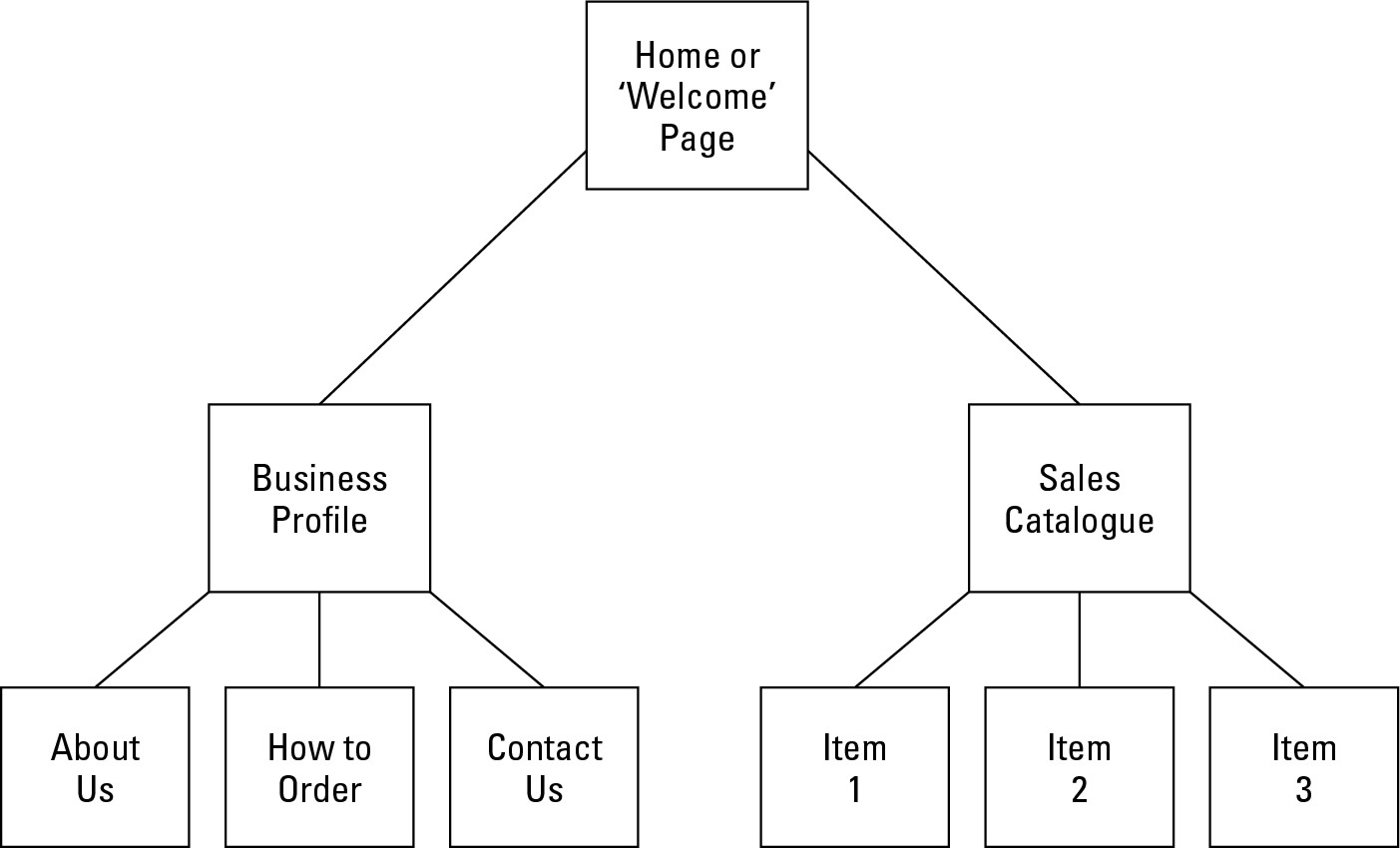
The preceding example results in a very simple Web site. But there’s nothing wrong with starting out simple. For Greg’s brother, who is creating his first Web site and is intimidated by getting started, this simple model is working well. Many other businesses start with a three-layered organisation for their Web sites. This arrangement divides the site into two sections, one about the company and one about the products or services for sale (see Figure 5-2).
|
Figure 5-2: This arrange-ment divides the site into two sections. |
|
Think of your home page as the lobby of a museum where you get the help of the friendly person at the information desk who hands you a list of the special exhibits you can visit that day and shows you a map so that you can begin to figure out how you’re going to get from here to there. Remember to include the following items on your home page:
 The name of the shop or business
Your logo, if you have one
Links to the main areas of your site or, if your site isn’t overly extensive, to every page
Contact information, such as your e-mail address, phone/fax numbers, and (optionally) your business address so that people know where to find you in the Land Beyond Cyberspace
Making them fall in love at first site
First impressions are critical on the Web, where shoppers have the ability to jump from site to site with a click of the mouse button. A few extra seconds of downtime waiting for complex images or mini-computer programs called Java applets to download can cause your prospective buyer to lose patience and you to lose a sale.
How do you make visitors to your welcome page feel like they are being greeted with open arms? Here are some suggestions:
Keep it simple. Don’t overload any one page with more than three or four images. Keep all images 20K or less in size.
Find a fast host. Some Web servers have super-fast connections to the Internet and others use slower lines. Test your site; if your pages take more than a couple of seconds to appear, ask your host company why and find out whether they can move you to a faster machine.
Offer a bargain. Nothing attracts attention as much as a contest, a giveaway, or a special sales promotion. If you have anything that you can give away, either through a contest or a deep discount, do it. See Chapter 6 for more ideas.
Provide instant gratification. Make sure that your most important information appears at or near the top of your page. Readers on the Web don’t like having to scroll through several screens worth of material in order to get to the information they want.
Nip and Tuck: Establishing a Visual Identity
The prospect of designing a Web site may be intimidating if you haven’t tried it before. But just remember that it really boils down to a simple principle: effective visual communication that conveys a particular message. The first step in creating graphics is not to open a painting program and start drawing, but rather to plan your page’s message. Next, determine the audience you want to reach with that message and think about how your graphics can best communicate what you want to say. Some ways to do this follow:
Gather ideas from Web sites that use graphics well – both award-winning sites and sites created by designers who are using graphics in new or unusual ways. To find some award winners, check out The Webby Awards (www.webbyawards.com), The International Web Page Awards (www.websiteawards.com), and the Interactive Media Awards (www.interactivemediaawards.com).
Use graphics consistently from page to page to create an identity and convey a consistent message.
Create graphics that meet visitors’ needs and expectations. If you’re selling fashions to teenagers, go for out-there graphics. If you’re selling financial advice to OAPs, choose a distinguished and sophisticated typeface.

Wallpaper that will wow
The proper term for the wallpaper behind the contents of a Web page is its background. Most Web browsers display the background of a page as light grey or blue unless you specify something different. In this case, leaving it alone isn’t good enough. If you don’t choose a different colour, viewers are likely to get the impression that the page is poorly designed or that the author of the page hasn’t put a great deal of thought into the project. So even a neutral colour, such as white, is better than grey.
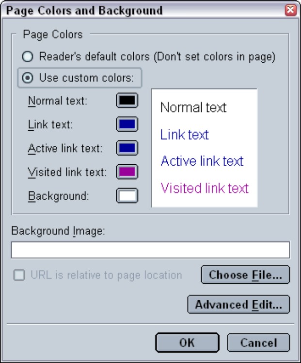
You can change the background of your Web page by tinkering with the HTML source code, but why would you want to? Most Web page creation programs offer a simple way to specify a colour or an image file to serve as the background of a Web page. For example, in an HTML editor called Netscape Composer, a free and easily overlooked Web page design tool that comes with the Netscape Communicator Web browser package, you use the Page Colours and Background dialog box (see Figure 5-3) to set your Web page wallpaper.
Colour your Web site effective
You can use colours to elicit a particular mood or emotion and also to convey your organisation’s identity on the Web. The right choice of colour can create impressions ranging from elegant to funky.
|
Figure 5-3: Most Web page editors let you specify background image/ colour options in a dialog box like this. |
|
The basic colour scheme chosen by the phone group T-Mobile (www.t-mobile.co.uk) conveys to customers its professionalism, yet also gives an impression of being with it – cool if you will. Compare that to Dan’s favourite Web site, brought to you by John Cleese (www.thejohncleese.com), which is a riot of colour and movement. Remember that while it’s a personal Web site, a huge business operation is behind it. Note how many items on the Web site are for sale, as well as the fact that you can pay to become a member.
When selecting colours for your own Web pages, consider the demographics of your target audience. Do some research on what emotions or impressions are conveyed by different colours and which colours best match the remit or identity of your business. Refer to resources such as the online essay by Noble Image Web Design (www.nobleimage.com/no_flash/articles/color_choices.htm), which examines in some detail the subject of how colour choices make Web surfers react differently.

Sometimes your own instincts are the best way to decide what colours to use. Do you need to attract kids with wild designs? Or would that put off your older, more discerning customers? Pay attention to your gut reactions, then get feedback from your colleagues, and test your choice on a few sample members of your audience before you make your final decision.
Tiling images in the background
You can use an image rather than a solid colour to serve as the background of a page. You specify an image in the HTML code of your Web page (or in your Web page editor), and browsers automatically tile the image, reproducing it over and over to fill up the current width and height of the browser window.
Background images only work when they’re subtle and don’t interfere with the page contents. Be careful to choose an image that doesn’t have any obvious lines that will create a distracting pattern when tiled. The effect you’re trying to create should literally resemble wallpaper.
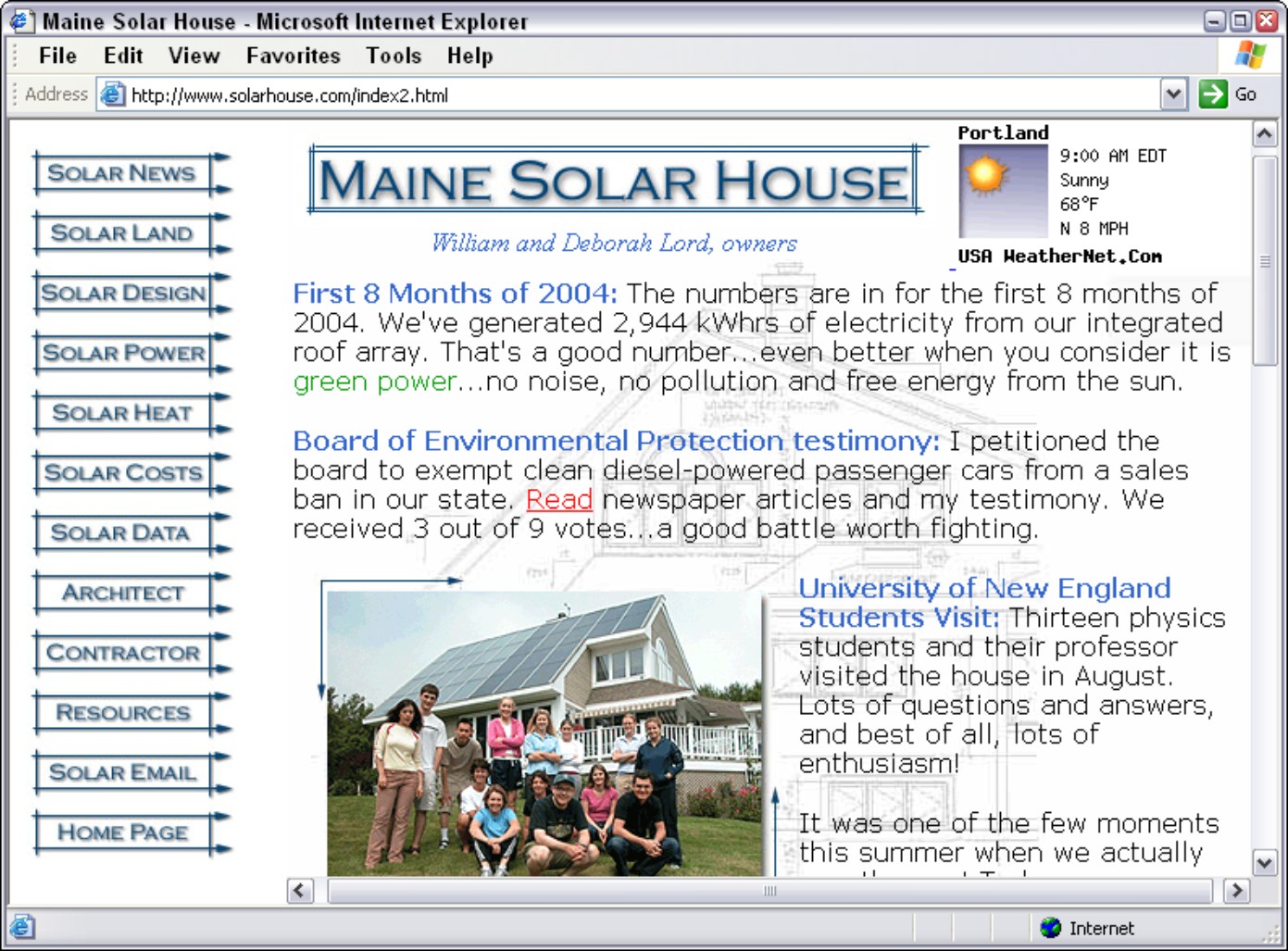
What you absolutely don’t want to have happen is that the background image makes the page unreadable. Visit the Maine Solar House home page (www.solarhouse.com), shown later in Figure 5-8, for a rare example of a background image that is faint enough to not interfere with foreground images and that actually adds something to the page’s design.
Using Web typefaces like a pro
If you create a Web page and don’t specify that the text be displayed in a particular font, the browser that displays the page will use its default font – which is usually Times or Helvetica (although individual users can customise their browsers by picking a different default font).
However, you don’t have to limit yourself to the same-old, same-old. As a Web page designer, you can exercise a degree of control over the appearance of your Web page by specifying that the body type and headings be displayed in a particular nonstandard font. A few of the choices available to you have names such as Arial, Courier, Century Schoolbook, and so on.
But just because you fall in love with a particular typeface doesn’t mean your audience will be able to admire it in all its beauty. The problem is that you don’t have ultimate control over whether a given browser will display the specified typeface because you don’t know for sure whether the individual user’s system has access to your preferred typefaces. If the particular font you specified is not available, the browser will fall back on its default font (which, again, is probably Helvetica or Times).
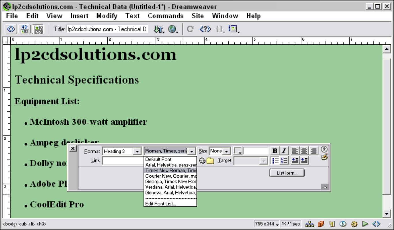
Where, exactly, do you specify type fonts, colours, and sizes for the text on a Web page? Again, special HTML tags tell Web browsers what fonts to display, but you don’t need to mess with these tags yourself if you’re using a Web page creation tool. The specific steps you take depend on what Web design tool you’re using. In Dreamweaver, you have the option of specifying a group of preferred typefaces rather than a single font in the Property Inspector (see Figure 5-4). If the viewer doesn’t have one font in the group, another font is displayed. Check the Help files with your own program to find out exactly how to format text and what typeface options you have.
|
Figure 5-4: Most Web page design tools let you specify a preferred font or fonts for your Web page in a dialog box like this. |
|

Clip art is free and fun
Not everyone has the time or resources to scan or download photos, or create their own original graphics. But that doesn’t mean you can’t add graphic interest to your Web page. Many Web page designers use clip-art bullets, diamonds, or other small images next to list items or major Web page headings to which they want to call special attention. Clip art can also provide a background pattern for a Web page or highlight sales headings such as Free!, New!, or Special!
When Greg first started out in the print publications business, he bought catalogues of illustrations, literally clipped out the art, and pasted it down. It’s still called clip art, but now the process is different. In keeping with the spirit of exchange that has been a part of the Internet since its inception, some talented and generous artists have created icons, buttons, and other illustrations in electronic form and offered them free for downloading.
Here are some suggestions for sources of clip art on the Web:
.jpg)
A picture is worth a thousand words
Some customers know exactly what they want from the get-go and don’t need any help from you. But most customers love to shop around or could use some encouragement to move from one item or catalogue page to another. This is where images can play an important role.
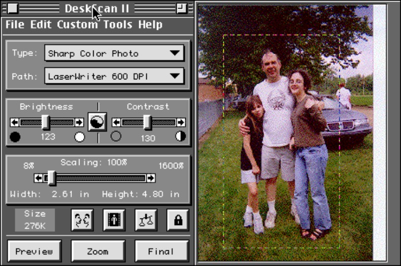
Even if you use only basic clip art, such as placing spheres or arrows next to sale items, your customer is likely to thank you by buying more. A much better approach, though, is to scan or take digital images of your sale items and provide compact, clear images of them on your site. Here’s a quick step-by-step guide to get you started:
1. Choose the right image to scan.
After you purchase a scanner or digital camera (see the suggestions in Chapter 2), the next step is to select images (if you’re going to scan) or take images (if you’re using a camera) that are well illuminated, have good contrast, and are relatively small in size.
The original quality of an image is just as important as how you scan or retouch it. Images that are murky or fuzzy in print will be even worse when viewed on a computer screen.
2. Preview the image.
Most digital cameras let you preview images so that you can decide whether to keep or delete individual pictures before downloading to your computer. If you’re working with a scanner, scanning programs let you make a quick preview scan of an image so that you can get an idea of what it looks like before you do the actual scan. When you press the Preview button, you hear a whirring sound as the optical device in the scanner captures the image. A preview image appears on-screen, surrounded by a rectangle made up of dashes, as shown in Figure 5-5.
|
Figure 5-5: The software lets you crop a preview image to make it smaller and reduce the file size. |
|
3. Crop the image.
Cropping an image is a good idea because it highlights the most important contents and reduces the file size. Reducing the file size of an image should always be a primary goal – the smaller the image, the quicker it appears in someone’s browser window. Cropping means that you resize the box around the image in order to select the portion of the image that you want to keep and leave out the parts of the image that aren’t essential.
Almost all scanning and graphics programs offer separate options for cropping an image and reducing the image size. By cropping the image, you eliminate parts of the image you don’t want, which does reduce the image size. But it doesn’t reduce the size of the objects within the image. Resizing the overall image size is a separate step, which enables you to change the dimensions of the entire image without eliminating any contents.
4. Select an input mode.
Tell the scanner or graphics program how you want it to save the visual data – as colour, line art (used for black-and-white drawings), or greyscale (used for black-and-white photos).
5. Set the resolution.
In Chapter 2, we note that digital images are made up of little bits (dots) of computerised information called pixels. The more pixels per inch, the higher the level of detail. When you scan an image, you can tell the scanner to make the dots smaller (creating a smoother image) or larger (resulting in a more jagged image). This adjustment is called setting the resolution of the image. (When you take a digital photo, the resolution of the image depends on your camera’s settings.)
How many dots per inch (dpi) do you want your image to be? When you’re scanning for the Web, you expect your images to appear primarily on computer screens. Because many computer monitors can display resolutions only up to 72 dpi, 72 dpi – a relatively rough resolution – is an adequate resolution for a Web image. (By contrast, many laser printers print at a resolution of 600 dpi.) But using this coarse resolution has the advantage of keeping the image’s file size small. Remember, the smaller the file size, the more quickly an image appears when your customers load your page in their Web browsers.
6. Adjust contrast and brightness.
Virtually all scanning programs and graphics editing programs provide brightness and contrast controls that you can adjust with your mouse to improve the image. If you’re happy with the image as is, leave the brightness and contrast set where they are. (You can also leave the image as is and adjust brightness and contrast later in a separate graphics program, such as Paint Shop Pro, which you can try out by downloading it from the Corel Web site (www.corel.co.uk).
7. Reduce the image size.
The old phrase ‘good things come in small packages’ is never more true than when you’re improving your digital image. If you’re scanning an image that is 8" x 10" and you’re sure that it needs to be about 4" x 5" when it appears on your Web page, scan it at 50 per cent of the original size. This step reduces the file size right away and makes the file easier to transport. That’s really important if you have to put it on a floppy disk to move it from one computer to another.
8. Scan away!
Your scanner makes a beautiful whirring sound as it turns those colours into pixels. Because you’re scanning only at 72 dpi, the process shouldn’t take too long.
9. Save the file.
Now you can save your image to disk. Most programs let you do so by choosing File⇒Save. In the dialog box that appears, enter a name for your file and select a file format. (Because you’re working with images to be published on the Web, remember to save either in GIF or JPEG format.)
For more details on scanning images, check out Scanning For Dummies, 2nd Edition, by Mark Chambers (Wiley).
Accommodating your viewers
Recent surveys show that broadband connections are taking over regular dialup connections. More people are using them because they’re quicker and no longer cost the earth. But the many Web surfers who still have very slow Internet connections (or very low tolerances for waiting) may not have the bandwidth to display even ordinary images quickly enough. And, although it may be tempting to show off, you may as well forget about presenting such content as live video, teleconferencing, and other graphics files on the Web. After many minutes or even just seconds of waiting, the surfer is likely to hit the browser’s Stop button, with the result that no graphics appear at all.
How do you prevent customers from blocking out your beautiful graphics and ruining the whole effect? Some alternatives include:
Creating low-resolution alternatives to high-resolution graphics, such as thumbnails (postage-stamp sized versions of larger images)
Cropping images to keep them small
Using line art whenever possible, rather than high-resolution photos
By using the same image more than once on a Web page, you can give the impression of greater activity but yet not slow down the appearance of the entire page. Why? If you repeat the same image three times, your customer’s browser has to download the image file only once. It stores the image in a storage area, called disk cache, on the user’s hard drive. To display the other instances of the image, the browser retrieves the file from the disk cache, so the second and third images appear much more quickly than the first one did.
Users can also disable image display altogether so that they don’t see graphics on any of the sites they visit. The solution: Always provide a simple textual alternative to your images so that, if the user has disabled the display of a particular image, a word or two describing that image appears in its place.
Creating a logo
An effective logo establishes your online business’s graphic identity in no uncertain terms. A logo can be as simple as a rendering of the company name that imparts an official typeface or colour. Whatever text it includes, a logo is a small, self-contained graphic object that conveys the group’s identity and purpose. Figure 5-6 shows an example of a logo.
|
Figure 5-6: A good logo effectively combines colour, type, and graphics to convey an organi- sation’s identity or mission. |
|
GIF versus JPEG
Web site technology and HTML may have changed dramatically over the past few years, but for the most part, there are only two types of images as far as Web pages are concerned: GIF and JPEG. Both formats use methods that compress computer image files so that the visual information contained within them can be transmitted easily over computer networks. (PNG, a third format designed a few years ago as a successor to GIF, is appearing online more and more, but it still isn’t as widely used as GIF.)
GIF stands for Graphics Interchange Format. GIF is best suited to text, line art, or images with well-defined edges. Special types of GIF allow images with transparent backgrounds to be interlaced (broken into layers that appear gradually over slow connections) and animated. JPEG (pronounced ‘jay-peg’) stands for Joint Photographic Experts Group, the name of the group that originated the format. JPEG is preferred for large photos and continuous tones of grayscale or colour that need greater compression.
Extreme Web Pages: Advanced Layouts
People who have some experience creating Web sites typically use frames and tables. On the other hand, they may be right up the street of an adventurous type who wants to start an online business. So this section includes some quick explanations of what tables and frames are so that you know where to start when, and if, you decide you do want to use them.
We should point out that learning HTML is almost like learning a foreign language. Of course, you don’t to speak HTML, but you do have to know it well if you want to get by. If you’re taking the HTML route, as opposed to paying a designer or using standard WISYWIG software, then you must spend at least a few weeks getting to know it well before you have a crack at creating your Web site. Remember: People are put off easily by poor design and functionality, so yours has to work perfectly when you launch it.
Setting the tables for your customers
Tables are to designers what statistics are to sports fans. In the case of a Web page, they provide another means to present information in a graphically interesting way. Tables were originally intended to present tabular data in columns and rows, much like a spreadsheet. But by using advanced HTML techniques, you can make tables a much more integrated and subtle part of your Web page.
Because you can easily create a basic table by using Web page editors, such as Dreamweaver and FrontPage, starting with one of these tools makes sense. Some adjustments with HTML are probably unavoidable, however, especially if you want to use tables to create blank columns on a Web page (as we explain later in this section). Here is a quick rundown of the main HTML tags used for tables:
<TABLE> </TABLE> encloses the entire table. The BORDER attribute sets the width of the line around the cells.
<TR> </TR> encloses a table row, a horizontal set of cells.
<TD> </TD> defines the contents of an individual cell. The HEIGHT and WIDTH attributes control the size of each cell. For example, the following code tells a browser that the table cell is 120 pixels wide:
<TD WIDTH=120> Contents of cell </TD>
A quick HTML primer
Thanks to Web page creation tools, you don’t have to master HyperText Markup Language in order to create your own Web pages, although some knowledge of HTML is helpful when it comes to editing pages and understanding how they’re put together.
HTML is a markup language, not a computer programming language. You use it in much the same way that old-fashioned editors marked up copy before they gave it to typesetters. A markup language allows you to identify major sections of a document, such as body text, headings, title, and so on. A software program (in the case of HTML, a Web browser) is programmed to recognise the markup language and to display the formatting elements that you have marked.
Markup tags are the basic building blocks of HTML as well as its more complex and powerful cousin, eXtensible Markup Language (XML). Tags enable you to structure the appearance of your document so that, when it’s transferred from one computer to another, it will look the way you described it. HTML tags appear within carrot-shaped brackets. Most HTML commands require a start tag at the beginning of the section and an end tag (which usually begins with a backslash) at the end.
For example, if you place the HTML tags <B> and </B> around the phrase ‘This text will be bold’, the words appear in bold type on any browser that displays them, no matter if it’s running on a Windows-based PC, a UNIX workstation, a Macintosh, a palm device that’s Web enabled, or any other computer.
Many HTML commands are accompanied by attributes, which provide a browser with more specific instructions on what action the tag is to perform. In the following lines of HTML, SRC is an attribute that works with the <IMG> tag to identify a file to display:
<IMG SRC=”house.jpg”>
Each attribute is separated from an HTML command by a single blank space. The equal sign (=) is an operator that introduces the value on which the attribute and command will function. Usually, the value is a filename or a directory path leading to a specific file that is to be displayed on a Web page. The straight (as opposed to curly) quotation marks around the value are essential for the HTML command to work.
Don’t forget that the cells in a table can contain images as well as text. Also, individual cells can have different colours from the cells around them. You can add a background colour to a table cell by adding the BGCOLOR attribute to the <TD> table cell tag.
The clever designer can use tables in a hidden way to arrange an entire page, or a large portion of a page, by doing two things:
Set the table border to 0. Doing so makes the table outline invisible, so the viewer sees only the contents of each cell, not the lines bordering the cell.
Fill some table cells with blank space so that they act as empty columns that add more white space to a page.
An example of the first approach, that of making the table borders invisible, appears in Figure 5-7, David Nishimura’s Vintage Pens Web site (www.vintagepens.com), where he sells vintage writing instruments.
|
Figure 5-7: This page is divided into table cells, which give the designer a high level of control over the layout. |
|
Framing your subject
Frames are subdivisions of a Web page, each consisting of its own separate Web document. Depending on how the designer sets up the Web page, visitors may be able to scroll through one frame independently of the other frames on the same page. A mouse click on a hypertext link contained in one frame may cause a new document to appear in an adjacent frame.
Simple two-frame layouts such as the one used by one of Greg’s personal favourite Web sites, Maine Solar House (see Figure 5-8), can be very effective. A page can be broken into as many frames as the designer wants, but you typically want to stick with only two to four frames because they make the page considerably more complex and slower to appear in its entirety.
|
Figure 5-8: This site uses a classic two-frame layout: A column of links in the narrow frame on the left changes the content in the frame on the right. |
|
Only the more advanced Web page creation programs provide you with menu options and toolbar buttons that enable you to create frames without having to enter the HTML manually. Most of the popular Web page editors do this, including Adobe Dreamweaver and HotDog Professional by Sausage Software. See each program’s Help topics for specific instructions on how to implement framing tools.
Breaking the grid with layers
Tables and frames bring organisation and interactivity to Web pages, but they confine your content to rows and columns. If you feel confined by the old up-down, left-right routine, explore layers for arranging your Web page content.
Layers, like table cells and frames, act as containers for text and images on a Web page. Layers are unique because you can move them around freely on the page – they can overlap one another, and they can ‘bleed’ right to the page margin.
With Dreamweaver, you can draw a layer directly on the Web page you’re creating. You add text or images to the layer and then resize or relocate it on the page by clicking and dragging it freely. The result is some innovative page designs that don’t conform to the usual grid.
Hiring a Professional Web Designer
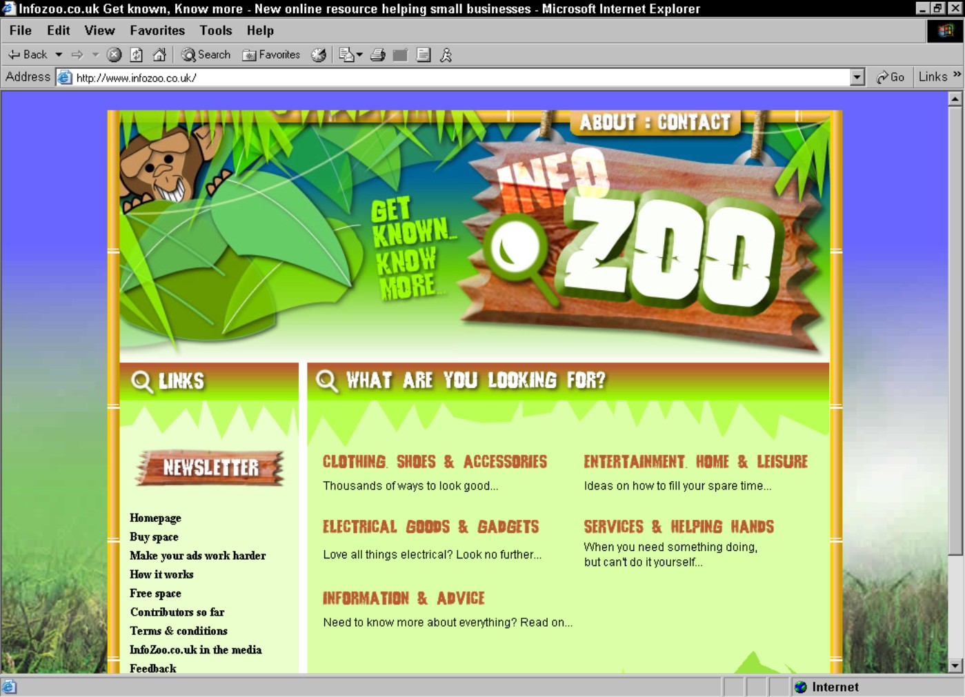
Part of the fun of running your own business is doing things yourself. So it comes as no surprise that many of the entrepreneurs we interviewed in the course of writing this book do their own Web page design, despite the extra time requirement and the fact that designers generally do it better! They discovered how to create Web sites by reading books or taking classes on the subject. But in many cases, the initial cost of hiring someone to help you design your online business can be a good investment in the long run. Dan, whose HTML is about as good as his Swahili, employed a Web design company to construct his Web site (www.infozoo.co.uk). The results are very professional and would take the average person a lot of time and expense to mimic. Keep in mind that after you pay someone to help you develop a look, you may be able to implement it in the future more easily yourself. For example:
If you need business cards, stationery, brochures, or other printed material in addition to a Web site, hiring someone to develop a consistent look for everything at the beginning is worth the money.
You can pay a designer to get you started with a logo, colour selections, and page layouts. Then you can save money by adding text yourself.
If, like Greg (apparently), you’re artistically impaired, consider the benefits of having your logo or other artwork drawn by a real artist.
Professional designers charge up to £100 per hour for their work (which is less than the average plumber). You can expect a designer to spend five or six hours to create a logo or template. But if your company uses that initial design for the foreseeable future, you’re not really paying that much per year.
In this case, as in all others, ask friends and family to help first. Dan’s got a couple of pals who are really artistic and have some technical knowledge, too. If you’re in the same boat, then you can save some serious cash.