
 |  |


If there is a correlation between one variable and another, what that means is that if one of your variables changes, the other is likely to change too.
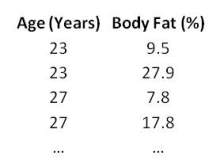
For example, say you had a hypothesis (a theory or hunch) that there was a relationship between age and percentage of body fat; that as you aged your percentage of body fat increases. We could go out and collect some data, like this:

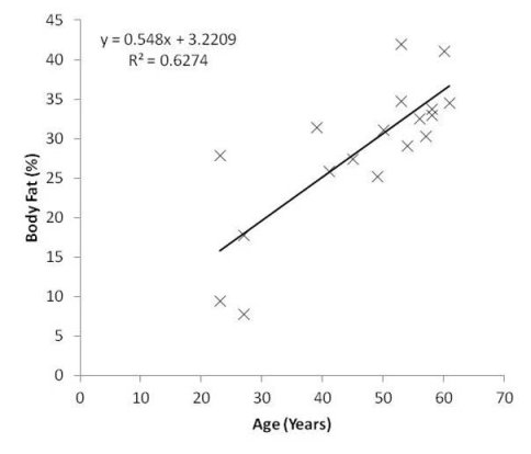
You would do a scatter plot of age against body fat percentage, and see if the line of best fit (aka a trend line or a regression line) is horizontal, vertical or if it has a trend. If the line is horizontal or vertical, that means that as one variable changes the other does not. In other words, there is not a relationship between them.
On the other hand, if the trend line is not horizontal or vertical, then we can say there is a trend, like this:

Scatter Plot Illustrating a Positive Correlation between Age and Percentage of Body Fat
In this example, the most appropriate trend line is one that is linear (but in other data that is not necessarily the case), and there is a positive correlation between age and percentage of body fat. That is, as you get older you are likely to gain increasing amounts of body fat. Ah, the joys of getting old...
Notice, though, that there is no suggestion that getting older causes you to gain extra body fat. You should probably know by now that correlation does not necessarily imply causation. To find out exactly why this is the case, don’t forget to download your FREE copy of Correlation Is Not Causation. I’ll remind you at the end of this chapter where you can get a copy.
On the chart, we have the equation of the line, which also includes the gradient (in this case, 0.548). The gradient tells you by how much the y-axis changes for each unit change in the x-axis. Here, we can say that body fat increases by a little over 0.5% every year.
A common misconception that the inexperienced make about correlations is that they assume that as long as the trend line is not horizontal or vertical, this means that there must be a correlation between the variables. This may or may not be true. You see, it depends on how far the plot points fall from the line of best fit. If they are all very close to the line, then you can be quietly confident that there may be a correlation, while on the other hand if the plot points are scattered then you should be less confident about a correlation.
You can assess your level of confidence by calculating the R2 value of the data. All statistics programs will be able to calculate this for you, even Microsoft Excel.
The R2 value (given on the chart above) is a measure of how far the plot points fall from the line. Briefly, the vertical distance from each plot point to the trend line is calculated. If these distances are small and consistent, the R2 value will be large (close to 1), whereas the larger and more variable they are, the smaller the R2 value will be (close to 0). R2 values are also often displayed as percentages.
In the graph above, the distances of the plot points from the regression line are small and mostly consistent, but with a few points that deviate appreciably. The R2 value therefore tells us that there is a strong positive relationship between age and body fat (an R2 value larger than 0.5 can be crudely categorised as ‘strong’).
We can’t tell though just from looking at the R2 value whether the relationship between age and body fat is statistically significant. For that, we need to run a statistical correlation test.
If the relationship between the variables is linear and a change in one variable is clearly associated with a proportional change in the other, then a Pearson Correlation test is appropriate. If the relationship between your data is such that a change in one variable does not necessarily indicate a proportional change in the other (i.e. they do not change together at a constant rate), then Spearman’s Correlation would be more appropriate.
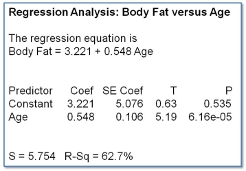
For our data, the relationship is such that change in age corresponds to a proportional change in body fat (the best-fit line through the data points is a straight line), so we run a Pearson Correlation, like this:

This is a typical output that you’ll find from many statistics programmes, although some may also output pages and pages of other stuff too. Some of it might be useful, but most of it won’t be, and to get started you need to look for the results that look like the table above.
OK, first thing to notice is that you get the equation of the line again. Check that it’s the same as the equation of the best-fit line that we generated in Excel (spoiler alert: it is).
Next there is a table that contains a lot of numbers, some of which we don’t need (they are used to calculate other numbers in the table, and seasoned statisticians start to feel uncomfortable if these other values are missing, so we humour them and leave them in...). The first important thing about the table is to note the coefficients. We use these to form the equation of the line. The coefficient of the Constant is the intercept and the coefficient of the variable Age is the gradient.
I’m going to skip right over the Standard Error of the Coefficient (a measure of the variability of the plot points) and the T statistic, and jump right to the p-value. The p-value of Age (6.16e-05) is very small and crucially is less than 0.05, and this tells us that the correlation between Age and Body Fat is statistically significant.
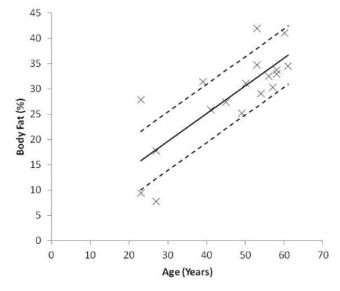
Below the table are a couple of goodness-of-fit test results. We have already seen the R2 value (again, check that it matches the R2 that we generated in Excel – another spoiler alert: it is), but the S value – the Standard Error of the Regression – is much more informative. The Standard Error gives us the average distance (arithmetic mean) that the plot points fall from the regression line, and is in the same units as the y-axis. Here, S tells us that the average distance between the plot points of body fat and the regression line is 5.754% body fat, and we can use this to show the average variation of the plot points on the graph, like this:

Scatter Plot with Line of Best Fit and Standard Error of the Regression
So, we started out with some data about Age and percentage of Body Fat, and we wondered if there might be a relationship between them. By plotting them against each other on a simple scatter plot in Excel, we could add a best-fit trend line and have Excel calculate the gradient, the equation of the line and an R2 value that tells us how far the plot points fall from the line – an indication of whether we should be confident about a correlation. We discovered that by using a correlation test we could find out if the correlation is statistically significant, and that the Standard Error of the Regression gives us more information about the spread of the plot points.
And we did all this with just a few clicks of the mouse...
Next, we’re going to look at statistical associations and see if we can pull off the same trick!
Still not visited the Resources page yet?
Well how about a little tempter? Visit the page to claim the book Correlation Is Not Causation absolutely FREE!
And if that’s not enough, there’s even more FREE stuff there to claim. Hop right over. You’ll find it here: