

| |


In the previous chapter, we looked at how to test for relationships when one of the variables was categorical; when we are dealing with the measurement of a variable within categories. Here we’re going to learn how to test for relationships when both variables are categorical, that is, when we are dealing with counts in categories.
Let’s go back and have another look at the data from the Body Fat versus Age study. These data were quite well behaved, but what if they weren’t? Instead, let’s pretend they were quite noisy, so much so that we didn’t really trust the data, and we needed a way to cut through the noise. One way of doing this is to put the data into categories, so we could say that 40 years of age marks the boundary between Young and Old, and that 25% of body fat marks an important boundary between Hi and Lo. I’ve made these boundaries up, and really, they need to be based on experience and a knowledge of typical boundaries in your area of speciality.
What these boundaries do is separate your plot points into four distinct quadrants, like this:
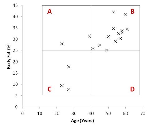
Scatter Plot of Age and Percentage of Body Fat with Four Distinct Quadrants
All you need to do now is add up all the points in each quadrant, and you’ll get a 2x2 contingency table (a contingency table is also known as a cross-classification table, frequency table or confusion matrix), like this:
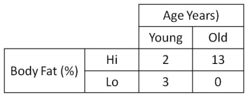
2x2 Contingency Table of Age and Body Fat
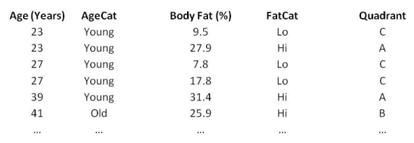
Of course, we don’t actually form a box, place it over a scatter plot then add up all the points in each quadrant. That would be silly, particularly if we had hundreds of data points. Instead, we work with the data in the spreadsheet to transform our data into categories so they can be placed into their respective quadrants automatically. Then we collate the counts from each quadrant to make up the 2x2 table. When we’ve done this, our data might look something like this:
OK, so let’s return to our contingency table. Why have we arranged it to be a 2x2 table, when we could have had more categories for each variable? Good question!
Well, the 2x2 table is a special case of contingency tables, and the statistical tests we can use on the 2x2 table are much more powerful than those for larger tables. We’ll look at that in a bit more detail soon.
What we’re looking for in a 2x2 table is whether the large numbers fall on a diagonal. If they do, that means that there is likely to be some sort of trend in the data (remember the regression line – we’re looking for a best-fit line that is not horizontal or vertical). For our data, the largest two numbers are on the diagonal from bottom-left to top-right. It looks like there might be a trend that indicates that older people are more likely to have higher levels of body fat.
How do we know if this is true or not? We need to perform a statistical hypothesis test. I’ve run a couple of different tests below so that we can compare them and their appropriateness for these data:
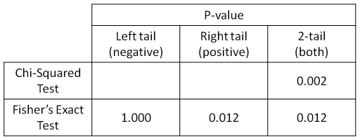
Selection of Statistical Results for Age versus Body Fat
Typically, the Chi-Squared Test is used for the analysis of contingency tables. Actually, the Chi-Squared Test can be used for tables of any size and is simple to compute, even with an Excel spreadsheet or even a pen and paper, although I’m not going to explain how to do it here.
The result of the Chi-Squared Test (p = 0.002) tells us that there is a statistically significant relationship between our variables.
There are a couple of problems with this calculation though. Firstly, the Chi-Squared Test is less accurate when there are counts of less than five in any of the cells. Worse than that, it really shouldn’t be used at all when there are counts of zero in any cell. Oops, our data seem to have violated all the assumptions of the Chi-Squared Test. It is fair to say that we can’t trust the result!
As an alternative to the Chi-Squared Test, we can use the Fisher’s Exact Test. This is computationally more complex than the Chi-Squared Test (for manual computation – it is not an issue for modern computers), but it is usually more accurate, is well suited to small sample sizes, and has no issues with small cell counts – even zeros. The downside is that it can only be used for 2x2 contingency tables.
The result of the Fisher’s Exact Test (p = 0.012) tells us that there is a statistically significant relationships between our variables. No assumptions are violated and we can trust the result. Hooray!
But hold on a minute – why are there three different p-values for the Fisher’s Exact Test?
When you have no prior hypothesis about what the outcome might be, then you use the 2-tail result. On the other hand, if you have a prior hypothesis, as we did with the Age v Body Fat experiment, then you state your hypothesis up front and then use the appropriate 1-tail result. Note that if your hypothesis was that there would be a positive association between your variables, then you MUST use the right-tail result. No cheating! But what if the right-tail result is not significant and the left-tail result is? Tough luck – your hypothesis was the wrong way round!
In our case we hypothesised that as you get older you will have more body fat – a positive association – then we must use the right-tail result, which is significant. Phew!
The good thing here is that the 1-tail result usually has a much smaller p-value than the 2-tail, so having a prior hypothesis really helps you pin down the result you’re looking for.
For our data, the right-tail and 2-tail results are the same, so it didn’t matter whether we had a prior hypothesis or not – the result was that as you age you are likely to gain extra body fat, and this result is statistically significant.
Remember that we started out with continuous data for Age and Body Fat, and we discovered that there was a significant correlation. On transforming these data to categories and analysing by contingency table, we found the same result, that there is a significant association.
So if we can get the same result by either method, which one should we use? Well, it all depends on your data. Continuous data contains more information than categorical data, but it also contains more bias, variation and noise. Transforming your data from continuous to categorical gets rid of a lot of these problems, but you also lose a lot of the information too.
What I’m getting at here is that analysing data in a continuous form is preferable to transforming it to categories, but only when the data is well behaved enough so that the ‘true’ answer shines through. How do we know when this is the case? Experience!
OK, so you know the drill by now – this is the bit where I remind you to visit the Resources page, so here it is.
Visit the resources page: