Chapter 4
Burning the Candle at Both Ends with Candlestick Charts
IN THIS CHAPTER
 Introducing candlesticks
Making candlesticks colorful
Putting together a candlestick chart
Using candlesticks for decision making
Candlestick charts provide users a graphic way to display price movement throughout the day on a daily chart. This type of display first became popular in Japan and today is one of the most popular charts in North America, especially for stock traders who need information for shorter periods of time, such as hourly or daily.
In this chapter, we break down the parts and colors of a candlestick chart, explain how to create one, and show you how to use one to make investing decisions.
 Each person has a different way of thinking about the market, which means different displays can be suited to different types of investors. Many longer-term investors find candlesticks too complex and would like to use something less detailed. You may find bar charts (see Chapter 5) or line charts (see Chapter 6) give you just the right information for what you need.
Deciphering the Parts of a Candlestick Chart
The name “candlestick” was given to this type of chart because it has a body (or candle) for each day pictured in the chart. The chart reader can see the opening and closing stock price with a wider area in between called the body for each day with a wick strung through the body of the candle. The wicks sticking out from the candlestick bar show the extremes of the price movement throughout the day.
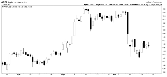
You can see an example of a candlestick chart in Figure 4-1. Each bar represents the price of Apple Inc. for a specific day.
The important distinction is that the body of the candle reflects what happened during the day:
- If it is hollow, the close was higher than the open. If it is filled in, the closing price was lower than when the markets opened.
- On a hollow candle, the close is shown at the top of the body of the candle. On a filled-in candle, the close is shown at the bottom of the body of the candle. If the close is roughly the same as the open, the candle will appear to have no body, like on Apple’s chart for May 2. This candle shape is called a doji.
Notice the closing price of Apple Inc. on May 3 was lower than on May 2, but the candle is still hollow. The filling of the candle doesn’t reflect the change from the day before. It may coincidentally reflect the direction from the previous close. The hollow or filled candle style is a subtle change that makes the individual candles for each day stand out more than other displays we discuss in this book.
The following sections go into more detail on the parts of a candlestick chart.
The candle body
When looking at the body of the candlestick, pay close attention to the components as well as the shapes of the candles.
Candlestick components
Each candle body has several components, which you can see in Figure 4-2. These components provide various pieces of information:
- The opening price in the morning
- The closing price at the end of the day
- The difference between the two prices, which is the body
- Hollow candle moved higher through the day
- Filled candle moved lower through the day
- The highest price of the day, shown by the top shadow (the upper “wick”)
- The lowest price of the day, indicated by the lower shadow (the lower “wick”)
Candlestick shapes
The body of the candle tells you whether the market improved or fell during the day. Its appearance gives you a feel for the price action throughout the day. You can visualize these differences in the candlestick shapes shown in Figure 4-3:
- A long, hollow body suggests the price moved up significantly in a single day, with buying pressure pushing it aggressively higher. (1)
- A short, hollow body suggests the market was positive through the day but change was not huge. (2)
- A line across the middle of the shadow, referred to as a doji, means the market opened and closed at or near the same level, usually meaning the market is balanced at that price. (3)
- A small, filled candle suggests the market was soft that day without a lot of momentum. (4)
- A large, filled candle suggests selling pressure was evident as the price moved significantly lower. (5)
Shadows on a hollow candle
The size of each shadow shows you how far the price moved away from the two key times of the day, the open and the close. You can see the differences in shadows in Figure 4-4. The shadows, or wicks, mean different things on a hollow body of the candle:
- Long shadows above a hollow candle suggest very little support at the higher level. Bearish. (A bear market is a market in which stock prices are falling. People holding stock tend to begin selling stock.) (1)
- Short shadows above a hollow body suggest the high was near to the close. Bullish. (A bull market is a market in which stock prices are rising. People tend to buy stock in this type of market.) (2)
- No shadow above means the price climbed all day and closed at the highest price of the day. Very bullish. (3)
- Small shadows below a hollow body mean the price tested slightly lower but then went up past the open to close at a higher level. Bullish. (4)
- Long shadows below a hollow body mean the price moved significantly lower during the day, but then buyers came in and pushed the price back up above the open. Bullish. (5)
Shadows on a filled candle
As we note in the preceding section, the size of each wick shows you how far the price moved away from the two key times of the day, the open and the close. The shadows mean different things on a filled body of the candle. Shadow differences on filled candles are shown in Figure 4-5:
- Long shadows above a filled-in body suggest very little support at the higher level. The price traded higher during the day and then dropped and fell below the open to close down on the day. Bearish. (1)
- Short shadows above a filled body suggest the price tried to go higher after the open but then traded down, moved below the open, and closed down from there. Bearish. (2)
- Little or no shadow above means the price opened and fell all day. The close was below the opening price of the day and couldn’t go higher. Bearish. (3)
- Small shadows below a filled body mean the price closed near the lows of the day. Bearish. (4)
- Long shadows below a filled-in body mean the price moved significantly lower during the day. Buyers then came in and pushed the price back up significantly but not above the opening price for the day. Buyers stepping in and reversing the price back up is bullish. (5)
Windows
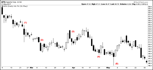
When the stock market opens in the morning, the opening price may not be the same as the previous day’s close. News about the company, the related industry, or other news in politics may have come out after the market closed on the previous day, causing a gap between the previous day’s close and the open the next day. The candlestick chart style does not try to connect the price points together. An example of this can be found on the Apache (APA) chart (refer to Figure 4-5) on April 27. On a candlestick chart these are called windows rather than gaps.
Introducing Color onto a Candlestick Chart
Introducing color on a candlestick chart is a method of quickly comparing the current candle’s price to yesterday’s closing price. The software uses the difference between a close higher than the day before or lower than the day before. For example, choosing one color that will show a close higher than the day before highlights an up day. Using a second color for a day when the market closes lower than the day before highlights a down day.
The majority of the time, the information from the hollow or filled candlestick coincides with the color code of the day:
- A hollow candle that shows price moved up from the open to the close may also show that the price closed up compared to the previous day.
- A filled candle shows price moved down from the open to the close. This closing price may also be lower than the close of the previous day.
 While we can’t show you color in this black-and-white print book, you can go to
 www.stockcharts.com and try it out yourself. In the create-a-chart box in the top middle of the screen, type in a stock symbol like BAC for Bank of America. This will show a colored candlestick chart of BAC.
You can see two distinguishing candles that show up when you use color to view the candles. Their unique qualities show up best on a color candlestick chart, but you can see the difference in the shading on a monochrome chart as well:
- The filled candles show price action moving down between the open and close. This becomes even more distinct when color is used because when the price closes above the previous day, the computer will use an up color with a filled candle.
- The hollow candles show price action moving up between the open and close. When you use color, if the price closes below the previous day, the computer will use the color you chose as the down color with a hollow candle.
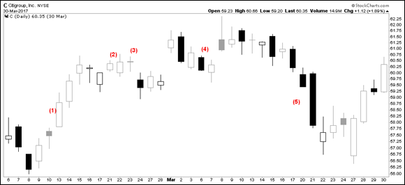
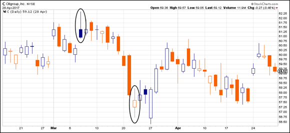
Examples of these two unique candles are shown in Figure 4-6. The candles of interest are on March 8 and March 22. These candles show up infrequently but represent important information:
- The March 8 candle closed below the open but above the previous day. It is a filled candle because it closed below the open, and the colored candlestick chart displays the color of an up day, meaning that it closed above the previous day.
- On March 22 the intraday price action was up, so the candle is hollow, but the price closed below the previous day, so it is given the color of a down day compared to the day before.
It does not always work out, but these unique candles sometimes mark turns in the market or important inflection points in the market. In the Citigroup example in Figure 4-6, they marked a short-term high on March 8 and very close to a short-term low on March 22. You can see other instances on the chart where these unique candles had no short-term influence.
Crafting Your Chart
You can set up your own chart with the price displayed using candlesticks. In this section we show you how to create a candlestick chart on www.stockcharts.com. To get started, go to stockcharts.com/freecharts/, enter the stock symbol you’re interested in seeing under “Create a SharpChart,” and click Go.
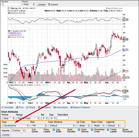
In the Chart Attributes area, you can create a candlestick chart by selecting Candlesticks in the Type drop-down menu. StockCharts.com defaults to a candlestick chart type for new visitors to the website. After selecting Candlesticks, you will need to click Update if the chart was in a different display format. You can see the tool for Chart Attributes in Figure 4-7.
There’s no harm in trying some of the other selections for the chart. A good one to change is the size from the Size drop-down menu. For example, you can select Landscape or 900 from the Size menu and click Update. This expands the chart out to the right if you’re on a landscape-oriented display, such as a laptop computer.
After changing some of the selections, click the Update button to show your changes on the chart. This action doesn’t save the chart style that you create, but it does let you experiment with the settings. Members can save the chart style as a default. In Parts 3 and 4, we introduce all the possible options for creating your own chart style, and in Chapter 17, we show you how to build a customized candlestick chart.
Reading and Using Your Chart to Make Decisions
Candlestick charts are primarily for short-term trading decisions; longer-term traders or investors tend to use candlestick charts to pick entry and exit points. It is important to understand when candles matter most in stock buying and selling decisions; you also need to become familiar with some of the most common patterns. This section introduces those critical decision-making points.
Knowing when candles matter
Candlesticks are built based on intraday price movements, so daily candlesticks aren’t typically used with long time horizons of a year or more. For shorter-term trading opportunities, though, candlesticks can be helpful. The following sections discuss short-term signs you may interpret from individual candles and candle groups.
Investigating individual candles
Candlestick signals typically have a life of five to ten candles. In Figures 4-3 and 4-4, the bullish examples show up more often in the direction of the uptrend. As you might expect, it is easier to find hollow candles with a small top shadow in an uptrend. In Figure 4-5, the bearish candles are plentiful in a downtrend. It is easier to find filled candles with small bottom shadows in a downtrend.
As each candle is interpreted to suggest bullishness or weakness, it is important to realize the next move expected may not follow through on the next candle.
Looking at groups of candles
Individual candles may not be very reliable to trade with, but looking at candles collectively can be helpful. Looking across a few months of candles gives you more information, and trading in the direction of the trend is usually more profitable.
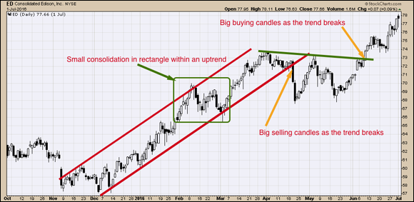
When a stock is in an uptrend, more hollow candles are present. When a break in a trend line occurs, you may experience heavy selling. On most charts, if you can draw a multi-month trend line, the candle that closes below the trend line is usually a big filled candle. (See Chapter 9 for more about trend lines.) An example of a trend line break on Consolidated Edison (ED) is shown in Figure 4-8.
Pairing two or more candles can be a little more valuable to confirm a pattern within a trending market. How is that done? The first candle sets a bullish or bearish expectation for the next day, and the next day, investors watch to see whether the move based on the directional bias starts to happen. If it does, they investigate buying the stock on that basis and go through a process to decide.
Technical analysis tools work better when stocks are trending. A stock moving sideways for years is hard to profit from. However, a stock moving sideways for a month or so also allows you the opportunity to buy near recent lows. The term for a stock with price action moving sideways is consolidating. Consolidating happens when the price of a stock stays between two price levels and moves sideways. The stock shown in Figure 4-8 consolidated for three months between $67 and $73.
Conversely, a sustainable move above a previous consolidation range will usually need to be a larger hollow candle. The thinking behind the candle size is that if the price moves above a consolidation area, the new buyer has to be willing to pay more for the stock than at any time in the consolidation period. If only a few new buyers are willing to buy into the stock at a higher level, the chart is most likely to fall back into the consolidation range. Rarely are timid moves above a consolidation zone the best ones to buy.
Buying based on bullish candlestick patterns
Candlesticks carry a lot of information. Understanding candlestick patterns can be very beneficial to see a change in trend or typical price action that supports a move in the direction of the main trend.
In Figure 4-8, the period from February 26 to March 2 is a great example of seeing a bullish signal on a candlestick chart. First of all, the intermediate trend was up but had consolidated in a small range between $66 and $70 for about a month. After moving down hard on February 27 to the previous low of February 17, the next two candles got very small, showing a loss of downside selling pressure.
On March 2, the stock fell hard after the market opening, but by the end of the day the price had recovered above the previous close and above the open to create a long shadow under the first hollow candle. This shape of candle is a bullish candlestick called a hammer and is often seen at the bottom of a countertrend move. This is exactly what you would look for to end a downward move. When March 3 had similar price action (another hammer) and closed higher, this was very strong price action. The stock continued higher for most of March.
One reason to use a candlestick display is to help find bullish setups. StockCharts.com runs a scan every day looking for hammer candlesticks like the one described earlier and various other candlestick patterns. Using these tools, some investors find good stocks to invest in just using candlesticks. Figure 4-9 shows some of the other candlestick pattern names, and the number of occurrences is shown on the right side under each stock market. In Chapter 14, you find information on how to use and save scans.