

Although many urbanists may find it distasteful, it is the suburbs—not core cities—that will most likely determine the country’s future transportation patterns. Much of what is missed in such thinking is that America’s suburbs are now the dominant work destination in almost all metro areas. Today, work origin–destination patterns are predominantly circumferential movements from suburb to suburb, around the rim of a wheel and no longer, like the spokes of a wheel, focused on some central hub.
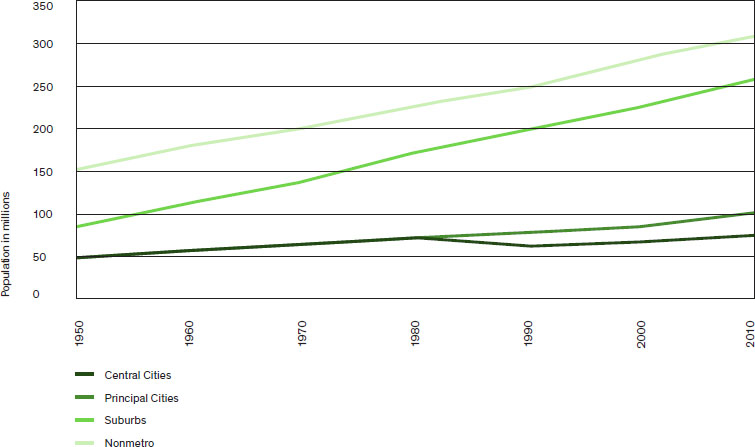
In 1950, with the nation’s population roughly half of what it is today, America was already a majority metro population, according to the Office of Management and Budget (OMB). The population was roughly split 60/40 percent between cities and suburbs, as then defined.1 By 2010, the shares shifted dramatically, with the split now 70/30 in favor of suburbs. In this period, suburbs gained more than 85 percent of national growth. (fig. 2.7.1)
These figures are based on the research produced in a National Cooperative Highway Research Program (NCHRP) study conducted as part of the “Commuting in America” project, which distinguishes between the historical central cities and the new Census Bureau concept of a “principal city.”2 This new concept often leads some to cast essentially suburban, auto-dominated areas such as Frederick, Maryland; White Plains, New York; or Long Beach, California, as part of central cities.3 Differentiating between principal cities that are central cities (as formerly defined) from those principal cities that are suburban, we find that 25 percent of principal cities are in fact suburban. (fig. 2.7.2)
The impact on trends is a relatively small one. If historic central cities are subtracted from all principal cities, the remaining suburban principal cities account for only about a six-million-person difference in growth allocated to suburbs rather than center cities in the period from 2000 to 2010. Even if all of the principal cities were assumed to be part of historical central cities, the suburban share would still be 61 percent of metro population.
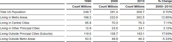
This suburban growth is a product of multiple trends, most particularly the accretion of formerly rural areas into the suburbs as the commuting shed to central areas expanded, as well as the designation of new metropolitan areas. In just the twenty years between 1990 and 2010, the number of MSAs (metropolitan statistical areas) grew from 323 to 381 areas, and the number of counties in MSAs went from 839 to 1,167—a third of the nation’s counties. Given that the OMB determines such additions largely on the basis of work-commute statistics, this is a valid metric of suburban growth. In many ways, the decline in the size of the nonmetro population in America has been the product of successful growth, rather than failure, as rural areas gained population and became associated with a nearby metropolitan area or became the center of a new area.
The key idea for transportation planning is that the vast majority of the job and population growth occurred outside the core cities, and even outside the principal cities. Research reveals that US population growth has now dropped below 1 percent a year and that metro areas have gained the great majority of the growth. Within metros, the growth has been predominantly in suburbs.
These trends are more evident if we look at population growth at the county level, which shows a startling picture of a nation sharply divided by growth characteristics. Of the 3,143 counties in America, over a thousand (a bit more than a third of the counties), consisting of both metro and nonmetro areas, lost about 2 million people between 2000 and 2010. Roughly another third, all in metro areas, gained over 27 million. The remaining third, consisting of nonmetro areas, gained slightly above 2 million. Overall, the nation is almost equally separated into three parts: a third losing population, a third with 93 percent of national growth, and a third just muddling through.
Among the almost two thousand nonmetro counties, about half lost 700,000 in population and the other half gained over 2 million, suggesting that travel behavior and demand will vary sharply around the nation depending on growth patterns.
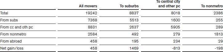
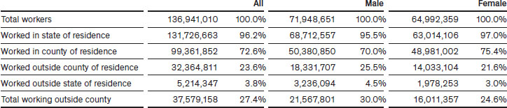
Beyond population change, the Census Bureau and the Bureau of Labor Statistics’ Current Population Survey is a major source for tracking the crucial data on flows of the labor force within and between metro and nonmetro areas. Between 2012 and 2013, about 19 million labor force members moved residences in the nation. As can be expected, the majority of flows are local and remain within a given area. Principal cities, in the Census Bureau definition, generated a six million shift of workers within their own areas, while suburbs accounted for about 5.5 million, and nonmetro areas accounted for about 1.8 million intra-area moves. The principal city labor force tends to move more frequently than suburban workers, given the greater tendency for rentals in cities. The following are brief notes of other revealing shifts between areas:
The almost six million intra–principal city moves consisted of several components: about 0.8 million worker moves occurred between principal cities in different metro areas; and 0.5 million shifted between different principal cities in the same metro area; and the large remainder, roughly 4.6 million, shifted within the same principal city.
Among the 5.5 million suburban labor force shifts, 4.7 million labor force members shifted within the same metropolitan area suburbs and the remainder shifted between suburbs in different metro areas.
The key outcome to understand is that within metro areas, suburbs gained about 0.7 million workers from principal cities as the suburbs received about 1.8 million workers from cities and sent 1.1 million to cities.
In intermetro moves, the suburbs also realized strong gains in workers, with a net gain of almost 0.4 million. At the same time, suburbs lost about 0.5 million to a principal city in a new metro area but received almost 0.9 million from principal cities in other metros. Suburb to suburb and principal city to principal city shifts between metros were almost exactly the same amount.
Again, the overall effect was that of the 1.3 million who left a suburb for another metro, 62 percent went to a suburb; and of the 1.7 million that left a principal city for another metro, only 47 percent went to a principal city in that new metro.
Of the limited nonmetro flows to metro areas, about 0.5 million went to suburbs and under 0.3 million went to principal cities. In net terms, nonmetros lost about 0.25 million to suburbs and showed a small positive gain from principal cities.
In contrast to historical patterns of a heavy focus on center cities, labor forces arriving from abroad divided about evenly between principal cities and all other areas.
Overall, the effect of all of these worker flows in just one year was the following: suburbs gained about 0.7 million workers from central cities in intrametropolitan moves; suburbs gained about 0.4 million workers from central cities in intermetropolitan moves; suburbs gained about 0.25 million from rural areas; and central cities lost slightly to rural areas. (fig. 2.7.3)
The variation in modes of transportation employed by commuters nationwide has been relatively stable over long periods. Between 1990 and 2010, the overall share of private vehicle use registered at above 86 percent over the two decades, but with driving alone adding twenty million users. This represents a gain in national share from 73.2 percent to 76.6 percent for driving alone, amid continued sharp declines in carpooling. Carpooling declined by two million workers, with its share dropping from 13.4 percent to 9.7 percent. Transit use gained almost a million users, raising its share slightly from 4.6 percent to 4.9 percent. Walking continued its decline, with a loss of seven hundred thousand and a drop in share from 3.9 percent to 2.8 percent. Working at home continues to mushroom, with a gain of 2.5 million and a share increase from 3 percent to over 4.3 percent. In all but the largest metro areas in America, working at home exceeds transit usage.
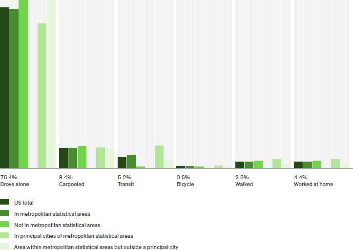
Similar to these national trends, the dominance of driving alone persists when we examine travel modes by more detailed geography. (fig. 2.7.4) For 2013, we analyzed the travel mode shares for commuters for the Census designations of principal cities and metro statistical areas (MSA). Driving alone is about 70 percent in all principal cities nationally. In all parts of MSAs that are not principal cities—in other words, in metro area suburbs—over 80 percent of commuters drive alone. Transit use was much higher in principal cities (10.6 percent) than in suburbs (3 percent). Walking had similar but not as marked differences at 4.3 percent and 1.8 percent, respectively. The levels of working at home and car-pooling exhibit strong similarity across all metro size classes, whereas transit is extremely affected by metro size and the age of the urban core.
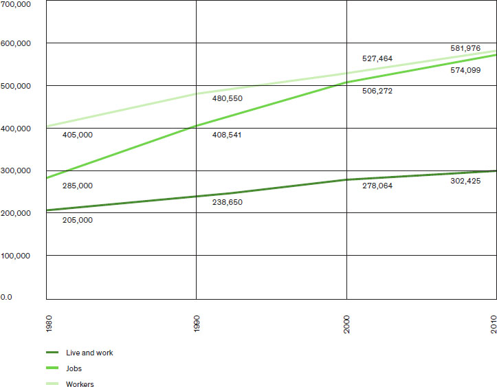
We can see the emerging national transportation patterns by examining the trends in Fairfax County, Virginia, an affluent, large suburb outside Washington, DC. The Commuting in America series has tracked Fairfax County’s relationships between workers and jobs for several decades.4 In the 1980s Fairfax County looked like a stereotypical bedroom suburb with many more workers than jobs (the jobs to worker ratio was 0.70). As a result, the county had to “export” many of its workers every day to job-rich inner-core areas, particularly Washington, DC. (fig. 2.7.5)
This changed dramatically in the 1990s and first decade of the new millennium. By 2010, the ratio of workers to jobs was just about equal, making the county ideal for study. In other words, if all the resident workers worked in the county, then no workers would have had to be imported each day to work; and only about 8,000 workers would have had to be exported each day to jobs elsewhere, in a county with over a million in population. In fact, only some 300,000 resident workers actually worked in the county, amounting to 52 percent of the worker population. This level is rather good for most suburban counties. For example, Prince Georges County (just across the Potomac) has only 39 percent of the population working within the county. Thus, in Fairfax, some 550,000 workers flowed across the county’s borders each day commuting out to jobs elsewhere while others flowed into the county to work. The difference between a potential 8,000 and an actual 550,000 flow across the county’s borders each day is the real story and challenge of American commuting.
By 2013, the balance in the county had already changed, indicating the transmutation of Fairfax County to a city-like destination; it was no longer a bedroom suburb. Most notably, the jobs to worker ratio had reached 1.04, as jobs increased far faster than workers in the period from 2010 to 2013. Another pertinent factor is that the share of those resident workers who remained in the county to work had increased from 52 percent to 54 percent. Despite that, the total number of those flowing across the county border each day had risen by 20,000, as the total number crossing the county’s borders rose from 552,000 to 572,000. As a result, worker inflow to the county has exceeded outflow for the first time. (fig. 2.7.6)
2010 |
2013 | |
Resident workers |
582,000 |
605,584 |
Jobs |
574,000 |
630,614 |
Jobs/worker ratio |
0.99 |
1.04 |
Workers who live and work in county |
302,000 |
332,086 |
Percent who live and work in county |
52% |
55% |
Workers exported each day |
280,000 |
273,498 |
Workers imported each day |
272,000 |
298,528 |
2.7.6 Current Worker Patterns, Fairfax County, Virginia
This labor export/import story is key to understanding commuting flows in America, illustrated so effectively by Fairfax County. What Fairfax demonstrated in 2010 is that it is more the skills mix that governs whether workers remain in a given county to work or must go elsewhere to locate a congenial job, rather than the simple ratio between the supply of jobs and workers available. Seen from the point of view of the employer, the commuter market-shed of skills needed within, say, a half hour’s commute time will be critical to their effective acquisition of the staff levels and skills they require.5
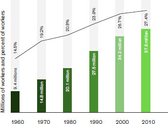
The story of cross-county flows is a dramatic one and exemplifies the massive role that the additions of new counties to suburbs of metro areas and their growth have had on the nation’s work-travel patterns. Over a fifty-year period, the number and share of workers who leave their residence county to work each day has been tracked by the Commuting in America series. (fig. 2.7.7) America’s counties vary in size substantially, thus, a snapshot of work travel could be misleading. However, they do retain constant borders over time, so their trend patterns are significant. In the 1960–2010 period, in which the number of workers roughly doubled, those leaving their home counties to work quadrupled from 9.4 million to over 37 million. The flatter trend line from 2000 to 2010 is a result of the more limited growth in workers in the period due to demographic and economic trends. Virginia leads all states with over 51 percent leaving their residence county to work,and Maryland is just behind it at 47 percent (attesting to the power of the federal establishment), followed by New Jersey at 46 percent and Georgia at 41 percent, compared to the national average of 27.4 percent.
Commuting across state lines is also growing, providing an indicator of the enormous scale of our major metro areas. Interstate commuting has increased from 3.6 percent of all commutes in 2000 to 3.8 percent in 2010, reaching a level of over 5 million workers. There are twenty states with more than 100,000 workers crossing state lines, and sixteen where that flow exceeds over 5 percent of the workforce, despite the fact that the sharp reductions in employment growth during the 2000 to 2010 period were largely felt in those occupations that tend to be longer distance activities (e.g., example, construction and factory work). The states with more than 10 percent of workers leaving their home state are, after the District of Columbia at 23 percent, Maryland, New Hampshire, Delaware, Rhode Island, New Jersey, and West Virginia. At 9.1 percent, Virginia is just below that threshold. This attests to the economic strength of New York City, Boston, and Washington, DC.
West Virginia is of particular interest because of its bimodal trip length distribution. Although many workers have short local trips within rural areas or small metros, at the same time, there is a large segment (just short of 12 percent) commuting across state lines to the Pittsburgh, Washington, DC, and Ohio areas. As jobs move farther out into suburban areas, they become increasingly accessible to rural workers.
The male-female distinctions in out-of-county commuting indicate that men are more likely to work out of state than women, as well as in a different county within state. (fig. 2.7.8) This is linked to a series of patterns involving occupational choices, that is, men are more likely to work in those occupations that are generally at greater distances, such as construction. Other factors, such as greater household responsibilities, often act to keep female workers closer to home.6 These factors are further reflected in that women have overall shorter work trip lengths and later work start times. Yet these differences have been diminishing over time.7
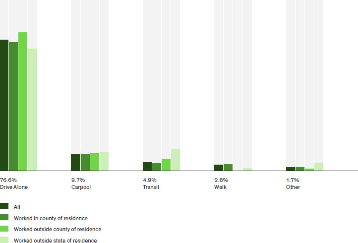
The use of the various modes of transportation varies significantly with travel destinations. (fig. 2.7.9) Walking would typically be considered a close-to-home mode, but about 4 percent of those who walk to work as their sole means of transportation indicate that they do cross a county line, and another 2 percent cross state lines in their walk-to-work travel. Such walk trips rarely exceed two miles.
In 2010 driving alone shows substantial increases for those leaving their home county. Driving alone constitutes 76.6 percent of all trips nationally; however, driving alone constitutes 81.5 percent of trips crossing a county line within a state. But it then drops down to just above 71 percent for trips crossing a state line. In part, this is due to the greater role of the short distance modes, which are all largely intracounty in character, such as walking, biking and working at home. Carpooling also shows some limited increase in out-of-county commutes, ranging from a national average below 10 percent to almost 11 percent. Transit use, too, exhibits a substantial increase in interstate commuting, in significant part due to the large commuter rail usage around New York City from neighboring New Jersey and Connecticut. More than 12 percent of work trips crossing state lines are transit based.
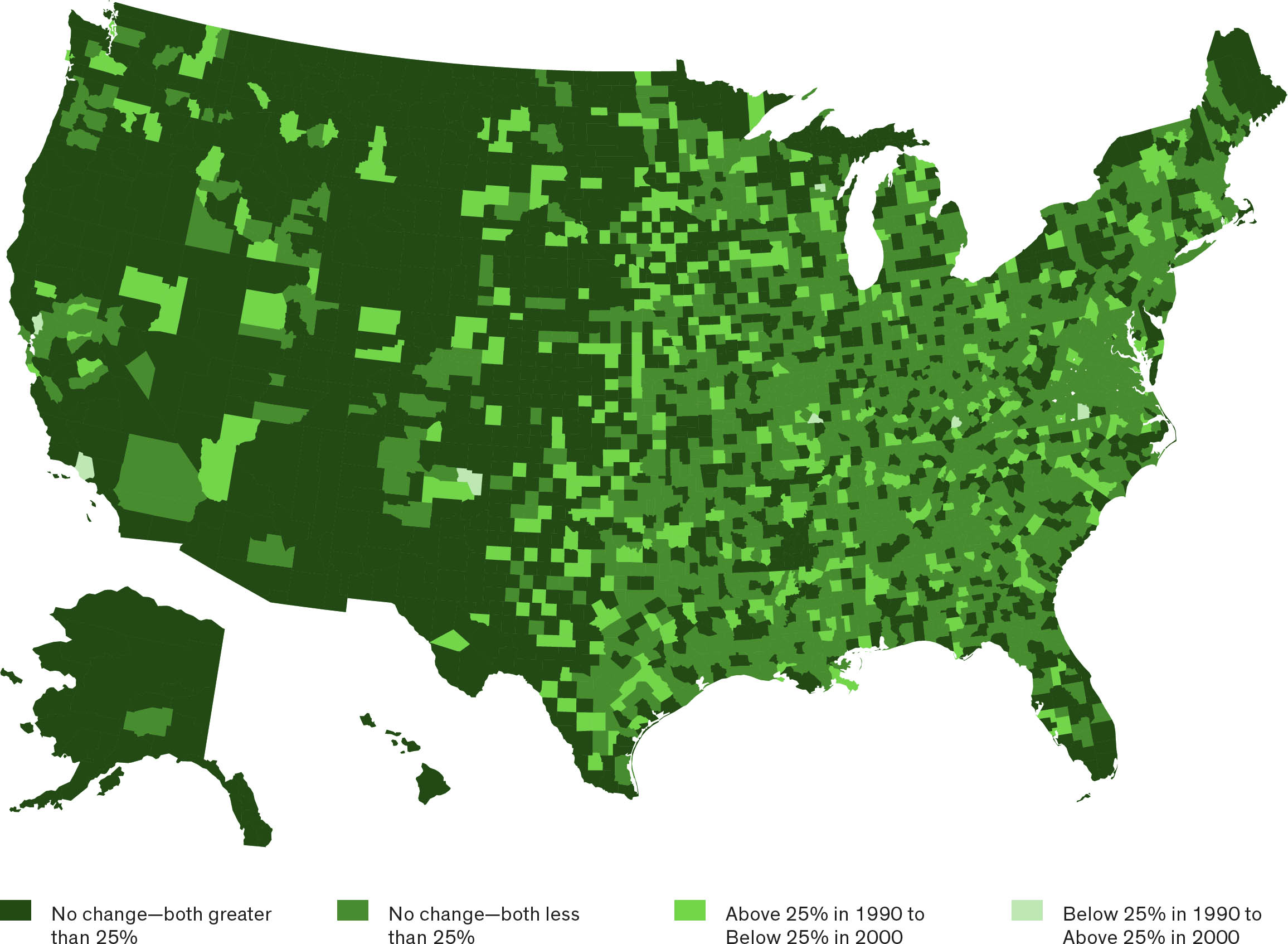
The Commuting in America series has mapped county changes in flows beyond county boundaries based on those counties exporting more than 25 percent of their workers over several decades. (fig. 2.7.10) The research shows that much of the country—from mid-Texas eastward—exports above 25 percent of workers each day from their residence county. The accretion of new areas is likely the product of metro fringe counties increasingly sending workers to metro area jobs and the attraction of high paying jobs in new rural auto plants and energy sites bringing workers from greater and greater distances. In total, there are 2,177 counties that are net exporters of workers each day heading toward 964 net importing counties.
Depicting work trip flow patterns and volumes at the metro level is a complex task given current Census categories of geographic delineation. (fig. 2.7.11) Previous Census delineations made clear the difference between central cities and their surrounding metro area (suburbs). Current Census geographic delineations suffer from a significant spatial weakness. They have created the concept of the principal city, which does not differentiate central cities from suburban centers that have grown up over the years. Those suburban centers may lie at considerable distance from the center. As a result, much meaningful geographic context is lost. As noted earlier, it is estimated that roughly 75 percent of the populations identified as living in principal cities fit the original concept of central cities, as previously understood, and the remaining 25 percent are geographically suburban in nature. This has had the effect of distorting some of the statistics displayed.
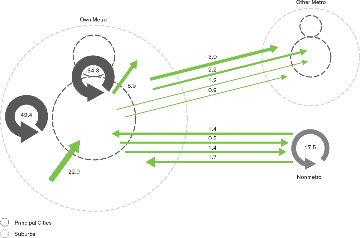
The central reality is that principal cities have no explicit geographic location in a metro area, weakening efforts to compare to the past. Statistically, it means that the intra–principal city flows can include the internal flows within both the central city and within suburban principal cities, but also can include flows between them. In 2011 within-suburb or suburb-to-suburb commute trips remained the largest category, capturing 42.4 million commuters—more than 30 percent of metro-commute trips. Recognizing that approximately 25 percent of principal cities are in fact suburban would shift approximately at least that much to the suburb-to-suburb flows, putting that category in the range of 50 million commuters, far more than the traditional suburb-to-city commute.
The second-largest share of commuting occurs within or between principal cities, at nearly 25 percent, which, again, would be reduced by the transfer of population and workers to the suburban category in a more geographically rigorous depiction. Third in significance is suburb-to-principal-city commuting, at more than 16 percent of commuting, much of which is, in fact, intra-suburban as well as the traditional downtown commute. Fourth is nonmetro-to-nonmetro commuting, at more than 12 percent; this category is basically unaffected by the shifts among principal cities and suburbs. Principal city–to-suburb commuting (reverse commuting) is more than 6 percent.
Remaining flows to and from other metro and nonmetro areas are modest. The largest of these is suburb to a suburb in another metro, at 2 percent; it should be recognized that, although low in volume, these flows affect two metro areas—the one they leave and the one they enter. Historically, these intermetro flows were the fastest growing trip patterns, but the recession, which disproportionately affected construction and factory jobs, reduced such trips from about 7.5 million in 2000 to 7.3 million in 2010.
Nonmetro flows, both within nonmetro areas and to metro areas, also declined appreciably, largely as a result of the recent incorporation of nonmetro counties into metro areas. Overall, these flows amounted to below 23 million in 2010, dropping down from over 31 million commuters in 2000.
In summary, these figures firmly establish the point that today, commuting patterns are increasingly complex. They interact across immense metro areas spanning thousands of square miles, including exchanges between rural and urban areas and across state lines. These patterns are the product of a dynamic economy with highly specialized job skills requirements. Employers need to locate in very large metros with massive agglomerations of workers in order to have reasonable access to the highly specialized workers they need.
The Leave It to Beaver model of a sole male worker living in the suburbs and commuting to downtown is far less relevant than in the past. So, too, is the idyllic notion that people can optimize their work travel by living near their workplace and walking to work. Where people choose to live is an even more complex choice today than in the past. With approximately two-thirds of workers living in a household with other workers, whose job will one live close to? With the velocity of job change, will people move each time they change jobs, incurring costs, disrupting lifestyles, school plans, and the like?
As the nation’s job picture brightens, it will become clearer that the key issue for the nation will be a lack of workers, particularly skilled workers to serve the nation’s economic development needs. The latest census projections indicate a gain of fewer than fourteen million men and women of the traditional working age, eighteen to sixty-five, over the next twenty years.8 Finding the workers to replace the baby boomer workforce will be a national challenge. Employers and employees will need to be able to access job opportunities over immense distances to meet those needs.
Given the declining skilled workforce supply in the coming decade, future productivity will depend in large part on the the ability of employers to reach out over longer distances to obtain the skills they require. It will be a period driven by worker supply rather than employer demand. This implies that large metro areas with their bigger pools of workers will be even more important. Further, it implies the need for transportation investments providing the ability to access distant workers with even more flexible work arrangements and schedules. So many work activities are increasingly around-the-clock, seven-days-a-week activities, at the same time that employees demand more flexible schedules and the ability to work at off-site locations. Freight movements, access to suppliers, and access to employers/employees will be central to the nation’s economic success.
Employers, increasingly footloose in terms of location, will go where the skilled workers are or where they want to be. Perhaps the central consideration for the future is that America’s major metro areas must be recognized as large multicounty, often multistate, economic engines.
This research is based on the Commuting in America series published each decade since 1986. The most recent version, Commuting in America 2013, is published as a series of sixteen briefs and an executive summary by AASHTO, the American Association of State Highway and Transportation Officials, supported by its Census Transportation Planning Products program and the National Cooperative Highway Research Program of the Transportation Research Board of the National Academies. The data are all the product of the American Community Survey of the United States Census Bureau or as otherwise noted. The author is solely responsible for its content.
2 The Commuting in America series has been conducted for four decades as a product of the National Academy of Sciences, Transportation Research Board, and the American Association of State Highway and Transportation Officials. The most recent is Commuting in America 2013: The National Report on Commuting Patterns and Trends (Washington, DC: American Association of State Highway and Transportation Officials, 2013).
3 Bruce Spear, “US Commuting and Travel Patterns: Data Development and Analysis,” National Cooperative Highway Research Program, NCHRP-8–36 Task 111, accessed November 15, 2015, http://apps.trb.org/cmsfeed/TRBNetProjectDisplay.asp?ProjectID=3298. A special study performed by the Transportation Research Board of the National Academies, to support the Commuting in America series update, which, among other activities, separated the traditional central cities from the concept of principal cities. Principal cities were developed, in part, to recognize the fact that many suburban communities and small cities had been incorporated into metropolitan areas as the metropolitan areas expanded outward and small towns evolved into cities that were destinations of workers in their own right. Some statistical treatments inappropriately assume that principal cities, as now defined, are the natural continuation of the original central city concepts. Principal cities include, for example, Frederick, Maryland, 50 miles from the District of Columbia; Lakewood, New Jersey, 80 miles from Manhattan; Framingham, 24 miles from Boston; or Marietta, 20 miles from Atlanta. An estimate provided by the NCHRP study indicates that about 75 percent of the principal cities population is attributable to central cities.
4 The term jobs, as used here, is an estimate based on counts of workers at their workplace, as observed in the American Community Survey. Consequently, it excludes second jobs held by some workers and is therefore a slight undercount of all jobs.
5 Commuting in America 2013: The National Report on Commuting Patterns and Trends.
6 National Household Travel Survey series 1969–2009, US Department of Transportation, http://nhts.ornl.gov/.
7 Commuting in America 2013: The National Report on Commuting Patterns and Trends.
8 US Census Bureau, 2014 Projections of the Population for the United States: 2015 to 2060, accessed November 15, 2015, http://www.census.gov/population/projections/data/national/2014.html.