Each of the toolkits we've explored provide standard layout components that help to organize widgets and interface elements in neat, standardized arrangements. When you think about the naming of these layouts, however (for example, VBox, Border, and Frame), they typically describe fine-grained control rather than higher-level design concepts. For this section, we need to step back a little and think about the overall flow of an application, what will be the most used parts of the application, and what should the user see when they first load the user interface.
As discussed in Chapter 2, Graphical User Interface Challenges, desktop applications have been standardized around a fairly common layout: menu, toolbar, palettes, and content. As applications have grown more complicated, there have been attempts to fit more functions and features into this space to allow users to gain access to the full feature set of these increasingly powerful applications. Since the rise in popularity of smart phones and mobile applications, there has been a lot of discussion about better use of screen real estate and how to make a great user experience with limited resources.
Research into the use of screens, readability of content, and related topics is now commonplace in relation to web design as well. Topics such as How eye scanning impacts visual hierarchy in UX design are often seen on recommended reading lists for those looking to improve their site's usability or user retention. With this in mind, we, as desktop or cross-platform application creators, should probably be thinking much more carefully about how our software is presented and whether the traditional methods fit with our specific use cases.
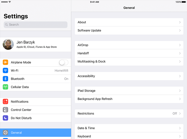
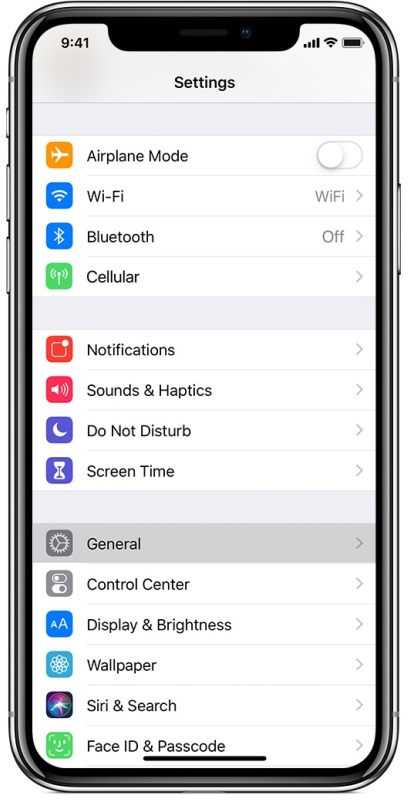
Some GUI toolkits are beginning to provide higher-level layouts that reflect intention rather than a static visual layout. For example, UISplitViewController in Apple's iOS presents a list view and detail view side by side when space is available or one view at a time (the detail view slides on when the list is tapped) when screens are smaller:

(Image copyright: Apple)

(Image copyright: Apple)
Where possible, these should be used in your application so your interface is configured appropriately for the current device, but there may be further customization needed. Let's look at some of the factors that impact more complex layout design.