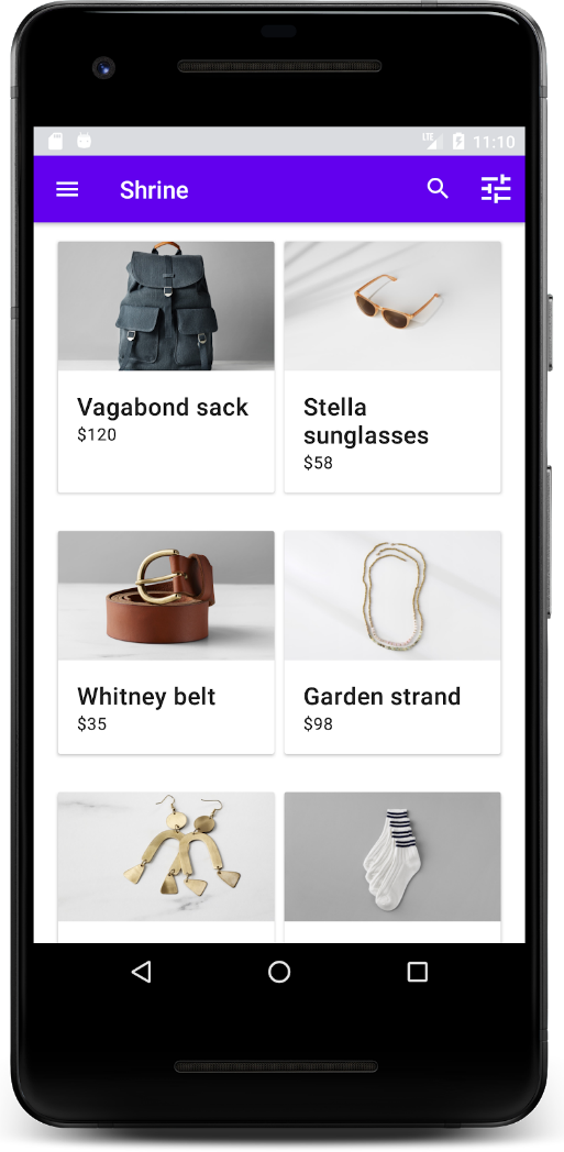
Material design, if you are not already familiar with the concept, can be defined as follows:
-material.io
The design principles will be familiar to anyone with an Android smartphone or tablet and are somewhat similar to the user interface design adopted by Microsoft for recent releases of the Windows operating system, which support tablets and touch screen user input. The approach aims to help developers quickly create beautiful applications and to ease communication between developers and designers. The design language also helps to promote a consistent user experience in a world where applications are trying to stand out with their own brand design.
An application that utilizes the material design principles will not look identical to all of the others, but will have sufficient similarities that a user should have no trouble understanding how it works. Colors, layouts, and navigation can be different from one interface to another, as long as they follow the guidelines set out. Material design includes some standard color palettes and advice for creating custom ones for your needs. Layouts and navigation widgets similarly have standard implementations, but these can be extended and used to suit the context. These standard widgets are called material components and have been created for Android, iOS, Flutter, and the web—Shiny is one potential approach to bringing them to desktop:

There are many tools online to help you learn about and adopt material design principles. They can be found on the material design website at material.io. Let's explore a few of the details that are at the core of the Shiny API.