Portraying Children’s Features
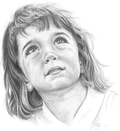
Children are fascinating drawing subjects, but they can be a challenge to draw accurately. It’s important to get the right proportions for the particular age (see pages 20–21 for more on children’s proportions) and to correctly render their features: Their eyes tend to be bigger and more rounded than those of adults, their nostrils are barely visible, and their hair is usually fine and wispy.
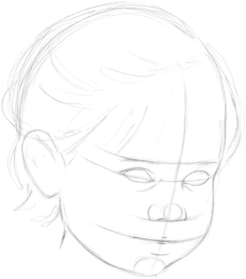
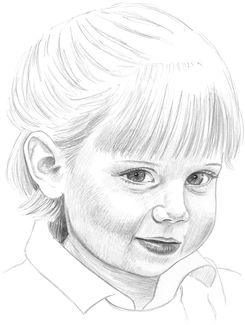
STEP 1 With a sharpened 2B pencil, I sketch the basic shape of the face. Using my knowledge of children’s proportions as a guide, I lightly draw the guidelines, which curve slightly because of the viewpoint. I place the features below the horizontal centerline, where the eyebrows begin. I block in the round eyes, placing them a little more than one eye-width apart. Then I sketch the round nose and small mouth and add some wispy hair to frame the face.
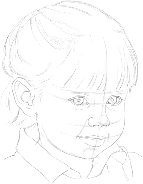
STEP 2 I add details to the eyes and indicate highlights. (Prominent highlights give children’s eyes that curious, youthful spark.) Then I develop the ear and fill out the lips. I draw a curved line from the tip of the girl’s left nostril up to her left eye to build up the nose and draw another line connecting the nose to the mouth, giving her right cheek form. I sketch a few quick lines to indicate the slightly chubby area underneath her eyes, extending the cheek a bit to round it out. I add the bangs with light, soft strokes.
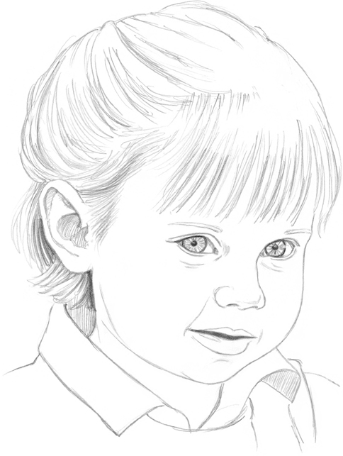
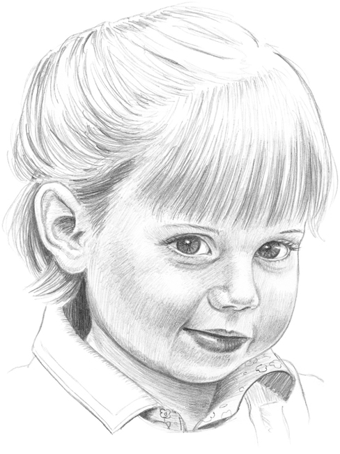
STEP 3 With a 3B pencil, I fill in the area between the lips, then shade the pupil and outline the iris. I add a few thin lines for hair between the scalp and the ear, darkening the hair where it is in shadow behind the ear. I keep the hair soft by sketching with light, short lines—this keeps my subject looking youthful. Switching back to the 2B pencil, I shade the inside of the ear and the underside of the shirt collar, helping to show the direction of the light source. Then I define the lines around the eyes and the mouth.
STEP 4 I shade the lips with a 2B pencil, leaving a light area on the bottom lip to give it shine. Then I shade the neck using light strokes that follow the shape of the neck. With a few short lines, I draw the eyebrows; I also add light shading to the lower half of the face, filling out the cheeks and making them look rosy.
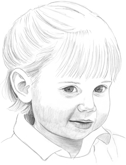
STEP 5 Over each eyelid, I sketch a series of small lines curving up to the eyebrows to show the youthful chubbiness. Then I add eyelashes using curved pencil strokes. To keep the subject looking young, I draw very light, almost nonexistent eyebrows. I shade the forehead in an up-and-down motion, and then I give her right cheek more form by darkening the areas around it. I use sweeping strokes to build up the bangs, leaving the paper white in areas for a shiny look.
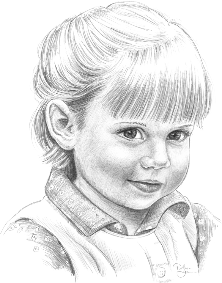
STEP 6 Still using the 2B pencil, I further build up the ear. I shade a small area between the bottom of the nose and the top of the lips to suggest the indentation, and I add shading to the creases around the mouth. I create more dark strokes in the back of the hair to show where the hair is layered. Then I draw a flower pattern on the shirt collar. Adding youthful patterns to your subject’s clothing helps define their age; overalls, jumpers, ribbons, baseball caps, and bows can also imply youth.
STEP 7 Putting my pencil aside for a moment, I carefully drag the edge of a kneaded eraser across the top of the bangs to create the appearance of blond hair. Using the 3B pencil, I create texture on the jumper and shirt by spacing the lines of the corduroy slightly apart from one another. Then I develop the floral pattern on the sleeves of her shirt. Finally I draw a small button, then stand back from my portrait and make sure the transitions from light to dark values are smooth and that there are no harsh or angular lines that might make the subject appear older than she is.
