Chapter 10
Graphics
KISS—Keep It Simple, but Scientific.
—Emanuel Parzen [1990]
Getting information from a table is like extracting sunbeams from a cucumber.
—Farquhar and Farquhar [1891]
IS A GRAPH REALLY NECESSARY? Is it a better vehicle than a table for communicating information to the reader? How many dimensions do you really need to illustrate? Do you need to illustrate repeated information for several groups? How do you select from a list of competing choices? How do you know whether the graph is effectively communicating the desired information? Does your graph answer a particular question, and are the elements of the graph chosen for your audience?
Graphics should emphasize and highlight salient features of the underlying data, and should coherently summarize large quantities of information. Although graphics provide a break from dense prose, authors must not forget that these illustrations should be scientifically informative rather than decorative. In this chapter, we outline mistakes in selection, creation, and execution of graphics and then discuss improvements.
Graphical illustrations should be simple and pleasing to the eye, but motivation for their inclusion must remain scientific. In other words, we avoid having too many graphical features that are purely decorative while keeping a critical eye open for opportunities to enhance the scientific implications for the reader. Good graphical designs utilize a large proportion of the ink to communicate scientific information in the overall display. Another source of guidance can be found in Yau [2011].
IS A GRAPH REALLY NECESSARY?
A picture is easily worth a 1000 words, but not if it will take more than 1000 words to explain its purpose.
KISS
Keep your graphs simple but complete. A particularly horrific example is located at http://www.aptech.com/3dcontour2.html with a copy at http://statcourse.com/research/sillygraph.jpeg.
Its flaws include all of the following:
1. The unnecessary shading and a false third dimension provide a distracting optical illusion as the cube appears to flick toward and then away from the viewer.
2. The unnecessary third dimension is meaningless as a single continuous variable (burn time) is plotted against a single categorical variable (fabric type).
3. The unnecessary color coding in the bars is distracting; it duplicates the information one can read directly from the Y axis.
4. Do the disks near the top of each bar point to the true burn time? Or does the burn time correspond to the top of the thin bar or the fat bar?
5. I am guessing that the categories on the left correspond to synthetic fabrics and those on the right to natural fabrics; still, a further label would have been helpful.
6. As the graph is separated from its descriptive context, a label providing the details of how burn time was determined is called for.
7. The one bit of seemingly relevant labelling, “average of three samples,” is accompanied by a distracting orange blob.
Rules for avoiding similar catastrophes in your own work are provided in the sections that follow.
THE SOCCER DATA
When his children were young, Dr. Hardin coached youth soccer (players of age 5) and recorded the total number of goals scored for the top five teams during the eight-game spring 2001 season in College Station, Texas. The total numbers of goals scored per team were 16 (team 1), 22 (team 2), 14 (team 3), 11 (team 4), and 18 (team 5). There are many ways we can describe these outcomes to the reader. In text above, we simply communicated the results in words.
A more effective presentation would be to write “the total numbers of goals scored by Teams 1 through 5 were 16, 22, 14, 11, and 18 respectively.” The College Station Soccer Club assigned the official team names as Team 1, Team 2, etc.1 Improving on this textual presentation, we could also write, “with the team number as the subscript the total numbers of goals were 222, 185, 161, 143, and 114.” This presentation improves communication by ordering the outcomes. With these particular data, the reader will naturally want to know the order.
FIVE RULES FOR AVOIDING BAD GRAPHICS
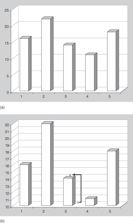
There are a number of choices in presenting the soccer outcomes in graphical form. Many are poor choices; they hide information, make it difficult to discern actual values, or inefficiently use the space within the graphic. Open almost any newspaper and you will see a bar chart similar to Figure 10.1a, which illustrates the soccer data. In this section, we provide five important rules for generating effective graphics. Subsequent sections will augment this list with specific examples.
Figure 10.1a includes a third dimension, a depth dimension that does not correspond to any information in the data. The resulting figure obfuscates the outcomes. Does Figure 10.1a indicate that Team 3 scored 14 goals, or does it appear that team scored 13 goals? The reader must focus on the top back corner of the three-dimensional rectangle since that part of the bar is (almost) at the same level as the grid lines on the plot; actually, the reader must first focus on the floor of the plot to initially discern the vertical distance of the back right corner of the rectangular bar from the corresponding grid line at the back (these are at the same height). The viewer must then mentally transfer this difference to the top of the rectangular bars to accurately infer the correct value.
To highlight the confusing effect caused by the false third dimension, look at Figure 10.1b wherein we provided additional grid lines. This plot illustrates the previously described technique for how to infer values from this type of graphic. The reality is that most readers focus on the front face of the rectangle and will subsequently misinterpret values in this data representation.
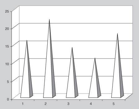
Figure 10.2 also includes a false third dimension. As in the previous example, the resulting illustration makes it difficult to discern the actual values presented. This illusion is further complicated by the fact that the depth dimension has been eliminated at the top of the three-dimensional pyramids so that it is nearly impossible to correctly ascertain the plotted values. Focus on the result of Team 4, compare it to the illustration in Figure 10.1a, and judge whether you think the plots are using the same data (they are).
Other types of plots that confuse the reader (and writer) with false third dimensions include point plots with shadows and line plots in which the data are connected with a three-dimensional line or ribbon. The only sure way to fix the problems in Figure 10.2 is to include the values atop each pyramid as a textual element or to include a tabular legend with the values.2
The point of these graphics is to avoid illustrations that utilize more dimensions than exist in the data. Clearly, a better presentation would indicate only two dimensions, one dimension that identifies the teams and the other dimension that identifies the number of goals scored.
Rule 1: Do not produce graphics illustrating more dimensions than exist in the information to be illustrated.
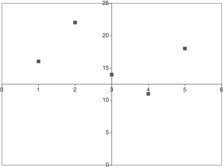
Figure 10.3 is an improvement over three-dimensional displays. It is easier to discern the outcomes for the teams, but the axis label obscures the outcome of Team 4. Axes should be moved outside of the plotting area, with enough labels so that the reader can quickly scan the illustration and identify values.
Rule 2: Do not superimpose labeling information on the graphical elements of interest. Labels add information to the plot, but should be placed in (otherwise) unused portions of the plotting region.
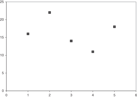
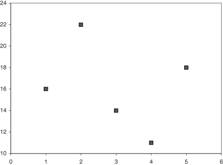
Figure 10.4 is a much better display of the information of interest. However, this graphic suffers from too much empty space. Choosing to begin the vertical axis at zero means that about 40% of the plotting region is empty. Unless there is a scientifically compelling reason to include a specific baseline in the graph, the presentation should be limited to the range of the information at hand. You can ignore this rule if you want to include zero as the baseline to admit a relative comparison of the values as well as an absolute comparison. Note how the symbol for Team 2 is twice as high as the symbol for Team 4 in Figure 10.4, but in Figure 10.5 this is no longer true since we eliminate the zero range of the data. There are several instances in which axis range can exceed the information at hand.
Rule 3: Do not allow the range of the axes labels to significantly decrease the area devoted to data presentation. Choose limits wisely and do not accept default values for the axes that are far outside of the range of data unless relative as well as absolute comparisons should be made by the reader.
Figure 10.5 eliminates the extra space included in Figure 10.4, where the vertical axis is allowed to more closely match the range of the outcomes. The presentation is good, but could be made better. The data of interest in this case involve a continuous and a categorical variable. This presentation treats the categorical variable as numeric for the purposes of organizing the display, but this is not necessary.
Rule 4: Carefully consider the nature of the information underlying the axes. Numeric axis labels imply a continuous range of values that can be confusing when the labels actually represent discrete values of an underlying categorical variable.
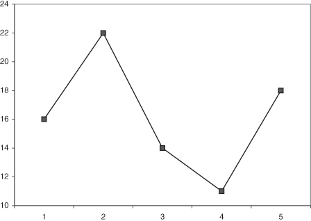
Figures 10.5 and 10.6 are further improvements of the presentation. The graph region, area of the illustration devoted to the data, is illustrated with axes that more closely match the range of the data. Figure 10.6 connects the point information with a line that may help visualize the difference between the values, but also indicates a nonexistent relationship: the horizontal axis is discrete rather than continuous. Even though these presentations vastly improve the illustration of the desired information, we are still using a two-dimensional presentation. In fact, our data are not really two-dimensional and the final illustration more accurately reflects the true nature of the information.
Rule 5: Do not connect discrete points unless there is either a scientific meaning to the implied interpolation, or a collection of profiles for group level outcomes.
Rules 4 and 5 are aimed at the practice of substituting numbers for labels and then treating those numeric labels as if they were in fact numeric. Had we included the word “Team” in front of the labels, there would be no confusion as to the nature of the labels. Even when nominative labels are used on an axis, we must consider the meaning of values between the labels. If the labels are truly discrete, data outcomes should not be connected or they may be misinterpreted as implying a continuous rather than discrete collection of values.
Figure 10.7 is an excellent and spatially economical illustration of the soccer data. There are no false dimensions, the range of the graphic is close to the range of the data, there is no difficulty interpreting the values indicated by the plotting symbols, and the legend fully explains the material.
Table 10.1 succinctly presents the relevant information in tabular form. Tables and figures have the advantage over in-text descriptions in that the information is more easily found while scanning through the containing document. If the information is summary in nature, we should make that information easy to find for the reader and place it in a figure or table. If the information is ancillary to the discussion, it can be left in text.
TABLE 10.1. Total numbers of goals scored by Teams 1 through 5 ordered by lowest total to highest totala

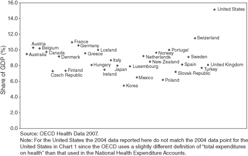
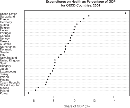
Figure 10.8, from a report by the Office of the Actuary of the Department of Health and Human Services, violates almost all the previous rules. Figure 10.9, a dot chart prepared by Michael Friendly in the R program, with country names on the vertical axis and percent of GDP spent on health on the horizontal is far more effective because it moves the country names outside the plot frame, makes the country dimension explicit, and sorts on the numeric values rather than the labels.
Rules for Error Bars
Error bars are commonly superimposed on bar charts (as in Figure 10.10). to provide some measure of the confidence we can give to the indicated values. Cumming, Fidler, and Vaux [2007] provide a number of rules for their use:
1. Error bars should be shown only for:
a. Sample sizes greater than four
b. Independently repeated experiments, and never for replicates
These caveats apply equally to boxplots (see figure 10).
2. The bar chart legend should include all of the following:
- A description of what the error bars represent
- The sample size
- The basis for the error bar (range, standard deviation, standard error, or confidence interval)
- If the latter, the degree of confidence (e.g., 90%)
Choosing between Tabular and Graphical Presentations
In choosing between tabular and graphical presentations, there are two issues to consider: the size (density) of the resulting graphic and the scale of the information. If the required number of rows for a tabular presentation would require more than one page, the graphical representation is usually preferred. Conversely, if the amount of information is small, the table is preferred. If the scale of the information makes it difficult to discern otherwise significant differences, a graphical presentation is better.
KISS
A picture may be worth a 1000 words but it should not take 1000 words to explain your picture.
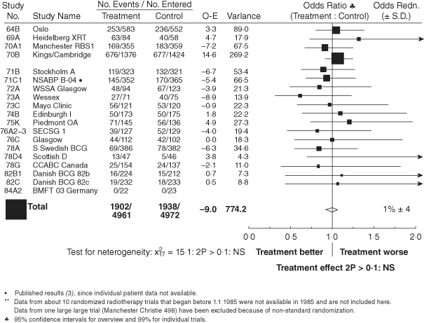
Figure 10.10 summarizes the results of 19 clinical studies on the effects of radiotherapy on the survival of postmastectomy patients. The figure is a hybrid presentation in which tabular information is combined with a graphic. But
Figure 10.10 is just too ambitious and raises more issues than it resolves. The axis for the odds ratio are asymmetric without explanation; that is, they are symmetric about one in absolute values, but not symmetric about one for ratio values. The sizes (spacing) of the graphic also change without explanation. Because the information does not quite fit into the framework in which it is forced, three different footnotes are required: one for a row, one for a column, and one for the overall title. Every possible way the reader might view the graphic proves to be a special case.
Richard Peto, the figure’s author, also notes in a personal communication a major error in methodology in the study on which the graphic is based, “emphasising analyses of total mortality in all patients ever randomised, when in fact the treatment has both importantly favourable and importantly unfavourable effects on cause-specific mortality.”
Curb your enthusiasm: Keep it Simple.
Knowin’ all the words in the dictionary ain’t gonna help if you got nuttin’ to say.
—Blind Lemon Jefferson
ONE RULE FOR CORRECT USAGE OF THREE-DIMENSIONAL GRAPHICS
As illustrated in the previous section, the introduction of superfluous dimensions in graphics should be avoided. The prevalence of turnkey solutions in software that implement these decorative presentations is alarming. At one time, these graphics were limited to business-oriented software and presentations, but this is no longer true. Misleading illustrations are starting to appear in scientific talks. Partly, this is due to the introduction of business-oriented software in university service courses (usually demanded by the served departments). Errors abound when increased license costs for scientific- and business-oriented software lead departments to eliminate the more scientifically oriented software packages.
The reader should not necessarily interpret these statements as a mandate to avoid business-oriented software. Many of these maligned packages are perfectly capable of producing scientific plots. Our warning is that we must educate ourselves in the correct software specifications.
Three-dimensional perspective plots are very effective but require specification of a viewpoint. Experiment with various viewpoints to highlight the properties of interest. Mathematical functions lend themselves to three-dimensional surface-type plots, whereas raw data are typically better illustrated with contour plots. This is especially true for map data such as surface temperatures or surface wind (where arrows can denote direction and the length of the arrow can denote the strength, which effectively adds a fourth dimension of information to the plot).
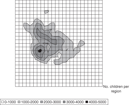
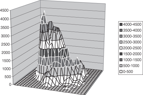
In Figures 10.11 and 10.12, we illustrate population density of children for Harris County, Texas. Illustrations of similar geographic data may be seen at http://www.spacetimeresearch.com/data-visualization-gallery.html. Illustration of the data on a map is a natural approach, and a contour plot reveals the pockets of dense and sparse populations. Further contour plots of vegetation, topography, roads, and other information may then be sandwiched to reveal spatial dependencies among various sources of information.
Whereas the contour plot in Figure 10.11 lends itself to comparison of maps, the perspective plot in Figure 10.12 is more difficult to interpret. The surface is more clearly illustrated, but the surface itself prevents viewing all of the data.
Rule 6: Use a contour plot rather than a perspective plot if a good viewpoint is not available. Always use a contour plot over the perspective plot when the axes denote map coordinates.
Though the contour plot is generally a better representation of mapped data, a desire to improve Figure 10.11 would lead us to suggest that the grid lines should be drawn in a lighter weight so that they have less emphasis than lines for the data surface. Another improvement to data illustrated according to real-world maps is to overlay the contour plot where certain known places or geopolitical distinctions may be marked. The graphic designer must weigh the addition of such decorative items with the improvement in inference that they bring.
THE MISUNDERSTOOD AND MALIGNED PIE CHART
The pie chart is undoubtedly the graphical illustration with the worst reputation. Wilkinson (1999) points out that the pie chart is simply a bar chart that has been converted to polar coordinates. Therein lies the problem: most humans naturally think in Cartesian coordinates.
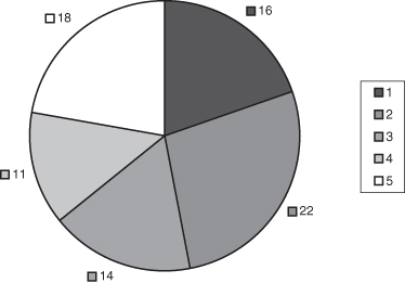
Focusing on Wilkinson’s point makes it easier to understand that the conversion of the bar height to an angle on the pie chart is most effective when the bar height represents a proportion. If the bars do not have values where the sum of all bars is meaningful, the pie chart is a poor choice for presenting the information (c.f. Figure 10.13).
Rule 7: Do not use pie charts unless the sum of the entries is scientifically meaningful and of interest to the reader.
On the other hand, the pie chart is an effective display for illustrating proportions. This is especially true when we want to focus on a particular slice of the graphic that is near 25% or 50% of the data, since we humans are adept at judging these size portions. Including the actual value as a text element decorating the associated pie slice effectively allows us to communicate both the raw number along with the visual clue of the proportion of the total that the category represents. A pie chart intended to display information on all sections when some sections are very small is very difficult to interpret. In these cases, a table or bar chart is to be preferred.
Additional research has addressed whether the information should be ordered before placement in the pie chart display. There are no general rules to follow other than to repeat that humans are fairly good at identifying pie shapes that are approximately one-half or one-quarter of the total display. As such, a good ordering of outcomes that included such approximate values would strive to place the leading edge of 25% and 50% pie slices along one of the major north–south or east––west axes. Reordering the set of values may lead to confusion if all other illustrations used a different ordering, so the graphic designer may ultimately feel compelled to reproduce those illustrations as well.
TWO RULES FOR EFFECTIVE DISPLAY OF SUBGROUP INFORMATION
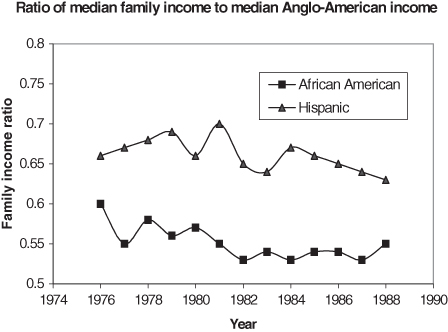
Graphical displays are very effective for communication of subgroup information, for example when we wish to compare changes in median family income over time of African-Americans and Hispanics. With a moderate number of subgroups, a graphical presentation can be much more effective than a similar tabular display. Labels, stacked bar displays, or a tabular arrangement of graphics can effectively display subgroup information. Each of these approaches has its limits, as we will see in the following sections.
In Figure 10.14, separate connected polylines easily separate the subgroup information. Each line is further distinguished with a different plotting symbol. Note how easy it is to confuse the information due to the inverted legend. To avoid this type of confusion, ensure that the order of entries (top to bottom) matches that of the graphic.
Rule 8: Put the legend items in the same order they appear in the graphic whenever possible. You may not know this order until after the graphic has been produced, so check the consistency of this information.
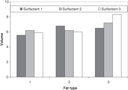
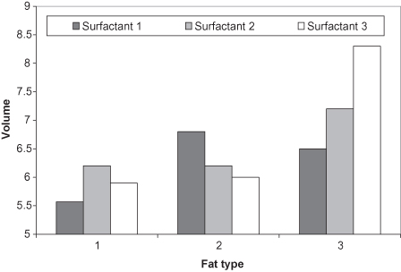
Clearly, there are other illustrations that would work even better for these particular data. When one subgroup is always greater than the other subgroup, we can use vertical bars between each measurement instead of two separate polylines. Using data from Table 10.2, a bar chart using subgroups is illustrated in Figure 10.15. Such a display not only points out the discrepancies in the data, but allows easier inference as to whether the discrepancy is static or changes over time. An improvement in the graphical display appears in Figure 10.16 where more emphasis on the values is achieved by altering the scale of the vertical axis.
TABLE 10.2. Volume of a mixture based on the included fat and surfactant typesa
| 1 |
1 |
5.57 |
| 1 |
2 |
6.20 |
| 1 |
3 |
5.90 |
| 2 |
1 |
6.80 |
| 2 |
2 |
6.20 |
| 2 |
3 |
6.00 |
| 3 |
1 |
6.50 |
| 3 |
2 |
7.20 |
| 3 |
3 |
8.30 |
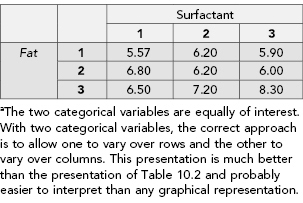
The construction of a table such as Table 10.2 effectively reduces the number of dimensions from two to one. This presentation makes it more difficult for the reader to discern the subgroup information that the analysis emphasizes. Although this organization matches the input to most statistical packages for correct analysis, it is not the best presentation for humans to discern the groups.
Keep in mind that tables are simply text-based graphics. All of the rules presented for graphical displays apply equally to textual displays.
TABLE 10.3. Volume of a mixture based on the included fat and surfactant typesa

The proper organization of the table in two dimensions clarifies the subgroup analysis. Tables may be augmented with decorative elements just as we augment graphics. Effective additions to the table are judged on their ability to focus attention on the science; otherwise these additions serve as distracters. Specific additions to tables include horizontal and vertical lines to differentiate subgroups, and font/color changes to distinguish headings from data entries.
Specifying a Y axis that starts at zero obscures the differences of the results and violates Rule 3. If we focus on the actual values of the subgroups, we can more readily see the differences.
Rule 9. Use plain language in your legends and text, not “computerese.”
An example violating this rule can be seen in the working paper posted at http://www.yuricareport.com/ElectionAftermath04/BerkeleyElection04_WP.pdf, where the authors use the phrase “% Democrat Vote Estimated if Electronic Voting = 0” in place of “Estimated % Vote for Democrats when Printed Ballots are Used.”
TWO RULES FOR TEXT ELEMENTS IN GRAPHICS
If a picture were really worth a thousand words, then graphics would considerably shorten our written reports. Although attributing “a thousand words” to each graphic is an exaggeration, it remains true that the graphic is often much more efficient at communicating numeric information than equivalent prose. This efficiency is in terms of the amount of information successfully communicated and not necessarily any space savings.
If the graphic is a summary of numeric information, then the caption is a summary of the graphic. This textual element should be considered part of the graphic design and should be carefully constructed rather than scribbled as an afterthought. Readers, for their own use, often copy graphics and tables that appear in articles and reports. Failure on the part of the graphic designer to completely document the graphic in the caption can result in gross misrepresentation when the graphic or table is copied and used as a summary in another presentation or report. It is not the presenter who copied the graph who suffers, but the original author who generated the graphic. Tufte [1983] advises that graphics “should be closely integrated with the statistical and verbal descriptions of the dataset” and the caption of the graphic clearly provides the best avenue for ensuring this integration. The caption should convey enough information to allow a reader who is in possession of the data (and suitable software) to recreate” the graphic [Gower et al., 2010].
Rule 10: Captions for your graphical presentations must be complete. Do not skimp on your descriptions.
Although it is common to add a bar representing ±1.96 standard deviations to some graphs, this addition should be spelled out in the graph’s legend or caption because other graphic designers might use the bar to represent 1 standard deviation. See, Tokita et al. [1993] for a particularly flagrant example.
The most effective method for writing a caption is to show the graphic to a third party. Allow them to question the meaning and information presented. Finally, take your explanations and write them all down as a series of simple sentences for the caption. Readers rarely, if ever, complain that the caption is too long. If they do complain that the caption is too long, it is a clear indication that the graphic design is poor. Were the graphic more effective, the associated caption would be of a reasonable length.
Depending on the purpose of your report, editors may challenge the duplication of information within the caption and within the text. Although we may not win every skirmish with those that want to abbreviate our reports, we are reminded that it is common for others to reproduce only tables and graphics from our reports for other purposes. Detailed captions help alleviate misrepresentations and other out-of-context references we certainly want to avoid. Thus, we endeavor to win as many of these battles with editors as possible.
Other text elements that are important in graphical design are the axes labels, title, and symbols that can be replaced by textual identifiers. Recognizing that the plot region of the graph presents numerical data, the axis must declare associated units of measure. If the axis is transformed (log or otherwise), the associated label must present this information as well. The title should be short and serves as the quick reference for the graphic and associated caption. By itself, the title usually does not contain enough information to fully interpret the graphic in isolation.
When symbols are used to denote points from the data that can be identified by meaningful labels, there are a few choices to consider for improving the information content of the graphic. First, we can replace all symbols with associated labels if such replacement results in a readable (nonoverlapping) presentation. If our focus highlights a few key points, we can substitute labels for only those values.
When replacing (or decorating) symbols with labels results in an overlapping indecipherable display, a legend is an effective tool, providing there are not too many legend entries. Producing a graphical legend with 100 entries is not an effective design. It is an easy task to design these elements when we stop to consider the purpose of the graphic. It is wise to consider two separate graphics when the amount of information overwhelms our ability to document elements in legends and the caption.
Too many line styles or plotting points can be visually confusing and prevent inference on the part of the reader. You are better off splitting the single graphic into multiple presentations when there are too many subgroups. An ad hoc rule of thumb is to limit the number of colors or symbols to less than eight.
Rule 11: Keep the number of line styles, colors, and symbols to a minimum.
MULTIDIMENSIONAL DISPLAYS
Representing several distinct measures for a collection of points is problematic in both text and graphics. The construction of tables for this display is difficult due to the necessity of effectively communicating the array of subtabular information. The same is true in graphical displays, but the distinction of the various quantities is somewhat easier.
Biplots
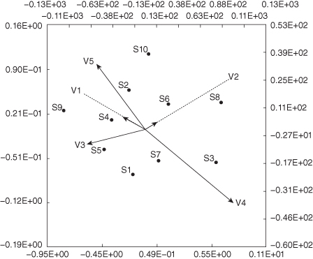
In principal component analysis, biplots are used to display the contributions of multiple variables in a two-dimensional display. Fewer than 10 variables should be used if the plot is to be readable [Falissard, 2012].
Common errors include all of the following [Gower et al., 2010]:
- Incomplete captions
- Incomplete legends
- Origin not indicated
- Shape/aspect misleading
Biplot scales should always employ the true aspect ratio. The scales of the biplot shown in Figure 10.17 do not. As a result, distances and angles are distorted, making the results impossible to interpret without extensive discussion. Moreover, the four scales (top, bottom, right, and left) measure two different things:
1. The scales at the top and the right give values of variables.
2. The scales at the bottom and the left are unnecessary as they give coordinates of samples in terms of principal components.
Putting the scales in scientific notation makes them hard to read (even if they were labeled so that we knew without this separate commentary what the numbers represented).
On the plus side, including correctly scaled scales in a biplot allows the viewer to quickly discard from consideration variables that occupy only an insignificant range of its biplot axis.
Choosing Effective Display Elements
As Cleveland and McGill [1988] emphasize, graphics involve both encoding of information by the graphic designer and decoding of the information by the reader. Various psychological properties affect the decoding of the information in terms of the reader’s graphical perception. For example, when two or more elements are presented, the reader will also envision by-products such as implied texture and shading. These by-products can be distracting and even misleading.
An example of mismanaging elements can be seen in the developer agreement available at https://www.ibm.com/developerworks/mydeveloperworks/files/app/person/060001TJG2/file/110ccd08-25d9-4932-9bcc-c583868c9f31?lang=en. The graphic of interest is on page 7/11 of that site and illustrates the focus areas of mobile computing adoption. The intent of the graphic is to convey the adoption rates of mobile computing in a variety of focus areas. The problem with the graphic is that the length/size of the graphics (the graphic is a bar chart) do not convey the same information as the text elements that specify the adoption rate. That is, when the reader focuses on the graphic for 10% and the graphic for 31%, the length is nowhere near three times as long. This inability to judge the relative values based on the sizes of the graphics could be a function of the fact that there is no horizontal axis, and so there is no way to know whether the left side of the graphic originates at zero.
Graphical displays represent a choice on the part of the designer in terms of the quantitative information that is highlighted. These decisions are based on the desire to assist the analyst and reader in discerning performance and properties of the data and associated models fitted to the data. Although many of the decisions in graphical construction simply follow convention, the designer is still free to choose geometric shapes to represent points, color or style for lines, and shading or textures to represent areas. The referenced authors included a helpful study in which various graphical styles were presented to readers (Cleveland and McGill [1988]). The ability to discern the underlying information was measured for each style and an ordered list of effective elementary design choices was inferred. The ordered list for illustrating numeric information is presented in Table 10.4. The goal of the list is to allow the reader to effectively differentiate among several values.
TABLE 10.4. Rank-ordered list of elementary design choices for conveying numeric information
| 1 |
Positions along a common scale |
| 2 |
Positions along identical, nonaligned scales |
| 3 |
Lengths |
| 4 |
Angles |
| 4–10 |
Slopesb |
| 6 |
Areas |
| 7 |
Volumes |
| 8 |
Densities |
| 9 |
Color saturations |
| 10 |
Color hues |
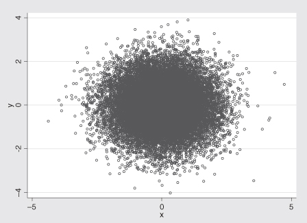
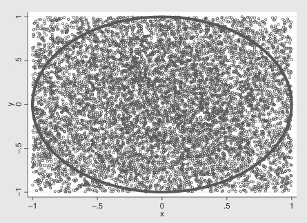
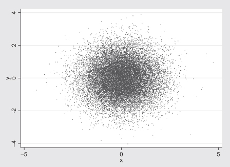
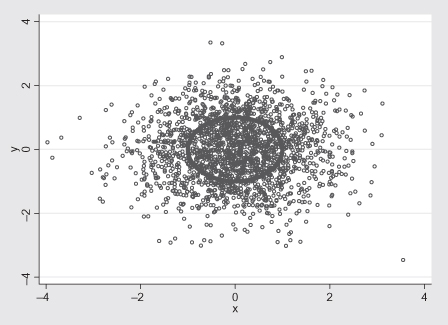
When faced with the challenge of depicting a large number of points, there are several steps one should consider when looking for patterns. An interesting challenge was issued by Yi Hui (see http://www.yihui.name/en/category_2.htm). Yi describes generating 20,000 rows (x) and 20,000 columns (y) from a N(0, 1) distribution. He also generated 10,000 data points that were on the unit circle (x2 + y2 = 1). The description of the data should be enough to allow the interested reader to generate a dataset with two variables (x and y) with 30,000 observations.
The challenge is to draw a scatterplot that reveals the circle pattern (the 10,000 points that are on the unit circle). An initial plot for which small circles denote each pair is simply too dark (due to overlapping circles) in the middle of the illustration to allow one to see that there are a number of observations on the unit circle; see Figure 10.18.
There are various approaches to consider when trying to illustrate a pattern in a large amount of data. In the first approach, we zoom in on the large amount of information by limiting the axes. This approach is seen in Figure 10.19. A second approach is to draw all of the data, but reduce the symbol form to a single dot. This approach works better on a computer screen (especially one that allows us to make the overall picture larger) than it does on a piece of paper; see Figure 10.20. Finally, not knowing where among the data points a feature may be hidden, we draw a small random sample of the data to see if any pattern appears; see Figure 10.21.
If the purpose of the java-enabled graph at http://www.flashbit.com/weave.html?defaults=qolILBlackDB.xml is to show what might be done, it succeeds. If its purpose is to show specific information, it violates all the rules and makes a mockery of an aggregate quality-of-life index.
CHOOSING EFFECTIVE DISPLAY ELEMENTS
When relying completely on the ability of software to produce scientific displays, many authors are limited by their mastery of the software. Most software packages will allow users to either specify in advance the desired properties of the graph, or to edit the graph to change individual items in the graph. Our ability to follow the guidelines outlined in this chapter is directly related to the time we spend learning to use the more advanced graphics features of software.
Color
Use color sparingly if at all. Its use should be reserved for oral presentations and electronic publications. Be aware that it has emotional connotations that vary from culture to culture and individual to individual. Be particularly sensitive to color choices when creating maps. On viewing http://interactive.spacetimeresearch.com/travel/#view=viewWorldMap&selectedWafers=0, United States residents may ask why their country is the same color as Africa, Indians may object to being treated as if India were part of China, and Canadians may object strenuously to being lumped in with the United States.
ORAL PRESENTATIONS
Graphs
The rules for graphics in print are equally applicable to lectures and may be summed up as, “Never use a chart that will take longer to explain than the information it was intended to provide.”
Use color sparingly; color can induce emotions that depend both upon the culture and the individual. Still, it can awaken an audience two-thirds of the way through a lengthy lecture. (Think of the use of color in the Rorschach plates.)
Tables
The numeric values in a table should occupy no more than three columns and include no more than three digits each, for example, 318, 3.18, 3.1 × 10⁸.
Text
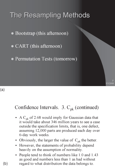
A slide should contain no more than three bullet points, as in Figure 10.22a, and should never be merely a rehash of the lecture itself, as in Figure 10.22b.
SUMMARY
- Examine the data and results to determine the number of dimensions in the information to be illustrated. Limit your graphic to that many dimensions.
- Limit the axes to exactly (or closely) match the range of data in the presentation unless a zero axis limit admits desired relative comparisons of the depicted values.
- Do not connect points in a scatterplot unless there is an underlying interpolation that makes scientific sense.
- Recognize that readers of your reports will copy tables and figures for their own use. Ensure that you are not misquoted by completely describing your graphics and tables in the associated legends. Do not skimp on these descriptions or you will force readers to scan the entire document for needed explanations.
- If readers are to accurately compare two different graphics for values (instead of shapes or predominant placement of outcomes), use the same axis ranges on the two plots.
- Use pie charts only when there are a small number of categories and the sum of the categorical values has scientific meaning.
- Tables are text-based graphics. Therefore, the rules governing organization and scientific presentation of graphics should be honored for the tables that we present. Headings should be differentiated from data entries by font weight or color change. Refrain from introducing multiple fonts in the tables and instead use one font and denote differences by varying weight (boldness), style (italics), and size.
- Numeric entries in tables should be in the same number of significant digits. Further, they should be right justified so that they line up and allow easy interpretation while scanning columns of numbers.
- Many of the charts could benefit from the addition of grid lines. Bar charts especially can benefit from horizontal grid lines from the Y axis labels. This is especially true of wider displays, but grid lines should be drawn in a lighter weight than the lines used to draw the major features of the graphic.
- Criticize your graphics and tables after production by isolating them with their associated caption. Determine if the salient information is obvious by asking a colleague to interpret the display. If we are serious about producing efficient communicative graphics, we must take the time ensure that our graphics are interpretable.
TO LEARN MORE
For many more examples of bad and/or misleading graphics, see http://www.math.yorku.ca/SCS/Gallery/. Wilkinson [1999] presents a formal grammar for describing graphics, but more importantly (for our purposes), the author lists graphical element hierarchies from best to worst. Cleveland [1994] focuses on the elements of common illustrations and he explores the effectiveness of each element in communicating numeric information. A classic text is Tukey [1977], in which the author lists both graphical and text-based graphical summaries of data. Tufte [1983] and Tufte [1990] organized much of the previous work and combined that work with modern developments; see also Burn [1993] and Wainer [1997, 2004]. For specific illustrations, subject-specific texts can be consulted for particular displays in context; for example, Hardin and Hilbe [2003, pages 143–167] illustrate the use of graphics for assessing model accuracy.
For a lighthearted, but enlightening, presentation of charts and graphs, see http://ilovecharts.tumblr.com. In particular, http://ilovecharts.tumblr.com/BenGreenman has an unofficial collection of charts in the so-called Museum of Silly Charts. Though tongue-in-cheek, the charts found at these sites humorously illustrate some of the difficulties of inferring information from graphics. As mentioned in the chapter’s opening, see Yau [2011] for another take on effective use of graphics.
Notes
1 These labels show the remarkable lack of imagination that we encounter in many data collection efforts. To be fair, the children had their own informal names such as Fireballs but not all of these names were available at data collection time.
2 If we include all of the values as text (as labels or in a tabular legend), the graph should illustrate more than just the labeled values.
