
I photographed this scene early one May morning when the shadows were still long and the grass was dewy. I knew immediately that I wanted to pump up the color and play with a complementary color scheme of green and rust. I also wanted to create a feeling of distance.
24" × 18" (61cm × 46cm) sanded pastel paper mounted on board
#305 Spruce Blue NuPastel
Other various hard, medium and soft pastels
Old bristle brush (new ones will be eaten up by the sanded paper)
Odorless mineral spirits or denatured alcohol, soft lead pencil, watercolor or diluted acrylics, workable fixative
I take hundreds of photographs and am always looking for scenes with a strong composition and interesting shapes to paint. I used this reference photo as a starting point, but I was not afraid to adjust the colors to suit my needs. Don’t be afraid to do the same!

Choose a light-colored sanded paper that is pre-mounted on a board to avoid buckling. Use watercolor or diluted acrylic to cover the board with a rust or orange underpainting. The paper does not have to be evenly covered. In fact, it is often more interesting when the wash is not perfectly opaque and flat.
Grid up your composition in the same proportion as your original reference photo, making changes as you see fit. Create a light pencil grid, then boldly draw in the darkest areas with a #305 Spruce Blue NuPastel. Take an old bristle brush loaded with odorless mineral spirits or denatured alcohol and brush freely over the dark areas. This will create a permanent underdrawing that does not become muddied or smeared with subsequent layers of pastel.

Using pastels of medium hardness, begin to lay in color very lightly over the orange background. I like to use Rembrandt pastels for this stage of the painting.
Start by choosing some shades to represent your lightest lights and your darkest darks. They should be close to the final values. This will give you the range of darks and lights that the rest of your colors will have to stay within.
Cover the rest of your paper with value-appropriate colors with a very light touch. Part of the beauty of this type of underpainting is that you can leave some of it showing through your pastel layers.
Use complementary colors to get an interesting “vibration” of colors. In this case I used a rust underpainting for a predominantly green final painting.
Choose hues that are brighter and richer than your reference photo. Note that there is very little detail at this point, just a general nod to the color and placement of the main elements of the scene.
Give the board a light spray with workable fixative at this point. However, to avoid darkening of colors, don’t use it on the later layers.
“Paint what makes your heart sing.”
—Jill Stefani Wagner, PSA
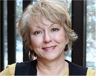
Whether painting landscapes, cityscapes or figures, artist Jill Stefani Wagner’s primary focus is always “light” and how it affects the scene. Working in pastel, oil and watercolor, she approaches her paintings as a sculptor would, carving the nuances of highlight and shadow.
Jill received a B.F.A. in painting from the University of Michigan School of Art and Design and owned an award-winning advertising firm before “seeing the light” and becoming a full-time painter. Now a busy professional artist, Jill paints 175 to 200 paintings a year.
Jill has been honored with multiple awards from the Pastel Society of America and has been featured in important art magazines including Pastel Journal and Fine Art Connoisseur.
Realism with a painterly twist best describes Jill’s jewel-like paintings. For Jill, painting is an endless adventure. It is my pleasure to share her pastel painting demo in the pages of this book.


Now the fun begins. Start comparing your colors and values. Establish the colors you want to use in your sky and the far tree line. When those are in place, you can begin working forward into the painting, using hues that are a little warmer and more vibrant as you come to the bottom. Also, as you move closer to the front of the painting, a bit more detail will become evident. Make your pastel strokes mirror the direction of the element you’re painting (e.g., for the grasses in the foreground, use vertical, spiky strokes, while the distant, rolling hills can be described with soft, horizontal passages).
Re-establish your highlights and deep shadows at this point, making sure that the area of most contrast is close to your focal point (in this case, the large tree). Note that the shadows are not one uniform color as they fall over different surfaces, but they are the same percentage darker than what is beneath them. For example, in the left of my painting, sunlit rows of new corn are brighter than the dark dirt. Accordingly in shadow, the corn is a darker color but still brighter than the dirt. As shadows fade into the distance, you see less and less of this variation in value.

Reflections on water are a recurring theme in my work. I love the abstract shapes and colors that occur when light reflects onto a wooded stream.
To paint this painting I used the same techniques as described in the demonstration. The painting started with a warm orange tone over the whole paper. To create distance, the elements in the background are less detailed and the far woods take on a muted blue-gray color. The photograph did not show this color shift, but I know from working outdoors that our eyes register this phenomenon in nature. As artists, we often need to “push” what we see in our reference photos to create a scene that reads correctly to the viewer.
Parker Mill Creek 2
Jill Stefani Wagner, PSA
Pastel on sanded paper mounted on board
24" × 18" (61cm × 46cm)

Continually compare and re-evaluate the values to make sure they ring true. Darken and lighten areas that need additional attention, but do not fill the entire tooth of the paper. Let some of the orange show through, especially at the bottom where the colors would be the warmest.
Save your softest pastels for the highlights that you apply at the very end. Keep most of the detail at your point of interest so that the observer’s eye goes there first, allowing the rest of the information to be “filled in” by the viewer. Stop before you think you are finished!
Rogers Farm
Jill Stefani Wagner, PSA
Pastel on sanded paper mounted on board
24" × 18" (61cm × 46cm)
I absolutely love painting outdoors. What I learn in the field greatly improves the color and light in my studio paintings as well. I’ve heard many artists say that you have to paint at least five hundred plein-air paintings before you really get it.