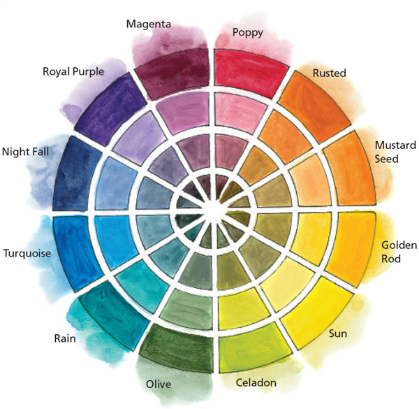
Experimenting with a hues, tint, tone and shade can open your eyes to new possibilities when choosing a portrait palette. I love to test paints in this way, paying special attention to the tint, tone and shade as they totally change the appearance of the hue. It helps me to be courageous and choose colors I’d never normally choose for creating a portrait. Any paints can be used for this, so I encourage you to pull out twelve colors that are representative of those on a color wheel and see how they play out.
Note: It’s always a good idea to write down the paint brands and colors chosen for this exercise so you have a reference later on.
Use any brand or colors you like for this exercise. I used Derivan Matisse Fluid Matte Sheer Acrylics.
Note: Change your water frequently and rinse your brush between each mixture to get the purest color swatches.