Chapter 6: Power View
Power View is a relatively new Microsoft tool for creating great-looking interactive dashboards. The Power View dashboard worksheet is a special type of worksheet in Excel 2013 that uses data from the Power Pivot model.
For all its apparent simplicity, Power View has a lot of features that you will be hard-pressed to figure out without someone giving you a hand. A lot of things about Power View are hard to figure out, but this chapter will help you cut through the confusion quickly.
How to Use Power View
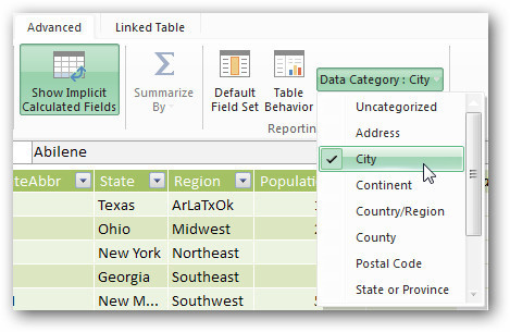
Here’s the basic process for using Power View: Load tables into the Power Pivot model, add relationships, and add elements to the Power View canvas. When you’re working in Power View, you need to take one extra step that is not required in Power Pivot: Make selections from the Data Category drop-down. In the Power Pivot window, go to the Advanced tab and click the Data Category drop-down. This drop-down lets you specify that a selected column represents a specific geography or other data type. Look through the columns in your model and select from the Data Category drop-down every category that fits one of your columns:
Figure 6.1
These are some commonly used categories:
-
• City
-
• State or Province
-
• Postal Code (for zip code fields)
You may find that other categories are worthwhile. If you have a product name field, select More Categories, Product, Product. For a company name, select More Categories, Organization, Company.
Two interesting categories are Image URL and Web URL. Image URL is for an image stored on your local hard drive or a network drive. Web URL is for images located on a website. Obviously, Web URL is far more portable and generally superior. These two types both let you show pictures in a dashboard.
|
Note
When you open a Power View dashboard that uses Web URL, Microsoft warns users that they are about to see external pictures. Maybe Microsoft is afraid you are going to slip porn in there instead of product pictures, but a person opening the workbook will have to choose to enable the external pictures before he or she can see your pictures.
|
Once you are done marking the data types for as many columns as you can, you close the Power Pivot window and return to Excel.
Inserting a Power View Report
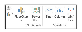
Once your data is in the Power Pivot model, go to the Insert tab in the Excel 2013 ribbon and choose Power View. It is about halfway over, just between Chart Types and Sparklines:
Figure 6.2
|
Note
It seems like PivotTable and Power View should be found on the Data tab of the ribbon, but they’re here, on the Insert tab.
|
The Default First Power View Table
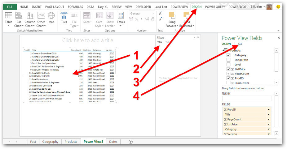
In earlier versions of Power View, you would start out with a pristine blank dashboard canvas. In the current version, Microsoft arbitrarily creates a table element on the dashboard. This element is rarely what you want, so feel free to delete it by selecting it and pressing the Delete key (see item 1 below):
Figure 6.3
You now have a big empty white canvas and Filters pane, as well as the Pivot Table field list on the right side.
The figure above points out a few confusing points about Power View:
-
• As shown at number 2, the blank Filters pane defaults to being open and taking up space. Because every element on a Power View dashboard is a filter for every other element, you may never have to use the Filters pane. Click the < icon at the top right of the Filters pane to collapse it.
-
• As shown at number 3, a variety of contextual ribbon tabs come and go while you are working with Power View. In a regular Excel feature, you would expect these ribbon tabs to be labeled Power View Tools, Design. But in Power View, you see just Design. Find the Power View ribbon tab. From there, scan right until you find either Power Query or Power Pivot. Anything between Power View and one of those two tabs is related to Power View. And, yes, the number and name of these tabs will change frequently, depending on what you are doing.
-
• As shown at number 4, The Power View field list starts out showing only one table. You need to click All to see the other tables.
Creating a New Dashboard Element
With your blank Power View canvas showing, follow these steps:
1. In the Power View field list, click All to see all tables.
2. Expand the Product table and choose Title.
3. Expand the Fact table and choose Revenue.
You now have a table element on the dashboard, showing title and total revenue per title:
Figure 6.4
You are free to change this table into a chart or some other type of element. Just remember that every new element starts as a table.
Finding the Hidden Controls on an Element
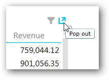
In Figure 6.4, it seems like there are not a lot of controls. There actually are controls, but they are hidden. When you hover your mouse over the table, controls appear at the top. In the next figure, you can see a control for applying a filter and another control, called Pop Out, for making a small element appear full screen:
Figure 6.5
In addition, some controls that are visible all the time don’t look like controls. For example, you can click on any heading to sort the table based on that column. For example, click once on the Revenue heading to sort smallest to largest and click again to sort in descending order:
Figure 6.6
Adding a New Element by Dragging a Field
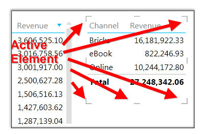
Say that you want to create a new element on a dashboard. Drag a field, such as Channel, to a blank section of the dashboard. You then have a new element with the channels listed. Once that new element exists and is active, you can add revenue to it by simply selecting the Revenue field:
Figure 6.7
Understanding the Field List
Even when you have two elements on a dashboard, you see only one Power View field list, and it refers to the currently active element. You can tell which element is active by looking for the eight resizing handles around the element. Spotting those handles can be tricky.
To move an element, hover your cursor over the edge of the active element, and the cursor changes to a hand. Drag the element to a new location.
|
Note
The drop zones in the Power View field list change, depending on the type of active element. For example, the field list for a column chart is different from the list for a card view or a map.
|
Changing a Table to a Chart
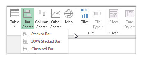
As mentioned earlier, every new element in a dashboard starts as a table, but it does not have to stay a table. The Design tab includes Table, Bar Chart, Column Chart, Other Chart, and Map drop-downs that offer choices for variations:
Figure 6.8
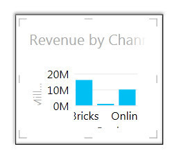
Ahhh, but there is a problem here: When you change a small table to a chart, Microsoft tries to jam the chart into the small space formerly occupied by the table. This rarely looks good:
Figure 6.9
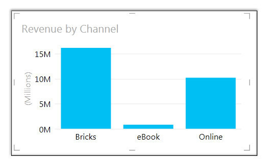
Plan on cursing in the direction of Redmond and then making the element large enough to actually hold the chart. After you resize it, the chart looks better:
Figure 6.10
Formatting Options
As an Excel pro, you will want to format charts. You’ll look for things like the Format task pane and the Excel 2013 Paint Brush icon. But these don’t exist in Power View. A few options do exist, but they are fairly boring compared to what you can do in Excel:
-
•
Power View, Themes:
Choose from 46 different themes. A theme changes from one monochrome chart color to another monochrome chart color. Sadly, you cannot vary colors by point.
-
•
Power View, Font:
Change the font style used in the element.
-
•
Power View, Text Size:
Choose 75%, 100%, 125%, and so on.
-
•
Power View, Background:
Change the background for the Power View canvas. These are ugly backgrounds that you might recognize as being borrowed from PowerPoint.
-
•
Power View, Set Image:
Replace an ugly PowerPoint background with a picture. You can then use adjacent icons to change the position and transparency.
-
• P
ower View, Set Image, Remove Image:
Takes your canvas back to white.
-
•
Layout, Title:
Choose None or Above Chart. You cannot actually edit the title.
-
•
Layout, Legend:
Set the legend position.
-
•
Layout, Data Labels:
Choose None or Show. It seems like you’d be able to change the number format here, but you can’t.
Understanding Hierarchy
Hierarchy is a really cool feature in Power View. To see how it works, consider this chart, which shows revenue by region:
Figure 6.11
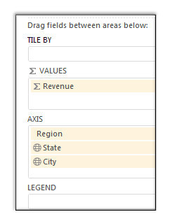
In the Power View field list, add the State and City fields to the Axis drop zone:
Figure 6.12
Now look at the chart. It appears that nothing has changed from Figure 6.11. However, you have created a powerful hierarchy. Double-click the West column in the chart, and the chart instantly updates to show the states in the West region:
Figure 6.13
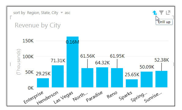
Double-click Nevada. The chart drills down to show the cities in Nevada. Now, this is cool! When you hover over the chart, a Drill Up icon appears in the top right:
Figure 6.14
Click the Drill Up icon to return to the State level and then click it again to return to Region.
Thanks to this Power View tool, hierarchies are very easy to set up—and they work well.
Alien Explicit Slicers and Implicit Slicers
Slicers debuted at Microsoft in Excel 2010. The Power View team has invented different-looking slicers, but they can still be either explicit or implicit.
Setting Up an Explicit Slicer
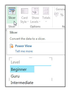
Every new element—including a slicer—starts as a table in Power View. To create a slicer by level, drag Level to a blank area of the canvas, and you get a table that lists the levels. Then go to the Design tab and choose Slicer to convert the table to an explicit slicer:
Figure 6.15
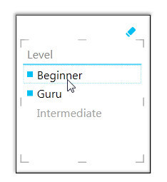
Here you can see that two of the three levels are selected:
Figure 6.16
When you hover your mouse over the slicer, you see the Clear Filter icon, which is an eraser icon instead of an X funnel icon. To choose a single item in the slicer, simply click it. To choose two items, you cannot click-and-drag as you can with normal Excel slicers. Instead, you click the first item and then Ctrl+click the other items.
Setting Up an Implicit Slicer
It turns out that you may not need explicit slicers at all. In Power View, every chart is a slicer for every other element. Here is a column chart that shows revenue by version:
Figure 6.17
When you click the 2010 column in the top chart, the other chart updates to show the revenue associated with the selected item. If you click 2007 instead of 2010, the lower chart updates to show the revenue associated with sales of Excel 2007.
To clear a filter, you click the selected column again, and the implicit slicer is cleared.
Comparing Explicit and Implicit Slicers
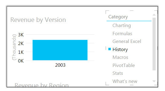
When you use an explicit slicer to filter this chart to only history books, the only version that appears is Excel 2003:
Figure 6.18
In contrast, when you choose History from an implicit slicer, the other chart continues to show a faint column with total revenue for Excel 2002, Excel 2003, Excel 2007, Excel 2010, and Excel 2013:
Figure 6.19
The bright section of the Excel 2003 column represents the one history title—a history book called
The Spreadsheet at 25
that I (Bill) wrote a long time ago. It was a fun little book, in color, with a pop-up page. But of course you don’t see many history books about spreadsheets.
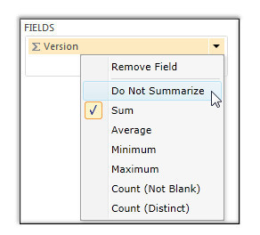
Before moving on, it’s important for you to be aware of two cautions related to the previous example. First, the values for the Level field are all numeric: 2002, 2003, 2007, 2010, and 2013. When you add this field containing numeric values to an element, Power View automatically chooses to sum the level, which is meaningless. To prevent this, in the Power View field list, open the drop-down next to Sum of Level and choose Do Not Summarize:
Figure 6.20
|
Note
Check out Count (Distinct) in the image above. Coming up with a distinct count is hard to do in a regular PivotTable but easy in Power Pivot and Power View.
|
The second caution is that while it is easy to convert a table to a slicer, you cannot convert a slicer back to a table or a chart. If a table or chart is your goal, you have to delete the slicer and add a new element.
Understanding the Two Kinds of Filters
When you expand the filter pane, you see two kinds of filters:
-
•
View filters:
This type of filter goes back to the original data set and applies a filter to the individual detail records.
-
•
Chart (or table) filters:
This type of filter applies to the summarized values that appear in the active chart or table.
|
Note
Bookmark this page so you can come back here to recall how this works. You’re going to need this information later.
|
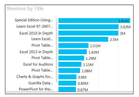
What’s really the difference between these filters? Consider this unfiltered chart, which shows revenue by title:
Figure 6.21
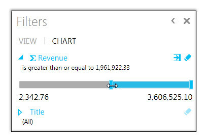
If you open the Filters pane, choose Chart, and drag the slider to select approximately $2 million, you see only the titles where the total revenue is greater than $2 million in aggregate:
Figure 6.22
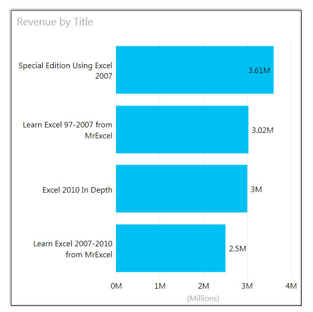
Then you see four titles in the chart:
Figure 6.23
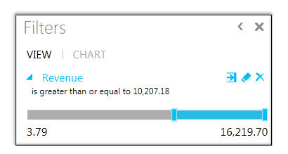
Now clear the chart filter and select View. Drag Revenue from the field list to the view filter. The slider now runs from $3.79 to $16,219. Choose a value close to $10,000. Power View now goes back to the original 400,000-row data set and looks for single transactions of more than $10,000 each:
Figure 6.24
Let’s face it: It is rare to sell more than $10,000 of books in a single transaction. So you could use this filter only for things like seeing the book sales made through really large seminars. Note that the total sales in the figure above are much smaller than the results shown here:
Figure 6.25
Setting Precise Filter Numbers
The last few examples say to drag the slider to
approximately
$2 million or
approximately
$10,000. It is impossible to have the slider land right on a particular number. Nudge the slider 1 pixel, and you will jump from 9978.79 to 10035.88.
If you need to get exactly to $10,000, click this icon until Power View shows the advanced filter:
Figure 6.26
You might have to click twice: once to get to the not-so-useful list filter and then again to get to advanced filter.
Understanding Tile By
Doesn’t the name Tile By make you think that Power View is going to give you multiple versions of your chart, in a tiled arrangement? Unfortunately, it doesn’t. Tile By creates a tab strip that lets you filter the one chart. (However, the good news is that a feature called Vertical Multiples, described in the next section, creates many tiles of the same chart.)
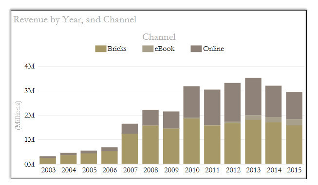
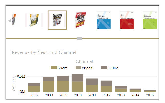
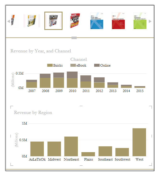
To see Tile By, consider this chart, which has Year as the Axis field and Channel as the Legend field:
Figure 6.27
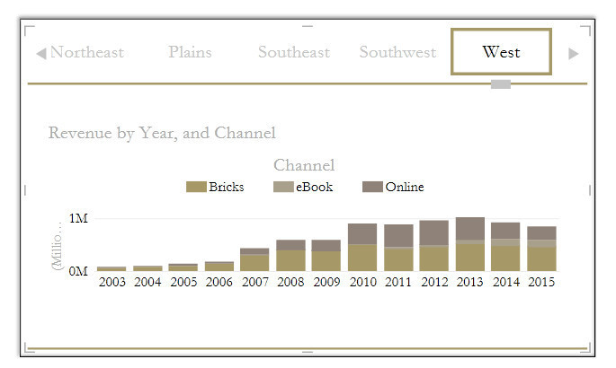
Drag the Region field to the Tile By drop zone in the Power View field list. A new tab strip appears above the chart. Select West from the tab strip, and the chart updates to show only the West region:
Figure 6.28
Try dragging the Web URL field to the Tile By drop zone. You can now choose pictures from the tab strip:
Figure 6.29
Tile By applies only to the chart between the horizontal lines. If you want a single Tile By to apply to two different elements, you need to follow these steps:
1. Set up a chart and add it to the Tile By drop zone in the Power View field list.
2. Set up another chart outside the Tile By lines.
3. Press Ctrl+X to cut the chart.
4. Click inside the Tile By lines.
5. Press Ctrl+V to paste the chart inside the Tile By area. You are now trying to squeeze two charts into a small area. You will have to resize both charts and/or the Tile By lines to make everything fit.
The following figure shows the PictureURL field added to the Tile By area:
Figure 6.30
Using Vertical Multiples to Create Tiled Charts
After you create a single chart, you can make multiple copies of it by dragging a field to the Vertical Multiples drop zone. Note that Power View offers both Horizontal Multiples and Vertical Multiples tools. Horizontal Multiples shows the charts in a single row. Vertical Multiples fits the charts into a rectangular matrix. This figure shows Horizontal Multiples:
Figure 6.31
Creating Maps in Power View
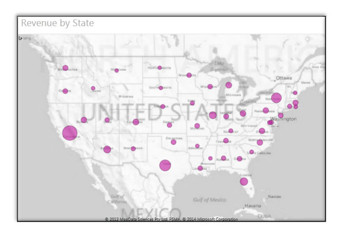
To create a map, you have to have some fields that are categorized in the Power Pivot window as geographic fields. For example, you can start with a table of revenue by state and convert that table to a map. If you are connected to the Internet, Power View uses Bing to show the data points on a map:
Figure 6.32
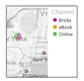
If you add Channel to the Color drop zone in the Power View field list, you get a pie chart in each state:
Figure 6.33
Even if your data is all in one country, you should consider adding a Country column to the original data set. Otherwise, sales in Paris, France, will show up in Paris, Kentucky. On the flip side, sales in Melbourne, Florida, will appear in Melbourne, Australia.
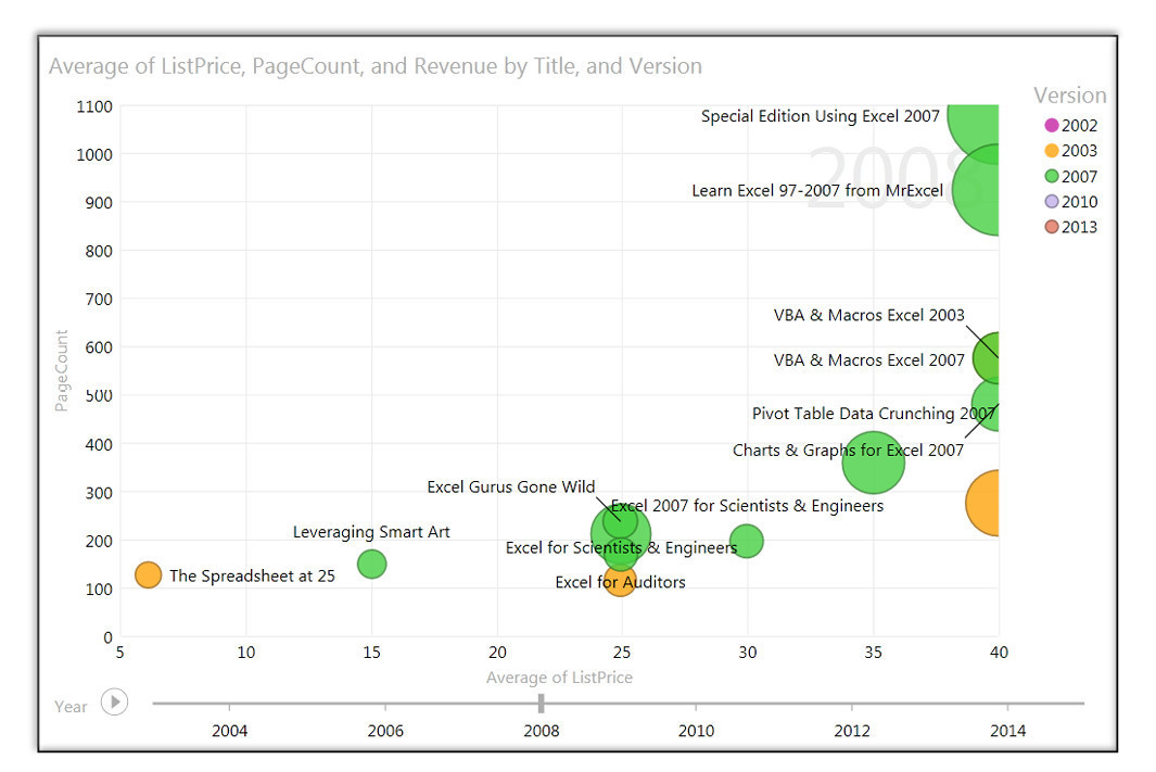
Creating Animated XY Charts
Follow these steps to create an animated XY chart:
1. Drag Revenue onto the canvas.
2. Set Table to Other Chart, Scatter.
3. Drag Title to the Details drop zone to ensure that each product gets a dot in the chart.
4. Drag List Price to the X Value drop zone. Use the drop-down to change from Sum to Average.
5. Drag Page Count to the Y Value drop zone.
6. Drag Version to the Color drop zone.
7. Drag Year to the Play Axis drop zone. (You might have to scroll the field list to see this drop zone.)
When you click the Play button, you see the chart animate over time. The chart conveys year, page count, list price, version, and total revenue—five different dimensions on a single chart:
Figure 6.34
|
Note
Check out the TED talk with Hans Rosling for a great example of an animated XY scatter chart in Power View.
|
