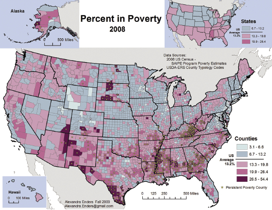
Figure 5.1 Alexandra Enders’s map of poverty in US counties based on 2008 US census data. Reprinted with permission.
Consider figure 5.1, a map of poverty across the counties of the United States in 2008. It was made by Alexandra Enders, then at the University of Montana, for a study exploring causal relationships between poverty and citizen disability. It is well understood that physical and sensory limits often cause poverty in affected individuals.1 But would areas where systemic poverty is greater show a larger number of persons with disabilities? If the correlation between poverty and disability was demonstrable, that would violate moral declarations of equality—we should all have a level playing field—and invoke the ethical corollary of mutual assistance for those who are less able through no fault of their own. After all, this was the idea behind the Americans with Disabilities Act of 1990 (ADA): a level playing field for all citizens irrespective of individual characteristics.2 In bioethics the moral referent might be “beneficence,”3 a moral duty to care and its broad social resonance as an ethical injunction.

Figure 5.1 Alexandra Enders’s map of poverty in US counties based on 2008 US census data. Reprinted with permission.
At first, I did nothing more than glance at the map. I had seen others that were similar in subject treatment. Visually, the map insists on the reality of a singular geography within which poverty is posted as a defining feature of the American landscape. That poverty is located in 3,007 distinct US counties whose thin gray boundaries are themselves contained within black lines identifying each of the fifty US states. An inset map aggregates county-level data into a portrait of poverty as a state-level characteristic. Neighboring countries are neutral nonentities in both. Canada’s northeastern coastline is evident in the map’s upper right; northern Mexico is grayed into insignificance in the lower left. Both regions are blank areas serving only to locate and frame the continental United States and its poverty.
The poverty posted in the Enders map is drawn from the US Department of Commerce Census Bureau’s “small area income and poverty estimates” (SAIPE).4 SAIPE poverty is a conclusion derived from a statistical regression model using data from the Census Bureau’s American Community Survey (ACE), Supplemental Nutrition Assistance Program (SNAP), and tax reported income.5 So SAIPE poverty is a kind of “poverty plus,” a community measure that presents in the rows and columns of its data set an index of relative deprivation.
A color ramp (light blue to deep purple-red) creates a scale descending from the wealthiest and richest quintiles (blues) to the poorer and then poorest quintiles in ever-deeper shades of red. In the few wealthiest, light-blue counties, poverty rates range from 3.3 to 6.6 percent of the population; in the darkest counties, poverty pervades in a range from 26.3 to 55.4 percent, a quarter to more than half of all residents. Counties with persistently high poverty are starred. Dividing blue and red—and thus by implication good and bad, have and have-not—was the calculated average percentage of all US citizens living in poverty in 2008: 13.2 percent.6
The map thus presents the statement that more than one in eight Americans live in SAIPE-defined poverty. It seems as natural (and thus acceptable) a feature of the landscape as the lakes and mountains of the land. In 2008 the national population was 304.09 million, and 13.2 percent of that population was 40.14 million, not coincidentally the approximate number of Americans reported that year to be without health care insurance.
The insert distinguished relative state-level poverty using only three categories: blue-gray (poverty at or below the national average), pink (13.3–19.8 percent poverty), and red for a single state, Mississippi (19.9–26.4 percent). Aggregated at this scale, the county extremes are averaged into oblivion, resulting in a relatively homogenous, benign portrait of poverty in the United States, with Mississippi the only real outlier.
Because it is a map, the argument is not simply about the statistical incidence of poverty but rather about relative poverty among US counties and states. Because it is “factual” and objective, the map makes no judgment on poverty’s prevalence or income inequality’s national extremes. They just … are.
When one looks at the Enders map, the usual reaction is neither surprise nor outrage but a simple shrug of the shoulders. Why was the map not a call to national action to help 39.8 million impoverished fellow citizens? Why did it not immediately invoke a sense of moral outrage? One reason is simply that it is not an easy read. There are so many counties and so much variation between them that nothing in the map really moves the reader to cry “help” or “shame!”
Of course, it might be different for a map reader living in one of the starred, dark-red counties. But even if he or she did see the map, its poverty is not absolute but relative, a deficit “here” compared to abundance “over there.” Perhaps the relative poverty presented is merely an inconvenience, driving an old pickup rather than a new Ford F-250 ($65,000–$75,000) or a Chevy Colorado ($21,000–$28,000). Maybe poverty means a night out at Boston Pizza rather than chicken cordon bleu at the local French bistro. It is hard to get excited about an abstraction mapped on a landscape so varied in its characteristics and so vast in its geographic range.
There was nothing particularly innovative or remotely radical about the Enders map. The official SAIPE website provides an automated tool allowing users to generate their own maps.7 Figure 5.2 shows a SAIPE website map that, for the sake of consistency, also presents 2008 data. The web-generated result gives up any pretense of international neighborliness, eliminating even the gray ghost of Canadian or Mexican borders. It is America alone and independent, its neighbors hidden. Where the Enders map used a five-color ramp, the web-generated map automatically used six more muted colored divisions. Like the Enders map, the SAIPE website map accepts a 13.2 percent county poverty as a natural divisor between haves and have-nots across the US landscape in 2008.
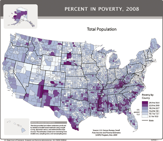
Figure 5.2 This map of the total percentage of Americans living in poverty was produced by the automatic mapping program of the US Census Bureau’s SAIPE website.
Both maps share the conclusion that poverty exists at an uneven rate in the counties of the United States. Both serve as statements of federally calculated, statistically defined economic inequalities. Both present without comment counties where the percentage of persons without sufficient “threshold” income for life’s daily necessities—the SAIPE definition of its poverty—is relatively high. One difference between the two maps is their respective color ramps. The more vibrant blues and reds in the Enders map make a stronger visual statement. The dull blues and purples of the SAIPE map, automatically imposed by the online program, mute the map’s message and thus the importance of any but the most extreme variation between counties.
Less obvious is the difference in the construction of the respective maps’ categories of poverty and wealth. In the Enders map, the light-blue coloring marked the least-impoverished counties with no more than a 6.6 percent rate of impoverishment, whereas the SAIPE map included in its wealthiest county category all those with less than 10 percent impoverishment. This gives the SAIPE map a larger number of first-tier counties. The poorest, dark-red counties in the Enders map were all those with 26.6 percent or more of the population living in SAIPE-certified poverty. The SAIPE mapping program painted its poorest counties beginning at 29.9 percent of the population, thus reducing by 3.3 percent the count of poorest counties. Thus the SAIPE map’s categories diminish by statistical fiat the prevalence of the very poor. The result is that dark-purple counties are less evidenced. Nor in this color ramp are the divisions so visually accentuated as poverty increases, step by step.
There is nothing nefarious here. Students of cartography are taught the many ways in which the statistical pie can be efficiently divided. One can use an equal interval between all the cases, set a defined interval between classes, or create divisions with a formula creating natural breaks in the data. For a more comparative method, simply calculate a set of standard deviations from the arithmetic mean. And so on. All are legitimate choices, although some serve better than others depending on the map’s focus and purpose. Finally, map data can be categorized in two, three, four, eight, or more statistical divisions. There is nothing sacred about the quintile, although, as a general rule, the larger color ramps (six to eight divisions) are harder to read.
What most radically distinguished the two maps was Enders’s starring of dark-red counties in which high levels of poverty are endemic, occurring year after year. Adding that level of historical data made hers not only a map of relative income inequality among US counties but also a map of attendant poverty as a recurrent and structural reality in at least some counties. Whatever poverty means to communities, the Enders map argues, it must be seen as a recurring feature of the social landscape, at least in the red-starred counties.
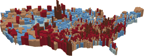
Figure 5.3 A 3-D extruded map of SAIPE poverty (2008) emphasizes the levels of poverty shown in earlier maps but does not change the message that poverty and wealth exist together across the US landscape. Map created by author.
The map can be reconstructed to emphasize the presence of relative poverty in the United States. Changing the number of statistical divisions or using more dramatic color ramps to present them might do the trick. That will not, however, change its basic message. Figure 5.3 uses the same 2008 SAIPE data as the previous two maps and the same quintile divisions (and color ramp) as the Enders map. It extrudes the data, however, adding height to the counties based on the percentage of poverty found in each. It is certainly more dramatic. Still, it makes few imperative demands on our sense of moral justice or ethical propriety. Our eye is drawn to one or two tall, brown clusters—skyscrapers of poverty. But without more data, those clusters don’t really mean very much to the average map reader.
As the percentage of American citizens living in poverty has increased over the years, the SAIPE statistician’s divisor has shifted. The first “statistically significant” increase in the average national poverty rate after 2004 (12.5 percent) was implemented when the average percentage of Americans living in federally certified SAIPE poverty rose to 12.7 percent from 12.5 percent. From 2008 to 2013, the poverty bar was set first at 13.23 percent, and then more recently (2015) the dividing line between blue and red counties was set at 15 percent of a county’s or state’s population living in poverty (closer to one in seven Americans). From this perspective, the maps of SAIPE-defined poverty in 2008 are pictures of the good old days when only about one in eight Americans lived in federally certified poverty.
Some may see all this as normal, natural, and anything but problematic. There are always winners and losers in a dynamic economy; income inequality is no more than the inevitable result of dynamic capitalism at work. The real issue is the general wealth of the nation (its gross domestic product, perhaps), not the plight of individual counties or the individual citizens residing in them. There is nothing wrong with extreme wealth existing adjacent to relative poverty so long as that wealth is legally obtained.8 The result is simply free market economics at work.
Good for those living in Enders’s light-blue places! Too bad for those in the darkly colored, starred counties. Nobody owes anyone anything because America is about individual freedom, the inalienable right to fail or succeed. Residents of the poorest counties can, as president Ronald Regan once advised, “vote with their feet” and move to richer, light-hued counties where they might (or might not) better their situation. If they decide to remain in place, well, that’s what liberty is all about, and anyone who thinks otherwise is a damn socialist.
The US Census Bureau calculates poverty by “comparing annual income to a set of dollar values called poverty thresholds that vary by family size, number of children, and the age of the householder.”9 Those “dollar values” are based in part on the consumer price index. Because the CPI is about buying power, the federal poverty threshold is about the monies a person or family has to spend on life’s necessities (rent, food, etc.) and, if there is a surplus, nonessential but desirable things (designer clothes, good wine, etc.).
If before-tax income is less than the consumer threshold value set by official statisticians, then people can’t afford the officially calculated basket of necessities. Posting the average poverty rate thus gives a general sense of the ability of the citizens of a county population to provide for themselves. As significantly, counties where incomes are low receive lower tax revenues and thus cannot afford the infrastructure (in education, health, job training, etc.) required if their poor are to improve their situation. At the other end of the tax line, the revenues of state and federal governments are similarly reduced. So poverty is about not only individual but also collective circumstances. It’s about people, families, and government haves and have-nots.
The US Census Bureau collects this data because “poverty rates are important indicators of community well-being and are used by government agencies and organizations to allocate need-based resources.”10 Thus the data are collected to identify communities whose level of deprivation is such that government agencies and organizations are or should be obliged ethically to “allocate need-based resources.”
Underlying this supposition is the moral presupposition that the federation is based on cooperation, on mutual assistance and support. As the preamble to the Constitution of the United States makes clear, the purpose of government is to “form a more perfect union” by promoting a “general welfare” that ensures the “blessings of liberty” for all. Mapped poverty describes an imperfect union in which that general welfare is denied to some. The map identifies a geography in which those promised blessings are selectively distributed and all individuals are not equally free to excel.
We have two opposing ethics here. First there is the “freedom to fail,” in which poverty is a natural thing and everyone is on his or her own. Markets rule, and losers in the economic game are … losers. If economics is the measure and broadly aggregate national well-being rather than local well-being the scale of address, then mapped poverty excites no interest except, perhaps, to warn folk away from the red-starred counties in the Enders map. But if one takes the Constitution as a moral declaration, a defining bedrock presupposition, then harm results to the nation at large in its ethical failure to promote the general welfare. From this perspective, the SAIPE maps identify a moral injury to some and should imply distress for all.
Consequently, we have known for a long time the deleterious effects of poverty on communities at large. “The [questionable] moral condition of the poor,” the physician Andrew Buchanan argued in the 1830s, “is in great measure the necessary consequence of the privations, to which they are subject.”11 To blame people for what were then called moral failures—crime, illness, dissolute behavior, drunkenness, homelessness, unemployment, and so on—without indicting the conditions that drove them to those extremes was not only inappropriate but also just plain unethical. It was unfair. For Buchanan and other nineteenth-century reformers, poverty resulted more from a general social failure than a simple failure of individual character and will.
It was not lost on Buchanan and his contemporaries that systemic poverty decreased regional and national tax-based revenues while making greater demands on society at large for the care of the indigent (widows and orphans, for example) and social ne’er-do-wells (those in prisons and workhouses). The moral failure to ensure care resulted in an economic liability that over time, they argued, would be greater than the costs of needed support.
We know today that poverty’s harm is not only moral and economic but in some cases mortal. The lower the income bracket, the higher the rate of mortality.12 Average life spans decline with decreases in income. This holds demonstrably at every level from the urban to the national. Since a landmark study published in 1998,13 for example, Scotland has tracked the inverse relationship between poverty and mortality (fig. 5.4). In 2012, for example, the “European age-standardized death rate was three times higher in the most deprived areas.”14
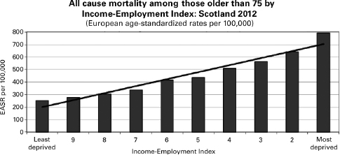
Figure 5.4 A representation of the straight-line relationship between poverty (unemployment) and mortality using Scottish federal data. Reprinted with permission.
The same relationship has been shown to hold elsewhere. That means a county map of life expectancy, or of early mortality, will correlate nicely with a map of SAIPE poverty by county. A 2016 study described a strong correlation between poverty and rates of a range of cancers in the United States.15 Not only were certain cancers more common among the poor, but they were diagnosed later and resulted in generally worse long-term outcomes (i.e., lower five-year survival rates). Similar corollaries can be found for mortality from cardiac disease, complications from diabetes, and so on.
Thus the Enders and SAIPE website poverty maps are at least potentially weighty documents, implying much even if in the end they say too little on their own. They can be read, like the redlined maps of the 1930s (fig. 4.1), as a way of identifying areas where investment should be shunned by opportunity seekers. Or, of course, they can be seen, at least in theory, as a call to action for those seeking a more perfect union.
Traditionally it has been the task of journalists and writers to particularize the statistical and transform the objective into a subject of moral indignation if not actual distress. Typically they do this by highlighting the effect of poverty on individuals. In the 1930s, the writer James Agee and photographer Walker Evans famously documented the lives of southern tenant farmers and sharecroppers whose lives were so restricted by structural poverty as to make any discussion of “buying power” a fantastic irrelevancy.16 In the 1950s, CBS broadcaster Edward R. Murrow described US structural poverty and its effects as a “harvest of shame.”17 In that tradition, MSNBC’s 2015 feature on the “geography of poverty” told the same tale, again.18
Agee and Evans’s reports (and those of their successors) presented a kind of “morally indignant anthropology,” condemning poverty and its effect as dehumanizing moral injuries.19 The lives of the rural poor they described were “so continuously and entirely consumed into the effort merely and barely to sustain itself; so profoundly deprived and harmed and atrophied in the courses of that effort, that it can be called life at all only by biological courtesy.”20 This was, the authors argued, a moral wrong and thus an unconscionable national blight. In denying the humanity of others, they insisted, the landowners and office holders who profited from the poor lost claim to their own humanity as well.
Systemic poverty and extreme income inequality also present a moral injury in the original sense of an insult to the nation itself. “We must make our choice,” Supreme Court Justice Louis Brandeis warned. “We may have democracy, or we may have wealth concentrated in the hands of a few. But we can’t have both.”21 Democracy demands an engaged and vibrant electorate capable of understanding the issues of the day and then participating in the political life of their communities and their nation. Poverty most typically breeds illiteracy and ill health, not social commitment and knowledge. The poorest tend to be those least likely to participate actively in public debate and discourse. From this perspective, the poverty reported in the Enders and SAIPE-based maps presents a danger not only to the economics of the nation but also to the political well-being of the nation at large.
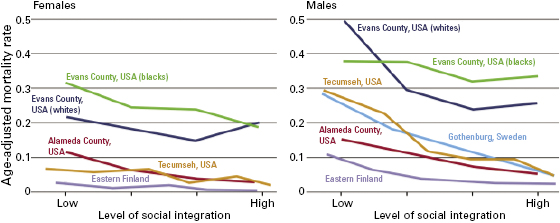
Figure 5.5 These graphs from a study published by the World Health Organization correlate social integration and mortality for three US counties and several in Europe. World Health Organization.
The argument against the reflexive acceptance of systemic poverty increases when its effects—increased mortality and decreased social engagement—are compared with the reality in other countries. In a study of the social determinants of health, the World Health Organization compared levels of mortality and social engagement in several US cities and several European nations.22 The trend lines shown in the study’s graphs are stark. They too correlated higher mortality (a result of poverty) and levels of social engagement. The message, implicit but precise, was that it doesn’t have to be this way in, say, Evans County, Georgia. It’s not in the wealthier Alameda, California, for example; in Gothenburg, Sweden; or in eastern Finland. It’s not inevitable but a result of choices we make politically in the nation.
Others argue a similar message focused on specific populations. Jonathan Kozol, for example, has reported for twenty-five years on the effect of structural poverty on poor, typically African American children and their families living in America’s inner cities. “The poorest children in America,” as Kozol called his subjects, exist in a state of sustained deprivation with few real educational opportunities, at best minimal health care, and, of course, no real buying power at all.23 The poverty Kozol describes, like Enders’s “starred” poverty, persists over time and despite the sometimes heroic effort of parents to improve their and their children’s status.24
“Buying power” is transposed in Kozol’s work from a general economic conclusion into a specific catalog of goods necessary for children if they are to thrive. Children without buying power live in a constant state of stress and distress resulting in a greater likelihood of long-term illness and failure. Kozol might have hammered home the point by mapping “children in poverty” using SAIPE poverty estimates for all children in each county in the nation (fig. 5.6). The website’s map calculator does this for two categories of childhood poverty: the poverty of all children under eighteen years old, and that of children between five and seventeen.
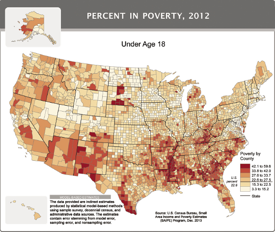
Figure 5.6 A map generated on the SAIPE website presenting county-level poverty affecting all children under eighteen years.
Figure 5.6 looks more or less the same as previous SAIPE maps but is, on closer inspection, very different. The dark-red counties with the most childhood poverty begin at 40 percent of the under-eighteen population and then expand to include those impoverished counties in which more than 67 percent of the youth are seriously poor. The next, lighter-red category describes counties in which roughly one-third or more of all children live in want. The divisor separating have from have-not counties in this map is 18.2 percent of the national population of children under eighteen living in the United States.
The map is an abstraction whose specific outcomes Kozol describes in excruciating detail: children who cannot go to school because of a lack of proper clothes; who are ill but whose families are so poor they cannot afford adequate health care. Distressed parents wish opportunities for children who will not receive them. In his books, and thus implicit in the map, are children who go hungry. Those like Kozol and others who moralize about this sad state do so on the basis of a virtue ethic in which dehumanizing poverty is not simply consequentially disastrous but morally unacceptable.
If, like Kozol, you believe that “the lives of children are the conscience of a nation”25 (because children are our and our nation’s future), then the SAIPE-generated map presents a conscientious moral injury that will adversely affect future generations. Children raised in the map’s dark counties are physically harmed by the poverty they experience. “Their brain activity is less organized … less well developed and less systematic.”26 They will be less likely to excel in school and be more prone to various illnesses. As a result, their potential to serve as thoughtful democratic participants will be diminished. As a people, the nation’s collective future is thus harmed by the long-term effects of the poverty posted in the maps.
As virtue ethicists (believing in declarations of democracy, general welfare, and a more perfect union), we should therefore insist on structural changes that might change the map. As consequentialists we should be concerned about the long-term effect of a class of citizens who lack the potential to participate fully in the nation. As economists arguing consequentially, we can say that the cost of generations of poor creates a financial barrier to hopes for broader progress. The long-term cost of child poverty in the United States in 2016 was estimated at $700 billion, about 4 percent of the GDP.27 As deontologists—well, it depends on which set of rules we choose to espouse.
This is not a new and radical riff, an unprecedented call for moral care. In the nineteenth century, as Christopher Hamlin writes, “concepts of liberty were often defined in terms of health: one could only be free to act if one were fit to act.”28 A poverty that bred ill health denied the impoverished person’s equality of opportunity and thus his or her equal and full participation in society. Consequentially, those limits affected the lives of all. As John Ferriar, a nineteenth-century physician in Manchester, England, put it, “The safety of the rich is intimately connected with the welfare of the poor. … Minute and constant attention to their wants is no less an act of self-preservation than of virtue.”29 Ferriar wrote during a time of ferocious epidemics30 in which the overcrowded homes of the ill-fed poor were perceived (correctly) as being reservoirs for diseases that spread across class barriers to the enclaves of the well-to-do.31 Nor was it lost on either Ferriar or his contemporaries that structural poverty provided a fertile field for social malcontents advocating radical social change.
Addressing the living conditions of the poor was therefore necessary if the well-to-do were to be spared devastating epidemics and the popularization of polarizing, revolutionary politics.32 Here the moral imperative was not to community or humanity but to a kind of enlightened self-interest. Perhaps less virtuous, but for many more compelling, the motive for reformers was as much the preservation of the political status quo and an improving economy as it was civic solidarity and communal responsibility.
Today it is not poverty per se but income inequality—the distances between light-blue and dark-red counties—that is described as the most critical causal factor causing ill health, promoting transmittable disease, and reducing active membership among some citizen groups.33 “The big idea,” wrote the editors of the British Medical Journal, “is that what matters in determining mortality and health in a society is less the overall wealth of that society and more how evenly wealth is distributed.”34
If we are morally obliged to promote population health (a critical criterion contributing to “general welfare”), then we are ethically obliged to address the problem of severe imbalances in wealth’s distribution. “Low income predisposes people to material and social deprivation,” wrote Juha Mikkonen and Dennis Rafael in 2014.35 “The greater the deprivation, the less likely individuals and families are able to afford the basic prerequisites of health, such as food, clothing, and housing.” The greater the comparative deprivation, the greater the distress experienced. The result, as Ferriar argued in his day, is that “disorders of marginalization will incubate and then be redistributed back down [or up] the urban hierarchy.”36
“Poverty takes many tolls,” the physician Peter J. Hotez wrote in 2012, “but in the United States, one of the most tragic has been its tight link with a group of infections known as the neglected tropical diseases [e.g., cysticercosis, toxocariasis, leishmaniasis] which we normally think of as confined to developing countries.”37 Their recent spread into the United States followed the fault lines of national poverty, Hotez wrote, across “the Gulf states of Louisiana, Mississippi and Alabama, where poverty rates are near 20 percent” and in pockets of extreme poverty “as high as in some sub-Saharan African countries.”
Hidden in maps of county and certainly state poverty are the divisions, sometimes, extreme, occurring within individual metropolitan regions. Beginning in 2007, Los Angeles’s densely populated and extremely impoverished Skid Row district (an area too small to be seen on either the Enders or the SAIPE maps) was “ground zero for the city’s largest tuberculosis outbreak in a decade.”38 There more than 7,000 Los Angelenos were exposed to a new and infectious bacterial strain incubated among the Row’s homeless and near homeless.
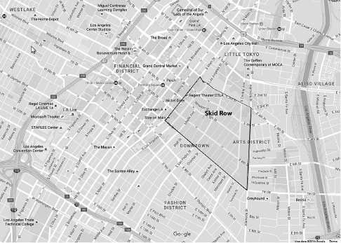
Figure 5.7 The Skid Row district of Los Angeles, where a new form of tuberculosis incubated among the poor. Google Maps.
Within a fifty-block radius (fig. 5.7), homelessness, poor nutrition, poor sanitation, and a lack of affordable health care created a veritable petri dish inviting pathogens to evolve and then proliferate.39 While alarming, the outbreak was hardly surprising. “We’ve had outbreaks of other diseases before because of the poor quality of life in the area, so this is not a shock to me,” a local police officer told reporters.40 From the bacterium’s point of view, Skid Row was a perfect environment not only for civil unrest and crime but for microbial colonization and diffusion.
Thus poverty and, more specifically, income inequality are consequential, the result injurious. “Perhaps the most important effect,” wrote Richard G. Wilkinson, “is the reduction of goodwill and cooperation among the public at large.”41 Here again is moral injury in its original sense: an injury to the nation at large. Implicit in maps of relative county poverty is the alienating moral stress and distress amid a lack of education and opportunity that result in a diminished sense of citizenship and nationhood.
For those who choose to see things in economic rather than clinical, ethical, or moral terms, the whole can be reframed as a costly problem. “Inequality turns a large proportion of the population from net contributors to a society’s economic welfare into net burdens on it.”42 In the polite economic language of modern sociologists: “The social and economic structure creates problems which impose cost burdens on the whole society, particularly on the public sector.” To take but one example: Approximately $34.5 billion was spent in 2013 on uncompensated care of uninsured persons presenting at hospital emergency rooms.43 Stabilizing if not curative treatment was required by law and its costs were borne primarily by the hospitals themselves. Those costs, of course, were then passed on to the greater public through higher service prices.
Other correlates, at once economic and social, include the relative rate of violent crimes.44 Ching-Chi Hsieh and M. D. Pugh, for example, reviewed thirty-four different studies positively correlating income inequality and acts of homicide, robbery, and nonhomicidal violence.45 More recently, Kate Pickett and Richard Wilkinson positively correlated with low income both general homicide rates and, separately, the percentage of births to adolescents.46 The costs of both the crimes and their aftermath (the necessity of courts, policing, penitentiaries, etc.) and adolescent births (child care, medical and social support) add to other costs that poverty demands of society at large.
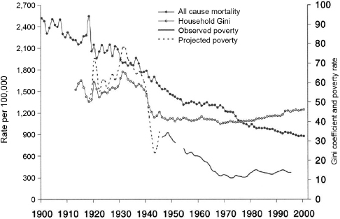
Figure 5.8 Income inequality, poverty, and mortality rise and fall together. Courtesy John Lynch.
It is not simply that poverty decreases life expectancy, increasing mortality among the impoverished in a starred, red county. It is more precisely relative poverty that increases mortality among people living in red-colored counties compared to those in wealthier, blue-colored counties. Figure 5.8 correlates “all cause mortality” with “household Gini” (an inequality measure) and poverty.47 If our morality insists on life as a precious thing to be nurtured and protected, and on our nation as the engine of a common democratic good, then we have an unacceptable result, a moral as well as economic injury to both the nation and the person.
The Enders and SAIPE-related maps of relative national poverty are about America. We may make that poverty disappear if we change the resolution and scale of the study. There are lots of ways to show this. Think, for example, internationally: Average per capita personal income in the United States in 2008 was $26,964,48 whereas in Bangladesh in 2012 it was US $1,940 a year.49 The relative poverty afflicting an average 15.2 percent of Americans in 2012 in this context is less important, except in extreme locations. It positively palls before the extreme poverty affecting 80 percent of the population of Chad and Liberia.
Figure 5.9 maps, as a definition of poverty, the percentage of a nation’s population living on less than $1 a day. Based on statistics given in The World Factbook (published by the CIA), the United States, China, and Russia are all a healthy dark blue, because those governments report (accurately or not) that less than 2 percent of their total population is that poor. It’s hard to ignore the idea of a poverty so extreme that a significant percentage of a population exists on less than $1 a day.50
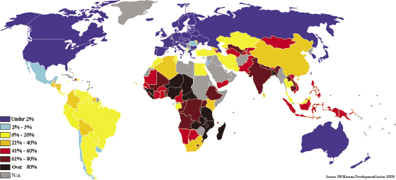
Figure 5.9 This map of persons living below national poverty lines is based on data from the CIA’s World Factbook. “Measuring Poverty,” Wikipedia.
If one is interested in global income inequality as a distinct, precisely calculated thing, the Gini index constructs a frequency distribution in which total equality is given as 1 and total inequality is 100. M. Tracy Hunter created a map of the world based on a set of Gini index calculations for each country using World Bank data (fig. 5.10).51
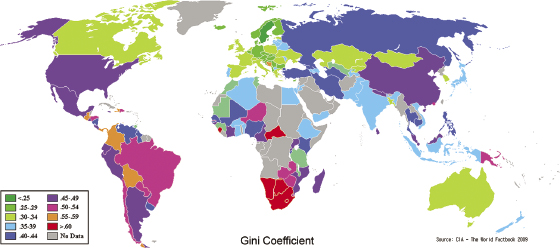
Figure 5.10 Using World Bank data, M. Tracy Hunter created a Gini index to map relative world inequality among world nations. Wikimedia Commons.
Who cares? Americans may argue a sense of responsibility to the poorest in their nation if they take seriously the idea of a nation dedicated to life, liberty, and the pursuit of happiness for all. Because the United States is a signatory to the 1948 United Nations Universal Declaration of Human Rights, at the least we should probably care as a nation about the extreme poverty of the dark-brown and red countries in the Gini map.
But if the scale of the nation seems an abstraction, its counties a geography we do not truly know, then the mapped world exists at an even greater remove, and the lives and deaths of distant persons are of little real moment for most of us who live elsewhere and in relative comfort. Pictures of starving children may give us a moment of moral unease, but it is brief. Chad, Brunei, and Bangladesh are not our problems. Catastrophic events—an epidemic,52 earthquake, tsunami, or revolutionary war—may temporarily engage our sympathies, but otherwise let the kids collect for UNICEF on Halloween. Simply put: the relation between “them” and “us” outside of a shared humanity seems hard to conceive. Harder still to muster is a sense of responsibility for the dire straits governing the lives of people living far from our homes or even our nation.
Deontologists might say that as long as our nation follows international rules set by agencies like the United Nations, then we are not enjoined to rectify the inequalities of the world. Nor, nationally, are we required to eliminate inequality if it is seen as a natural outcome of an equitable economic climate. Consequentialists might insist that the real issue is poverty’s effects, the economic and social costs of structural, systemic inequality. Virtue ethicists, for their part, might argue that good people care for others, and poverty anywhere is about not caring about others. Humanitarianism should be the guiding ethical rule.
The maps and their demographic datasets engage none of these postures. They are “objective,” and it is because they are “objective” that we instinctively trust them. Implicit in their construction is an “everything else being equal” caution, which absolves it from pairing the mapped data with contextual data. In their objectivity, however, they are stripped of the kind of obvious relevancies that might compel us to engage their arguments, let alone act on them. That is where the journalists and writers come in. But in their attention to detailed specifics, the general landscape of poverty—economic, moral, and practical—and its root causes are often lost.
At best the result is a kind of moral unease without an imperative to act. If the maps are seen as a general argument whose specifics can be unpacked in a context in which collective responsibility is demonstrable, then the issues become much clearer. As the next chapter makes clear, this is not hard to do. It is simply that we rarely choose to do it.