
Figure 6.1 Nothing to add here. Nothing to take away. It's perfect.
6
The Virtues of Simplicity
Or, Why It's Hard to Pound in a Nail Sideways
If you take away one thing from this book, let it be the advice in this section. Simpler is almost always better.
Maurice Saatchi, of London's M&C Saatchi, on simplicity: “Simplicity is all. Simple logic, simple arguments, simple visual images. If you can't reduce your argument to a few crisp words and phrases, there's something wrong with your argument.”
Make Sure the Fuse on Your Idea Isn't Too Short or Too Long
Here's the thing: The customer has to get your ad instantly, or close to instantly. I sometimes refer to this as the Speed of the Get. For my money, a quick-get is the first and the most important thing an idea needs to have. A quick-get matters more than even the creativity of the piece. Heresy, I know, but it's the truth.
On the other hand, you don't want your idea to be too quick of a get. If your idea doesn't have enough substance to it, it may well be an instant read but will likely have little effect on the viewer. Sort of like a STOP sign; obviously an instant read but not likely something I'm gonna post on my Facebook. But few students err on the too-fast end of the continuum; most ideas that fail are too slow.
In an effort to create an intriguing idea that requires a little bit of the viewer—which overall is a good thing—students almost encode their ideas, requiring a get that takes three or four beats longer than any ad should. I liken the Speed of the Get to the length of a fuse on a stick of dynamite.
If the fuse on an idea is too short, the idea goes off too fast. Before the reader is even really paying attention, its quick, clueless bang makes it clear there's nothing there to be interested in. But I've found most students tend to set their fuses too long; equally bad because nobody has time to wait around for your idea to go off. The fuse burns, camera follows it around the corner, everybody loses interest, a minute later somebody maybe hears a distant…>BANG<…and goes, “Did you hear somethin'…? Never mind.”
Do the same with your ad. Cut away every part of the ad you don't need, which is usually most of it. To determine whether you need a certain image, phrase, or word to make your idea work, take it out. If the idea crashes without it, that part was what I call a load-bearing beam. But if the idea still works without it, well, it didn't need it and you should consider taking it out.
Which reminds me. There's an old parable about problem solving called Occam's razor. It states when you have two correct answers that both solve the problem, the more correct answer is the simplest one because it solves the problem with fewer moving parts. It solves the problem more elegantly.
Simple has Stopping Power
What is it about the two ads in Figures 6.2 and 6.3?

Figure 6.2 No headline. No product. Just a mud-caked boat on a trailer. For Jeep.
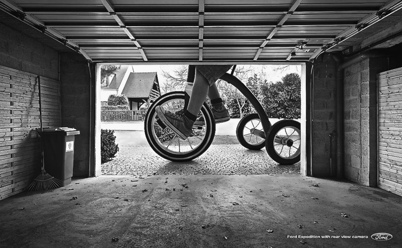
Figure 6.3 Headline reads “Ford Expedition with rear view camera.”
For my money, it's this. The ads stop me because, other than the logo, there's only one place I can look. And then, once I'm looking, I realize the image, it's…off…it's weird somehow, so I lean in thinkin' what the hel…>BANG<…and the ad goes off. The fuse is exactly the right length on both of these ideas.
Simple doesn't figure it all out for you. Sometimes it asks the reader to finish it. The less you put in the ad, the better. The writer Saki said, “When baiting a trap with cheese, always leave room for the mouse.”
Simple is Bigger
On May 7, 1915, a German U-boat sank a passenger ship, the Lusitania, killing some 1,190 civilians, many of them women and children. America was finally too angry to stay out of the Great War, and enlistment posters began to appear in shop windows, one of which is reprinted here (Figure 6.4).
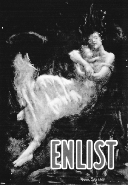
Figure 6.4 Simple graphic images are powerful. One hundred years later, this World War I recruitment poster still works.
Most other World War I posters were not as visual and instead used headlines like “Irishmen, Avenge The Lusitania!” and “Take Up The Sword of Justice.” Seems to me, all these decades later, they're not nearly as powerful as this one simple image, this one word.
Remember, in a cluttered TV or print environment, less is truly more. So have your radio spot be one guy saying 40 words. Have your print ad be all one color. Lock the camera down and do your whole TV spot on a tabletop. Show a scorpion walking up a baby's arm, I don't know, but do something simple. Simple is big.
The artist Cezanne said, “With an apple, I will astonish Paris.”
Simple is Easier to Remember
On a rainy November day in 1863, a U.S. senator named Edward Everett walked up to a podium and gave a two-and-one-half-hour speech consecrating a new cemetery. It was an impassioned speech, I'm sure, but I have been having trouble finding a transcript of this speech at the library.
The speaker who followed gave a 273-word speech, beginning with the words “Four score and seven years ago…”
Which of the two Gettysburg addresses given that day are you more familiar with?
Simple Breaks Through Clutter
The kryptonite of clutter is simplicity. How can anything else but simplicity break out of clutter? Should we do clutter that's more clever? Or perhaps clutter that has a better design? Clutter that's more strategically correct? No. The only effective antidote to clutter is simplicity.
Even the Super Bowl, with its annual collection of eye-popping TV commercials, has its own brand of clutter. Call it “good clutter” if you will. But it's still clutter and you have to find a way to improve what a scientist might call its “signal-to-noise ratio.” You have to break out. You can do that with an idea of draconian simplicity.
Keep Paring Away Until You Have the Essence of Your Ad
Let's start with three observations from three different men: one dead, one British, and one crazy.
Robert Louis Stevenson said, “The only art is to omit.”
Tony Cox, a fabulous British writer: “Inside every fat ad there's a thinner and better one trying to get out.”
And then there's Neil French, an absolutely stellar writer from Singapore. I was lucky enough to meet him one day, and he walked me through a wonderful exercise in in the art of omitting, of reductionism.
He started by drawing a thumbnail sketch of a typical ad (#1 in Figure 6.5). You have your headline, your visual, some body copy, a tag line and a logo.
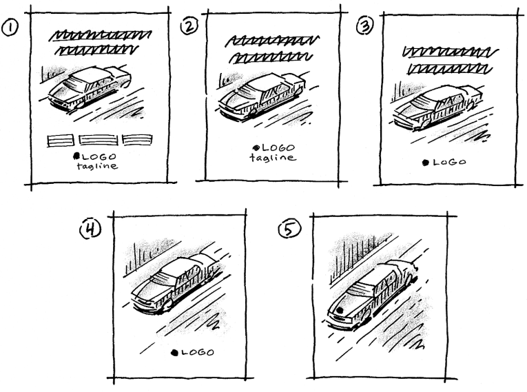
Figure 6.5 Neil's cool idea: reductionism. Ad #5 is almost always going to be better than Ad #1.
Okay, he asked, can we make this ad work without the body copy? Maybe we could do that by making the headline work a little harder. We can? Good, let's take out the body copy. That leaves the slightly cleaner layout of #2.
What about that tag line? Is it bringing any new information to the ad? No? Then let's broom it. Look, the third layout's even better.
Now, about that headline. Is it doing something the visual can't do? And that logo—isn't there some way we can incorporate it into the visual?
Ultimately, Neil reduced his ad to one thing. He suggested I do the same with my next ad. Get it down to one thing. Sometimes it's just a headline. Sometimes a picture. Either way, he said, the math always works out the same. Every element you add to a layout reduces the importance of all the other elements. And conversely, every item you subtract raises the visibility and importance of what's left.
Admittedly, this kind of draconian reductionism is hard to pull off, especially when you have a client wanting to put more in an ad, not less. In my career I've done it only once. But to this day, that ad remains my favorite. It's the one you see here, reminding store buyers to stock Lee jeans (Figure 6.6). No logo. No headline.
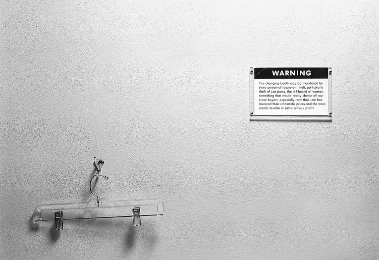
Figure 6.6 It's hard to read reprinted here, but the little warning sign says: “This changing booth is monitored by store personnel to prevent theft, particularly theft of Lee jeans, the #1 brand of women, something that would really cheese off our store buyers, especially now that Lee has lowered their wholesale prices and the store stands to rake in some serious profit.”
One last thing I noticed about simple. It doesn't age. Maybe it's just me, but this ad for Lee jeans, along with most of the ads in the chapter, they all seem timeless; like they could run tomorrow, as is.
A Few Words About Outdoor (Three Would Be Ideal, Actually)
Billboards, Banner Ads, Posters, 15-Second TV—They All Force You to be Simple
These media may be some of the best places to practice the art of simplicity. Because there's no room to do much else other than get right to your idea. There's no drumroll here, folks, just cymbal crash.
It's been said an outdoor board should have no more than seven words. Any more and a passing driver can't read it. But then you have to add the client's logo, which is one or two words. Now you're up to nine words. And if your visual is something that takes one or two beats to understand, well, you may have too much on your plate already.
When you think about it, is a banner ad any different? You're cruising along the Internet at about 90 clicks per hour and—zoom—what was that we just passed? (“Ooooooh, was that a banner ad? Honey, pull the car back around.”) Given the speed of our passing audiences, I suggest draconian measures. Shoot for three words, tops. It doesn't mean you'll be able to keep it to three, but start with three as your goal. I'm proud to say I once got it down to six letters for Horst Salons. (Figure 6.7)
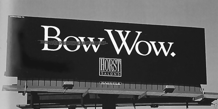
Figure 6.7 The red strike-through changes the meaning. (AD was Carol Henderson.)
Here's a great way to test whether your outdoor ad is simple enough and works fast. It's also a great way to present it to the client. Walk up to your client, holding the layout of your idea with its back to your audience. Say, “Okay, here's a board we were thinking about” and then flip it around and show them the idea for two seconds.
Just two seconds—one Mississippi, two Mississippi—then flip it back around again.
Check out how fast the board is in Figure 6.8. Don't forget that logos can add to a word count, so it helps to have a cool client like KitKat who knows the board works even better without their logo. You hardly have to count past one Mississippi.

Figure 6.8 That old KitKat tagline has been around since 1958. No wonder we don't have to see all of it to remember all of it.
Your outdoor ideas will have to work just as quickly. Visualize precisely how your idea is going to be viewed by the customer. Car approaches, billboard whizzes by, and it's gone. Web surfer zooms by and it's gone. If the ideas you're showing are as fast as the ones pictured here, this presentation technique can be persuasive. Remember, the rule is your idea has to go at least 65 miles an hour.
Outdoor is a Great Place to Get Outrageous
Big as they are on the landscape, outdoor boards are an event, not just an ad. In fact, what makes for a good print advertisement doesn't necessarily make for a good billboard. Whatever you do, don't create something that's just okay. When it's finally posted, the huge size of a billboard magnifies your okay idea into a giant tribute to mediocrity and just screams
OKAY.
You don't want to be just okay.
Check out the outdoor idea shown in Figure 6.9; it's way better than okay. Go Fast! is one of Amsterdam's more popular energy drinks. Y&R used Amsterdam's much-photographed canals as a place to launch water bikes with the Go Fast! logo on the side; water bikes driven by actors and powered by a fast, silent, and hidden motor. The cameras came out in droves and the idea ended up being viewed online by a global audience.
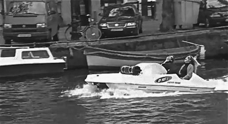
Figure 6.9 An example of “outdoor as event.”
Outdoor begs for the ostentatious; for spectacle. British TV channel Gold put a 50-foot dead parrot on the streets of London to promote their broadcast of the Monty Python reunion (Figure 6.10). (YouTube their “Dead Parrot.”)

Figure 6.10 This parrot is not “pining for the fjords.” It is dead. An ex-parrot. Bereft of life. Joined the choir invisible, it has.
Remember, we're in “made-you-look, made-you-look” territory here. Outdoor companies, prop makers, and tech firms can help bring just about any wild idea to life. And now with the confluence of the Web and mobile phones, people on the street can interact with boards. (Look for some more great examples outdoor on the OBIE awards website.)
Your Outdoor Must Delight People
Except for the handful of great ideas in the One Show every year, most of the outdoor I see really is pretty bad. The thing is, when an idea is bad online, I click and it's gone. But if I live across the street from a bad outdoor concept, there's nothing I can do about it except close my curtains and drink myself to sleep.
Copywriter Howard Gossage didn't believe outdoor boards were a true advertising medium:
An advertising medium is a medium that incidentally carries advertising but whose primary function is to provide something else: entertainment, news, etc.…Your exposure to television commercials is conditional on their being accompanied by entertainment that is not otherwise available. No such parity or tit-for-tat or fair exchange exists in outdoor advertising.…I'm afraid the poor old billboard doesn't qualify as a medium at all; its medium, if any, is the scenery around it and that is not its to give away.1
In 2006, the city of Sao Paulo, Brazil, outlawed billboards, and here in America several states are weighing similar bans. (Yay.) So, until the day billboards are outlawed altogether (either as “corporate littering” or perhaps “retinal trespassing”), you owe the citizens of the town where your outdoor appears—you owe them your very best work. Let your work enrich their lives in some way. Delight them. (See Figures 6.11–6.18.)
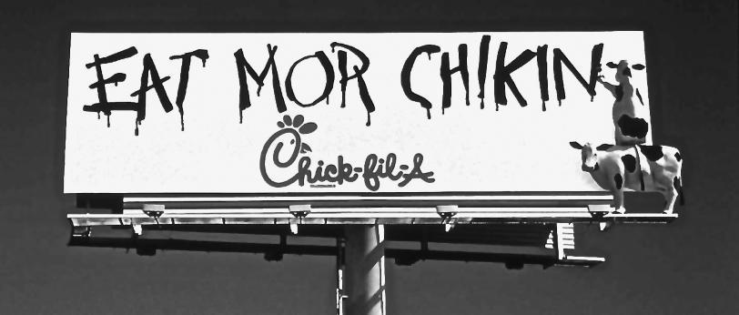
Figure 6.11 Chick-fil-A spends a lot of its marketing dollars in its well-loved long-running outdoor campaign.
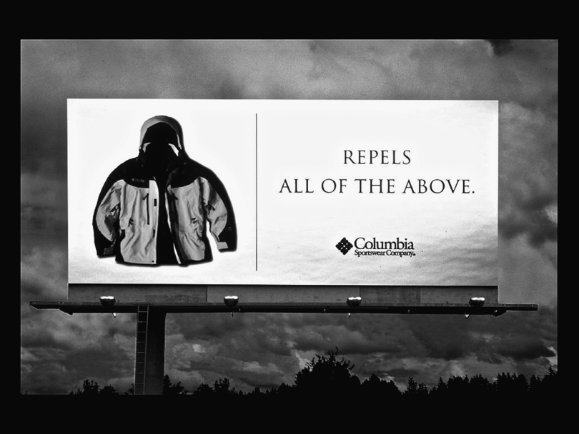
Figure 6.12 This Columbia Sportswear board uses its surroundings to make its point.
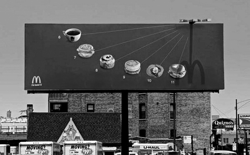
Figure 6.13 An engineer helped Leo Burnett's team pick exactly the right location for this sundial board in Chicago.
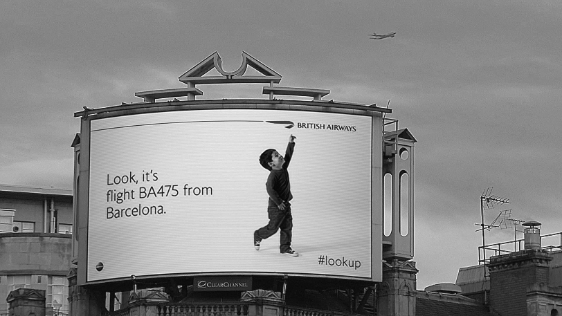
Figure 6.14 Cannes Lion-winning digital billboard tracked overhead flights of British Airways, identifying in real time both flight number and destination.
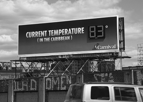
Figure 6.15 Carnival Cruises' board uses one of the many free streams of data online.
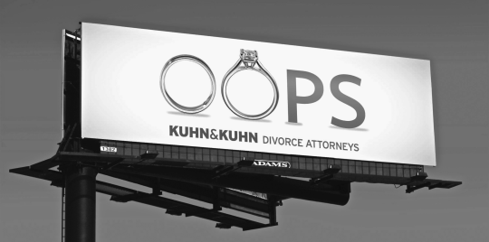
Figure 6.16 Simplicity is good in all media, but glorious in outdoor.
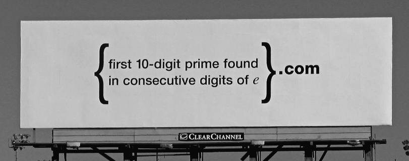
Figure 6.17 If you could figure it out and then added .com, you identified yourself as a brainy recruit in this cool Google recruitment campaign.
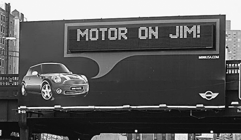
Figure 6.18 Coded RFID key fobs were given to new MINI owners in four U.S. cities. Radio waves activated personalized messages as they drove past.