How can I use yellows and oranges to lift my paintings?
The sharp tones of yellow and orange have a uniquely fresh quality, linked as the citrus colours. Oranges and lemons have rung the bells of St Clement’s in every school playground, while just the thought of lemon drops or a chilled glass of orange juice can make the mouth water. During the 1920s and 30s bright yellows, oranges and lime greens were the favourite colours of ceramic artists such as Clarice Cliff.
Yellow has been a substitute for gold in a thousand years of religious painings. In the secular present it brings to mind early spring flowers, the summer warmth of sunlight on the landscape, and the glow of lamplight on a winter afternoon. Orange is an even stronger presence. Many believe that the golden apple awarded by Apollo to the most beauteous goddess was in fact an orange, and throughout history a glowing bowl of oranges has been – and is still – a favourite subject for still-life painters. It is best used sparingly – the intense brilliance can explode on the eye and needs careful handling – but orange is an invaluable tool for adding that single finishing stroke that raises an entire painting to new heights.

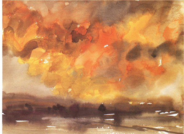
Storm Landscape
30 × 40 cm (113/4 × 153/4 in)
We are blessed with a wealth of sky colours, but there is no reason to stay with variations of blue or grey. On a winter evening, the deepening dusk is reflected by the fiery clouds lit by the sinking sun. Here the deeper yellows and oranges come into their own. Cadmium Yellow and Cadmium Orange have been used extensively, with Ivory Black and Purple added to soften the mixes. This gives a wide variety of tones and hues from these few colours; powerful, but surprisingly subtle. An equally strong ground line pulls the whole together, and the flashes of white paper allow the great asset of watercolour, its luminous transparency, to flood the paper – and the viewer’s eye.
The search for the perfect yellow was long and dangerous: the Naples yellow of the seventeenth century was originally made with a mineral from quarries on Mount Vesuvius, and its lead content created a highly toxic mix, supposed to have affected many painters who used it, including Vincent van Gogh (1853-90).
From the end of the eighteenth century great strides were made in discovering new and somewhat safer metals, including chromium and cadmium yellows. Now these, too, are subject to scrutiny as chemists search for the perfect pigments – bright, lightfast, and completely nontoxic under all conditions.
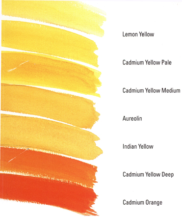
Today there are many new chemical compounds as well as some tried and true favourites. The yellows and oranges of the colour swatches above make up a good, varied palette. With a similar palette, experiment with mixes incorporating yellows and oranges to enjoy some of the subtle, in-between colours that bring so much individuality to paintings. Yellow, in particular, has a remarkable effect on many colder pigments, bringing an aura of warmth even when lightly added to the colour balance.
Try an orange mix instead of red for that single highlight that brings a composition to life, or for an entire background to demand everyone’s attention. These yellow and orange colour mixes added to your techniques will open a window and let in the sun.
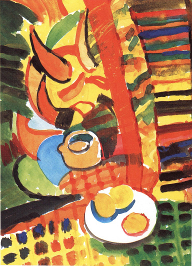
A Plate Of Lemons and the Rest(Sonia Smith)
40 × 30 cm (153/4 × 113/4 in)
There is nothing like letting powerful colours have their head; here yellow, orange and green have taken over a fairly conventional subject and wrapped it up in a blaze of shapes, shadows and riotous pattern. Somewhere there is a kettle, a plate of lemons and a pile of books, but this composition serves as a demonstration of how many varied tones you could achieve with mixes of all the citrus colours in full flood.
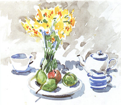
A Plate of Pears
45 × 56 cm (173/4 × 221/4 in)
The contrast with the painting here could not be greater, although the subjects share a domestic appeal – plates of fruit, kitchenware, a cup and saucer. This free painting, in Coeruleum and grey wash, covers only a small part of the paper, lying lightly in gentle shapes. The Cadmium Yellow and Cadmium Orange daffodils are sketched in as touches of colour, while the green fruit adds emphasis to the foreground. The pears are made up from the two yellows and blue; in the shadows yellow has lightened the blue; and a touch of the orange added to one side of the apple creates a delicious bloom.
This suggested palette of a varied group of seven citrus colours extends from a clear, transparent yellow to strong, opaque orange. They will add freshness and warmth to your painting.
Lemon Yellow A bright, transparent colour, with an underlying hint of green. Barium, made with nickel, and cadmium yellows are other versions of lemon; being opaque they have better covering power than Lemon Yellow and perhaps hold their own better in mixing. Barium is toxic and has dropped out of most manufacturers’ catalogues. All the lemons are quite pale, so in mixes additional pigment may be needed.
Cadmium Yellow Pale A clear soft yellow with good covering power. The cadmiums offer a range of colours within the spectrum, and there is a cadmium lemon available that is even paler than the colour shown here; both are opaque.
Cadmium Yellow is very good in mixes, as it has the strength to keep its gentle, sunny effect.
Cadmium Yellow Medium This is the mid-yellow of the opaque cadmiums, and is fantastic for the effect of full sunlight. It contains a good bit of orange, but the effect is golden rather than red. Use Cadmium Yellow in mixes to keep a cheerful glow and warmth in the colour.
Aureolin This colour has also been called Cobalt Yellow, although the term Aureolin is more commonly used in catalogues. A lovely clear colour, it keeps its strength even in dilute washes. However, there are some artists who find its slightly brownish cast uncomfortable, although in mixes it gives a marvellous range of unusual browns, greens and those elusive, yellowy-rose colours once called pinks.
Indian Yellow A traditional colour whose name has been adopted for a mix with modern ingredients. The original Indian Yellow came from the urine of cows who had been fed entirely on mango leaves – neither healthy for the cows nor good for the artist, as it was far from permanent. Today made up in the laboratory, Indian Yellow is slightly lighter than the remaining two colours, as it has very little red; its soft tone makes it perfect for autumn shadows and leaves. For a similar but deeper yellow, turn to Yellow Ochre (in ‘Brown Studies’).
Cadmium Yellow Deep This is the first of what are in effect two oranges; Cadmium Yellow Deep has all the virtues of the opaque cadmiums. It is strong, punchy, a vivid yellow-orange, and sings out on the page against all the other yellow pigments. It is not easy to control in mixes and will tend to dominate any combination.
Cadmium Orange This is the most brilliant of all the oranges. It is opaque, with strong covering power. Somewhere in between Cadmium Yellow and Cadmium Red, it does seem to have more yellow than the red, and should be mixed with other colours accordingly. It is far more reliable than Chrome Orange.
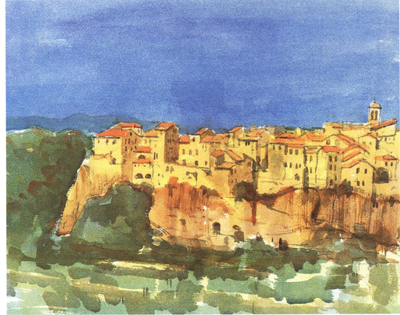
Italian Hill Town
38 × 43 cm (141/2 × 17 in)
In the winter these hill towns seem to grow directly out of the rock, but in summer the burgeoning green woodlands act as a cushion to show off the shifting highlights and shadows of the buildings. The green trees are painted in varied mixes of Coeruleum and Lemon Yellow but with much Cadmium Orange added to give them a warm tone. The rocks are Lemon Yellow and sienna mixes, the buildings a lighter version of the same mix.
When using particular colours a great deal, make up colour mix swatches like these in as many variations as possible, to create a personal reference library.
Blacks and Cadmium Yellow One of the most rewarding mixes is seeing yellow and black turn into such a range of subtle and exciting shades. Here Cadmium Yellow is set against three blacks, and near blacks, to show how it will behave. The colour in the top swatch is a very dark browny-black Sepia, and the autumn-leaf browns and golds that are the result could not be more beautiful. The second, in the middle row, is deep Lamp Black, and the green of the resulting mix is the loveliest of soft verdant tones. The third, Cadmium Yellow into Ivory Black, gives a grey-blue edge and cooler mixes in the centre.
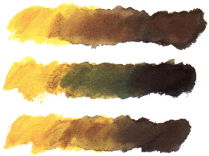
Blacks and Cadmium Yellow
French Ultramarine with yellows and an orange These are the brighter mixes of French Ultramarine with yellows and oranges. Top: Lemon Yellow shows its green cast, with turquoise tones as the two colours blend. Middle: a soft wash with Indian Yellow has equally soft grey-greens in the centre. Bottom: with Cadmium Orange there is a range of cool, almost sepia colours.
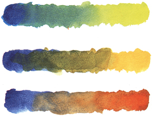
French Ultramarine with yellows and an orange