
Logos
Possibly one of the most important elements of product awareness is the product(s) logo. One only has to look down a crowded street or alongside a busy road and see the BP or Shell signs to instantly know the identity of the fuel being sold. Similarly, when you see a superstore, the sight of the logo immediately identifies the company that is supplying it – though of course a striking logo is only useful if you recognize the company or product that it represents.
There are many toy companies out there, but only a very few that the general public associates with a particular product. Mention Hornby and Scalextric and everybody immediately thinks ‘trains and racing sets’. However, mention Hasegawa or even Tamiya and many people would probably have to be prompted to reply. When it comes to construction kits, excellent though these two companies are, there is only one company (certainly in the UK) that virtually everybody recognizes, and that is good old Airfix.
There are very few companies whose name is generally regarded as the generic name for that product. One almost invariably says that someone is hoovering upstairs, when in fact they are more likely today to be Dysoning, but we all call a vacuum cleaner a ‘hoover’. The same is true of Airfix. The famous kits were only a part of (and a later addition to) a prominent plastics company, but they would come to take over the name in the public’s perception, and also be the only part of the group that would survive intact after 1981, and still be eagerly sought after today.
Long before the kits were thought of, Airfix was probably only well known to a few people, and then for toys. However, if you’d mentioned Airfix to a ‘spiv’ in the late 1940s he’d have instantly whipped out his comb! So, therefore, every company, whether a household name or not, needs a recognizable logo, and Airfix is no exception – and its logo has evolved into one of the most recognizable ones, certainly in the toy and hobby trade. Without the famous kits, it is likely that most people would hardly remember Airfix today: it would be a barely remembered name from their youth.
Logos Until 1981
Type 1
Type 1A logo.
Type 1B logo.
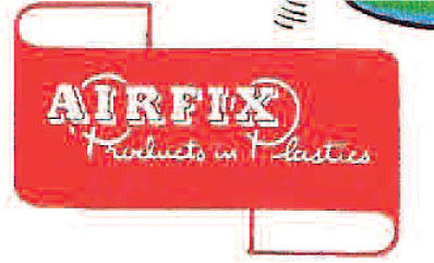
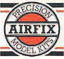
The earliest known logo is ‘Airfix Products in Plastics’, and is the one which probably lasted longest. Later the ‘Products in Plastics’ would disappear as the brand became better known. The logo was originally based on a scroll with the two ends unrolled or turned back. In essence it has remained a scroll, but later was incorporated into a circle: thus the logo adorning the new Gladiator kit is still recognizable as a scroll with the ends turned back, albeit stylized. If we are to give logos ‘type’ numbers then this is clearly Type 1.
The Type 1 logo reigned supreme throughout the early days at Airfix up until Type 2 packaging was first used around 1959 – about twenty years! Not only was a new box/header style introduced, but the logo was also modernized to suit it.
Type 2
Type 2 kit logo.
In the Type 2 logo, ‘Products in Plastics’ was dropped and ‘Airfix’ was enlarged to fill the scroll. The font was changed to probably Arial, and italicized; in fact the whole scroll was ‘italicized’ and sharpened up. The turnbacks now met in the middle and were generally left white, while the background to the main part was usually coloured with the word ‘Airfix’ left in white. Sometimes the ‘Airfix’ was in black, with or without the other colour.
AIRFIX without the scroll background was sometimes used on catalogues and leaflets. When the motor racing sets were introduced, the turnbacks were lengthened slightly and black and white squares were added, presumably to resemble the ‘chequered’ flag waved at the winner! Later AIRFIX:MRRC would be inserted into the logo.
This new logo should be referred to as Type 2, and it lasted until Type 4 packaging was introduced in late 1971.
Type 3
Type 3 logo.
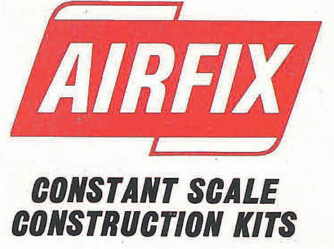
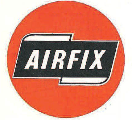
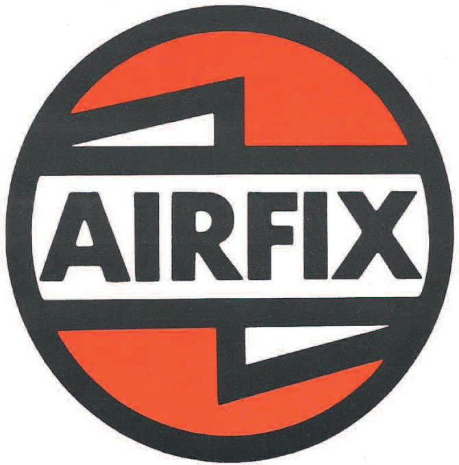
However, two subtle changes occurred with the introduction of Type 3 packaging in 1963. Firstly, the Type 2 logo was placed inside a coloured circle (usually red), and on the kit boxes/headers, details of the scale were added, for example ‘AIRFIX-OO SCALE’ or ‘AIRFIX CONSTANT SCALE’. Some of the 1:24 American cars used a blue circle. Although it is not strictly speaking a new logo design, I shall refer to it as Type 3, because it keeps us in step with the packaging. It also represented a transitional style to Type 4 and introduced the concept of the round Airfix logo. A circle is considered to be the perfect shape, which is why the likes of BMW, Mercedes and Audi all have circular logos.
The 1971 eighth edition catalogue and leaflet both used the red circular Type 3 logo. However, the ‘summer reprint’ leaflet displayed a new, Type 4 logo that was clearly an update of the Type 3 logo and was to form the basis of all subsequent logos.
Type 4
Type 4 logo.
Oddly, although the new logo appeared on the leaflet in its final form, the ninth edition catalogue showed it with the turnbacks in red, and the first Type 4 packaged kits (Type 4a) showed the logo in one colour (for instance Islander was yellow). Type 4b packaging used the two prominent colours from the box illustration, and it was only on Type 4c packaging that we get the red, black and white logo used exclusively. Some Type 4 boxes (the Collector’s Series) used an all-white logo.
Although red was the standard colour, some other ranges, such as Arts and Crafts, used orange or blue/green for the background colour.
Type 5
Type 5 logo.
When Type 5 packaging was introduced, the Type 4 logo was still used. However, on the front of the second edition 1977 leaflet and the first edition 1978 leaflet a revised ‘italicized’ logo was shown, but not on the back! It also featured throughout the fifteenth edition catalogue alongside the standard Type 4. I’m not aware of it being used on any kit boxes. It was used on the 1977 Toys and Games catalogue, and was used by Airfix MRRC and Airfix Motor Ace. Since it was around at the time of Type 5, this makes it also Type 5.
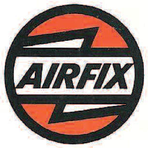
Type 6
Type 6 logo.
In 1979 there was a further alteration to the Type 4 logo. Apparently many boxes were getting longer, and to incorporate a reasonably sized round logo with similar-sized titles would result in a greater incursion into the box-top illustration. The answer was to ‘flatten’ the circle to make an oval. Now a much larger logo could adorn the box top because it was wider rather than deeper. It was used on Type 6 packaging and was the basis for the GMR logo on the rebranded trains of the same time. It thus becomes, conveniently, Type 6.
Type 7
Type 7 logo.
In the last few months of Airfix Products Ltd, a new logo was devised and it adorned the short-lived 1981 catalogue, although very few of us got to see one! It seemed to hark back to all the earlier logos, combining bits of each to produce a logo that was instantly unrecognizable. With hindsight it does seem strange that if money was so tight in 1980, a considerable amount should be expended on a costly redesign of the boxes and logo to seemingly little effect. Perhaps I am being unfair and there were sound commercial reasons for doing this. So what about the logo?
It returned to the circular shape of Type 4, using the red circle of Type 3, only now smaller. AIRFIX was written in a font similar to the original Type 1, and the ‘Precision Model Kits’ reminded us of ‘Products in Plastics’. On the catalogue, these words were replaced by ‘New Kits for 1981’. Boxes using this logo with paintings or photographs of the model are referred to as Type 7, so the logo becomes Type 7 also.
Thus far the logo has more or less coincided with the box type, but following the 1981 buyout by General Mills, they began to diverge.
Logos Post-1981
Type 8
Type 8 logo.
When Palitoy, like Humbrol and Hornby later on, took over Airfix, initially they would use the existing designs and logos, including Types 6 and 7. Then in the 1982 catalogue two new logos appeared. The first and main one was a modification of Type 4, where the black and white were reversed. The red was the same. A small ‘R’ in a circle was added after ‘AIRFIX’, presumably to indicate ‘registered’ as in registered trademark. It first appeared on Type 8 packaging and so is a Type 8 logo.
Type 9
Type 9 logo.
The second was a modification of the Type 6 logo without the turnbacks and with stylized lettering for Airfix. It also had the small R. It mainly seems to have been used on US-originated kits and two issues of Airfix’s magazine Model Trains. It should probably be referred to as Type 9. When Humbrol acquired Airfix in 1986, the Type 8 logo was used for several years. In the 1990 catalogue it was used in modified form to indicate the contents of the page.
Type 10
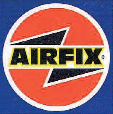
Type 10 logo.
A modified logo was introduced in the 1995 catalogue to coincide with the introduction of Type 11 packaging. ‘AIRFIX’ was now outlined in yellow and the turnbacks were italicized as per Type 5. It has remained as the standard logo ever since, with a couple of minor variations, and becomes Type 10.
Type 11
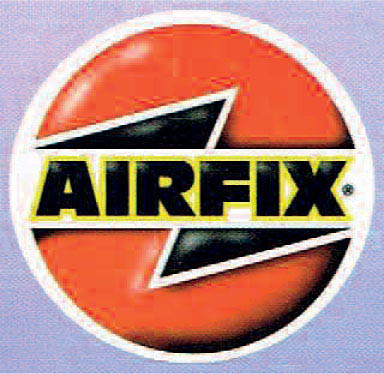
Type 11 logo.
In 1999, the logo was given a 3-D effect complete with shading and highlights, making it reminiscent of the old enamel badges often worn at school to denote certain responsibilities such as ‘prefect’ or ‘librarian’. Although it is the same layout as Type 10, I shall refer to it as Type 11, as it is different enough to warrant a seperate type number.
Type 12
Type 12a logo.
Type 12b logo.
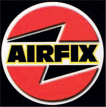
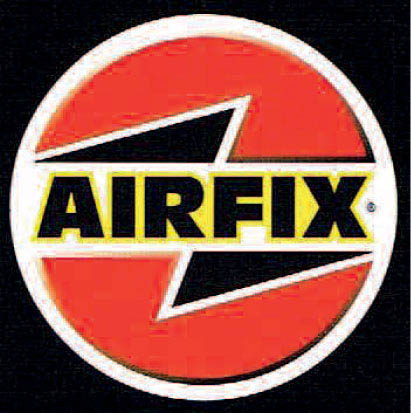
In 2001, however, it was modified again when it lost its ‘enamelling’ and the red parts were given a raised, shaded effect which looked almost plastic. The little R was also dropped, which made it a much clearer and more satisfying logo, although it has recently been added to new Hornby releases. Its use was initially continued by Hornby, although the little R was put back. It is, by my reckoning, Type 12, so we have Types 12a and 12b, to be pedantic.
Type 13
Type 13 logo.
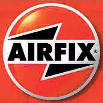
Around 2009, Hornby introduced its new Type 16 packaging, which is predominantly red. To go with it is a modified logo, which becomes Type 13. It is an amalgam of several earlier logos and drops the yellow around ‘Airfix’. It is not an unlucky logo, since many of the finest Airfix kits have been released beneath it.
In Summary
Hopefully, the accompanying artwork will make the above descriptions clear. I have tried to produce an example of every variation. There may have been one or two minor variations not mentioned above, but on the whole I believe the list is fairly comprehensive and allows us to roughly date a kit release.
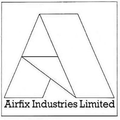
Airfix’s corporate logo.
One logo which has not, so far, been mentioned is the corporate logo. This was used to represent the main company of the Airfix group, Airfix Industries Limited, and was used on company stationery, financial documents and even lorries! It was a stylized ‘A’ and was in use until Airfix called in the receivers in 1981; it is illustrated below.