While the color wheel is a universal tool considered helpful in pairing hues, the French brush off any suggestion that world authorities can improve on nature, whose endless color possibilities coexist in harmony. As proof, they offer a blur of visual interest and drama, often straying beyond conventional combinations to more distinctive, unexpected choices after focusing on the use of the room and changing light, both natural and artificial.
No matter that more than a century ago French chemist Michel Eugène Chevreul’s pioneering work as director of Gobelin, the famous tapestry and carpeting manufacturer, contributed to the development of the color wheel. Given that the Republic’s climate and terrain vary from region to region, most people prefer trusting their instincts—reflecting the diversity of the natural world or the stately façades of historic sites. From the warm waters of the Mediterranean Sea to the lush, lavender-filled hills of Provence to the imposing architecture of Paris’ 6th arrondissement—the City of Light’s literary heart—the visual landscape of France influences Gallic color palettes.
Mixing subtle values of the same color family appeals to the uptown sensibilities of Parisians, whose cosmopolitan style requires that wall finishes, fabrics and furnishings simply complement each other rather than compete for attention.
Vibrant colors appear garish in the capital’s soft light, while luminous, subdued shades such as oatmeal, crème fraîche, parchment, putty and greige (a mix of gray and beige) project sophisticated airs that capture the unmistakably chic mood of the city. In pursuit of beauty, some scrape centuries of paint off walls, trying to unearth the original color or at least one suggestive of what once was. More, though, see no need to make any changes to a place filled with memories, since dwellings often remain in the same family for generations.
Contrary to common belief, those living in Provence also shy away from intense, saturated hues—although outsiders continue to associate Provence with the brilliantly colored Provençal florals and paisleys that have draped outdoor markets in a charming way ever since Avignon became home to Souleiado textiles. It isn’t that these prints are off-limits. Only that for a while now, habitués have been gravitating to palettes both muted and restrained. Earthy, subtle tones of sand, clay, biscuit, fawn, café au lait and mushroom—which appear bleached by the sun in the region’s strong light—are in vogue.
For a romantic air, the look may refreshingly include a pastel. But rather than pair it with other pastels, locals prefer mixing one with airy whites, ivories, parchment and all manner of pale grays and putties, which can prove a palliative foil to stronger, more distinctive colors.
Bright, colorful accents are at home on the French Rivera in the beach cities of Nice and Cannes, where many longtime residents use a punch of color to enrich interiors, whether it is a splash of balmy yellow, poppy red or deeper claret that shores up sites flooded with light. Blue, once believed to keep all manner of misfortune away, lands in a wave of favorite shades, from the sapphire blue that bathes the sweeping coastline to the picture perfect blue in the cloudless sky. Nevertheless, the French star du moment is l’indigo—midnight blue, a black blue.
This is not to say that color doesn’t make its way from faithfully tended vineyards, olive groves and wheat fields, as well as orchards with the latest crop of oranges, peaches and plums. It does. And, as if that weren’t enough, the shifting shades of leafy green offer never-ending design inspiration.
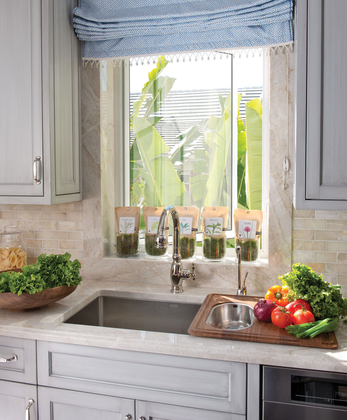
While the typical French jardin potager (kitchen garden) germinates outside, it need not. Here, herbs prop on a windowsill, where abundant light insures that a ready supply of dill, basil, chives and more will soon be within easy reach. The polished nickel faucet with integrated spray is by Kohler; stainless steel sink is Franke, 16 gauge. The lower the gauge, the thicker the grade stainless steel, which means fewer dents are apt to occur. Roman shade sports Quadrille fabric and Samuel & Sons trimming.
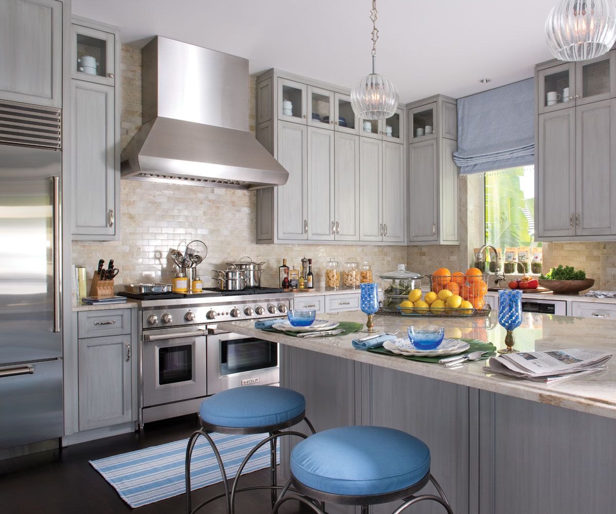
Nudging a kitchen beyond the ordinary are Baroncelli hand-blown Murano glass pendants that drift over an island decked in quartzite—the stone that is having its moment. Stainless steel Sub-Zero refrigerator sides a Wolf range, which is recognizable with or without red knobs. Outdoor-friendly enamelware—classic white with blue rim and vintage charm—parks in restoration glass-front upper cabinets until called into use for relaxed entertaining. Hand-brushed glazed cabinets infuse the room with innumerable shades of gray. The base? Farrow & Ball No. 229, “Elephant’s Breath.”

Just because pantries are common stock doesn’t mean one needs to look predictable. Here, organization is a staple.

Left: Traditionalists might favor the look of woven baskets, while those seeking a more contemporary spin might prefer custom-sized, steel wire baskets from Global Industrial, Port Washington, New York. With napkins today seemingly shrinking to a fraction of their former size, a group of oversized luncheon napkins—constructed from disparate Quadrille fabrics—sets itself apart from its peers. Servants at Versailles folded serviettes (napkins) into exquisite forms: boats, swans, flowers. Runner is from Dash & Albert.
Right: While using processed food is commonplace in restaurants worldwide, the renowned capital of gastronomy considers doing so an affront to the French culture. Notably, a consumer protection law passed in 2014 requires restaurants throughout the Republic to highlight those dishes made using fresh ingredients with the logo “fait maison,” or “homemade.” A dish not labeled presumably includes some frozen food.

Oenophiles say it is important to stock an assortment of glasses to capture a variety of wines’ subtle aromas and range of flavors. Stemware for reds should be larger and bolder than for whites, colorless to see the clarity of the wine and comfortable to hold—with the vessel’s foot as wide as the widest part of the bowl, for stability. Since losing our appetite for common glass, with its green edge, stemware from Ralph Lauren Home parks on lead-free Starphire shelves. Mirror backing doubles the look. Adding interest to the sidewall is a three-dimensional papier-mâché sculpture, Crabe Royal du Kamtchatka, by French artist Philippe Balayn.
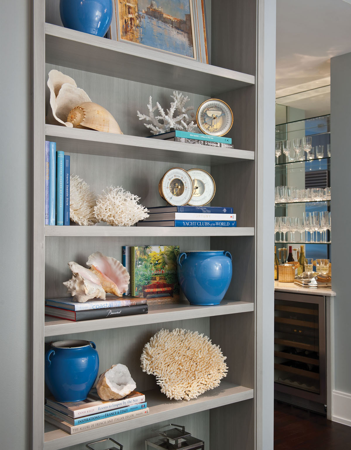
Napoléon’s forces, came, saw and conquered the Venetian Republic in 1797, taking away some of the city’s most important artwork. Oil of the Grand Canal, by noted painter Mathew Alexander, a member of the Royal Society of British Artists, merits a spot on open shelves in a hall among vintage French pots, glazed blue. Barometers, dating from 1890 to 1920, that once resided in homes abroad join lanterns, creating an attractive seascape. All are from The Barometer Shop in Cushing, Maine.
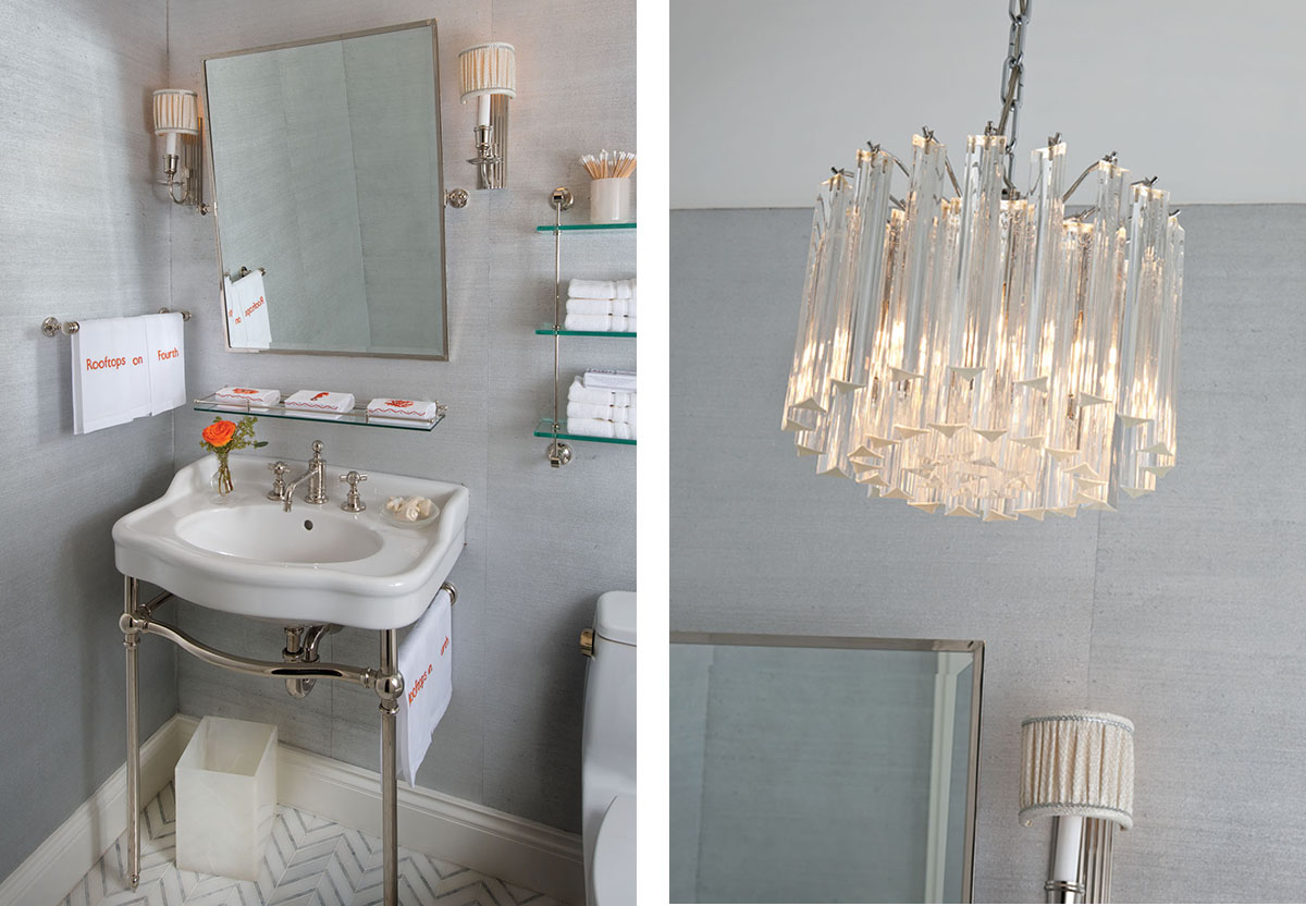
Left: Anya Larkin “Silver Night” wallpaper is the discreet backdrop for a powder room with Waterworks fittings, Labrazel accessories and New Ravenna’s “Raj” mosaic flooring laid in a chevron pattern. Dallasite Joan Cecil embroidered “Rooftops on Fourth” on linen hand towels by Sferra. Although the centuries-old desire for fine linens has not changed, people have. Responding to the challenge, Sharyn Blond Linens, Fairway, Kansas, introduced sea-related guest towels, hand-embroidered in Madeira, Spain.
Right: A chandelier from Chameleon Lighting projects a modern silhouette while shedding light on chevron-patterned flooring. To determine the appropriate size chandelier, add the length and width of the room, then convert the number of feet to inches for the fixture’s diameter. And know that a chandelier can always profit from a professional cleaning.

Enviable weather on Florida’s Gulf Coast prompts leisurely breakfasts, if not alfresco luncheons on the veranda of a beach house. Place mats are by Deborah Rhodes; blue bowls from Barneys New York.

With a list of ingredients hand painted on chair backs and assembly instructions on seat cushions, a salad—the ideal light lunch—can become a reality following a quick trip to the grocery or farmers market. In England, only seven dairies are certified to produce Stilton, the king of cheeses.

When Louis XIV’s taste for luxury put a drain on France’s assets, the king decreed that the public send all silver and gold to the treasury to be melted to pay war debts. Replacing plates with ceramic pieces boosted interest in the country’s humble faïence (tin-glazed earthenware) industry, where layering and design go hand in hand. Bespoke dinnerware—each plate unique—by Parisian artist Marie Thurman is from Bergdorf Goodman, NYC. Flatware made in Portugal, available through Dahlgren Duck, Dallas.
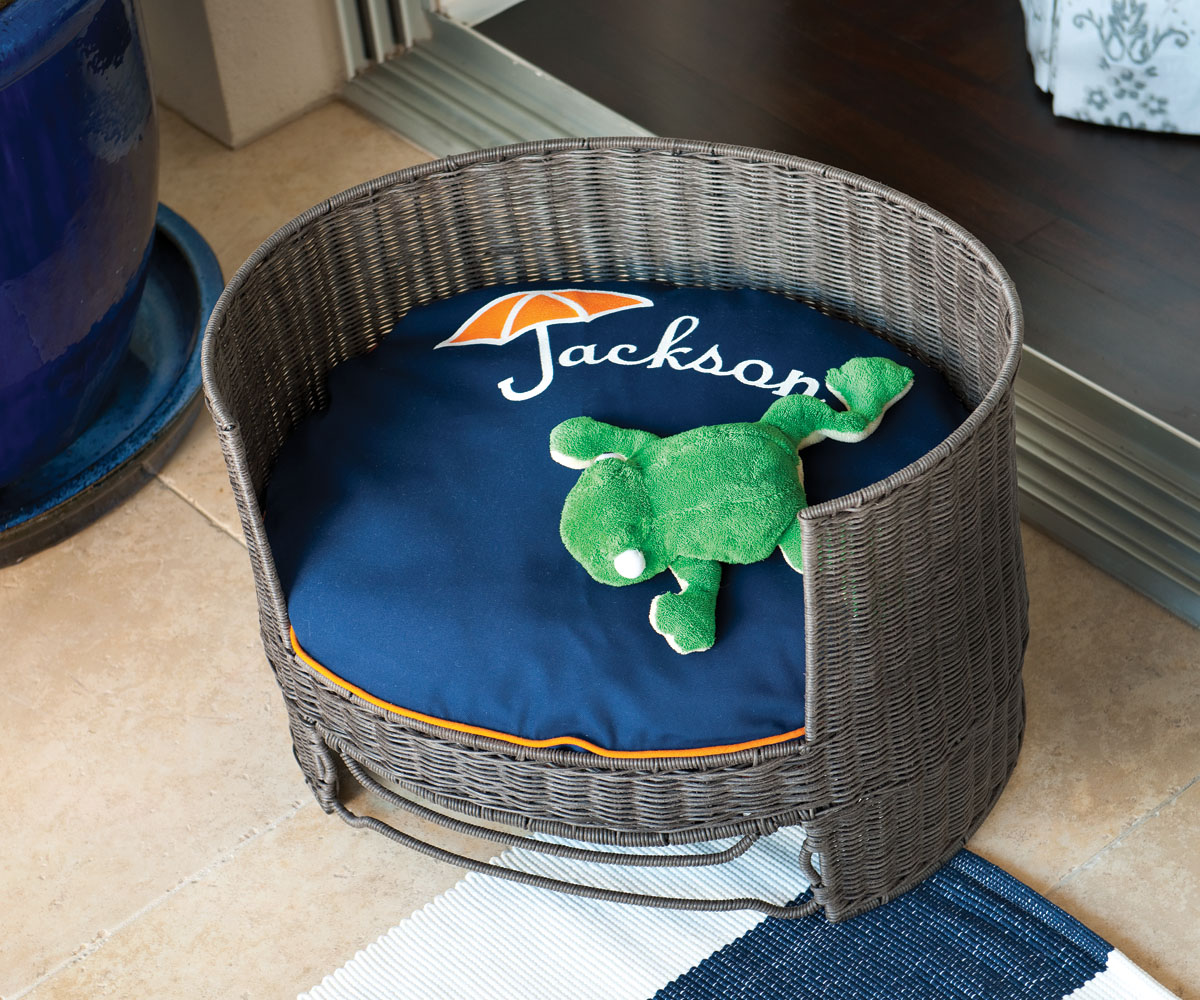
The French bulldog, with its sweet personality, is the dog of the moment in France, surpassing the Jack Russell in popularity. Dogs have long had a special place in French hearts. Being the accessory of choice, they accompany their owners to cafés, museums, movies, markets and just about everywhere else. An ocean away, we can be equally obsessive about our pets. Indeed, Jackson’s comfort is always foremost in mind.

The iconic navy-and-white nautical stripe—a hose-friendly Dash & Albert area rug—defines a Murray’s Iron Works grouping with sofa in a Perennials solid and chairs covered in a graphic Quadrille print, accented with contrasting welt. An assorted mix of pillows is the answer to making a deep sofa comfortable. Striped beach towels are from Ralph Lauren Home. Hand-blown hurricane lanterns happened upon in sun-drenched St. Tropez—a postage stamp of paradise—add ambience to the space.
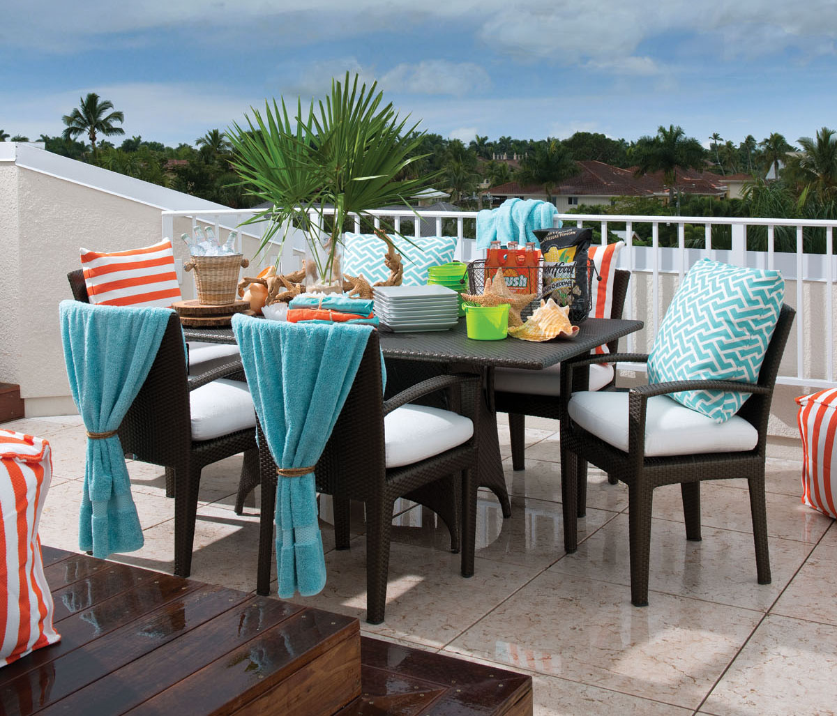
Arresting streaks of color frame a table set for easy entertaining.

Where better to watch the sun set, entertain friends, read a book or take a quick nap than on a rooftop? A graphic stripe covers a Dash & Albert pouf sturdy enough to serve as seating or hold a drinks tray. Playful “Aga” from China Seas gives an edge to the canopy-shaded daybed by Dedon.
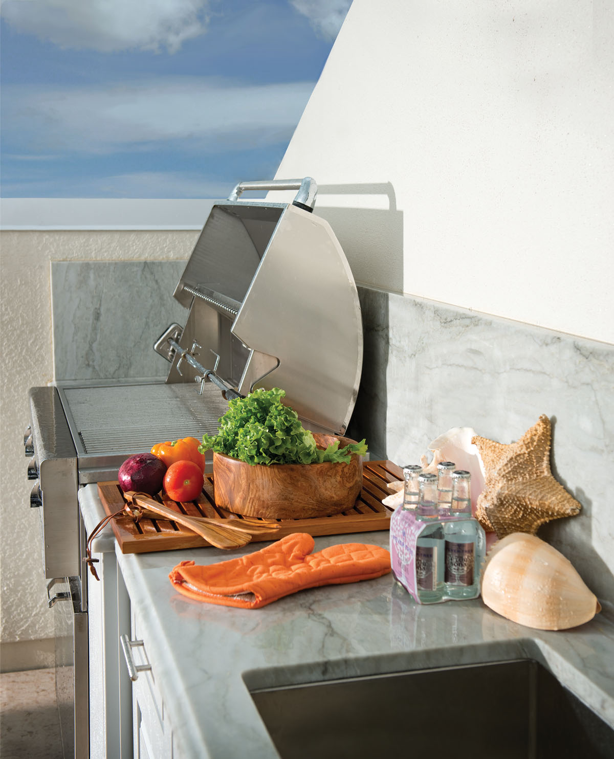
The popularity of grilling outdoors shows no signs of waning.

Mixing textures—rough (woven Dedon Chaise) and smooth (Perennials fabrics on chaises), soft (towels) and hard (flooring)—creates a laid-back space where an umbrella offers protection from the sun once a thunderstorm has moved on. Brushed Egyptian cotton blue-and-white-striped beach towels are from Ralph Lauren Home; those in aqua are from Yves Delorme. Defining the seating area is Brazilian Ipea, a hardwood so incredibly strong that it is impossible for a nail to penetrate. As a result, craftsmen drilled small holes in the lumber, and then screwed the deck together.