7
ANGELIC VISIONS AND DEADLY TERRORS
IN EIGHTEENTH-CENTURY ENGLAND, AN ENGRAVER was “the photographer of his day,” hired to create reproducible prints for the public. As these prints became more fashionable, an entire industry sprang up around translating an artist’s canvas into metal and ink. This kind of work required tremendous skill. One English engraver, for example, gained notoriety for how realistically he could reproduce cat hair. On the edges of this industry stood William Blake: poet, artist, and professional etcher. He didn’t want his creations outsourced to another engraver, no matter how faithfully the man might carve cat hair into metal plates. Blake wanted to paint, engrave, and print that cat hair—or, more specifically, that Tyger hair—himself.
Amid the dark fumes and hissing acid, surrounded with turpentine, aqua fortis, wax, charcoal, and copper, William Blake must have resembled a mad scientist when he achieved his breakthrough. Sometime in early 1787, after years of experimenting with nitric acid to burn images into copper plates, Blake discovered a novel way to illustrate his poems. He and his younger brother Robert had been trying to crack the riddle of “relief etching,” a graphic technique that would allow illustrated books to be printed quicker and more cheaply than traditional methods. For years, Blake had searched for the answer, feeling he “must create a [new] system or be enslaved by another man’s.”
The “system” most likely used if a publisher wanted to add a high-quality illustration in 1787 was intaglio printing. This meant hiring a professional engraver to cut the desired image into a copper plate using metal tools, or to etch the design chemically, using a complex process requiring wax, needles, and nitric acid. Both these methods were time-consuming and expensive, and required an entirely different printing press from the rest of the book. Like supermodels, it took a small army of talented professionals to make them look that good.
But Blake wanted total control, from conception through to the printing. No other compositors, inkers and pullers, editors, or publishers—just one simple line running from the artist to his work to the public at large.
After years of dissatisfaction, William and Robert Blake sat up one night talking in their London home and stumbled upon an elegantly simple solution. Instead of covering a copper plate in wax, using a needle to scratch out the intended design and “biting” the lines with acid, what if they painted directly onto the copper plate itself and then bathed the plate in acid to burn away the surrounding copper? This would create a plate whose design stood up off the surface of the metal in relief, like a modern-day rubber stamp. This method could potentially become a much faster and less expensive way to print any illustration an artist could imagine.
Relief printing was in fact an older form of graphic illustration—older than the printing press itself. In the early 1400s, woodcuts were used to illustrate everything from saintly icons (for praying) to sinful cards (for playing). Yet this type of printing required cutting away the wooden sides of the line you wanted to print, and thus produced a somewhat unrefined look. One scholar compares woodcuts to homemade gin: “cheap, crude, and effective.”
Blake’s proposed relief etching would dramatically reduce the cost of creating illustrations while still allowing the artist complete control over the brushstrokes. “Even Milton and Shakespeare could not publish their own works,” Blake lamented. All he and Robert needed to do was find a viscous ink that would dry upon application, adhere strongly to metal, and resist all forms of nitric acid. No problem! Well, as long as you ignore the fact that such an ink did not exist, no problem!
Despite being William’s junior in the world of print, Robert Blake actually came to his older brother’s rescue and taught him a secret recipe for creating just such an ink. It consisted of precise ratios of turpentine, asphaltum (black petroleum), and linseed oil. High-fives all around! The next morning, William’s wife ran out to the market with their last shillings and purchased the required ingredients—and it worked, just as Robert said it would.
If the story of Blake’s relief etching ended there, it might be remembered as a mildly interesting anecdote about two brothers who invented something cool in the history of print. But there is more information you should know: Robert Blake was dead at the time. He had died earlier in the year, sometime before February 11, 1787.
Absent that key detail—that Robert’s body was cold and buried in a London cemetery when he taught his brother the secret of relief etching—changes the nature of the story a bit. As it should. William Blake was an incredible poet, artist, and printer, but he was also considered mad, or at least delusional, by those who knew him best. Chatting the night away with the disembodied spirits of Shakespeare, John Milton, William Wallace, the biblical prophet Isaiah—this was all totally and monotonously normal for Blake. After all, why create new printing techniques by trial and error when you can simply learn about them from dead people?
Any change, large or small, in the details of a story can translate into significant changes to its overall meaning. This applies to more than just history. It also applies to books. And it especially applies to the works of William Blake.
SONGS OF INNOCENCE
1789
The Author & Printer W Blake
This is the text of the title page in Blake’s most famous printing endeavor. Songs of Innocence is a collection of poems (or songs) apparently intended for children. It includes such titles as “A Cradle Song,” “Infant Joy,” “The Lamb,” and (because this was the eighteenth century and kids got bills to pay) “The Chimney Sweeper.”
Everything a reader needs to understand about Blake’s book is all there on the title page: Songs of Innocence, printed in 1789 by a W. Blake, who is also the author. That should just about do it, right?
Wrong. Without the title page in its original trappings, the text communicates only part of the message. For example, many of the themes inside Songs of Innocence deal with safeguarding children, birds, old people, and other indelibly cute creatures from the evils of the world. Take a look at the original title page illustration on the next page (a Blake relief etching, by the way), and you’ll see that the narrative shifts a bit.

INDIVIDUAL TITLE PAGE OF SONGS OF INNOCENCE FROM SONGS OF INNOCENCE AND EXPERIENCE, BY WILLIAM BLAKE, PRINTED IN 1795. Image courtesy Yale Center for British Art.
First, we feel a moral imperative to apologize for reproducing that title page in black and white. It is simply breathtaking in its original state, with a delicate wash of blues, reds, greens, and yellows. You’re missing something extraordinary if you don’t see it in color, an experience so beautiful that it’s almost painful to tease you with this echo. But that is the point. When the illustration is translated into this medium, part of the experience is lost. Still, as bad as that is, you’re missing way more when you have only the text in front of you, which is how Blake’s poetry is most commonly reproduced, and how most of us first read him.
When the text is combined with the image as Blake intended, we notice something else going on, something a bit at odds with the title. Blake specialist Robert Essick explains, “An adult reading to or lecturing children is a common motif in frontispieces and title-page vignettes of eighteenth century children’s books. Blake exploits this convention by making one significant revision: the heavily dressed mother or nurse shows the book . . . to the boy and girl” [emphasis added].
It’s as if Blake were somehow condoning the idea of children reading (and one of them a girl, no less!). By now it shouldn’t surprise you that reading in the eighteenth century was a seriously dangerous pastime. Historian Robert Altick summarized the stakes: “Popular education struck horror into the souls of those committed to eighteenth-century social theory. It promised sloth, debauchery, and the assumption of superior airs on the part of the people—followed, as the day the night, by irreligion and revolution.”
And how about the tree that’s looming above those little revolutionaries? The vine winding around its trunk is serpentine in nature, and there are strange apples straining against their boughs, leaning forward like delicious orbs of good and evil hovering tantalizingly above youthful innocence. What seems at first like a totally mundane title page for a kid’s book becomes a perilous scene of biblical proportions that makes you want to scream out, Don’t read it! Run away! The call is coming from inside the book! After seeing the words in their original context, we suddenly have to revise the interpretation that these poems are meant only for children—or that they’re even innocent at all.
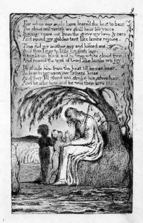
Another example from Blake’s Songs of Innocence can be found in the poem “The Little Black Boy,” in which Blake takes a swing at the racism and white entitlement of eighteenth-century England. Read on its own, without the accompanying illustrations, the poem is about a little boy who notices he’s different from other boys: “White as an angel is the English child: / But I am black as if bereav’d of light.”
“And we are put on earth a little space,” the boy’s mother tells him, “That we may learn to bear the beams of love. / And these black bodies and this sun-burnt face / Is but a cloud . . .”
Totally fine with this, says every Englishman, because it’s 1789.
The boy then continues, addressing the white child, “And thus I say to little English boy. / When I from black and he from white cloud free / . . . I’ll shade him from the heat till he can bear, / To lean in joy upon our father’s knee. / And then I’ll stand and stroke his silver hair, / And be like him and he will then love me.”
Sounds about right. This is what little black boys should aspire to be: shade for white people. To be loved by white people, you must serve white people. And stroke their silver hair. Still, add Blake’s illustrations, and the story changes a bit. The last plate shows Jesus not with two children “free” from color, but with both a white and a black child at his knee.
As you can see on the following page, the little black boy is still a little black boy. Despite being in the presence of God, he hasn’t shed his “cloud” of dark skin as promised. In fact, he even appears to have angelic wings by virtue of the . . . we’re going to say lambs (?) feeding in the background. Or large, furry newts? Shaved ocelots, maybe? Whatever. In this copy, the black boy has wings and seems to be interceding on behalf of the white child, who has not yet learned to “bear the beams of love.” As one scholar noted: “Thus the design puts [the white boy] in the position of the lost soul who has been rescued by his black ‘guardian angel.’”
“THE LITTLE BLACK BOY (CONTINUED),” FROM SONGS OF INNOCENCE AND OF EXPERIENCE, BY WILLIAM BLAKE, PRINTED IN 1795. Image courtesy Yale Center for British Art.
Books are not created in a vacuum. The larger context of a work, including material elements beyond the printed words, makes up an inextricable part of the interpretation. Blake’s work is endlessly challenging, which is one reason it’s so beautiful. As readers, we lose the fundamental Blakeness of a work—that weird, provocative, glorious spirit—the further we push it out of context.
It is easy to take these small details for granted, even though they can completely alter our experience of a book. For example, most of us don’t normally notice how illustrations, merely by their placement, can change the meaning of texts. Consider the 1796 edition of Leonora, translated into English from the original German by J. T. Stanley. The publisher, William Miller, commissioned William Blake to create three original designs for the poem. One of those designs would be used as the frontispiece, opposite the title page. The frontispiece essentially sets the tone and expectations of the entire book, and is far and away the most important illustration. In many books published in the eighteenth century, it is the only illustration.
In the spirit of the Grimm brothers’ fairy tales, which were being collected in Germany about the same time, Leonora is the story of a young woman whose life goes awry in grotesque ways. As the poem opens, she is awaiting the return of her fiancé, William, from the Seven Years’ War (1754–63, and yes, we’re aware that’s nine years; historians aren’t good at naming things. Or math, apparently). When Leonora’s waiting proves fruitless, she blames God, much to the disapproval of her mother, who tries to console her by saying:
Who knows but that he yet survives
Perchance far off from hence he lives
And thinks no more of you.
Forget, forget the faithless youth
Away with grief, your sorrow soothe
Since William proves untrue.
Sometimes mothers know just what to say to mend a broken heart. This was definitely not one of those times. Telling a teenage girl not to worry because her true love isn’t dead, he’s probably just an asshole who has a family of his own by now, is the exact opposite of helpful. Not surprisingly, Leonora acts like a teenager, dramatically beating her breast and praying for death.
Her fiancé then suddenly shows up on horseback in front of her house and invites her on a midnight ride. But here’s the catch: she has to go right now, and can’t tell anyone. So many red flags to unpack here, but Leonora is young and doesn’t realize how very awful German fairy tales are. After riding around talking about dead people for a while, William then reveals himself to be Death, who’s come to take her to hell for blaspheming God. The earth then cracks open to receive her.
Despite the genuinely disturbing latter half of the poem, the various English translations of Leonora end on an optimistic note. Leonora exclaims, “Thy will be done / Lord, let thy anger cease,” and “[t]he spectres vanish’d into air . . . all was hushed in peace.” In one version, William even returns from the war revealing that the whole poem was just a dream from the mind of a feverishly lovesick girl.
Various illustrators created designs for the immensely popular Leonora, which spurred several translations, play adaptations, and musical compositions. On the following page is an original pen-and-ink drawing for a famous scene in Leonora, by the German painter Johann David Schubert, made a few years after Blake’s commission.
You can almost see the Disney film in the making: the dashing hero with great hair, the doting maid whose body not only defies the physics of riding a horse, but does so in order to showcase her tiny waist, supple breasts, and cartoonish doe eyes. And is that a nude ankle we see?

“LEONORE,” ORIGINAL PEN-AND-INK DRAWING BY JOHANN DAVID SCHUBERT, CIRCA 1800. Image courtesy Schmidt Auctions.

FRONTISPIECE OF THE 1796 STANLEY TRANSLATION OF LEONORA, DESIGNED BY WILLIAM BLAKE. Image courtesy Christie’s Auction
Now look at what Blake did.
Good God, man! Leave something for our nightmares. And this was the frontispiece, the most important image in the book. Blake’s illustration changes the focus of the entire text from a theme of eventual redemption and God’s ceaseless love to a cacophony of muscular butts, limbs that aren’t physically possible, and a teenage maiden who’s got no goddamn time for flashing ankles.
In case you’re wondering—no, this design didn’t play well with readers. From the British Critic: “[Concerning] the distorted, absurd, and impossible monsters, exhibited in the frontispiece to Mr. Stanley’s last edition . . . [Blake] substitutes deformity and extravagance for force and expression, and draws men and women without skins, with their joints all dislocated, or imaginary beings, which neither can nor ought to exist.”
That illustration changed readers’ perceptions of Leonora. Single images really can have that much power. Take Sherlock Holmes as a further example. When we picture the world’s most famous detective, we see him sporting that iconic deerstalker hat. That fashion choice comes not from the author, Arthur Conan Doyle, but from an image by Sidney Paget, the man who illustrated the Sherlock Holmes stories when they first appeared in the literary magazine The Strand.
It’s worth noting that critics of Blake’s Leonora weren’t being entirely fair in their judgment. After all, the poem was an eighteenth-century German tale in the vein of birds pecking out the eyes of Cinderella’s stepsisters. When Death reveals himself to Leonora at the end of the poem, it goes like this:
Scarce had he spoke, when, dire to tell
His flesh like touchwood from him fell
His eyes forsook his head.
A skull, and naked bones alone
Supply the place of William gone
’Twas Death that clasp’d the maid.
Now off to bed, kiddies. Blow out the candles. Sweet dreams. Blake’s frontispiece is pretty faithful, if you ask us. (We’ll also take this opportunity to emphasize how much we love this image. There’s something truly breathtaking about Blake’s species of nightmare.) His contemporaries, however, did not agree. The biographer G. E. Bentley notes that after this publication, “most books with Blake’s engravings after his own designs were commissioned chiefly by his close friends . . . or were published by himself.” Blake’s frontispiece to Leonora altered the focus of the work, and it was not a change appreciated by readers of his day.
Blake could have taken special umbrage at one line from the British Critic: namely, that the figures in his design portrayed “imaginary beings, which neither can nor ought to exist.” He probably read that in a room somewhere and shook his head. Because, for William Blake, the figures from his illustrations weren’t merely wisps of some roiling fever. They were actual beings that wove together the fabric of his reality.
WILLIAM BLAKE was born in 1757 to the owners of a hosiery shop in London. Even as a young boy, he seemed more interested in doodling on handbills than winding tape, wrapping parcels, and measuring yards of fabric. Also at an early age, God scared the shit out of him by peeping into his window. “You know, dear, the first time you saw God,” his wife reminded him during one interview, “was when you were four years old, and he put his head to the window, and set you a-screaming.”
God later tried to make up for this poor first impression by granting glorious visions to the young lad: such as the biblical prophet Ezekiel sitting under a tree watching him; or another tree filled with angels, who were, also, silently watching him; then there were the haymakers working in the fields surrounded by angelic beings, and they were all watching him. From an early age, Blake understood that God was watching you. All the time.
Blake was one of those people for whom the term enthusiasm, from a Greek word meaning “inspired by a god,” truly applied. “When [Blake] said ‘my visions,’” wrote journalist and confidant Henry Robinson, “it was in the ordinary unemphatic tone in which we speak of everyday matters.”
Many people who spent time with Blake became convinced that he was suffering from delusions, or was outright insane. One of the harshest critics of his work railed, “When the ebullitions of a distempered brain are mistaken for the sallies of genius . . . the malady has indeed attained a pernicious height.” He went on to call Blake “an unfortunate lunatic, whose personal inoffensiveness secures him from confinement.”
Another close friend of Blake’s put it in the most politically correct way possible: “I very much fear his abstract habits are . . . much at variance with the usual modes of human life.” And Blake’s wife famously remarked, “I have very little of Mr. Blake’s company; he is always in Paradise.”
Blake genuinely believed he interacted with ghosts, angels, and demons on a daily basis. He often awoke to “harps which I hear before the Sun’s rising.” And, okay, one of his poems was dictated to him by a faerie in his parlor. But does that mean Blake was suffering from psychosis? Is that how we judge a person’s sanity? By the medical definition of “psychosis,” yes, it is. But as Blake observed, “there are probably men shut up as mad in Bedlam, who are not so . . . possibly the madmen outside have shut up the sane people.” And that is totally not something a madman would say. . . .
Blake’s “religious convictions . . . [have] brought on him the credit of being an absolute lunatic,” wrote Robinson, “this belief of our artist’s in the intercourse which . . . he enjoys with the spiritual world has more than anything else injured his reputation.” Robinson’s assessment was probably accurate. Blake was not fully appreciated in his time, and he died nearly penniless. There’s no doubt that his visions made for awkward social situations. Take this comment made to a small group of friends one evening: “I can look at a knot in a piece of wood till I am frightened at it.” This creates a striking image of Blake as a wide-eyed old man who is constantly afraid of everyday objects within his cone of vision.
What Robinson overlooks in his assessment, however, is that much of Blake’s brilliance was positively defined by his “intercourse” with the supernatural. As Doris Lessing has written, “Posterity, it seems, has to soften and make respectable, smooth and polish, unable to see that the rough, the raw, the discordant, may be the source and nurse of creativity.” It was as if Blake’s senses perceived more than the natural world around him—experiences and information lost to the rest of us.
This “talent” manifested itself from his very first venture into the printing houses of London. Admitting that his son would never be great at sewing and dressmaking like a proper haberdasher, Blake’s father enrolled him in the drawing school of Henry Pars from ages ten to fourteen. Upon graduation, young William was taken to interview as a potential apprentice to William Wynne Ryland, an artist and print seller who once served as engraver to the king. The fee that Ryland would have charged was probably hefty (somewhere in the neighborhood of one hundred pounds sterling), but Blake’s father was willing to pay if his son’s future could be comfortably secured.
The interview did not go well. “Father,” Blake reportedly said, “I do not like the man’s face: it looks as if he will live to be hanged.” On the list of things not to say during a job interview, this has to be near the top. You are suggesting that your potential employer (a) Looks like he might be a criminal; or (b) Is ugly enough that someone should hang him. In Mr. Ryland’s case, however, it turns out that a was the correct answer. Falling on hard times, William Ryland was found guilty of forging bills from the East India Company to the tune of £7,114. In August 1783 (eleven years after Blake’s interview), he was indeed hanged from a tree.
Blake’s father took him next to see James Basire, the principal engraver to both the Royal Society and the Society of Antiquaries. Since Basire possessed a face that didn’t suggest future crimes, Blake was apprenticed to him for seven years, at the cost of fifty-two pounds. From Basire, Blake learned the art of engraving, which included, among other things, cutting clean, straight lines into copper plates; cutting angled lines to represent shade (crosshatching); using a “dot-and-lozenge” technique, which added small dots between the cut lines to create a 3D-esque depth of field; and the specialty of Basire’s shop, intricate, curving “worm-lines.”
Blake also learned how to etch copper plates with aqua fortis, or nitric acid. First coating the entire plate with acid-resistant wax, an engraver would sketch out the illustrator’s design with a needle. Next, he would drop the plate into an acid bath, which bit those traced lines into the metal, but left intact the parts of the plate covered in wax. Blake later explained this process to one of his own apprentices in a way that brings to mind Patrick Swayze and Demi Moore over that potter’s wheel in Ghost. “Take a cake of virgins wax . . . and stroke it regularly over the surface of a warm plate (the plate must be warm enough to melt the wax as it passes over) then immediately draw a feather over it and . . .” Good Lord, Mr. Blake, you are about to exceed the minimum age requirement for this book!
After seven respectable years with Basire, Blake graduated to journeyman, and was likely sent off with the customary gift of a “double suit of clothes and the tools of his trade.” Rather than open his own studio, however, Blake felt the inspiration of God instructing him to return to art school. So it was that he found himself at the Royal Academy in Somerset House in 1779. He was a capable but obstinate student, unwilling to bend to the demands of instructors with whom he disagreed. According to his preeminent biographer, Blake “distrusted oil color as a modern and perverse invention.” So what would he consider a more established and hallowed medium? Watercolors. Obviously.
Watercolors come with their own problems. They fade easily in the sun and aren’t nearly as permanent in application as oil. Blake wanted to get around this, and fortunately, God showed him how—or, rather, the father of God showed him how.
“[Blake] ground and mixed his water-colors himself on a piece of statuary marble, after a method of his own, with common carpenter’s glue diluted, which he had found . . . to be a good binder. Joseph, the sacred carpenter, had appeared in vision and revealed that secret to him.” Sure, seeing dead people means you get branded a lunatic by your closest confidants, but it also means you get free art supply recipes. Fair trade.
After leaving the Royal Academy, Blake married, and took charge of his younger brother Robert after their father passed away. With the inheritance money, he was able to purchase an engraver’s printing press, a big rolling press that was capable of producing the much greater pressure required for common intaglio illustrations. This came in handy when he and a partner opened a print shop in 1784. Because they were both trained engravers, they didn’t have to hire others to create the material sold in their shop. Keeping everything in house cut down on the costs of production.
Life seemed to be going well for William Blake. His business was successful enough; he had a competent and loving spouse who helped in the shop; and he was even training his beloved brother Robert to follow in his footsteps as an engraver. Three years later, however, the scene was markedly changed. Robert lay coughing up blood, deep in the last stages of tuberculosis; William barely moved from his bedside during the last two weeks. When Robert died at the age of twenty-four, Blake said he saw the young man’s spirit ascend to heaven, clapping for joy. As happy as Robert’s ghost may have been, the brother he left behind cracked inside. He collapsed from exhaustion and for three days could not be roused, not even to attend Robert’s funeral.
More than a decade later, Blake found solace in his ability to commune freely with Robert. “Thirteen years ago I lost a brother,” he wrote, “and with his spirit I converse daily and hourly . . . I hear his advice and even now write from his dictate.” During one of those conversations, Robert’s ghost revealed the secrets of relief etching—because, apparently, when you die you become much better at your occupation than you ever were in life.
For Blake, the ability to etch in relief (to paint directly onto a copper plate and simply melt away the surrounding copper) commenced a rebirth in the art of illuminated manuscripts. Illuminated manuscripts added hand-drawn ornaments, borders, and miniature paintings to embellish and beautify a text. During most of the first three hundred fifty years of print, graphic elements were usually added to books by what could be carved into a woodblock or scratched onto a metal plate. Now, by painting directly onto the medium, Blake could incorporate styles of art that were largely foreign to the mechanical printing process. The resulting books are an ineffable joy to behold, and a chance to see one of them a major event. The last copy of Songs of Innocence to sell at auction, for example, went for almost a million dollars in 2001.
In a 1793 advertisement for his relief-etched books, Blake wrote that his new style of printing was “more ornamental, uniform, and grand, than any before discovered, while it produces works at less than one fourth of the expense . . . The illuminated books are printed in colors, and on the most beautiful wove paper that could be procured.” It was “a method of printing which combines the painter and the poet,” making the author, the artist, the engraver, and the printer all the same person.
After the invention of his relief etching, Blake finally achieved complete creative control over his work, with no middleman inserting his own interpretation. In many books, this species of seemingly harmless meddling can be as simple as changing the font, or the layout of the text on the page, or the type of paper. It’s not unusual for an author to try to maintain control of these elements as well. For instance, in the twentieth century, James Joyce wrote the story of Ulysses as a single day in a leap year, and he made sure that the first edition mirrored this by having exactly 366 leaves.
William Blake wanted every choice that affected the final product to be his alone. As a result, when we use an edition that reproduces only the text (or an illustrated edition without the color), we lose some of Blake’s consciously crafted meaning. Consider the way in which the painter and poet work against each other in Blake’s “London,” from Songs of Experience. “London” is a cheery poem about life in a stand-up town where the Janes and the Darbs beat their gums on the street corners and laugh—a town where just drawing one’s breath is the cat’s meow. Just kidding, it’s about how much London, as a place for human beings to live, sucks. “In every face [you] meet,” there are “marks of woe.” There are “mind-forg’d manacles.” “[Y]outhful Harlots” curse. “[T]he hapless Soldier’s sigh / Runs in blood down Palace walls.” It’s the eighteenth-century equivalent of a half-star Yelp review.

“LONDON,” FROM SONGS OF INNOCENCE AND OF EXPERIENCE, BY WILLIAM BLAKE, PRINTED IN 1795. IMAGE COURTESY YALE CENTER FOR BRITISH ART.
Yet, this is the original illustrated page of “London.”
Above the manically depressive text stands the image of a young boy helping a crippled old man, an illustrative act of charity overshadowing the textual human woes. Unless that kid is leading the old man to a gang of street punks who beat him up and steal those sweet crutches, the illustration and the poem are sending two different messages to the reader that must be considered together when experiencing “London.” Taken as a composite work of art, the poem can be read as a question and answer: the text as the problem and the illustration as the solution.
The additional context of Blake’s illustrations changes how we read the text, but important meanings can be imposed by other factors we may not immediately notice. When Charles Dickens was publishing his serial novel Hard Times in 1854, he did so within the pages of his own weekly magazine, Household Words. The weekly also contained nonfiction articles, but their arrangement in relation to the fictional Hard Times installments was designed to provide setting and context to the events of the novel. Actual news articles about the rights of workers, failed safety regulations, accidents, and industrial reform coincided with the lives and deaths of Dickens’s fictional characters. When reading Hard Times as a standalone novel separate from Household Words, we miss major components of the argument Dickens is making.
As the scholar Jerome McGann argues, the words on a page offer only “the merest glimpse of that complex world we call literary work and the meanings it produces.” William Blake is an exquisite example of this concept because his “composite art” of word and image allows for unusual complexity, with layers upon layers of meaning.

EUROPE A PROPHECY FRONTISPIECE BY WILLIAM BLAKE, PRINTED IN 1795. Image courtesy Yale Center for British Art.
Sometime just before 1794, William Blake had his most powerful vision. A godlike figure appeared to him and “hovered over his head at the top of his staircase.” What God was doing up there is anyone’s guess (though, if Blake’s experiences as a youth are any indication, God was probably waiting to pop out and scare the bejesus out of him). Upon seeing this vision, Blake felt inspired to create one of his most famous illustrations, “The Ancient of Days.”

EUROPE A PROPHECY TITLE PAGE BY WILLIAM BLAKE, PRINTED IN 1795. Image courtesy Yale Center for British Art.
This design became the frontispiece of Blake’s lengthy poem Europe a Prophecy (1794). Filled with all the doom and gloom and apocalyptic fervor that the 1790s could muster (which was a surprisingly large amount), Europe’s text depicts a world of “almost hopeless torment,” where understanding the causes of evil does nothing to free mankind from their collective suffering. Just a light read, really.
Next to “Ancient of Days” sits Europe’s title page, shown above.
Not only the illustrations, but their specific placement in the book, tell a story. The creator God from Blake’s frontispiece reaches down from the sky to fashion not a garden of Edenic beauty, or a naked man and woman, or even dinosaurs who need to hurry up and go extinct before the naked man and woman get booted from the magical garden for fruitful translations. Instead, reading the book’s illustrations from left to right, God first creates a traditional symbol of evil: the Serpent.
We tend to assume that a book’s narrative is communicated simply by the words alone. That’s an obvious mistake when you consider Blake’s work, but the principle applies much more broadly. Some modern authors, experimenting with the new medium of digital-born texts, have created narratives that change based on how you interact with them. In Shelley Jackson’s 1996 hypertext novel, Patchwork Girl, the reader is presented with the body of a woman. Each body part has its own individual backstory. “I am buried here. You can resurrect me, but only piecemeal. If you want to see the whole, you will have to sew me together yourself.” A woman’s body, graveyards, journals, and even a quilt—the reader must click on various hyperlinks, embarking on a tale of a female Frankenstein’s monster created interactively by the reader. The way a reader advances the story “characterize[s] a good deal of the way we conceive of gender and identity.” As brilliantly crafted as Jackson’s narrative is, it could not exist outside its original medium without dramatic loss to its meaning.
For William Blake, certain symbols were bursting with significance. The Serpent, like that from Europe a Prophecy, held an interesting place in Blake’s mythos: “Satan . . . is father & God of this world.” And there was this gem: “The Prince of darkness is a gentleman & not a man[;] he is a Lord Chancellor.” All right, Mr. Blake. How did you come upon this information?
“For many years . . . I longed to see Satan.”
No story that starts this way ever ends well.
“I never could have believed that [Satan] was the vulgar fiend which our legends represent him . . . At last I saw him. I was going upstairs in the dark, when suddenly a light came streaming amongst my feet, I turned round, and there he was looking fiercely at me through the iron grating of my staircase window.” Blake really needed to stay away from windows and staircases at night.
“. . . through the bars glared the most frightful phantom that ever man imagined. Its eyes were large and like live coals—its teeth as long as those of a harrow [spiked plough], and the claws seemed such as might appear in [a] distempered dream . . . It is the gothic fiend of legends, the true devil—all else is apocryphal.”
To recap: I wanted to meet Satan. I didn’t believe he was as awful as the legends say. There was a light at my window. Whoa! Just kidding about that Lord Chancellor nonsense; he is a monster! A goddamned monster!
Blake’s demons had many faces. “The Tyger,” arguably his most famous poem, published in 1794, starts off like a children’s rhyme. Then it quickly turns into something an angsty teenager might read to summon Cthugha, the Lovecraftian fire god.
Tyger Tyger, burning bright,
In the forests of the night;
What immortal hand or eye
Could frame thy fearful symmetry?
And what shoulder, & what art,
Could twist the sinews of thy heart?
And when thy heart began to beat,
What dread hand? & what dread feet?
What the hammer? what the chain,
In what furnace was thy brain?
What the anvil? what dread grasp
Dare its deadly terrors clasp!

“THE TYGER,” IN SONGS OF INNOCENCE AND OF EXPERIENCE, BY WILLIAM BLAKE, PRINTED IN 1795. Image courtesy Yale Center for British Art.
The text itself should be read only to children who don’t cry at eighteenth-century German fairy tales—but the design Blake chose to personify this hellish beast of youthful nightmare looks like this:

“GHOST OF A FLEA,” ORIGINAL WATERCOLOR BY WILLIAM BLAKE, C. 1819–20. Image courtesy Tate Museum.
Well, that’s not very frightening at all. It’s kind of adorable. Less “dare its deadly terrors clasp” and more “I CAN HAS DEADLY TERRORS?”
Blake’s work can often be more intriguing for its questions than its answers. Why would he draw his forest demon like that? Who knows? The weird tree face at the top is scarier than the feline predator. It wasn’t as if William Blake were incapable of designing “distorted, absurd, and impossible monsters.” Recall his illustration of Leonora or, better yet, this terror of Christian indecency.
This is the “Ghost of a Flea,” circa 1819. And here is how this amazing image came about:
I [Allan Cunningham] called on him one evening, and found Blake more than usually excited. He told me he had seen a wonderful thing—the ghost of a flea!
“And did you make a drawing of him?” I inquired.
“No, indeed,” said he, “I wish I had, but I shall if he appears again!”
He looked earnestly into a corner of the room, and then said, “here he is—reach me my things—I shall keep my eye on him. There he comes! His eager tongue whisking out of his mouth, a cup in his hand to hold blood, and covered with a scaly skin of gold and green”;—as he described him so he drew him.
The last sentence of Cunningham’s description is priceless. You walk into your friend’s house, and he tells you that he’s seen the ghost of a flea. Generally, being familiar with the size and shape of a flea, you ask him to draw it, because—why not? It will probably be cute. He scribbles for a few minutes and then hands you the picture of a six-foot-two bipedal fish monster carrying a mixing bowl of human blood. When Cunningham wrote, “[A]s he described him so he drew him,” he nonchalantly captured one of the most fundamental aspects of his friend’s world. For Blake, the grotesque and the heavenly were mixed with the most ordinary features of life.
William Blake was a visionary in every sense of the word. While regarded mostly as an oddity during his lifetime—whenever he went missing for a while, people assumed he was either dead or finally locked up in a madhouse—he invented an illustration method that would be admired and remarked upon for centuries to come. In fact, his precise relief etching technique wasn’t fully understood until the second half of the twentieth century. But while his technical achievements are interesting and beautiful, the intentions that drove him to these breakthroughs are equally compelling.
Blake couldn’t bear working only as an engraver, accomplishing the “mere drudgery” of imitating some other artist’s original work. He took control of the medium, forcing readers to recognize that a text should not be analyzed apart from its materiality. The bibliographer G. Thomas Tanselle says, “Books are a part of material culture. Every artifact, every physical object made by human beings, is a record of human effort at a particular time and place, as well as a tangible link to all the succeeding moments of its life.” Blake understood this, and his printing methods were meant to be an integral part of his message. He explains this in a way so very Blakean: “The notion that man has a body distinct from his soul, is to be expunged; this I shall do, by printing in the infernal method, by corrosives [etching], which in Hell are salutary and medicinal, melting apparent surfaces away, and displaying the infinite which was hid.”
During the last years of his life, Blake slipped into acute poverty, and varying degrees of mental wellness. Some who met him described him as “so evidently insane, that the predominant feeling in conversing with him, or even looking at him, could only be sorrow and compassion.” At other times it was said of him, “I remember William Blake, in the quiet consistency of his daily life, as one of the sanest, if not the most thoroughly sane man I have ever known.” Which is sweet, but also hints of protesting a bit too much. How’s your uncle, Bill? Oh, fine, fine. Completely sane. Really, he’s great. Not insane at all.
Henry Robinson, the journalist from whom comes a treasure trove of Blake interviews, diagnosed Blake in 1810 with “monomania,” a nineteenth-century psychiatric term for a person whose mind was mostly sound, except for one pathological preoccupation. From Robinson’s interviews we get rare (and sometimes heartbreaking) insights into Blake’s progressing preoccupation.

“THE CIRCLE OF THE LUSTFUL, PAOLO AND FRANCESCA,” ORIGINAL ILLUSTRATION TO DANTE’S INFERNO, BY WILLIAM BLAKE. ENGRAVING WITH DRYPOINT, 1826–27. Image courtesy John Windle, Antiquarian Bookseller.
“He is now old,” Robinson wrote, “pale, with a Socratic countenance, and an expression of great sweetness, though with something of languor about it except when animated, and then he has about him an air of inspiration . . . [he] spoke of his paintings as being what he had seen in his visions . . . In the same tone he said repeatedly, ‘the Spirit told me.’ . . .
“[Blake] paused & added, ‘I was Socrates,’ and then, as if correcting himself, said, ‘a sort of brother. I must have had conversations with him. So I had with Jesus Christ. I have an obscure recollection of having been with both of them.’”
To generate income and keep him busy during the last months of his life, Blake was commissioned by one of his friends to design engravings for a new edition of Dante’s Inferno. Never content with a simple illustration of another’s work, he used the medium to make his own commentary on Dante’s epic, described by one scholar as “Blake’s most drastic act of reinterpretation.” Blake died before the series was completed, but the images left to us have proved to be “triumphs of the engraver’s art, among the finest line-engravings ever made.”
William Blake died in 1827, at the age of sixty-nine. The exact causes of his death are unknown, but there is evidence that he was suffering from sclerosing cholangitis, an inflammatory bowel disease that may have been “caused or aggravated by chronic copper intoxication.” If that’s true, then, by his art, he lived, he dreamed, and he died.
Blake was a man of contradictions. He was haunted by ghosts and demons, yet from those interactions, he created some of the most alluring and innovative works of the era. As one biographer notes, William Blake lived in a paradise of his own making, in “realms of gold.” This is a place “we too may dwell . . . if we use our imaginations”—if, that is, we can stomach the leering gods, demons, and terrifying man-fleas. Perhaps to join Blake, all we really need to do is listen. Escuchar a los muertos con los ojos, as Francisco de Quevedo said. “Listen to the dead with your eyes.”