Grid layout seeks to solve the problems of laying out complex web pages, a task which until now we have had to use floats and positioned elements for. It also allows us to separate how things are laid out from the source order – something we saw in our exploration of flexbox. I really like the grid layout proposal and I hope after seeing these examples you will too.
To start laying items out on a grid we first need to create the grid on a parent element. We do this by setting the display property to grid (I am using the –ms prefix) and then setting the number of columns and rows our grid will have.
.wrapper {
display: -ms-grid;
-ms-grid-columns: 200px 20px auto 20px 250px;
-ms-grid-rows: auto 1fr;
}
The CSS above creates a grid inside the element with a class of wrapper. The grid will have five columns: a 200-pixel wide sidebar; a gutter of 20 pixels; a central column that will stretch to take up any available space; another 20-pixel gutter; and a final 250-pixel wide column. So, this is a very simple layout with two fixed-width columns and a flexible central column.
For the rows, I have set my first row as auto – it will expand to fit whatever we put into it – then a second row of 1fr. This is actually a fraction value, but in this case it will mean that this row takes up whatever space we have left – it’s a two row grid.
We can now pop some items into the grid. My markup looks like this:
<div class="wrapper">
<nav class="mainnav">
<ul>
<li><a href="">Introductory</a></li>
<li><a href="">The First Cat Show</a></li>
<li><a href="">Habits</a></li>
<li><a href="">Trained Cats</a></li>
<li><a href="">Usefulness of Cats</a></li>
</ul>
</nav>
<h2 class="subhead">Usefulness of cats</h2>
<article class="content">
<p>…</p>
</article>
<blockquote class="quote">
<p>….</p>
</blockquote>
</div>
To put the navigation into the left static column, the article in the centre, and the quote on the right I can do the following:
.mainnav {
-ms-grid-column: 1;
-ms-grid-row: 2;
}
.subhead {
-ms-grid-row: 1;
-ms-grid-column:3;
}
.content {
-ms-grid-column: 3;
-ms-grid-row: 2;
}
.quote {
-ms-grid-column: 5;
-ms-grid-row: 2;
}
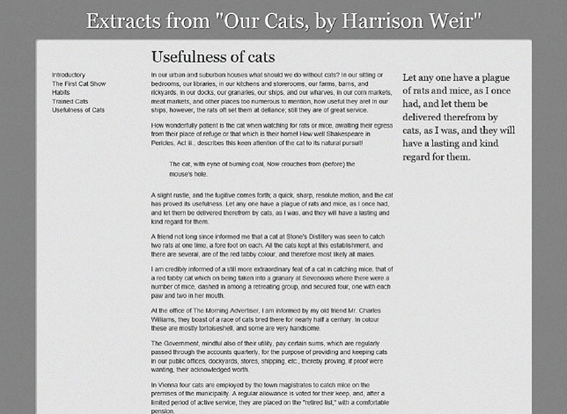
All we do is say which column and row we want to place the content into. Remember that the gutters count as columns too, so the main column is actually column 3 and the right column is column 5.
The simple grid layout example.
When trying to understand grids I have found it useful to visualise the process as creating an old-fashioned table for layout, except doing it in CSS. I then place my items inside the table cells. However, unlike tables for layout, by defining the grid in the CSS we are free to redefine it to suit the environment in which the content is displayed. This means that grids can be a powerful tool in the future of responsive design.
I’m now going to take a look at a slightly more complex, and probably more realistic example to demonstrate how grid layout can be used for responsive design.
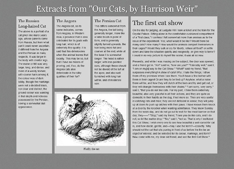
My document is very simple: a div with a class of wrapper; then five sections marked up with a class of box containing some information; and an image from our Victorian book about cats. For simplicity, I have added a second class so that I can easily target each content area with CSS.
<h1 class="title">Extracts from "Our Cats, by Harrison Weir"</h1>
<div class="wrapper">
<div class="box content1">
<h2>The first cat show</h2>
<p> …</p>
</div>
<div class="box content2">
<h3>The Angora</h3>
<p>… </p>
</div>
<div class="box content3">
<h3>The Persian Cat</h3>
<p>… </p>
</div>
<div class="box content4">
<h3>The Russian Long-haired Cat</h3>
<p>...</p>
</div>
<div class="box picturebox">
<figure>
<img src="fluffy.jpg" alt="Fluffy the cat" />
<figcaption>Fluffy, the cat</figcaption>
</figure>
</div>
</div>
With just some basic CSS for styling, we end up with a linearised design as shown in the figure below.
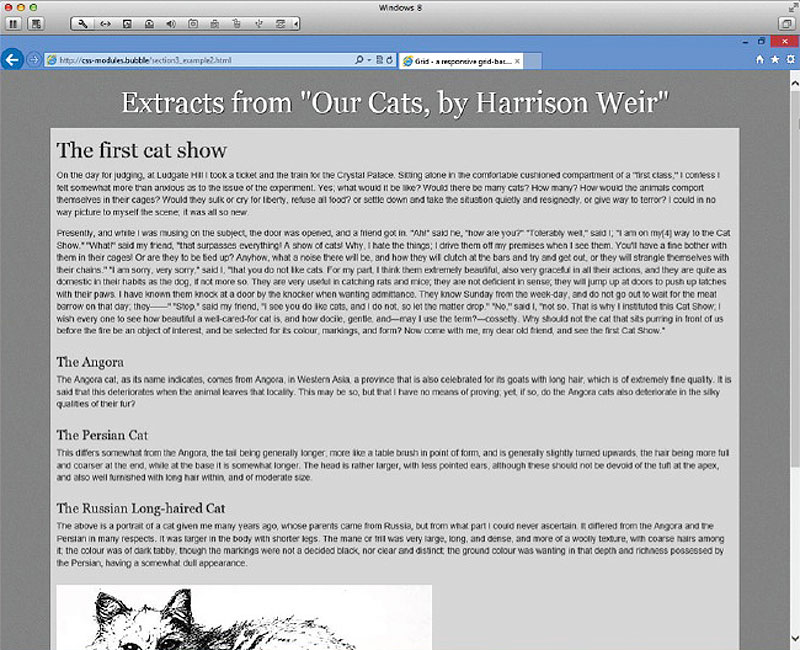
Our starting point.
We now need to declare our grid, and I’ll do this by adding to the properties for .wrapper.
.wrapper {
width: 90%;
margin: 0 auto 0 auto;
display: -ms-grid;
-ms-grid-columns: 1fr (4.25fr 1fr)[6];
-ms-grid-rows: (auto 20px)[4];
}
I have set display to -ms-grid, declaring this element contains a grid layout. I have set up my columns using a shorthand syntax for multiple columns. By putting a set of columns in round brackets followed by a number in square brackets, we say that we want to repeat this column pattern n times; in this case, I want these two columns to be repeated six times. I use the concept of fractions to create a flexible grid. The gutters between my columns are to be 1 fraction unit; the columns themselves 4.25 fraction units.
I then use the same syntax for rows, creating a row that will expand to fit the content followed by a 20-pixel gap between rows four times.
If you refresh your page after adding this CSS you will find that the entire column has collapsed. This is because everything is now trying to fit into row 1, column 1 as we haven’t provided any positioning information. Once you have declared a grid on an element, all of its child elements need to be placed on the grid.
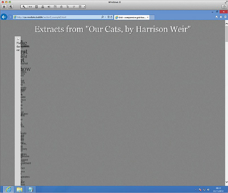
After declaring a grid on a parent element all child elements will display in row 1, column 1.
I’m going to start by positioning my elements as I want them to display for narrower screen sizes. As people using such devices are likely to be reading from the top down, I’m going to display things pretty much in the order they are in the source – which I have structured in terms of content priority for screen readers. In this new world of separated source and layout I don’t need to worry about where things are in the source, as we will see.
.content1 {
-ms-grid-row: 1;
-ms-grid-column: 2;
-ms-grid-column-span:12;
}
.content2 {
-ms-grid-row:3;
-ms-grid-column: 2;
-ms-grid-column-span:5;
}
.content3 {
-ms-grid-row:3;
-ms-grid-column:8;
-ms-grid-column-span:6;
}
.content4 {
-ms-grid-row:7;
-ms-grid-column: 2;
-ms-grid-column-span:12;
}
.picturebox {
-ms-grid-row:5;
-ms-grid-column: 2;
-ms-grid-column-span:12;
}
This all looks fairly straightforward. I now choose which row I want to put my items into – remember that the 20-pixel gaps are rows, so we should place items into the odd-numbered rows. I then set the starting column for each area and set how many columns it should span. Most of my boxes are full-width, but I have split content2 and content3 into two columns. This now displays in the browser as a simple layout.
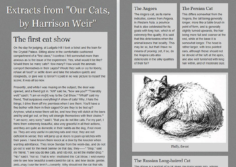
The layout on narrower screens.
I am now going to add my first media query, and make some changes to the layout once the browser window reaches 700 pixels wide.
@media only screen and (min-width: 700px) {
.wrapper {
-ms-grid-columns: 1fr (4.25fr 1fr)[9];
-ms-grid-rows: (auto 20px)[5];
}
.content1 {
-ms-grid-row: 1;
-ms-grid-column: 2;
-ms-grid-column-span:17;
}
.content2 {
-ms-grid-row:3;
-ms-grid-column:8;
-ms-grid-column-span:5;
}
.content3 {
-ms-grid-row:3;
-ms-grid-column:14;
-ms-grid-column-span:5;
}
.content4 {
-ms-grid-row:3;
-ms-grid-column: 2;
-ms-grid-row-span: 3;
-ms-grid-column-span:5;
}
.picturebox {
-ms-grid-row:5;
-ms-grid-column: 8;
-ms-grid-column-span:11;
}
}
For this wider layout, I have redefined my grid to have more columns and an additional row. My first content area remains at full-width at the top of the layout. However, I have now split the other content into three columns, making one of them span across two rows, the other two becoming half–height, and dropping the image in below them spanning both areas.

The more complex layout for screens wider than 700 pixels.
Finally, I can rearrange my content again for wider screens with a media query that kicks in at 940 pixels wide.
@media only screen and (min-width: 940px) {
.wrapper {
-ms-grid-columns: 1fr (4.25fr 1fr)[16];
-ms-grid-rows: (auto 20px)[3];
}
.content1 {
-ms-grid-row:1;
-ms-grid-row-span: 3;
-ms-grid-column: 20;
-ms-grid-column-span:13;
}
.content4, .content2, .content3 {
-ms-grid-row:1;
}
.picturebox {
-ms-grid-row:3;
}
}
I have redefined the grid again, this time ending up with a pretty standard grid based on the 960 grid system. I can then move my content area to create a layout with three narrow columns, one wider column and the image sat under two of the narrower columns.
The wider screen layout.
The real beauty of this module is the ease with which we can shift content around in the layout without changing the source markup. I also think the syntax of this module is pretty easy to understand once you have grasped the model – certainly for old-school folk like me who remember using tables for layout!
As already explained, this module has currently only been implemented in IE10, since the specification itself was proposed by Microsoft. If you are developing Windows apps you may already be able to use it in that context, though I really hope we’ll see implementations in other browsers soon.