Taking a group of items and spacing them along an axis is a task that has traditionally been rather difficult in web design. Floated elements need a width, yet each one might be a different width and getting them all to fit on a single line with equal spacing usually involves some JavaScript.
Flexbox makes this task easy. In my markup I have a list that contains my navigation..
<nav class="mainnav">
<ul>
<li><a href="">Introductory</a></li>
<li><a href="">The First Cat Show</a></li>
<li><a href="">Habits</a></li>
<li><a href="">Trained Cats</a></li>
<li><a href="">Usefulness of Cats</a></li>
</ul>
</nav>
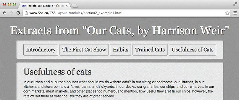
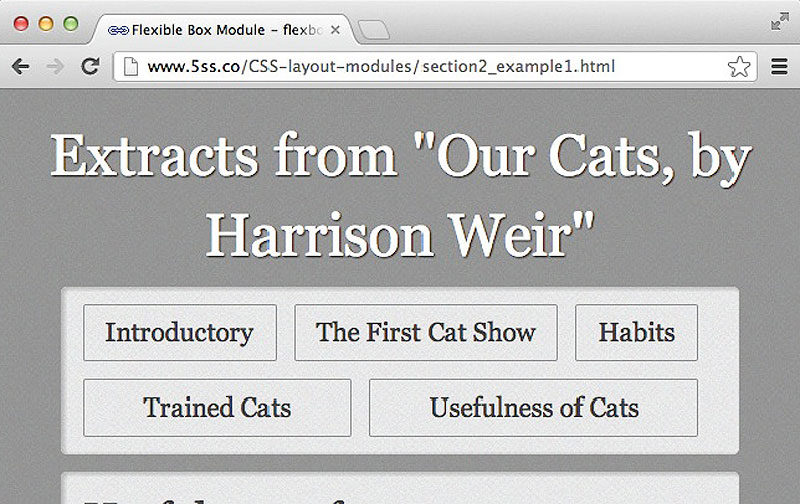
I would like these items to be spaced evenly as horizontal navigation. Using flexbox, this is as simple as setting them to display:flex and deciding whether I want space around or between the elements.
nav ul{
margin: 0;
padding: 0;
list-style: none;
display: flex;
justify-content: space-between;
}
The navigation as a row with equal space between each item.
Had we set the value of justify-content to space-around then the space would have been added all around each element equally, meaning that instead of being flush to the outside edges of the container, there would be some space before the first and after the last element.
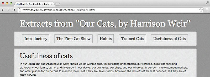
The navigation as a row with equal space around each item.
The simple example above uses some default behaviour of flexbox. The items here have been displayed as a row. This is the default behaviour and is equivalent to setting the property flex-direction to row.
The flex-direction property can have one of four values: row; row-reverse; column; and column-reverse. These enable you to display the items in a row, or reverse their order in a row; and similarly in a column, or a column with the order reversed.
nav ul{
margin: 0;
padding: 0;
list-style: none;
display: flex;
justify-content: space-between;
flex-direction: row-reverse;
}
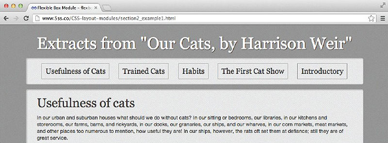
Using flex-direction:row-reverse to display the items in reverse order.
Another interesting aspect of flexbox is that it enables you to create equal height boxes, even if the content of some boxes is longer than others. The default value of the property align-items is stretch. This stretches each item in the group to the height of the tallest. You can see this in action in our navigation if we make the window narrower, so some items wrap on to two lines. The borders of all items remain the same height.
Items in the group all take the height of the tallest item.
The property align-items can also take the following values:
flex-startflex-endcenterbaselinestretchTo understand how these work you need to realise that flexbox has a concept of two axes: the main axis, along which items flow; and the cross-axis. By setting flex-direction to row or column you determine your main axis and whether that flows left or right, up or down; the secondary, or cross-axis, then runs across it.
If the flex-direction is row then your main axis runs left to right. Setting align-items to flex-end means they will not take on the full height and shorter items will be aligned to the bottom of the box.

Our example with the align-items property given a value of flex-end
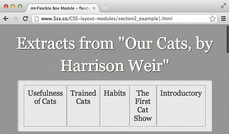
In the example we have been working with, if we make the viewport narrower, then the text in the items wraps. Ultimately, however, we will run out of room and the box will become wider than the available area. One way to deal with this is to set the items inside our flexbox element to wrap.
Whether or not items are allowed to wrap is decided by the flex-wrap property, which can take values of wrap, nowrap and wrap-reverse. The default, if you do not set a value for flex-wrap, is nowrap.
nav ul{
margin: 0;
padding: 0;
list-style: none;
display: flex;
justify-content: space-between;
align-items: stretch;
flex-direction: row-reverse;
flex-wrap: wrap;
}

The items wrap if we add flex-wrap:wrap to the container
You can see now, though, that the spacing between items is less desirable. You can fix this by getting the elements themselves so stretch and fill some space. We can do that by setting the property flex to auto on the items themselves – in this case I add this property to the li element.
nav li {
border: 1px solid #999;
border-radius: 2px;
flex:auto;
margin: 0 1em 1em 0;
text-align: center;
}
The elements wrap on to two lines and take up all of the space.
Setting the value of flex to auto on an item makes the items fit nicely within a space, but there are other ways to use this property.
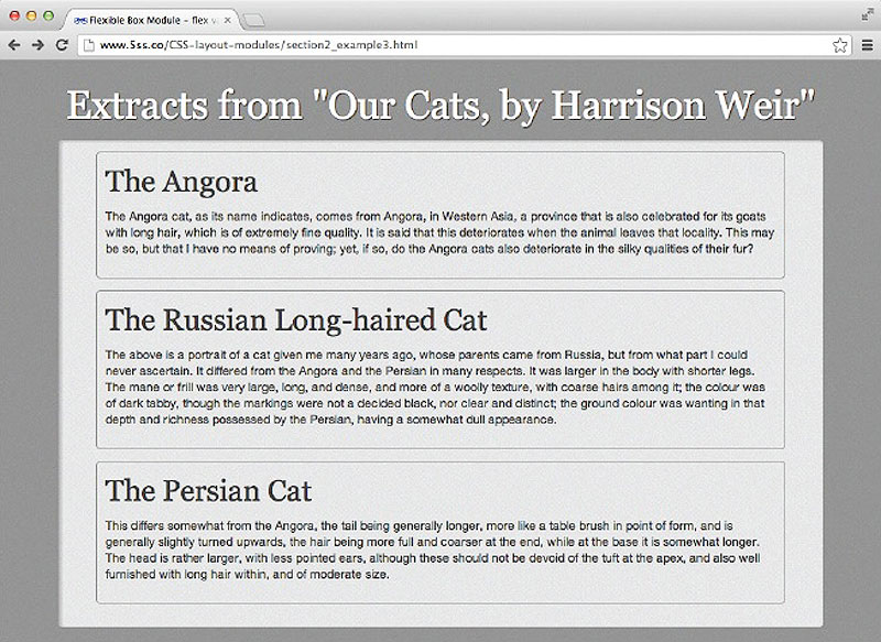
In this example I have three boxes containing information about long-haired cat breeds. These are marked up with a class of box, and I have also added a class to identify each box individually.
<div class="boxes">
<div class="box box1">
<h2>The Angora</h2>
<p>… </p>
</div>
<div class="box box2">
<h2>The Persian Cat</h2>
<p>… </p>
</div>
<div class="box box3">
<h2>The Russian Long-haired Cat</h2>
<p>… </p>
</div>
</div>
To display these boxes in a row I am going to make the container – boxes – a flex element and then to each box inside I will assign a value to the flex property of 1. This gives each box an equal width within the space.
.boxes {
display: flex;
flex-direction: row;
flex-wrap: wrap;
align-items: stretch;
justify-content: space-between;
}
.box {
border: 1px solid #999;
border-radius: 5px;
flex: 1;
margin: 0 1em 1em 1em;
padding: 10px;
}
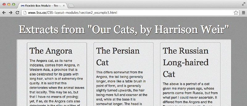
The three boxes are of equal width within the container.
We might want one of the boxes to take up more space than the others, but still have the width calculated according to the available space. The third box in the markup has a class of box3. If I give box3 a flex value of 2 it will now take up twice as much space as boxes that are set to flex:1.
.box3 { flex: 2; }
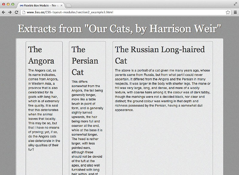
The third box takes up twice the width of the other boxes.
We have already seen that it is possible to reverse the order in which items are shown. You can also target individual items and set an order for them with the order property.
By giving each of my items an order property I can easily move box3, the wider box, to the centre, by giving it a value of 2.
.box1 { order: 1; }
.box2 { order: 3; }
.box3 {
flex: 2;
order: 2;
}
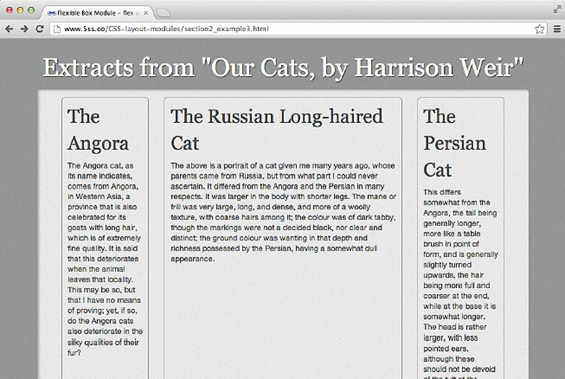
Using the order property to change the order of our items.
The items remain exactly as they were in the HTML. This means you can order your markup so it makes sense in terms of accessibility and how it would be read out by a text-to-speech device. You can then use the order property to create a visual layout that works best.
Flexbox is a great addition to our toolkit when we create responsive designs. Being able to wrap rows and flex items to fit the available space means that with very little effort simple designs can be responsive.
Once you start to mix flexbox with media queries you can achieve far more complex layouts. Being able to display items independently of source order makes creating a different arrangement of elements for different screen sizes possible. You can also easily switch flex-direction as shown in the example below. We can display our navigation as a column until we get to a width of 700 pixels, at which point we switch to displaying it as a row.
nav ul{
margin: 0;
padding: 0;
list-style: none;
display: flex;
flex-direction: column;
justify-content: space-between;
align-items: stretch;
}
@media only screen and (min-width: 700px) {
nav ul {
flex-direction: row;
}
}
Flexbox is a good example of how specifications in their early stages can change. There is a lot of out-of-date information about flexbox available because the implementation has changed so much from the initial proposal. When searching for more information on flexbox, take note of this CSS Tricks article on how to check if the advice you are reading is current.
While it would be possible to polyfill a lot of the flexbox functionality using JavaScript, you may also find that you can allow browsers to fall back to a linear state if they do not support flexbox. For example, our three boxes display as in the figure below in a non-supporting browser.
Flexbox items linearized in a browser with no flexbox support.
Falling back to a linearised display is easier if you are just using the module for small interface elements rather than your entire layout. Another possibility would be to use Modernizr to detect flexbox support and fork your CSS with flexbox and non-flexbox alternatives.