PREFACE Drawing Humans
WHILE FANTASY MONSTERS AND MAGIC TURNIPS ARE ALL WELL AND GOOD, MOST PEOPLE WILL WANT THEIR STORIES TO CENTER AROUND MORE HUMANLIKE CREATURES. WE FIND IT EASY TO RELATE TO HUMANS BECAUSE WE KNOW THEM BEST.
HUMANS ARE A FANTASTIC TOOL FOR VISUAL STORYTELLING BECAUSE WE CAN TELL AT A GLANCE WHAT A FACIAL EXPRESSION OR GESTURE IS TRYING TO CONVEY. THIS ALLOWS YOU, AS THE ARTIST, TO TELL A STORY WITH ONLY A FEW SUBTLE TOUCHES.
ONE PROBLEM THAT DRAWING CREATURES BASED ON HUMAN BEINGS PRESENTS IS THAT WE KNOW HUMANS SO WELL. WE SEE THEM EVERY DAY. IF SOMETHING IS JUST A LITTLE BIT OFF, YOU'LL BE ABLE TO SPOT IT AT A GLANCE. WITH ENOUGH PRACTICE DRAWING THE FORM, YOU WILL LEARN HOW TO FIX THESE PROBLEMS. AS YOU PRACTICE, STICK TO A VERY REGULAR AND MEASURED SET OF PROPORTIONS AND USE A LOOSE SKELETON UNDERNEATH YOUR DRAWINGS TO GET IT RIGHT.
THE SAME TECHNIQUE WILL WORK FOR FANTASY CREATURES BASED ON HUMANS. EVEN THOUGH, AS FANTASY CREATURES, YOU CAN DRAW THEM HOWEVER YOU WISH, IT HELPS TO KNOW HOW TO DRAW BASIC HUMAN FORMS SO THAT THE HUMAN ASPECTS OF YOUR CREATURES LOOK BELIEVABLE. THE FOLLOWING PAGES CONTAIN SOME BASIC TECHNIQUES FOR MASTERING THE HUMAN PARTS OF YOUR FANTASY RACES.
BASIC SHAPES
First things first. Before you can dive into drawing beautiful beasts, you need to arm yourself with some drawing basics. The easiest way to think about drawing anything is to think of everything as shapes. Anything you would ever want to draw — tables, chairs, flowers or unicorns — consists of simple shapes.
BASIC SHAPES LEAD TO FANTASTIC CHARACTERS
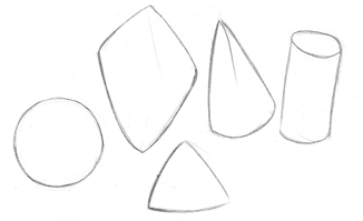
Practice drawing these simple shapes before moving on to more complicated forms.
DRAWING ANY CREATURE BEGINS WITH BASIC SHAPES

Every creature you'll learn about in the pages to follow will begin with simple shapes such as these.
TOOLS YOU NEED
The wonderful thing about drawing is that you really don't need much — your own imagination is the most important thing. To get what's in your head down on paper, though, you will need:
some pencils
a pencil sharpener
a kneaded eraser
paper
That's all that's required to propel yourself into fantasy creature creation readiness!
SHADING AND 3-D EFFECTS
Fantasy characters appear more realistic when you draw them to look three-dimensional. It isn't as hard as it sounds. You just have to pay attention to darks and lights and how they affect your creature.
Consider first where the light is coming from. This is called the light source. Where the light source hits your dragon or other object is the lightest spot, called the highlight. The rest of your creature will likely be in some stage of shadow. As you develop your skills at shading the shadow areas, your creatures will begin to take on new life.
PRACTICE ON SIMPLE SHAPES

Polygons (shapes with three or more sides) will often have one side facing the light source. This side will be considerably lighter then those angled in a different direction. Sides that are completely cut off from the light will be very dark, giving you a harsh edge.
With round objects there is no clear definition of where things get cut off from direct light. The answer to this problem is fairly simple: Because there's a gradual cutoff from the light, you will have gradual shadow with no harsh edges. Figure out where your light is hitting directly, and as things move farther away from that point of light, they should get darker.
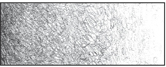
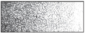
SIMPLE PENCIL TECHNIQUES FOR SHADING
1 Scribble — Swirl your pencil in overlapping circles.
2 Stipple — Place dots close together or far apart.

3 Crosshatching — Lay hatch marks, one over the other.
4 Hatching — Place short lines close together or far apart.
BE AWARE OF THE LIGHT SOURCE
As cool as fantasy characters are, they remain solid, tangible objects that follow the same laws as everything else when it comes to light source. Lighting that comes from a single direction will yield highlights on the surfaces that it hits, and shadows on the areas blocked off from the rays.
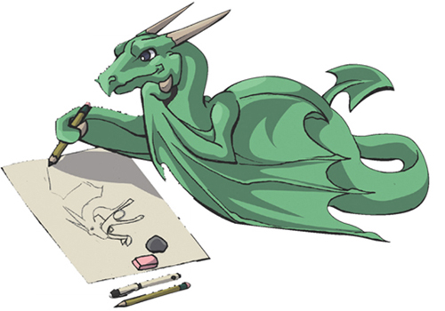
PENCILING AND INKING
You may want to keep your pencil lines very soft and natural looking, and just paint right on top of them, so in the end you have no linework at all. Inking your drawing is an equally interesting approach. An inked drawing makes your character very crisp and clean, and will make coloring much easier later on, as you've already begun defining your character. Inking also makes line cleanup easy. Just draw all your construction lines in pencil, then do your finals in ink. When you're finished, go back in with an eraser and rub it over the entire drawing, leaving only the final ink lines behind.
A ballpoint pen will give you a finer, more varied ink line than markers, but watch for smudging! Some ballpoint pens leave unequal amounts of ink in a line, causing much grief later on. Markers are not always the best solution either because they are very susceptible to bleeding. Many art stores carry disposable technical pens that are ideal for starting out with inks. They are fairly cheap, come in different colors and are easy to use.
PENCIL

Pencil lines are light and easy to cover with ink or paint. If you would like your pencil lines to show, you can use a mechanical pencil to tighten up your linework. Then, you can take it into your favorite computer program and color it. If you leave your pencil drawing as is, you can easily shade it with a variety of soft and hard leads.
BALLPOINT PEN
Ballpoint is nice because it's possible to do very light lines and shade as well. You can achieve delicate linework that is difficult to achieve with other inking tools. Compared to a pencil, though, erasing is difficult.
TECHNICAL PEN
Technical pens create very thin, sharp lines, perfect for comic books. Shading with liquid ink involves a series of line widths, hatching, stippling and crosshatching. It's not possible to get a series of greys with the ink itself, because it will always come out black. Use a Micron pen if you want a clean unshaded drawing, or a drawing that's shaded using line-work with a lot of character.
BRUSHPEN
A brushpen allows you to create thick and thin organic lines. Your lines will never be as delicate or exact as those done with ballpoint or technical pens, but you can achieve a lot of character and inking speed with a brushpen.
COLORING
You can take several different approaches to color as you plan out your characters. Color combined with lighting sets the mood for any image. Desaturated colors and earth tones will give you a soft, natural-looking image. If you place some vibrant colors against mostly neutral colors, those vibrant colors will seem very bright, almost glowing. Vibrant colors set against a neonlike setting won't stand out as much. If you want your characters to really pop out from the page, color them just a touch more boldly than the background. Making good color choices will make your characters look believable. For instance, orange with pink and green polka dots may not be a great choice for a vampire's skin.
THE COLOR WHEEL

The color wheel is a great tool to help you plan out your character's color scheme. The primary colors are red, yellow and blue. The secondary colors are orange, green and purple. Complementary colors sit across from each other and analogous colors sit next to each other.
COLOR CHAOS
You can paint your character with a rainbow of colors, picking out the ones you like best and seeing where it goes. You don't have to follow a specific coloring strategy if you don't want to, but if you find your image isn't coming together how you would like, thinking ahead and using coloring strategy may be beneficial.
ANALOGOUS COLORS
Analogous colors, or families of colors, are colors that are next to each other on the color wheel. In this case, shades of red-orange, orange, and yellow-orange were used to color the image. This allows for more variety of color than a monochromatic image while still having your colors feel largely the same.
MONOCHROMATIC COLORS
A simple way to bring an image together is to use monochromatic colors. That is, you use varying shades and intensities of the same color. The colors will look like they belong together, because they are all the same hue. You can bring in little bits of other colors here and there for variety.
DESATURATED COLORS
Not all colors need to be bright. Just because your character's hair is pink doesn't mean it needs to be the pinkest pink available. Toning down all your colors will give you a more natural image and may help avoid rainbow chaos.
PERSPECTIVE AND OVERLAP
Overlap is a great tool for creating perspective, the illusion of space, and is arguably one of the more important aspects to creating drawings full of depth. When you draw one object or part of an object overlapping another, the object in front automatically looks closer while the one in the back looks farther away.
You can use overlapping objects to create a sense of perspective not only in individual characters but also in entire scenes. Draw a mountain, then a house overlapping it followed by a orc overlapping the house and you've got a foreground, middle ground and background. Once those are clearly defined, you've got a believable drawing.
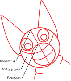
OVERLAPPING DEFINES YOUR SPACE
Overlapping shapes help clearly define your foreground, middle ground and background and give friendly dragons like these a clear sense of solidity.

NO PERSPECTIVE OR OVERLAP
Without any overlap or perspective, it is difficult to get an idea of the scale of things. It is also difficult to think of the object as existing within a space. It's lost, floating on the paper.

OVERLAP GIVES A SENSE OF ORDER AND GROUND
Overlap provides a sense of space. The brain registers that one object must be in front of the other.

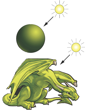
OVERLAP PLUS SIZE VARIATION PROVIDE MORE PERSPECTIVE
The green dragon is smaller than the brown. When we see it though, we don't think he's actually smaller then the brown. We just assume he's farther back in the space that they share.
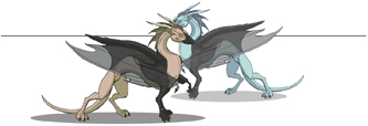
OVERLAP PLUS SIZE VARIATION PLUS ATMOSPHERE EQUALS PERSPECTIVE TO THE MAX!
Atmospheric perspective means that things that are closer appear brighter, have greater contrast and look more in focus. As they recede, all these effects fade. Using all three perspective techniques gives the viewer a good sense of depth.
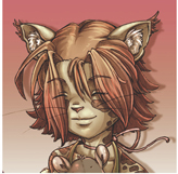
HUMAN CHARACTERISTICS

Drawing the human body can be frustrating at first. Because we see people every single day, our eyes know what the body looks like. Then, when we draw bodies, tiny mistakes or things that are slightly off jump right off the page and scream. “This is wrong! This is wrong!” Never fear. With enough practice and a few basic guidelines, you can avoid those mistakes and make drawing the human form much less painful, even fun.
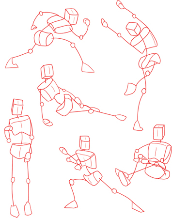
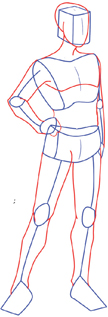
START WITH SIMPLE SHAPES
Before investing a lot of time in a pose, sketch out an extremely loose framework. Use 3-D boxes to represent the head, chest and hips to show the direction a figure is facing and the movement it's making. If your simple line-and-circle sketch isn't okay, you'll have only spent like one minute drawing out the stick and box figure. Erase that sucker and try again.
HUMAN BODY (FEMALE FOCUS)

All people share similar proportions and body constructions. Despite this, both genders have slight quirks to their forms. Here are some highlights to pay special attention to.
›1‹

Joints are less pronounced.
›2‹

Breasts sit above the rib cage. Hips pull outward from the waist, and are generally larger and more pronounced than in males.
›3‹
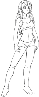
Muscles in legs and arms are subtle. Waist pulls in sharply.
›4‹

Keep the largeshadKeep the large shadows across the major forms of the body. Muscles will have very soft shadows in comparison, if they have them at all.
HUMAN BODY (MALE FOCUS)
The male body has its own set of areas that need some subtle differentiation. Here are some things to keep in mind when drawing the male form.
›1‹

Joints are more pronounced.
›2‹
The hips and waist do not have a defined bend where they meet.
›3‹
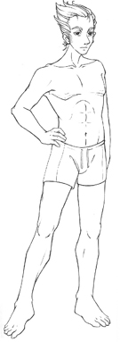
If the character is athletic, a 6-pack may be visible.
›4‹
Keep the large shadows across the major forms of the body. Muscles will have very soft shadows in comparison, if they have them at all.
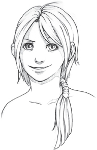
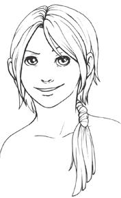
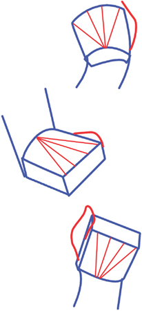
FACIAL PROPORTIONS
Except in cases of identical twins, or, still rarer, identical fauns, all faces are different. That said, most faces follow a constant set of relative measurements. Laying out basic face shapes based on these measurements before you begin the unique features of your head will help you achieve a believable, good-looking drawing.
›1‹

Start with an oval for the head.
Draw a horizontal line (eyeline) in the middle of the oval. Draw a vertical line down the middle.
›2‹
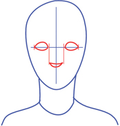
Draw eyes on the eyeline 1 eyelength from each other and just over ½ an eyelength from the edge of the face.
Draw the nose 1½ eyelengths from the eyeline.
›3‹
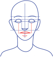
Add the mouth 1 eyelength from the bottom of the nose.
Eyebrows sit ½ an eyelength from the top of the eyes.
Ears extend from the eye-line to the noseline.
›4‹
Begin adding the quirks and features that make a character unique. Thick or thin eyebrows, a full head of hair, eye shape, lip shape, nose definition — these features will make your character an individual.
›5‹

Set the eyes back into the skull with some deep shadows. Add highlights across the face where the cheekbones jut out and shadows under the nose and lips.
FACIAL EXPRESSIONS
Your character won't just be staring blankly all the time. Humans have very recognizable facial expressions to convey their moods. The majority of these expressions are conveyed through the eyebrows and the lips.

A wide, closelipped grin with eyebrows held high will make your character look content.

A wide smile with exposed teeth and eyebrows held high gives your character a playful expression. A wink adds to this.

Show shock or surprise using a lot of white around the edges of the eyes.
For brooding anger, angling the eyebrows will convey the emotion all on their own.
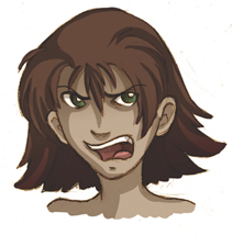
Eyebrows angled down and pulled close to the eyes show anger. Bared teeth add to this.
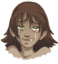
Eyebrows tilted upwards will help convey worry or sorrow. Tears help, too, but even without them this character would look distressed.

Pulling up the lip and raising an eyebrow can show confusion.
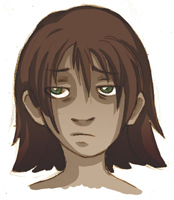
Lips pulled off to one side and eyebrows held straight or slightly quirked show boredom.
FACIAL FEATURES
The face has several key structures, which, though tiny, are important to get right so that your person looks like a person and not a monkey. Monkeys are nice and all, but I rather fear that if too many are created, they will take over. You don't want a monkey invasion, do you? Of course you do, but I'm afraid I'll have to stop you by showing you some easy ways to break down the human face. Take that, monkey horde!
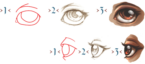
EYES
1 Eyes are perfectly round, but the eyelids create an oval shape. Leave space between the two when doing side views.
2 Irises are also circular, but are partially hidden by the eyelids unless the character is frightened. Then the entire iris is visible.
3 Since eyes sit back in the head, they are usually in shadow. Color eyes an off-white and you'll be pleased with the results!
NOSES

1 There is usually a ball shape on the end of the nose. This shape is mainly used in your construction lines, and most likely will not be visible in your final linework. As you render your drawing, hints of this underlying shape will come out. Draw tear-shapes with small curves for nostrils.
2 Shading your nose will help define it. The nose sticks out from the rest of the face. Shadows will be visible on one side of the nose if light is hitting the face from the side, and typically there will be shadows underneath as well. Soften out those harsh lines.
3 The center line and tip of the nose will often have the brightest highlights. Don't make any of the highlights exceptionally bright, or the face will look greasy!

CLOSED MOUTHS
Define closed mouths with one harsh line where the lips meet. Add shading underneath the lower lip to pop it out rather than drawing a harsh line around the shape.

TOOTHY SMILES
Make the teeth one solid shape to simplify unless those teeth are really important for your character (like a goblin). If you decide to draw the shape of each tooth, the shading on them should be extremely subtle. It's easy to end up with a dirty looking mouth.

OPEN MOUTHS
If you are working on a larger drawing, it's especially important to remember the details. When your character opens her mouth, you do not want a big red blob on the inside. The interior of the mouth contains very specific features — the upper and lower teeth, tongue, and even walls (you know, the inside of the cheek!). Don't overlook these small details in your rush to finish.
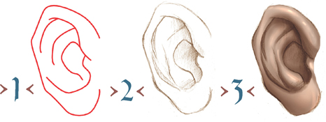
EARS
The ear is an oval shape with many delicate shapes within that give it its complex appearance. The outer edge of the ear has a raised rim to it, and the interior has a raised piece of cartilage that echoes the shape of the ear on the inside. Shading in the innermost circle of the ear helps to set it back. The lobe of the ear is not recessed at all, so it will often be the brightest part of the ear.
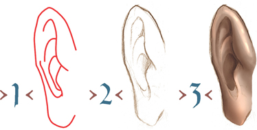
EARS, THREE-QUARTER VIEW
When drawing the ear from a three-quarter view, you must take into account the perspective from which you are viewing it. Because the part of the ear connected to the head is closer to you than the area that sticks out farthest, it will appear to have a thick rim that gets thinner as it recedes into space.
HAIR
Different hairstyles and effects are sometimes tricky. No matter what hair style you're drawing, do not draw each individual strand of hair; instead, start with its basic shape, then add strands for detail. Here are some different do's you might consider.

THE BUN
Draw a dot on top of your character's head. Around this dot, draw shapes that pull out, around, and back into it. This dot is the center of your bun. Add lines that follow the shape of the hair as it pulls out of and back into the center. If your character's hair is a bit messier, add some fly-away chunks. When hair is pulled into a bun, it becomes a rounder, larger object and will thus cast larger, more defined shadows. The underside of the bun will often have a shadow running along it. Don't get caught up in shading each and every strand of hair. Concentrate on large areas of shadow and highlight to get the point across.
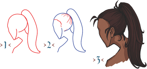
THE PONYTAIL
The ponytail can be placed high or low on the head. Add curved lines to show direction, remembering that the hair is being pulled around the skull to that center point where the ponytail is pulled tight. There will generally be a small ring of shadow along this center point as well.
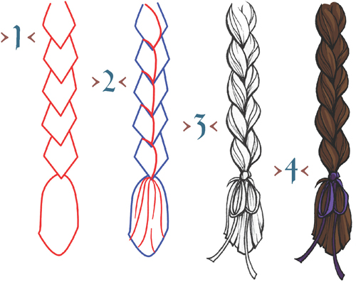
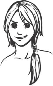
THE BRAID
The braid is a repeating pattern of interwoven chunks of hair. Begin simple. Draw interlocking, overlapping diamond shapes for the basic layout. Down the center of each diamond, draw a curved line that wraps diagonally and meets up with the next point in the one below it. Add lines that curve around the shape of each knot for dimension. When shading a braid, keep in mind which direction the light is coming from. If it's a light source to the upper right, your shadows will fall along the lower left of each segment of the braid.

LAYERED VS. STRAIGHT HAIR
Hair lines will rarely be perfectly straight. When drawing even “straight” hair, use large, subtle curves. Even with hair the same length you can get a lot of variation based on the cut alone. Consider whether you'd like your character to have even or layered hair. When drawing layered hair, decide whether you would like it to be layered all over, or cut to frame the face. When shading a layered hairstyle, the irregular chunks of hair will cause the highlights and shadows to be broken up.
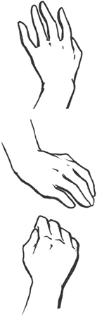
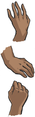
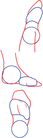
HANDS
Human hands are incredibly intricate, with twenty-seven bones packed into a very tiny space. This makes them a bit of a challenge to draw. But, with some breakdown and simplification, they become something that's second nature. Remember, you have easy reference “at hand.” (*groan*)
›1‹

Use a box to represent the palm. Because boxes are easy to draw in perspective, this will give you a good base to work from no matter what position you would like the hand to be in.
›2‹
Add the thumb. From the point where the box meets the wrist, draw 4 lines branching out in a radius, evenly spaced if seen from head on. If the box goes back into space because of perspective, take this into account. This even spacing now gives you good reference for step 3.
›3‹

Fingers have 3 sections, but it's possible to draw them in 2. Using lines you drew as a guide, add fingers. The tips and bends of the finger will form an arc of sorts, with the middle and ring fingers longer then the pointer and little fingers.
›4‹
Nail out your final linework and erase any additional construction lines. Add indications of knuckles.
›5‹
Use a common light source on all areas of the hand. If the light is coming from the upper right, each and every finger will have a shadow along its lower left. The exception to this rule is if the hand is somehow directly in front of or behind a light source, in which case the light will evenly bend around it.
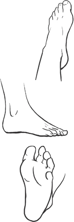
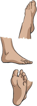
FEET
Feet are often overlooked, covered by shoes, boots or the surrounding foliage. Feet are just as intricate as hands, and it's important to have a believable, solid base for your character to stand on.
›1‹

Simple shapes create a front half and a heel.
›2‹
Feet slope downward from the ankle. There may be an indication of the ankle itself or overlap where the foot curves around.
›3‹
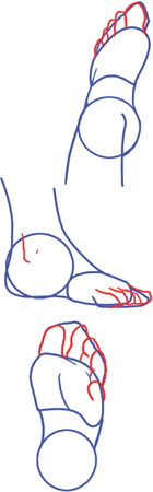
Toes sit in an evenly spaced arc with each toe simplified into two bends — one where it meets the foot, and one inside the toe itself. The big toe is… well… bigger than the rest!
›4‹
Erase your construction lines and place the details such as toenails and lines to show overlap and folding.
›5‹
Add shadows and highlight, conforming to the shapes within the form. Curve shadows around the ball of a foot, showing its rounded nature. Shadows will be particularly dark where one toe touches against another, keeping out most of the light and creating a “line.”