Chapter 11
Convert Prospects into Leads
The previous chapter talked about calls-to-action that convert untargeted traffic. This chapter talks about how to use specialized web pages (landing pages) to convert high percentages of more targeted traffic that is driven through programs, such as e-mail marketing or pay-per-click (PPC) campaigns.
You can use landing pages to channel recipients of your individual outreach programs. For example, if your e-mail newsletter has a link in it about biotech patent law, it is much better to have the link go to a page built solely around biotech patent law with an offer and form on it, rather than your home page or a generic page about patent law that touches on industries other than biotech. The same holds true for corresponding with your list through Twitter, LinkedIn Groups, and SMS (text) updates, among others. (It is time we all started thinking beyond e-mail as the only vehicle for communicating with our marketing database.)
You can also use landing pages to build specific content for search traffic, specifically pay per click or Google AdWords. If you want to get more value out of the money you're spending on AdWords, then you should send AdWords traffic to a specific landing page on the topic of the ad you are buying rather than sending them to your generic home page. You can increase conversion rates and return on investment (ROI) by several times by making PPC landing pages extremely relevant.
Landing Page Best Practices
The landing page is the final step in converting a visitor to a lead. It's where the visitor ultimately decides whether to proceed with the transaction of trading his or her contact information for the information being offered. A good landing page can convert 50 percent of its visitors into qualified leads while a poor one will convert less than 1 percent. Using landing page best practices can dramatically improve your conversion rates and lower your cost per lead. Some best practices for landing pages are described next.
Matching
It's important that you match the content on your landing page with the content on your call-to-action as precisely as possible. Amazon's landing pages are great examples on how to do this. If you search Google for “Clayton Christensen book,” Amazon's Google listing brings you to the following page with Christensen's best-selling book on it (see Figure 11.1).

Figure 11.1 Screen Shot of Amazon.com's Page for Clayton Christensen's Book
Building Trust
In order to increase ROI, your landing page should project a professional image, including professional design, well-written copy, and other factors. A poorly designed page or dubious product claims may raise concerns in your visitor's mind about providing information to your company. Your landing page should efficiently and quickly convey value and show that your company is reputable and trustworthy. Figure 11.2 is an example of a page that might not convey the level of trust required to convert a visitor into a lead.
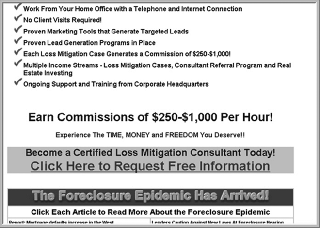
Figure 11.2 Untrustworthy Landing Page
Go Naked
Your landing page has one function only: to get people to fill out your form! Landing page best practices indicate that reducing the number of offers on the page and removing potentially distracting navigation to other sections of your website will increase ROI. Why is that? Because removing all this extraneous “stuff” gives people no other option except to fill out the form (see Figure 11.3). You have spent money and effort in order to convince a visitor to land on the most targeted page you have, relative to what that person is interested in, so don't give them an opportunity (or worse, enticement) to leave the landing page and go somewhere less targeted on your site.
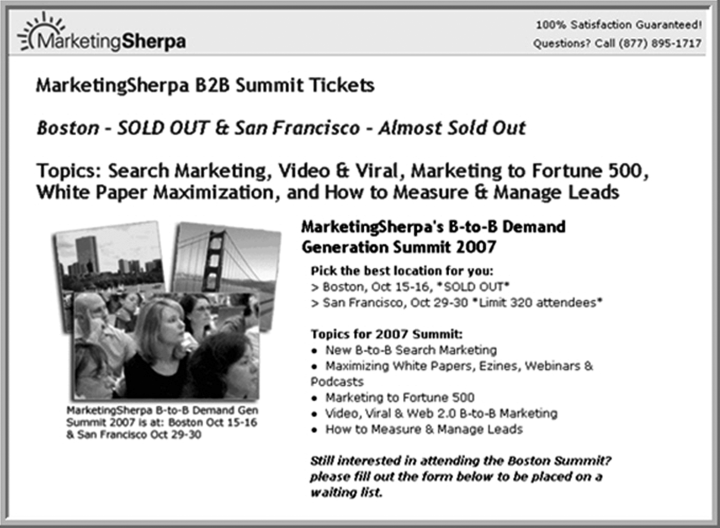
Figure 11.3 Screen Shot of Landing Page without Navigation
Graphics Matter
Including lots of images on a standard web page can work against you because images don't help improve your Google rankings (remember, the search engine spider can't “read” images). In the case of landing pages, SEO isn't your main priority, so this is one place where eye-popping graphics can really work. (See Figure 11.4.) Just make sure you don't overdo it so that it becomes a distraction from the main goal. You need to test your landing pages to figure out what maximizes conversions.
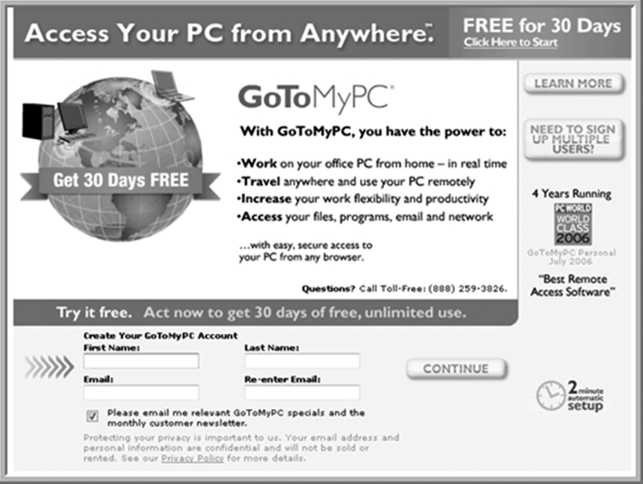
Figure 11.4 Screen Shot of Landing Page with Eye-Popping Graphics
Keep It Simple
You've drawn a visitor to a page where the single option available is to provide you with the information you need to convert him or her to a lead. (See Figure 11.5.) Now is not the time to bombard this person with more options or additional information to read. If you decide that you need any explanatory text, keep it very short; a bulleted list is a good model.
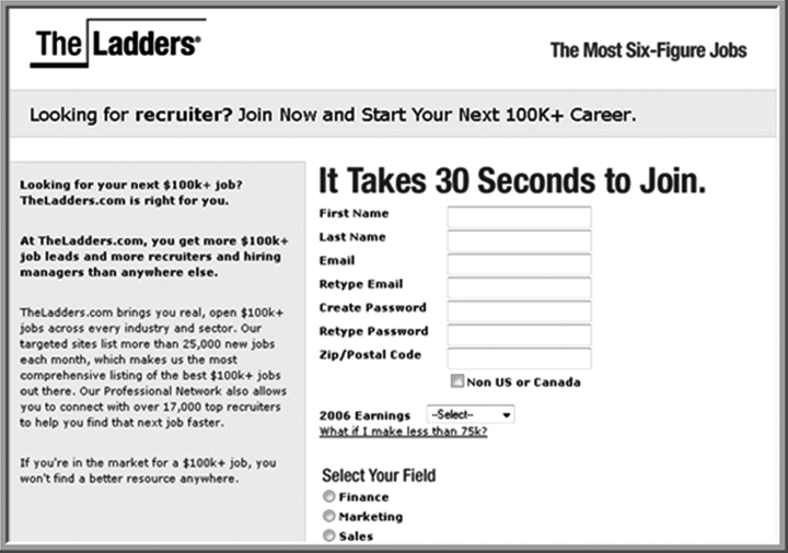
Figure 11.5 Screen Shot of Simple Landing Page
In order to maximize your prospect-to-lead conversion percentage, it's important that you test multiple landing page designs with different language, content length, images, and so on. As with testing calls-to-action that we discussed in Chapter 10, you'll be surprised at the conversion rate differences between small changes in your landing pages. In order to do those tests, we recommend you have your site set up so that you (not your IT person) can easily make changes and run tests on your landing pages with conversion rate metrics. Using the best practices we've outlined here and experimenting with them can dramatically improve your visitor-to-lead conversion rates on your forms.
Creating Functional Forms
Once your visitors have clicked through from an e-mail, pay-per-click ad, or e-newsletter, you want them to come to a landing page with a form on it, versus a landing page with a link to an e-mail address on it. If you give them a link to an e-mail address, they might send you an e-mail, but you'll then have to remember to manually add this name to your database. Instead, use software that will permanently capture lead information for use down the road. Every person who fills out a call-to-action on your site should be permanently captured and nurtured.
Short
Although it's tempting to ask your prospect a lot of questions, visitors are much more likely to ignore long forms or to abandon them before completing the process. Keep your forms simple and short by asking only the most important questions, such as name and e-mail address, and if the person is in the market for your product or services. (This will help you weed out those people who are downloading your information for other reasons, such as writing blog posts, trade publication articles, or white papers, or because they are your competition!) Your sales organization will want you to ask for more information, but you need to be very careful to balance the number of questions with conversion ratios. We recommend you keep the form short and then gather more information (e.g., addresses) as you move along in the sales process.
Above the Fold
Keep at least part of the form visible to readers above the fold so that they don't have to scroll down the page.
Not Sensitive
If you ask for sensitive information, such as a Social Security numbers or company revenues, you'll dramatically lower your conversion rates. Keep the information you ask for relatively benign and collect more sensitive information later in the sales process.
Simple
Do not ask your prospects questions that require them to go elsewhere to find the information. Nor should you ask questions that require prospects to “think.” Thinking and research equals lower conversion rates. In the same vein, don't provide “cancel” or “clear” buttons, as they confuse visitors and often lead to mistakenly clearing the forms, which irritates users and forces them to re-enter the data, often resulting in them just giving up. (See Figure 11.6.)
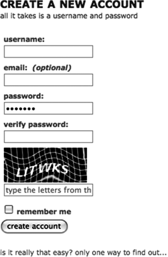
Figure 11.6 Screen Shot of a Simple, Functional Form
Trust
One of the challenges with getting people to fill out forms is addressing their concerns about how their data will be used. For example, if you ask for someone's e-mail address, the visitor might wonder whether you'll rent or sell their information to third parties (a common practice in some industries). To increase your credibility and trust, it's useful to have a clear privacy policy explaining what you will and will not do with people's information. You can link to your privacy policy right from your form. Having this kind of transparency increases the likelihood that users will complete your form.
Auto Responder
Make sure you configure your form so that prospects receive an e-mail confirmation when it is filled out, with a further call-to-action, in order to continue to pull them into your funnel to extract more information about them.
As mentioned before, in order to do those tests, we recommend you have your site set up so that you (not your IT person) can easily make changes and run tests on your forms and conversion rates.
Going Beyond the Form
The good thing about the web today is that you know a lot more about the people who fill out your form than what is in the form. Configure your site so that you can track every page prospect's visit, every comment they make on your blog, and the company for whom they work. (This is a little spooky, but worth doing.) All of this information should go into your database, along with the form information; having this comprehensive view of your prospect on hand when you follow up will increase your likelihood of closure. For example, someone who went to two pages on your site and filled out a form with their Gmail address should be treated much differently than someone who visited your site five times, made two supportive comments on your blog, visited the same pharmaceutical case study on your site three times, and is coming from Pfizer's office building.
A Word of Caution
Many marketers in mid-size and large companies spend 80 percent of their time worrying about conversion rates and 20 percent of their time on getting more visitors in the first place. The biggest problem most companies face is not converting more visitors to leads, but rather getting more visitors in the first place. For most businesses, it is prudent to flip those ratios around so that you are spending 80 percent of your time getting more visitors, and 20 percent of your time getting higher conversion rates.
Tracking Your Progress
You need to track a few metrics regarding every landing page, such as visitors, conversions, and resulting conversion rate. Measuring these with different variations of the landing page layout, as described earlier can help you optimize your landing page for maximum results. You want to think about landing pages as continuous improvement machines that constantly get better with testing and tweaking. As a rule of thumb, you should be getting at least 15 percent of the people who come to a landing page to convert and fill out the form. If you are getting over 50 percent, you are doing an exceptional job. (See Figure 11.7.)

Figure 11.7 Landing Page Metrics
Inbound in Action: Zappos
An online shoe retailer and an inbound marketing success story, Zappos has grown to over $1 billion in revenue since its beginning 10 years ago. Although most people buy shoes from the shoe store in their local malls, a store can carry only so much inventory due to space limitations, which in turn limits selection. Because Zappos is online, they have an almost unlimited inventory. Where this really works well is when you have feet with slightly strange dimensions—really wide or really big. Most mall-based shoe stores won't bother carrying inventory for size 18 sandals, for example, because the market for them is so limited. For people who wear size 18, Zappos is one of the few places to shop.
Zappos spent considerable time building a web presence and ensuring their site was well optimized. “Google has a really sophisticated crawler,” says Matt Burchard, director of Content and Direct Online Marketing, “and is able to identify the exact pages for specific products, such as size 18 shoes.” Zappos also spends considerable time monitoring and analyzing its search data. If the company notices that customers are searching for something specific for which the company doesn't have a landing page, they will manually build one.
When you search Google for size 18 shoes, and you click the Zappos listing in the organic search results (Zappos uses both paid and organic search practices to generate inbound leads), you come to a landing page that features only size 18 shoes. Zappos includes controls on the page to configure for size and width (up to EEEEEEEEE by the way!), but the control to get the user to other sizes is just set on 18. Zappos is smart—when they get someone interested in size 18 shoes, they do not send them to a page that makes them navigate down to find the size 18 shoes.
Incidentally, Zappos is also a master at leveraging social media and blogs to get found by customers. Many of their employees are active Twitter users and the company writes a number of blogs as well.
To Do
- Ensure your website is configured so that you can set up a landing page, change it, and measure the impact on conversion rate without help from IT people.
- Ensure your website is configured so that you can set up forms, change them, and measure the impact on conversion rate without help from IT people.
- Make sure your landing pages match your call-to-action, build trust, are naked, have graphics, and are simple to use.
- Make sure your forms are short, above the fold, not asking for sensitive information, are simple, build trust, and have autorespond.
- ____________________________________________________
- ____________________________________________________
- ____________________________________________________