• Understanding how to interpret pie charts and bar charts
• Representing proportion graphically
• Knowing how to convert raw data to charts
Every day, in every newspaper, magazine and current-affairs website, you will find a wealth of statistics. Often, though, these numbers are not displayed in tables or lists but are incorporated into diagrams of the statistics. There are several different types of diagram or chart, and most are easy to understand visually. Indeed, this is why they are used!
In this chapter, we will have a look at these charts in more depth; you will see how to interpret them and how to understand the rules for producing charts yourself. Most spreadsheet programs have tools for creating such charts, and if you want nice-looking charts for a presentation, that is the best way to proceed. You can think of this chapter as a behind-the-scenes glimpse of what these programs do.
The first type of diagram we will look at is the pie chart. The name is “pie” as in something delicious baked in the oven, rather than the number π that we met in Circles. But, as it happens, both are relevant, since a pie chart is essentially a circle, divided up into differently colored slices. The idea is that the size of each slice corresponds to some proportion of the whole.
Let’s take an example. In my city, one third of the people have blond hair, one third brown and one third black. To represent this information in a pie chart is straightforward: first draw a circle, and then divide it into three slices. One slice represents the people with blond hair, another those with brown hair, and the third those with black hair. Crucially, in this case, the three slices must be the same size, because the three sections of the population are the same size.
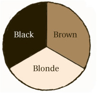
Now we come to the geometric nub of the matter. How do we divide a circle into thirds? It is easy enough to do it approximately by eye, but we want to do it exactly. The slices will all meet at the center of the circle. The key to the matter is the angle of each slice. Because the three slices are all intended to have equal size, the three angles must be equal too. What is more, in the terminology of the chapter Angles, these form angles at a point, which means that they must add up to 360°. So we are looking for three equal angles which add to 360°. It is obvious, I hope, that each one must be 360 ÷ 3 = 120°. Once the angles have been established, it is just a matter of drawing the chart, using a protractor.
HAVE A GO AT THIS YOURSELF IN QUIZZES 1 AND 2.
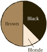
Of course, things are trickier when the proportions are not all the same. In the next town along, half the people have brown hair, three eighths have black hair and just one eighth have blond hair. How can this be represented as a pie chart? The clue is in the proportions: one half, three eighths and one eighth. All we need to do is split up the angle at the center of the pie according to these proportions. This amounts to multiplying 360° by each of the proportions in turn. To start with,  . This represents the largest slice: the half of people who have brown hair. (It should not be a surprise that 180° looks like a straight line.) Next,
 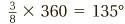 . (You can calculate this by multiplying 360 by 3 and then dividing by 8.) Finally,
 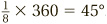 . With these angles, it is now easy enough to draw the chart.
If we want to draw a pie chart, we need to be able to calculate proportions from the raw statistics, rather than having the proportions given to us. Usually, things will not come out as neatly as  or a
or a  ! But precisely the same line of thinking as above will yield a beautiful pie chart, even for messier sets of data.
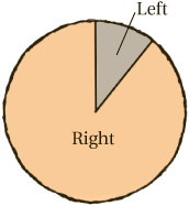
Suppose, in my town, there are 1,794 people who are right-handed and 215 who are left-handed. To express this data in a pie chart, we need to know what angles correspond to the slices for “right-handed” and “left-handed.” To do that, we first need to know the proportion of right-handed and left-handed people in the whole population.
The total number of people is 1794 + 215 = 2009. So the proportion of right-handed people is  , and that of left-handed people is
  . We could convert these to decimals or percentages, but there is no need.
Instead, we can now work out the angles for the pie chart. The angle corresponding to right-handed people is now  , which we calculate by multiplying 360 by 1,794, and then dividing by 2,009, to give an answer of 321.5° (to one decimal place). Similarly
 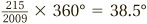 (to one decimal place). These are the angles needed for the pie chart, which can then be drawn easily.
TRY THIS YOURSELF IN QUIZ 3.
Even more familiar than pie charts are bar charts. The starting point this time is a pair of axes, similar to those we used in Coordinates. The vertical axis has the scale on it. So if we are measuring the populations of countries, then the vertical axis might be labeled with numbers such as 10 million, 20 million, 30 million, and so on.
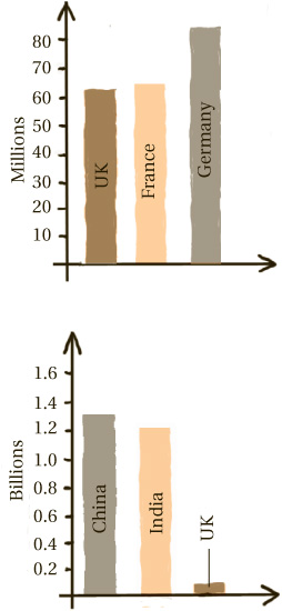
The horizontal axis is the ground from which bars grow. The first bar, for example, might represent the UK: the height of the bar carries the data. In this case, it represents the population of the UK, around 63 million. Then the next bar represents the next country, and so on. It is good practice to keep the bars equally spaced.
(Sometimes you see bar charts with the axes switched round, so that the bars extend from left to right, as if running a race, rather than growing from the ground, like buildings.)
The idea of a bar chart is simple enough: this is why they are so commonly used. The main element of skill is in choosing the right scale for the data. For example, if I wanted to include China (population 1.3 billion) and India (1.2 billion) in the above chart, then the scale I used above is not suitable, as the bars for China and India would be too long to fit on the page. It would be better to have a scale in billions this time.
Of course this makes the UK bar very small, but that’s unavoidable.
On the other hand, if I was comparing the populations of various small islands such as Fair Isle (population 72) and Bressay (population 390), then a scale which increased in hundreds would be better.
So, the first step to creating a bar chart is to look at the numbers involved, and choose a sensible scale. Pick a maximum number: ideally a nice round number, which is slightly more than the biggest number you need to represent on the chart. I might pick 500 for the islands example above. After that, all that remains is to draw the axes, write in the scale on the vertical axis (making sure that the numbers increase in equal steps, not in uneven jumps), then draw in bars with the correct heights, and label the bars so we know what’s what.
There are various ways in which bar charts can be spiced up to represent subtler forms of data. One such is the segmented bar chart.
GOT IT? TRY QUIZ 4.
What is the purpose of it? Well, in some ways it combines the strengths of a pie chart and a bar chart. Suppose we want to make a chart representing the population of a certain country, and how this has evolved over the years 2002–2011. A bar chart seems a good choice here, with ten bars representing the ten years, and the heights of the columns representing the population that year.
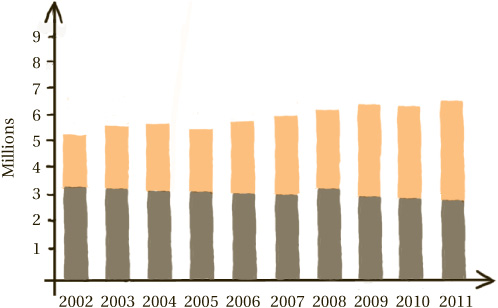
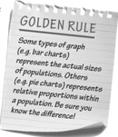
We might also be interested in what proportion of population is in full-time work, for example. If we were only interested in those proportions, then a pie chart would be a better choice. We could have a sequence of ten pie charts, one for each year. Each pie chart would be cut into two slices: one representing people who are in full-time work, and the other representing those who are not, making it easy to compare the proportions. Notice, though, that these pie charts contain no information about actual numbers of people. As our golden rule tells us, they are solely about proportions of the population, not about the size of the population.
We might want both of these types of data in our chart: absolute numbers and proportions. In this case, the best option is to take the bar chart and slightly amend it. Each bar represents the entire population in one year. The idea is to split it into two segments: one representing the people in full-time work, and the other those who are not. Now we can easily compare the size of the full population from year to year, as well as the numbers of people in full-time work.
IT’S TIME FOR QUIZ 5
Sum up There are many different ways to represent data: bar charts, pie charts and segmented bar charts are just a few. All of them are easy to understand visually—after all, that is the point!
1 Calculate the angles needed for these pie chart.
a In a block of flats, a quarter of the flats have one resident, half have two, and a quarter have three or more.
b On a menu, two thirds of the dishes are vegetarian, one sixth contain meat, and one sixth contain fish.
c One day, a TV channel dedicates one fifth of the time to news, three fifths of the time to drama, one tenth of the time to music, and one tenth to advertising.
d In a bookshop, five eighths of the books are fiction, one eighth are reference, one eighth are biography and one eighth are assorted non-fiction.
e In my house, seven tenths of the wall-space is painted, one fifth is wallpapered, and one tenth is tiled.
2 Draw a pie chart for each of the scenarios in question 1.
3 Calculate the proportions, and angles, needed for the pie charts in these situations.
a A room contains 10 men and 12 women.
b A radio station dedicates 1 hour a day to news, 1 hour to advertising and the rest to music.
c One month, a cinema shows 8 thrillers, 15 comedies, 2 horror films and 5 children’s films.
d A man’s CD collection contains 124 rock albums, 17 jazz albums, 36 classical albums and 3 spoken word albums
e A page of text contains 104 nouns, 76 verbs, 25 adjectives and 18 adverbs.
4 Draw a bar charts to represent each of these situations.
a In a village, 34 households have only cats, 75 have only dogs, 17 have both cats and dogs, while 88 have neither cats nor dogs.
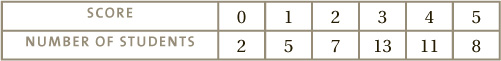
b A class of students take a test. Their marks out of 5 are:
c An orchestra contains 27 string players, 14 wind players, 8 brass players and 3 percussionists.
d A jungle contains 14.5 million herbivorous animals, 1.6 carnivorous animals and 10.1 million trees.
e A shop tracks its number of customers: in 2009 there were 10,225, in 2010 there were 12,987, in 2011 there were 15,011 and in 2012 there were 14,991.
5 Draw segmented bar charts for these sets of data. (Notice that sometimes the first type of data includes the second, and sometimes the two are separate.)
a The number of people in a village:
b The number of crimes reported to police: