Chapter 7
Perfecting Your Printed Materials
In This Chapter
Crafting great print pieces with good font selection and flow
Creating brochures with focused impact
Designing and testing effective print ads
Marketers traditionally budget more for print advertising than for any other type of advertising, with the exception being the major national or multinational brands that market largely on television. For most local and regional advertising, print traditionally provided the most flexible and effective all-around advertising medium. Although print is shrinking due to the competition of Web-based advertising and promotions, it’s still a major part of your marketing program and needs to be done right.
This chapter helps you integrate printed material, which isn’t limited strictly to print advertising, into your business’s marketing plan. Even if you’re a small mom-and-pop business, you can make an impact on customers (both current and potential) with professional-looking printed materials that reinforce your brand image and overall marketing message.
 When designing anything in print, your purpose is to stimulate a sale. Think ahead to that goal. If your product sells in stores, create signs, packaging, displays, or coupons that echo the ad’s theme and remind the buyer of that theme. If the sale occurs on a Web site, make sure the ad sends prospects to a landing page where the offer from the ad is highlighted and it’s obvious what to do next. If you make the sale in person, supply the salespeople or distributors with catalogs, order forms, PowerPoint presentations, or brochures (see the “Producing Quality, Effective Brochures” section later in this chapter) that are consistent with your design to remind them of the ad that began the sales process. Roll the ad’s design forward to the point of purchase and beyond if you plan follow-up mailings, a mail-in warranty card, or other post-purchase contacts.
Designing Printed Marketing Materials
Many marketers start with their printed marketing materials (think ads, brochures, product literature as PDFs, and so on) and then work outward from there to incorporate the appeal and design concepts from their printed materials into other forms of marketing. Brochures, tear sheets (one-page, catalog-style descriptions of products), posters for outdoor advertising, direct-mail letters, catalogs, and even blogs and Web pages all share the basic elements of good print advertising: good copy and visuals mixed with eye-catching headlines. They also all require a common look and feel that unites the separate pieces. Therefore, all good marketers need mastery of print advertising as a vital part of their knowledge base. The following sections cover the essentials of what you should know.
Including the eight necessary parts
Before you can create great printed marketing materials, you must dissect an ad, brochure, tear sheet, or similar piece to identify its parts. Fortunately, you won’t find anything gross or disgusting inside most printed marketing materials. Just parts. And each part has a special name, as you can see from this list:
Headline: The large-print words that first attract the eye, usually at the top of the page.
Subhead: The optional addition to the headline to provide more detail, also in large (but not quite as large) print.
Copy or body copy: The main text, set in a readable size, like what printers use in the main text of a book or magazine.
Visual: An illustration that makes a visual statement. This image may be the main focus of the ad or other printed material (especially when you’ve designed an ad to show readers your product), or it may be secondary to the copy.
Caption: Copy attached to the visual to explain or discuss that visual. You usually place a caption beneath the visual, but you can put it on any side or even within or on the visual.
Trademark: A unique design that represents the brand or company (like Nike’s swoosh). You should always register trademarks; see Chapter 14 for more info.
Signature: The company’s trademarked version of its name. Often advertisers use a logo design that features a brand name in a distinctive font and style. The signature is a written equivalent to the trademark’s visual identity.
Slogan: An optional element consisting of a (ideally) short phrase evoking the spirit or personality of the brand. Timberland used a series of print ads in which the slogan “Boots, shoes, clothing, wind, water, earth and sky” appeared in the bottom-left corner, just beneath the company’s distinctive signature and logo — which marketers displayed on a photo of a rectangular patch of leather, like patches that appear on one of their products.
Figure 7-1 shows most of these elements in a rough design for a print ad (a brochure’s layout is a bit more complicated and is covered later in this chapter). I use generic terms in place of actual parts of an ad (headline for the headline, for example) so you can more easily see all the elements in action. This fairly simple palette for a print ad design allows you endless variation and creativity. You can say or show anything, and you can do so in many different ways. (And even if you aren’t buying space to run the ad in a magazine or newspaper, you can use this layout for a one-page marketing sheet to include in folders or as handouts at trade shows.)
Figure 7-1: A sample print ad featuring most of the eight elements.

Putting the parts together: Design and layout
Design refers to the look, feel, and style of your ad or other printed marketing materials. Design is an aesthetic concept and, thus, hard to put into precise terms. But design is vitally important: It has to take the basic appeal of your product and make that appeal work visually on paper (see Chapter 6 for details on how to develop appeal). Specifically, the design must overcome the marketer’s constant problem: Nobody cares about advertising. So your design must somehow reach out to readers, grab their attention, and hold it long enough to communicate the appeal of the product you’re advertising and attach that appeal to your brand name in readers’ memories.
A memorable photograph is often the easiest way to grab the reader. If you don’t have a better idea, try using a photo of an interesting face or of a child, as long as you can make the image relevant in some way to your product. Beautiful nature scenes are also good eye-catchers. (I’ve included a selection of photos on the CD in this book’s companion volume, Marketing Kit For Dummies, 3rd Edition, published by Wiley.)
 Great advertising has to rise off the page, reach out, and grab you by the eyeballs. In the cluttered world of modern print-based marketing, this design goal is the only one that really works! So I want you to tape up a bunch of ads from the same publication(s) yours will go in (or use samples of competitor brochures, catalog sheets, or whatever it is you’ll be designing in print). Put a draft of your design up along with these benchmarks and then step back — way back. Now, does your design grab the eye more than all the others? If not . . . back to the drawing board!
One good way to make your design stand out from the rest is to edit it down so you can have fewer words that are set in larger type. Less is often more when it comes to good print marketing design and writing.
Going with a professional designer
If you don’t have the talent or desire to design ads and other printed materials, know that it’s okay to delegate this work to skilled designers. This section walks you through the process of working with a designer.
First, a designer crafts several thumbnails, rough sketches used to describe layout concepts. Traditionally thumbnails were created as small, quick sketches in pen or pencil, but nowadays designers are using computer programs such as Adobe InDesign to create more impressive-looking thumbnails. Younger designers call them mockups rather than thumbnails, but both serve the same purpose.
After you sign off on a thumbnail or mockup you like, the designer traditionally develops it into a rough, a full-sized sketch or high-quality computer-generated mockup with headlines and subheads set in an appropriate font style (the appearance of the printed letters). The rough may have sketches for the illustrations, or the designer may pull low-resolution pictures off the Web to give you an idea of proposed illustrations. (To finalize the design, you’ll probably need to either purchase the right to use a high-resolution image from a stock photography provider or hire a photographer or artist to create an image.) At this time, the designer also shows you where the body copy will go, but she won’t use actual copy unless you already have some drafted that she can drop into the rough design.
Sometimes clients of ad agencies insist on seeing designs in the rough stage, to avoid the expense of having those designs developed more fully before presentation. I recommend that you ask to see rough versions of your designs, even if your agency hesitates to show you its work in unfinished form. After the agency realizes that you appreciate the design process and don’t criticize the roughs simply because they’re rough, you can give the agency more guidance and help during the design process.
After a rough meets your approval, the designer develops that rough into a comp (short for comprehensive layout). A comp should look pretty much like a final version of the design, whether it’s created as a full-color proof on a computer or whether it’s done by hand. Today most comps are neatly printed on color laser printers, unless the designer is remote, in which case you may receive a PDF file by e-mail that you’re expected to review from your end.
If you’re working on a brochure or a special insert for a magazine, ask to see a dummy, which is a form of comp that simulates the feel — as well as the look — of the final design. By doing a dummy comp, you can assess the feel of the design while you’re evaluating its appearance and decide whether you like the paper, ink, size, and any other physical elements of the design, such as folds, die cuts, or perforations.
Doing the design on your own
Anyone with a basic computer and printer can now set up shop and create his or her own fliers, brochures, business cards, and ad layouts. In fact, Microsoft Word includes a number of excellent templates that simplify layout and allow you to bang out a new brochure or other printed marketing piece quickly.
If you want to try your hand at designing your own printed materials and are good at thinking visually, invest some time and effort into honing your computer-based design techniques. I cover a lot of the basics of brochure and ad design in Marketing Kit For Dummies, 3rd Edition (Wiley); I also provide templates I designed to make a variety of options fairly easy for you.
![]() Designers often experiment with numerous layouts for their print ads or other printed materials before selecting one for formal development. Whatever approach you take to becoming a do-it-yourself designer, I strongly recommend that you experiment with layouts the way pro designers do. The more layouts you look at, the more likely you are to get an out-of-the-box idea that has eye-grabbing power.
Designers often experiment with numerous layouts for their print ads or other printed materials before selecting one for formal development. Whatever approach you take to becoming a do-it-yourself designer, I strongly recommend that you experiment with layouts the way pro designers do. The more layouts you look at, the more likely you are to get an out-of-the-box idea that has eye-grabbing power.
Finding your font
Deciding on a font (not to be confused with a typeface) is perhaps one of the most important choices you make regarding your printed marketing materials. Typeface refers only to the distinctive design of the letters (Times New Roman, for example). Font, on the other hand, actually refers to one particular size and style of a typeface design (such as 10-point, bold, Times New Roman). It’s the particular attributes for the characters (letters, numbers, and symbols) used in printing your design.
The right font for any job is the one that makes your text easily readable and that harmonizes with the overall design most effectively. For a headline, the font also needs to grab the reader’s attention. The body copy (see “Including the eight necessary parts” earlier in this chapter) doesn’t have to grab attention in the same way — in fact, if it does, the copy often loses readability. For example, a reverse font (light or white on dark) may be just the thing for a bold headline, but if you use the reverse font in the body copy too, nobody reads your copy. It’s just too hard on the eye to read more than a line or two in reverse font. The following sections help you find the font that will make your printed marketing materials pop.
Choosing a typeface
Finding the right font for your needs starts with figuring out what sort of typeface you want. You have an amazing number of choices, because designers have been developing typefaces for as long as printing presses have existed.
A clean, sparse design, with a lot of white space on the page and stark contrasts in the artwork, deserves the clean lines of a sans serif typeface — meaning one that doesn’t have any decorative serifs (those little bars or flourishes at the ends of the main lines in a character). The most popular body-copy fonts without serifs are Helvetica, Univers, Optima, and Avant Garde. Figure 7-2 shows some fonts with and without serifs.
Figure 7-2: Fonts with and without serifs.

A richly decorative, old-fashioned sort of design needs a more decorative and traditional serif typeface, like Century or Times New Roman. The most popular body-copy fonts with serifs include Garamond, Melior, Century, Times New Roman, and Caledonia. Table 7-1 shows an assortment of typeface choices, in which you can compare the clean lines of the sans serif typefaces with the more decorative designs of the serif typefaces.
|
Table 7-1 Popular Typefaces for Ads |
|
|
Sans Serif |
Serif |
|
Helvetica |
Century |
|
Univers |
Garamond |
|
Optima |
Melior |
|
Avant Garde |
Times New Roman |
In tests, Helvetica, Times New Roman, and Century generally top the lists as most readable, so start with one of these typefaces for your body copy; only change it if it doesn’t seem to work. Research also shows that people read lowercase letters about 13 percent faster than uppercase letters, so avoid long stretches of copy set in all caps. People also read most easily when letters are dark and contrast strongly with their background. Thus, black 12-point Helvetica on white is probably the most readable font specification for the body copy of a printed marketing piece, even if it seems dull to a sophisticated designer.
Generalizing about the best kind of headline typeface is no easy task, because designers play around with headlines to a greater extent than they do with body copy. But as a general rule, you can use Helvetica for the headline when you use Century for the body, and vice versa. Or you can just use a bolder, larger version of the body copy font for your headline. You can also reverse a larger, bold version of your type onto a black background for the headline. Anything to make the headline grab the reader’s attention, stand out from the body copy, and ultimately lead vision and curiosity into the body copy’s text. (Remember to keep the headline readable though. Nothing too fancy, please.)
Sometimes designers combine body copy of a decorative typeface (one with serifs, like Times New Roman) with headers of a sans serif typeface (like Helvetica). The contrast between the clean lines of the large-sized header and the more decorative characters of the smaller body copy pleases the eye and tends to draw the reader from header to body copy. This book uses that technique. Compare the sans serif bold characters of this chapter’s title with the more delicate and decorative characters in which the publisher set the text for a good example of this design concept in action.
Making size and style choices within the typeface
Any given typeface presents a ton of choices, so selecting your typeface is just the beginning. How big should the characters be? Do you want to use the standard version of the typeface, a lighter version, a bold (darker) version, or an italic (right-leaning) version?
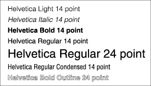
Believe it or not, making your style and size choices is really rather easy. Just look at samples of some standard point sizes (12- and 14-point text for the body copy, for example, and 24-, 36-, and 48-point for the headlines). Many designers make their choices by eye, looking for an easy-to-read size that isn’t so large that it causes the words or sentences to break up into too many fragments across the page — but not so small that it gives the reader too many words per line. Keep readability in mind as the goal. Figure 7-3 shows a variety of size and style choices for the Helvetica typeface. As you can see, you have access to a wonderful range of options, even within this one popular design.
Keep in mind that you can change just about any aspect of a typeface. You can alter the distance between lines — called the leading — or you can squeeze characters together or stretch them apart to make a word fit a space. Assume that anything is possible and ask your printer, or consult the manual of your desktop-publishing or word-processing software, to find out how to make a change.
Figure 7-3: Some of the many choices offered by the Helvetica typeface.
 Now, having said that anything is possible, I want to warn you that your customers’ eyes read type quite conservatively. Although most of us know little about the design of typefaces, we find traditional designs instinctively appealing. The spacing of characters and lines, the balance and flow of individual characters (with some white space around them or an appropriate illustration to break up the text) — all of these familiar design elements please the eye and make reading easy and pleasurable. So when you need to provide emphasis, try to do so in a conservative manner. For example, try simply bolding your body copy before resorting to a new style of type. Too many type styles may reduce your design’s readability.
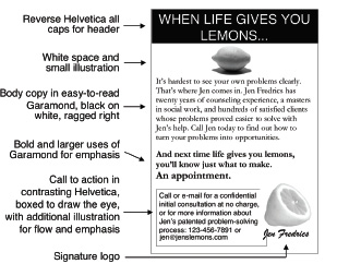
A good design uses two type families and varies the size of them, mixing in appropriate italics, bold, or reverse type if the overall design benefits from it. Figure 7-4 shows a black-and-white print ad laid out using Garamond and Helvetica, which are traditional, easy-to-read fonts. Some graphic designers avoid them because they like to be less traditional and more creative, but as the figure shows, these two type families lend themselves to clean, attractive, appealing, and (most important) readable designs.
Don’t just play with type for the sake of playing (as all too many designers and do-it-yourselfers do). Stick with popular fonts, in popular sizes, except where you have to solve a problem or you want to make a special point.
Figure 7-4: A print ad that makes good use of traditional type styles and simple illustrations.
Selecting a point size
When designers and printers talk about font sizes, they’re referring to a traditional measure of the height of the letters (based on the highest and lowest parts of the biggest letters). One point equals about 1/72 of an inch, so a 10-point type is 10/72 of an inch high, at the most.
Personally, I’ve never measured a character with a ruler. I just know that if the letters seem too small for easy reading, then I need to bump the typeface up a couple points. Ten-point type is the smallest size you can use for body copy, but you may want to use 11- or 12-point for brochures, especially if your readers are middle-aged or older.
Your eye can’t distinguish easily between fonts that are only one or two sizes apart, so specify a larger jump than that to distinguish between body copy and subhead, or subhead and headline. For example, if your body copy is set in 10-point Times New Roman, then you need to set subheads at least two steps up (steps being defined by standard point sizes: 9, 12, 14, 16, 18, 24, 36 and 48, although in-between sizes can also be used).
Bringing it all together in a perfect flow
As you put your ad together, think about your entire page as an artistic composition that has to have certain qualities. It must have balance, meaning that nothing should be so heavy or large as to prevent you from seeing the other elements. However, perfect balance is boring, so use differences in size and placement of type, white space, and illustrations to create flow. Flow is the smooth movement of attention from an entry point, around the page, and to an end point. In marketing, the entry point is almost always the headline, and the end point is either the brand name and logo, or a call to action, depending on whether you want to emphasize brand-building or generate traffic.
The ad in Figure 7-4 has great flow. The eye starts with the headline, is drawn down by the lemon to body copy that has a gentle sweeping curve to its ragged right side, until the eye is temporarily arrested by the bolder punch line. But it doesn’t end there. The larger scale of the second lemon makes it jump up off the page, and the boxed, contrasting type of the call to action also demands attention so that the eye goes down and to the left for another batch of reading.
Notice how Figure 7-4 has a subtle flow cue in the way the second lemon has been cut. It seems to be telling a sequential story in which the service the ad describes has processed the “lemon” or problem and found the “lemon aid” or the solution within it. The flow doesn’t quite stop at the call to action. The eye wants to finish the journey by moving to the right (a natural way to read), where it encounters the big lemon again before ending on the signature. The last thing you see in a list is the most memorable, so this exit point ensures maximum recall of the brand name.
In a really well-designed print ad, brochure, Web site, or blog page, the writing and the selection of type styles are just a part of the bigger-picture design, which ought to draw the viewer through a well-planned flow of reading and viewing experiences. Modern designers lay out their designs on imaginary grids (where each section, like a headline, or a column, fills a rectangular zone in the layout grid; see Marketing Kit For Dummies, 3rd Edition, [Wiley] for examples). However, ensuring good flow is more important than worrying too much about establishing an elaborate grid or underlying architecture. As long as the ad attracts attention and flows the reader through its component parts, the design is working.
Producing Quality, Effective Brochures
Word-processing or graphics software, a good inkjet or laser printer, and the help of your local photocopy or print shop (which also has folding machines) allow you to design and produce brochures, fliers, and more quite easily. In the sections that follow, however, I focus largely on the classic business staple: the basic brochure. Why? Because it’s an easy, effective way to market your company. (Note: Although I focus on brochures, the guidance provided in the following sections is also applicable to producing a variety of printed pieces, including fliers and catalog sheets.)
Knowing the purpose of your brochure
Marketers often order a brochure without a clear idea of what purpose the brochure should serve. They just think a brochure is a good idea. “Oh, we need them to, you know, like, put in the envelope along with a letter, or, um, for our salespeople to keep in the trunks of their cars.”
Many brochure designs foolishly waste money because they don’t accomplish any specific marketing goals; they just look pretty, at best. To avoid producing a pretty-but-pointless brochure that doesn’t achieve a sales goal, know the answers to the following questions (which focus your brochure design and make it useful to your marketing):
Who will read the brochure?
How will they get the brochure?
What should they do after reading the brochure?
Without a specific focus, your brochure can’t be properly suited to any single use. It becomes a dull, vague scrap of paper (read: waste of money) that talks generally about your company or product but doesn’t hit readers over the head with any particular appeal or call to action.
A good general rule is to define up to three specific purposes for the brochure. Don’t go past three though, because your design can’t accomplish more than three purposes effectively. The most common and appropriate purposes for a brochure are to
Act as a reference on the product, or technical details of the product, for prospects
Support a personal selling effort by lending credibility and helping overcome objections (to find out more about sales, check out Chapter 17)
Generate leads through a direct-mail campaign (I cover direct-mail campaigns in Chapter 13)
Say you want to design a brochure that does all three of these tasks well. Start by designing the contents. What product and technical information must be included? Write the information down or collect necessary illustrations so that you have the fact base (the essential information to communicate) in front of you.
The next sections highlight the essential elements your brochure should contain to achieve its purpose(s).
A realistic acknowledgement of strengths and weaknesses
When creating your brochure, you need to be able to realistically address your product’s strong points and weaker points. Organize your fact base to highlight your product’s greatest strengths and overcome its weaknesses. The copy should read as if you’re listening to the reader’s concerns and needs and answering each one with an appropriate response. You can write subheads like “Our Product Doesn’t Need Service” so that salespeople or prospects can easily see how your facts (in copy and/or illustrations) overcome each specific objection and highlight all the major benefits.
Also consider any of these options as you decide what to write in order to make your brochure’s copy powerfully persuasive:
The main benefits your product offers
Key points of difference that make your product better than the competition
Customers’ favorite reasons for buying or aspects of your product
Customer testimonials or case histories
Product benefits, points of difference, reasons for buying, and customer testimonials are all good ways of explaining why your product is great because they make the case based on evidence.
A clear, compelling appeal
A little basic appeal (see Chapter 6) communicated in a punchy headline and a few dozen words of copy, along with an appropriate and eye-catching illustration, help your brochure stand on its own as a marketing tool. The appeal needs to project a winning personality. It can be fun or serious, emotional or factual — but it must be appealing. The appeal is the bait that draws the prospect to your hook, so you need to make sure your hook is well baited!
Laying out your brochure
An effective brochure follows this standard layout:
The appeal, with its enticing headline and compelling copy and visual, goes on the front of the brochure — or the outside when you fold it for mailing, or the central panel out of three if you fold a sheet twice.
The subheads that structure the main copy (which responds to objections and highlights strengths, as explained earlier in this chapter) goes on the inside pages.
The fact base, needed for reference use, goes in the copy and illustrations beneath your subheads.
If you don’t know what each part of your brochure does, then you need to redesign it. Otherwise that brochure becomes a waste of time and money.
Although you can lay out a brochure in many ways, I often prefer the format shown in Figure 7-5. It’s simple and inexpensive because you print the brochure on a single sheet of legal-sized paper that you then fold three times. You can fit this brochure in a standard #10 or #12 envelope, or you can tape it together along the open fold and mail it on its own. This layout allows for some detail but not enough to get you into any real trouble. Larger formats and multipage pieces tend to fill up with the worst, wordiest copy, and people rarely read them. (For some actual brochure templates, check out Marketing Kit For Dummies, 3rd Edition [Wiley].)
To convert Figure 7-5’s design into an even simpler, cheaper format, use 81/2-x-11-inch paper and eliminate the return mailer (the left-hand page on the front, the right-hand on the back). It’s the part that can be returned with the blanks filled in to request information or accept a special offer. If you do remove the return mailer, however, be sure to include follow-up instructions and contact information on one of the brochure’s inside pages. You can point readers to a Web address where you have a form they can fill in to receive more information. An electronic form can thereby take the place of the traditional return mailer.
Figure 7-5: A simple, multipurpose brochure layout.

Printing your finished product
You can print and fold a brochure (like the one shown in Figure 7-5) at the local photocopy shop. Most copy stores now accept e-mailed copies of files and can produce short runs of your brochures (as well as pamphlets, catalog sheets, and other printed materials) right from your files. However, if you need thousands of copies, you should look into offset printing, which is a more cost-effective option at that quantity. Offset printing is how most books, magazines, and newspapers are printed. The printer makes a plate of each page, and the printing press automatically inks the plate, transfers or “offsets” the ink to a rubber blanket, and then transfers that to the page.
You can also do smaller runs (100 or less) right from your own color printer. Buy matte or glossy brochure paper designed for your brand of printer (HPs work well for this) and simply select the appropriate paper type in the print dialog box. Today’s printers can produce absolutely stunning brochures, but you have to fold these brochures yourself, and the ink cartridges or toners aren’t cheap, so print as needed rather than inventory a large number of brochures.
Placing a Print Ad
Ad agencies and the marketing departments of big companies have specialists who do nothing but buy media, and some brokers specialize in it for mid-sized or smaller marketers. But if you’re a smaller-scale marketer, you can easily figure out how to buy media space on your own. The following sections cover a marketing specialty called media buying, with an emphasis on buying print ad space.
Determining whether you can afford an ad
Print ads can be quite expensive, so before you run out and start placing them, you need to know whether buying one is a smart financial move for your business. Make sure you acquaint yourself with all the costs before making any decision.
If you’re marketing a small business, start by collecting magazines or newspapers that you’re sure your prospective customers read. Then look for the information in them that identifies the publisher and gives a phone number for advertisers to call. Call or visit their Web sites to obtain a rate sheet (a table listing the prices of ads by size of ad and also showing the discount rate per ad if you buy multiple ads rather than just a single one). If the publication is a magazine, also ask for the schedule, which tells you when ads for each issue need to be placed and what the topics of future issues will be.
After you’ve collected a selection of rate sheets from magazines or newspapers, take a hard look at the pricing. How expensive is the average ad (in the middle of the size range for each publication)? The answer may be a broad number. If a single ad costs one-twentieth (5 percent) or more of your marketing budget for the entire year, throw that rate sheet away and forget about advertising in that publication. You need dozens of ad placements per year to make a good print ad campaign, so don’t begin with a publication unless you can easily afford to keep going.
In addition to finding a publication you can afford to advertise in regularly, use economical print media such as brochures, blogs, mailings, and e-mails. (I help you figure out how to design a brochure earlier in this chapter.) If you operate on too small a scale or budget to afford print advertising, try turning your ad design into a good flier and mailing it. You can send it to 500 names and see what happens. That’s a lot less risky and expensive than buying space in a magazine that goes to 200,000 names — some of whom may not care at all about what you’re offering. Or you can search for smaller-circulation publications with a more local or specialized readership, where the rates may be much cheaper.
Finding inexpensive places to advertise
Every business looks for ways to save money on advertising. You may be surprised to know that several options are available to you if you’re trying to save some cash. Consider the following less-expensive options for advertising:
Local theater program: I recently went to the theater, and I noticed that many local businesses had purchased ad space in the program. What did this cost? Less than $100 for many of them. Compare that to an ad in a major magazine, which can cost $100,000. My point is this: If buying ads in the best publications to reach your market is too expensive, you can always find smaller-circulation publications that charge less, but be sure to pick publications your customers and prospects read.
A professional association’s monthly newsletter: Professionals are people who have buying power, so even if you don’t sell a product just for them, they may still respond to your ad. Some insurance agents have advertised successfully in newsletters that go to doctors, for example. Increasingly such newsletters are published in Web versions in addition to — or even instead of — print versions. With a Web publication, you can take advantage of the larger reach of the Web and the lower price of a small publication.
![]() Local and small-town newspapers: You can find hundreds of newspapers and weeklies with circulation (readership) only in the tens of thousands, which means their rates for ads are one-fifth to one-tenth the price of big-city newspapers (and even less expensive when compared to major national magazines). Of course, you don’t reach as many people, either. Advertising tends to be priced on a cost per thousand readers basis (the cost of buying that ad divided by the number of readers who read the publication and then multiplied by 1,000), so you generally get as much exposure as you’re willing to pay for. But by buying ads in small-circulation publications, you avoid taking huge risks and minimize your investment.
Local and small-town newspapers: You can find hundreds of newspapers and weeklies with circulation (readership) only in the tens of thousands, which means their rates for ads are one-fifth to one-tenth the price of big-city newspapers (and even less expensive when compared to major national magazines). Of course, you don’t reach as many people, either. Advertising tends to be priced on a cost per thousand readers basis (the cost of buying that ad divided by the number of readers who read the publication and then multiplied by 1,000), so you generally get as much exposure as you’re willing to pay for. But by buying ads in small-circulation publications, you avoid taking huge risks and minimize your investment.
Keep the scale of your print advertising (or any advertising for that matter) at such a level that you can afford to run an ad that may produce zero sales. Although zero sales certainly isn’t your goal, it’s always a possibility, and you want to base your buying decision on that possibility while you’re experimenting to find an effective venue for your ads.
Selecting the ad size
What size ad should you buy? The answer depends in part on the design of your ad. Does the ad have a strong, simple visual or headline that catches the eye, even if it’s only a third of a page in size? Or does the ad need to be displayed in a larger format to work well?
In addition to your (or your designer’s) judgment about the specifics of your ad, also take into account some general statistics on what percentage of readers notice an ad based on its size. As you may expect, the rate goes up with the size — bigger ads get more notice (all other things being equal), according to a study by Cahners Publishing Co. (see Table 7-2).
|
Table 7-2 Selecting the Right Size Ad |
|
|
Size of Ad |
Percent of Readers Noticing Ad |
|
Fractional (part-of-page) ad |
24% |
|
One-page ad |
40% |
|
Two-page spread |
55% |
The bigger the ad, the bigger the impact. But also consider the fact that the percentage of readers noticing your ad doesn’t go up in proportion to the increase in size. Doubling the size of your ad gives you something like a quarter more viewers, not twice as many. That’s partly why the cost of a full-page ad isn’t twice the cost of a half-page ad. For example, a full-page, four-color ad in Health magazine costs 59 percent more than a 1/2-page, four-color ad. The same ad, run at full versus half size, probably attracts, at most, about a third more reader notices, meaning your cost per reader exposed to the ad is higher for that full-page ad than for the half-page ad (although your impact on each of those readers may be greater with a larger ad, which is why the cost per reader can be set at a higher level for a larger ad).
Testing and improving your print ad
You may be wondering how you can tell whether anybody is actually reading your ad. If you run a direct-response ad (one that asks readers to take a measurable action such as calling, faxing, or going to a store), then you should have a clear indication of that ad’s effectiveness within days of its first appearance. Say you expect to receive a lot of inquiries and orders over the telephone or on your Web site’s landing page (the page where you send readers of the ad; see Chapter 10) during the week the issue with your ad goes on sale. If you don’t receive those calls, you know you have a problem. Now what? The next sections tell you what you can do.
Pretest your ad for a fee
Much brand advertising is indirect, leaving it to the retailer or local office to close the sale. No phones ring, whether consumers liked the ad or not, so in order to know whether your ad worked, you may need to go to a market research firm and have your ad tested for effectiveness. In fact, if you plan to spend more than $200,000 on print ads, you can probably consider the $20,000 or so needed to hire a research firm to pretest the ad money well spent. (Pretesting means exposing people to the ad in a controlled setting and measuring their reactions to it.)
Firms such as Readex Research (www.readexresearch.com), Marketing Research Services, Inc. (www.mrsi.com), Decision Analyst (www.decisionanalyst.com), and PreTesting Group (www.pretesting.com) provide pretesting research. The PreTesting Group even uses a hidden camera to track subjects’ eye movement while they read magazines with a test ad in them, which is a good way to measure the ad’s stopping power, or its ability to grab and hold reader attention.
Sometimes pretesting allows you to find a problem that can be fixed without starting from scratch. Maybe your headline and photo get high scores, but the body copy flunks. You can try rewriting and shortening the copy, and you may also try changing the layout or your choice of fonts. Perhaps the body copy is in reverse font, which consumers find hard to read. In that case, try switching the text to dark letters on a white or light background.
Or maybe you need to switch from a black-and-white or two-color visual to a four-color one. Cahners Publishing Co. reports from its studies that black-and-white ads and two-color ads attract the notice of about a third of readers, and four-color ads attract almost half of readers — 46 percent, to be precise. So as with size, more is better when it comes to colors. However, you need to run the numbers to see how the extra costs and extra readers affect your cost-per-thousand figure.

Conduct your own ad analysis for free
You may not really need to spend good money on a research service to find out whether your ad is working. Here are some free research alternatives that you can do all on your own:
Run three variations on the ad and see which one generates the most calls or Web site visits (offering a discount based on a code number tells you which responses come from which ad).
Conduct your own ad tests. Ask people to look at your ad for 20 seconds and then quiz them about what they remember. If they missed much of the ad, you probably need to rewrite it!
Assemble your own panel of customers and ask them to rate your ad and give you feedback about why they do or don’t find it appealing.
Run the same ad (or very similar ones) in large and small formats and see which pulls in the largest number of consumers.
Any experiments you can run as you do your marketing give you useful feedback about what’s working and what isn’t. Always think of ways to compare different options and see how those options perform when you advertise, giving you useful insight into ad effectiveness.