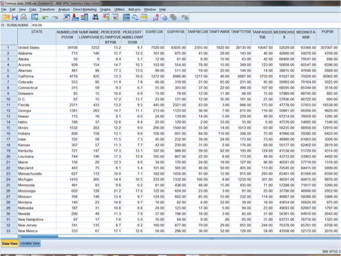
Figure 13.1. Aggregate-level data in data view.
13
AGGREGATE RESEARCH
Sometimes individual-level data are not appropriate for answering research questions; we need data from aggregates, or units that are composed of many individuals, such as cities, states, nations, schools, clubs, or churches. Each of these units (states, clubs) is composed of hundreds, if not thousands, of individuals. Aggregate-level data, as opposed to survey-level data, relies on a smaller number of cases, but each case is made up of thousands of smaller units. Say, for example, you had a data set made up of variables collected by the U.S. Census Bureau that reported data on the 50 states. How many cases would the data set have? The cases, or units of analysis, would be each individual state, so there would be 50 cases where each one case is composed of millions of individual units (people). The SPSS screen shown in Figure 13.1 is an example of an aggregate database in which there are many variables for each state (cases).
Figure 13.1. Aggregate-level data in data view.

Apart from census data, another example of aggregate data would comprise variables taken from a congregation, where variables may include total number of members, number of baptisms, number of deaths, value of churches/equipment/property, or debt on buildings/property. These examples of aggregate data stand in stark contrast to the data collected for the General Social Survey (GSS) 2010. This GSS has 4901 cases or individuals. The discrepancy in the number of cases we deal with depending on the type of data we have will cause us to look at some unique aspects of aggregate data.
Aggregate data refers to individual data that have been summed up to larger units (e.g., like individual patient data across different hospitals being summed to county- or state-level reporting). Formal organizations often use these data because you can convey several general patterns embedded in individual responses. School districts, hospitals, businesses, and other such social units aggregate data to summarize a great deal of information and to protect against identifying specific individual responses. Conclusions made in studies using aggregate data should be made at the highest level of aggregation to avoid the ecological fallacy, or trying to generalize to people when the data are taken at the aggregate level (see Chapter 10).
There are two types of aggregate units: areal units and social units. Areal units are cases made up of geographically defined boundaries (e.g., counties, states, nations, etc.). Social units are derived from social boundaries (e.g., churches, clubs, sports teams, etc.). Statistically both types of units are treated the same in analysis. One unique feature of aggregate-level data collection is that since the units are composed of thousands of smaller units, they are not usually data that researchers can collect on their own. For example, researchers cannot go door to door asking every state resident how many murders he or she has committed that year in order to determine the state’s murder rate. Since aggregate measures are composed of counts of individuals based on areal or social units, social scientists generally rely on some type of official agency to collect these statistics so that they can be utilized in social research.
At the beginning of this book, we talked about the need for the process of science to help establish a baseline for how the world really is, rather than what we tend to think it is or should be. Aggregate data allow us to describe phenomena on a broader level. In the book’s introduction, we noted the common American belief that religious participation has been in decline since the birth of the nation. Much debate exists among researchers who study religion about individual church attendance patterns; people can exaggerate their religious participation in national surveys (for example, saying they go to church every week, when it’s closer to once or twice a month; see Hadaway and Marler 2005). Individual reports of religious participation cannot tell us about the overall picture of American church growth and decline patterns, only aggregate data can to that.
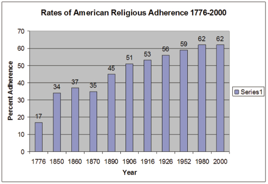
In their book The Churching of America 1776–2005, Finke and Stark (2005) used aggregate data over 200 years of American history to illustrate patterns of church growth and decline. What they found was a complex picture of individual denominations growing or declining, but what was so surprising is that their data show an overall growth pattern in American religious adherence over time, noting that at the beginning of the Revolutionary War, 17 percent of Americans were “churched.” By the mid-1860s, 37 percent of Americans were churched. By the mid-1920s, religious adherence had reached 56 percent, and then by the 1960s the adherence rate stabilized at 62 percent.
Figure 13.2 shows the rates of American religious adherence from 1776 to 2000. As you can see, the rates of adherence increase steadily across these years. The last years (1980–2000) show some stabilization of the growth pattern. Current research may suggest reasons for this plateau, although it may simply overrepresent a dynamic on the continued growth of the phenomenon. As we noted in Chapter 2, much has been made about religious “nones” and how that dynamic impacts the overall growth of religion. At this point, there is no clear reason these two ideas—continued religious growth and the growth of “nones”—are contradictory. With a 62 percent adherence rate holding steady, that leaves 38 percent of Americans who do not regularly participate in religious organizations. Many of these 38 percent claim a religious affiliation, even though they are not formal adherents. At this point it appears the 15 percent of American religious “nones” accurately describe a portion of the percentage of America’s nonadherents.
Figure 13.2. The growth in rates of American religious adherence 1776–2000.1
Finke and Stark’s (2005) study could only have been undertaken using aggregate data. In their book, Finke and Stark describe the data sources they used for the study. One of the hallmarks of the study is their use of U.S. Census data ranging from 1890 to 1936. During these decades the U.S. Census collected data on every American religious body including total membership, Sunday school enrollment, number of congregations, and many other variables (see Finke and Stark 2005, Chapter 1, for a description of their data).
Using a variety of aggregate data was appropriate for Finke and Stark’s research question, which hypothesized that religion operates as a religious economy and that in countries with a relatively unregulated religious market, religious organizations will thrive. What that means is that living in a country where people are free to practice any kind of religion, anyone can build their own firm (church)—or participate in a competitive religious market in order to win souls/adherents. The aggregate data (200 years’ worth) support Finke and Stark’s hypothesis that when religious regulation remains relatively low, religious participation will be relatively high (a 62 percent religious adherence rate is quite high).
Aggregate data are also unique in that they rely on different types of numerical values. Since aggregate data rely on people’s actual behaviors/characteristics (murder rate, property crime rate, percentage of the population with a college degree, median family income in states, etc.), the numerical values tend to be interval- or ratio-level measures (the hallmark of both measures is that they have equal distance between units; see Chapter 5 on measurement to review the levels of measurement). In comparing areal or social units, we need to make sure that the measures are standardized so that we can compare variables across units (another key is to make sure to compare similar units, e.g., nations compared to nations, states compared to states, Girl Scout troops compared to Girl Scout troops, congregations to congregations, etc.).
Units that are comparable may not be the same size (for example, look on a map at California and Rhode Island—can you even find Rhode Island?). If you take just the raw number of some variable to compare across states, the total number of anything within a state will be skewed toward the size of the population of that state. For example, if you had a variable that measured the number of people receiving food stamps in a state, chances are the states with the highest number of food stamp recipients would be California, New York, and Texas. In looking at these states, do you notice anything that they have in common? They are the largest three U.S. states. It should make sense that they would have the highest numbers of people receiving food stamps, since they have the highest populations. But do these states have a higher proportion of their population receiving food stamps compared to other, smaller states? Unless we take into account some common denominator, we cannot compare which states may have a higher percentage of food stamp recipients.
In order to compare phenomena across states, we need to standardize raw numbers by using rates and percentages. Rates are calculated using a common base for each unit so we can compare variables across units. Remember when you learned fractions in elementary school? You learned to add and subtract things that had different bases (or denominators):

Remember when you did that? What? Is that not how it works? Oh, that’s right, we need to make each fraction that we’re using equivalent or comparable. We do this by finding a common denominator (base) for each fraction. For the previous equation, the common denominator between one-half and one-fourth is fourths:

Creating a common base for a rate often relies on the type of aggregate unit you have. If we’re looking at data taken on the 50 U.S. states, a commonly used base is “per 100,000 population.” By using the state’s population as a common base, we can compare which states have the highest or lowest rates of some variable because each variable takes into account the state’s total population. Let’s go back to the example of the variable for “number of persons (in thousands) receiving food stamps” in a state. This variable gives the raw number (or total number) of people within each state receiving food stamps “in thousands.” If we look at the states with the highest number of food stamp recipients, indeed, California, Texas, and New York are at the top of the list: California with 2259 food stamp recipients, Texas with 1636 food stamp recipients, and New York with 1627 food stamp recipients (see Figure 13.3).
Figure 13.3. Number of persons (in thousands) receiving food stamps.
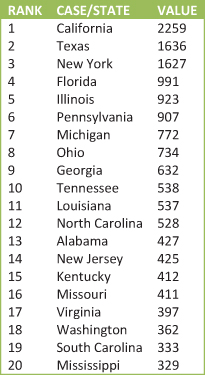
What do the numbers in Figure 13.3 tell us? The variable description explains that the numbers given for each state are “in thousands”; therefore we need to multiply the number by 1000 to see the number of food stamp recipients for each state (California with 2,259,000 food stamp recipients, Texas with 1,636,000, and New York with 1,627,000).
Again, having these particular states with the highest number of food stamp recipients is logical because these are the states with the largest populations. If we want to compare which states have the highest proportion of their populations receiving food stamps, we need to calculate using rate. Rates allow us to compare across states to see which has a higher proportion or percentage of their populations receiving food stamps. In order to calculate a rate, we take the raw number of food stamp recipients (the numerator) and divide by a common base. For this example we divide the total number of food stamp recipients by the total population of the state:

When we take each state’s total number of people receiving food stamps (the raw number) and divide it by the state’s total population (common base), we can then see the states with the highest percentage of their populations receiving food stamps, shown in Figure 13.4.
Figure 13.4. Percentage of the population receiving food stamps.
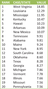
The three states with the highest percentage of food stamp recipients from Figure 13.4 are West Virginia with 14.85 percent of their population receiving food stamps, Louisiana with 12.29 percent of their population receiving food stamps, and Mississippi with 11.95 percent of their population receiving food stamps. Where do California, Texas, and New York fall on percentage of population receiving food stamps? New York is ranked 11 out of the 50 states, with Texas ranked 14 out of 50 states, and California ranked 25 out of 50 states (California not shown on Figure 13.4).
Rates allow us to standardize variables in order to compare the variables across aggregate units. When calculating and evaluating rates we want to be aware of what is being used as the common base. Look at the following variables. How do they differ?

While both variables measure beer consumption, they are calculated differently. The first (BEER) is calculated using total gallons of beer consumed; the other (%BEER) is calculated using total percentage of alcoholic beverages consumed that was beer. Variables that address the same overall concept (beer consumption) can be calculated quite differently depending on the numerator (raw number) and denominator (common base). When evaluating rates, we want to be aware that depending on the common base used to calculate the rate, we could have very accurate statistics that tell very different stories. Let’s explore this more using the example of divorce rates.
It’s important to evaluate a rate by knowing how the rate is calculated. What story is being told by the use of a particular rate? One way to think about evaluating a rate is by asking what is being used as the common base—is it the most relevant base? A relevant base can give you a more precise measure. For example, most Americans can tell you that the divorce rate is 50 percent. The description of this statistic tells you something about how it is created. Since it is a rate, we know it’s an aggregate-level measure. Since aggregate-level measures/rates take a raw number and divide it by a common base, what is the common base used here to calculate the divorce rate of 50 percent? Do you know how this rate is calculated? Based on our previous discussion, you might guess that the raw number of divorces per year would be the numerator, and perhaps the total population the denominator for this rate. That’s not how this particular rate is calculated. We should also add that the 50 percent divorce rate has become an urban legend. The rate has a very real beginning, but is it the best measure of divorce in America?
Divorce rates are a good example of how you can have accurate statistics that differ from one another. There are a number of ways to calculate the divorce rate—all of them accurate, yet all of them different. Depending on the common base, we can come up with a variety of ways to describe the divorce rate including the ratio of annual marriages to annual divorces, the crude divorce rate, or the refined divorce rate. Let’s look more in depth at these three measures.
The 50 percent divorce rate seems to be the rate that has won the popular debate. This is the highest possible estimate for divorce and receives the most media attention. How is it calculated? Generally this rate is calculated by taking the raw number of divorces granted in a given year (numerator) and dividing by the raw number of marriages performed in a given year (the denominator). In 1981 there were 1.2 million divorces and 2.4 million marriages. Using annual divorces divided by annual marriages for 1981 yields a divorce rate of 50 percent.

Consider how this rate is calculated. How many marriages performed in a given year are the same ones ending in divorce that same year (although there are certainly a few, it is probably not a significant number). So what does this rate mean? Although accurate, we are not comparing the same dynamic in the numerator and denominator. While marriages were performed in a given year, the divorces are the result of marriages of varying length over the course of several years. There is another problem with the precision of the variable. What happens if the number of divorces stays the same but the number of marriages declines? The divorce rate will rise. Again, this is an accurate statistic; it is clear how it is calculated. The 50 percent divorce rate, however, is probably not the best estimate of divorce in America.
We could look at the total number of divorces granted per year to give a different picture to see how divorce changes over time. But what should we use as a common base? We cannot simply compare the raw numbers of divorces per state—they would be skewed toward the states with the largest populations having the highest numbers of divorces (and we would not be able to compare the raw numbers across states). An alternative measure is the crude divorce rate, which takes the total number of divorces and then divides them by the total population of each unit (state). Think about this rate’s common base. Who is included in the total population? Is the total population of a state at risk for divorce (children and the unmarried)? No, not all members of a state’s population share an equal risk for divorce. While calculating the crude divorce rate is an accurate way to measure divorce rates, it still may not be the best way to measure divorce rates (it will be a significantly lower rate than the 50 percent rate, running somewhere around 30 percent).
The most precise divorce rate, the refined divorce rate, calculates the number of divorces per 1000 married women over the age of 15. This rate is considered the best estimate of divorce because it counts the total number of divorces (numerator) and divides the number by the total number of women eligible for divorce (the denominator). The refined divorce is the best indicator of divorce because the common base is the most relevant base, or the base that takes the most accurate population. By taking only married women over 15 years old as the common base, we arrive at a rate that is more precise in describing divorce. These data can be more difficult to collect; thus social researchers often rely on individual level data regarding divorce to see a picture of divorce in America. Nationally representative surveys like the GSS ask respondents, “[Excluding those who have never been married] Is respondent or has respondent ever been divorced or legally separated?” When asked if a respondent has ever been divorced, the number responding affirmatively hovers around 42 percent. Although 42 percent may not seem very far away from 50 percent, it is significantly less.
Aggregate-level data give us a fuller picture of a social unit (e.g., states or nations), than individual survey data can for some measures. All of the measures of divorce we’ve discussed represent accurate measures of divorce. This is something to keep in mind. When we talked about valid and reliable measures for survey data, we noted that partisan or special interest groups will phrase items in such a way as to bias the outcome. This can also happen with the reporting of rates. Depending on the specific interests of a group, rates can be used to selectively support those interests. As you read about rates, think about what type of group is reporting the data. Does the group reporting the data have a stake in how people think about the issue? How is the rate calculated? If how the rate is calculated is not included in the report, be cautious. If the rate calculation is described, consider what the base tells you; is it the most relevant base? Does the base yield a lower (crude divorce rate) or higher (divorces granted in a year divided by marriages performed that same year) estimate of the phenomenon?
One last unique feature of aggregate-level data is the problem of outliers. An outlier is an extreme case that distorts the true relationship between variables, either by creating a correlation that should not exist or suppressing a correlation that should. While aggregate level measures are composed of hundreds, thousands, or millions of individuals, the aggregate units themselves have significantly fewer units. The United States has over 310 million residents, but for data taken at the state level (aggregate level) those 310 million people are divided into just 50 states. When analyzing 50 cases, if even one case is significantly different from the others, that case may throw off any statistical calculations (creating a significant correlation when there is not one or creating an insignificant correlation when there really is a significant relationship). Therefore, we need to test for outliers—cases that distort the true relationship between variables.
Look at Figure 13.5, which shows a scatterplot between percentage white in a state and the number of astrology offices per 100,000 population. We hypothesize that whites are the most likely to visit astrology offices.
Figure 13.5. Number of astrology offices per 100,000 population by percentage white.
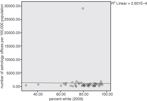
The scatterplot in Figure 13.5 illustrates a flat cluster of the states with an R2 = 2.601E-4! Notice at the top of Figure 13.5, however, the lone dot that is far from the regression line (line of best fit). It appears that there is an outlier—an extreme case that distorts the true relationship between percentage white and astrology offices. When data are arrayed in this manner, we need to think about what is so unique about that case that it would be so far afield of the other data points. In going back to SPSS and sorting the cases, we find that the outlier is the data for the whole United States. In our census data file, each state, the District of Columbia, and the United States are included as cases. Clearly, we need to “select cases” and take out the United States before we can come to any conclusions about the relationship between our variables. Because aggregate data use fewer cases, we want to make sure that our analyses do not contain any cases that are significantly different (for example, Washington, D.C., may also serve as an outlier when compared to the states; rather than being a state, it is more equivalent to a large urban city. States and cities are not comparable units, so Washington, D.C., may need to be removed from the data set).
As we’ve illustrated, aggregate data help social scientists look at the big picture; social patterns that are beyond the scope of individuals. How the data are collected, how rates are calculated (and interpreted), and how one case can distort the relationships within the data demonstrate the unique features of this research design. In order to explore more about aggregate data, we have provided two practice exercises. The first exercise deals with how rates are calculated. The second exercise comes from the ARDA (www.theARDA.com) and walks you through the Learning Module for Exploring Congregations in America.

Notes
1 Adapted from Finke and Stark 2005.
2 Adapted from Corbett and Roberts 2002.
3 This exercise is printed by permission from the Association of Religion Data Archives (http://www.thearda.com/learningcenter/learningactivities/module8.asp).