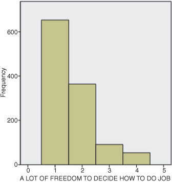
Figure DMUC.1. The SPSS histogram for the work autonomy study variable.
DATA MANAGEMENT UNIT C: DESCRIPTIVE STATISTICS1
Statistical procedures are best used to discover patterns in the data that are not directly observable. Bringing light to these patterns allows researchers to understand and engage in problem solving. This section describes descriptive statistics for each of the major levels of data: nominal, ordinal, interval, and ratio. Since statistical procedures are designed for specific kinds of data, we believe it is important to discuss each procedure separately, according to its level. SPSS can be used with all of these levels of data, as you will see.
Statistics, like other courses of study, is multifaceted. It includes both descriptive and inferential processes. Descriptive statistics are methods to summarize and boil down the essence of a set of information so that it can be understood more readily and from different vantage points. We live in a world that is bombarded with data; descriptive statistical techniques are ways of making sense of it. Using these straightforward methods reveals numerical and visual patterns in data that are not immediately apparent. Stated differently, these methods allow us to see the world as it is, not necessarily by common sense.
Inferential statistics are a different matter altogether. These methods allow you to make predictions about unknown values on the basis of small sets of sample values. In real life, we are presented with situations that cannot provide us with certainty. Would a method for teaching mathematics improve the scores of all students who take the course? Can we predict what a student might score on a standardized test? Inferential statistics allow us to infer or make an observation about an unknown value from values that are known. Obviously, we cannot do this with absolute certainty; we do not live in a totally predictable world. But we can make inferences within certain bounds of probability. Statistical procedures allow us to get closer to certainty than we could get without them.
Descriptive statistics include graphical and numerical procedures to assist the researcher to understand and see patterns in data. Typically, a researcher gathers data, which, unexamined, exists as a series of numbers with no discernible relationship. By using descriptive statistical techniques, the researcher can present the data in such a way that whatever patterns exist can be assessed numerically and visually.
In the chi square chapter where we discussed the contingency table, we noted that nominal data are best described by noting the percentages of cases that fall within each category of a particular variable. For example, Figure 7.1 shows what percentage of the General Social Survey (GSS) respondents could be categorized as having high or low work autonomy based on their response to the item dealing with freedom to make decisions at work. Since this is a nominal (categorical) variable, we can describe the data simply by noting the percentages of cases that fall in either category.
You will also notice in Figure 7.1 that the second study variable, health condition, can also be described with percentages, even though this variable is an ordinal variable. The categories of health condition are distinctly different, but they have the quality of “more than–less than” that characterizes ordinal data.
When we discussed contingency table analyses, we noted that you can describe the relationship between the study variables using measures of association. Chi-square procedures typically use contingency coefficient, phi, or Cramer’s V to describe the relationship between nominal level variables. (If our analysis had used two ordinal variables, we could have used Kendall’s Tau-b to describe the association.)
There are ways to describe nominal and ordinal data visually (graphically) as well as numerically. The primary way to do this is through the use of the histogram, which is a graph that displays the number of cases that fall within each category of a study variable. Figure DMUC.1 shows a histogram describing the work autonomy variable that we used in the chi-square analysis for Figure 7.1.
Figure DMUC.1. The SPSS histogram for the work autonomy study variable.

As you can see, Figure DMUC.1 shows the “frequency” on the vertical (y) axis and separate columns for each category of the GSS item on the horizontal (x) axis. The numbers for the horizontal axis represent coded values for the categories created by GSS. Thus the question posed to respondents was, “[I have] a lot of freedom to decide how to do [my] job.”
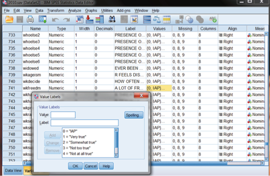
Figure DMUC.2 shows the main category codes for this GSS item (“wkfreedm”). You can view “value labels” for study variables by looking at the variable view of the main data screen and clicking on a specific variable’s “Values” column. In Figure DMUC.2, we have selected the values column for the “wkfreedm” variable. Each variable in the database is given a brief name (shown in the “Name” column to the far left), and many are assigned labels corresponding to the wording of the survey item (shown under the “Label” column for each variable). By clicking anywhere in these cells, you can see the information supplied for each variable. The “Value Labels” box that appears for the wkfreedm variable is shown in Figure DMUC.2. As one example, the category of “1” means “Very true.” It is these label codes that are reproduced in the horizontal axis of the histogram, as shown in Figure DMUC.1.2 One reason for this is that study variables are often interval data and the category codes are continuous (i.e., the different values have equal distances).
Figure DMUC.2. The SPSS Variable View window showing value labels for “wkfreedm.”
When they are viewed as interval data, the columns of data are joined together with no distances between the columns to reflect the continuous nature of the data. The value of each column is placed in the middle of the column. (Sometimes, “grouped” data are represented in which each side of each column represents the class limits of each category’s values.)
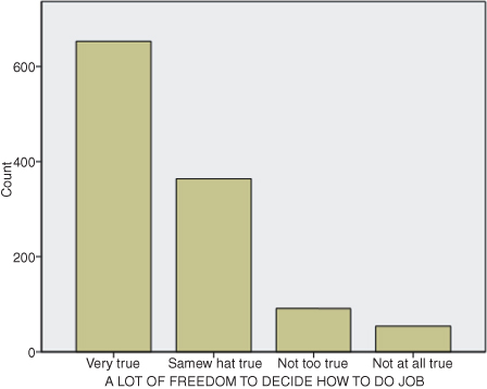
You can see the difference in SPSS graphs by looking at the same variable (wkfreedm) in a “bar graph,” shown in Figure DMUC.3. Both graphs look very similar, with most of the respondents reporting stronger agreement with the statement (i.e., taller columns on the left sides of the graphs). But the bar graph makes no assumptions about the levels of measurement of the variable represented. As you can see, the bars are separated, and the variable labels are reported as they appear in the original database (if the person compiling the data included them!). The columns of “counts” of data are shown as separate categories, in this case befitting the level of measurement of this variable. The researcher can decide whether to treat the data as ordinal or nominal in the study.3
Figure DMUC.3. The SPSS bar graph for the work autonomy study variable.
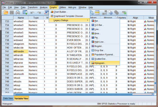
The process for using SPSS to generate graphs like those in Figures DMUC.1 and DMUC.3 is accomplished through the use of the main menu ribbon. Figure DMUC.4 shows how to obtain either the bar graph or the histogram. As you can see, we selected “Graphs” on the main menu ribbon and then “Legacy Dialogs” in the submenu. SPSS graphics allows you to use a variety of means to customize figures, but the “Legacy Dialogs” represents the more common type of figures used by researchers. You can see in Figure DMUC.4 that the bar graph is the topmost choice in the list.
Figure DMUC.4. The SPSS Legacy Dialogs specification window for wkfreedm.
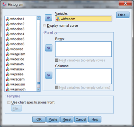
If we choose “Histogram,” as shown in Figure DMUC.4, we are presented with a separate specification window for the histogram. Figure DMUC.4a shows this window in which we have moved wkfreedm from the list of variables on the left to the “variable:” window on the right using the arrow button. You can explore the additional specification features for this graph, but simply choosing OK will create the histogram shown in Figure DMUC.1.
Figure DMUC.4a. The SPSS Histogram specification window for wkfreedm.
As we mentioned earlier, data can be described numerically as well as visually. We have already used one SPSS procedure for describing nominal (and ordinal) data, that of crosstabs. In the chi-square chapter, we used the example of work autonomy and health condition to explain how to use the crosstabs procedure and how to interpret the results. In the preceding section we discussed visual (graphical) methods of describing individual study variables. In this section, we discuss how to use SPSS to obtain descriptive numerical statistics.
The Frequency command allows the user to examine the number and percentage of cases that fall within categories of nominal and ordinal variables. We can use one of the preceding examples (the GSS variable, health condition) to demonstrate how to obtain these results. Figure DMUC.5 shows the SPSS window for Frequencies derived from the main menu ribbon.
Figure DMUC.5. The SPSS Frequencies window for obtaining descriptive statistics.
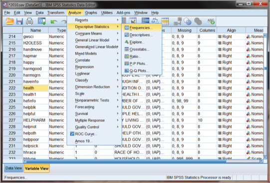
As you can see in Figure DMUC.5, we used the main Analyze menu to specify “Descriptive Statistics” and then “Frequencies.” You will also notice in Figure DMUC.6 that we highlighted the variable (“health”) in the Name column that we will use in the example.
Figure DMUC.6. The SPSS Frequencies specification window.
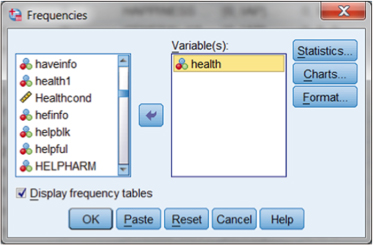
Figure DMUC.6 shows the Frequencies menu that appears when the “Descriptive Statistics–Frequencies” selection is made. The user selects the variable from the list on the left and moves it to the “Variable(s):” window using the arrow key. Note that you may select more than one variable to examine for each analysis.
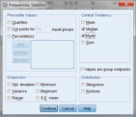
From this window, you can make additional specifications for the output using the buttons in the upper right side of the specification window. The top button (Statistics) allows you to specify which descriptive procedures you would like to run. Recognizing that this is an ordinal-level variable, we cannot call for a mean but are limited to median and mode to assess central tendency. Figure DMUC.7 shows the specification menu that appears when you select Statistics. As you can see, we selected only “Median” and “Mode” in the “Central Tendency” panel of choices. The default for Frequencies is to show number and percentage of cases in categories of the variable, which are measures of dispersion.
Figure DMUC.7. The SPSS Frequencies: Statistics specification window.
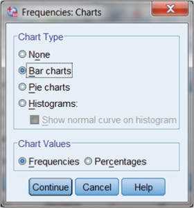
Before finalizing the procedure, note that we can choose the Charts button (see Figure DMUC.6) to specify visual (graphic) representations. This additional specification is shown in Figure DMUC.8. As you can see, we called for a bar chart but could have chosen a number of other graphic measures. Note also that the chart we choose can be portrayed in “Frequencies” or “Percentages.” We chose the default: “Frequencies.”
Figure DMUC.8. The SPSS Frequencies: Charts specification window.
When we make the Statistics and Charts specifications, we are returned to the main Frequencies menu. Note that (see Figure DMUC.6) the box “Display frequency tables” is checked as a default. This will allow us to see a table with the frequency of cases by category.
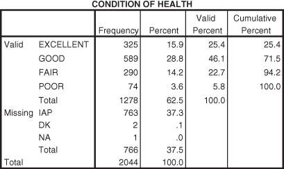
When we finalize the procedure (by pressing OK), SPSS returns several output tables. Three are of particular interest. Figures DMUC.9, DMUC.10 and DMUC.11 show the graphic (bar graph), statistics, and frequency (frequencies table) output, respectively.
Figure DMUC.9. The SPSS bar chart obtained from Frequencies: Charts.
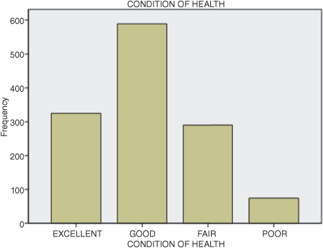
Figure DMUC.10. The SPSS statistics table obtained from Frequencies.
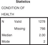
Figure DMUC.11. The SPSS frequencies table obtained from Frequencies: Statistics.
The bar chart in Figure DMUC.9 is similar to that for work autonomy that we discussed earlier (see Figure DMUC.3). Note that most of the respondents (i.e., the mode) indicated “good” as a descriptor of their general health. Only a very few indicated “poor.”
The statistics table in Figure DMUC.10 indicates both the median and mode information based on the GSS codes for the categories (1 = Excellent, 2 = Good, etc.). As you can see, the median and mode are both 2, which indicates that the category coded with a 2 (Good) obtained the most respondent selections (Mode) and that this category was in the middle of the overall distribution of respondent selections (Median).
The frequency table in Figure DMUC.11 contains a great deal of information. As you can see, there are five columns of information for each variable category. The first column lists the categories for the variable, including the missing response categories, “IAP” (“inapplicable to a set of respondents), “DK” (don’t know), and “NA” (nonapplicable). The second column (“Frequency”) shows the number of respondents who made selections for each category of health (or were classified according to the IAP category, for example). The third column (“Percent”) shows the percentage of the total number of responses of the cases in a particular category. The fourth column (“Valid Percent”) shows the percentage of respondents in the primary categories. The last column (“Cumulative Percent”) shows the accumulating percentage from the first to the last primary category of responses. Thus 325 respondents indicated “Excellent” health, which represented 15.9 percent of all response categories including “missing” (325/2044), but which represented 25.4 percent of the responses in the four nonmissing categories (325/1278).
Researchers should carefully decide which percentages to report. In most cases, you can report only the valid percentages, but it is important to point out the number of missing cases as well.
Many social science research variables (interval level) are normally distributed in that they conform to the bell curve where data pile up in the middle and tail off in both directions. Normal distributions are important in research because many research techniques (especially those designed for interval data) require variables to be normally distributed. Researchers typically examine four dimensions of a distribution of data to determine whether it is normal: central tendency, variability, skewness, and kurtosis.
Simply looking at a set of numbers is not the best way to understand the patterns that may exist. The numbers are typically in no particular order, so the researcher probably cannot discern any meaningful pattern. Are there procedures we can use to understand these patterns numerically?
Central tendency measures suggest that a group of scores can be understood more comprehensively by using a series of numerical procedures. As these measures suggest, we can understand a lot about a set of data just by observing whether or not most of the scores cluster or build up around a typical score. That is, do the scores have a tendency to approach the middle from both ends? There will be scores spreading out around this central point, but it is helpful to describe the central point in different ways and for different purposes. The primary question the researcher asks here is, “Can we identify a ‘typical’ score that represents most of the scores in the distribution?” The following are the most commonly used central tendency measures.
The mean is the arithmetic average of a set of scores. To calculate a mean, the researcher needs at least interval data because you need to be able to add, subtract, multiply, and divide numbers to calculate it. If you have less than interval data, it would not make sense to use these arithmetic operations, since you could not assume the intervals between data points are equal. (For example, you could not get a meaningful “average sex,” since sex is nominal level.)
Calculating the mean value uses one of the most basic formulas in statistics, the average:

This formula uses the “ ” symbol, which means “sum of.” Therefore, the average, or mean value, can be calculated by adding up a set of numbers, or “summing” them, and then dividing by how many numbers there are in the set by the number of data observations (N). To take an example, the data values in Table DMUC.1 represent actual values from a school database from Washington state.4 These are a sample of schools with fourth grade (N = 40) percentage of students qualified to receive free or reduced lunches. This variable is important to social researchers, since it represents one of the only ways to gauge the family income level of the students. Since the values are percentages of all students in the school, the data are interval level.
TABLE DMUC.1. School Data for Central Tendency
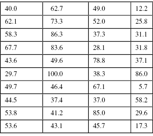
Using the values in Table DMUC.1, we can calculate the mean by summing the 40 numbers to get 1979.41. If we divide this number by 40, the amount of numbers in the set, we get 49.49.

What does the mean of 49.49 indicate? If you inspect the data in Table DMUC.1 you will see that 100 percent of the students in one school qualified for free or reduced lunch while 5.7 percent of the students at another qualified. That is quite a difference! What is the typical percentage of students who qualified for free or reduced lunch? That is, if you had to report one score that most typified all the scores, which would it be? This is the mean, or average value. It expresses a central value (toward the middle) that characterizes all the values.
Another measure of central tendency is the median, or middle score among a set of scores. This isn’t a calculation like the mean, but rather it identifies the score that lies directly in the middle of the set of scores when they are arranged large to small (or small to large). In our set of scores, the median is 46.05. If you were to rank-order the set of scores by listing them small to large, you would find that the direct middle of the set of scores is between the twentieth (45.7) and twenty-first (46.4) numbers in the list. In order to identify the direct middle score, you would have to average these two numbers to get  . An equal number of scores in the group of scores are above and below 46.05.
The median is important because sometimes the arithmetic average is not the most typical score in a set of scores. For example, if I am trying to find the typical housing value in a given neighborhood, I might end up with a lot of houses valued at a few hundred thousand and five or six houses valued in the millions. If you added all these values up and divided by the number of houses, the resulting average would not really characterize the typical house because the influence of the million-dollar homes would present an inordinately high value.
To take another example, the values in Table DMUC.2 are similar to those in Table DMUC.1 with the exception of seven values. In order to illustrate the effects of “extreme scores,” we replaced each percentage over 70 with a score of 100.0. If you calculate an average on the adjusted values in Table DMUC.2, the resulting value is 52.16.
TABLE DMUC.2. Adjusted Free or Reduced Lunch Percentages
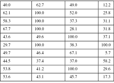
Changing six of the original values resulted in the mean changing from 49.49 to 52.16. But what happens to the median when we make this change? Nothing. The median remains 46.05, since it represents the middle of the group of scores, not their average value. In this case, which is the more typical score? The mean value registers the influence of these large scores, thereby “pulling” the average away from the center of the group. The median stays at the center.
This small example shows that only a few extreme scores can exert quite an influence on the mean value. It also shows that the median value in this circumstance might be the more typical score of all the scores, since it stays nearer the center of the group. Researchers should be alert to the presence of extreme scores, since they oftentimes strongly affect the measure of central tendency. This is especially true any time the values reflect money such as housing values, household income, and so on.
The mode is the most frequently occurring score in a set of scores. This is the most basic of the measures of central tendency, since it can be used with virtually any set of data. Referring to Table DMUC.1, you will see that there are no values exactly the same. This is often the case when we use “continuous” data (like the percentages of free or reduced lunches by school). When there are equivalent values in the database, the mode is a typical score or category, since data most often mass up around a central point. In this case, it makes sense that the mode, at the greatest point of accumulation in the set, represents the most prevalent score.
One data pattern that social scientists need to look for is the bimodal distribution of data. This situation occurs when the data have two (or more) clusters of data rather than massing up around the middle of the distribution. You can detect a bimodal distribution numerically by observing several values of the same number. But in larger databases, it is more difficult to do this. In this case, it is easier to use visual means of describing the data. We discuss these further in a later section, but consider the example in Figure DMUC.12. The data in Figure DMUC.12 are the GSS 2010 respondents’ socioeconomic indexes (sei). As you can see from the graphic (histogram), there are two more or less distinct clusters of data rather than just one. There is a cluster near the index score of 30 and another cluster around the index score of 65.
Figure DMUC.12. The sei data from GSS 2010.
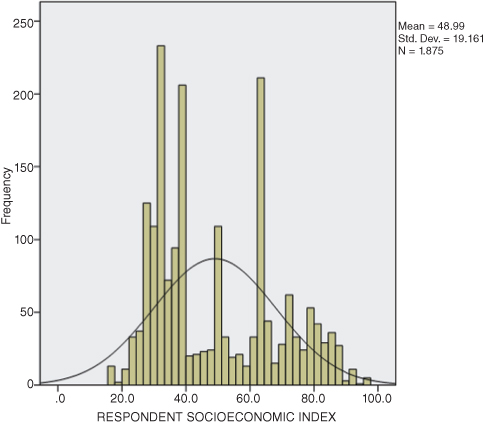
In this situation, what is the most appropriate measure of central tendency? The data are interval, so we could calculate a mean. The mean for these adjusted scores is 48.99. However, would this mean value truly be the most characteristic, or typical, score in the set of scores? No, because the scores in the set of data (in Figure DMUC.12) no longer cluster around a central point; they cluster around two central points. Therefore, it would be misleading to report a mean of 48.99, even though it is technically a correct calculation. The discerning researcher would report that there are two clusters of data, indicating a bimodal distribution. In the case of the data reported in Figure DMUC.12, it appears that “most” of the GSS respondents indicated sei indexes quite divergent from one another.
The mean is used with interval (or ratio) data, since it is a mathematical calculation that requires equal intervals. The median and mode can be used with interval as well as “lower levels” of data (i.e., ordinal and nominal), whereas a mean cannot. Using either median or mode with interval data does not require a mathematical calculation; it simply involves rank-ordering the values and finding the middle score or the most frequently occurring score, respectively. The mean cannot be used with ordinal or nominal data, since we cannot use mathematical calculations involving addition, subtraction, multiplication, and division on these data, as we discussed earlier.
The median is a better indicator of central tendency than the mean with “skewed” or imbalanced distributions. We have more to say shortly about skewed sets of scores, but for now, we should recognize that a set of scores can contain extreme scores that might result in the mean being unfairly influenced and therefore not being the most representative measure of central tendency. Even when the data are interval (as, for example, when the data are dealing with monetary value, or income), the mean is not always the best choice of central tendency despite the fact that it can use arithmetic calculations.
The mode, in contrast, is helpful in describing when a set of scores fall into more than one distinct cluster (bimodal distribution). Consider Figure DMUC.12 that shows an example with interval data. The mode is primarily used for central tendency with nominal data.
We continue to explore descriptive statistics in this chapter. This time, we examine the extent to which scores spread out from the mean of a distribution of values. It is important to understand the characteristic score or value of a distribution, as we saw with central tendency, but it is also critical to understand the extent of the scatter, variability, or dispersion of scores away from the center. How far away do scores fall, do the scores fall equally to the left and right of the mean, and to what extent do the scores bunch up in the middle relative to their spread? The answers to these and similar questions will help us to complete our description of the distribution of values.
Skewness is a term that describes whether, or to what extent, a set of values is not perfectly balanced but rather trails off to the left or right of center. We will not discuss how to calculate skew, but it is easy to show. If you look at Figure DMUC.1, you can see that the number of cases trail off to the right side of the histogram. The number of cases do not bunch up in the middle of the histogram as they would if the (interval) data were normally distributed (i.e., in the bell curve shape). This is an example of a “positive skew,” since the values trail off to the right (generally in the direction of greater values of the variable). The data can also trail off to the left of center in which case it would represent a “negative skew.”
You can see the skew more easily if you superimpose the normal curve onto the histogram as we have done in Figure DMUC.13. This figure is from the GSS database in which respondents were asked about their number of hours of e-mail per week. (Note that you can superimpose the normal curve on the figure by checking the “Display normal curve” box in the histogram specification window as shown in Figure DMUC.4a.) Clearly, the data are not normally distributed! There are many respondents who indicate a great many hours of e-mailing per week. So much so, that the researcher might question the nature of the item and the respondents. (For example, does this include one’s occupational use of e-mail? Only personal use? etc.)
Figure DMUC.13. The SPSS wkfreedm histogram with superimposed normal curve.
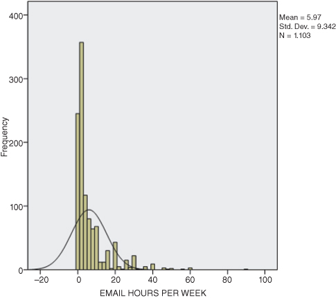
Kurtosis is another way to help describe a distribution of values. This measure indicates how peaked or flat the distribution of values appears. Distributions where all the values cluster tightly around the mean might show a very high point in the distribution, since all the scores are pushing together and therefore upward. This is known as a leptokurtic distribution. Distributions with the opposite dynamic, those with few scores massing around the mean, are called platykurtic and appear flat. “Perfectly” balanced distributions show the characteristic bell curve pattern, being neither too peaked nor too flat. The distribution of responses in Figure DMUC.13 clearly indicates a leptokurtic distribution, since an inordinate number of respondents indicated only a few hours of e-mailing per week.
One simple way to measure variability is to use the range, the numerical difference between the highest and lowest scores in the distribution. This represents a helpful global measure of the spread of the scores. But remember it is a global measure and will not provide extensive information. Nevertheless, the range provides a convenient shorthand measure of dispersion and can provide helpful benchmarks for assessing whether or not a distribution is generally distributed normally.
The percentile or percentile rank is the point in a distribution of scores below which a given percentage of scores fall. This is an indication of rank, since it establishes a score that is above the percentage of a set of scores. For example, a student scoring in the 82nd percentile on a math achievement test would score above 82 percent of the other students who took the test.
Therefore, percentiles describe where a certain score is in relation to the others in the distribution. The usefulness of percentiles for educators is clear, since most schools report percentile results for achievement tests. The general public also sees these measures reported in newspaper and Web site reports of school and district progress.
Education researchers use a variety of measures based on percentiles to help describe how scores relate to other scores and to show rankings within the total set of scores, including quartiles (measures that divide the total set of scores into four equal groups), deciles (measures that break a frequency distribution into 10 equal groups), and the interquartile range that represents the middle half of a frequency distribution (since they represent the difference between the first and third quartiles).
The standard deviation (SD) and variance (VAR) are both measures of the dispersion of scores in a distribution. That is, these measures provide a view of the nature and extent of the scatter of scores around the mean. So, along with the mean, skewness, and kurtosis, they provide a way of describing the distribution of a set of scores. With these measures, the researcher can decide whether a distribution of scores is normally distributed.
The variance (VAR) is by definition the square of the SD. Conceptually, the VAR is a global measure of the spread of scores, since it represents an average squared deviation. If you summed the squared distances between each score and the mean of a distribution of scores (i.e., if you squared and summed the deviation amounts), you would have a global measure of the total amount of variation among all the scores. If you divided this number by the number of scores, the result would be the VAR, or the average squared distance of the cases from the mean.
The SD is the square root of the VAR. If you were to take the square root of the average squared distances from the mean, the resulting figure is the standard deviation. That is, it represents a standard amount of distance between the mean and each score in the distribution (not the average squared distance, which is the VAR). We refer to this as standard, since we created a standardized unit by dividing it by the number of scores, yielding a value that has known properties to statisticians and researchers. We know that, if a distribution is perfectly normally distributed, the distribution will contain about six SD units, three on each side of the mean.
Both the SD and the VAR provide an idea of the extent of the spread of scores in a distribution. If the SD is small, the scores will be more alike and have little spread. If is large, the scores will vary greatly and spread out more extensively. Thus, if a distribution of test scores has a SD of 2, it conceptually indicates that typically the scores were within 2 points of the mean. In such a case, the overall distribution would probably appear to be quite scrunched together, in comparison to a distribution of test scores with a SD of 5.
We have more to say about this difference in other chapters when we discuss inferential statistics. For now, it is important to point out that computing SD for a sample of values, as we did with the ratio data, will yield a different value depending on whether we understand the distribution of data to represent a complete set of scores or merely a sample of a population.
Remember that inferential statistics differs from descriptive statistics primarily in the fact that, with inferential statistics, we are using sample values to make inferences or decisions about the populations from which the samples are thought to come. In descriptive statistics, we make no such attributions; rather, we simply measure the distribution of values at hand and treat all the values we have as the complete set of information (i.e., its own population). When we get to considerations of inferential statistics, you will find that, in order to make attributions about populations based on sample values, we typically must adjust the sample values, since we are making guesses about what the populations look like. To make better estimates of population values, we adjust the sample values.
SPSS has no way of distinguishing inferential or descriptive computations of SD. Therefore, they present the inferential SD as the default value. We will show how to determine the differences and examine the resulting values using SPSS.
Obtaining descriptive statistics from SPSS® for interval and ratio data is straightforward. The primary consideration for the user is which statistical information is needed. The procedures and output available depend on a number of factors including the level of data for the variable(s) requested. In the preceding section, we discussed using the SPSS Frequencies procedure for nominal and ordinal levels of data. This procedure can also be used with interval data, but it is more convenient to use the “Analyze–Descriptive Statistics–Descriptives” command from the main Analyze menu.
As you can see from Figure DMUC.14, we are showing the example of creating descriptive statistics for the percentage of (seventh grade) students in Washington schools who met the standard for the math assessment in 2010. This is an aggregate measure in that the scores represent the collected percentage of students by school. These data are used widely in evaluation research, but remember that they are not individual data, which restricts the nature and extent of the conclusions that can be made using them in research.
Figure DMUC.14. The SPSS Descriptive Statistics–Descriptives menu.
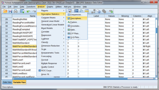
Despite the nature of the data, the descriptive statistics outcomes can be derived using the same procedure. We are requesting descriptive statistics for an interval-level variable that we can use to determine, among other outcomes, the extent to which the distribution of data approximates a normal distribution.
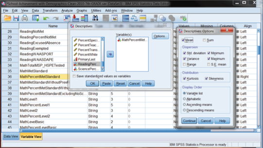
When we initiate this choice in SPSS, we are presented with several choices for descriptive statistics outcomes. As you can see in Figure DMUC.15, we specify a variable (“Math Percent Met Standard”) in the “Variable(s):” window of the “Descriptives” submenu, and then we can choose the Options button to choose the output measures we want. In the example in Figure DMUC.15, we chose the Mean, SD, VAR, minimum and maximum values, skewness, and kurtosis.
Figure DMUC.15. The SPSS descriptive statistics specification menus.
By making these choices, SPSS returns the output table shown in Figure DMUC.16. As you can see, we now have “descriptors” for 484 schools (with seventh grades) in Washington. We can see the four main descriptors of distributions: central tendency (mean = 52.64), dispersion (SD = 18.173, and VAR = 330.271), skewness (−0.043), and kurtosis (−0.398).
Figure DMUC.16. The SPSS descriptive statistics output.

Interpreting skewness and kurtosis is a bit of an art, but there are some guidelines that may be helpful. Skewness (the balance or imbalance of a set of interval data) is best interpreted by dividing the skewness statistic (−0.043) by its standard error (0.111). If the resulting number is less than 2 or 3, the distribution is probably “balanced” or does not appear lopsided. You can use the sign (positive or negative) of the skewness value to indicate which way the skew tends (i.e., negative to the left and positive to the right), but the magnitude of the result indicates whether or not the skewness is excessive.
This guideline is greatly affected by the overall size of the data set, however. Typically, the Std. Error of Skewness reported by SPSS will be smaller with larger numbers of values in the distribution. So large data sets (200 to 400) might have very small Std. Error of Skewness numbers and result in the overall skewness result being very large (since dividing by a smaller number yields a larger result). Smaller data sets will typically have large Std. Error of Skewness numbers with resulting small skewness results.
In light of these issues, the researcher needs to consider the size of the distribution as well as the visual evidence to make a decision about skewness. In our example the skewness result is (−0.387) (derived by −.043/.111), which, according to our guideline, represents a balanced distribution.
The kurtosis finding is interpreted in the same way as the skewness finding. In our example, the kurtosis number is −1.79 (derived from −0.398/0.222) which is within the acceptable guideline. The negative result indicates a flatter distribution; a positive number indicates a more peaked distribution.
There are other ways to obtain descriptive statistic outcomes from SPSS, but one we note here is the “Explore” procedure. If you look at Figure DMUC.14, you will see that the “Explore” procedure is obtained through the “Analyze–Descriptive Statistics” menu (the Explore choice is located just below “Descriptives”). When you make this choice, SPSS returns the menu shown in Figure DMUC.17.
Figure DMUC.17. The SPSS Explore menu.
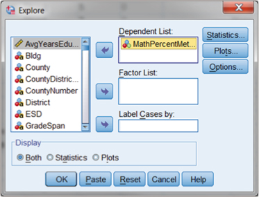
As you can see, we specified Math Percent Met Standard in the “Dependent List:” window by using the arrow key. At this point, we have several additional choices to help in our specification. We will only examine some of these, since several relate to inferential processes, a discussion for later sections.
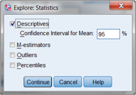
The first additional specification results from the Statistics button in the upper right corner of the Explore menu. By choosing this button, we will be able to call for descriptive analyses, as shown in Figure DMUC.18.
Figure DMUC.18. The SPSS “Explore: Statistics” menu.
The Explore menu (shown in Figure DMUC.17) also includes a choice for “Plots” through the button in the upper-right corner. By choosing this option, you will see the following submenu (“Explore: Plots”) in which you can choose a range of outputs to help assess the nature of the variable distribution. Figure DMUC.19 shows these options.
Figure DMUC.19. The SPSS “Explore: Plots” menu.
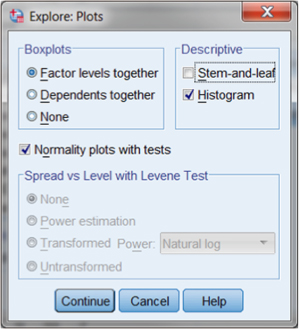
In the following section, we discuss visual assessments of descriptive statistics. For now, we focus on the numerical output, which are available by checking the box “Normality plots with tests” in the middle of the Explore: Plots menu.
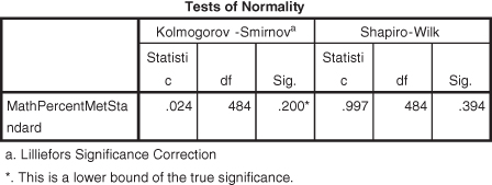
Figure DMUC.20 and DMUC.21, respectively, show the numerical output that results from the choices made in Figures DMUC.18 and DMUC.19.
Figure DMUC.20. The SPSS descriptive output from the “Explore: Statistics” menu.
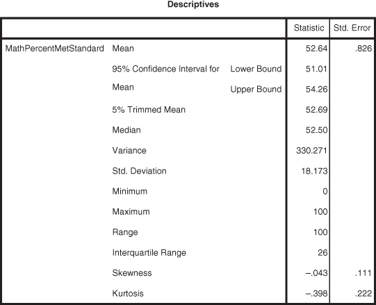
Figure DMUC.21. The SPSS descriptive output from the Explore: Plots menu.
The output in Figure DMUC.20 largely reproduces the output obtained from the Descriptive Statistics–Statistics procedure (see Figure DMUC.16). There are additional values (e.g., median, range, and others), but the SD, VAR, skewness, and kurtosis figures are available.
The output in Figure DMUC.21 is much different in nature in that they represent inferential tests of the normality of the distribution of the test variable. Since we will discuss inferential statistics in different sections, we point out here that the Kolmogorov-Smirnov and Shapiro-Wilk tests help researchers to assess whether the test variable (Math Percent Met Standard) is considered normally distributed (i.e., balanced, not bimodal, not lopsided, etc.). If the “Sig.” value for both tests is greater than 0.05, then the distribution is considered within normal bounds. In this example, both Sig. values exceed 0.05 (0.200 and 0.394, respectively), so we can consider the Math Percent Met Standard variable to be normally distributed. These statistical tests are sensitive to the conditions of different variables (e.g., sample size), so interpret them cautiously.
As we have mentioned, it is always good to look at the visual output of statistical analyses in order to gain a better descriptive picture of a variable or variables in a study. We turn to this now with respect to interval-level variables.
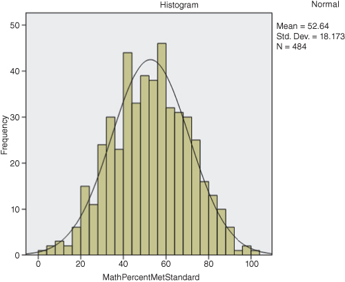
We have already seen how to create bar charts (Figures DMUC.8 and DMUC.9) and histograms (Figures DMUC.4 and DMUC.4a). Histograms are simpler to see with interval data, as shown in Figure DMUC.22. We obtained this histogram through the Explore procedure (see specification in Figure DMUC.19). You can just as easily create the histogram by the methods we discussed in the earlier section. In either case, you will note that the histogram appears to be normally distributed. The earlier histogram procedure allowed the user to superimpose the normal curve so that the “fit” is clearer. You can still make this change by double clicking on the histogram in the SPSS output that results from the Explore procedure (shown in Figure DMUC.22). This results in a “Chart Editor” that presents several choices for changing the appearance of the histogram. If you select, “Elements–Show Distribution Curve” in the Chart Editor screen, you can select the Normal Curve overlay (as we have done for Figure DMUC.22).
Figure DMUC.22. The SPSS histogram derived through the Explore: Plots menu.
| Use and Function | SPSS Menus |
| Create a histogram showing the categories of a variable in bars | Graphs–Legacy Dialogs–Histograms (there are alternative ways of doing this, but this is the simplest) |
| Create descriptive statistics by showing the frequency and percent of the variable categories (values) | Analyze–Descriptive Statistics–Frequencies |
| Create descriptive statistics for interval-level variables | Analyze–Descriptive Statistics–Descriptives |
| Create descriptive statistics for an interval variable according to the categories of a predictor variable (including separate tests of normality) | Analyze–Descriptive Statistics–Explore |
Notes
1 Some of the material in this section is adapted from Abbott (2010), with permission of the publisher.
2 When we used this variable in the chi-square study (with health condition), we combined the wkfreedm categories into “high” or “low” by assigning categories 1 and 2 to “high” and categories 3 and 4 to “low.”
3 In the chi-square study, we combined ordinal categories and “transformed” this to a nominal variable with two categories. Technically, we could still treat it as ordinal, but “categorizing” variables in this way treats them as nominal variables. This process had minimal impact on the association measures in the chi-square analysis.
4 The data are used courtesy of the Office of the Superintendent of Public Instruction, Olympia, Washington.