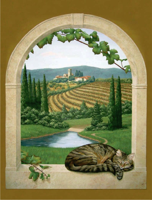
ATMOSPHERIC PERSPECTIVE IN TUSCAN MURAL
Photograph by Julie Damore
JEFF RAUM
This demo is showing only the middle ground of the completed piece. Keep this in mind as you are painting. The middle ground offers a good example of atmospheric perspective. In atmospheric perspective, objects are cooler, have less contrast, and the intensity, or chroma, of the color is less when the objects are far away. As the objects get closer to the viewer, they get warmer, have more contrast and the colors intensify.
Do not get too detailed in this part of your mural. Remember, the more detailed you make the midground, the more detailed your foreground will need to be. Give yourself some room to grow and prioritize. Keep your work sedate, and then “pull out all the stops” and wow the viewer with the foreground elements.
MATERIALS
Brushes
 -inch (10mm) and 1-inch (25mm) flats
A collection of “ratty” used brushes
Detail brush
Delta Ceramcoat Paints
Blue Mist, Blue Spruce, Burnt
Umber, Cloudberry Tan,
Coastline Blue, Cricket,
Dark Flesh, Gamal Green,
Hammered Iron, Light
Timberline Green, Medium
Foliage Green, Norsk Blue,
Raw Linen, Rainforest Green,
Spice Tan, Territorial Beige,
Wedgwood Green
BEFORE HE PAINTED

Jeff attended college and received his BFA in commercial design in 1983. Jeff’s original desire was to become a book illustrator, but he landed his first job in a Washington, DC, commercial art studio. After eight months, he quit and moved to New York to work with a 3D animation studio creating story boards and backdrops for television commercials. Eventually he was promoted to an art director and worked on the first season of the children’s show, Pee Wee’s Playhouse. This led to Jeff becoming a make-up artist on Broadway for the plays, I’m Not Rappaport and Into the Woods.
After Broadway, Jeff moved to Los Angeles with the intent of working in the movie industry, but he was told he would have to start at the bottom because he wasn’t in the union. So Jeff created his own decorative painting business, Muracles, in 1989. He started by calling interior designers listed in the phone book to set up an appointment to show his portfolio. If no appointment was possible, he mailed a flyer. More recently, he has had a booth at local home shows and designer expos. Also, Jeff uses a marketing firm to obtain targeted mailing lists of home owners. He also has participated in showcase homes which put him in touch with numerous designers.
Jeff, unfortunately, has moved around a lot, and each move meant starting his business over to gain recognition in a new market. Now, with the Internet, Jeff recommends having a Web site for continuity and keeping your phone number the same if possible to keep the referral process going strong.
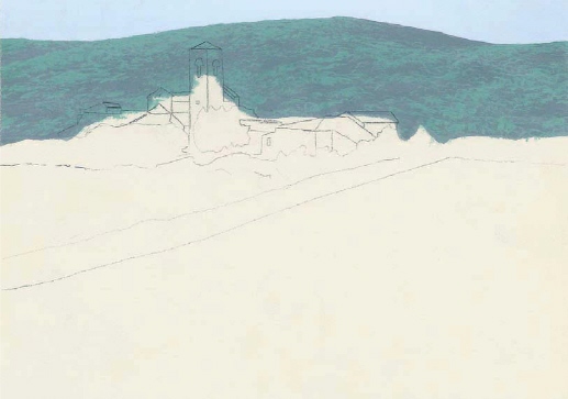
1. BACKGROUND AND LAYOUT. The background hills are blocked in with Norsk Blue. Scumble in treetops using a ratty brush with Rainforest Green. Let dry. Now cover the hills with a wash of watered-down Blue Mist to “knock them back.” The more opaque your wash, the farther away the hills will appear. Working with references, outline the major shapes of your village. You may want to work out the layout on scrap paper and then, when satisfied, transfer to your wall using graphite or transfer paper.
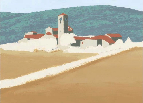
2. BUILDINGS. Using a -inch (10mm) flat, block in the light side of the buildings with Raw Linen. Add Hammered Iron with some Norsk Blue to paint the shadowed sides. Use Dark Flesh to paint the roofs. With the 1-inch (25mm) flat brush use Cloudberry Tan and mass in the ground with more Blue Mist added in the distance.
EXPERT ADVICE
Tip 1: If the village still looks too bold or if you want to create more of an early morning feeling, put a wash of Blue Mist over the entire town. Use a large brush and water down the Blue Mist to “dirty water” consistency. Apply in broad, horizontal strokes. Keep a rag handy to wipe off excess.
Tip 2: When painting the grapevines, keep in mind the vines should get larger as they get nearer. Also, as the vines go up the hill closer to eye level, the view of them will change from looking down on top of them to seeing them from the side.
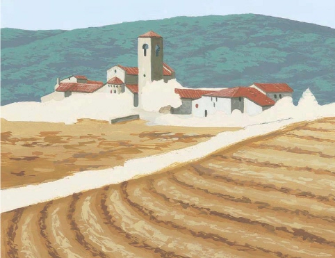
3. DETAILS ON BUILDINGS. Add darker shadows with Hammered Iron. Windows and doors are Hammered Iron or Norsk Blue. Vary the visual texture of the light walls by mixing in some Blue Mist. Using a detail brush, add some texture to the roofs with Hammered Iron and Raw Linen watered down. Remember to keep it simple. At this distance, you want to imply detail.
Use Cloudberry Tan, Spice Tan, and Territorial Beige to add texture to the ground and create the rows of grapevines. Finally, use a Raw Linen + Cloudberry Tan mixture and rough up the ground between the rows.

4. FOLIAGE. Block in the foliage around the village using Blue Spruce. Using a darker color around the village makes the light buildings “pop” and helps focus the viewer’s attention on the focal point. Use a “ratty” used brush and scumble in the distant trees in the orchard and the grapevines using Medium Foliage Green. Continue using Medium Foliage Green and block in the rows of trees separating the two orchards. To add more contrast to the trees that are closest, add Gamal Green.

5. FOLIAGE. Highlight the distant trees with Wedgwood Green, keeping the color focused on the left side of the trees. As the trees get closer to the viewer, add more Light Timberline Green to warm up the greens. Add Cricket to the foliage that is closest to create more contrast. Add grapevine posts with Burnt Umber and use water-downed Burnt Umber to darken shadows in the foreground. Use Blue Mist here and there to highlight posts.