Introduction
In the late 1800s in Holland, a curious phenomenon occurred: The human birthrate rose at the same pace as the local population of white storks. Generations of parents would later rely on the connection to avoid awkward conversations with their children. While the story faded into folklore, the real-life correlation persisted. New research in the twentieth and twenty-first centuries has consistently confirmed a statistically significant connection between storks and human birthrates in a number of European countries.
In 1958, William Phillips, a professor at the London School of Economics, published a paper regarding the connection between unemployment and inflation. As other economists explored Phillips’s data, the correlation spread like wildfire: high inflation rates were linked to low unemployment and vice versa. The policy implications were explicit. National economies needed only to choose between inflation and unemployment, or somehow find a balance between the two. The Phillips curve, as the connection came to be called, informed macroeconomic policy decisions for years in both Europe and the United States.
Humans are biologically inclined to recognize patterns. We spend thousands of dollars on college because education level correlates with monetary earnings later in life. We are attracted to the strong smell of freshly baked cookies because the strength of the aroma correlates with the proximity of the cookies. We go to bed early because a good night’s sleep correlates with a better mood the next day. We avoid eating cheese before sleeping because cheese consumption correlates with fatal bedsheet tangling accidents.
Wait, what was that about cheese?
The pattern is clear: a statistical correlation exists between the increasing rate of national cheese consumption and the increasing number of accidental suffocations and strangulations in bed. I’ve got the graph to prove it:

It could be that melted cheese clogs airways. It could be that cheese causes night terrors. Or it could be that the correlation is totally spurious and accountable to chance. Almost certainly it is the latter. Does correlation imply causation? It’s intuitive, but it’s not always true.
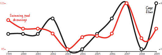
Correlation, as a concept, means strictly that two things vary together. Automobile use correlates with automobile accidents. Warm weather correlates with ice cream sales. Overcast skies correlate with rain. But then there’s this one: the number of films Nicolas Cage has appeared in each year correlates with the number of people who have drowned by falling into a swimming pool.
Correlations don’t always make sense.
Remember the correlation between babies and storks? It was also coincidence. The modern research into the phenomenon was conducted by scientists who wanted to show that statistics used improperly can provide wildly fallible results, and they succeeded. It turns out William Phillips’s theory on economics doesn’t hold up either. The inflation-employment connection was pervasive, but it was overly simplistic. Years later, new research showed that Phillips’s pattern didn’t hold up with long-term data. The variables are related, but they don’t directly control each other.

Provided enough data, it is possible to find things that correlate even when they shouldn’t. The method is often called “data dredging.” Data dredging is a technique used to find something that correlates with one variable by comparing it to hundreds of other variables. Normally scientists first hypothesize about a connection between two variables before they analyze data to determine the extent to which that connection exists. For example, testing the theory of whether storks bring babies by correlating storks with birthrates.
Instead of testing individual hypotheses, a computer program can data dredge by simply comparing every dataset to every other dataset. Technology and data collection in the twenty-first century makes this significantly easier. Instead of reading the back of every movie at Blockbuster, I can hop on IMDb.com to find the number of movies Nic Cage appeared in within two minutes. I don’t need to track all of Walmart’s annual sales to see if there is a correlation to their data; someone at Statista.com has already pulled it from their annual reports. What about deaths from a particular cause? The Centers for Disease Control publishes all its data. How many stay-at-home dads are there? The U.S. Census will give me an estimate. This is the world of big data and big correlations.
In the following pages you’ll see dozens of correlations between completely unrelated sets of data. Every correlation was discovered by a computer. The correlations were all produced in the same way: One giant database of variables collected from a variety of sources is mined to find unexpected connections.
In order to create each chart, I begin by selecting a statistic I want to correlate. An algorithm then goes through the entire set of statistics and calculates the correlation coefficient for every variable compared to the one I selected. From there the program displays the strongest correlations. In this book I use Pearson’s correlation coefficient, which is very common for expressing linear relationships between variables.
Out of the thousands of graphs my algorithm has generated that could have appeared in this book, I had some help selecting which ones would be the most fun to show. I sent a link to many of my fellow students here at Harvard Law School and asked them to rate and comment on various graphs. Collectively they cast more than 13,000 votes on how interesting they found each graph, and I wish I had space to thank every one of them by name. Since I don’t, maybe I can shift the blame to them instead: If you don’t find a particular graph interesting, please blame the students of Harvard Law School.
Despite the humor, this book has a serious side. Graphs can lie, and not all correlations are indicative of an underlying causal connection. Data dredging is part of why it is possible to find so many spurious relationships. The correlations are also strong because very few points are being compared. Instead of comparing just ten years, we should ideally be looking at hundreds of points of comparison. Correlations are an important part of scientific analysis, but they can be misleading if used incorrectly. Even the charts are designed to be subtly deceptive. The data on the Y-axes doesn’t always start at zero, which makes the graphs appear to line up much better than they otherwise would. The data points are real and mathematically placed, but they are displayed in a very specific way.
You can double-check any statistic in this book by going to the following web address: http://tylervigen.com/sources. There you will find each data source with a direct link to where the relevant statistic was found. You’ll also find plenty more charts not included in this book, many of which have a reduced copyright restriction so that they can be displayed in educational or professional settings as an example of how not to use statistics. This project has been a welcome distraction from law school, to say the least, so I hope you enjoy reading my spurious correlations as much as I enjoyed preparing them for you.
SOURCES:
R. Murray Thomas, Blending Qualitative and Quantitative Research Methods in Theses and Dissertations (Thousand Oaks, CA: Corwin Press, 2003).
Ellen Spector Platt, Garlic, Onion, and Other Alliums (Mechanicsburg, PA: Stackpole Books, 2003).
R. Matthews, (2000), Storks Deliver Babies (p= 0.008). Teaching Statistics, 22: 36–38.
The Collected Scientific Papers of Paul A. Samuelson
John Phelan, “Milton Friedman and the rise and fall of the Phillips Curve,” The Commentator, October 23, 2012. www.thecommentator.com/article/1895/milton_friedman_and_the_rise_and_fall_of_the_phillips_curve
Brian Domitrovic, “The Economics Nobel Goes to Sargent & Sims: Attackers of the Phillips Curve,” Forbes, October 10, 2011. www.forbes.com/sites/briandomitrovic/2011/10/10/the-economics-nobel-goes-to-sargent-sims-attackers-of-the-phillips-curve