CHAPTER SIX
‘PEAK DALE’ BACK SCENE PROJECT
PLANNING AND RESEARCH
My latest ongoing project is called ‘Peak Dale’. The concept from the start was to try to replicate in miniature part of the Derbyshire landscape and to fit a model railway into the setting, deliberately resisting any temptation to be carried away with fitting track before the landscaping was all planned. Unfortunately, it is often obvious when viewing a layout that the modeller has made the common mistake of adding the landscaping as an afterthought. One thing to remember is that the landscape was always there first, presenting the railway navvies with the task of building the tracks through it. Construction was directed at making the railway as level as possible and this would involve major earthworks, with hilly terrain having to be tamed by the building of embankments, cuttings, tunnels and viaducts. The layout plan for ‘Peak Dale’ would includ all of these features.

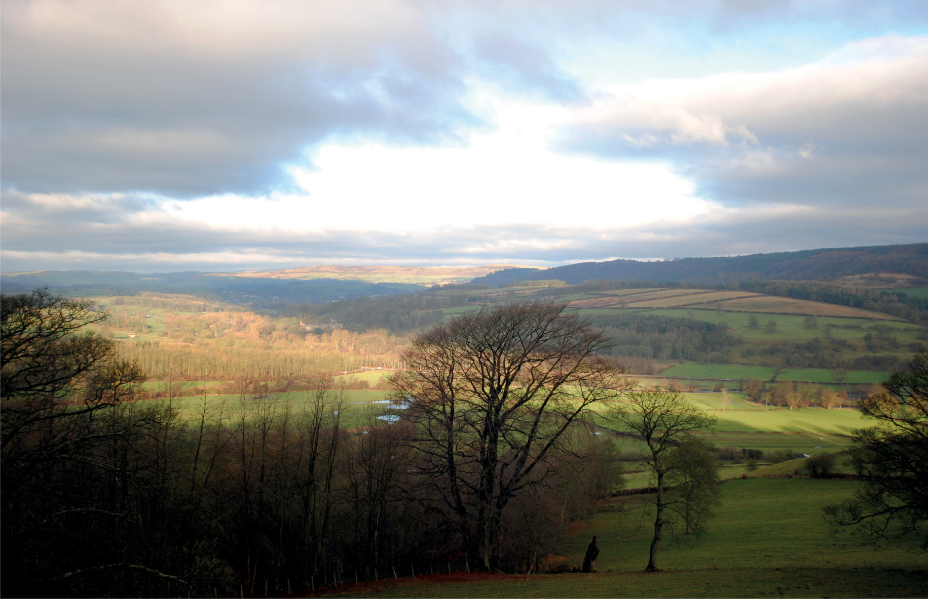
The type of landscape that inspired me to model ‘Peak Dale’. This photograph was taken from the Monsal Trail, once the track bed of the Peak Main Line, looking down into ‘Water-Cum-Jolly-Dale. The river has carved its way through the limestone to form a deep gorge and the scene is just waiting to be modelled.

Another reference photograph taken along Monsal Dale, showing the rugged terrain of the Wye Valley. It illustrates how geology has shaped the land and, together with the action of the elements, has worn it away to create today’s landscape.
Much consideration was given at the planning stage to both the profile and the terrain of the land in a particular part of Derbyshire, along with the vistas I wanted to portray in miniature form. The next important issue to consider was the scale to which the layout and model would be built. My aspiration was to model the trains in scale with the dominating landscape surrounding it, but at the same time to be aware of the practical space in which the layout would have to fit. Most modellers will have a limited space in which to fit their model railway, so smaller scales often offer the best solution, unless you are happy with a short end-to-end shunting layout. I was fortunate enough to have a garage measuring 17 x 8ft (around 5 x 2.5m) available – it is a reasonable space, but there are a few issues always associated with garages, including dust, spiders, and cold air and leaves blowing in when the main door is open. The concrete floor is mainly responsible for creating the dust, but this can be remedied by painting with heavyduty garage floor paint.
With the space selected, I had to decide on the scale for the layout. I was tempted to go for 2mm scale, as I could fit so much into the space and this would have allowed me to model the landscaping to great depth. I have, however, been a keen modeller of the larger scales, with 4mm suiting both my aspiration for rolling stock for this layout, and my practical skills, with deteriorating eyesight. In addition, until recently 4mm scale has offered the widest variety of locomotives, rolling stock, track and other railway infrastructure. The out-of-the-box models of locomotives and rolling stock that have been produced in this scale tend to show superb detail.
Choosing 4mm scale for ‘Peak Dale’, however, was always going to be limiting in terms of the depth of scenery that would be required, as well as the length of the trains. Careful planning was needed to prevent it looking silly.
The first decision when constructing the base boards was the height at which the track bed would be set. I settled on 4ft (120cm) from the floor level, so that the trains running on the layout could be viewed at eye level, which is of course the way they would be observed in real life. (Oddly, most layouts on show at exhibitions are viewed by the observers looking down on the trains.)

The distant hillsides diminishing along the skyline.

A view of the White Peak taken at Blackwell Mill, near to Millers Dale, showing the dramatic landscape of the upper Wye Valley.

Another photograph, with the limestone outcrops of stratified rock dominating Chee Dale, again taken from the track bed of the former Peak Main Line – excellent reference material for this type of rock strata, which would feature in both the landscape and the back scene for the project.

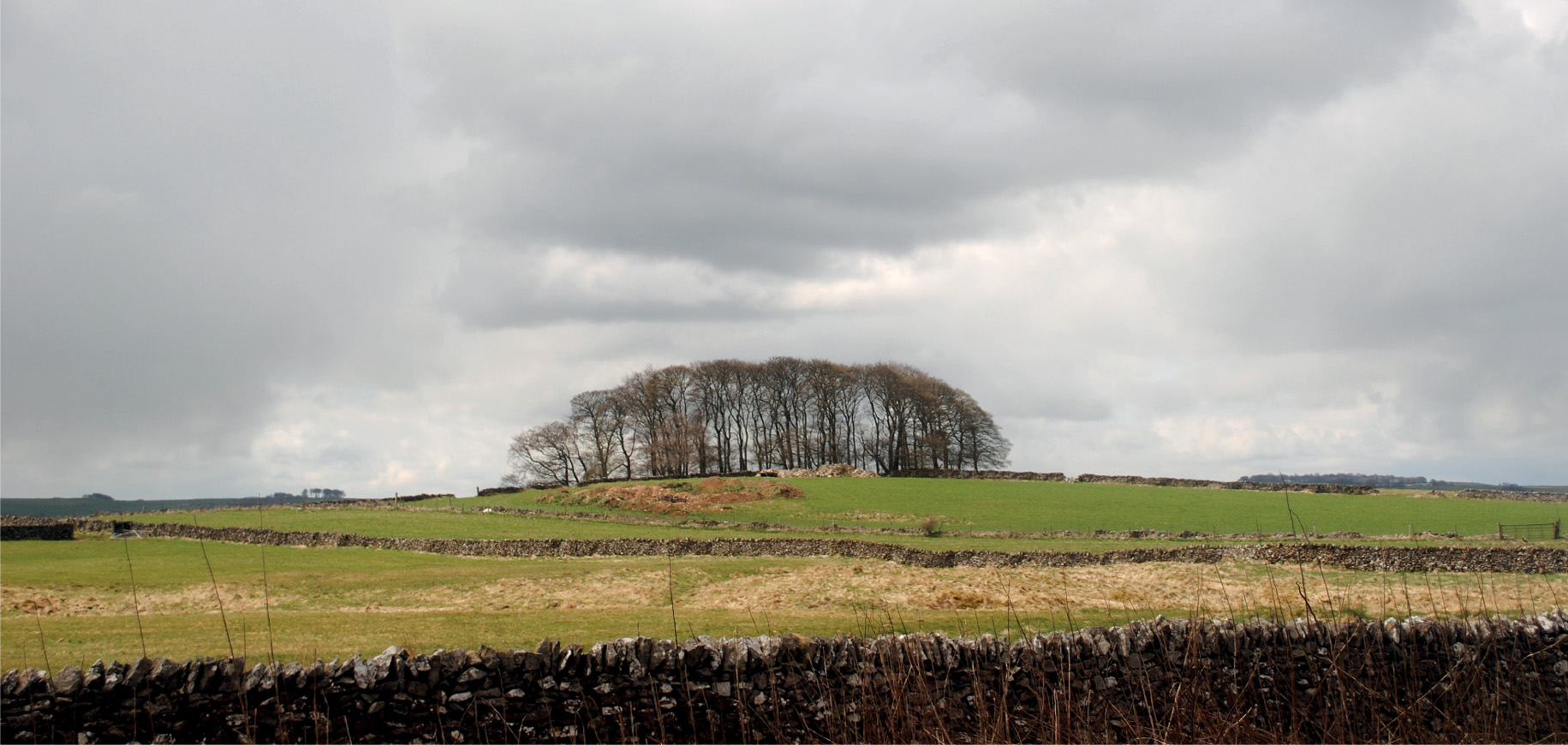
Common features of the White Peak are the groups of windswept trees topping the gentle slopes of the hills, together with miles of dry-stone walling. These would have to be prominent on any back scene depicting this part of the world.

Another photograph taken for reference of the upper Wye Valley. This area near Millers Dale has been scarred in the past with limestone quarrying.

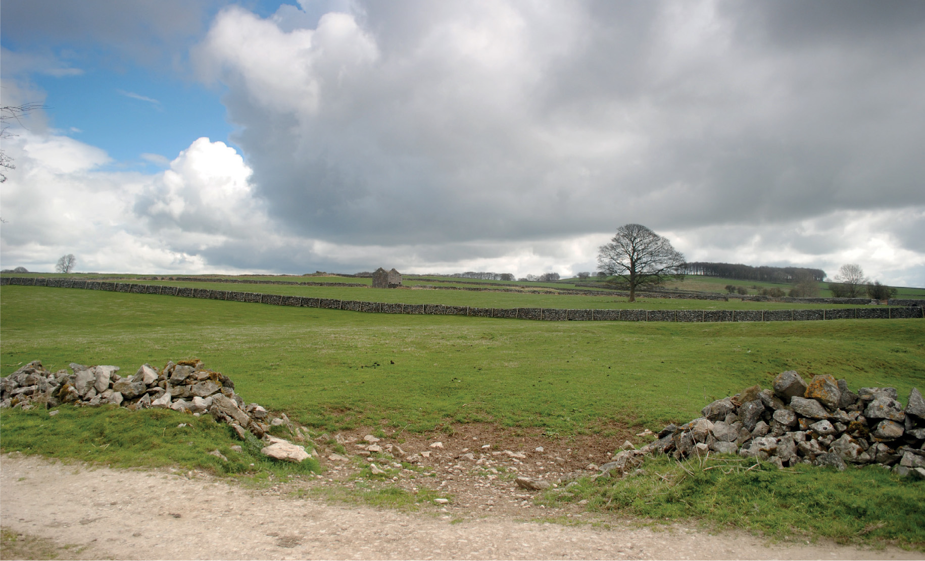
Intermingled with the dry-stone walls in the area are the many field barns built from the same materials. These simple buildings have now become part of the White Peak landscape and would definitely feature on the back scene.

More reference material for the dry-stone walls and ruined barns.
Having the track set at this higher level would also provide me with the opportunity to model both the landscaping rising above the track level and that dropping from the track level. The lowest level on the layout would be the river flowing through the valley, while the highest would be the limestone tor rising from one side of the valley. This part of the layout would be fitted into one corner, where the maximum depth for the landscaping could be achieved. The railway would cross this valley on a five-arch viaduct and would be the focal point for viewing the trains, with the track bed sitting around 9in (22cm) above the river below. This end of the layout would be on a constant curve forming part of the radius required.
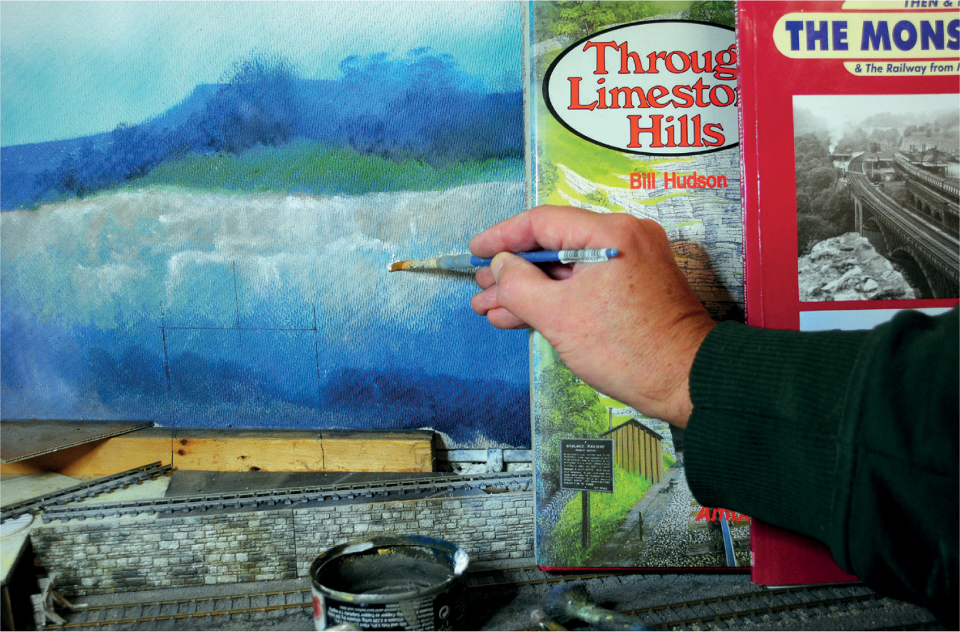
Before attempting any construction, I planned a few visits to this part of the White Peak area of Derbyshire, not only to take plenty of photographs to refer to during the building process, but also to get a complete feel for the location. One of these visits included a walk along the Monsal Trail, which up until the late 1960s was the main Derby to Manchester rail route through the Peak District. Photographs taken from the track bed would become valuable reference material for both the construction of the layout and for creating a realistic-looking back scene. I also found the book Through Limestone Hills by Bill Hudson very useful, and would recommend it as invaluable reference for anyone wishing to model the Peak Line.
MAKING A START ON THE BASE BOARDS
Construction started with an open-topped base board, with the frames made first. A top was cut and fitted on to the framework; this would be for the river bed, at the lowest level of the model. A second frame was then constructed to support the track bed and scenery in the right-hand corner. Both the frames measured 4 x 3ft (120 x 90cm), with the left-hand frame supported 3ft 3in (98cm) off the floor level. The right-hand frame was raised and supported at 3ft 10in (115cm) from the floor level. The track bed on the right was then added on a series of risers to give a track bed level of exactly 4ft (120cm). The left track bed was left open for the time being, as this would be carried on the viaduct.
The layout would have one long side requiring landscaping, and this would be supported on a shallow shelf fixed to the garage wall on a series of brackets. The track bed still remained at the mean level of 4ft (120cm), allowing for a rising hillside to be modelled at the back, with the land falling away at the front. This would give the impression of the railway hugging the contours of the side of the valley. The railway would have to be cut into the hillside for most of its length on this side, creating a limestone cutting. At the far left of the shelf, the railway would enter a tunnel where the hillside extended into the valley, at this point forming a gorge.
CREATING THE BACK SCENE
Before any landscaping could be started it was important to turn my attention to the back scene. This became obvious to me when looking at the two corners of the layout, where it would be almost impossible to fit the back scene afterwards. To create the depth needed for this to look correct, and within scale to the rest of the layout, the backcloth would need to be at least 24in (60cm) deep. If space had permitted, I would have considered fitting a deeper backcloth, but, after checking with a sample section of board in various positions around the layout, I was happy that the 24in (60cm) depth would be adequate and give me the effect I was looking for.
The next question was what material and what medium to use to execute the back scene. I decided to create my own painted back scene, rather than using a photographic version. This would allow me to create exactly the rural landscape required, and give me full control of perspective at all stages and positions.
For this project, I decided that hardboard sheets from a local timber supplier would be adequate, with the intention of applying the paint to the rough side. The first task was to give the boards a couple of coats of white primer paint, making sure that the paint covered into the grain of the hardboard. Once the white primer paint had completely dried, the boards were offered up into position and fixed to the garage wall using large panel pins. In order to make up the required lengths, some boards would need to be cut to fit, although it is a good idea to keep cutting to a minimum, and making sure that the shorter sections appear in the corners rather than on the sides.

The ‘Peak Dale’ project under early construction, with the back scene boards in position and fixed to the garage walls. Using open-topped base boards allowed the track bed to be raised, to create different levels for the scenery. The rough side of the hardboard was used and the board on the left-hand side was re-used from the ‘Baslow’ layout, painted over with white emulsion paint as a base for the new artwork.

Looking down on the track bed running up to where the viaduct will be installed, the back scene boards can be seen only inches away. Once the back scene has been painted and the landscaping completed using the various techniques, this distance should appear greater.
PAINTING THE SKYSCAPE
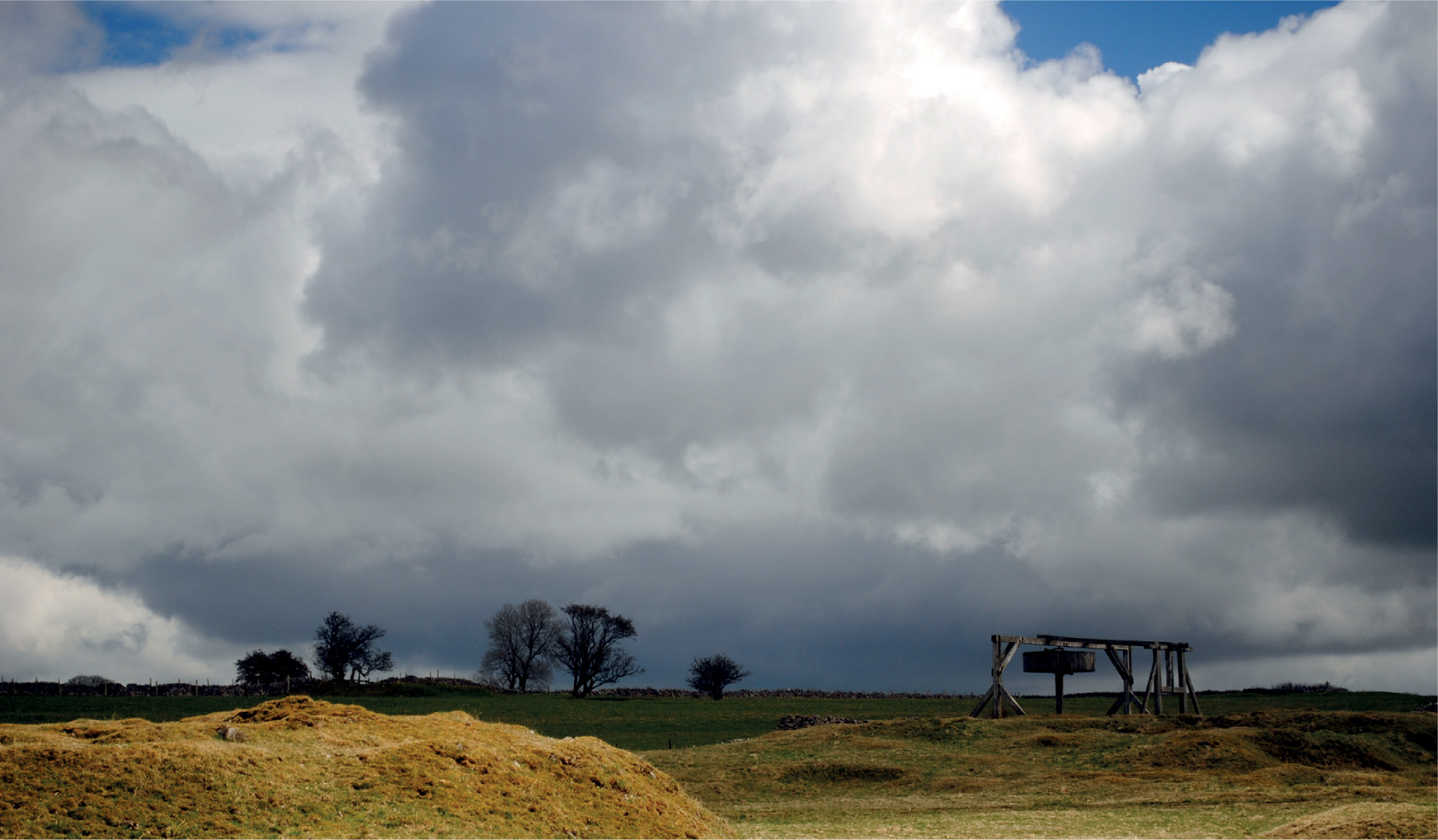
With the back boards fixed in position, it was time to turn my attention to creating the skyscape. As with most things connected to model-making, the starting point is photographic reference, which I found in a combination of my own portfolio collection and a book of Peak District landscapes.
The medium selected for painting the sky was acrylic spray paint, in the form of the trusted range of car colours and primers found at Halfords. These must be applied in a certain order, working basically from dark to light, the first colour being a mid-shade of mauve or blue. The car-body spray colour Ford Wedgewood Blue matches almost perfectly to the shade found under and at the base of the clouds in the photographs. Another colour worth considering for the under-cloud would be Vauxhall Smoke Blue.
When observing cloud formations, you will notice that the clouds normally sit at a certain level, giving the impression of floating. To replicate this effect, hold a strip of card or something similar a short distance away from the boards, and apply the spray over the top edge of the card, resulting in a diffused edge. One word of warning when attempting this: always keep the card level and parallel with the edge of the boards, otherwise the clouds will all be floating at slightly different angles!
The next colour in the order of application is a pale blue, to represent the blue sky. Again, this was a car-body spray from the Halfords range – either Ford Riviera Blue or Vauxhall Pastel Blue.
At the next painting stage, the tops are added to the clouds, by simply spraying Halfords White Primer. This needs to be applied in short bursts to create a ‘fluffy’ effect. The last colour to add is a light cream, such as Ford Ivory from the Halfords range – it is an optional choice, but if it is applied correctly it can give the ideal finishing touch. It creates the effect of the sunlight just catching the top edge of the clouds. When attempting this, however, only very short bursts of the spray paint should be used, just touching the top of the cloud formation.
(Note: although the spray paints listed here were all in stock and available from Halfords at the time of writing, certain colours are occasionally withdrawn from the range.)
PAINTING THE HORIZON OR SKYLINE
The horizon or skyline was the next painting stage to tackle. This was first applied from a mix of acrylic paint using Violet, Cobalt Blue and Titanium White to create a light bluish-mauve colour. This was applied using a household 1-in paintbrush with careful control, picking out the skyline, and then with large strokes to fill in afterwards. I again used photographic reference from my portfolio collection and books to replicate the skyline. The filling in will need to extend right down to the base of the back drop, which will give a background for applying both the mid-ground and foreground.
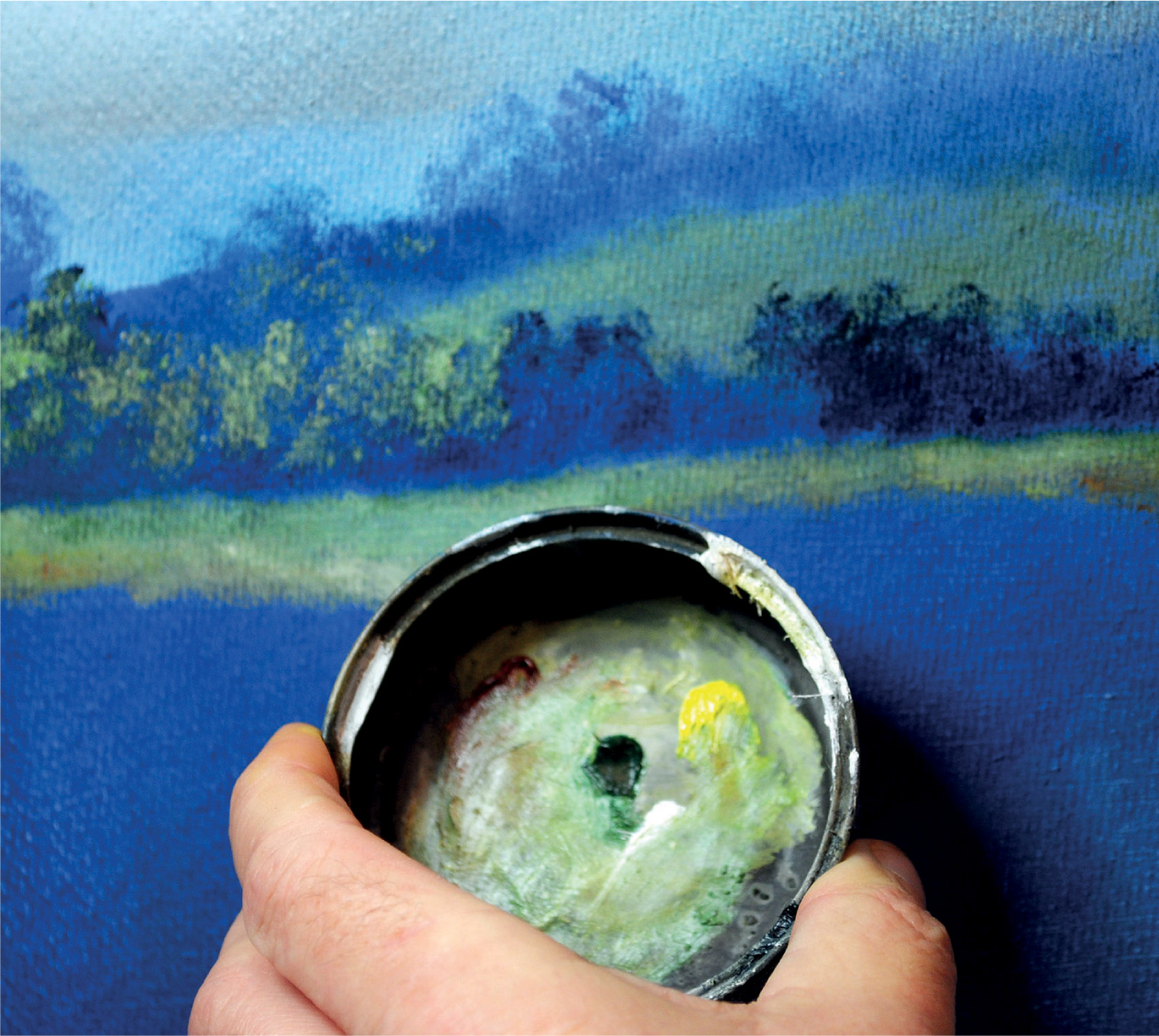
Before moving on to the mid-ground, I went over the horizon with oil paint, mixing exactly the same shade of colour from the tubes. This was applied using a smaller filbert brush, with any trees appearing on the skyline being picked out by using a simple stippling technique with the same brush.
PAINTING THE MID-GROUND AND FOREGROUND
The mid-ground was blocked in next, making the background colour slightly darker by adding Paynes Grey to the same mix. Trees were again put in with the filbert brush, using the same painting techniques – these would appear larger than those on the skyline, of course.

The opposite side of the layout, showing some of the structures in the early stages. This part depicts the industrial landscape that was scarred first by lead mining and then by limestone quarrying. The processing of lime created some prominent features, including the kilns that were built to be served by the railway.

The early stages of creating the skyscape, skyline and the mid-ground of the old lead-mining area, with its distinctive landscaping and structures. The sky has been painted using acrylic sprays, while the rest of this first stage has been blocked in using acrylic and emulsion.
The hillsides were then highlighted by adding shades of green, made up by mixing Sap Green with a little Lemon Yellow and Titanium White added for the highlights. A quarter-inch (6mm) flat brush was used for applying the oil paint, adding the highlights last. As always, it is wise to use photographic reference to establish where the shade and highlights should appear.
Any trees or woodland can be added by using a darker shade of the background colour, with more Paynes Grey mixed in with the mauve. This was used to create the bulk of the trees, applying the paint with a filbert brush using a stippling action again. When this stage was dry enough, greens were made up for the foliage using the same mix as the fields. When applying the foliage, the same stippling technique with the filbert brush was used, but only to one side. This will replicate the effect of sunlight on the tree or trees, with the other side remaining in shade, giving a threedimensional effect. For an autumn scene, more Yellow Ochre could be used in the mix. For winter, the first painting stage can be left untouched, without any foliage colour added.
For this Derbyshire White Peak landscape, outcrops of limestone were added to the mid-ground and the foreground using a quarter-inch (6mm) flat brush. These were simply painted with Paynes Grey first, and then the highlights to the rock were picked out in Titanium White.
The mid-ground of this rural scene also featured the odd building, including the stone-built field barns and the other farm buildings, used by those who were eking out an existence in the barren limestone landscape. All these structures were executed using an angled flat or chisel brush; this type of brush is ideal for this purpose. The gable ends of the buildings were put in first, followed by the side walls and the roof. By painting the buildings in this three-quarter perspective, a three-dimensional effect is achieved.
The trees and undergrowth in the foreground may be painted in the same way as the mid-ground, although more contrast to the colour will be required to give the illusion of these features being closer to the viewer.

The boards on the viaduct side have been re-painted to create a scene representing the White Peak. The dry-stone walls and the ruins of the field barns scattered across the landscape have been re-created on the back scene using the photographs taken for reference.

The view from the viaduct, looking into the wooded river valley. The open hillsides are visible in the background, criss-crossed by dry-stone walls. It was important to paint the back scene first, before the viaduct was constructed and any landscaping attempted.

The skyline along this section of the back scene features a group of windswept trees. The reference photographs show how common this feature is on the White Peak skyline.

The rolling hills are intermingled with small woods creating field boundaries – another feature of the landscape taken from the reference material and used on the back scene.
ADDING INDUSTRIAL BUILDINGS AND EARTH WORKINGS
The right-hand corner of the layout was reserved to depict some of the Peak District’s industry. The midground would feature the remains of lead-mining activity, while the foreground of the boards would be devoted to the working limestone quarries.

This photograph of the Magpie Mine, near the village of Sheldon in the heart of the White Peak, was used as reference for the lead mines that would feature on the back scene. The engine house and chimney are not unlike those found in Cornwall.

Another reference photograph for the lead-mine ruins.
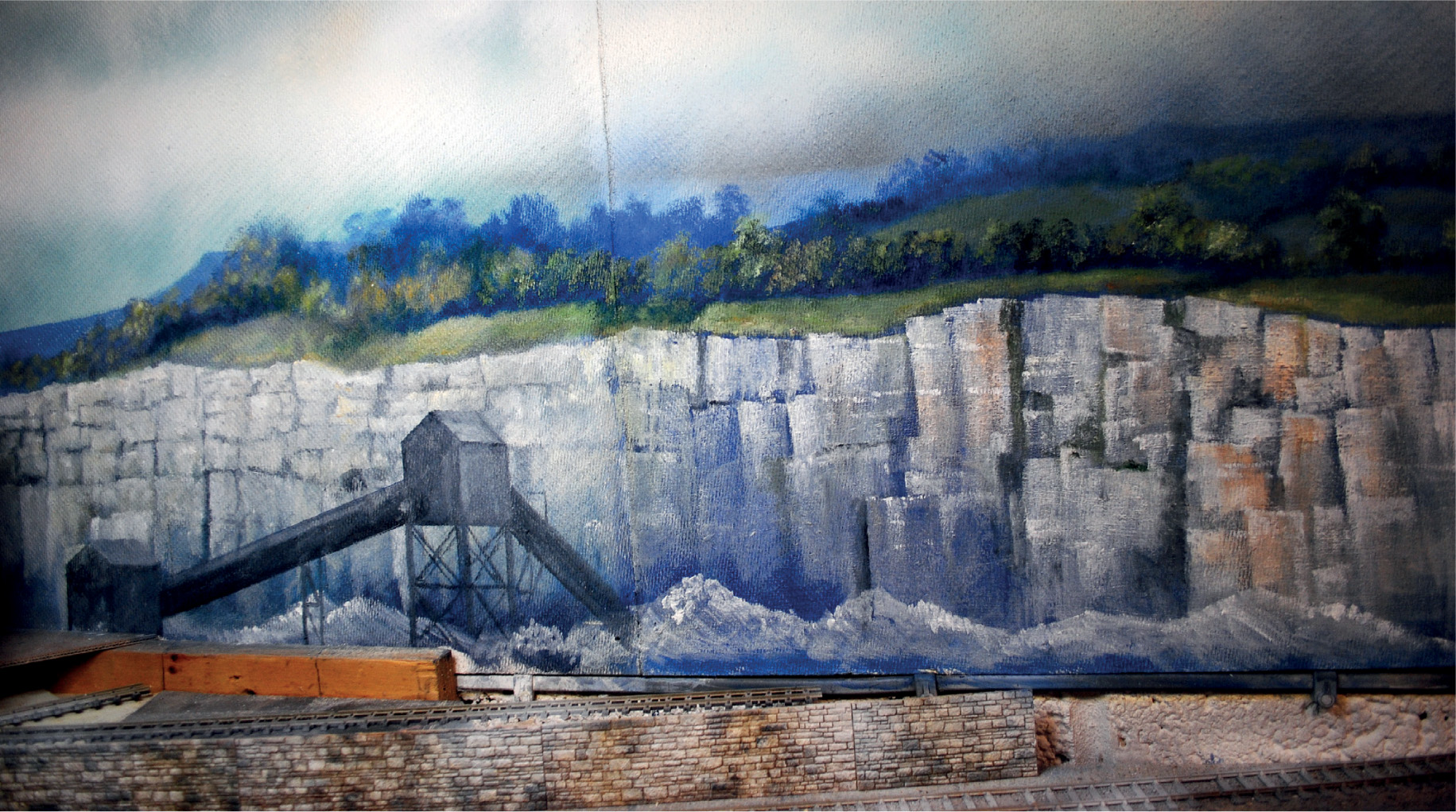
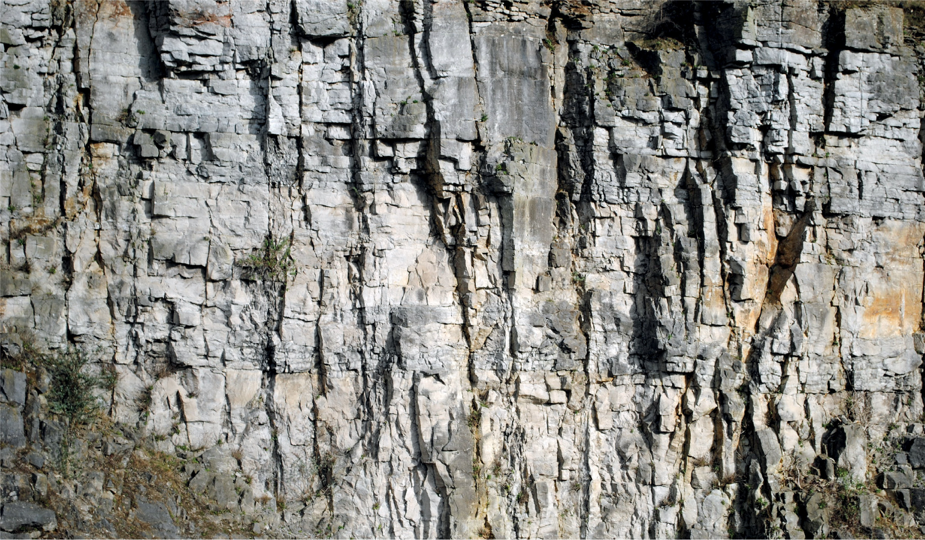
The quarry face was painted in the same way as the limestone outcrops, although scaled up slightly. A larger angle-edged flat brush was used to replicate the cut and blasted stone of the quarry face. The technique was to use downward strokes of the brush to achieve something like the rock strata exposed. Before any painting, however, a trip to Wirksworth was arranged to photograph a working quarry. This provided plenty of reference for this section of the backcloth.
The painting began with the locating of the leadmine workings on the hillside, which had already been loosely blocked in using acrylic paints. To help with painting the structures, I first selected one of the photographs I had taken from a reasonable distance away. This needed to be proportionate to the size at which it would appear on the back scene. The next stage was to use a print-out or photocopy to make a tracing of the structure, or to cut out and draw around. The drawn outline was then filled in with oil paint, creating a silhouette, which was then enhanced by the addition of light and shade, as on all the other buildings. It is important to ensure that the light and shade are consistent with everything else painted on a back scene.

When re-creating the buildings and structures associated with the lead mine, the more reference material collected, the better the chance of a reasonable representation.
The land around the ruins of the mine buildings was then painted in, using oils, including the waste heaps of discarded stone scattered around the mine workings. The same hillside featured a number of earthworks known locally as rakes, which appeared where the lead was excavated closer to the surface, creating open-cast mine workings. This industry has long since been abandoned, but the spoil heaps have remained and are now a common sight in parts of the White Peak landscape.

Perfect reference to create this part of the back scene – the photograph shows how the lead mine buildings, structures and workings blend with dry-stone walling and the landscape of White Peak.
This area was finished off with hardy trees and bushes of hawthorn and blackthorn being painted in, scattered over the hillside. This was done using the traditional stippling technique with an old filbert brush, in a dark purplish-grey colour mixed on the palette. (Old worn-out brushes should always be kept, as they can be very useful for painting foliage.) The foliage was added to one side, using the same brush, but this time with a mix of light green.
In front of the stone engine house, the remains of the timber-built head stocks stand forlorn. To replicate these on the back scene, I used a fine No.1 onestroke brush over a pencilled-in outline.
The last section of the back scene to be tackled in this corner of the layout was the scenic break to divide the visual part from the cassette fiddle area. This would be painted on to a board positioned at an angle; a curved board would have been a better solution, but space was again an issue. This board needed an aperture to be cut into it for the track and the trains to pass through, not forgetting to allow for enough clearance. Most of the board would consist of sky, although it would require a small amount of landscape, painted using a light mauve colour, with any edges diffused to make it look less obvious. The sky and the landscape here would need to be a continuation of the board nearest to it. This end board was painted on MDF and was supported straight on to the surface of the base board by two short battens.
Once the end board had been painted, the sorting screens could be positioned in front. A girder bridge carrying a conveyor belt, bringing stone over from the quarry to be sorted and graded in the screens, was positioned running right up to the back scene. The inclusion of the bridge would add to the effect of disguising the trains running from the scenic part of the layout.
The scenic break at the other end of ‘Peak Dale’ consisted of the railway disappearing into a tunnel. Tunnels and over bridges are the ideal way of creating the scenic break and enhancing the transition between the model and the two-dimensional back scene. (For more on this, see Chapter 7.)

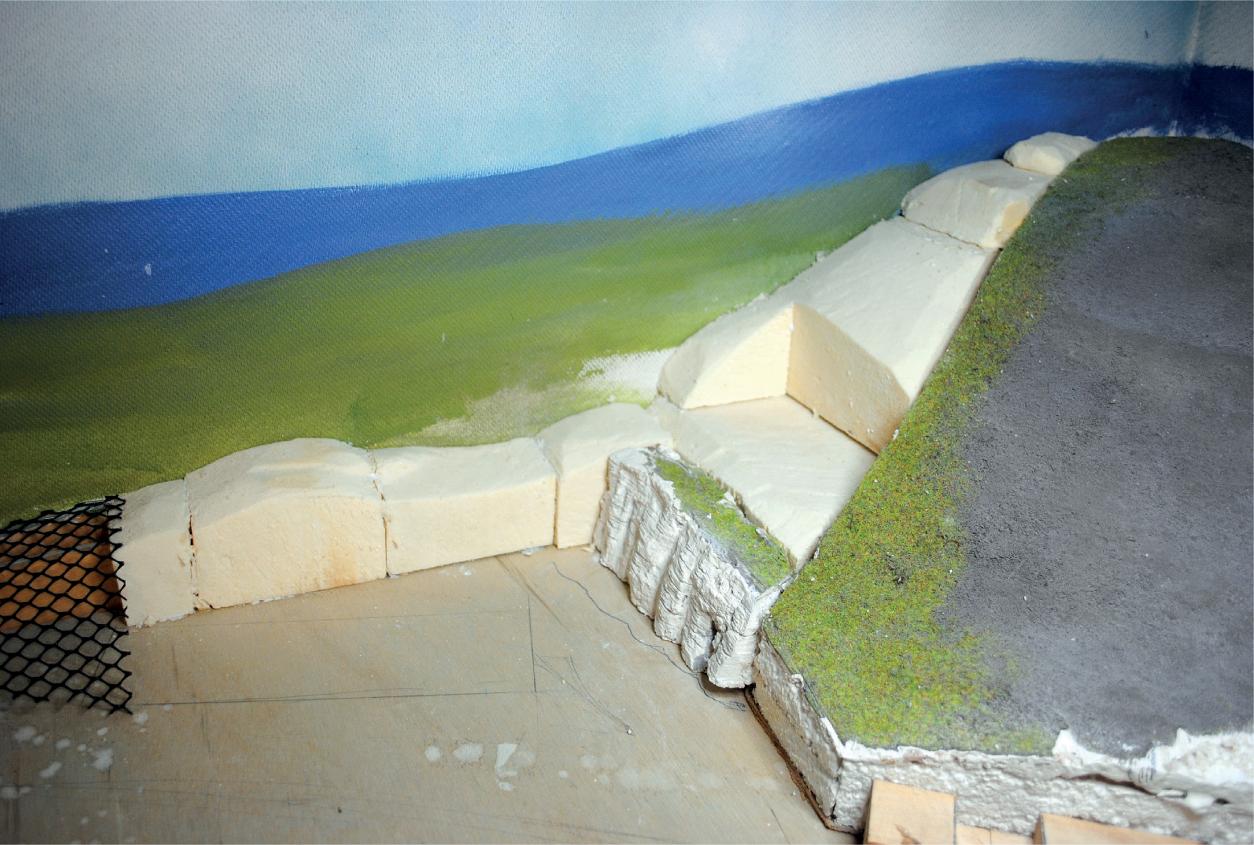
The foundations for the landscape in which the lead mine and associated buildings will be placed. The landscaping will need to blend with the back scene, with no obvious joins.

The whole scene, with the remains of the lead mines found on the hillside to the right. The back scene is still in the early stages of painting, but the ruins of the other mines have already been started on the back scene.

The same view at a slightly later stage, with the highlights and foliage added to all the trees and other vegetation. The ruins of the engine house and headstocks have now been detailed.

Close-up showing the blending of the landscaping with the back scene.

The other side of the layout, where the limestone landscape has been depicted, and the woodland and farmsteads are intermingled with the open countryside.

If space allows, it is preferable to fit a curved back scene, but here there was no option but to fit the back scene into the right-angled corner, and then to mask the corner as much as possible. This was achieved by painting the wooded valley on to both the boards making up the corner, and taking great care in the positioning of the mill buildings.

A view of the cottage, together with the ruins of the lead-mining workings, to show how the model is blended with the back scene to create a cameo.

A wider view, to show how the whole scene blends with the back scene.

The first stages of painting in the quarry face, using Titanium White oil paint to replicate the freshly blasted limestone.

The fissures within the rock strata are painted in using Paynes Grey with a finer brush; looking at plenty of reference material will help with achieving a realistic result.

The completed left-hand side of the quarry, with the stone lift fitted. This building has been placed at an angle to the back scene, with the back and roof ridge cut to fit.

The next board has been fitted up to the back wall and painted with white emulsion ready to receive the artwork.

The join between the back scene boards is filled using a little more emulsion paint.

The aim of the spray painting is to create the effect of a stormy sky, using Dark Sea Grey from the Humbrol range and Ford Nordic Blue from the Halfords range of acrylic car-body paints. By spraying the Dark Sea Grey first and then going over lightly with Nordic Blue, a reasonable representation can be achieved.

The landscape and the quarry face have been added over the dark blue painted background. This method of painting created the instant depth required for the back scene.

Here the same dark blue colour has been added first with a well-worn filbert paint brush. This technique gives the same depth to any bushes, trees or other foliage.

The skyline has been painted in using a mix of oil paint in a bluish-mauve colour. This has been extended right down to the bottom of the board, creating the base colour to paint the next section of the quarry face. The form of the trees and undergrowth has been painted in a darker shade of the same colour.

A mix of Sap Green, with a little Lemon Yellow and Titanium White added to lighten it, has been applied to one side of the trees and undergrowth, creating the foliage. The fields and grassland were picked out using the same colour.

The mix in the tin – a small amount of Yellow Ochre has also has been added.

The foliage has been completed using a stippling technique with a worn-out ¼-in filbert brush. The grassland has also been finished off, with a few Titanium White highlights.

Close-up of the stippling effect applied to the foliage.

The rock face of the quarry has been started, using downward brush strokes with a ¾-in angled chisel flat brush.

Close-up showing how using the angled edge of this type of brush can give an instant replication of the limestone rock face.

This section of the painted quarry face blends with the left-hand board. A small amount of Yellow Ochre was mixed with the Titanium White to give the rock face a more authentic colour, and to tone down the white slightly.

The finished quarry, complete with heaps of stone and the conveyor system to take the quarried rock for sorting and grading.

Photograph taken at Middle Peak, Wirksworth, to provide reference material for painting the quarry face.

Another reference photograph used to create an authentic-looking back scene.

In this photograph, reference was found at Middleton Moor for the many waste tips that scar the landscape of the White Peak.

The early lead-mine workings at Sheldon – the Derbyshire landscape has been changed by man for many years.

In contrast to the lead-mining areas, the sides of the Derbyshire dales are mainly wooded. Evidence of lead mining is also found in the dales, with caves leading to worked seams of galena.

Panorama of the Wye Valley, with Haddon Hall in the centre. This image shows the changing landscape of the Peak District, with the limestone in the bottom of the valley, extending to the grit-stone edges and the moors visible on the skyline.

The River Wye in Monsal Dale – more reference for the limestone crags. This dramatic landscape was viewed by passengers travelling on the Midland’s Peak Line, with the railway hugging the opposite side of the dale.

The limestone crags replicated on the back scene above the tunnel. The reference for this came from visits to Monsal Dale.

This section of the Peak Dale layout, now finished, is only 14in (35cm) wide at this point. However, with the landscaping blending perfectly with the back scene, an illusion has been created of it being so much wider. The track bed runs along a shelf with the limestone rock cutting setting off the passing goods train.

A Jubilee is seen along the same stretch of track. The back scene puts the train into perspective, giving the desired effect I was looking for with this model.


