“I myself do nothing. The Holy Spirit accomplishes all through me.” – William Blake
Adding colored lighting, even if it’s a small amount, is a very effective way to liven up a lighting composition. It can be used to wash large surface areas such as a light colored backdrop or to add an accent here and there, such as on a series of white columns. There are also times when it’s appropriate to wash the entire platform with color, such as when a praise and worship band is playing.
There are many ways to create a good color wash. The simplest is to use PAR cans with colored gels. To get more utility from them we can also add a color scroller to each PAR can. That will allow us to remotely select from a choice of up to 32 different colors on each PAR can, or in the case of a color mixing scroller, many more colors. Alternatively, we could use automated color wash fixtures or automated profile spot fixtures to remotely change the focus and color of each instrument. These luminaires can be relatively expensive, but there are a number of color changing fixtures that don’t pan and tilt; they cost somewhere between a PAR can with a scroller and an automated luminaire. All of these are effective ways of creating a color wash.
We should consider designing color wash into our lighting system with something other than automated lights or in addition to automated lights. That way, if the budget is cut and we lose the ability to buy automated lighting then we’ll still have some colored light. If we don’t have an alternative for providing a color wash, then eliminating the automated lighting will leave us with nothing but no-color white light. That happened to me a couple of times before I realized the importance of specifying more than one type of color wash fixture.
Once we decide where to put our color wash fixtures, then we need to decide which colors to use in them. That’s where an understanding of color theory will serve us well. Most color theory comes from the art world, though a painter uses subtractive color while the lighting designer uses additive color.
One of the most important design decisions is choosing colors for our color wash. Sometimes there are very specific color requirements, such as the colors of a logo or certain theme colors such as Christmas or the Fourth of July. Barring those circumstances, our choice of colors should reflect the needs of the production over our personal favorites. The colors we use have a major influence on the look of the design and if we understand basic concepts of color it can help us create intelligent and effective designs.
Some people believe that form affects people’s intellect and color affects people’s emotions. It is the emotional component that we want to address by choosing certain colors or color combinations. Color can be very subjective and different people may have different reactions to the same colors. On the other hand, there are very specific ways that we can use color to create strong contrasts, harmony and disharmony.
Most modern color theory is based on the color wheel and the way colors interact with each other. The first color wheel was devised by Sir Isaac Newton in the 1600s when he discovered that sunlight was made up of a spectrum of colors. Since then, several contributions have been made to the study of color theory by such people as Johann Wolfgang von Goethe, Michel Chevreul, Johannes Itten, and Josef Albers.
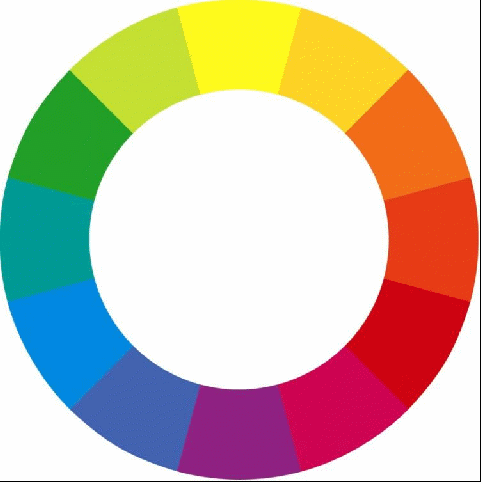
After several modifications to the original color wheel, Johannes Itten devised a color wheel based on the work of Chevreul and others. He used it to teach art classes at Bauhaus in the early 1900s and he wrote about it in his classic book on color called “The Art of Color.” It looks like that shown in Figure 54 below.
Figure 54 - Johannes Itten's subtractive mixing color wheel.
Notice that the color wheel is arranged around the three equally spaced primaries – red, blue, and yellow. Exactly midway between each primary is one of the secondary colors – green, orange, and purple, and between each secondary color is a tertiary color – blue-green, green-yellow, yellow-orange, orange-red, red-purple, and purple-blue. This is the color wheel that most painters use today. With a little modification to distinguish between how a painter uses color and how a lighting designer uses color, we can make good use of the color wheel. We’ll discuss more about that later.
Johannes Itten recognized seven ways of creating contrast with color, and these contrasts can help us with lighting design as much as they help a painter design a canvas. The seven contrasts are:
Contrast of saturation – the contrast between two colors of the same hue but with different levels of saturation.
Contrast of light and dark – the contrast between light and dark, including that of light and shadow.
Contrast of proportion – the contrast between two or more colors covering greater or lesser areas, e.g., 75% red contrasted with 25% yellow.
Contrast of complements – the contrast between complementary colors such as purple/yellow or blue/orange.
Simultaneous contrast – the contrast between two colors that are so strongly opposite that they create the illusion of movement or vibration.
Contrast of hue – the contrast between two colors of different hue.
Contrast of warm and cool – the contrast between warm colors and cool colors.

Figure 55 - Itten's contrasts: (A) Contrast of saturation; (B) Contrast of light and dark; (C) Contrast of proportion; (D) Contrast of complements; (E) Simultaneous contrast; (F) Contrast of hue; (G) Contrast of warm and cool.
Concepts:
Color, and people’s reaction to color, is subjective.
Color theory is based on the color wheel and how colors interact with each other.
Sir Isaac Newton discovered that white light is composed of the spectrum of colors.
Johannes Itten recognized that there are seven types of color contrast: contrast of saturation, contrast of light and dark, contrast of proportion, contrast of complements, simultaneous contrast, contrast of hues, and contrast of warm and cool.
Words to Know
Primary – first in a hierarchy
Secondary – second in a hierarchy
Tertiary – third in a hierarchy
We can use the principles of color theory developed by artists such as Itten and Albers as a basis for creating contrast and harmony in our lighting design. Since color harmony is, for the most part, subjective rather than totally objective, we should keep in mind that color theory is simply a starting point and the needs and wants of the design are not to be superseded by a blind application of these principles.
Itten’s color wheel is based on the three primaries – red, blue, and yellow. But depending on the application, the primary colors can be either red, blue and green, or they can be red, blue and yellow. For an artist working with paint, it is important to be able to mix pure hues of primary color to create secondary colors. Therefore, such an artist considers red, blue and yellow to be the primaries because blue and yellow can be mixed together to produce green. However, an artist working with light who mixes blue and yellow will end up with white. To get yellow, the artist working with light must mix red and green.
The main difference between these two scenarios is that the painter is using subtractive color mixing while the lighting designer uses additive color mixing. When a painter puts pigment on a canvas, that pigment absorbs or subtracts every color in the spectrum except the color of the pigment. For example, yellow pigment subtracts all the blue and red and reflects yellow, which is what the eye sees. It’s the same principle as a CMY color mixing system. The full-spectrum light that passes through a yellow filter in the CMY system becomes yellow because the blue light is blocked and the red and green light is passed (red + green = yellow). Or if a magenta filter in a CMY system is used instead, then the yellow light is blocked and the red and blue light is passed (red + blue = magenta). Now suppose we use both the yellow and the magenta filters – which color will result? The yellow filter passes red and green and the magenta filter passes red and blue, so the only color that passes through both filters is red, which is what our eye will see. That’s how a subtractive color system works.

Figure 56 - A CMY color mixing system showing the subtractive method. (A) A yellow filter blocks blue and passes red and green, producing yellow light. (B) A magenta filter blocks green and passes red and blue, producing magenta light. (C) A yellow and magenta filter in series blocks blue and green and passes red light.
But a lighting designer is more concerned with additive color because the light emanating from a fixture is additive. When we mix red and green light it produces yellow. Therefore, we can recognize the difference between the additive primary colors – red, blue, and green – and the subtractive primary colors – red, blue, and yellow. With that in mind we can rearrange the color wheel to reflect our concern with additive primaries as follows.

Figure 57 - The additive color wheel.
Secondary colors are those colors that can be obtained by mixing any two primary colors. These are: cyan (blue + green); magenta (red + blue); and yellow (red + green) and they are equidistant from each of the primary colors. Tertiary colors are those in between each pair of primary and secondary colors. These are: green-yellow; orange; red-magenta; indigo; blue-cyan; and green-blue.
Concepts:
The additive primaries are red, blue, and green.
The subtractive primaries are red, blue, and yellow.
The additive secondary colors are cyan, magenta, and yellow.
The additive tertiary colors are green-yellow; orange; red-magenta; indigo; blue-cyan; and green-blue.
Words to Know
Additive – relating to the addition of light and color
Subtractive – relating to the subtraction of light and color
Complementary colors are pairs of colors which, when added together, produce white light. For example, we know that mixing red, blue and green light makes white light. Since red mixed with blue makes magenta, then we can deduce that magenta and green are complementary colors.
The combination of the human eye and brain seeks color balance and harmony in visual composition much the same way the ear and brain seek resolution in musical composition. Complementary colors provide color harmony. They are easily found as opposite pairs on the color wheel. Rather than mixing them together, if we use them side-by-side, then we can create some interesting and useful color compositions.
Using our additive color wheel, we have six complementary color pairs that we can use as a basis or starting point for creating a lighting scene. They are:
Magenta/green
Indigo/green-yellow
Blue/yellow
Blue-cyan/ orange
Cyan/red
Cyan-green/red-magenta
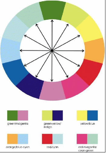
Figure 58 - Complementary color pairs.
Combining colors in complementary pairs is one example of a way to create harmony between colors. There are several other ways to accomplish similar effects. Some examples are outlined below.
One color plus the two colors on either side of its complementary color is a split complementary color combination. For example, green, indigo and red-magenta works together very well. There are twelve such combinations that we can derive from our color wheel.

Figure 59 - Split complementary colors.
Three colors equidistant apart on the color wheel constitute a triad. Notice of the four possible triads, one uses all the primary colors, one uses all the secondary colors, and the last two use combinations of tertiary colors.
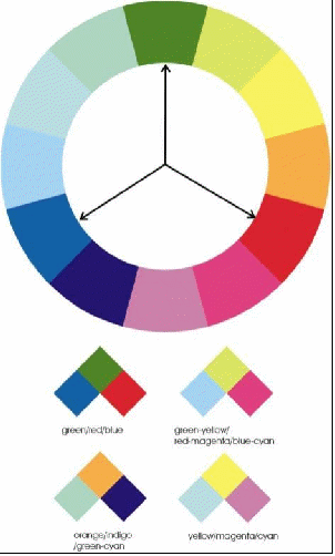
Figure 60 – Color triads: of the four possible three-color combinations of triads, one uses all the primaries, one uses all secondaries, and two use tertiary colors.
Strong color combinations can be found by using analogous colors, or colors that are side-by-side in the color wheel. It can be a two-color combination such as blue/indigo, or a three-color combination such as blue/indigo/magenta. There are 12 two-color combinations and 12 three-color combinations in our color wheel.

Figure 61 - Analogous three-color (top) and two-color combinations.
Any color or combination of colors can be combined with white to expand the catalog of color combinations. In terms the seven types of contrast previously discussed, white can be used to create three of them: contrast of saturation, contrast of light and dark, and contrast of proportion. For example, white and any single color can take on the feel of a deeply saturated color contrasted with a completely washed out color. Or it can be used very effectively to create contrast with some well-placed shadows. Lastly, it can be used to change the proportion of a single-color wash to a wash with accents.

Figure 62 - White light can be combined with any single color to create effective contrast. (Artist: Big Daddy Weave; Lighting designers: Andrew Wakeman, Phil Gilbert, Richard Cadena; Production company: Maxx Productions)
A single color can be used as symbolism to very effectively create a strong association with a particular feel or emotion. A big uniform wash of a single color can be monotonous but we have the benefit of creating an interesting composition by introducing textures in the form of gobos, aerial beams (with sufficient haze or other interference medium) or set pieces such as soft goods or hard set pieces. Certain colors have a strong association with a particular emotion or subliminal suggestion. For example, when you think of passion, does the color purple come to mind? Other strong color associations include:
Red – aggressive, dangerous, dynamic, energetic, strong, fire, blood, Coca-Cola, laser light, rock ‘n’ roll!
Green – monster skin, alien skin, forest, trees, grass, money, envy, emeralds, St. Patrick’s Day, Celtic culture
Blue – cold, ice, melancholy, sky, IBM
Purple – passion, mysticism, royalty
Yellow – cowardice, sunshine
Orange –sunset
White – purity, clouds, snow, peace, surrender
Concepts:
Complementary colors are pairs of colors which, when added together, produce white light.
Complementary colors are opposite of each other on the color wheel.
Split complementary colors are three-color combinations with one color plus the two colors on either side of its complementary.
Triads are three-color combinations that are equidistant apart on the color wheel.
Analogous colors are side-by-side in the color wheel. They can be two-color combinations or three-color combinations.
White can be combined with any color to create contrast of saturation, contrast of light and dark, or contrast of proportion.
Single colors often evoke a strong emotion response based on color associations.
Words to Know
Complementary – completing
Triad – a group of three
Analogous – similar or alike
Symbolism – representation by means of attributing meaning to an object
By selecting the right lighting instruments and fitting them with a good selection of colors, diffusion and color correction, we can equip ourselves with the right tools to create the most effective lighting design possible. By using the seven contrasts pioneered by Itten, we can make the most of the lighting system.
With contrast of saturation we can emphasize the spatial relationship of all the parts of the stage – downstage, midstage and upstage. Lesser saturated colors appear to be farther away, as if viewing a distant horizon through a thin haze. More saturated colors appear to be closer. Alternatively, we can create depth by using white light downstage and colored light upstage.
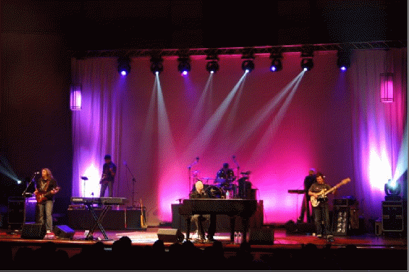
Figure 63 - The contrast between the white light downstage on the artist and the colored light on the backdrop helps define the areas of the stage, giving it more dimension and depth. (Artist: Mark Schultz; Lighting design: Andrew Wakeman, Phil Gilbert, Richard Cadena; Production company: Maxx Productions)
The contrast of light and dark is a natural for the lighting designer, but by paying special attention to shadows you can elevate your art much as Leonardo da Vinci did by using chiaroscuro. Claude Debussy said, “Music is the silence between the notes.” By the same token, it’s the shadows that make great lighting come to the fore.
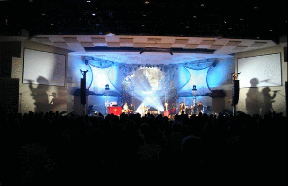
Figure 64 - Incorporating shadows into your lighting design can be fun and effective. (Artist: Watermark; Lighting design: Richard Cadena)
The contrast of proportion can help create new looks from old. By changing the proportion of one color in a multi-color look, we can totally change the feel of that look. In an environment where freshness and new ideas are highly valued, using proportion in our looks is like money in the bank. Many lighting designers go to great lengths to avoid repeating a look. Similarly, the Bezold Effect tells us that changing one color in a multiple-color composition changes the entire appearance.

Figure 65 - Adding a color in a small proportion completely transforms the look of this sanctuary. (First Baptist Church, Sacramento; Lighting designer: Richard Cadena)
The contrast of complements provides fertile ground for color combinations, hopefully not as a catalog of combinations from which to select like a Chinese menu, but a starting point for sparking ideas and variations. Simultaneous contrast is a subset of complementary colors, except they are a special case whereby the combination is so vibrant as to create the illusion of motion and energy. The classic combination is red/green, although this combination is strongly associated with Christmas so it should be used appropriately.

Figure 66 - The simultaneous contrast of the red/green is among the strongest of contrasts. (Artist: Shaun Groves; Lighting designer: Richard Cadena; Production company: Maxx Productions)
Contrast of warm and cool is one of the keystones in the McCandless lighting method, which he used to help model the subject. Since the advent of color television, there has been some debate about the effectiveness of using warm and cool colors on opposing sides of the same subject. Some people believe that accurate color rendition models the face much better.
But the contrast of hues – the juxtaposition of two or more colors – is the lighting designer’s stock in trade. It is the backbone of our compositions and the soul of our art. Learning how to use it effectively is tantamount to perfecting the craft of lighting design.
After selecting lighting instruments and laying them out on a lighting plot, the selection of diffusion, color temperature and color is the most important aspect of lighting design. It’s what gives the lighting rig its character and flexibility. The ability to control the quality of light – shadows, contrast, color, glare, etc. – is as important as the quantity, uniformity and direction of the lighting. These tasks are accomplished with the use of diffusion materials, gels and color selection. Although there is a lot of documentation and reading material available about these aspects of lighting design, experience is the best teacher. If we experiment with different uses and combinations of these tools we will come to know them well enough to apply them freely.
