Color Plates
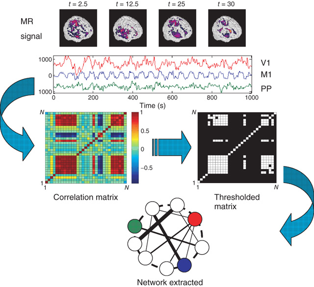
Figure 3.1 Methodology used to extract functional networks from the brain fMRI BOLD signals. The correlation matrix is calculated from all pairs of BOLD time series. The strongest correlations are selected to define the networks nodes. The top four images represent examples of snapshots of activity at one moment and the three traces correspond to time series of activity at selected voxels from visual (V1), motor (M1), and posterioparietal (PP) cortices. (Figure redrawn from [41].)
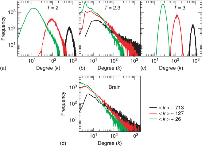
Figure 3.2 At criticality, brain and Ising networks are indistinguishable from each other. The graphs show a comparison of the link density distributions computed from correlation networks extracted from brain data (d) and from numerical simulations of the Ising model (a-c) at three temperatures: critical (T = 2.3), subcritical (T| = 2), and supercritical (T = 3). (a-c) The degree distribution for the Ising networks at T = 2, T = 2.3, and T = 3 for three representative values of (k) ≈ 26, 127, and 713. (d) Degree distribution for correlated brain network for the same three values of (k). (Figure redrawn from Fraiman et al. [42].)
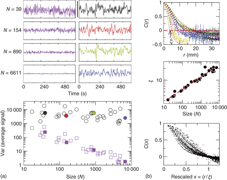
Figure 3.4 Spontaneous fluctuations of fMRI data show anomalous behavior of the variance (a) and divergence of the correlation length (b). Top figures in panel a show four examples of average BOLD time series (i.e.,  in Eq. (3.2)) computed from clusters of different sizes
  . Note that while the amplitude of the raw BOLD signals (right panels) remains approximately constant, in the case of the shuffled data sets (left panels) the amplitude decreases drastically for increasing cluster sizes. The bottom graph in panel a shows the calculations for the 35 clusters (circles) plotted as a function of the cluster size, demonstrating that variance is independent of the RSN's cluster size. The square symbols show similar computations for a surrogate time series constructed by randomly reordering the original BOLD time series, which exhibit the expected
  scaling (dashed line). Filled symbols in the bottom panel are used to denote the values for the time series used as examples in the top panel. In panel b, there are three graphs: the top one shows the correlation function
  as a function of distance for clusters of different sizes. Contrary to naive expectations, large clusters are as correlated as relatively smaller ones: the correlation length increases with cluster size, a well-known signature of criticality. Each line in the top panel shows the mean cross-correlation
  of BOLD activity fluctuations as a function of distance
  averaged over all time series of each of the 35 clusters. The correlation length
  , denoted by the zero crossing of
  is not a constant. As shown in the middle graph scale,
  grows linearly with the average cluster diameter
  for all the 35 clusters (filled circles),
  . The bottom graph shows the collapse of
  by rescaling the distance with
  . (Figure redrawn from Fraiman and Chialvo [56].)
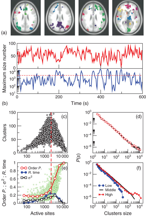
Figure 3.7 The level of brain activity continuously fluctuates above and below a phase transition. (a) Examples of coactivated clusters of neighbor voxels (clusters are 3D structures; thus, seemingly disconnected clusters may have the same color in a 2D slice). (b) Example of the temporal evolution of the number of clusters and its maximum size (in units of voxels) in one individual. (c) Instantaneous relation between the number of clusters versus the number of active sites (i.e., voxels above the threshold) showing a positive/negative correlation depending on whether activity is below/above a critical value ( voxels, indicated by the dashed line here and in panel b). (d) The cluster size distribution follows a power law spanning four orders of magnitude. Individual statistics for each of the 10 subjects are plotted with lines and the average with symbols. (e) The order parameter, defined here as the (normalized) size of the largest cluster, is plotted as a function of the number of active sites (isolated data points denoted by dots, averages plotted with circles joined by lines). The calculation of the residence time density distribution (“R. time”, filled circles) indicates that the brain spends relatively more time near the transition point. Note that the peak of the R. time in this panel coincides with the peak of the number of clusters in panel c, as well as the variance of the order parameter (squares). (f) The computation of the cluster size distribution calculated for three ranges of activity (low: 0–800; middle: 800–5000; and high
  5000) reveals the same scale invariance plotted in panel d for relatively small clusters, but shows changes in the cutoff for large clusters. (Figure redrawn from [58].)
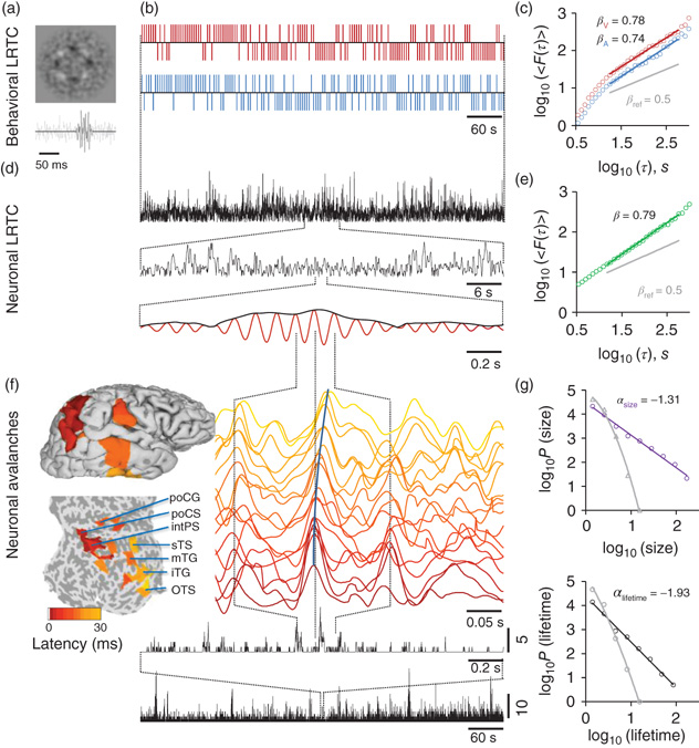
Figure 5.1 The individual scaling laws of individual behavioral LRTC, neuronal LRTC, and neuronal avalanches can be quantified with threshold-stimulus detection tasks (TSDT) and source-reconstructed M/EEG recordings. (a) Examples of noise-embedded visual and auditory stimuli whose signal-to-noise ratios are tuned before the experiment to yield a ∼50% hit rate and then maintained constant. (b) Behavioral performance time series of detected (upward ticks) and undetected (downward ticks) display-rich dynamics in a bimodal audiovisual TSDT (visual, red; auditory, blue; time series are for the first 10 min of a 30 min session of a representative subject). (c) Visual and auditory detection time series exhibit long-range temporal correlations (LRTC) that can be characterized for each individual subject by DFA exponents, βV and βA. (d) Amplitude fluctuations of neuronal oscillations in local cortical patches (here, 10 Hz in inferior parietal gyrus) are fractally self-similar and (e) show robust LRTC. (f) Avalanche dynamics are salient in source-reconstructed broadband data. The time series of cortical patches in the example avalanche are color coded by the peak latency. These colors correspond to those displayed on pial and flattened cortical surfaces and show the progression of this activity cascade from posterior parietal-to-temporal and post-central loci. The avalanche time series (bottom, black lines) show the number of cortical patches where a peak was found with zeros, indicating interavalanche periods. (g) The sizes and lifetimes of cortical avalanches are approximately power-law distributed with exponents, α, close to those of a critical branching process (−1.5 and −2, respectively). All data in this figure are from the same 30 min session of a subject that is representative in having β closest to population mean.
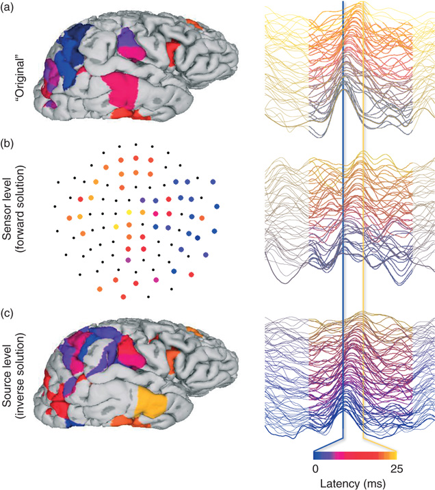
Figure 5.2 Source modeling of spontaneous M/EEG data can be used to reconstructs cortical current time series for analyses of LRTC and neuronal avalanches: a schematic illustration of the sensor- and source-level of a cortical activity cascade. (a) A neuronal avalanche was identified from source-reconstructed, real-valued, and broad-band (1–25 Hz) M/EEG data of a representative subject. In this illustration, we use these source time series as “original” waveforms of cortical currents. The left panel shows cortical patches where the peak amplitude exceeded a threshold of three standard deviations. The right panel shows the time series of these patches. The patches and time series are color coded by the latency of the peak from the first peak in this cascade. (b) All patch time series in (a), including those not participating in the avalanche, were forward transformed to perform virtual M/EEG data acquisition and visualize the sensor level data in MEG planar gradiometers. (c) Cortically constrained minimum-norm-estimate source modeling of the sensor data (b) reconstructs the relatively well spatiotemporal characteristics of the original cascade.
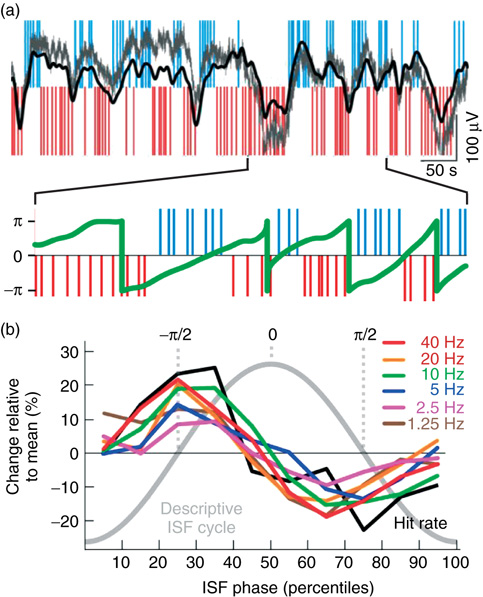
Figure 5.3 EEG ISFs are salient in an awake human EEG and correlated with behavioral ISFs. (a) Large-amplitude ISFs are readily observable in raw full-band EEG data (gray line: unfiltered, black line: band-pass filtering from 0.01 to 0.1 Hz) and reveal a correlation of the ISF phase (green line) with psychophysical performance (blue and red ticks as in Figure 5.2). (b) Amplitudes of 1–40 Hz oscillations are correlated with the ISF phase similarly to behavior.
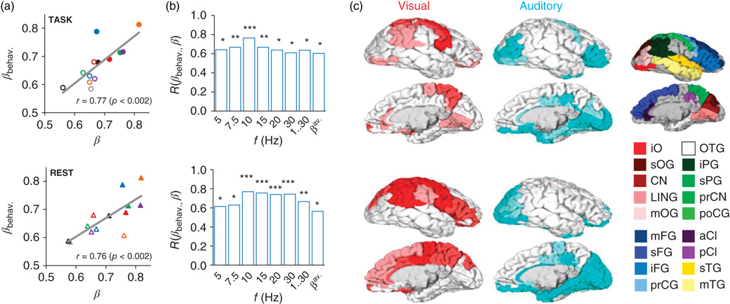
Figure 5.4 Scale-free neuronal dynamics are correlated with interindividual variability in behavioral scaling laws. (a) Mean local LRTC in the 10 Hz band (β) both during the TSDT task performance and in a separate resting-state session are correlated with the mean behavioral scaling exponents (βbehav.). (b) This correlation was significant in frequency bands from 5 to 30 Hz, in broadband data, and for the avalanche DFA (*p < 0.05, **p < 0.01; ***p < 0.005). (c) Neuroanatomical source regions for the correlation between neuronal and behavioral LRTC scaling exponents. Pearson correlation coefficients were computed between βbehav. and β in the beta and gamma (15, 20, and 30 Hz) bands for each cortical patch and significant (p < 0.05, FDR (false discovery rate) corrected) correlations were displayed on cortical surfaces. For each cortical patch of the Destrieux parcellation, the color intensity indicates the fraction of significant correlations across the three bands (pale 1/3, medium 2/3, full 3/3). Red: Correlation of visual behavioral scaling exponents, βV, with the β of neuronal LRTC during visual task performance (upper panel) and in separate resting-state data (lower panel). Blue: Correlation of auditory behavioral scaling exponents, βA, with the β of neuronal LRTC during auditory task performance and in separate resting-state data. Abbreviations: a, anterior; i, inferior; m, middle; p, posterior; pr, pre-; s, superior; C, central; CI, cingulate; CN, cuneus; F, frontal; G, gyrus; LIN, lingual; O, occipital; P, parietal; T, temporal. Red colors, occipital; green, parietal; blue, frontal; yellow, temporal; purple, cingulate. iPG shows the angular part.
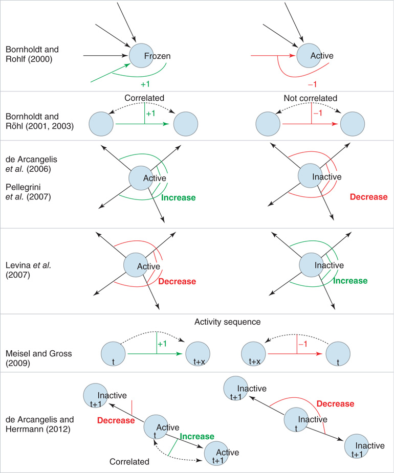
Figure 10.1 Schematic illustration of some of the different approaches to self-organization in neural network models. Rows 1 − 2: Links are either added (denoted by +1; green link) or removed (denoted by −1; red link) as a function of node activity or correlation between nodes. Rows 3 - 4: Here, activity or inactivity of a node affects all outgoings links (thin lines). All weights of the outgoing links from a node are decreased (red) or increased (green) as a function of node activity. Row 5: Links are created and facilitated when nodes become active in the correct temporal sequence. Links directed against the sequence of activation are deleted. Row 6: Positive correlation in the activity between two nodes selectively increases the corresponding link, whereas there is non-selective weight decrease for links between uncorrelated or inactive nodes.
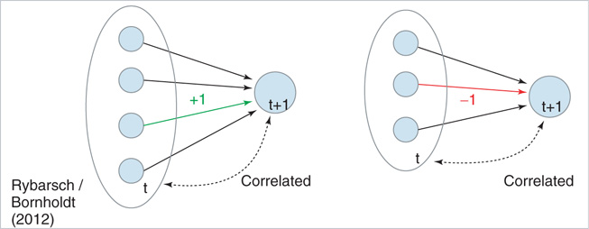
Figure 10.12 Schematic illustration of the rewiring mechanism based on average input correlation. In this example, the target node initially has three in-links. Left: If the addition of a fourth input increases the average input correlation Ciavg, a link will be inserted. Right: If removal of an existing in-link increases Ciavg, the link will be deleted.
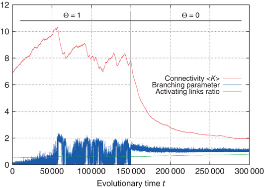
Figure 10.16 Rewiring response to a sudden decrease of activation thresholds. All  were set from 1 to 0 in the same time step.

Figure 12.2 Two neuronal avalanches in the scale-free network. Two-hundred and fifty neurons are connected by directed bonds (direction indicated by the arrow at one edge), representing the synapses. The size of each neuron is proportional to the number of in-connections, namely the number of dendrites. The two different avalanches are characterized by pink and blue colors. Connections and neurons not involved in the avalanche propagation are shown in gray.
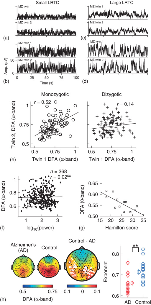
Figure 13.5 Results of applying DFA to neuronal oscillations. (a–d) Individual differences in long-range temporal correlations in α oscillations are, to a large extent, accounted for by genetic variation, which can be seen qualitatively by looking at four sets of monozygotic twins. (Figure modified from [32].) (e) The effect of genetic variation on LRTC can be quantified by the difference in correlations of DFA exponents between monozygotic and dizygotic twins. (Figure modified from [32].) (f) The DFA exponent is independent of oscillation power. Data were recorded using EEG on 368 subjects during a 3 min eyes-closed rest session. (Figure modified from [32].) (g) DFA exponents of θ oscillations in the left sensorimotor region correlate with the severity of depression based on the Hamilton score. Data recorded from 12 depressed patients with MEG, during an eyes-closed rest session of 16 minutes. (Figure modified from [55].) (h) DFA of α oscillations shows a significant decrease in the parietal area in patients with Alzheimer's disease than in controls. MEG was recorded during 4 min of eyes-closed rest and the DFA exponent estimated in the time range of 1–25 s. (Right) Individual-subject DFA exponents averaged across significant channels are shown for the patients diagnosed with early-stage Alzheimer's disease (n = 19) and the age-matched control subjects (n = 16). (Figure modified from [56].)
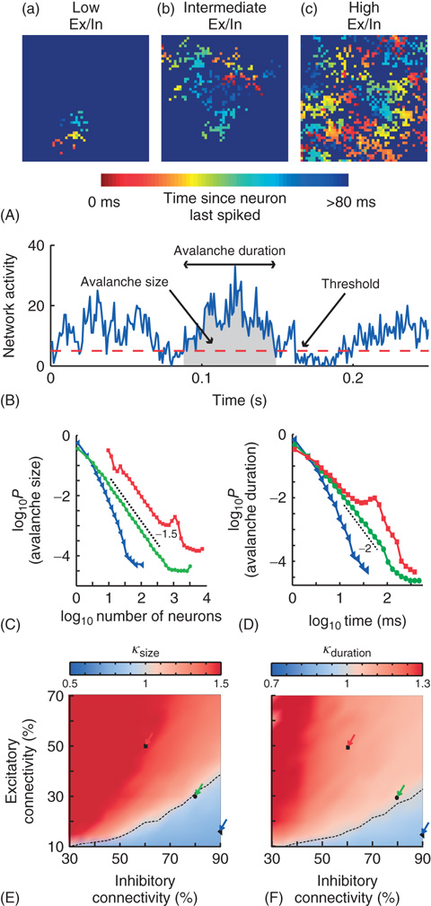
Figure 13.7 On short timescales (120 ms), activity spreads in the form of neuronal avalanches. (A) Example snapshot of network activity for three networks with different excitatory (Ex)/inhibitory (In) connectivity balance (Ex/In balance). Colors indicate the time since each neuron last spiked. (a) Networks with low Ex/In balance show wavelike propagation over short distances. (b) Networks with intermediate Ex/In balance often display patterns that are able to span the network and repeat. (c) Networks with high Ex/In balance have high network activity, but have little spatial coherence in their activity patterns. (B) An avalanche starts and ends when integrated network activity crosses a threshold value. (C) The avalanche-size distribution shows power-law scaling in the transition region (green circles) with a slope of −1.5 (dashed line). The subcritical region has an exponential distribution (blue triangles). The supercritical region (red squares) has a clear characteristic scale. (D) The avalanche-size distribution shows power-law scaling in the transition region (green circles) with a slope of −2 (dashed line). The subcritical region has an exponential distribution (blue triangles). The supercritical region (red squares) has a clear characteristic scale. (E) The connectivity-parameter space shows a transition (dashed black line) from subcritical (blue) to supercritical (red) avalanches. Arrows indicate the connectivity parameters of networks in (C). (F) The connectivity-parameter space shows a transition (dashed black line) from subcritical (blue) to supercritical (red) avalanches. Arrows indicate the connectivity parameters of networks in (D). (Modified from [61].)
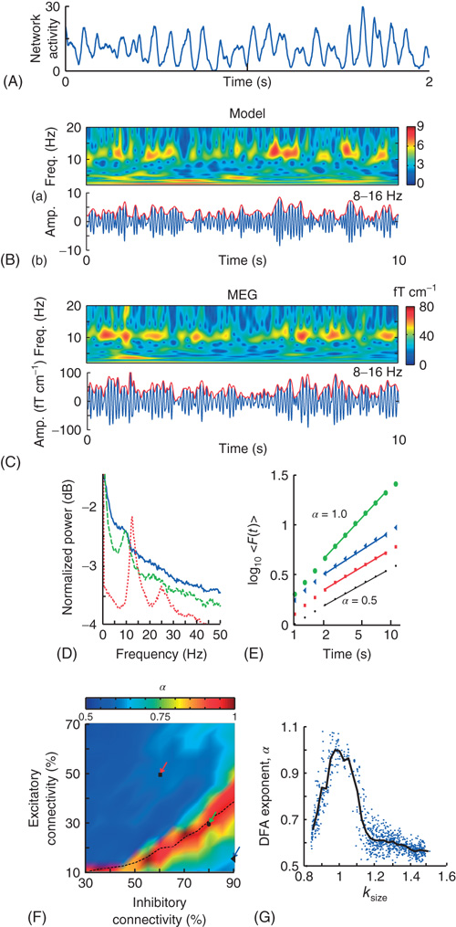
Figure 13.8 On long timescales (>2 s), the model produces oscillations qualitatively and quantitatively similar to human α-band oscillations. A: The spatially integrated network activity in a sliding window of 10 ms displays oscillatory variation. B: (a) Time-frequency plot of the integrated network activity from a network with 50% excitatory and 90% inhibitory connectivity. (b) Integrated network activity filtered at 8–16 Hz (blue), and the amplitude envelope (red). C: The same plots as in (B), but for a representative subject and MEG planar gradiometer above the parietal region. D: Power spectrum of the integrated network activity shows a clear peak frequency at ∼10 Hz for three networks with Excitatory:Inhibitory connectivity of 50% : 60% (red), 30% : 80% (green), and 15% : 90% (blue), respectively. E: DFA in double-logarithmic coordinates shows power-law scaling in the critical regime with α = 0.9 (green circles). The subcritical (α = 0.6, blue triangles) and supercritical (α = 0.6, red squares) regimes display similar correlations to a random signal (black dots). F: The connectivity-parameter space shows a clear peak region with stronger long-range temporal correlations. Overlaying the transition line from Figure 13.7E indicates that peak DFA occurs at κ ∼ 1. G: DFA exponents peak when the networks produce neuronal avalanches with critical exponents (κ ∼ 1). (Modified from [61].)
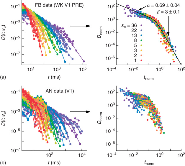
Figure 16.7 Families of distributions of inter-avalanche intervals  for (a) freely behaving animals and (b) anesthetized animals. Left column: regular distributions. Right column: rescaled distributions (see text for details). Different colors denote different values of
  . (Adapted from Ref. [50].)
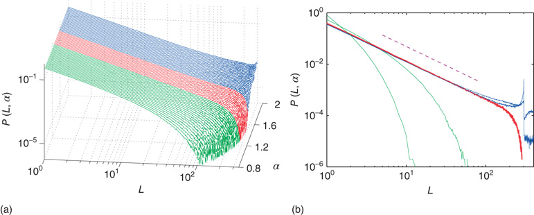
Figure 20.2 Distribution of avalanche sizes for different values of the connection parameter  . (a) At
  , the distribution is subcritical (green). It becomes critical in an interval around
  (red). For
  , the distribution is supercritical (blue). (Figure first published in Ref. [23].) (b) Characteristic examples of all three kinds of distributions with the same color code. Results are obtained for
  (Figure adapted from Ref. [39].) http://www.nature.com/reprints/permission-requests.html.
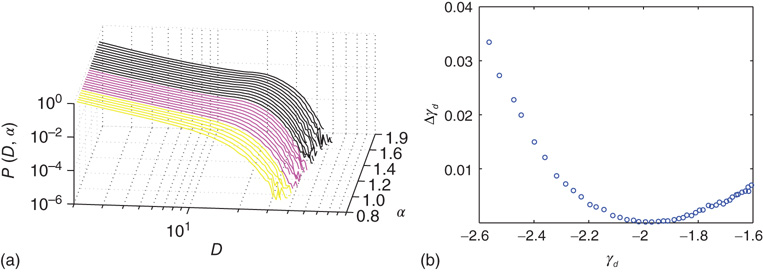
Figure 20.4 (a) Avalanche duration distribution for different values of the connectivity parameter  . (b) Power law exponent
  fitted for small avalanche durations as a function of the goodness of the power law fit to the avalanche size distribution.
  ,
,  ,
,  . In (a), green gray traces correspond to subcritical distributions of avalanche sizes, red gray traces critical and blue ones supercritical. For details see Figure 20.2.
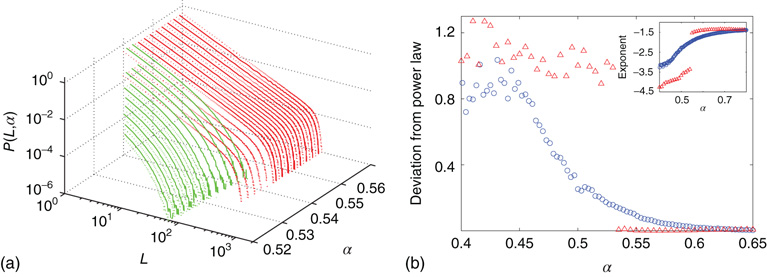
Figure 20.8 (a) Distribution of avalanche sizes for different values of  . Below
  a subcritical distribution exists (green). Critical behavior can be observed above
  (blue/red). The picture indicates a hysteresis with respect to
  , which is illustrated by the section through the 3-D plot and shown in the inset. For large networks, all distributions of the upper branch are critical, while the lower branch remains subcritical. See also Figure 20.9. (b) Deviation of avalanche size distribution from a power law for different
  . Triangles represent facilitatory synapses, while circles represent depressing synapses. The inset shows the exponent of the nearest power law distribution. For both,
  ,
,  [39].
[39].