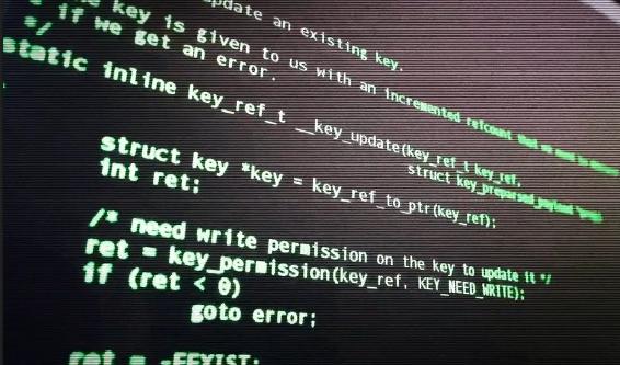
Here’s a quick note. I said the font doesn't matter when writing source code, but you might be wondering that whenever you see programming on TV or in the movies, they always have the same kind of look to it. Often something like this:

Fig 1.5.1: A sample program from the movies
You don't see source code written in a font like Times New Roman or Comic Sans, but if it doesn't matter what font we use, why does it usually look like this?
Well, partially it's history. Early programming environments included simple dumb terminals that were black screens with green text. That's all they could do.
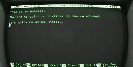
Fig 1.5.2: Old programming environment
And even though modern operating systems can provide more visually stimulating content, a lot of programmers are very comfortable with a very simple and straightforward layout. Partly it's a little cinematic, most programmers don't code with just a green font on a black background. They use editors with color coding, some like a dark background, some like a light background.
But one thing is true: even though we could use any font we want because the language doesn't care. The convention is that when writing source code, we use a mono spaced font where each letter uses the same width as opposed to a proportional font where a letter like I or L takes up less space than a letter like M.
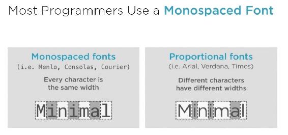
Fig 1.5.2: Comparing Monospaced font to Proportional Font
The reason is that in a monospace font it's easy to tell when words and sentences across different lines are the same length, but is that important you think? Well, yes, it is.
You see, when we write code, we care about exact indentation and how our lines line up with each other as we're looking at them and it's not just for aesthetics.
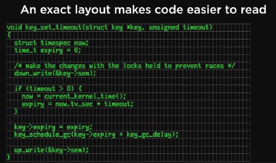
Fig 1.5.3: Code Layout in monospaced font
It makes the structure of our code more apparent. It lets us read source code and easily tell which parts of the program belong together. That's why code looks like code.