Creating a symbol font doesn’t take much more know-how than creating vector graphics. If you are familiar and comfortable with applications like Adobe Illustrator or Inkscape, then you are well on your way to creating your own font. For our purposes, the difference between separate vector graphics and a font is that the font file bundles all your graphics together into a single downloadable file where each graphic is mapped to a different glyph. Much like CSS sprites did for background images, font files are beginning to serve a similar purpose.
To create a font, we need a vector graphic for each glyph. For a simple, one-case roman alphabet you’d need twenty-six vector images. If you want lower- and uppercase, numerals, punctuation and so on, this increases the effort. Now, we’re not making a full font you’d use for writing, so we only need to create as many vector icons as needed. We can leave the rest of the letters blank. This will crunch the font file as small as possible, decreasing the bandwidth and time to download for the reader.
As we noted earlier, there is a section of the font file reserved for private use. This means there is space for characters that aren’t expected to be glyphs which have some sort of previous meaning. For instance, you shouldn’t map a vector icon of the Facebook logo to the letter F because the two don’t mean the same thing; but if you make a beautiful illuminated drop-cap F, then by all means put it as the letter F in the font file.
The other thing you need to keep in mind as you design your symbols is that they can effectively only be one colour. Just like the letters of the alphabet, fonts are single-colour shapes. If you are expecting to make a multicoloured, gradient logo as a symbol font you’re out of luck, though some CSS3 trickery might get you part of the way there.
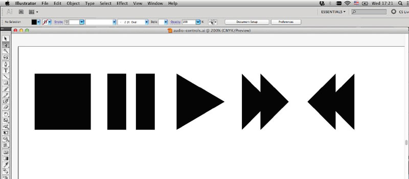
As a simple example, we’re going to walk through how to make your own set of audio icons: play, pause, stop, fast-forward and rewind. These are simple shapes to create and will give you a chance to familiarise yourself with the tools. Then you can go back and repeat the steps with more complex shapes that suit your needs.
If you don’t have your shapes as vectors already, you’ll need to create them. To do so, you need software such as Adobe Illustrator or Inkspace. Any software that can export to SVG will do.
We’ll create these five icons with the shape tools.
Five audio icons we’ll draw and convert into a symbol font.
To make our lives easier, we want to design the icons to a size close to what the importing software will use. For instance, 1,024×1,024 pixels is a standard size. If we can make our audio icons at that scale, it will minimise the tweaking needed in the font software.
There are a few other things to note about optimising your symbols for fonts. This includes subpixel aliasing. While you might import your design at 1,024×1,024, there will be an underlying grid used by the software to increase or decrease the font size. If part of your design sits between two columns or rows of the grid, when shrunk it won’t occupy a full pixel, making the edges softer and not as crisp. To avoid this, all you would need to do is push the original design left or right, or up or down so it sits nicely on the grid. When GitHub designed its icon set, Octicons, Cameron McEfee wrote an excellent post about this grid.
Now that we have created the individual vector graphics, we need to use some font-making software to combine them into a font file. There are several alternatives at various price points. If you are going to make a living creating fonts, there are professional tools like Fontographer or Glyphs. But there is also free software that anyone can download and use called FontForge. It’s not pretty, but it runs on all major platforms. The general workflow is the same even if you are using different software.
Download and install FontForge. Depending on your operating system and version, you will probably need to install some additional software such as X11, XQuartz or cygwin.
Finding your way around FontForge can be daunting, but there are only a few special areas we’ll be focusing on as you create your font. These are: the Element menu and the Encoding menu.
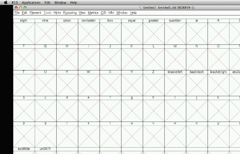
FontForge has two main windows: the window where you can see your entire list of glyphs; and a specific glyph editor window. To make your life easier, the main window can be adjusted so you can better see your symbols. If you go to the View menu, and then select 96 pixel outline, it will make the boxes bigger so you can actually see the glyphs you are working with. You can adjust the size to your preference.
At this point, you should see something like this, a complete alphabet of empty glyphs that the software is expecting you to draw.
For this example, we’re only going to create five glyphs, so we can save some space with the file size by removing all the extra, empty glyphs. To do this, open the Encoding menu, then select Remove Unused Slots.
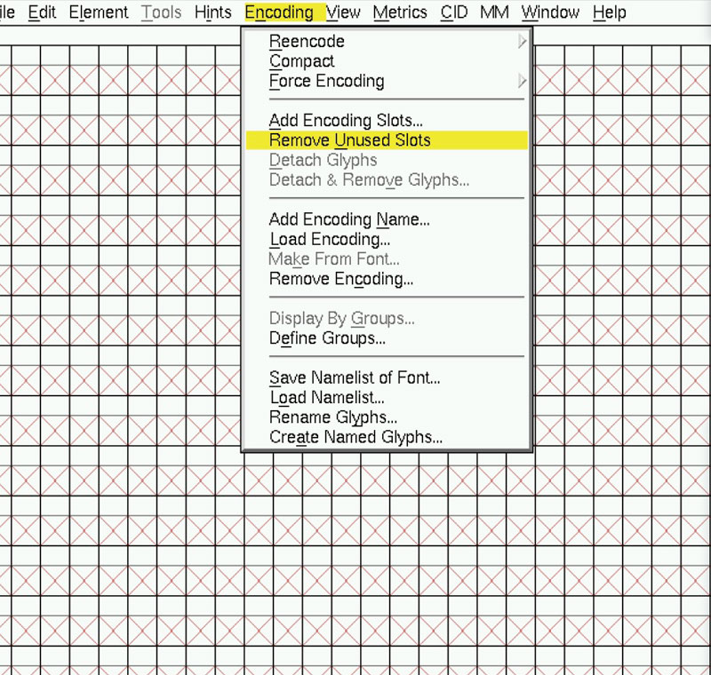
Remove unused slots to decrease the file size.
This will clear out the entire font, making it as compact as possible.
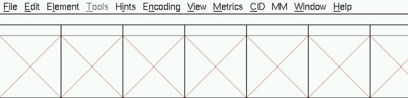
Completely empty font file.
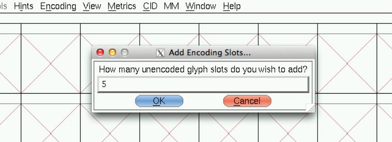
You’re probably wondering, now that it is empty, how do I add my symbols? Well, we need to add just a few glyphs back in. To do this, go into the Encoding menu and select Add Encoding Slots…. This will bring up a dialog box asking how many glyph slots you want to add. For this example, we are going to add five, so type 5 and press OK.
Five empty encoding slots.
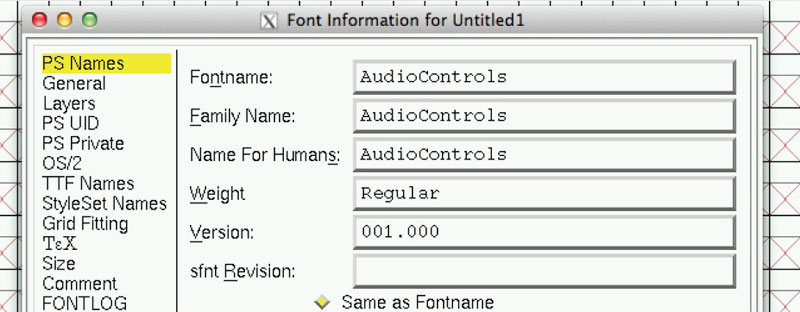
Before we get any further, let’s save our work and give it a name. Go to the Element menu and select Font Info…. This brings up a dialog box where we can enter some information about the font.
Metadata menu to add information about your new font.
You have several options here, but the ones we want to focus on are simply the Fontname input, the Family Name and Name For Humans. You can dig around in the other options, but this is all that is needed to create your font.
At this point, we’ve set up the metadata and the structure. If we close the window we can get back to importing our symbols.
As we can see, there are five slots waiting to receive some vector glyphs. If we double-click on the first empty square, that brings up the glyph editor window. Much like other editing programs, we have a floating palette with some tools such as zoom, select, scale and so on. We’ll use these to fine-tune the positioning and size of our vector shapes. You can see in the empty editor that there are several guidelines. These are for the various letter heights. If you are unfamiliar with x-heights, descenders and ascenders, don’t worry: you can read up on them in the callout below.
Other typeface heights are calculated in relation to the height of the x. In our example, we want our audio controls to be the same height as the letter x, so we want to make our glyphs fill the lines as close to the max as possible. An ascender is the part of a character that goes above the x-height, such as the dot in the letter i (called a tittle), but also in the tall lines in letters like b and d. A descender is the opposite: it is the part of a character that falls below the baseline. These are the dangling tails on letters like y, j and q. Depending on your glyphs, you might want parts of your design to drop below the baseline or extend beyond the x-height.
A little noticed characteristic of rounded letters is that they actually curve just below the baseline. If you take a very close look at letters like c and o, the baseline actually cuts into the bottom curves slightly. If these letters sit precisely on the baseline, they look as if they are positioned too high. This is something to keep in mind when creating round glyphs.
In the glyph editor window, you see a blank area. You could start drawing inside this using the tools in the palette, but since we already made our vector graphics in a separate program, we can import them instead. This lets you use the tools you are comfortable with, such as Illustrator, Inkscape, Photoshop or Fireworks, as long as they export as SVG.
To import your vector graphics, go to the File menu and select Import… to open a file browser. Browse to your SVG file and import it. For instance, if we import the stop.svg file you’ll see this:
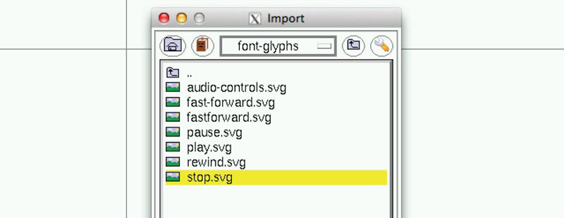
The stop.svg file has been imported into a FontForge glyph.
Maybe your symbol is too small or too large. To correct this we need to resize the vector. So, select everything, then go over to the palette and select the scale. That’s the one that looks like this:
Scale your shape menu item.
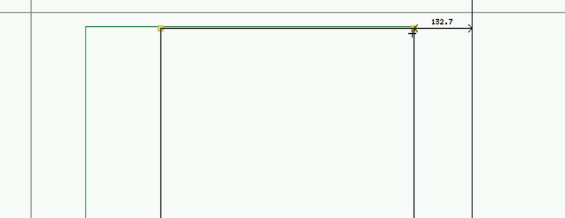
You can then scale the image until it reaches the x-height. Repeat this process for each symbol you import. Another handy tool is under the Metrics menu. The Center in Width command will move your glyph to the centre of the glyph’s width. This makes sure everything is evenly spaced.
If you are using symbols on your website independently of one another, you don’t need to worry about the character width, but if you want the glyphs to sit next to each other when displayed, you may need to adjust the character width so they aren’t so spaced out away from each other. The letter i isn’t the same width as the letter w in most fonts. Your symbols may vary in width, and you might need to adjust each character’s plot width so when the symbols are used next to each other, there is not a fixed width for each.
With all the symbols imported, we need to map them to a specific character in the font. Up to this point, we’ve emptied the font of all the characters, specified five new spaces, and then imported symbols into those spaces. Now we need to assign those glyphs to code points so they can be typed or referenced in other applications.
Mapping the glyphs to a Unicode value.
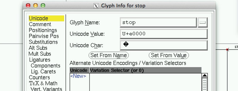
Click on the first symbol in the FontForge main window. Once highlighted, go up to the Element menu and select Glyph Info…. At this point, we’ll add some metadata to the symbol, such as a name. We’ll call this one “stop” and then assign it to a Unicode value. Since in this example we’re not working with standard characters, we’ll use the portion of Unicode that is reserved for private use. The first spot available in the private use area is e000, so type that into the box labelled Unicode Value. There are plenty of other options in the dialog box, but those aren’t useful to us right now, so press OK.
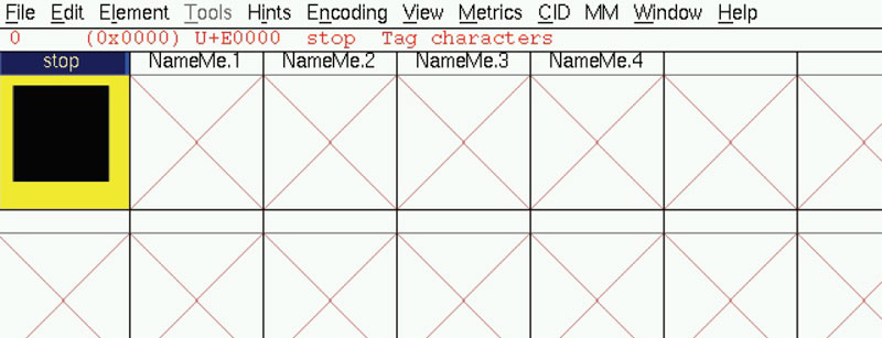
Edited charactor now shows "stop" above it
Back in the main window, we can now see that the character we just edited no longer has a ? above it. Instead it says stop. We’ll need to repeat this process for the other four glyphs, but as we do this, we must assign them to different Unicode positions. The first one was e000, so we’ll sequentially increase it to e001, then e002 and so on. These are hexadecimal values, the same as HTML colour values, running from 00 to ff. Remember, after 99 comes 9a, then 9b. After 9f come a0, a1 and so on, up to ff. For our Unicode points, e009 is followed by e00a, e00b and so on.
At this point, we should save everything and prepare to create our own font. To do this, go to the File menu and select Generate Fonts…. You’ll get a few different options; the best is to save as Open Type. We can convert from that to anything else we’ll need later. Save it with an appropriate name and that’s it!
You have now created your own font that can be installed on your machine and used locally. Go ahead and try it – you can install the font on to your system. To view your new creation in an HTML page, we’ll need to use some of the snippets from Part 3 to embed your new font. In our previous examples, we always referenced a character we can type on the keyboard, but our font uses the code points e000, e001, and so on. How would we reference those?
In HTML we can reference any character by its decimal value using the escape sequences.  is the decimal representation of e000. And you thought that the escape code was only useful for &, < and >. There are plenty of online tools that will help you convert between hex and decimal values.
In CSS, this is a little different. To escape our e000 character, we need to use a leading \ (backslash) character. For instance:
.stop:before{
content: "\e000";
}
This will display our stop symbol in any element with a class of stop.
In Part 3 we touched briefly on ligatures and some of the things you can do to improve the semantics of your HTML, while at the same time display these symbol fonts.
We’ll walk through an example of how to type the word stop and have the symbol we just imported appear instead. Once you understand how that works, you can create ligatures for the other four symbols we imported.
The first thing we need to do is create an additional glyph for the space character. So, let’s go back to the Encoding menu, select Add Encoding Slots… and add one more. Select the new box that was created and go to the Element menu and Glyph Info to map this to the space. You should now see the glyph info window. For Glyph Name you can type “space”; for Unicode Char, just press the space bar and that should fill in the Unicode Value of U+0020 automatically.
Adding the space character is important because this is used as part of the ligature. It is buried in some font specification – don’t ask me why, but we’ll need it. You don’t have to do anything with the space glyph beyond adding one; it is blank by default.
Next, we want to map the keypresses s-t-o-p to our stop symbol. To do this we need to define some ligatures. In the Element menu, under Font Info…, we’ll see a new dialog box. This is where we entered the name of the font previously, but now we’ll explore some of the other options. In the list on the left, there is an option called Lookups. If we click this, it will load a new pane with information about the ligatures. You see it is an empty list in GSUB. Let’s click the Add Lookup button to the right. This will open a new dialog where we define the type of ligature we are creating. Under the Type drop–down, select Ligature Substitution.
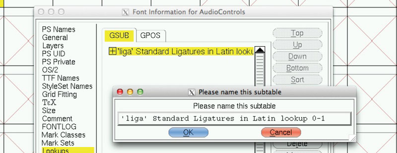
Ligature menu.
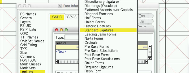
In the small box below the Type, click the – (the dash sign) to add a new feature. From the list, select the Standard Ligatures option. This will populate the table with a new feature and “Script(s) & language(s)” which has liga and DFTL{dflt} as options.
We can give our new lookup a name and press OK. Back in the GSUB list, we’ll see our new liga option. This simply tells the font file there will be some ligatures; we still need to define what combinations of keypresses will invoke the ligature menu. To do this we need to click the Add Subtable button which opens a new dialog.
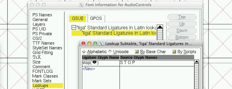
Defining a Ligature.
In this new dialog we’ll define our ligatures. The left column in the table is the Ligature Glyph Name. This is the name we entered as the ligature name in the Glyph Info dialog. We can type the word stop and it will find our symbol called stop. The column on the right is Source Glyph Names. These are the keystrokes used to invoke this ligature. Here, enter “s t o p” (with spaces) and press OK.
The bad news is that the font has no concept of stop because we removed all the unused glyphs. We have to go back and add all these characters if we want to represent them as ligatures. There are a few options here: you could go back and draw all the missing glyphs; you could find a new open source font you like and use that as a basis from which to add your glyphs; or simply create the glyphs and draw nothing.
No matter which way forward you choose for the missing glyphs, you now have the knowledge to create your own ligatures. It is also possible to map several versions of a word to the same symbol. You could map “stop”, “Stop”, “STOP”, or even “Alto” so that when any of those key combinations are entered, the ligature kicks in and displays the stop symbol we created.
Once we’re happy with our symbols and any ligatures we want to create, we need to save this to a proper font file which we can upload to our web servers to reference in our HTML. But before we do that, we’re going to need to create a few versions of the font file for the different browsers.
Not all browsers support ligatures. That means in these browsers you won’t get the symbol, but instead just the word. There are ways around this. You could type the Unicode for the symbol rather than letting the text convert it to that symbol via ligatures. The downside is that you don’t get the clean words which search engines can index. The other option is to use conditional comments and load a small piece of JavaScript for just the browsers that can’t render your ligatures. This JavaScript file will go through the text to find and replace all the words which should be ligatures and replace them with the Unicode values. This gets you the best of both worlds. Non-JavaScript browsers can see the raw text, but capable devices get to see the symbol.
Between Internet Explorer, WebKit and Mozilla, we are going to need to generate a few different font file types to include all the browsers. We’ll need the WOFF, OTF, TTF and EOT formats.
There are several services available online and as downloadable command line tools to do this. They allow you to upload your TTF or OTF file and will send you back a zip with all the additional formats. The major issue with some of these services is that your ligatures might also get removed during the conversion, so remember to check on all the different browsers.
You’ll also need to run the conversion every time you make a minor change to your font, so find a good workflow you are comfortable with. FontForge can save in a few of the required formats and, depending on how complex your font graphics are or what sort of compression you need, various services might remove more or less metadata creating smaller file sizes.
A few final thoughts about optimising the file size: removing all the unused glyphs in the font makes things smaller. Also, the fewer points in your vector files, the smaller the font will also be.
Base64-encoding the font into the HTML might increase the number of bytes, but reduce the requests. These are all options to consider when you are ready to deploy your designs.
You may not realise this, but corporate logos actually change depending on their size and resolution. Fancy horizontal lines become fewer at smaller sizes and line widths can be exaggerated at the larger end. With your symbol fonts, you don’t have the ability to change the design at different sizes. If you have an overly complex design with fine detail, it might look great at 32pt, but at 12pt it is a blurry mess. This is something to consider as you create your symbols; you might actually have to create multiple types and use different font files for different intended display sizes.